News of the Cavaliers wearing a Goodyear advertising patch next season first began circulating back in early February. More than three months later, the team finally made it official yesterday.
I heard a lot of people saying, “Well, at least it’s in a team color, and it fits into the space — not so bad.” In other words: Instead of being unacceptable, wrong, and ugly, this patch is just unacceptable and wrong. Zero tolerance! #NoUniAds
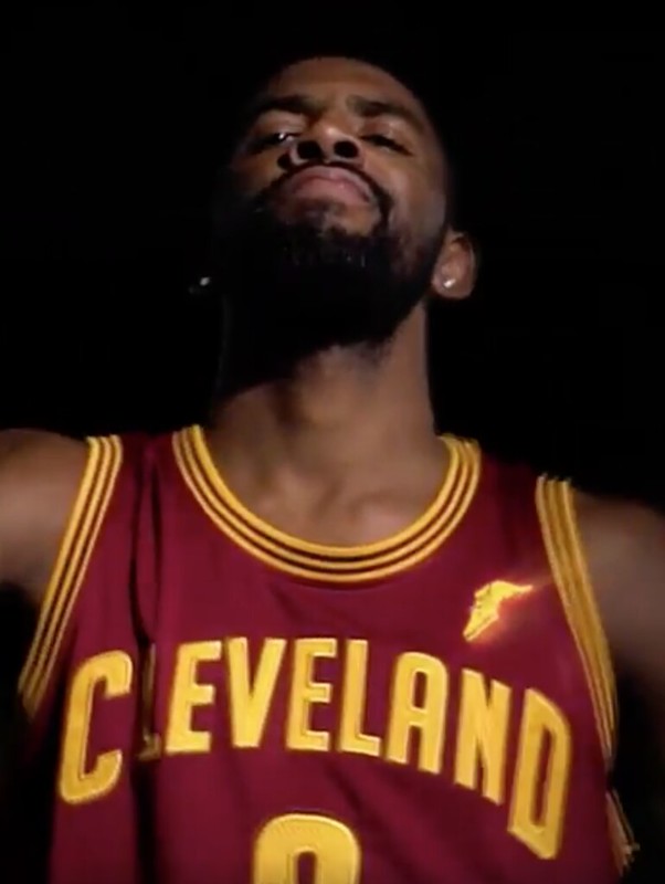
The image shown above is a screen shot from a promotional video that the team released. (The ad patch looks shiny due to a special effect in the video.) As of now, that’s the only view of the ad patch that we have, because, to my knowledge, no patch-clad jerseys were shown at yesterday’s press conference — a very odd omission. There’s also been a lot of chatter about the Cavs getting a new uniform design next season, so maybe they didn’t want to showcase the outgoing design at the presser. But if that’s the case, why show it in the video? Weird.
One interesting tidbit: According to this article, “Goodyear is not the official tire of the NBA (that designation belongs to Kumho), but that category was not protected in this case. Protected sponsors include broadcast partners (ESPN, ABC & Turner), Spalding (the official ball) and Tissot (the official timekeeper).” Ah, corporate theater — such drama.
The Cavs are the sixth team to announce their corporate uniform advertiser for next season. The other five are the 76ers (who’ll be wearing a StubHub patch), Kings (Blue Diamond Almonds), Celtics (GE), Nets (Infor), and Jazz (Qualtrics). It remains unclear if the league’s two dozen other teams are simply biding their time, or if we’ll end up with a situation of some teams participating in the uni-advertising program and other teams opting out of it.
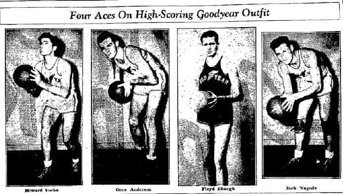
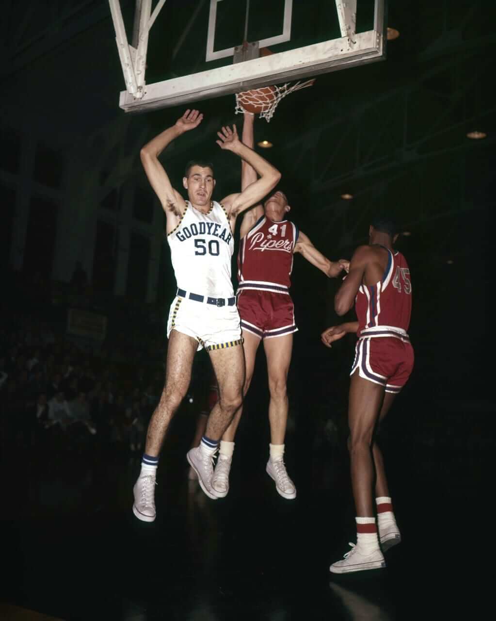
Meanwhile, my ESPN colleague Darren Rovell points out that the Goodyear name and logo have previously appeared on the uniforms of the Akron Wingfoots, a company-sponsored team dating back to 1918. Here some photos from 1937 (you can learn more about the Wingfoots here and here; click photos to slightly enlarge):
The Wingfoots backstory got reader Bryant Johnston thinking: Given the new Cavs/Goodyear partnership, could the Cavs wear a Wingfoots throwback? Maybe something like this:
It seems unlikely — until you think about the Pacers’ Hickory throwbacks, which are sorta/kinda in the same realm. Hmmmm.
One final item: As you’d expect, the Cavs are using the new advertising partnership to sell a lot of merch. I don’t really care about any of that, but this photo caught my eye, if only because the red triangle in the top-left corner of the white box looks a lot like a Nabisco package.
Click to enlarge
Collector’s Corner
By Brinke Guthrie
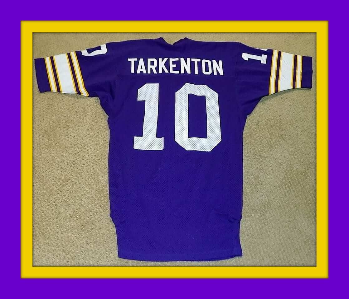
Tomorrow is Purple Amnesty Day, but Collector’s Corner always runs on Tuesdays, so we’re taking our purple shot now with this Sand-Knit Fran Tarkenton Vikings jersey. The listing doesn’t say he wore it, but he better have, considering what they’re asking for it! It’s not the Mary Tyler Moore design, but still.
Now for the rest of this week’s picks:
• Sticking with NFL authentics, here’s a game-worn Philadelphia Eagles sideline jacket, supposedly worn by Philly punter Max Runager.
• How about this Dallas Cowboys sideline jacket. This sure brings back the memories — saw a number of these on the sidelines while watching the Cowboys.
• One more game-used item: this “Batman”-style Steelers jersey, a Rawlings item from the Pittsburgh Sports Shop. Worn in 1966 by Jerry Simmons, then they got rid of Jerry and gave No. 25 to Don Shy for 1967. Check out that price tag!
• KGO Newstalk AM 810 and The San Francisco Examiner sponsored this 1970s 49ers bandana/handkerchief.
• Check out this state of the art (well, for its time) Electronic Touchdown handheld NFL game from Mattel. As Earl Shores of the Unforgettable Buzz notes, “The 1977 Mattel Electronic Football was, at the time, the top-selling toy of all time. And once Mattel exploded the market with the game, everybody wanted in on the action. Even Tudor Games began selling their own versions of Electronic Football. And of course the Sears model, which Coleco made for Sears. These games were the beginning of Electric Football becoming ‘just another toy.'”
• Nice artwork on this 1960s Kansas City Chiefs poster.
• Here’s the lowest price I’ve seen in a while for a full set of 1970-1971 Chiquita NFL stickers.
• Helmet buggy alert! Someone had a bit of trouble putting on those Detroit Lions decals.
• The Detroit Tigers and IHOP were a great double-play combo. Says so right on this 1970 placemat.
• Here’s another placemat for the following MLB season, no restaurant branding on this one. The “1971 Baseball Guide” has stats from the 1970 season.

Movie contest reminder: In case you missed it over the weekend, Phil is running a new contest to create an updated design for a jersey featured in a movie. All the details are in this post.
The winning designer will get a custom-sized version of his or her jersey, produced by our friends at Garb Athletic. The deadline is this Thursday, May 18, at midnight Eastern, so get crackin’!
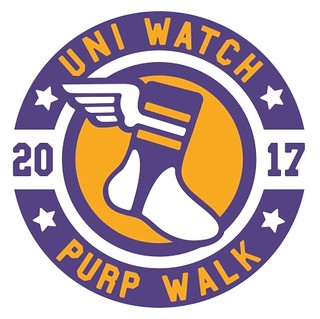
Purp Walk is almost here: Our annual Purple Amnesty Day begins tonight at midnight Eastern. There’s a preview, including a look at this year’s Purp Walk shirt (available for only 24 hours, no exceptions) and info on how to get a 10% discount on it, here. Come back to the site at midnight Eastern for all the the purple fun.
New ESPN column: ESPN is doing a bunch of NBA top-10 lists. My contribution is, of course, a list of the top 10 uniforms in NBA history. Check it out here.
The Ticker
By Paul, pinch-hitting today for Mike

Baseball News: The Giants and Dodgers wore red ribbons last night for Until There’s a Cure, an anti-AIDS support group. The Giants have been doing this promotion annually since 1993 (from Mike Anderson and David Watterson). … Fun fact: In between Babe Ruth leaving the Yankees and his number being retired, several other Yanks wore No. 3. … That last shot also shows the Yanks wearing the McAuliffe number font, now associated with the Red Sox. Lots of teams used to wear it, including the Reds, Dodgers, A’s, Angels, and Senators (see player at far left). … Pretty cool throwbacks, complete with long sleeves, for Indiana. … Rays INF Brad Miller was still using a pink bat — and some excellent stirrups — last night (from Cody the Chicken). … Bit of a uni number malfunction last night for Norfolk Tides P Tyler Wilson (from Jordan Pascale). … In yesterday’s lede I mentioned that several former Yankees at Derek Jeter’s number-retirement ceremony were wearing Yankee Stadium Monument Park blazers, and that former Yank Carlos Beltran brought out Jeter’s blazer. What I didn’t realize was that the whole idea of having Monument Park blazers came from Beltran.

Pro and College Football News: The 1984 Saints had two FNOBs: Reggie and Rodney Lewis. … Cleveland Indians manager Terry Francona has a personalized Browns jersey hanging in his office. … Little-remembered fact: Due to the 1982 players’ strike, the unusual playoff format was referred to as a “Super Bowl Tournament.” Further details here (from Bill Kellick). … Man, remember when we used to argue and speculate over the color of the Broncos’ early-1962 helmet decal? Nowadays there are lots of photos clearly showing that it was blue. … While looking for something else, I came across this shot of several early-1970s NFL players wearing plain white uniforms with their names on the front, as part of a TV special. … Muskingum, a D3 school, is apparently going with Under Armour jerseys and Nike pants. And really, why not? The design is more important the manufacturer (from @chaser84).

NBA News: While looking for something else, I stumbled upon this old shot of a Sonics player with a blank NOB stripe. Judging by the hair, that looks like Jack Sikma. His normal number was 43, not 25, so maybe that was a blood jersey, which would explain the NNOB. … An NBA columnist says it’s time for teams to stop wearing black for “funeral” games, which seems like a lengthy way of saying, “Grow up already” (from Dave Watterson). … Pretty funny observation on where the Hawks may have gotten the inspiration for their uniform fabric.

Soccer News: Lots of new kits, all courtesy of Josh Hinton: Brighton home, Legia Warsaw, Newcastle United home, Everton home, and AC Milan home. … Virginia Tech’s head injury lab has been turning its attention to the issue of protective soccer headbands.

Grab Bag: With more and more children questioning their own gender identity, a top private school in London is introducing gender-neutral school uniforms. … New lacrosse helmets for Maryland and Syracuse. … Last night my friend David and I had dinner at a Chinese restaurant in downtown Brooklyn, which had an amusing soup dumpling-themed T-shirt design. … The city of Saluda, N.C., is preparing to copyright its logo. … Agricultural products made in Alaska routinely carry an “Alaska Grown” logo. But that won’t be appearing on Alaska-grown marijuana. … Faaaaascinating article on how TV network logos used to be physical objects. Highly recommended. … New uniforms for the men’s and women’s French volleyball teams, and ditto for Italy (from Jeremy Brahm).
In addition to the six teams mentioned who
have revealed their uni-ads, didn’t the Hornets also reveal they will be wearing the Jordan Brand logo as their sponsor?
The Hornets will have the jumpman logo instead of the Nike logo. It remains to be seen if they also have a uniform
sponsoradvertiser.Player at far left in the Senators McAuliffe font photo may have been a Red Sox player. Game is at Fenway and players from both teams are on the field.
Look carefully at the socks: That’s a Senators player with his back turned to us. The photo shows the Senators wearing McAuliffe numbers, but the Red Sox wearing block. Fascinating!
Also, what’s up with the caps on the two Red Sox players with their backs to us on the right? They both appear to have two piping-like horizontal hoops around the base of the cap. A cap style not previously documented? Straps to hold some kind of device – flip-up sunglasses? – in place? Accident of lighting and shadow?
#17 seems to have the same sock design as the other Senator. #7 on the Red Sox doesn’t seem to have the font, although the other Sox players in the shot do.
Zero tolerance and #NoUniAds doesn’t require us to check our aesthetic judgment, any more than the evils of Soviet Communism should prevent us from appreciating the artistic merits of work done in the state-sponsored Socialist Realism school. The Goodyear “wingfoot” is one of the better major corporate logos out there – one of the better of all time – and in both its literal form and its symbolic meaning, it fits well and non-disruptively on a sports jersey. In other circumstances, I would find the Goodyear logo unobjectionable, even possibly good, on a team’s jersey. For example, if a team were owned by the Goodyear company, the presence of the Wingfoot on the logo could be a charming quirk, akin to the Steelers wearing a barely modified Steelmark logo on their helmets. Whereas most of the NBA jersey ads we’ve seen so far would be aesthetic abominations even if circumstances made the presence of a corporate logo on the jersey in some way acceptable.
Nonetheless, the circumstances are what they are, and so the Goodyear Cavs jerseys are abominations. Burn them all!
Zero tolerance and #NoUniAds doesn’t require us to check our aesthetic judgment, any more than the evils of Soviet Communism should prevent us from appreciating the artistic merits of work done in the state-sponsored Socialist Realism school.
Absurd comparison. Art conducted under Soviet rule is still, you know, ART. Advertising that has no business being on a uniform is still, you know, advertising that has no business being on a uniform.
The fact that the Goodyear logo is a handsome piece of corporate design (a point with which I agree) is not relevant, because there are lots of places where a handsome piece of corporate design does not belong. If Goodyear were somehow allowed to advertise by plastering its logo on the door of City Hall, that would obviously be unacceptable. Same goes for its placement on an NBA uniform.
(I am not suggesting a moral equivalence between an ad on the door to City Hall and an ad on an NBA uniform. I am simply making the point that an attractive logo does not self-justify the use of that logo in all situations.)
Absurd counter-comparison! Sports uniforms aren’t art, they’re design. Most design – including all professional sports uniforms – is commercial design, and therefore a form of advertising. To exactly the extent that it’s proper and acceptable to appreciate the aesthetic merits of any pro sports uniform, it is also proper and acceptable to ponder the aesthetic merits of any other bit of corporate design and advertising. The problem with uni ads is not an issue of kind, it’s an issue of quantity. A third-party ad on a pro jersey is an advertisement on top of an advertisement. It’s the equivalent of when you click “play” to watch an online video of a movie trailer or a commercial but have to wait through a whole other 30-second product advertisement before the ad you want to watch plays.
To hold otherwise would require us to reject out of hand, on principle, both the Steelers helmet logo and the name “Wrigley Field.” I’m not willing to follow the logic to its inevitable and absurd conclusions. Perhaps others are; we can look forward to a spirited debate about the corporatist evils of Steelers uniforms, incorporating as they do an industrial cartel’s product advertising logo, later this summer when football starts back up. For now, it’s sufficient to note that there may be circumstances in which it’s not inappropriate for a corporate logo to appear on a sports uniform – circumstances in which the corporate logo would be more than or other than a straightforward advertisement. In such circumstances, the Goodyear Cavs jersey might be OK. Whereas the Infor Nets jersey would look terrible in any circumstances.
I daresay my comparison of a corporate logo being used in two equally unacceptable situations (on a uniform and on the door of City Hall) is a far more appropriate comparison than your attempt to mix apples and oranges by comparing commercial design to artwork, Scott. Art is not design — they have different goals, different origins, etc. Not a good comparison.
My point is a simple one: The fact that some corporate ad patches on NBA uniforms may be uglier than others is at most a footnote to the larger point that *all* corporate ad patches, whether ugly or pretty, *do not belong* on an NBA uniform. Once you start saying, “Well, this one isn’t so bad, because at least it’s color-coordinated,” etc., then you’re in the same territory as “a little bit pregnant” or “limited nuclear war,” because you’re carving out little zones of acceptability for something that is fundamentally unacceptable.
I’m waiting for our Politicians to have their “sponsors” proudly displayed on their “uniforms”…I think they’d probably look a lot like NASCAR driver uniforms.
The circumstances are what they are, and so the Goodyear patch is wholly objectionable. No hedging about that. It’s not the least bad or least ugly or anything; it’s one of an equally bad bunch. It’s just that if the circumstances were such that a corporate patch were not in and of itself out of line, then I think I would find this particular example to be closer to the Steelers helmet logo or to the name of Wrigley Field. This is not true of most of the NBA jersey ads so far – in the main, I would object to them on aesthetic grounds even if I did not object to them as crass advertisements.
I think it’s worth exploring the Steelers thing in greater depth sometime. The Steelmark was created as a retail advertisement by and for some of the largest corporations in America at the time. The Steelmark logo isn’t sort of like the NBA corporate ad logos, it is exactly and wholly identical. It is a corporate logo intended to advertise a commercial product to the stuff-buying public. Both the Steelers helmet Steelmark logo and the Cavs Goodyear jersey logo are modified, slightly, to more closely suit the team on whose uniforms it appears. I suspect that most of us would agree that the Steelmark’s presence on the Steelers helmet is acceptable, and that most of us would agree that the presence of the Goodyear logo on Cavs uniforms is objectionable. So there is a line somewhere between the two cases. The difference is not to be found in the third-party corporate logos themselves; they indistinguishable in nature and purpose. So the difference may come from the relationship between the team and the third-party corporate entity. Or it may come from simple acceptance of things long established. I hope it’s the former, not the latter, because if the latter, then we’ll have no grounds on which to object to NBA jersey ads once they’ve been around for a while.
How is it in any way similar to Wrigley Field? Wrigley is the name of the guy who owned the team. He didn’t put his name or gum logo on the team’s uniform.
Steelers: If it happened today, I’d certainly be opposed to it. It is, as you say, “an acceptance of things long established.”
Though I agree wholeheartedly that ads have no place on uniforms, I feel like we should promote and encourage the use of attractive corporate logos and designs that fit well with the team’s existing visual style. If we’re going to be required to deal with uni ads no matter what, give me the Wingfoot over “INFOR” (whatever that is) any day of the week.
I feel like we should promote and encourage the use of attractive corporate logos and designs that fit well with the team’s existing visual style.
Strongly disagree. I say make them as ugly and garish as possible, so everyone can see them for what they are.
It’s a little bit amusing to me how strongly Scott and Paul disagree with each other when, in fact, they actually both agree that 1) the Goodyear logo doesn’t look bad from a purely aesthetic standpoint, and 2) sports uniforms should not have corporate advertisements on them. The disagreement seems to stem from a difference of priority and emphasis.
“Though I agree wholeheartedly that ads have no place on uniforms, I feel like we should promote and encourage the use of attractive corporate logos and designs that fit well with the team’s existing visual style.”
Agreed.
I think it’s great that you have such strong opinions on this, Paul. I happen to agree with you on the issue. But, at least in the NBA, it’s over. And I do think we need to acknowledge the effort some sponsors (like GE for the Celts, changing their corporate color for the patch) have made to make their presence as visually appealing as possible. I’d much rather my team (the Nets) had given a damn about how their advertising patch looks instead of just slapping a big, red rectangle on their chest.
Now, I would agree that having this zero tolerance stance — and therefore, breeding the idea that the NBA are greedy and soul-less, as opposed to the other leagues — might help leagues like MLB and the NHL and NFL hesitate before they jump on the bandwagon, too. So I totally get it. But I think we do ourselves as disservice to put them into one aesthetic bucket, because it excused future bad uni-sponsor behavior like, “Well, those people are going to hate it no matter what, just make it as obnoxious as possible.”
If you want to create a spectrum or hierarchy of evil for Big Four uniform advertising, with some evils being greater or lesser than others, that’s certainly your prerogative. I understand.
But for me, it’s just evil, and I’ll continue to view it as such. When you talk about certain uniform
sponsorsadvertisers exhibiting “bad behavior,” that suggests that others have *good* behavior. I respectfully disagree. There is no good way to do this.If you make them as ugly and garish as you can, the only thing you end up with is ugly uniforms. Which people seem to be fine with, at least if the big soccer leagues are any indication. There won’t be a public outcry or backlash big enough to force the NBA to reverse course and remove the logos, so we’re stuck with them regardless. That’s why we should promote aesthetically pleasing logos: so those of us that DO care aren’t having our eyes completely assailed by something hideous for the rest of our days.
#NoUniAds needs to strengthen its core among the soccer crowd.
It really has to be an all or none across all sports.
Will the corporate ads mean lower ticket prices at the door? Probably not.
How about tax breaks for publicly-funded arenas? Not likely.
I strongly stand with #NoUniAds, and I wouldn’t mind with ads on the boards, on the courts or even the fields.
As if on cue, Stoke City just announced its first-ever sleeve advertiser:
link
When I saw the Cavs jersey, it made me immediately think of the Adidas running/causual shoes Goodyear logos on them. I’m not sure what the special correlation the shoes have beyond the logo – I assume it has to be the rubber used for the soles. If a Cavs player wears those shoes, just think of how many Goodyear logos would be on them.
link
Typo: The 1984 Saints had *two* FNOBs.
Fixed.
Add the Astros to the McAuliffe font list. See the photo below and the Astros section in Bill Henderson’s Game Worn book. I don’t have it in front of me, but I believe they wore McAuliffe on the late ’60s road uniforms and at least in the early ’70s after the switch to orange.
link
Ah, good one!
I lived 11 years in that area and I never imagined I’d see the Tryon Daily Bulletin show up on Uni Watch. Small world.
Can we talk about those Pipers’ jersey in the Good Year picture? WOW! That’s gorgeous!
Hmm…your Purp Walk logo is eerily similar to the Goodyear logo…coincidence?
Ha, was waiting for someone to bring that up today!
As noted on the linked Purp Walk page, Bryan’s design inspiration was the NY Athletic League logo:
link
ESPN is doing a bunch of NBA top-10 lists this week. My contribution is, of course, a list of the top 10 uniforms in NBA history:
link
Paul, like most Top 10 lists, I went into your ESPN piece hoping to find at least one to poke at your over and doggone it, I think you nailed it. The only shocker was the inclusion of the modern Suns but you made a convincing argument.
I began following the Premier League about 3 years ago and the placement of the ads has always disturbed me. The only reason there is ads on uniforms is greed. I stand with #NoUniAds
Concur on the top ten list for pro basketball. Paul, you nailed it. Those “The City” uniforms are incredible in how well their design elements celebrate San Francisco. I will never understand why the Nets’ stars and stripes did not immediately become the uniform for the USA Olympic team.
The Trail Blazers’ iconic design first appeared the season after they won the 77 NBA championship. I thought the diagonal stripes resembled a ceremonial sash (think George C. Scott in “Patton”) for the champions.
Soccer is a different animal. Not many teams could survive without money companies pay to advertise on the jerseys. Not the same with NBA, NFL, MLB
Wait, are you really suggesting that top-tier teams like Man U, Real Madrid, etc. *couldn’t survive* without selling out?
Granted, I don’t know much about soccer. But come on. Really?
Some good-lookin’ uniforms in the list Paul. I too was surprised with your inclusion of the Suns uniform considering their road uniform is purple.
Not a fan of the road. But those home whites — tasty.
Pretty soon we’ll be seeing 10 best uniform sponsors…
Advertisers, not sponsors! ;)
I completely concur with you on the Celts, Suns, Nuggets and Blazers.
Yikes. I’m not surprised by your picks except the Suns one. But outside of possibly the Blazers none of those are even my favorite sets from those particular teams! Amazing how different tastes can be….
Do you think with the possible revelation of the Atlanta Hawks uniform inspiration that we will see Delta as the uniform ad on their jersey’s next season?
I have been a very poor prognosticator regarding who the advertisers would be (I thought they’d all be lifestyle brands, which hasn’t turned out to be the case), so I’m not going to speculate. But is it possible? Sure, it’s possible. They’re an Atlanta-based company, after all.
Maybe Coca Cola?
Proofreading:
“And once Mattel exploded the market with the game everybody, wanted in on the action.”
– The comma goes after “game”
Fixed.
To everyone out there, I wish you a heartfelt Happy Purple Amnesty Day Eve!
Two comments:
-I’m happy to see that it’s a classic Browns jersey in Francona’s office.
-Jill St. John…sigh…
Not that this makes it better I really truly hate ads on unis, especially as a Celtics fan, but Goodyear actually has a NBA historical presence. The Akron Goodyear wingfoots were a founding member of the National basketball league, one of the two forerunners to the NBA (along with the baa that featured the Knicks Celtics, and warriors). Not only were they founding members but also the first champions.
This doesn’t make it better, but it should be noted that company teams were a part of the NBL until the merger, ie the Detroit pistons began as the fort Wayne zoller pistons. It doesn’t make aesthetics or branding right and I can’t stress how much I hate it, but it is an interesting perspective.
That article about network logos as physical objects is fantastic! Watching the movie at the bottom about the creation of HBO’s old pre-movie thingamajig, I noticed that HBO must have changed its logo whlie the spot was in production. They show model makers creating the shiny metal model of the old HBO logo, with the O nested inside the B, but the final animation uses the current HBO logo, with the full B visible. What a fun day on set that must have been when the client saw the painstakingly constructed sculpture and said, “Really terrific work, but we’ve just redesigned our logo, so you’ll have to start over from scratch.”
“Really terrific work, but we’ve just redesigned our logo, so you’ll have to start over from scratch.”
Par for the course, actually. :)
The Cavs and Celtics at least have graphic logos instead of wordmark logos.
Interesting point. Back around 2000, when the NFL uniform contract was split between Nike, Adidas, and Puma, I particularly hated that the Puma-outfitted teams had to wear a Puma maker’s mark that included the word “Puma.” In many cases, that was literally the only word on the jersey (aside from the player’s NOB). Terrible.
Got my ‘bowling shirt’ today – excellent as always!
Glad you like, Lou!
While watching the Cubs play the Red Sox a week or so ago, I noticed that the Cub’s helmets had McCauliff numbers on them. Red with white outline.
Yup. Been like that for many years.
It may be the lighting, but Muskingum’s colors are black and magenta. That looks really red to me. When I was in college at a rival school, their unis in most sports were primarily black with magenta outlining, etc (i.e., very little pinkish showing). Those pants in actual magenta would be something to see on the field.