Click to enlarge
For five months now, ever since it was announced that Derek Jeter’s number would be retired on Mother’s Day, I’ve been wondering how the Yankees would handle the uniforms. Would they really wear pink instead of their usual timeless uniforms? Would they maybe wear their regular uniforms for the pregame ceremony and then switch to pink for the game? Would they skip the pink altogether and just stick with their normal uniforms?
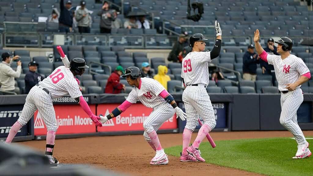
Things were complicated by the fact that the Yanks had been rained out on Saturday, necessitating a doubleheader yesterday. Unsurprisingly, the Yanks wore pink for the opener (click to enlarge):
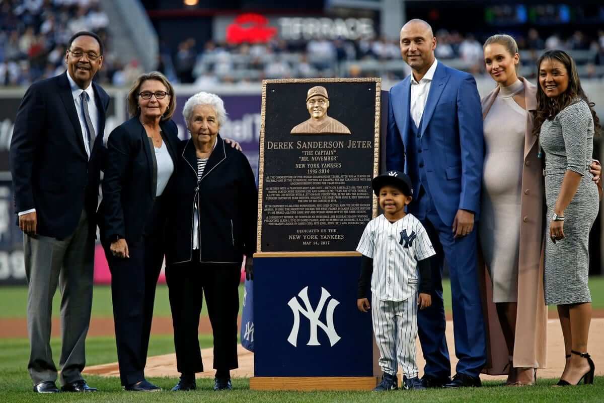
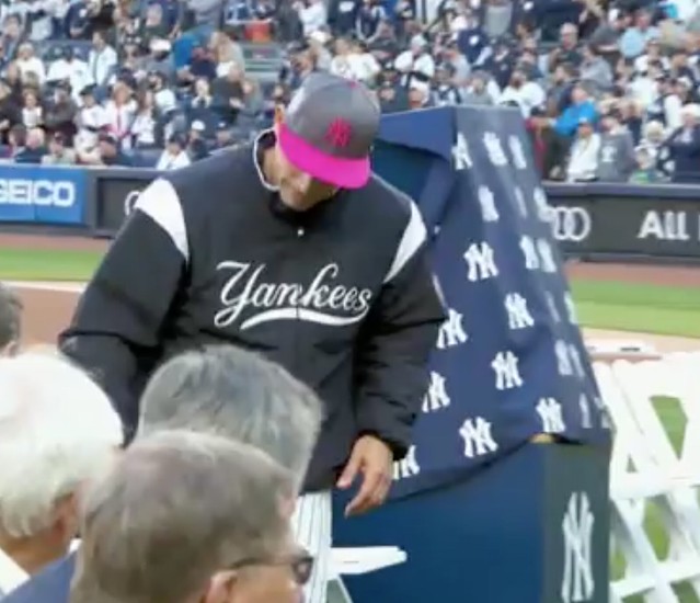
Prior to the second game, they had Jeter’s number-retirement ceremony. Most of the participants wore civvies, of course. But Yankees skipper Joe Girardi was part of the proceedings, and he wore the pink cap:
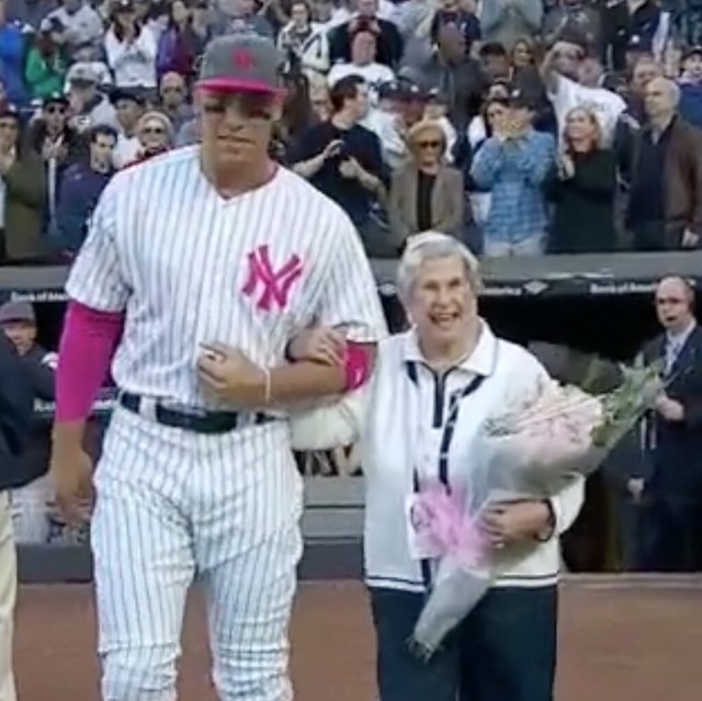
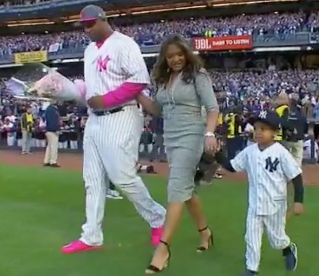
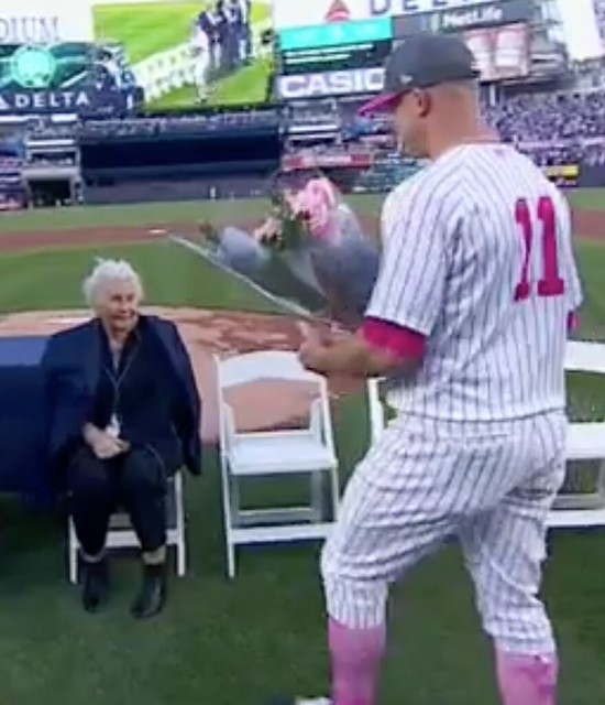
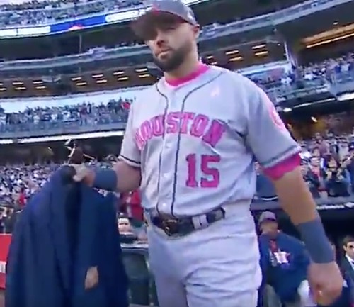
In addition, several current Yankees escorted members of Jeter’s family onto the field (and, in one case, brought flowers to Jeter’s grandmother), and those players all wore pink:
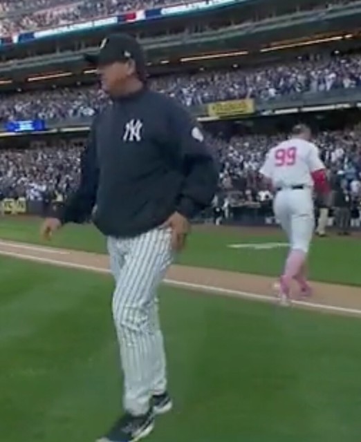
The one exception was Yankees bench coach Rob Thomson, who apparently didn’t want any part of the pink-out:
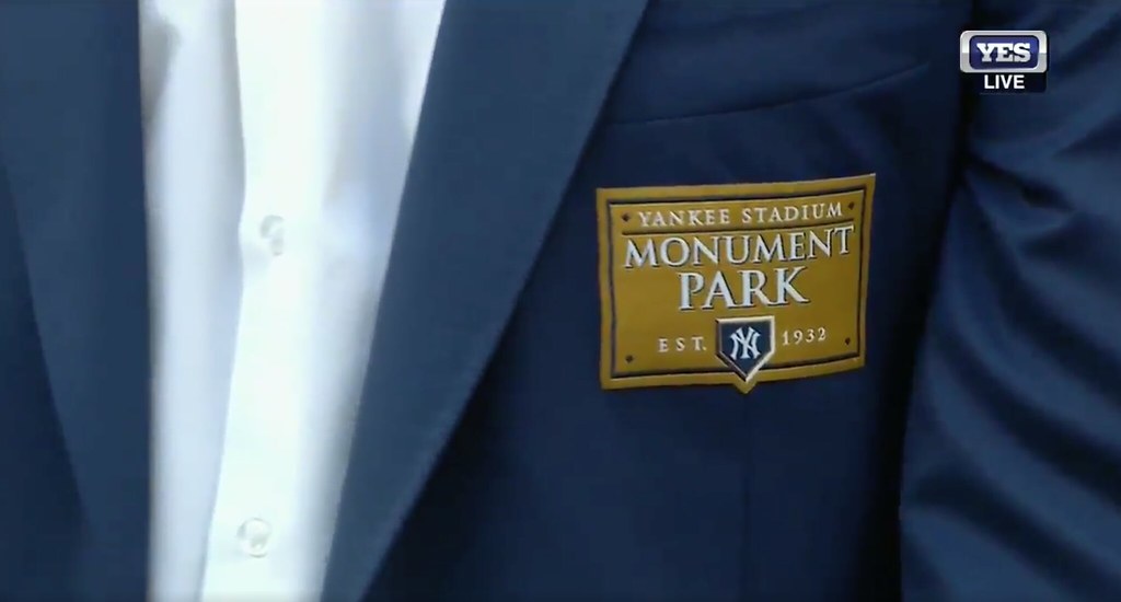
In another uni-related development, all of the pregame ceremony participants who are represented in Yankee Stadium’s Monument Park wore special blazers (click to enlarge):

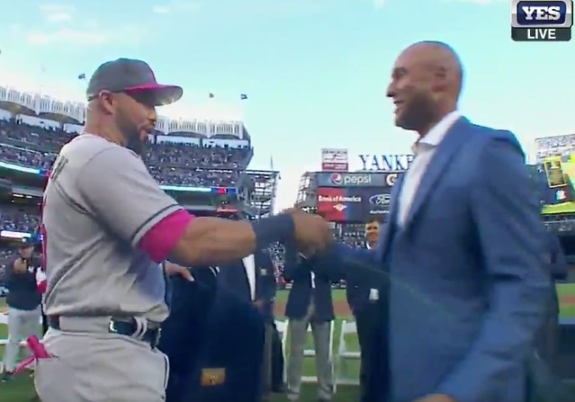
Jeter’s own blazer was brought to him by his former teammate Carlos Beltran, who now plays for the Astros. He came out of the visitors’ dugout and presented the blazer to Jeter — while wearing pink:
Honestly, I thought it all looked ridiculous. Is this really the look you want immortalized in time and replayed over and over for years to come? Then again, having the ceremony on Mother’s Day was reportedly done at Jeter’s request, because he’s very close to his mom, so maybe he liked the idea of having the pink backdrop (although that’s hard to fathom, given that he retired before the pinkwashed unis became the norm).
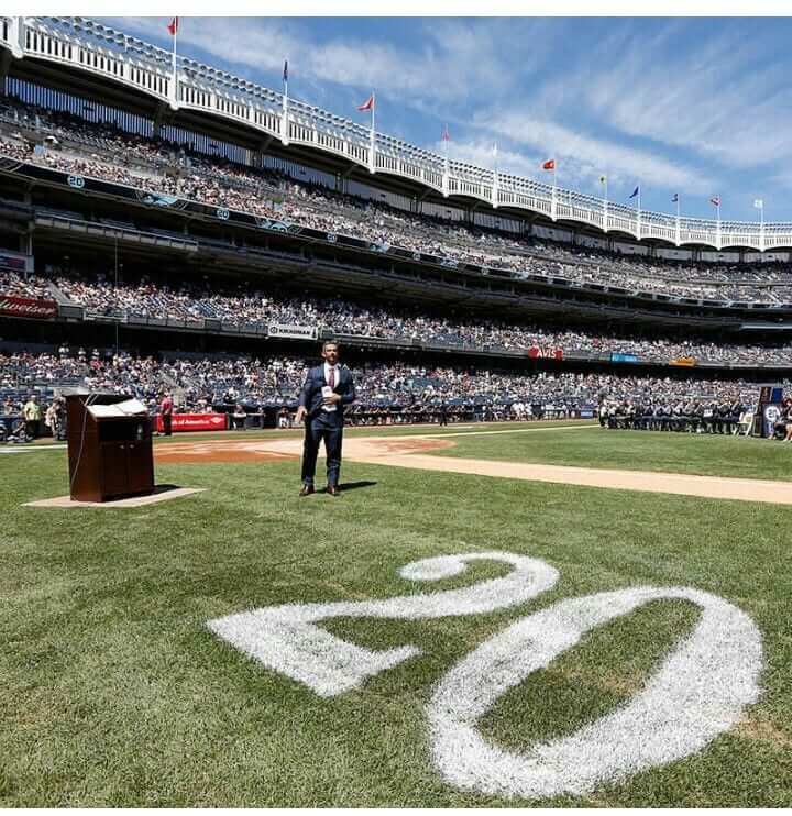
Meanwhile, there was one major glitch: The Yanks stenciled Jeter’s number onto the grass along the two baselines. Nothing unusual about that, of course. But in a surprising lapse in judgment, they used a non-Yankees font:
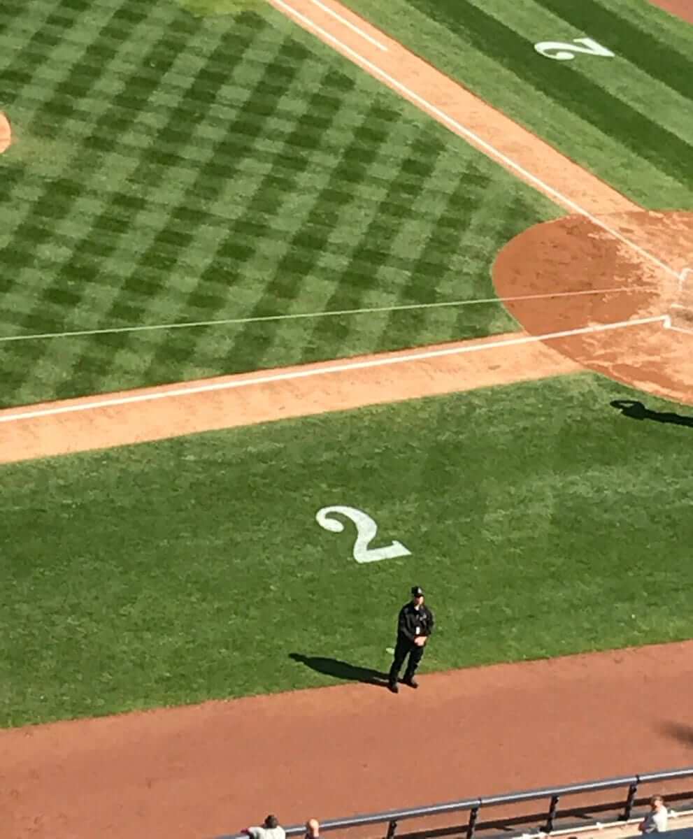
Incredibly, it appears that they just used the same stencil they use for the yard markers in the Pinstripe Bowl (click to enlarge):
How have they handled this kind of thing in the past? They used the proper font for Mariano Rivera Day in 2013:
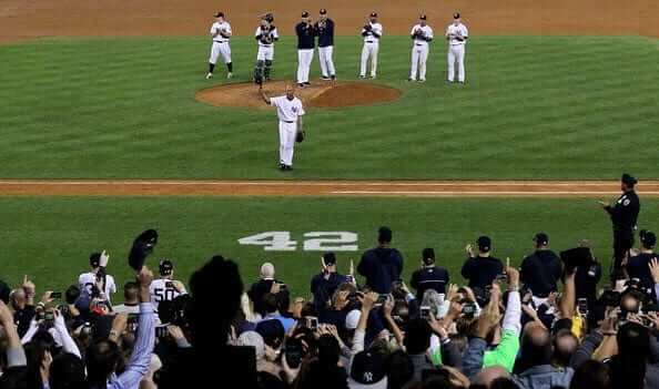
But they used the yard marker font for Jorge Posada’s number retirement in 2015, so I guess you could say there’s some precedent:
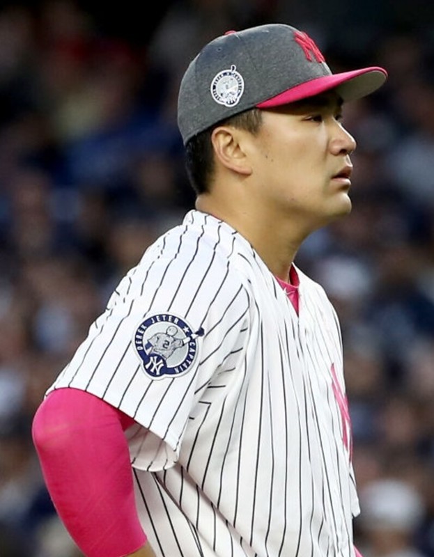
As for the game, the Yanks wore cap and jersey patches commemorating Jeter’s big day:
Next up: Memorial Day. Oh boy, can’t wait!
(My thanks to Isaac Benjamin, @BobbyTooSlow, @saviddachs, and @Fontophile for their contributions to the number-font discussion.)
Click to enlarge
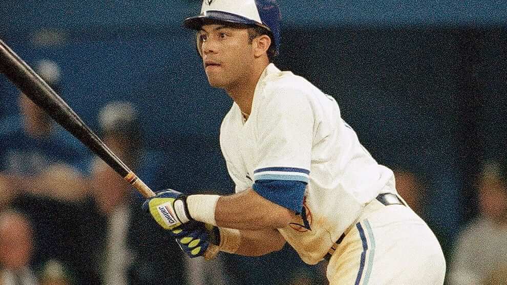
First-generation neon: Neon/fluorescent colors are all over the uni-verse these days. But when did they first appear in the Big Four leagues?
Reader John Martin has found one of the earliest examples I’ve ever seen (see above). That’s Robbie Alomar during the 1992 ALCS, wearing neon-trimmed batting gloves. Okay, so maybe it’s more lime green than true neon, but it’s definitely in the same family. Anyone know of any earlier examples of neon or neon-trimmed gear?
As an aside, those batting gloves were made by Cooper, a brand I typically associate with hockey, not baseball. “It’s a company I have only seldom seen used by MLB players, mainly Roger Clemens’s glove during his Blue Jays stint,” says John. I didn’t realize Cooper made baseball gloves. But according to this Wikipedia entry, the company was “Canada’s leading producer of leather baseball gloves.” Interesting — I had no idea.
Update: Shortly after today’s post went up, several readers pointed out that Rickey Henderson was wearing neon-toned batting gloves as early as 1989:
Membership update: Eight new designs have been added to the membership card gallery (including Jamie MacDonald’s late-’90s Hawks treatment, shown at right, which is the latest example of how the worst uniforms make for the best membership cards). The printed and laminated versions of those cards should mail out in a day or two.
Remember, all membership cardholders are now eligible for a 15% discount on everything in our Teespring shop. (If you’re a card-carrying member and want the discount code, just email me and I’ll send it to you.) You can sign up for your own custom-designed membership card here, you can see all the cards we’ve designed so far here, and you can see how we produce the cards here.

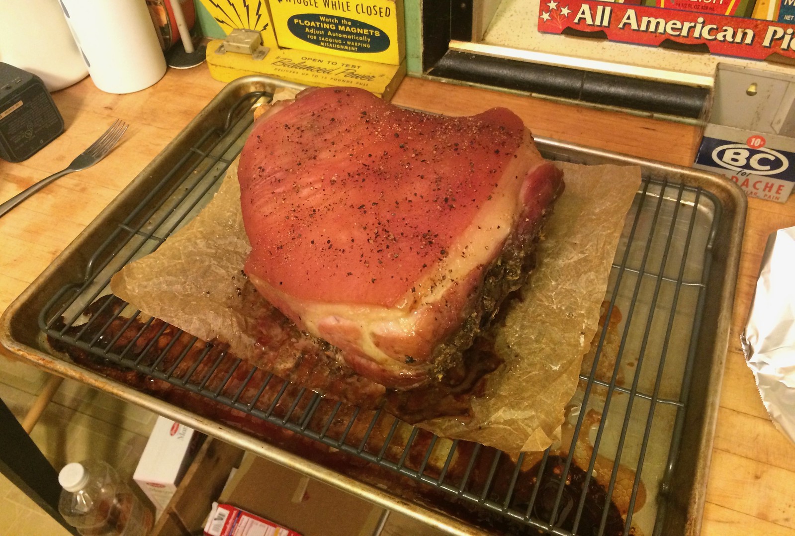
Culinary Corner: It rained all day on Saturday, so the Tugboat Captain and I decided to slow-roast a big ol’ pork shoulder. We had tried something similar about four months ago, and it was good, but there were a few things we felt we could improve upon, so that’s what we set out to do. Here’s how we did it (sorry, I didn’t take photos of the early stages):
1. The night before, we went to the supermarket and got a pork shoulder that was just shy of 8 pounds. It was only $1.69 per, which means it cost 13 bucks and change — less than a good steak.
2. We took it home and brined it overnight in a mix of water, salt, sugar, rosemary, bay leaves, peppercorns, garlic, onions, and maybe one or two other things I’m forgetting.
3. The next morning, we removed the pork from the brine and patted it dry. Then we prepared a stuffing that consisted of garlic, rosemary, thyme, sage, mustard powder, smoked salt, pepper, and maybe something else, I forget. We cut a bunch of slits in the bottom and sides of the pork shoulder (but not in the skin on top) and filled them with a stuffing. Then we added salt and pepper all over the pork’s exterior.
4. We set my oven as low as it would go — 250 º — put the pork in there, and let it cook for eight hours while we did other stuff around the house.
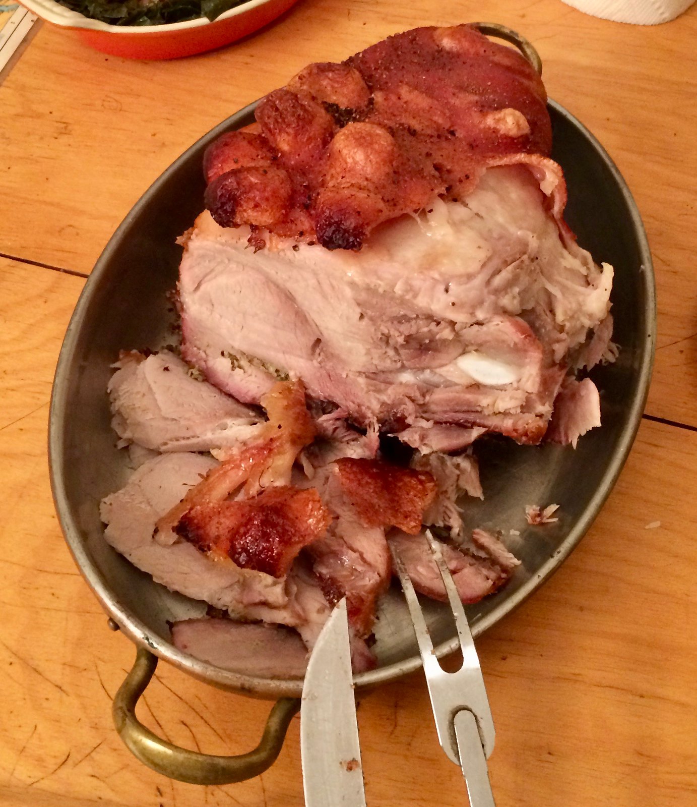
5. After eight hours, the roast’s internal temperature was 162 º, and the meat yielded fairly easily when I inserted a fork and twisted it. That meant it was time to take it out of the oven. Here’s how it looked (for all of these photos, you can click to enlarge):
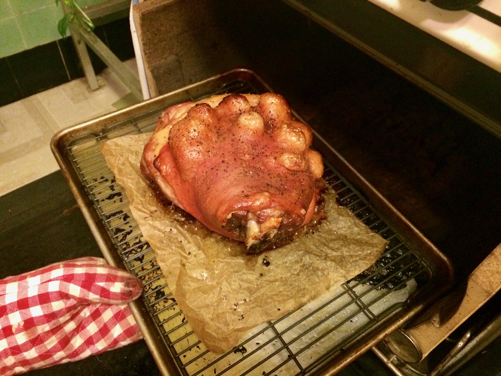
6. We cranked up the oven to 500 º. When it was ready, we put the pork back in for 20 minutes, rotating it every 5 minutes. The idea here was to crisp up the skin, and it worked, in somewhat freakish fashion. The skin bubbled up in big crispy warts that looked like something out of science fiction (it almost looked like challah):
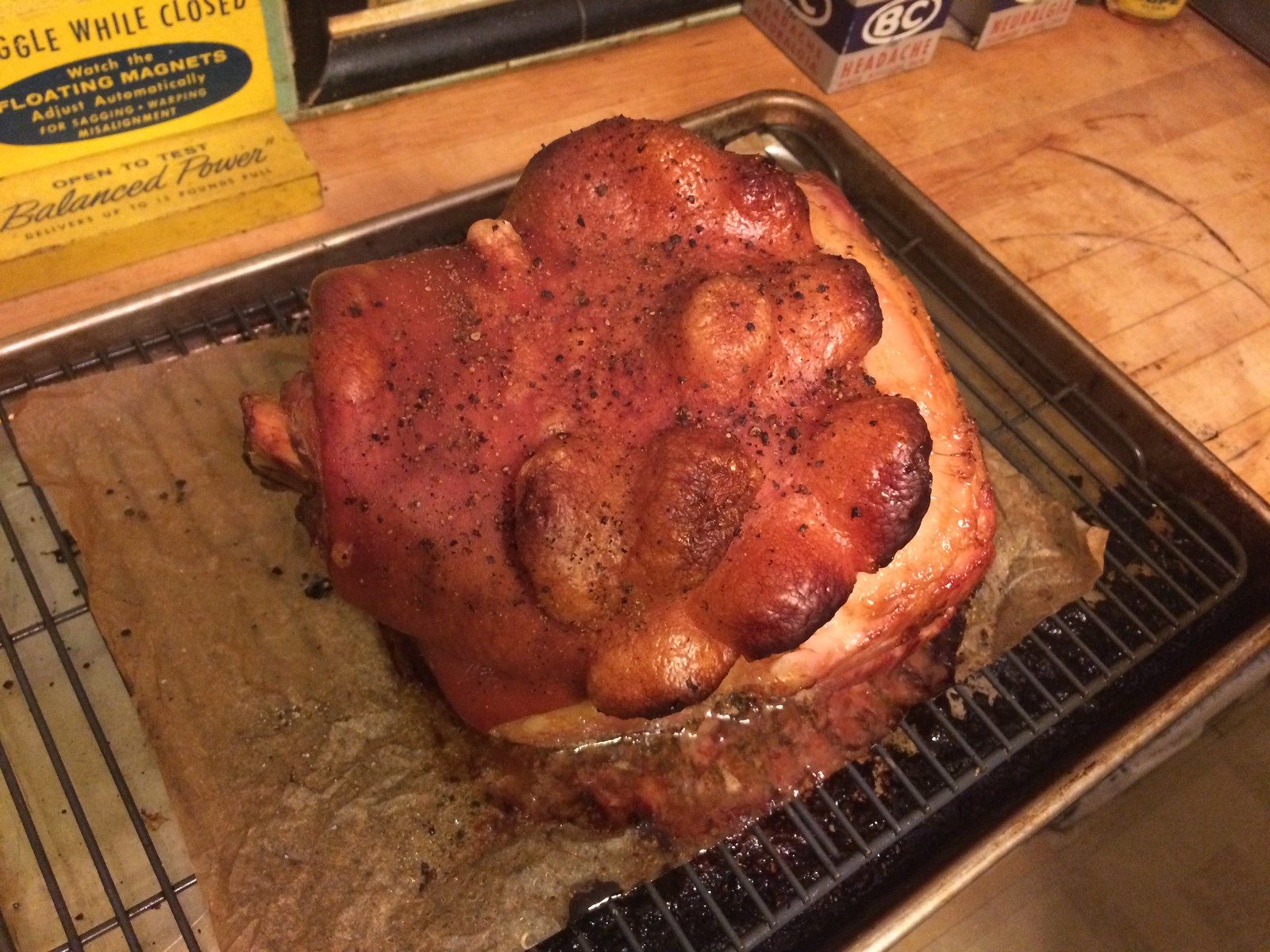
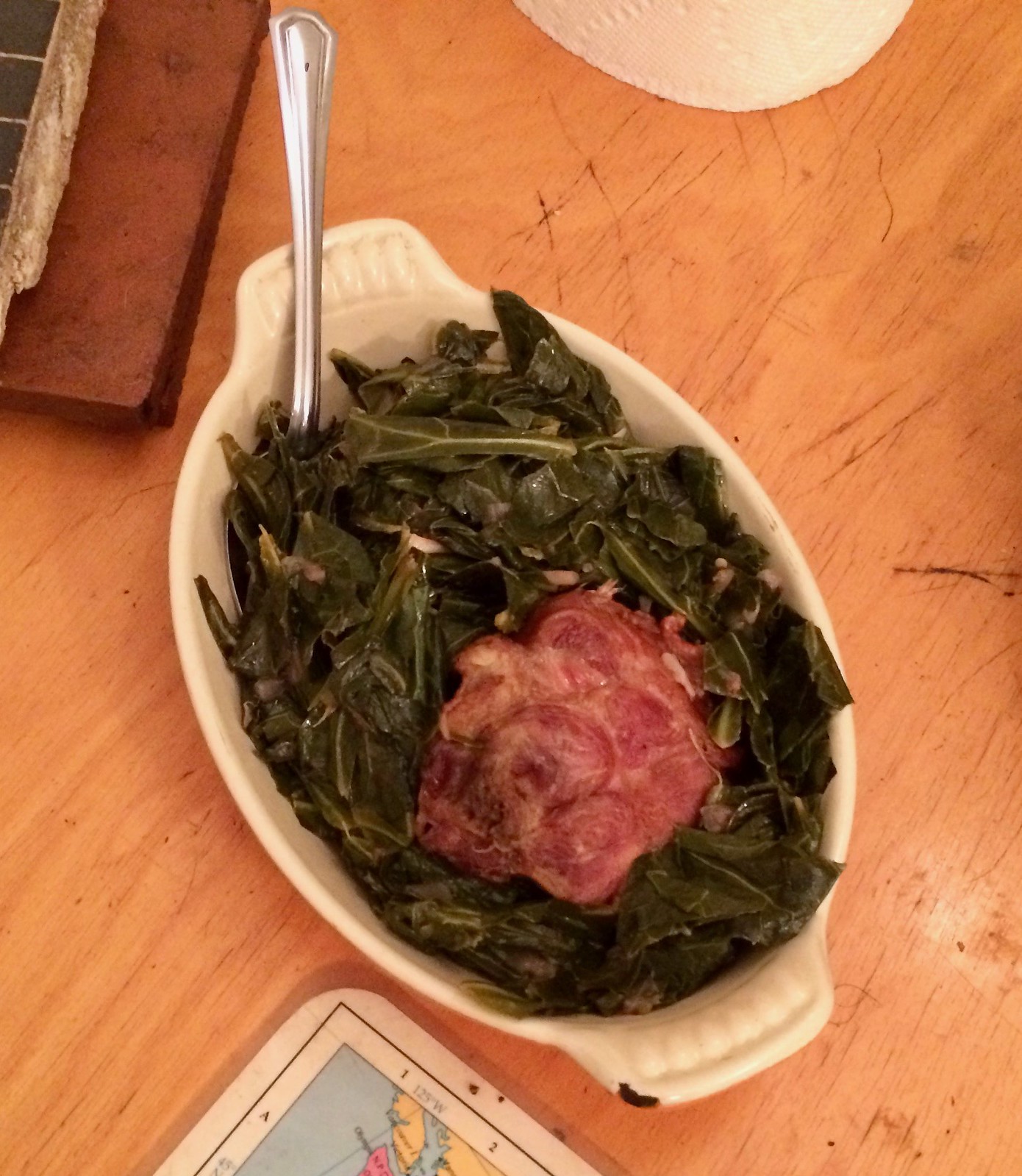
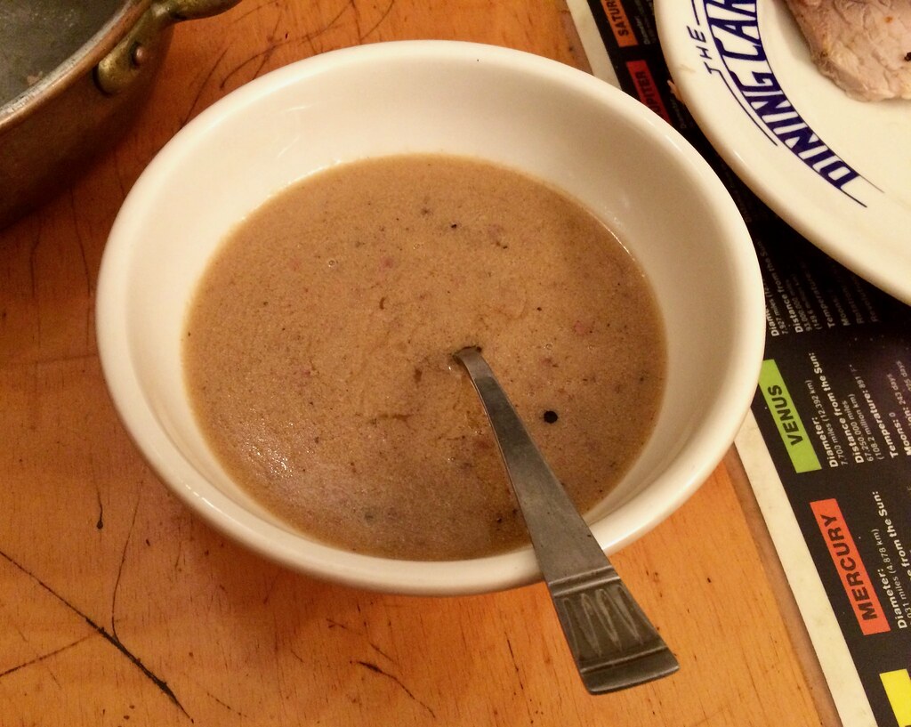
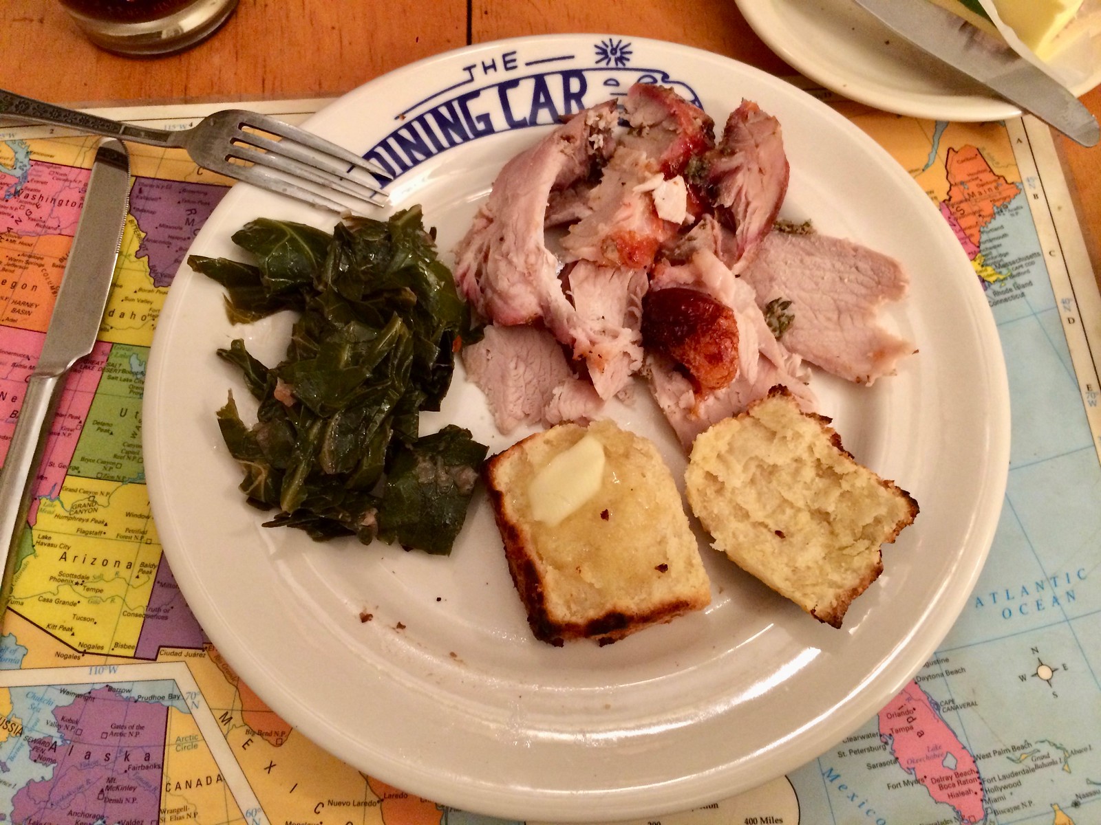
Along the way, we had made buttermilk biscuits (from this recipe — recommended), collard greens with a smoked turkey tail, and some gravy. The result was a very satisfying meal, and a great way to turn a rainy day into something fun and delicious:

Movie contest reminder: In case you missed it over the weekend, Phil is running a new contest to create an updated design for a jersey featured in a movie. All the details are in this post.
The winning designer will get a custom-sized version of his or her jersey, produced by our friends at Garb Athletic. The deadline is this Thursday, May 18, at midnight Eastern, so get crackin’!
Purp Walk reminder: Our annual Purple Amnesty Day is this Wednesday, May 17, and we have big plans. Get the full scoop, including a look at this year’s Purp Walk shirt (available for only 24 hours, no exceptions) and info on how to get a 10% discount on it, here.
The Ticker
By Alex Hider

Baseball News: Indians OF Daniel Robertson became the first player in franchise history ”” outside of Ricky “Wild Thing” Vaughn ”” to wear No. 99 yesterday, while wearing pink Mother’s Day unis. He, along with teammate Carlos Santana, wore extremely high socks (from Brad Foster). … Speaking of Mother’s Day, couple of things to add from Phil’s post on Sunday: The Brewers went the extra mile and wore pink logos on their batting helmets (from Tom Sauve). … The Royals usually raise a white “W” in their stadium after a win. Yesterday, it was pink (from David Westfall). … Cardinals OF Randal Grichuk had his mother’s name (Beverly) on his elbow pad this weekend (from Tyler Mudd). … The Red Sox wore pants without piping this weekend, except for first baseman Josh Rutledge (from Kevin Vautour). … Several plate umpires wore pink masks yesterday (from Mike Anderson). … The Dodgers wore their regular blue caps on Saturday but switched to the pink-trimmed caps yesterday. … Keon Broxton had “Angela Bell” written on his eye black this weekend (from Zachary Loesl). … In non-pink news: Contrary to popular opinion, there is one single-digit number the Yankees have not yet retired ”” but no player in franchise history has ever worn it. … Max Scherzer wore teammate Gio Gonzalez’s helmet yesterday (from Sean Sharkey). … The Sugarland Skeeters and Lancaster Barnstormers of the Atlantic League went color-on-color (from Stephen Winters). … Indiana wore pink camo uniforms for Mother’s Day (from Zachary James Loesl). … Arkansas wore throwbacks unis yesterday (from Matt Snyder). … Scott Rogers spotted a Little Leaguer with an upside-down 8 on his jersey.

Football News: Twenty-five NFL teams have reportedly purchased Vicis Zero1 helmets for use next season. Some are calling the helmet the “safest football helmet ever,” and it recently got the highest rating in an NFL safety test. If you click on that last link, you can see a short video showing how the helmet shell deforms upon impact — pretty wild stuff. Broncos WR Carlos Henderson is among the first players spotted wearing it. … Is Illinois removing the triple stripe from its orange helmets?

Hockey News: Here’s a great New York Times piece about goalie masks and the artists that paint them. … Hockey teams are only supposed to have one captain apiece, but the Seattle Thunderbirds appear to have two (from Curtis Rogers).

Grab Bag: Adidas reportedly wants to re-negotiate its apparel contract with AC Milan due to the team’s poor performance (from Ed Zelaski). … Yale lacrosse puts the flag of each player’s home country on their helmets (from Timmy Westside). … A recent design contest has resulted in New York City getting a new “I voted” sticker, which will make its debut this September. … New uniforms for Japanese men’s volleyball (from Jeremy Brahm). … The increasingly high prices for sports collectibles are leading to a rash of thefts. … The U.S. Army’s uniform board is considering bringing back the iconic “pinks and greens” uniform (from Eric Keskeys).
Neon….Maybe Ricky Henderson wore gloves during 1988-90 timeframe?
Yes, someone else just sent me an example of that. Adding to text now.
Proofreading:
“In non-pink new:” news
Thanks. Fixed.
The first time I remember pink or neon was Andre Agassi with the trim and acid wash in the early 90s. I hope the acid wash never makes it way back.
Agassi was doing the acid wash thing at least as early as 1988:
link
I rocked those Nike denim tennis shorts! That same period, skiing had a lot of the hi-viz. I remember hunting in powder for my friend’s ski, and I found it by the glowing pink hi-viz bottom. Never could understand how the flourencent colors glowed?
Hi-viz colors are colors which reflect UV light as well as regular light. They’re especially effective when there is more UV relative to regular light e.g. when the sun has just gone down but it’s still light. That’s why they’re really effective at dusk but not so different from something like red in the middle of the day.
I really thought the Yankees would use the doubleheader as a convenient excuse to ditch wearing pink for the Jeter celebration. Everything was set up perfectly for them.
I agree it looked absolutely ridiculous.
Could have been worse. At least they didn’t wear pink special blazers.
I’m an Astros fan who dislikes the Yankees, and I think it’s ridiculous to have the most hallowed franchise in American sports honor one of their greats while wearing pink. The special-event uniforms in MLB are out of control, especially now that they’ve extended it to an all-weekend thing.
Is it all about the cause? Because if it is, just write the check, hang a banner, paint a ribbon on the field, put a ribbon on the uniforms, but leave the logos and colors of the uniform alone. Otherwise, you’re making a profit off the cause, and I don’t think that’s right, either.
They are supposedly not making a profit, because all of the net proceeds from the merch sales are donated.
Not defending the pink uniforms. Just setting the record straight regarding profiteering.
That font used on the field for Jeter’s ceremonies has been used for a few years now and probably started around 2015 (definitely after 2013). It was used for Willie Randolph Day, when Yogi Berra was honored after his passing, and probably also used for Pettitte Day and Alex Rodriguez’s 3000th hit ceremony.
In another Yankee Stadium-related bit of trivia: the auxiliary scoreboards in the outfield were tracking pitch count on Thursday, possibly as an experiment. It’s displayed where the batter’s position would be. First noticed it Thursday night when a position was listed as “76” and number kept rising with each pitch. The label still read “POS” instead of “PITCH” so either they still have to change that or maybe they’ll end the experiment when the Yankees return home.
Manual scoreboards are ridiculous anywhere but Fenway and Wrigley.
On the bright side, the Yankees have apparently stopped asking fans to remove their caps during God Bless America.
Rob Thompson is my hero.
Is there a contest for Most Ridiculous Hand-Operated Scoreboard?
That might be entertaining and informational.
—
“Asking fans to remove caps during God Bless America”? I don’t watch the Yankees even thought YES is on my cable, and didn’t know that was a thing.
Agreed, it’s really off-putting to have that song elevated to the level of the national anthem.
I hate the fact that the Yankees still play God Bless America in the 7th inning. It was appropriate and a nice idea back in 2001 or even 2002. I know they probably won’t but I hope they drop it. By the way I’m an ardent patriot and love my country. I just don’t need a song to remind me of that fact. Instead of “honoring” America with this silly song break in the 7th maybe donate $5,000 a game to a veteran in need. That would do much more good than a song.
I happened to be in a sports bar for a late lunch with the usual variety of ballgames on the TVs and for the life of me, I couldn’t tell who was playing who and where without checking the score box. Just wear a ribbon on the uniform for cripes sake and stop the non-sense.
-I remember Cooper baseball bats too when I was younger:
link
Owned a Cooper glove many years back, remember it for being a nice fit, good quality; that contrasts with their goal equipment, as they fell behind in quality and innovation of some of the smaller companies. For a number of years, Cooper was an active advertiser on Detroit Tiger radio broadcasts as well for their bats; according to the Wikipedia page, they had 30% of MLB players using their bats at the peak of popularity, making them number two behind Louisville Slugger.
I recall their catcher’s equipment and batting helmets in little league. I always wanted to use it because I was more obsessed with hockey than baseball.
The first neon color I recall gaining traction in sports was the yellow-green tennis balls in the 1970s. Though I am tempted to say the Southern California Sun had neon magenta uniforms, I can’t recall a fluorescent color with certainty until the NFL World League Orlando Thunder in 1991.
While bright, certainly, I am not sure the the Suns magenta could be called “neon”.
link
Lee
Based upon the content in yesterday’s NYT sports page (Yankee numbers, Goalie masks) I had to check to make sure that PL had not become the new editor!
The worst abomination of MLB’s pinkathon was the Red Sox catcher Sandy Leon’s use of pink shin guards, pink chest protector and pink mask. Almost made the game unwatchable.
Proofreading:
“Shortly after today’s post went up, several readers pointed out the Rickey Henderson
– that Rickey Henderson
Fixed.
The insert cause here awareness uniforms make me think of that line from A Bronx Tale, the one about gangsters believing that whoever sends the biggest arrangement of flowers to a funeral cares the most. Every year, we have to show that we care more than we did last year.
The ratchet only turns one way.
Imagine if Aaron, Ripken, Rose, Ryan or Henderson set their career marks wearing the pink.
Having multiple captains wearing a C is a very common practice outside of the NHL. Boston College only gives out Cs.
In truth, most, if not all, college hockey teams only have captain’s “C”s; it does help people remember that the “A” does NOT stand for Assistant Captain, but Alternate Captain. However, it is somewhat surprising to see it on a Canadian Hockey League team.
The MLB wasted no time in moving from Mother’s Day to Father’s Day as a I received an email first thing this morning hawking the Father’s Day baby blue merch. You’d think they’d be pushing the god awful camo merch first since Memorial Day is in 2 weeks.
They started hawking the Memorial Day stuff a few weeks ago.
The NHL actually banned fluorescent logos at one point – late 80s or early 90s. Said it was a distraction. It was popular at the time to have logos on the sticks done this way. This is all from memory and I can’t find anything online to support it, unfortunately, but I do remember it.
Oh and Cooper baseball gloves were extremely common here in Canada, we had several in the household over the years and my brother still has One somewhere.
That ban was presumably lifted for the 2015 All-Star Game:
link
Illinois, where they update their uniforms, but not the operating systems on their phones.
re: x2 Captains
I don’t know about the WHL, but in USA Hockey you can have multiple C’s, but only one is granted captains privileges. It is designated on the scoresheet.
Great looking meal. Question for you Paul, how do you not get fat? You’re a couple of years older than me but eat (and drink) a lot better and appear to weigh a lot less. Good genes? Some crazy exercise besides your cycling that you haven’t told us about? Walking a lot in NYC?
I only show you guys the really fun meals. I don’t eat like that all the time. At one point last week, I had salad for dinner three nights in a row (mainly because I had a lot of lettuce and tomatoes on hand and wanted to use them up).
Daily cycling helps (I bike *hard*, get sweaty, etc.). Also: I weigh myself every morning. If I’m drifting in the wrong direction, I adjust my food intake accordingly.
Genes: Not sure. My mom is slim, my father was maybe 10 lbs overweight, my brother is very overweight. Used to have another brother — he was built like me. None of them exercised.
Like many people, I gained a lot of weight — about 20 lbs — during my first year of college (limitless access to brownies, french fries, etc.). That summer, I made a point of losing most of it, and I’ve been more or less the same weight ever since. As is typical, my metabolism has changed over the years, but I’ve tried hard to stay in that same basic weight zone.
Working at home probably helps. I’m not subjected to work-related luncheons, vending machines, etc. I can control the food I have access to here in the house.
OK, that’s probably more than you wanted to know!
Paul, I always appreciate when you share your recipes in the Culinary Corner. Cool food and fun ways to prepare them. And it is good to know what other people do to maintain a healthy weight. The more tips I hear the better off I am. Thanks for sharing.
I feel like I am really missing something obvious. Why is that classic Army uniform called ‘pinks and greens’? I didn’t see the pink in the photo of Ike and others on the linked “Army Times” article.
The trousers and shirt had a rose tint to them. Combined with a green drab jacket, gives you pinks and greens.
link
Your response reminds me… when will you offer one of your “ask me anything” (or whatever its called) segments?
I have a terrible memory, but it seems it’s been awhile.
Lee
It may be delicious, but that pork really creeped me out. Looks like the Horta from Star Trek.
Y-E-S!
I was trying to come up with the right comparison, and you nailed it!!
I’m assuming that MLB stipulated to the Yankees, very forcefully I’m sure, that they had to participate in Pink-a-palooza this whole weekend. For a lot of years the Bombers got a lot of passes on a lot of small stuff, but that seems to be ending. I’m feeling that the MLB front office is going to enforce the rules a lot more, especially as they start making these special day unis more standardized.
Actually, participation in the holiday uniform programs is completely optional. Teams have more control than most fans realize (that’s why the Giants are wearing orange lettering, instead of blue, for Father’s Day, because they refused to look like the Dodgers). The Yankees could have opted out if they had wanted. But nobody wants to be the one team that “hates Mother’s Day” or “hates breast cancer victims,” etc.
“Who refuses to wear the AIDS ribbon?”
I despised the CAMO-ing of unis and pinkening is just as deplorable. That hoosier baseball uniform is THE worst thing I have ever seen on the field. WTF?
I hate all the pink too. And hate that its now Saturday AND Sunday.
I agree 100% with Rich (above): Just write the check, hang a banner, paint a ribbon on the field, put a ribbon on the uniforms, but leave the logos and colors of the uniform alone.
Lee
My memory is a bit fuzzy here, in early 00s when Steve Yzerman would go on IR, the Red Wings would issue a third ‘A’ patch instead of breaking his long standing captaincy.
Interestingly, counter, the Habs dished out interim C’s to at least Shayne Corson, Eric Weinrich, and Alex Kovalev during extended absences by Saku Koivu. Similar to Detroit (if your memory is correct), I don’t think the Penguins had a fill in C for Sidney Crosby in 2011-12 either.
This would be an interesting list to make and keep, I think!
I couldn’t take the Yankees pink uni’s, especially the socks. So, like when watching a “colorized” B&W movie, I took the color out. That didn’t fare too well, as it looked as if I was watching an early episode of The Twilight Zone. I just couldn’t…
Even in the NHL, co-captains happen. Carbonneau and Chelios for the Habs, and more recently Briere and Drury for the Sabres. Don’t know how the Habs arranged it, but Briere and Drury alternated game by game wearing the C, so just one at a time.
Does the NCAA have restrictions regarding the font(s) used in on-field numbering? If not, what’s stopping the Pinstripe Bowl from using the Yankees’ number font?
I’m with you. That would be a fun look and a way to make the bowl unique!
Paul, with the Vicis helmet, how will the logo stickers and striping not get mangled or detatched when the shell buckles?
Good question. We’ll see.
Carlos Williams? That’s rookie Carlos Henderson, 3rd round pick out of Louisiana Tech
Fixed.
Proofreading:
“pork shoulder than was just shy of 8 pounds” that instead of than?
Fixed.
Wishing I could identify one MLB team for which the pink-wash actually looks okay. But I can’t. It’s just hideous.
Love the pan that the collards are in. Vintage Le Creuset cast iron, right? I hope it is flame.
They only make those in ceramic these days.
Also, on behalf of Delaware, I am sorry you did not enjoy the First State.
Yes, Le Creuset. And yes, it’s flame. I’m lucky enough to have a five or six Le Creuset pieces (all in flame): big Dutch oven, medium Dutch oven, saucepan, multiple baking dishes (including the one with the collards).
All were inherited — some from my mom (who no longer cooks), some from my sister-in-law (who, sadly, is no longer living). So whenever I use this stuff, I think of my family, which is a nice thing.
I’m fairly certain Ozzie Guillen wore neon, or another shade of green, batting gloves at one point in the late 80’s, or 1990 season with the White Sox. Couldn’t find a pic though.