Bear with me here, because today’s entry is going to take a minute to explain.
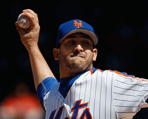
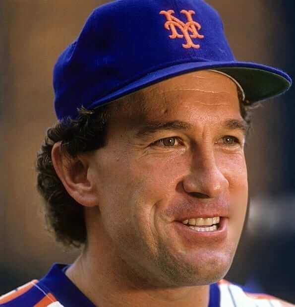
Here’s the deal: MLB caps these days normally have black underbrims. But when the Mets wore their 1986 throwbacks last season, they wore throwback caps with era-appropriate blue squatchees (instead of the current orange) and grey underbrims, as shown above.
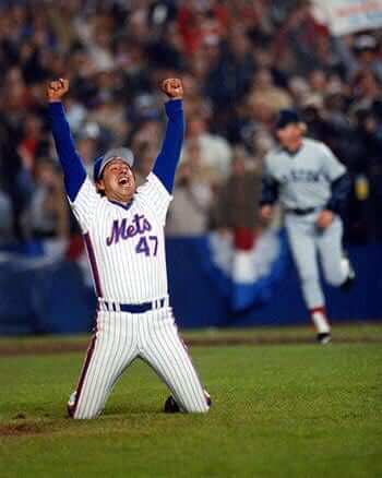
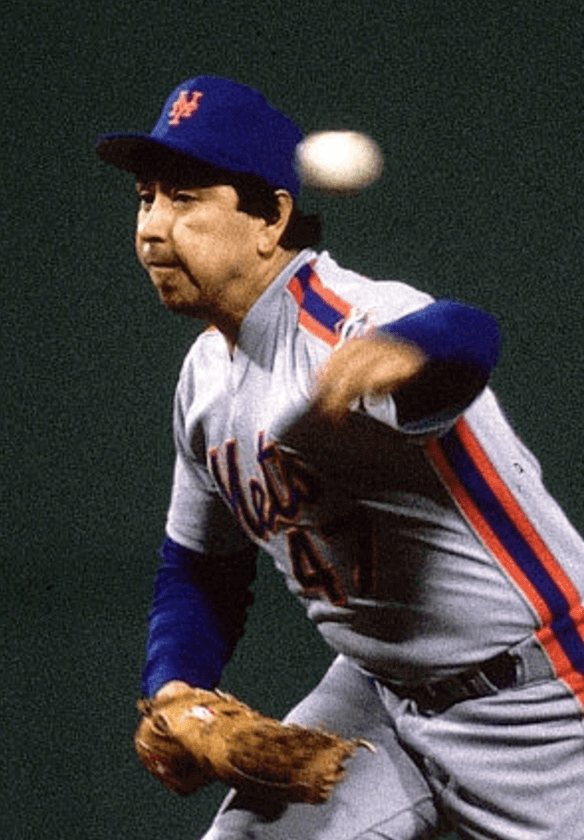
I initially thought the grey underbrims were era-appropriate. After all, one of the most famous photos from the 1986 season — Jesse Orosco’s exultant pose after getting the last out of the World Series — clearly shows the underbrim being grey:
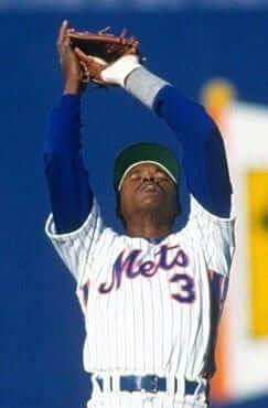
But then several readers started coming up with photos showing that the Mets actually had green underbrims during the 1986 regular season:
So did the Mets change caps for the playoffs, or maybe just for the World Series? This shot from the NLCS appears to show a green underbrim, so it looks like they got fresh caps, with a new underbrim color, for the World Series. For last year’s throwbacks, someone decided to match the Series caps, not the regular season caps (or maybe they weren’t even aware of the difference).
All of that is a long setup for an email I recently received from reader Tom Raimonde. He listened to the audio of the Mets uniform panel discussion that I recently chaired at the 2017 Queens Baseball Convention, where I briefly mentioned the 1986 underbrim color change. That prompted him to send me the following note:
I want to share my recollection with you about the change in the Mets’ caps for the 1986 postseason. This info may be buried in Gary Carter’s autobiography or one of the other 1986 books, but mostly this info comes from memory as a couple of buddies and I shared a season ticket package, and sometimes “inside” info came our way.
In 1986, the Mets had already decided on a uniform change for the 1987 season, which included that one-year road script, but it also included a change in the team’s shade of blue. I never see that fact mentioned now, but it was made significantly lighter/brighter. The original shade of blue was the darker royal used by the Dodgers. I recall sitting at many night games at Shea before the change, thinking that they almost looked black because of the lighting. The new 1987 caps with the brighter shade of blue also had grey underbrims.
Going into the 1986 postseason, [equipment manager] Charlie Samuels decided to order fresh caps so the Mets would look crisp on the field. The caps he received were the upcoming 1987 version [with the brighter shade of blue and the grey underbrims]. I don’t know if the order was specifically for the ’87 caps or if that is all that was available for a late-’86 order.
One result of this is that photos from the postseason clearly show that the Mets’ undersleeves didn’t match the caps — the sleeves were the darker 1986 shade of blue, and the caps were the lighter 1987 shade. It’s one of those things you cannot un-see once you see it!
I’d never noticed this before, so I went back and looked at a bunch of 1986 World Series photos. The problem, of course, is that most photos show batters or baserunners, and they’re wearing helmets, not caps. Most of the cap-clad players shown in the photos are pitchers. Do they really show the cap/sleeve mismatch that Tom described in his email?
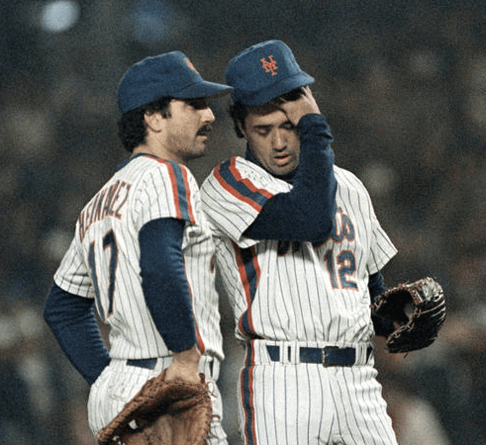
The answer is that some of them do and some of them don’t. For example, here’s a shot of Ron Darling, and then another shot with Darling and Keith Hernandez. Both shots are from Game 7 of the ’86 Series, and both appear to show caps that are lighter and brighter than the sleeves, just as Tom described:
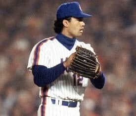
Here’s another shot of Darling, this time from Game 4. Again, his cap seems lighter and brighter than his sleeves:
Similarly, manager Davey Johnson’s cap also looks lighter/brighter than his sleeves in this shot of him shaking hands with Red Sox skipper John McNamara:
But there are also plenty of photos in which the cap and sleeves appear to be the same shade of blue. Here are some examples of that:
Given that these are all 30-year-old photos that were originally shot on film and then converted to digital, and given that they were also shot at night under variable lighting conditions, it’s hard to say how true-to-life they are. Also, it seems to me that MLB undershirts were pretty free-form back in 1986. Some players wore team-issued base layers while others wore pretty much whatever they wanted as long as it was reasonably close to the team’s official color. So that could explain some of the variations we’re seeing in the photos as well.
Overall, I’m neither confirming nor disputing Tom’s account. I’m mostly pointing out how hard it can sometimes be to confirm things, even with photographic evidence.
With that in mind, here’s one more bit of info from Tom:
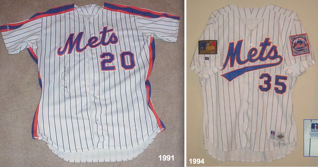
For the 1993 season (my last as a season ticket-holder), the Mets darkened the blue on the caps and uniforms slightly. I specifically remember marketing materials saying it was “one Pantone darker.” Other changes that year were that the pinstripes were thinner, farther apart, and no longer a zigzag pattern, and of course the tail on the chest script.
I do remember noticing that the blue got darker in 1993, And I also knew that the pinstripes changed from zigzag to straight, but I didn’t realize that the pinstripe spacing had changed. But sure enough, a comparison of jerseys from Bill Henderson’s guide appears to show the wider spacing on the 1993-94 jersey style (click to enlarge):
That’s it for today’s installment of “Paul writes about the Mets too often.” Big thanks to Tom Raimonde for sharing his recollections and making this entry possible.
Uniforms in ads, continued: Wednesday’s post about a Viagra commercial with some very Knicks-esque uniforms prompted an anonymous reader to point me toward the Canadian Purolator oil filter ad shown above. If you watch it, you’ll see that it concludes with the appearance of a hockey goalie with a “J. Gardien” NOB (French for “guardian”). Look closely, though, and it appears that the goalie’s leg pads are being worn on the wrong legs!
It’s the little things, right?
Concepts by Angus O’Keefe and Cody Whitmore; click to enlarge
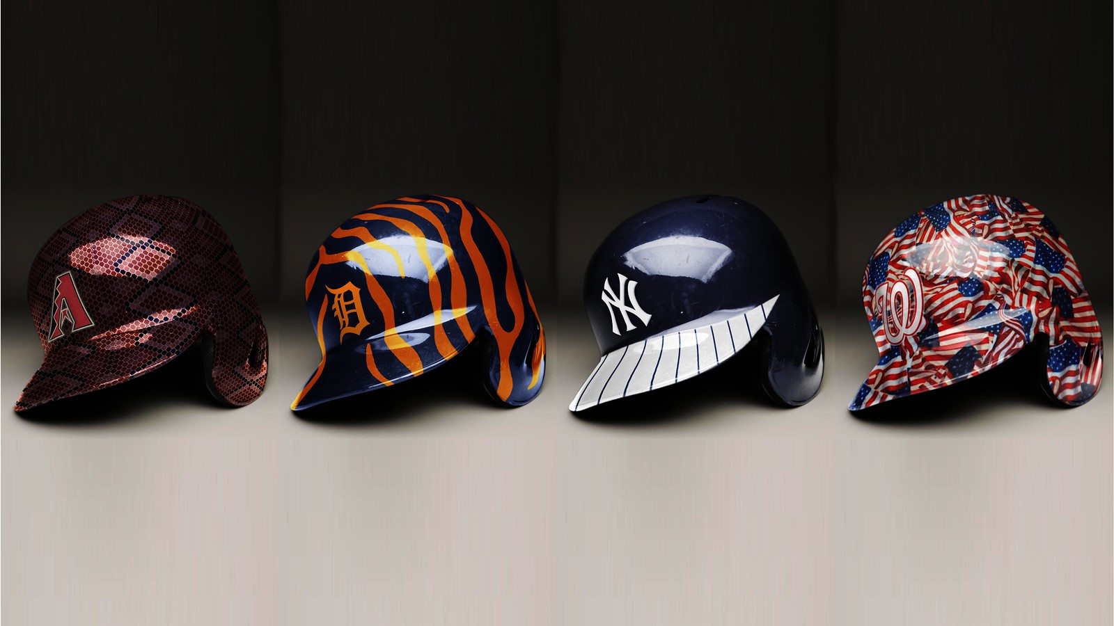
ESPN reminder: My latest ESPN column takes a look at how hydro dipping could transform MLB batting helmets, with some very cool concepts on display. Check it out here.
Discount reminder: In case you missed it earlier this week, all Uni Watch membership cardholders are now entitled to a 15% discount on any of the merchandise listed in our Teespring store.
The discount code will be provided to new enrollees when they place their card orders. Existing enrollees can obtain the discount code by contacting me. Once I confirm that you are indeed a card-carrying Uni Watch member, I’ll email the discount code to you. (If you want to include a photo or screen shot of your card, that would be helpful, but it’s not required. I can look you up in my records.)
As always, you can sign up for your own custom-designed membership card here, you can see all the designs we’ve done so far here, and you can see how we produce the cards here.
IMPORTANT ”” Purp Walk update: Yesterday I gave some details of what we have planned for this year’s Purple Amnesty Day, which is next Wednesday, May 17. If you missed that news yesterday, look here. And even if you read what I had to say yesterday, you should still check out today’s link, because I now have updated info on how you can get a discount on this year’s Purp Walk shirt and other important details regarding the shirt sale. Again, get the full scoop here.
The Ticker
By Paul

Baseball News: The Reds’ relievers award a silver throwback jacket to the reliever who performs best in conditioning drills (thanks, Brinke). … Whoa, check out what WVU wore the other night — gold jerseys over blue pants, with striped stirrups to boot (from Joshua Exline). … A new minor league team in Royse City, Texas, will be called the Griffins. Here are the logos and uniforms, along with a press release (from Alan Beam, whose company did the design work). … MLB is toning down the camouflage elements for this year’s Memorial Day uniforms — except for the socks. Sigh (from Brian Wulff). … If you choose the May 11 podcast in this listing and then skip ahead to the 37:30 mark, you’ll hear an explanation of the New Orleans Babycakes’ game-by-game uniform protocol (from Wayne Muller). … Whoa, check out this awesome photo of the Mariners bowling at Exhibition Stadium! I don’t know the backstory there, but it’s an awesome shot. And that apparently wasn’t the only time it happened (big thanks to @SpoonT12 and @RamoneCat, respectively). … Speaking of the Mariners, their current NOB lettering routinely leads to awful-looking letterspacing issues (from Dean Richard). … 1980s throwbacks last night for the Nashville Sounds. … The Blue Jays and Mariners went blue vs. blue last night. … Half of the MLB players who currently wear No. 2 say they wear it because of Derek Jeter. … Reliever Al Alburquerque is with the Royals this year, and his NOB is still really long (from @quecmo).

NFL News: The Patriots are getting a new field surface (from Cole P). … The Rams, having already let their fans vote on one throwback date for the upcoming season, are now asking them to pick a second one. Earlier this year the Rams also let fans vote on the team’s new pants striping and facemask color. Good for them for giving a say to their fan base (thanks, Phil). … The Seahawks are among the teams switching to Nike’s new jersey template (from Trevor Milless). … Some uni-number switcheroos for the Patriots (from Andrew Cosentino). … With the Bills having hired Panthers defensive coordinator Sean McDermott to be their head coach, and then hiring Panthers assistant GM Brandon Beane to be their GM, the Instagram account Panthers Authority created this Bills/Panthers logo mashup (from Andrew Cosentino).

NBA News: Click at your own risk: Here are one observer’s picks for the NBA’s 10 best current jerseys. … NBA bow ties? Sure, why not (from Tommy Turner). … A Mormon missionary serving in West Africa stumbled across his boyhood Jazz jersey, which his mother had donated many years earlier (from Sara Schieve).

Soccer News: The Swedish team AIK, which has been with Adidas for many years, is switching to Nike (from Ed Å»elaski”). … New away kit for Indy Eleven. … New kits for the Dutch club Feyenoord (from Josh Hinton).

Grab Bag: There’s a new book about the history of various types of uniforms — sports and non-sports — in Australia. … New 60th-season logo for Assiniboia Downs in Winnipeg (from Moe Khan). … For some people, the Facebook logo — just the logo — is enough to trigger nicotine-like cravings. … A teen-ager ran a half-marathon while wearing Crocs (from Mike Styczen). … The cover illustration for next week’s issue of The New Yorker shows Attorney General Jeff Sessions in a police uniform and President Trump in a pilot’s uniform. The illo, by Barry Blitt, is a riff on the recent incident with United Airlines passenger David Dao, with former FBI director James Comey swapped in for Dao.
Al Albuquerque should read Al Alburquerque
You know, all this time I thought he spelled it like the city in New Mexico. Didn’t realize he had the extra “r” (even though it’s plainly visible in the linked photo). Now I’ll definitely remember! Fixed.
Mike Francesca thinks you’re both wrong.
The City in New Mexico used to spell it with the extra “r” also and later changed it.
Fascinating! Didn’t know that. For those who are curious, more details here:
link
I’m always troubled by the lack of athletic uniforms bearing the words “Albuquerque”, “Truth or Consequences” or “Pep”. Perhaps a trip to New Mexico is in order.
a few more great ones in the Land of Enchantment include Abiquiu, Tucumcari, and Texico (not to be confused with Texaco).
When he and Phil Coke were the Tigers righty and lefty setup men, I used to joke that he should change his last name to Pepsi to make it easier on everyone.
…or Jack to show more cohesion.
Al Alburquerque is OK, but I still can’t get a Ron Mexico jersey.
(Maybe Ron New Mexico?)
I went to look up the Rams to find the voting for the throwback game, and link. The link as of 8:15 AM EDT, though it looks like the Seahawks are running away with this one.
I was hoping the second game would be on the road against the Cowboys to avoid the horrible clashing of their gold trimmed navy jersey with the new white focused elements.
Not sure what you’re talking about. link, and the only thing that’s expected to change about them is the collar finally being fixed thanks to the switch to the new template.
Oh, wait, never mind, I got what you were saying backwards.
I personally don’t think the Rams deserve any credit for reaching out to their fan base. I’m sure they picked whatever they wanted to pick and said that’s what won the vote.
The votes were held on social media, with the vote totals visible to everyone in real time.
Hey. I dont have a picture, but still getting autoplay sound (probably video?). Multiple sources at once. Can’t even find the video to disable/pause them.
Not that is solves the root cause, but you can mute tabs in most browsers by right-clicking the tab and selecting mute.
Yea. Thats what I do.
” Look closely, though, and it appears that the goalie’s leg pads are being worn on the wrong legs!
It’s the little things, right?”
Dude, you blew it! The proper end comment should have been:
“Nothing gets by us!”
Re: Hydrodipped batting helmets. Concepts looked really good, for the most part, but it would bug me if (when) they get used. A batting helmet is supposed to be a protective version of the cap everybody else on the team wears…ugh
I remember that too. It was in either the Yearbook, Program or Media Guide.
I wasn’t aware of a color change from 1986-87, and I am fairly certain — though not 100% — that the pre-1993 blue was restored to the uniform in 1995.
I hate the distorted shape of the “M” on those 1993/94 home jerseys. The tail didn’t bother me, but the shape of the M looks terrible.
Agreed. I always thought that that “M” looked exactly like the not-quite-right version that moms would come up with when sewing DIY Mets jerseys for their kids.
The 1993-94 wordmark with the “tail” worked better in theory than in practice, i.e., better link than link. And you’re right; the “M” is fercocta either way.
Speaking of the Mets’ “M”, am I the only one bothered by link?
The interior point of the “M” is link with the general upward sweep of the wordmark.
When originally introduced, the interior point of the “M” was link. But link, it got out of alignment, and it’s been off ever since. That means the Mets have essentially two wordmarks, one used link and one link.
I usually appreciate the small inconsistencies of a hand-drawn logo, but this crosses the line from “charming” to “stupid”. And it drives me nuts every time I see it.
But then again, might just be me. I also prefer their link to the link.
Yes, this has bugged me for years.
The defective version is what I refer to as the “Wilpon script,” as opposed to the classic script.
Darn. Screwed up the coding in that third para.
Should be “the Mets have essentially two wordmarks, one used link and one link.”
The changes made for 1987, as I recall, were (a.) the one-year “New York” road script; (b.) the change in manufacturer to Rawlings; and (c.) the elimination of the NOB “nameplate”.
I actually liked the script road jerseys. Then in 1988 they went to those bland block letters. That’s why the Dodgers beat them LOL
The link road script would have worked without the white outline, and with placket piping added.
The link was a little awkward-looking; I never liked the lower-case “N” or the oversized “Y”.
2nd this I spent all last year looking at the 86 pictures and I couldn’t help but feel like the blue was a twinge darker. Thanks Paul for bringing this as I thought I was crazy.
In addition to being the literal translation for “guardian” the word “gardien” is also the French word for “goalie.” Or more formally, “gardien de but” which translates to “guardian of the goal”
Interesting tidbit on Jesse Orosco’s World Series hat. Last month on the Tony Kornheiser podcast, Richard Justice claimed that John “Junior” Feinstein stole Orosco’s hat out of the Mets’ locker room! La Cheeserie to any other little out there
Looking at the pictures from the 1986 Series and I’m wondering why the Red Sox ever went away from that stirrup design.
Well, baseball went away from stirrups, period.
But the Sox changed from striped hosiery to solid-red in the mid-2000s (I forget the exact year, too busy to look it up right now). At the time, they said it was specifically to live up to the team name.
I think the conscious return to red hose was because they got called out for wearing blue socks most of the time. I think the stripes had been long gone at that point, though with the pajama trend in full swing by then it may be tough to tell.
I wish the masses would call out the Chicago AL team for wearing black socks instead of white.
Me too, but I think that was more about the Red Sox link than anything else.
The striped stirrups disappeared after the 2002 season when the Red Sox switched from blue undershirts to red with the new ownership. Their stated reasoning was getting back to the “red” in Red Sox.
It’s pretty easy to remember for Sox fans as 2003 was the fresh start after the Yawkey years. It was the second year of the Henry/Werner/Lucchino ownership, but really the first that was totally under their control. Not only was it the first year of the “bring back the red” campaign, it was the first year of Theo Epstein, the seats on top of the Green Monster, and some guy who was supposed to platoon with Jeremy Giambi, Bill Mueller, and Shea Hillenbrand at DH.
(Replying to myself here).
Although, as kdf alludes, I’m not sure the striped stirrups were really seen all that much before 2002 anyways. The only guys I remember consistently wearing them were Mike Benjamin and Jeff Frye, and they were both gone by 2000. Even guys that didn’t go with the full “pajama” look, like Nomar, only showed a tiny sliver of sock. I remember you could usually see the red of Nomar’s stirrup. Come to think of it, I think a lot of guys that went with the long pants that ended at the ankle just wore red soccer-style socks and not the striped stirrups.
Interesting stuff on the 86 Mets. When did MLB start using the postseason to roll out uni changes or revisions? I thought it was around the early 90’s when sporting goods chains started popping up in the malls. I seem to recall the Indians sporting new bullpen jackets in the 95 postseason.
The Orioles had new jerseys with different sleeve trim for the 1971 ALCS and World Series.
Loved your Mets hat post. I have been meaning to email you about their ’86 WS caps. When they took the field for game one I noticed it immediately. Both the underbrims and the lighter color.
I wonder if the Mets blues appearing to match or not match is similar to how the Cowboys wore royal blue on the white uniforms because it appeared to match the helmet navy blue in photos and on TV in the pre HD days?
One thing I love about Uni Watch is that just when you think Paul, Phil, and the various guest writers can’t possibly get more obsessive about obscure uniform elements, you’ll read about the colors of the under-brims of caps and differences in shades of blue on uniforms worn during a handful of games 31 years ago.
Gotta love it!
Paul, will the link to buy the Purp Walk tees go up Wednesday at midnight EST as well? Thanks.
Yes. Basically, Wednesday’s post, including a link to the shirt-ordering page, will go up at midnight (instead of our usual time of between 7am-9am Eastern). It might not include the Ticker at midnight — I’ll probably add that when I wake up in the morning, and maybe some other non-Purp Walk stuff — but the Purp Walk will begin at midnight.
Thanks.
FYI, That Purolator isn’t a Canadian company.
Purolator in the US makes oil filters. Purolator in canada is a delivery company. They’re not related.
Not related now but were many decades ago (1967-1987)
link
link.
Proofreading:
If you choose the May 11 podcast in this listing and then skip ahead to the 37:30 mark, you’ll here an explanation
– “hear”
A teen-ager ran a half-marathon while wearing Crocs
– “teenager”
Could someone please teach the WVU team how to blouse your pants.
Reads like an Onion story but all too real:
Jim Thorpe Award, presented annually to nation’s top college football defensive back, is now the Paycom Jim Thorpe Award.
link
and the 2017 JP Morgan Chase Bank Heisman Award Winner is…!
“Now in its 31st year, the Paycom Jim Thorpe Award will be presented at the Home Depot College Football Awards show in December, hosted by ESPN.”
Ouch, my brain.
That press release really over-sells the Patriots’ new field surface.
Patriots’ new artificial surface must be an improvement over what they had at Exhibition Stadium. I don’t see the point in staging bowling games on the field; were they trying to say that the surface is so hard you could bowl on it? Surely you could skate on it, whether with inline skates or ice skates.
Exhibition Stadium was in Toronto, the former home of the Blue Jays.
Yes, I was referring to the bowling pictures that were posted in the baseball section. I did not mean to say that the Patriots played in Toronto, although they played in several different stadiums before their current location.
Here’s another photo of baseball players bowling on the field:
link
The caption says it’s at SkyDome in 1990 and was done pre-game for charity.
Re: Bowling at the ballpark…
Here’s Washington Senators’ Gil Hodges and Yankees’ Yogi Berra on the lane at RKF Stadium, probably when they were both managing in 1963.
link