The Royals held one of their Negro League throwback promotions yesterday (they do a fair amount of those, because the Negro Leagues Baseball Museum is in Kansas City), dressing up as the Kansas City Monarchs, while the visiting Indians dressed up as the Cleveland Buckeyes. Let’s take a closer look, shall we?
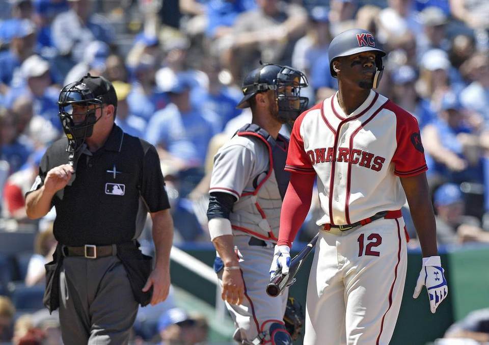
• As you can see in the photo above, the Royals/Monarchs had uni numbers on their upper thighs — except for Jorge Bonifacio, whose number was AWOL (for some of these photos, you can click to enlarge):
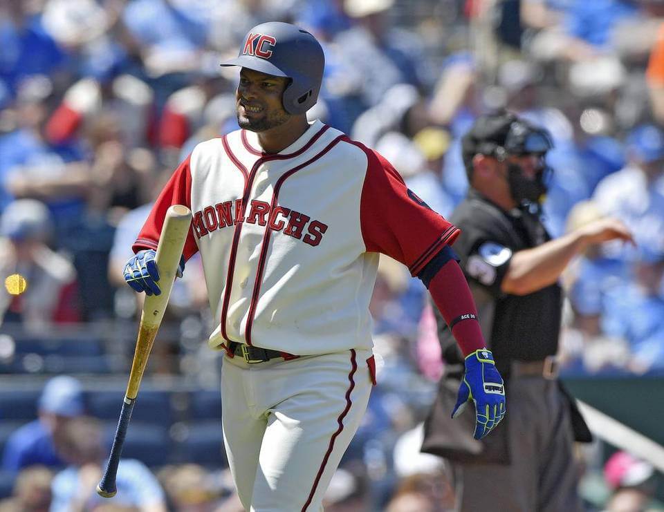
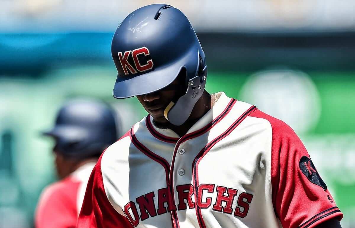
• And as you can see in that last photo, the Royals used matte throwback helmets (the Indians just wore their regular helmets). Looks like they even got a matte faceguard for Jorge Soler:
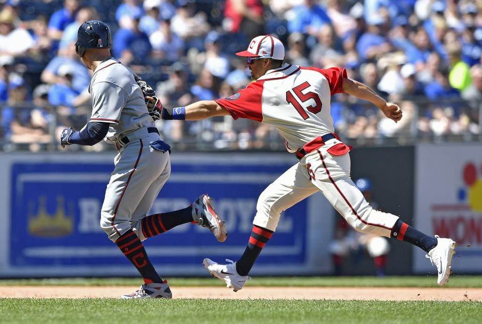
• As usual with these sorts of games, some players went high-cuffed while others went the pajama route. And as has become the MLB norm, there was no consistency among the sock styles shown by the high-cuffers, which seems particularly disappointing in a throwback game. Look at these two Cleveland players:
• One of my favorite things about Negro League uniforms: contrast-colored flap pockets!
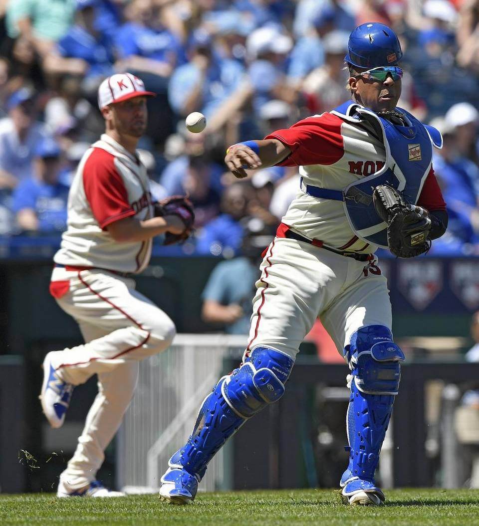
• Both catchers wore their usual gear. That was fine for Cleveland’s Yan Gomes, whose equipment pretty well matched the throwback color scheme. But it didn’t work out so well for KC’s Salvador Pérez:
• All of the jerseys, caps, and pants were blissfully free of the MLB logo. But there was still plenty of logo creep in the form of makers’ marks, which looked particularly brutal on the KC caps:
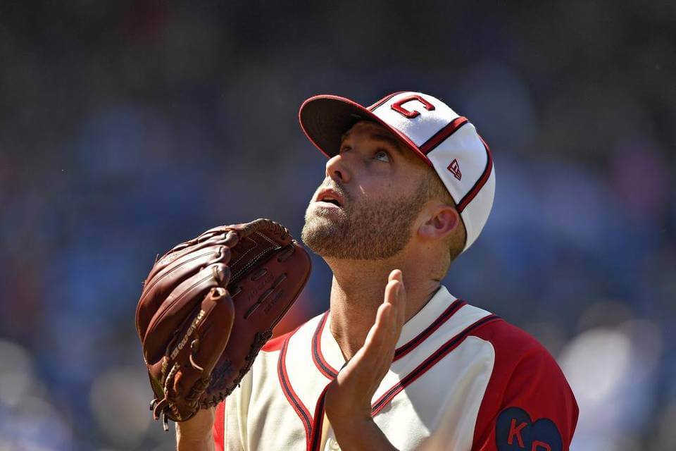
• Just once I’d like to see a throwback game where the umpires go retro along with the players. Maybe they’ll do that one day — but not yesterday:
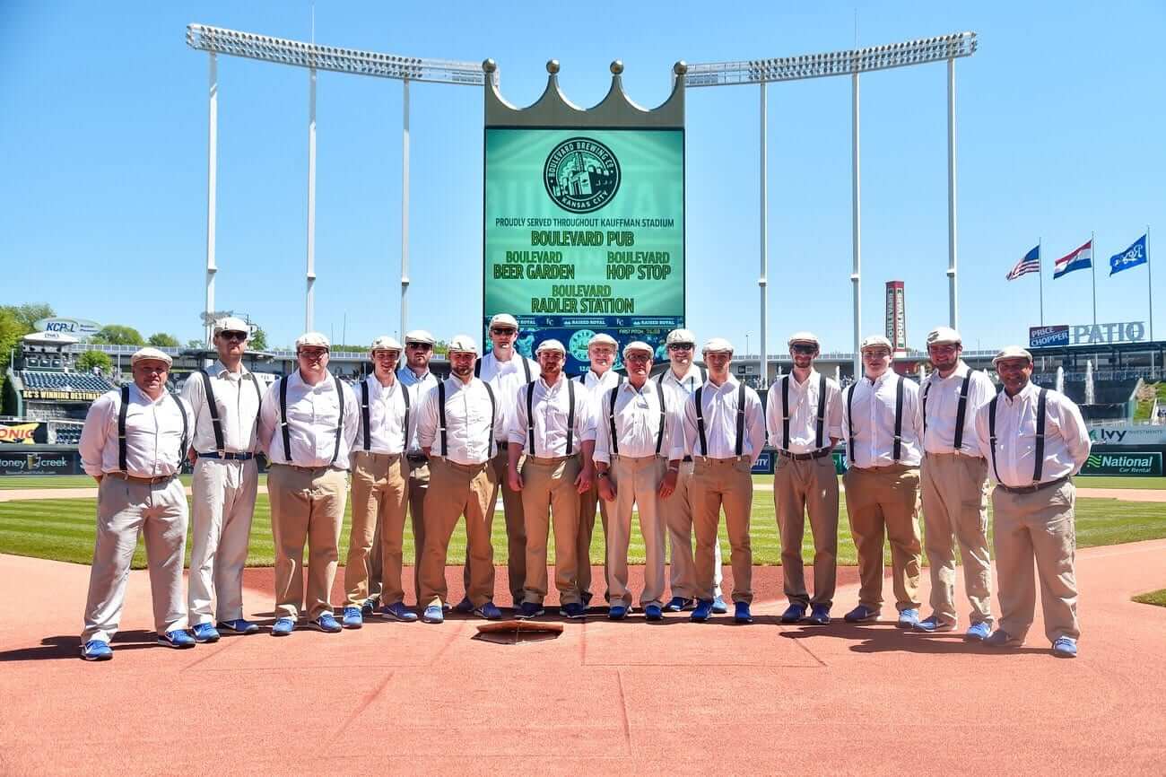
• The Royals’ grounds crew, however, got into the sprit of the occasion:
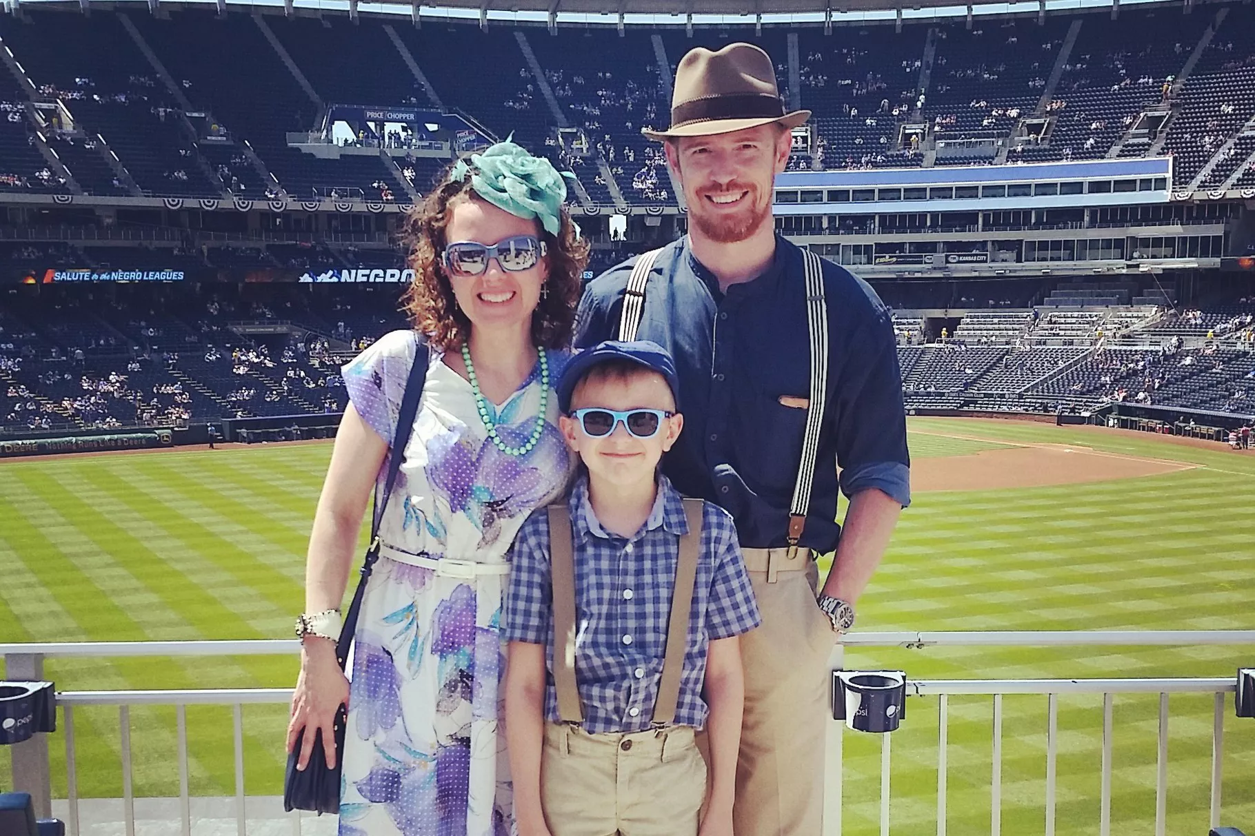
• Lots of fans played along, because it was “Dressed to the Nines Day,” with many game attendees wearing their retro-styled Sunday best (you can see a bunch of additional photos here):
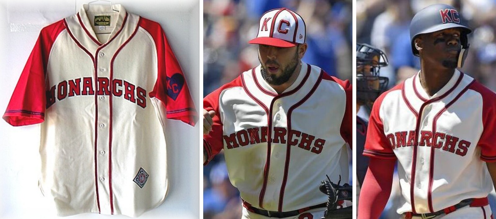
• Here’s a little detail I bet nobody else noticed (or cared about, most likely): The Monarchs’ original jerseys had sun collars, which are little stand-up collar extensions that protect the lower-rear neck from the sun. You see those semi-frequently on old baseball jerseys. It looks to me like Majestic tried to simulate the sun collars by using a conventional jersey cut and then moving the headspoon piping down from the collar’s edge, creating the illusion of a sun collar. To show you what I mean, here’s a side-by-side comparison of a retail throwback with a genuine sun collar on the left, and then two game shots from yesterday:
• Oh, and just to make things more interesting, some bees decided that the bunting at Kaufman Stadium was a good place to hang out yesterday:
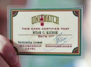
ITEM! Big membership news: People sometimes ask me, “I’m considering getting a membership card. But do I get any benefits, aside from the card itself?”
Beginning today, the answer to that question is yes. Effective immediately, all Uni Watch membership cardholders will be entitled to a 15% discount on any of the merchandise listed in our Teespring store.
The discount code will be provided to new enrollees when their cards are mailed to them. Existing enrollees can obtain the discount code by emailing me. Once I confirm that you are indeed a cardholder, I’ll email the discount code to you.
As always, you can sign up for your own custom-designed membership card here, you can see all the designs we’ve done so far here, and you can see how we produce the cards here.

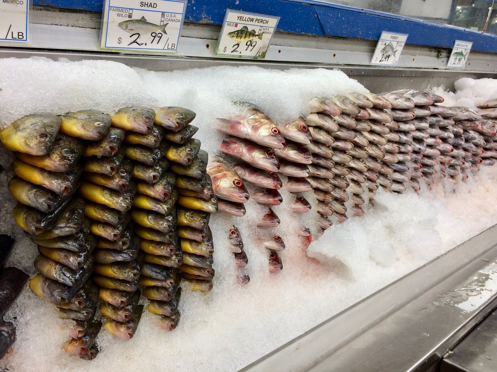
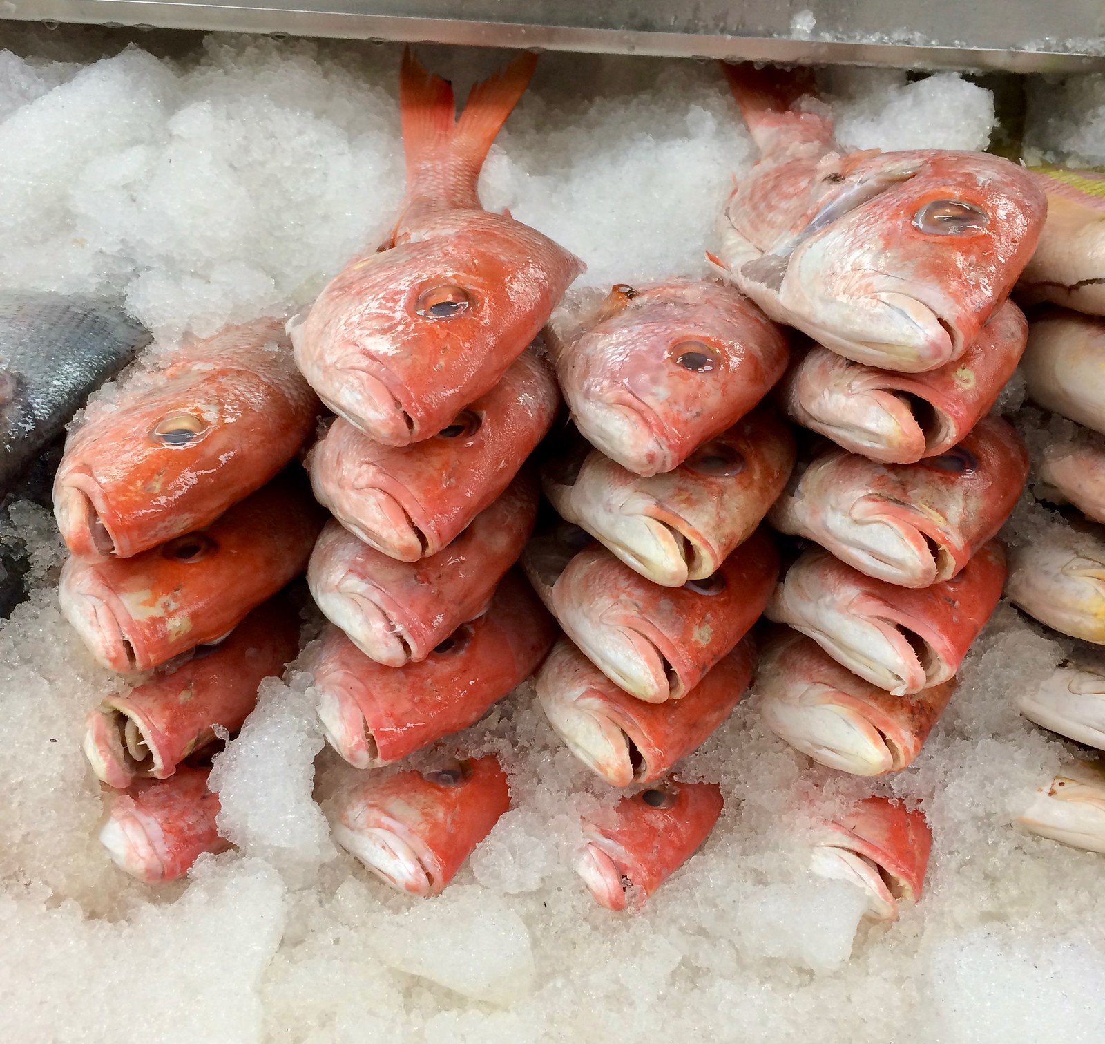
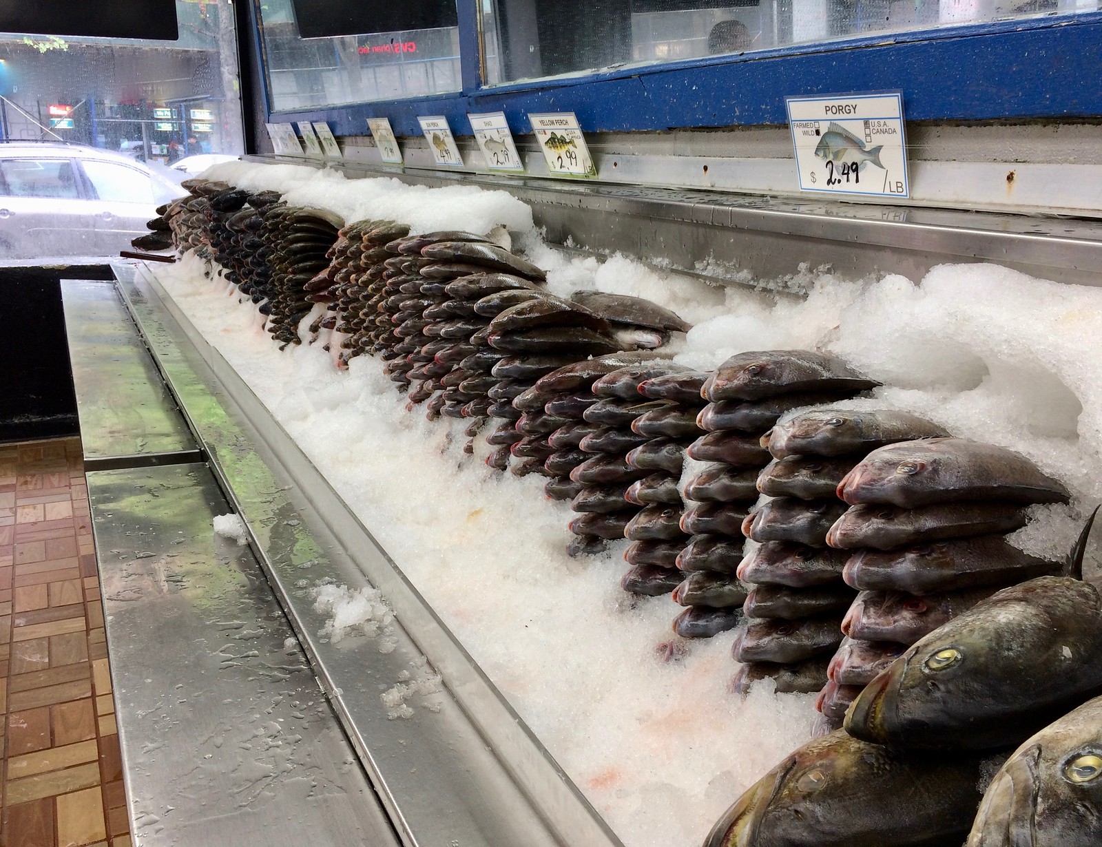
For all fish photos, click to enlarge
A very, uh, uniform presentation: I was walking around Harlem yesterday and passed a fish market where the whole fish were arranged in stacks. Never seen that before — it was almost like the fish were bricks, with the crushed ice serving as mortar.
For some reason I found it compelling. Maybe it was all the rows of sad fish faces, or maybe I just like seeing things presented in a neat, orderly presentation.


The Ticker
By Alex Hider

Baseball News: A’s P Bobby Wahl got away with wearing a cap without the New Era logo yesterday. … Cubs 2B Javier Baez was wearing teammate Addison Russell’s batting gloves during last night’s game (from Griffin Smith). … Rays batboys are wearing facemasks this season (from Martin). … This column argues that while some of the Stance sock designs are gaudy, they could help fight pajama pants syndrome. … Nebraska wore state-themed stars and stripes caps yesterday (from @spomedome). … A Tennessee baseball player was present for the birth of his son last month ”” in full uniform. … Navy-on-navy matchup in NAIA between Menlo College and The Master’s University.

Football News: Here’s another set of NFL uniform power rankings (from Phil). … Is the “M” from Mississippi’s script wordmark being treated as a logo now? It appears so from this retail shirt (from Eric Odden). … Stanford Slifer spotted a Florida State-themed golf cart at the school’s graduation ceremony this weekend. … Chiefs QB Len Dawson at one point had a crazy improvised facemask setup. Lots of additional facemask oddities here.

Hockey News: Researchers at the University of Alberta have created the world’s smallest sports logo ”” or probably any logo, for that matter. It’s an Edmonton Oilers logo that’s 40 times smaller than the width of a human hair. … Great feature on the company behind many of the free T-shirt giveaways that take place during the playoffs in the NBA and NHL. … France G Cristobal Huet got blood on his jersey at the World Championships and had to wear a teammate’s jersey in place of his own.

NBA News: Raptors G Norman Powell isn’t happy that LeBron James pulled on his jersey during Game 3 of the Toronto/Cleveland series on Friday. … ICYMI from the hockey section: Great feature on the company behind many of the free T-shirt giveaways that take place during the playoffs in the NBA and NHL.

Soccer News: There was an English Premier League patch malfunction during yesterday’s Manchester United/Arsenal games yesterday (from Mike Wice). … New kits for AFC Cleveland of the National Premier Soccer League (from Ed Zelaski).

Grab Bag: Funny car driver John Force tried on wrestler Ric “Nature Boy” Flair’s iconic coat (from David Firestone). … NASCAR driver Chase Elliott will wear special racing shoes honoring the 30th anniversary of his father’s record-breaking run at Talladega Superspeedway (also from David Firestone). … A Seattle bakery is selling lots of local team-themed cookies. I love that the ‘upside-down 5 in place of a 2’ issue is a thing at this level,” says John Kimmerlein.
That microscopic Oilers logo is impressive, but it’s nowhere near as small as this IBM logo made of individual atoms:
link
When designers talk about logo scaleability, they usually mean something like a range from roadside billboard to polo-shirt embroidery. The IBM logo scales well all the way down to the atomic level.
I’m always impressed by the Roylas’ throwbacks. Another nice job yesterday.
Paul…in the fish story you have “were were” in first sentence and in hockey ticker Edmonton is spelled wrong.
…says the guy who spelled ‘Royals’ wrong. jeez
Both fixed.
Probably because I’m much less trusting than our host, seeing the fish display makes me think they’re pushing to sell the top row product first since it would be such a mess to pull a fish from lower in the stack.
That means they’d have to keep building the stacks from the bottom (like grocers who build the milk displays from the back), which seems like it would be fairly difficult.
In the ticker: Ric Flair has an iconic robe, not a coat.
Respectfully, those NFL uni rankings are wack. He has Seattle No. 1 and Green Bay barely Top 10.
The article blows; lots of rambling about “boring” uniforms that sounds like the grievance of a 12 year-old.
Along with the on the field retro, yesterday at Kauffman Stadium was also “Dressed to the Nines” Day, where the fans are encouraged to wear their Sunday best like fans did back in the day. It always results in some pretty great shots of fans too – that’d be a fun addition to the column.
I didn’t see any photos of that, Kyle. Are you aware of any shots on the web, or did you mean that they showed some good shots on TV?
link
Ah, nice. I’ll add that the lede.
As a lifelong Minnesotan, it’s odd to see a display of ‘sun perch’ for sale in a retail setting.
What we know as sunfish or sunnies (regardless of whether they’re of the blue gill or pumpkin seed variety) are the most ubiquitous fish in the state. We almost universally hone our fishing skills chasing sunnies with a snoopy fishing pole, but I think I’ve only ever seen them for sale in one store before. It’s a fish you catch, not buy.
In 2004, Iowa had a throwback game against Kent State where the referees got into the act and wore throwback uniforms. Here’s the best screen-cap I could find – link.
There’s a highlight video of the game here – link. I’d recommend watching it on mute if you follow the link, it’s a fan made video with a poor taste in music.
Nice!
I should have specified that I meant baseball. In the NFL, the refs wore throwback caps for some of the 1994 throwback games:
link
And NFL refs even wore throwback *AFL* uniforms for some of the throwback games in 2009:
link
Naturally, both of these are shown on the mighty Gridiron Uniform Database’s website:
link
Proofreading:
“A Tennessee baseball player was present for the birth of this son last month”
– Should be “his” son
Fixed.
All those photos, and not one showing us the cap the Barons wore in the field.
“Stanford Slifer spotted a Florida State-themed golf cart at the school’s graduation ceremony this weekend.”
Is that really a golf cart or some type of utility vehicle? Seems like those tires would destroy a fairway.
Ah, the musical classics.
The 80s were a darn fine to to grow up. We didn’t have no internet, but we had MTV that actually played music videos.
link
Your favorite player, Matt Fratboy (I prefer Frat Harvey), gets suspended and no comment?
Has nothing to do with uniforms, clothing, or anything else remotely related to this website. Why would I comment?
I was being facetious, although him not playing does affect the on-field aesthetics of the Mets. Especially when he was picking blue jerseys for his starts.
Actually, as we’ve been over many times, they didn’t wear blue very often when he pitched last year.
In any case, when a player who’s only on the field once every five days is suspended for three days, that doesn’t make much of an on-field impact.
Too bad Kansas City didn’t name the team the Monarchs, in honor of the Negro League and the Monarchs. Might have been too close in years to when the Monarchs finally disbanded in 1965. Some suggest the Royals name was because of the Monarchs, having a similar meaning. But the Royals were named after the billion dollar livestock industry.
Actually they were named after an annual livestock show called the American Royal. If they were named after the industry, they would have been called the Armours or Swifts or Farmlands or whatever meat packing plants were still open in 1969.
Here’s what I read. It was kind of unclear:
Pharmaceutical executive Ewing Kauffman won the bidding for the new Kansas City team. He conducted a contest to determine the best and most appropriate name for the new franchise. Sanford Porte from Overland Park, Kansas submitted the name Royals, in recognition of Missouri’s billion-dollar livestock industry. His suggestion was that the American Royal best exemplified Kansas City through its pageantry and parade, so the new team should be named the Royals. The name was selected out of 17,000 submissions and the Royals Board voted 6-1 to adopt the name. The one dissenting vote was Mr Kauffman’s. He eventually changed his mind after the name grew on him. (Some sources say it was in honor of the Kansas City Monarchs, a Negro League team.)[2] The team’s logo, a crown atop a shield with the letters “KC” inside the shield, was created by Shannon Manning, an artist at Hallmark Cards, based in Kansas City
Don’t believe everything you read on wikipedia. The American Royal is a livestock show. Not “the industry”.
I understand the desire to see the umpires “throw back” with the players but the truth is that the players aren’t actually “thrown back.” The wear structured hats, batting helmets, colored shoes, mismatched or unseen hosiery, various protective gear, etc.; none of which was seen or known during the period to which MLB or the teams are trying to recreate. To me it is simply sartorial eye-candy.
Well, yes. Of course. I’d just like to see the umps go with the sartorial eye candy as well.
you think any of them could wrangle the ol’ outside chest protector?
link
Seahawks with the #1 Uniform? Not even.
No one calls them “Mississippi”; it’s “Ole Miss”