Technically speaking, Opening Day was on Sunday. But yesterday was the real Opening Day (or as longtime Uni Watch reader/pal Robert Marshall calls it, the “holiest of holies”) for most teams, and there were lots of uni-notable details on display. Dig:
• The Braves waited until Opening Day to unveil their new 3D helmet logo. I’ve known about this one for a few months but was sworn to secrecy.
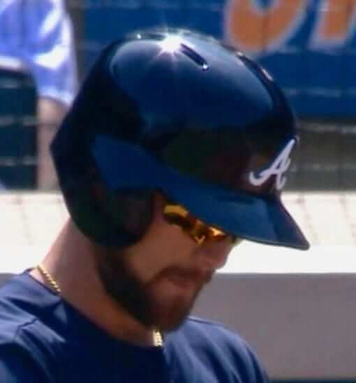
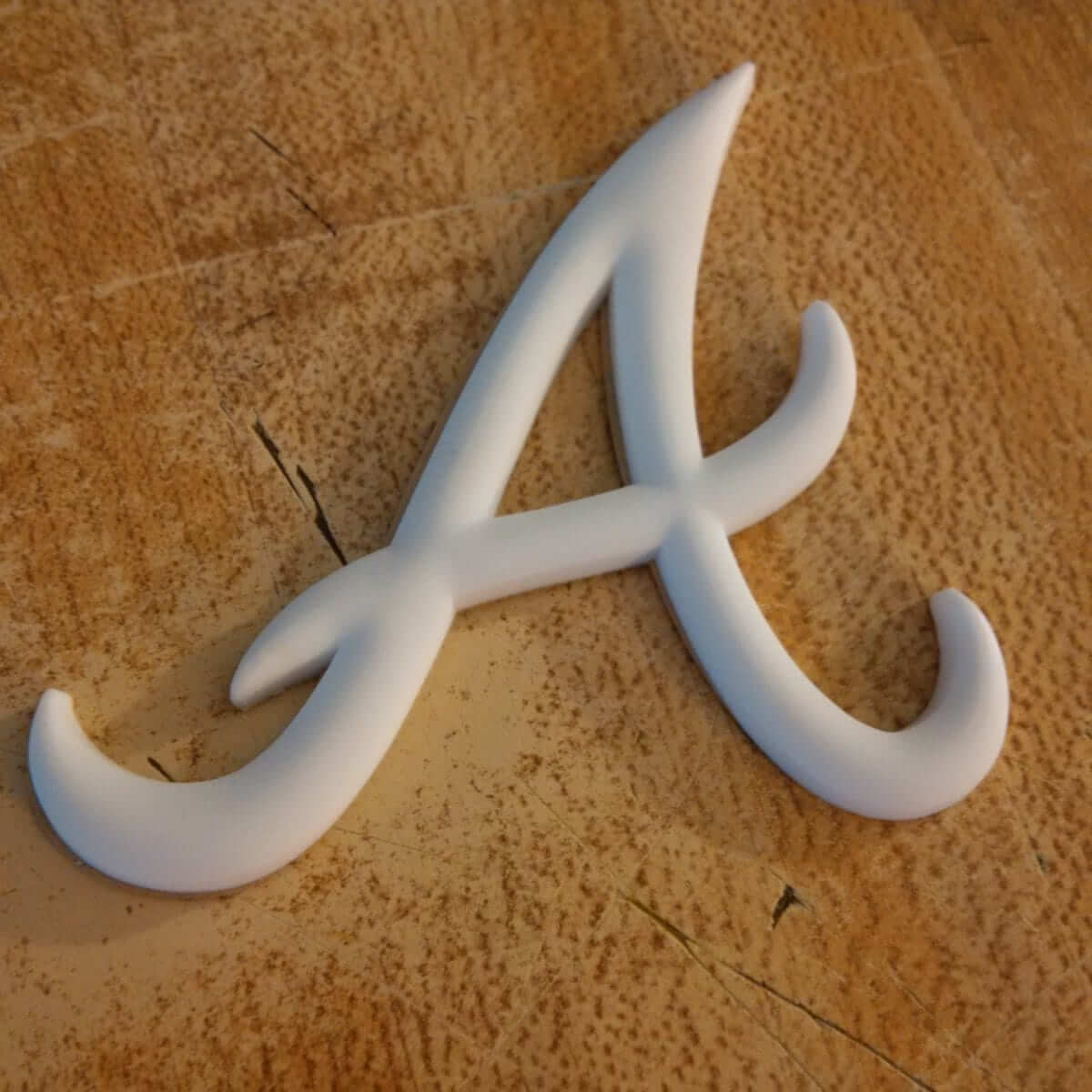
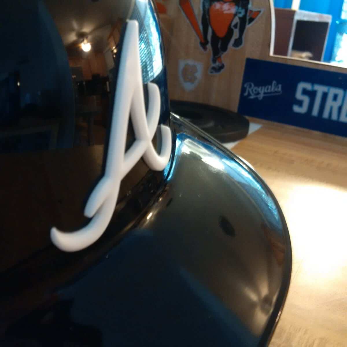
• The Nats also went 3D with their helmet logo yesterday. They’ll have a separate version for their road helmet. Again, I knew about this one well in advance but couldn’t say anything.

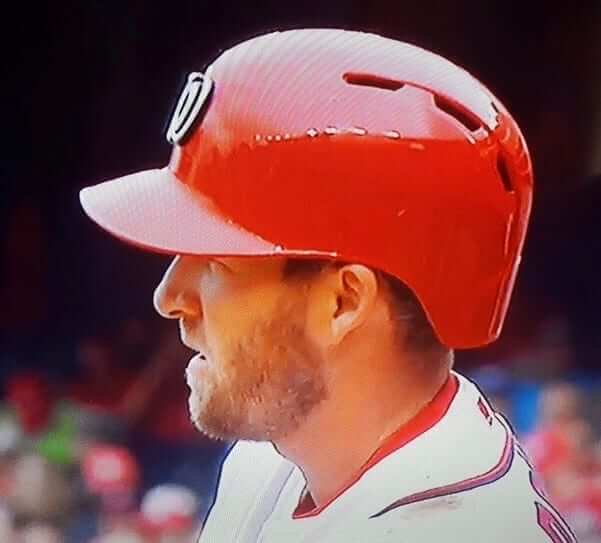
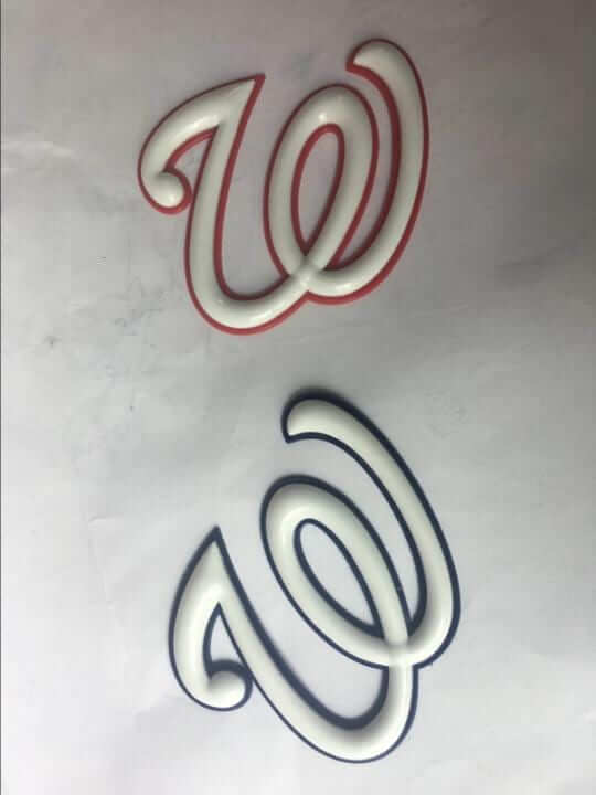
For those keeping score at home there are now six teams wearing 3D logos (all except the Dodgers are new for 2017): Braves, Cardinals, Dodgers, Nats, Rangers, and White Sox. I know there have been other teams tinkering with the 3D option, so this list may still grow in 2017.
And while we’re at it, there are now 12 teams wearing matte helmets (teams in italics are new additions for 2017): Diamondbacks, Dodgers, Giants, Mariners, Marlins, Orioles, Padres, Pirates, Rangers, Rockies, White Sox, and Yankees (road only).
• Speaking of helmets, the White Sox have changed the numbers on the back of theirs. The numbers used to be outlined but now they’re solid white:
In addition to matte shell & 3D logo, Chisox also changing number style on helmet. Old version on left, new on right. (h/t @estrucan_raider) pic.twitter.com/XExMgdof1o
— Paul Lukas (@UniWatch) April 3, 2017
• Several Mets players wore blue cleats, including starting pitcher Noah Syndergaard.
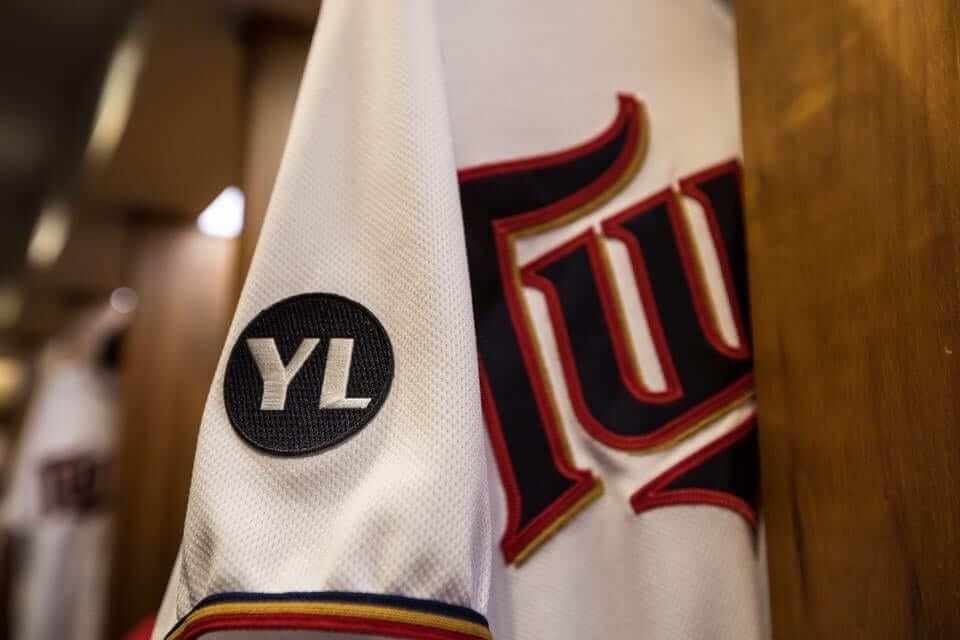
• The Twins added a “YL” memorial patch for pitching prospect Yorman Landa. My understanding is that this patch was only for the season opener and will not be worn for the rest of the year (click to enlarge).
• Speaking of memorials, there had been talk that the Tigers might change their Mike Ilitch memorial patch from the one they had been wearing in spring training, but they stuck with the same design. They also used the patch design as the basis for a pattern mowed into the outfield grass at Comerica Park (an interesting move given that the Tigers are currently on the road and won’t have their home opener until Friday).
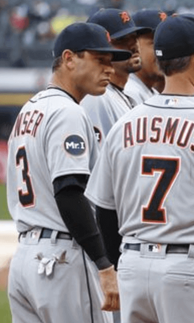
Comerica Park pays tribute to Mike Ilitch with Mr. I cut into the grass. pic.twitter.com/SDgsLkrbzJ
— Roop Raj (@rooprajfox2) April 3, 2017
• Some of the Rangers were wearing these crazy lone star-themed socks:
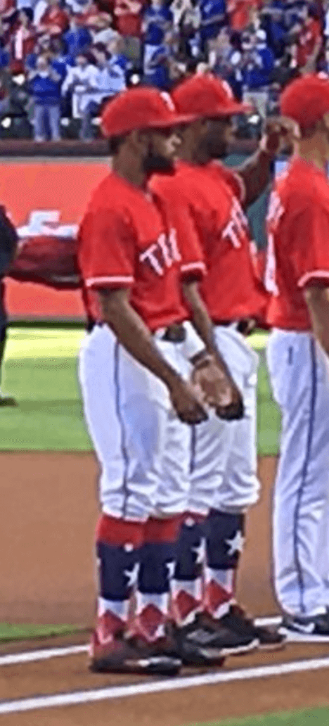
As the season unfolds, we’re going to be seeing lots of other new sock designs (a bunch more of them have just been added to Stance’s online shop), although they won’t all be as bold as that Rangers design. Here are some that debuted yesterday:
you'll see new socks from #Reds players who wear their pants up. There's another version w/ Mr Redlegs head pic.twitter.com/slH5hQvE6v
— C. Trent Rosecrans (@ctrent) April 3, 2017
@PhilHecken @UniWatch The Twins Stance socks pic.twitter.com/meCN4MvS6C
— Chris Howell (@ChrisHHowell) April 3, 2017
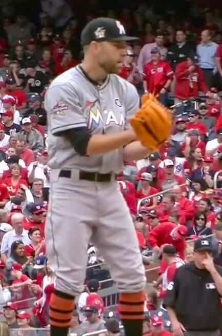
• As you can see in that last photo, the Marlins are wearing an All-Star Game patch on their caps in addition to the one on their sleeves. I had previously reported on the sleeve patch but not the cap version.
• Here’s a weird one: Pirates reliever Felipe Rivero was apparently wearing a watch when he entered the game. He took it off and put it in his back pocket before starting to pitch.
Did Felipe Rivero just take the mound wearing an Apple Watch? He removed it before throwing a pitch. @UniWatch pic.twitter.com/Nt7gHPiiVP
— Zack Tanner 🌹 (@ZackTanner) April 3, 2017
• I’ve noted before that Welington Castillo is among the handful of MLB catchers who wear their catching helmets with the brim facing forward. But it’s a lot more noticeable now that he’s with the Orioles, because the brim is contrast-colored:
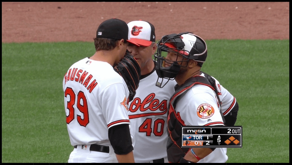
• Most teams have the players line up along the baselines for their Opening Day pregame introductions. But the Orioles always have them line up along the infield instead, making it look like the infield is playing in to cut off a run at the plate:
• Speaking of the O’s, here’s a good look at their new matte helmet and their Camden Yards 25th-anniversary patch, both of which made their on-field debut yesterday:
• The Rangers debuted their new matte helmets and 3D logo, and Rougned Odor wasted no time in gunking up his helmet with pine tar.
New helmet prep 101!! pic.twitter.com/nze1UBedsC
— Texas Rangers (@Rangers) April 3, 2017
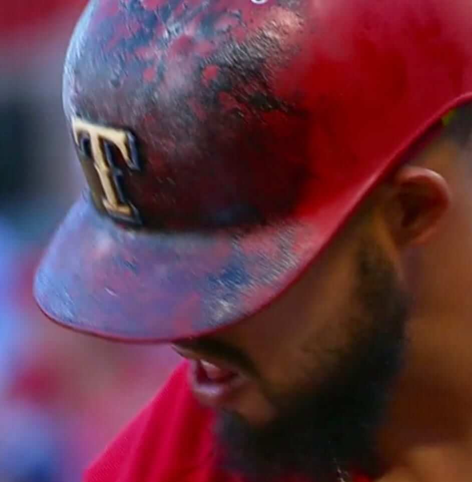
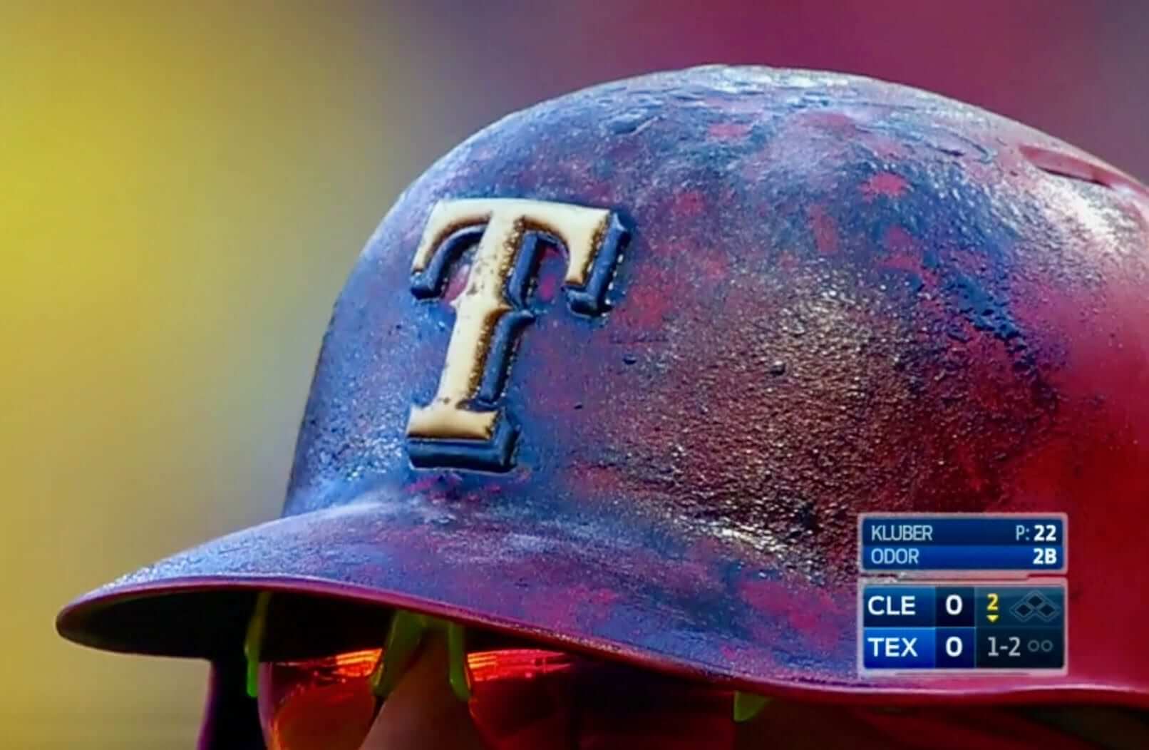
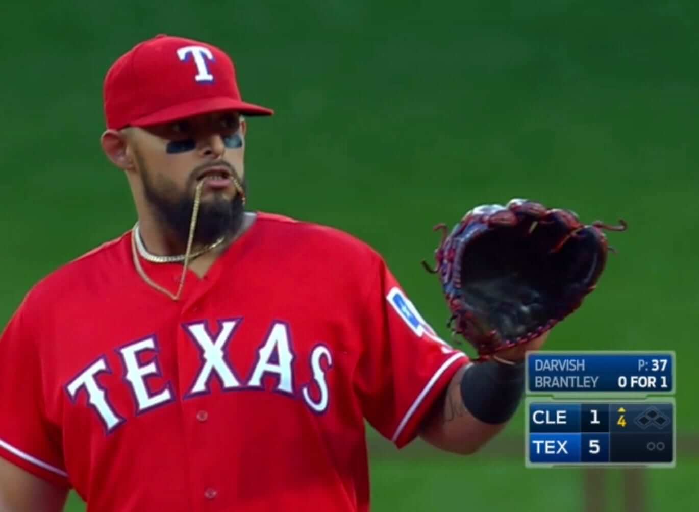
• Odor also has some funny ideas about what to do with his jewelry during a game:
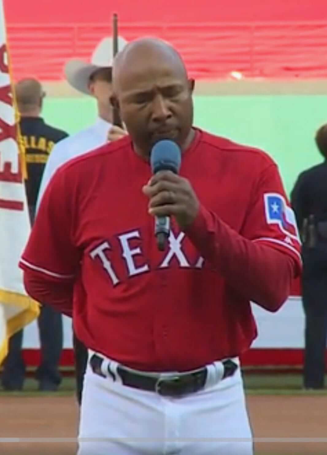
• Rangers third base coach Tony Beasley sang the national anthem — in uniform! (Further info here.)
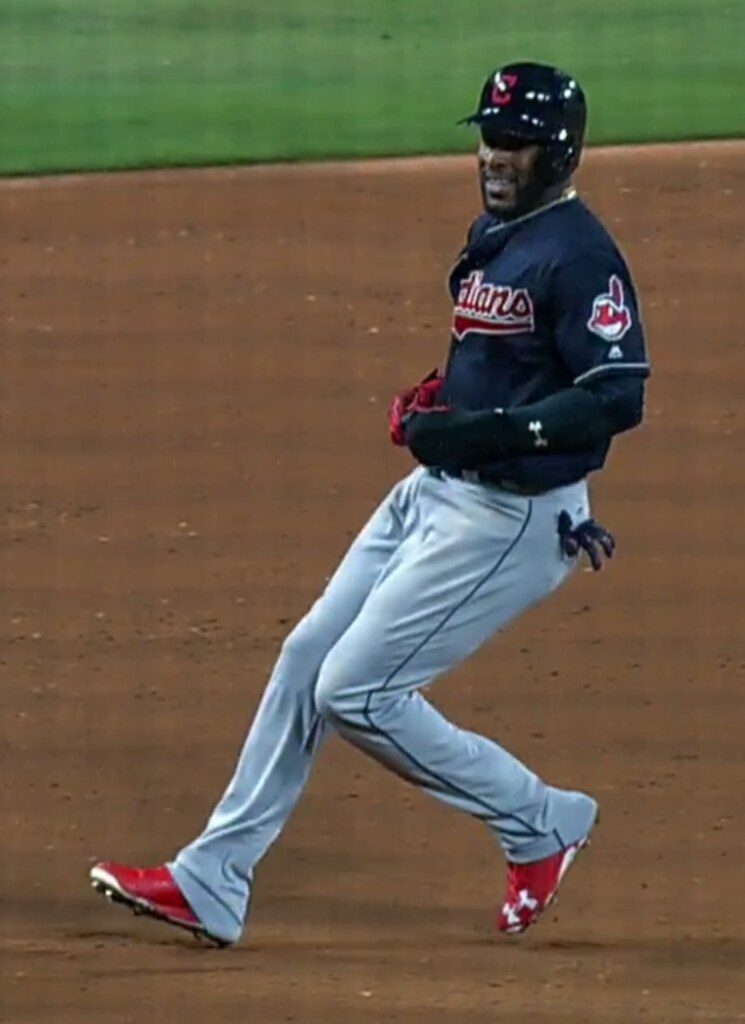
• Cleveland rookie Yandy DÃaz, making his MLB debut, did the old trick of impaling his pant cuffs on the his back spikes, which is supposedly banned (although it’s never enforced).
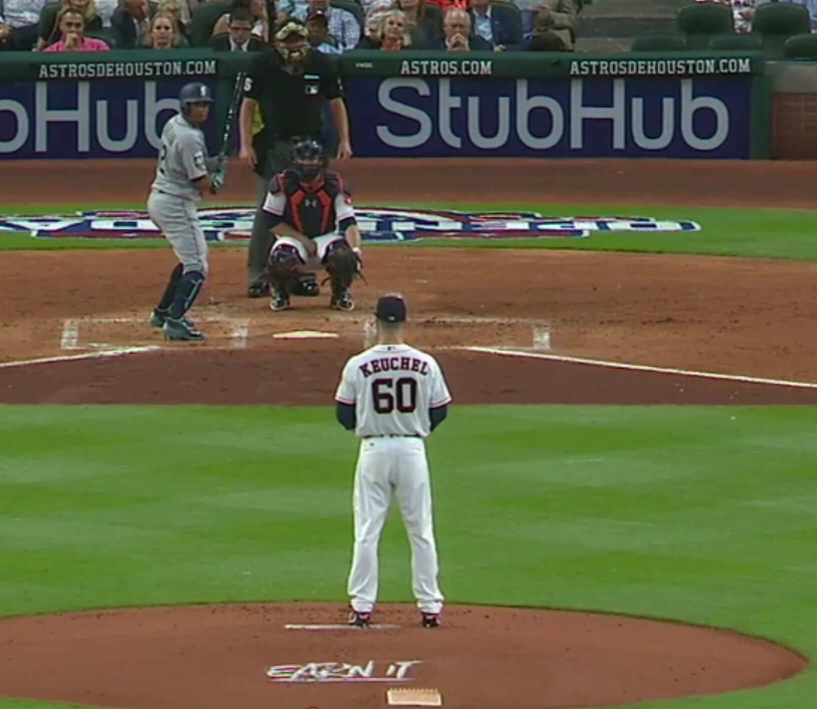
• Lame-o move in Houston, where the Astros put this year’s marketing slogan on the back of the mound. Let’s hope (a) that this was just a one-game thing, and (b) that it doesn’t catch on with other teams.
• A’s pitcher Chris Bassit somehow got away with wearing a cap that didn’t have the shameful New Era logo creep:
@UniWatch #Athletics pitcher Chris Bassit # 40 sans New Era creep on his cap during player intros tonight pic.twitter.com/G9VVj2Z8Ab
— Richard Paloma (@RichPaloma) April 4, 2017
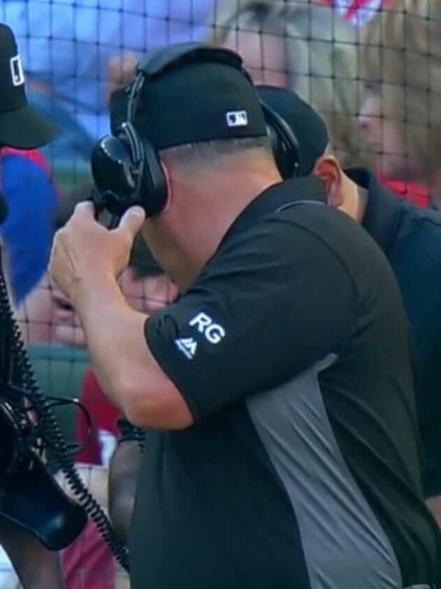
• Finally, you may have noticed the umpires wearing an “RG” sleeve insignia. That’s in memory of former American League umpire Russell Goetz, who died last month.
(My thanks to all contributors and apologies for not keeping track of your names. It was a hectic day!)
Collector’s Corner
By Brinke Guthrie
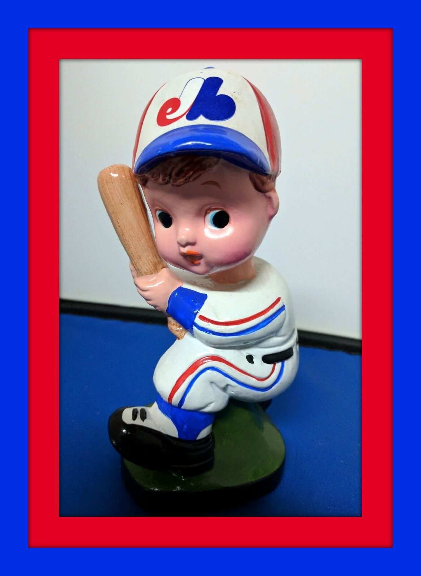
All baseball this week to celebrate the start of the season! Let’s start things off with this super-looking 1970s Expos bobblehead. Never seen this pose before! We’ve also got this vintage Expos record album en Français, with some great cover art! Not sure what the deal is with this one — doesn’t look like the players were singing on it or anything. Qui sait?
Now for the rest of our Opening Week picks:
• Here’s another Brooks advert from back in the day, in poster form. Bird Fidrych and George Brett among the stars that were wearing “America’s Great Athletic Shoes.”
• This Billy Martin Oakland A’s T-shirt is courtesy of the now-defunct Oakland Tribune, proclaiming “Good News!”
• Another one from the Swingin’ A’s era: their yearbook for 1971 says “Swing ‘N’ Run In ’71!”
• Here’s a batch of 1970s Chicago White Sox thermal mugs.
• Staying in Chicago, we have a set of four Chicago Cubs milk glasses.
• One more Cubs item (heck, they’re the champs, let’s give ’em some love): this inflatable beach ball. It says “1970s era” on the listing, and comes sponsored by Heileman’s Old Style beer.
• This (early?) 1970s Reds kid’s T-shirt says “Cincinnati Stadium” on it. The Reds have played in lots of ballparks (including the fancifully named Palace of the Fans), but never in anything by that name.
• Check out the cover art on this 1963 Los Angeles Angels yearbook!
• This 1960s San Francisco Giants drinking glass is in great shape for its age.
• Interesting rendering of the New York skyline on this 1960s Mets mini pennant.
• And we wrap up with a submission from reader Jacob Sherman, who found these excellent Astros coasters, each with its own swizzle stick!
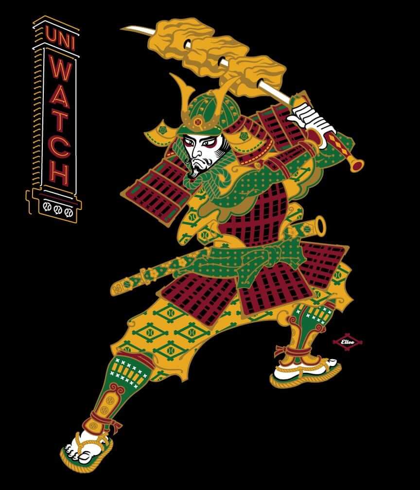
T-Shirt reminder: In case you missed it last week, our latest limited-edition T-shirt in the Uni Watch Artist’s Series is by the great Larry Torrez (aka Eltee of DC). In the spirit of his Meatscots caricature series, he’s imagined a fictitious Japanese baseball team called the Kyoto Yakitori, whose mascot is a baseball-playing samurai with a sword that serves as a baseball bat and as a yakitori chicken kebab skewer (click to enlarge):
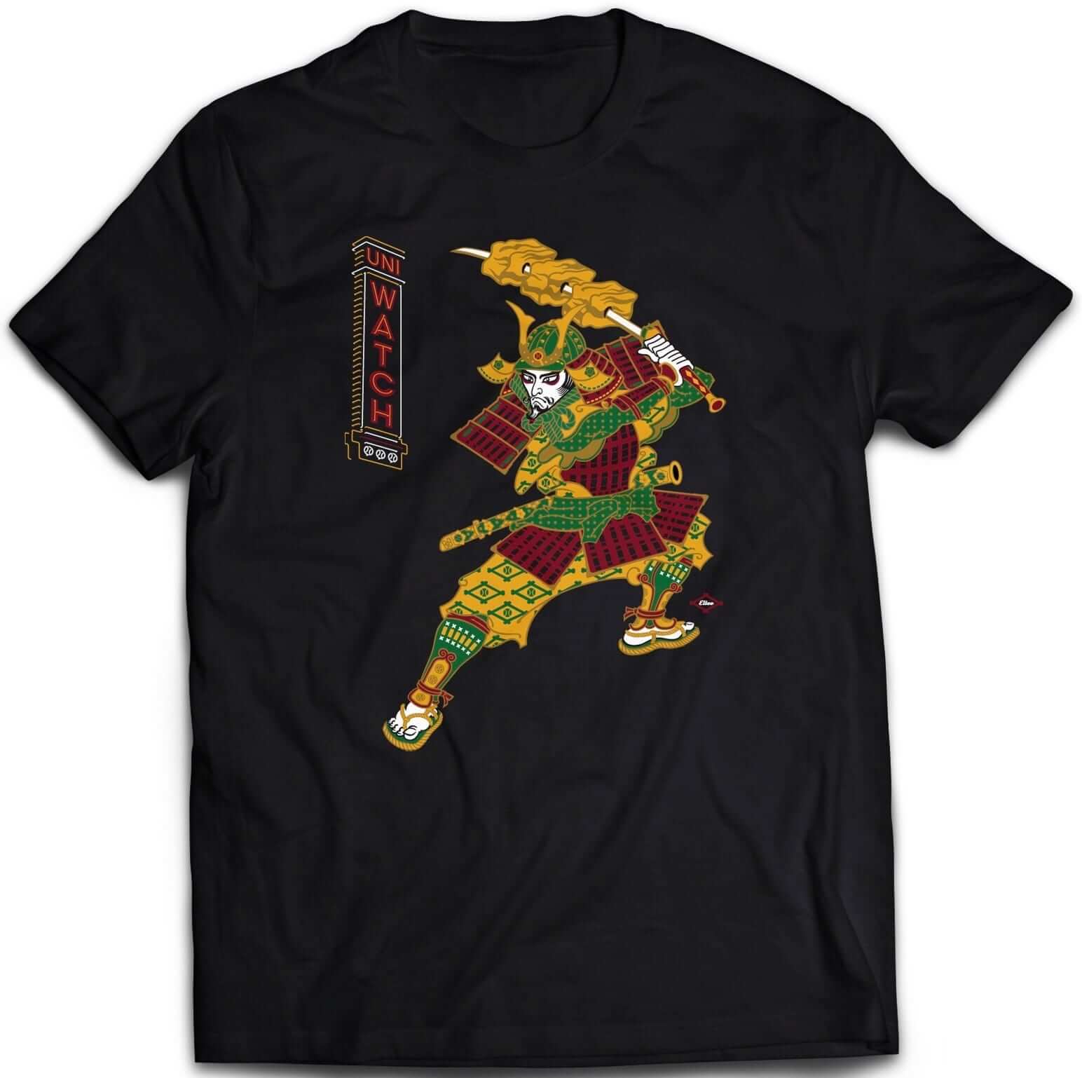
It’s available in three different black short-sleeve options (two of which come in sizes up to 5XL) and one long-sleeve option (up to 5XL). plus I’ve also made the design available as a sticker.
Some of you have also asked why I’m okay with this design if I have issues with Native American-based sports designs. That’s a perfectly valid question, and I’ve created a separate page to address it. Look here.
The shirt is available here through this Thursday, April 6. My thanks, as always, for your consideration.
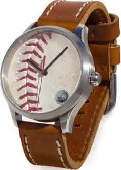
New advertiser shout-out: In my 2016 holiday gift guide, I singled out the excellent jersey-lined wallets made by the California company Tokens & Icons. In addition to the wallets, they make all sorts of cool gift items out of repurposed sports materials: wristwatches, cufflinks, bottle openers, and more.
T&I doesn’t usually advertise, but they got a bit of a sales bump from my gift guide mention, so they got in touch and wanted to know more about Uni Watch. Over the past few months I’ve gotten to know T&I founder Ward Wallau and sales director Milan Micich, both of whom are really interesting guys. They’re smart, funny, and creative — my favorite combination. And they totally Get Itâ„¢. Ward has even ordered a Uni Watch membership card for himself, and I’m hoping to meet up with them during their next trip to New York.
In the meantime, I’m happy to announce that T&I will be advertising with Uni Watch for most of the rest of 2017. I’m proud to have them as represented on the site, and I hope you’ll consider them for your shopping needs. Thanks.
StripeRite sale: We’re continuing our sale on StripeRite socks. From now through April 7, use the discount code FINALFOUR to get 10% off. This applies to any order from our first or second batch of StripeRites. Thanks for your consideration.
Contest reminder: I’m running a new ESPN design challenge to redesign the Raiders for their move to Las Vegas. Full details here.
The Ticker
By Mike Chamernik

Baseball News: Cubs 2B Javy Baez says he missed a sharply hit grounder on Sunday night because the ball blended in with a white banner ad behind home plate. … Hip hop artists helped make MLB caps fashionable, and they really like to rep their favorite teams. … Back in the 1980s and ’90s, 7-Eleven produced baseball trading card coins. Peter Fredrickson still has his collection. … Here’s a good view of how Hall of Fame outfielder Richie Ashburn wore protective padding under his Phillies cap (from @uniformcritic, via Phil). … Passengers in Mets apparel get priority boarding on Delta flights out of the New York City airports for the next week and a half. … A New York City Council member is proposing legislation that would require the Mets and Yankees to extend the protective netting in their respective stadiums. MLB policies already recommend that netting extend 70 feet in each direction from home plate. The NYC teams both comply with that, but the new legislation, if approved, would require the netting to extend 90 feet.

Pro Football News: A few weeks ago Will Scheibler found that the Ottawa Citizen newspaper held a new logo contest for the CFL’s Ottawa Rough Riders in 1989. He was able to obtain a newspaper account of the contest, which includes designs from the other finalists.

Hockey News: The rock band Weezer is selling four different hockey-style jerseys for their Canadian tour (from Michael Perri). … New cream alternates for the Cobourg Cougars, a Jr. A team in the OJHL (from David Foot).

Basketball News: Gonzaga’s Nigel Williams-Goss was missing his Final Four patch last night. So were a few other Zags players (from @WhoIsJoeyBoom). … The UNC and Gonzaga student sections were given towels that had the Final Four’s court design on them (from James Gilbert). … A pro wrestler in NXT named Kassius Ohno wears NBA throwback-inspired personalized jerseys, including ones based on the designs of the Kings, Sonics, and Dream Team (from Yancy Yeater).

Soccer News: Puma will be the new kit supplier for the German club Borussia Mönchengladbach starting in 2018-19 (from Ed Å»elaski). … Here’s what it would look like if European soccer clubs were American football teams (from @cesarcu52). … The uniform company Capelli Sport will be the new supplier for the USL’s Harrisburg City Islanders (from Ed Å»elaski).

Grab Bag: For more than a decade, an anonymous vigilante has been going around Bristol, England, and fixing punctuation on store fronts and street signs. Here’s a video about him. He uses stickers, not paint, to make his edits (from Pete Woychick and Oscar Raab). … Alex Shuman recently went duckpin bowling at a charming place called Perillo’s Bowl-O-Drome in Waterbury, Conn. “Sadly, the owner is closing the place for good May 22,” he says. … Residents of Orlando, Fla., are being asked to vote on a new flag design (from Evan Birchfield).
Small correction: the Apostriphiser is what the fellow uses in his pursuit, rather than his own nickname. Three cheers for him anyway!
Fixed.
As a wrestling fan, I think Ohno’s look is fun…except for that Dream Team look…an all white snug jersey/white trunks outfit looked like a grown man in a too-small onesie.
Stance Socks:
I am a fan of striped socks and stirrups and was delighted to see their comeback the past couple years.
I am not a fan of the stance logo and MLB logo floating on the socks and the giant team logos on the socks. That is three logos on socks.
I agree, I could do without the team logos on the socks (except those like the Phillies and Twins, who have Thad them for years). Logos and stripes together are too busy. And to Stance, the Red Sox hose are predominantly red. Please check Paul and Scott Turner’s collaboration with American Trench to see how to do it properly (and copy the Orioles design while you’re there).
The Red Sox themselves have preferred to have socks that match their team name, rather than the old stripes. That’s up to them, not up to the outfitter.
Never a fan of corporate logos on the unis at all. However if MLB is a good corporate partner to Stance, it would make sense to get back to pant-leg/sock uniformity rules, no? Maybe I haven’t been following too closely lately but has MLB made any approach to that recently?
Yes, you are correct. My apologies as I did not mention what I made the reference to. My reference was that the Red Sox hose sold as “on field” by stance is a pair of navy socks with small red stripes.
The Nats 3-D helmet logo appears to be based on the team’s updated-in-2011 curly W logo. Note the shape and angles of the arm on the left, and the X where the loops cross. If so, this is the first time the 2011 curly W has appeared on the front of a Nats cap or jersey.
Paul, I am surprised that you were told to be quiet about the Braves making their helmet decal 3D. Seems like such a minor detail in the uniform world. Are there a lot of examples of seemingly “minute” uniform details that you must keep under wraps? Does it ever surprise you that they’d want people to be hush hush?
Never surprises me, and I’m always fine with it. Organizations want to be in control of their own narratives. Nothing wrong with that.
As a journalist, it’s frustrating for me to have information and not be able to share it. But life is full situations in which we’re entrusted to keep a secret. Part of being an adult, right? Right.
I sometimes wish the only part of being an adult would be keeping secrets like that
As a non-journalist, I’m curious what benefit you get from learning info that you have to sit on. I understand the benefit for the team/league; if they tell you ahead of time and swear you to secrecy, they prevent you from learning it on your own and spilling the beans before they’re ready. But what do you get out of the transaction? Is it the ability to prepare strong coverage for the official unveiling instead of having to scramble at the last minute?
Among the many benefits:
– Knowledge is power, always, even if it’s knowledge I can’t yet act upon. It still adds to what I know about my beat, and that’s always a good thing.
– It helps build relationships with whoever’s providing me with the information.
– It often helps me prepare coverage in advance, so I have time to prepare a thoughtful article instead of slapping something together on the fly.
That last point is why I personally wish more organizations would share the news with you ahead of time. I would much rather see a well thought out piece – perhaps including insider/behind the scenes information – on the day of a reveal than to learn about the change earlier through blurry screen shots and rumors.
How does it work if someone does get a hold of the top-secret information & leaks it? Would you coming out and saying, “I can confirm that this is accurate” ruin your credibility with the organization(s), such that you still need to wait until the team officially announces something, or do they stop caring (other than the source of the leak itself) once the cat’s out of the bag?
If someone leaks something I already know about, and if I’ve promised to keep it secret, then I don’t confirm the leak. If I give my word, my word is good. Simple.
That doesn’t mean I *ignore* the leak, but I don’t confirm its legitimacy (which is what happens with most alleged leaks). And if that means someone else gets to confirm the leak’s legitimacy instead of me, and if that someone else therefore gets to grab all the glory, so be it. If I give my word, my word is good, the end. (Once the story is confirmed and out there, then I’ll write about it like anyone else, of course.)
Nothing I’m describing here is unusual or unique to me. It’s standard journalistic practice — not just in the uni-verse, but in throughout the media world.
Two things:
One, I think there is an acceptable range of thickness for the three dimensional logos, and I think Washington’s exceeds that. The profile shot looks pretty clumsy. It needs to taper more at the edges or something.
Two, the team logos look absolutely atrocious on the socks. Those lack the e-leg-ance of uniform socks, instead looking like licensed “fashion” knee-highs that you can buy at the mall. This observation is an independent evaluation with no consideration for the other two logos on the socks. Those are also atrocious, in their own right.
Honestly, I’d rather continue with the pajamas than look at any of this.
MLB’s marketing material should say, “If it’s worth doing, it’s worth overdoing!”
I’ll agree that logoless socks (team, manufacturer, and MLB) would be an improvement. Striping should be enough.
MLB’s marketing material should say, “If it’s worth doing, it’s worth overdoing!”
MLB? Heck, that’s basically the U.S. national motto, and has been from the beginning. Ought to be stamped on our coins! As PT Barnum never actually said but could have, “Nobody ever lost money underestimating the taste and intelligence of the American public, except for the XFL.”
On the socks, I’m not sure that three logos is actually worse than one logo – it’s sort of a matter of infinity-times-three just being infinity – and if these rococo designs are what it takes to get young players to flash a little hose, I’m fine with it. If the next step can be uniformity in sock design choice among players on a team, all the better.
On the Nats helmet, yeah, the base layer that forms the outline does seem ridiculously thick. I’d love to know more about the technical process of how the rubbery 3-D logos are manufactured. Is there a minimum thickness for each layer? Must a multi-color logo be stacked layers, or is it possible to next colors side-by-side in a single plane?
Do you honestly think that they’ll go back to good looking socks now that the cat’s out of the bag? :-)
Logos aside – and that’s nothing to do with the socks; just look at the caps, jerseys, and pants – I don’t think the socks are actually bad-looking. I mean, a few pairs are, sure, but by and large the new socks are at least adequate enough that they’re better than pajama pants. Mainly, I want them to be, as it were, uniform among players on the same team.
In regards to arrScott’s questions about nesting the 3D logos: The Rangers have kind of done that with their drop shadow. I actually thought they had, but looking closely at this photo that was posted here the other day, on the blue helmet it looks like it is actually a white T on a blue base, which fades to a red drop shadow. Opposite for the red helmet. You can see the base color below the right arm of the T and a bit above the bottom right serif.
link
It would appear that the reason the Nationals’ 3D logo is so thick is because it is layered with two colors (The white W and a red or blue outline). The Braves’ simple white A works better in 3D. There is probably a minimum thickness needed for each color of the material.
The Cardinals’ 3D helmet logo works much better. The navy trim (on the red helmet) appears to be flush with the surface of the helmet, rather like a decal.
Maybe the dark grays in the WBC have skewed my perception, but I swear some of the road grays are a lighter shade this year, particularly the Phillies and Royals. Anyone else notice this, or am I crazy?
From having seen many, many Phillies games from seats close to the third-base wall in Washington 2005-2015, it is not possible for the Phillies road “gray” to get any lighter. In sunshine, the Phillies road gray looks just barely eggshell off-white as it is. I remember one time, before the start of the game, a Phillies team photographer stood just across the wall from me, wearing a Mitchell & Ness throwback flannel road jersey, and the Phillies players closest to her looked like they were wearing actual home white uniforms by comparison. It was really, really stark, and that was under the more forgiving lights, not even during a sunlit day game.
I dunno. In years past, the white trim around the letters seemed to pop to me. I was watching the game yesterday, and it seemed to completely blend in with the jersey.
I have an idea- instead of putting netting up at Citi and the Stadium- outlaw cell phones, tablets and every other distraction. Pay attention to the game and bring a glove. Teach your kids to pay attention.
Too many morons aren’t paying attention at the game. Why pay a fortune for a ticket if you aren’t going to watch the game? Don’t get me wrong- I agree with the netting at this point- I don’t want anyone killed because they are too busy texting, chatting, tweeting or taking selfies. But it is common sense folks. Like looking both ways when crossing the street.
It’s pretty obvious at this point that people don’t go to the game to watch the game. They go to the game to eat, drink, socialize, tweet, shop, etc. The ballpark is now basically the mall, except that there happens to be a ballgame taking place in the background (and I do mean *background*).
It’s sort of like how some people go to a rock show and end up spending the whole time getting high, or playing hacky sack, or hitting on girls/guys, or whatever it is that people do at rock shows these days. For some people, the actual ticketed event isn’t the focus of why they’re there. The event just provides the sense of tribalism that ensures they’ll be surrounded by lots of relatively like-minded people, which is why they’re going.
Now, that’s not why *I* go to a ballgame (or a rock show). But it’s definitely why lots of people do. And the teams obviously know it, because they now stock their ballparks with tons of on-site “attractions” that have nothing to do with the ballgame. That’s what people want and respond to.
This is basically the difference between life and lifestyle — the difference between being into the thing and being into the *trappings* of the thing.
Very well said, Paul. The experience of a ballgame has given way to the experience of being at a ballgame for many.
Sadly, what Paul says is true. Hopefully, there will come a day when the nets will be made of translucent material like fluorocarbon fishing line and become almost invisible. It’s lousy to watch a game through today’s mesh (went to a Nats game last season with that extended netting and I had a hard time adjusting to watching the action through the screen).
The bright side: Technology and human behavior has created this problem with mesh, but someone will find a solution via technology to solve it.
But many people go to the games to get foul balls, and it would be upsetting to many if that joy of a baseball game is taken from them because of extended netting.
At the old Yankee Stadium, cellphones were banned from the seats directly behind the plate, presumably because of the influx of dingalings calling their friends watching at home and standing up and waving. When the new stadium opened, that ban went away. When you charge such exorbitant ticket prices, you can’t exactly dictate things like that to those who can, or will, pay those prices.
I also agree with extended netting. I’ve seen some people get real hurt. HBO who did a convincing PSA on it. What I found hysterical is that in east Asia people will pay more for a seat in a special section without netting but comes with a helmet and glove.
link
While I see where this is coming from, a vast majority of the dangerous foul balls hit in that area would be impossible to duck even if the person was staring at them the whole way. They’re faster than most human reaction time. I’m fully in favor of expanding the nets.
Yes, people are paying less and less attention during games, but to whittle it down to “if you’re paying attention, you don’t get hurt” is wrong. I encourage you to grab someone’s HBO subscription info (unless you have your own) and watch this piece. If you’re sitting in those foul ball seats, you’re probably toast even if you’re paying attention.
link
Very few foul balls even go over the dugouts, so extending the netting over them is not doing anything to promote fan safety. Should we also ban all unhealthy food from ballparks, too, since that hurts people as well?
The Angels item being offered on eBay is a yearbook and not a program.
Fixed.
I know it was 1989, but those Rough Riders designs were terrible. Those designs were the top 4 ????!!! Good grief…
WTF, Ottawa? The other Canadian cities don’t seem to have trouble producing excellent symbols and graphics. Step up your game!
Those logos were terrible.
I commented here last time this came up but that article is cool for two things:
The woman on the right of the photo was Joanne Polak, who was the first woman to be a GM of a pro sports team in North America. She still might be the only one.
The writer of the article is Earl McRae, who died a few years ago. He might be the most famous sportswriter ever in Canada. Earl McRae is who Bobby Orr would be if he had talent. His magazine piece on Bobby Orr is a must-read.
link
link
Bobby didn’t want to leave Boston. I’m guessing that he was finding out little by little how Alan Eagleson screwed him out of the part ownership of the team that the Bruins had offered him to re-sign. Eagleson, the weasel, never told Orr about the offer and he signed with Chicago thinking the Bruins had lowballed him.
Its an incredible story.
In 1975-75, the year he turned 27, he played 80 games. He played in 30 the rest of his career and was out of hockey by age 30.
Plus everything he did for Derek Sanderson.
More famous than Red Fisher? Really?
Yeah, that might have been a little hyperbolic.
That said, growing up in English Canada we didn’t see much Red Fisher.
I also might have said Scott Young.
Maybe Red was a regular radio interview between periods at the Forum; I don’t remember at this point. I can’t think of a Toronto equivalent, though, and this is the first I’ve heard of McRae. (Hard to imagine a Famous Canadian Sportswriters category on Jeopardy!)
Orr not only played in all 80 games in 1974-75, he led the damn league in scoring with 46 goals and 89 assists for 135 points!
In November of 1975 the Bruins and Rangers made the famous Esposito and Vadnais for Park and Ratelle trade. Because of the deterioration of Orr’s knee, he and Park played only 10 games together for Boston. Bobby had 18 points in those 10 games! Imagine…Orr and Park playing the points on the power play. Maybe Montreal wouldn’t have won four Stanley Cups in a row from 76 to 79.
I do remember the Rough Riders making a uniform change for the 1989 season which I thought looked great.
They ditched the white pants which were worn at home until 1988:
link
Then started to wear the road black pants at home to create a more intimidating mono-black uniform in 1989:
link
Forget the fact it was not fancy – the traditional “R” looked great and had history.
Maybe the execution leaves something to be desired, but I like the Stance socks. The stripes could be straightened and the pixilation of the team insignia addressed, but they are onto something. The direction is positive. I want to see detail around the player’s ankle and I’m not so married to stirrups that I decry something different.
The blueprint for success was already there. It was so easy, and they still messed it up.
It’s socks.
Anything that you may want addressed already has been by them, and they made the choice. They have chosen to create socks that look bad.
Lee
I haven’t looked lately, but do the Cubs still use the embroidered patch on their batting helmets? Wouldn’t that qualify as a 3D helmet logo as well?
We went thru this last year when the Dodgers came out with their 3D logo.
Yes, the Cubs still have the embroidered patch. I suppose you could call that 3D. Hell, even a standard logo decal is technically 3D (it does have thickness/depth/etc.). But to my mind the Cubs patch occupies a sort of middle ground between a standard decal and a molded 3D logo. If you disagree, that’s fine — I understand your point — but I’ll be sticking to my definitions.
That’s cool. I’m just figuring out what your definitions are, and don’t have a problem with the newer raised logos like the Dodgers introduced being in a different category than an embroidered decal.
I am just waiting for a team to put a 3D squatchee on their helmet. We’ve seen flat decals for that. I’m kinda torn on if it would be a good look or not.
I am just waiting for a team to put a 3D squatchee on their helmet. We’ve seen flat decals for that. I’m kinda torn on if it would be a good look or not.
That’s already been done! The Mets and White Sox began doing it in 2012:
link
The O’s helmets really could use a squatchee. They way the white front panel just comes to a point at the top bothers me.
My big peeve with the home Orioles batting helmet is the orange on the brim ending at the white panels instead of coloring the entire brim, like on their home helmet and every other team with a two-tone batting helmet.
Paul, come on. The Cubs logo IS 3D and it’s even better because it’s embroidered. It’s been in use 40 years and barely mentioned. The trendy new logos are launched and you can’t get enough? Please.
Mark, I simply think it’s in a different category. Here’s why: If you’re watching on TV or looking at photos, you usually can’t even tell that the Cubs logo is different than a flat decal. It’s nice that we *know* it’s different, but it doesn’t *look* different. (As for it being “barely mentioned,” that’s demonstrably untrue, since I’ve written about it literally dozens of times since 2007.)
The new 3D logos do look different. You can see the depth, the contours. I’m not saying that’s a good thing or a bad thing (we can all make up our own minds about that), but I do think it’s a significantly *different* thing.
As for whether it’s “trendy,” we’ll see. “Trendy,” by definition, means it’ll be short-lived. I’m not so sure that’s gonna be the case.
Oddly, the lumpy quality I disparaged about embroidered cap logos is something I’m liking about the raised helmet insignias. Perhaps it’s because embroidery is already special; it doesn’t need to be made *more* special. On the other hand, the sticker on the front of the helmet is pretty blah. When its profile is raised literally, it’s also raised metaphorically.
When its profile is raised literally, it’s also raised metaphorically.
Nicely put, Walter!!
I ought to get a freebie from Tokens & Icons since that was my recommendation for last year’s Christmas list! lol Just kidding about the freebie. They make some great stuff and I am glad I had a suggestion pay off.
On uni notes, the new socks are great as long as more players wear them and stop the pajama pants. I would prefer stirrups. The socks are one small step in the right direction.
On uni notes, the new socks are great as long as more players wear them and stop the pajama pants. I would prefer stirrups. The socks are one small step in the right direction.
But here’s the thing: Are more players going high-cuffed than in the past? Or are we just taking note of the new sock designs?
We may have to do a new high-cuffer census, like we did last season:
link
Excellent point Paul. May not be more going high cuffed just that the socks are more bold so it seems that way. I watched Cardinals-Cubs Sunday night and you may be right that there aren’t any more than usual.
A fair question. My two cents: if it encourages players to abandon the PJ pants, it’s a worthwhile (if not ideal) aesthetic trade-off.
I plan to watch the Giants game tonight, I will try to tally everyone up!
Lee
Tony Beasley was the manager of the 2004 Arizona Fall League’s Phoenix Desert Dogs. He sang the National Anthem prior the the 2004 AFL Championship game at Scottsdale Stadium.
For those of you who don’t know what the AFL is, each MLB team sends several top prospects there after the Minor League season to play against top competition in Oct / Nov. There are six teams which each have 5 MLB affiliates. They play in spring training ballparks in the Phoenix area. It’s not publicized very much, unless a team sends a gimmick like Tim Tebow there to take a roster spot from a more deserving player.
Not sure if this was mentioned, but Chuck Berry’s daughter Ingrid sang the national anthem on Sunday night at Busch Stadium. She was holding her dad’s ubiquitous captain’s cap.
link
Nice!
(Even if it was the Cardinals)
Lee
Mixed feelings about MLB socks.
a) It’s more of a look-at-me ploy.
b) The concept of “uniform” has vanished.
c) Until a retro movement comes along, stirrups will continue to disappear.
But
d) With shoe design bein what it is, garish has been with us for some time.
e) The stripes reintroduce some much-needed color and pizazz.
But
f) The stripes are W-A-Y too high.
g) The logos, meh. Never was a fan of them back when the Twins and White Sox had ’em.
Now, excuse me. There are some kids on my lawn.
I couldn’t agree more about the “uniform” part. Whether it’s ugly Stance socks, stirrups, or, doG forbid, pajama pants, just pick a style for everyone, and stick to it.
In watching the Phillies game yesterday, I noticed the white stripes on the sleeves have gotten larger, and also larger than the red stripe in between. Looks crappy, they ought to just make the sleeves plain, and get rid of the striping altogether. Secondly, the first i in Phillies, has a large white field that shows when the shirt opens up. This is a bad look also, that field would disappear if it was gray.
I really doubt that Cubs beach ball is from the 1970s. That Cubs logo wasn’t on the unis until 1979. The Old Style beer logo looks a lot more like the one used in the 1990s than the 1970s or early 1980s (see below). My guess is the beach ball is from late 1980s at the earliest. Could have been a Wrigley Field give away. Its still cool though!
Old Style sign from 1976
link
Old Style promo from 1984:
link
Old Style Poster from 1995:
link
Safety barriers isolate fans away from the game and degrades the fan experience. It’s especially concerning to me that government is meddling with this.
There is too much change in baseball right now. Baseball is supposed to be the most old timey and unchanging of the sports. This is all putting a bad taste in my mouth.
Safety barriers isolate fans away from the game and degrades the fan experience. It’s especially concerning to me that government is meddling with this.
Right. But taking a foul ball in the face doesn’t “degrade the fan experience” at all, right? And yeah, how dare the government establish safety standards to protect its citizens! Next thing you know they’ll be putting up stop signs and traffic lights on highways…
Baseball is supposed to be the most old timey and unchanging of the sports.
When it comes to baseball, Eric, I’m probably conservative enough to make you look like a wild-eyed radical. But the notion that baseball is “supposed” to be old-timey (or “supposed” to be anything else) is, frankly, absurd. And the notion that sone of our fellow citizens should risk injury in order to preserve your notion of “old-timey”-ness is — well, let’s just say it’s a lot worse than absurd and leave it at that.
assumed risk. If you are at a baseball game look out for baseballs and bats. There is no need for govt interference on this. If people think its too dangerous they can make that decision on where to sit, or to go at all.
The great thing about libertarianism is —
Wait, it’ll come to me…..
JD, if you’re opposed to municipal safety standards at sporting facilities on the basis of “assumed risk,” please tell me:
-Â Are you also opposed to stop signs, traffic lights, and guardrails on hairpin turns? If not, why not?
-Â Are you also opposed to occupancy limits at various venues? If not, why not?
-Â Are you also opposed to the Clean Food & Drug Act? If not, why not?
-Â Are you also opposed to the existence of OSHA? If not, why not?
-Â Are you also opposed to construction standards that ensure safe homes and buildings? If not, why not?
And so on. “Assumed risk” is a fancy term for law of the jungle. And the thing about the law of the jungle is that works great in, you know, the jungle — but not so great in a civil society. If you’re going to call yourself civilized, you have standards to help guarantee the social contract in which we all partake. That’s not to say that all safety standards are good ones, but you sure can’t claim that the very idea of safety standards is somehow rendered moot by “assumed risk.” (Or at least you can’t claim it on this website and get away with it.)
Under a doctrine of “assumed risk,” we’d have no rules or laws about anything. Hey, life is risky — deal with it. Don’t like it? Tough shit. Should’ve thought of that before you went ahead and got born.
I wanted to hear what the Libertarian party stood for in the last election, so I called their main phone line. I asked about their views on gun control…they told they me don’t even believe cars should be registered let alone guns. Okayyyy.
>>Under a doctrine of “assumed risk,” we’d have no rules or laws about anything. >>
Actually, assumption of risk is very important concept in our legal system. Assumption of risk is taught to every first year law student in the country.
That isn’t to say baseball stadiums shouldn’t do more to stop fans from getting hit with foul balls, however.
Actually, assumption of risk is very important concept in our legal system.
Yeah, but mostly as a way of indemnifying defendants from civil litigation.
That’s not how it was invoked in this discussion. JD was invoking it not as a *legal* concept relating to tort law, but as an *intellectual* concept relating to public policy, as a way of arguing against the need for municipal safety standards, which is a completely different context. Taken to its logical conclusion, that argument would leave us with no safety standards at all, and the risks in life wouldn’t have to be “assumed” — they’d just be omnipresent. That might be a libertarian’s wet dream, but it’s no way to run a civil society.
Fair enough! I wonder how much would be required to improve foul ball safety. Seems to me like only the first couple rows along the foul lines would be at effected. Netting to block hard hit balls doesn’t have to be to intrusive. Its not as if the net behind the plate effect much view.
Just bc there’s safety standards doesn’t mean the government has to control it
Just bc there’s safety standards doesn’t mean the government has to control it
Then who or what sets the standards?
Private ownership
The underlying issue is that people have gotten really hurt and it’s no fault of their own. Baseball won’t pay for your injuries as it’s stated on your tickets (printed and e-tickets) that by entering with that ticket, you’re abiding by the rules that state they won’t pay – you’re attending at your own risk…At what point does it become negligence? Studies are showing that even if a person is paying careful attention, they will most likely get injured anyway.
link
When is enough enough, JenInChicago? Would you surround the entire field with a net? What if a fan gets conked with a home run ball? The netting that has been in place for decades was perfect, and now in recent years there has been all sorts of demands to extend to netting for minimal gains in protections.
I agree. I also thought the NHL overreacted after that girl died after getting hit in Columbus (although she died from how she reacted to the puck, not the impact itself, if I’m not mistaken). Can you imagine being a longtime season ticket holder and having tickets right behind the hometeam’s dugout, and show up this week to have to stare through a net?
Yeah, there’s nothing like overreacting to, uh, someone getting killed….
I’ve been to a bunch of games at Meiji Jingu stadium and the Tokyo Dome.
link
link
Sitting down low along the baselines, especially, I find it very hard to pick up the ball out of the pitchers hand and off the bat from behind the netting. Its not very much fun to watch the game down there.
Mike,
Dumb (but sincere) question: Are fans who attend games in Japan asked by the ushers to return foul balls?
Thanks,
C.
Kassius Ohno had been doing the basketball jerseys on the independent circuit (under the name Chris Hero) for a few years prior to his signing with WWE. Has done a bunch of college and pro teams including the Lakers, Clippers, Bulls, Knicks, and Duke. Most of the designs can be seen here: link
I’ve always bought it was pretty cool.
reminds me of of of the merch Lil Dicky wear/sells
link
I watched a lot of baseball yesterday and I’m going to go all “get off my lawn” old man rant. Uniforms should be “uniform”. It’s bad enough that some have baggy/long pajama bottoms and some have “knickers”, but the ones with knickers don’t necessarily have matching socks. And a player shouldn’t be allowed to wear non-matching accessories, like lime yellow arm bands. There was also a player who had a green & yellow mitt, and wasn’t on the A’s. Lastly, a team should have one color for their cleats. OK, I feel better now.
One more thing, I’m good with the matte helmets, and I’m glad this is team-wide and not something each player could chose like the knickers. I’m not a fan of the pine tar on the helmet. Could you imagine the NFL allowing players to rough-up their helmets.
To be fair on the NFL comparison, baseball helmets are worn to guard against a rare occurrence, and the pine tar doesn’t plausibly affect the helmet’s performance in that rare instance. Whereas football helmets play some degree of protective role for a player in nearly every play when he’s on the field. So the NFL’s stricter standards for player and team treatment of helmets, and MLB’s lower standards for the same, reflect an entirely reasonable response to the circumstances each faces. Perhaps the NFL is too strict, and MLB too loosey-goosey, but each league is at least on the appropriate end of the helmet-fastidiousness spectrum.
I can’t believe that MLB has absolutely no control on how their players present themselves. I was thinking your exact thoughts watching Cespedes with his ridiculous sleeve yesterday.
He’s been wearing his “ridiculous sleeve” since 2015, so that horse is pretty far out of the barn. (I don’t like it either, but it’s a little late to start complaining about it now.)
It’s never too late for a grumpy old sports fan to complain, Paul. I don’t see the Mets very often up here in Blue Jays Country (I miss the Expos!) so the sleeve is not something I’ve grown used to.
From Nike.com’s Russell Wilson shoe description…
“Because quarterbacks are on the field for the longest amount of time, they require a shoe that is both light and supportive. Rasmussen’s team built the forefoot of the Alpha Menace Elite as a speed shoe, but boosted the heel with extra cushioning.”
The QB is on the field the longest? They are usually in the 5-10 spot, no?
The Braves 3D helmet logo looks like it’s made of fondant. I like it. The Nats one with the colored trim, just not as tasty looking.
Someone else said the same thing yesterday on twitter. I agree, mainly because I’m in favor of anything that encourages the use of the word “fondant”!
My god the Dodgers Stance socks look like 2-in-1 stirrup socks wtf! link
Looks like the same factory will be producing the baseball uniforms after Under Armour obtains the rights.
link