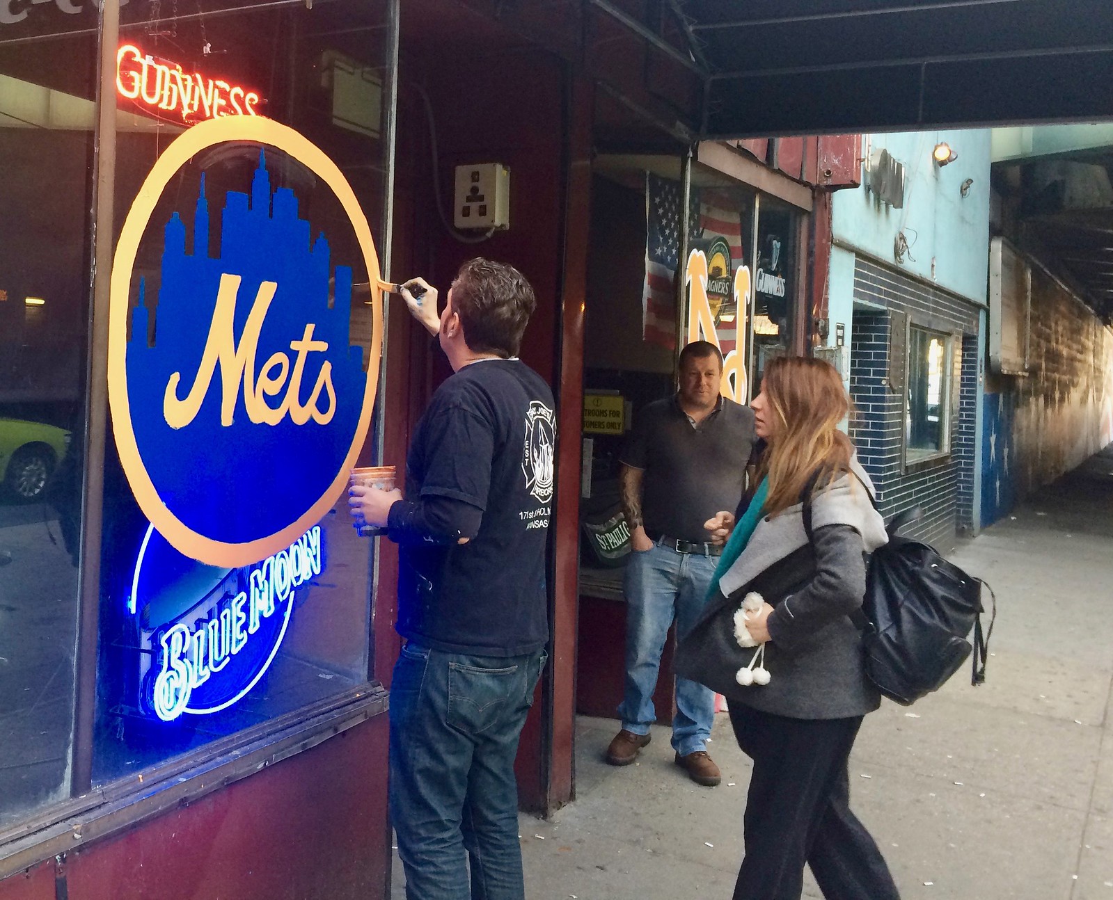
Click to enlarge
Teams and ballparks aren’t the only things getting readied for Opening Day. During a Sunday adventure in Queens, the Tugboat Captain and I stopped in at an excellent watering hole called the Station Bar and found artist Matt Dolingo painting Mets logos on the bar’s exterior windows, just in time for today’s season opener. He put the skyline logo on one window, as shown above, and “NY” insignia on the other (click to enlarge):

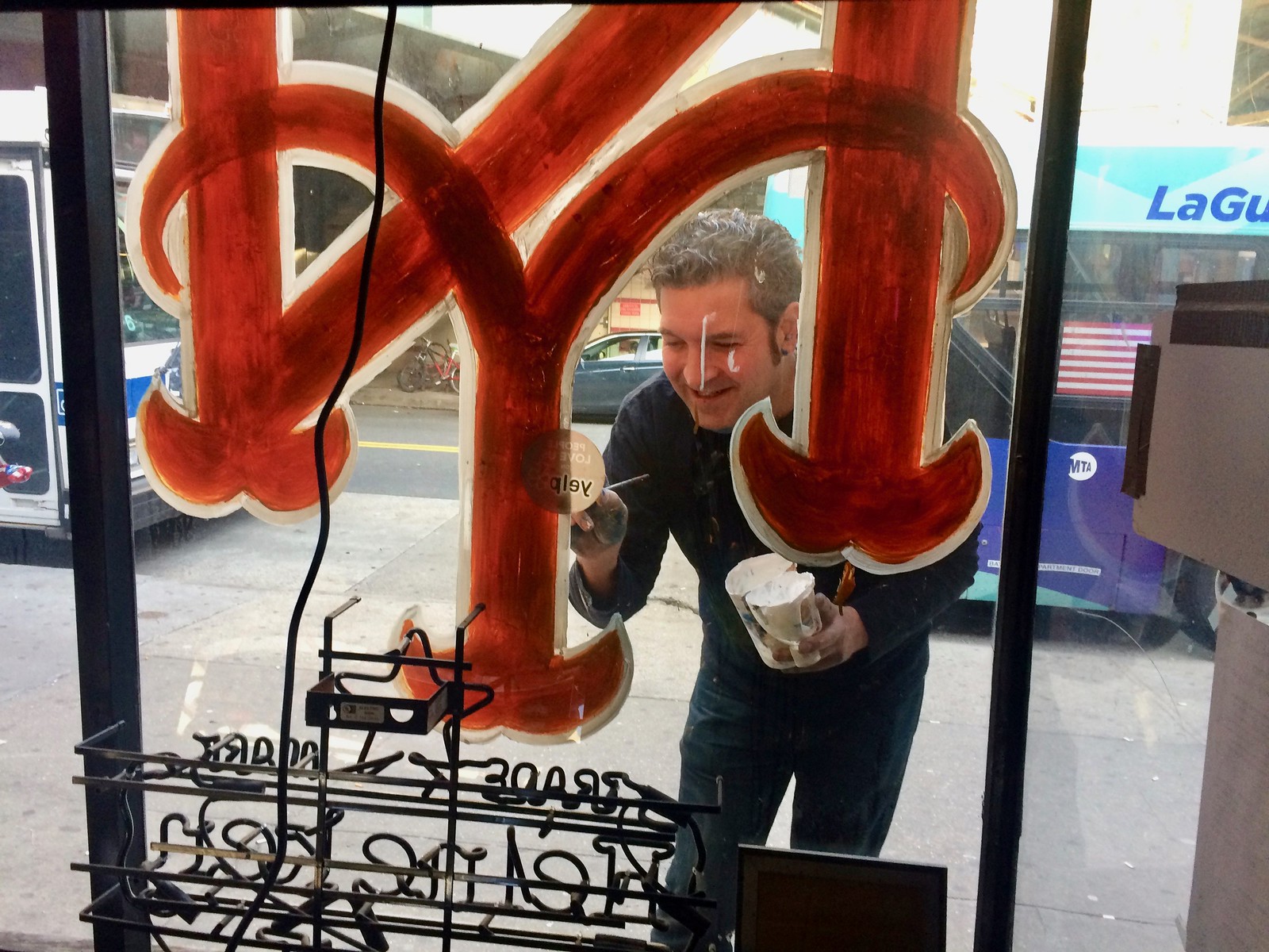
Matt did all of this freehand, and mostly from memory (although at one point he borrowed my cell phone to get a closer look at the skyline logo). The only thing better than watching him paint was sharing a few beers with him when he took a break. Cheers, mate — hope we see you again soon.
While most MLB teams will be opening their seasons today, there were three games yesterday. Uni-notable details included the following:
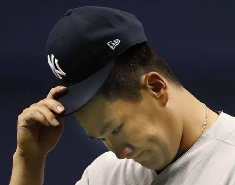
• The New Era cap logo made its shameful regular season debut — including, yes, for the Yankees.
• In the Yanks/Rays game, at least four Rays players wore white shoes, including starting pitcher Chris Archer:
• A Stance rep had recently told me that we would no longer see mismatched socks on the field this season. In other words, if two or more players on a given team went high-cuffed, they would all be wearing the same sock design. But as you can see in those last two photos, that wasn’t the case for Archer and outfielder Corey Dickerson. I think that’s going to be a very difficult genie to get back in the bottle.
• Meanwhile, Rays third baseman Evan Longoria wore baby blue cleats:
Ӭ
• I couldn’t find a photo of this, but I was watching some of the Yanks/Rays game and noticed that the Rays’ batboy at the Trop was wearing a facemask attached to his helmet. Not sure if this is unique to that one batboy, unique to the Trop, or a new MLB-wide thing. Will try to find out more.
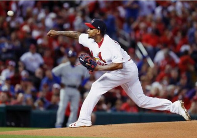
• Cardinals starter Carlos Martinez inscribed the numbers of Oscar Taveras and Yordano Ventura in the Busch Stadum mound prior to the start of last night’s game against the Cubs:
• Martinez was also one of several Cardinals who wore white shoes:
• There had been lots of speculation about the Cubs possibly adding a “World Champions” sleeve patch (like the one included on the jersey they gave to President Obama in January), but they didn’t wear one for last night’s game in St. Louis. It will definitely be included on the gold-trimmed jerseys they’ll be wearing for their first two home games, but it remains to be seen if they’ll wear it on their standard home jerseys after that.
• Cubs skipper Joe Maddon began the game wearing the Cubs’ spring training cap — the one with the white “C” logo (he later changed to the proper cap).
@PhilHecken @UniWatch Maddon with the spring training hat on tonight?! #ThatsCub #capson pic.twitter.com/wR6kxtPi5L
— Eric Mahler (@emahler3) April 3, 2017
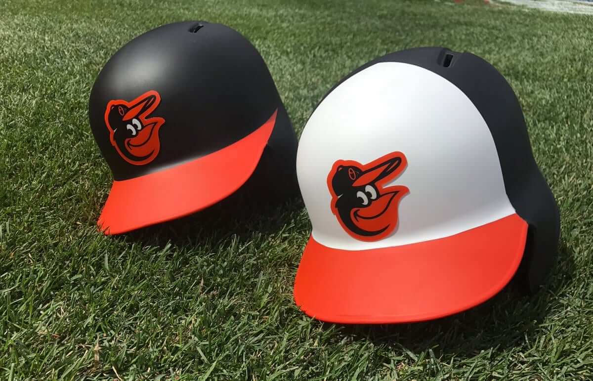
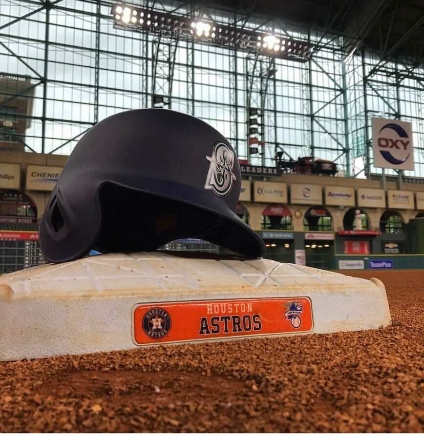
• Although the Orioles and Mariners didn’t play yesterday, they announced that they’re the latest teams to go with matte-finish batting helmets (click to enlarge):
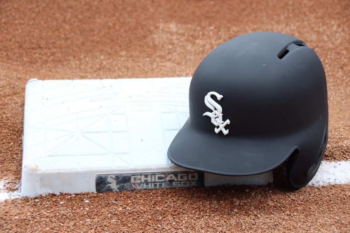
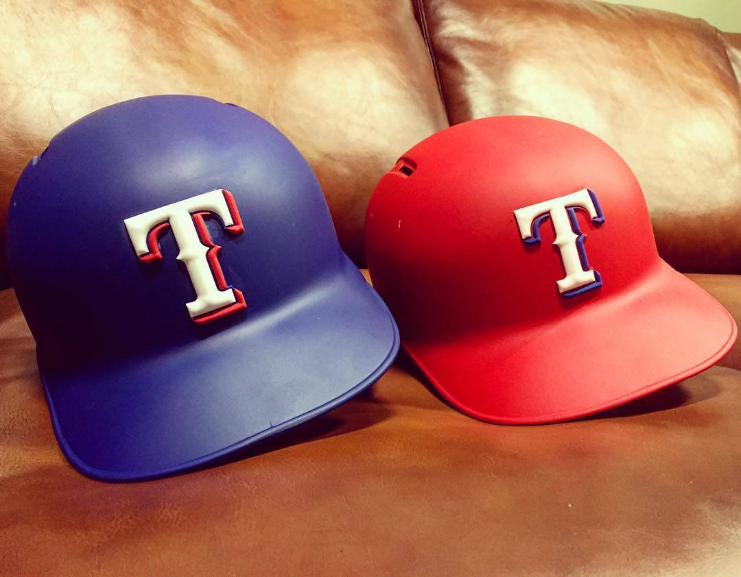
• And the White Sox and Rangers went a step further: They’re going with matte-finish helmets and 3-D logos (click to enlarge).
I think that’s it. Whoever you’re rooting for today, I hope they win (well, unless you’re rooting for the Braves, who’ll be facing my Mets). Play ball!
A treasure from the vaults: Reader Steven Stern sent along something really great yesterday: a link to a 1972 documentary about the Quebec Nordiques, featuring about 90 seconds of the team’s logo and uniform designer discussing his original concepts and how he eventually modified them based on the team’s feedback. The embed above should start at the appropriate juncture of the video; if it doesn’t, skip ahead to the 13:10 mark.
And yes, any uni-related mention of the Nordiques has to include a reference to their 1995 phantom uniforms, which never made it onto the ice because the team moved to Colorado and became the Avalanche.
T-Shirt reminder: In case you missed it last week, our latest limited-edition T-shirt in the Uni Watch Artist’s Series is by the great Larry Torrez (aka Eltee of DC). In the spirit of his Meatscots caricature series, he’s imagined a fictitious Japanese baseball team called the Kyoto Yakitori, whose mascot is a baseball-playing samurai with a sword that serves as a baseball bat and as a yakitori chicken kebab skewer (click to enlarge):
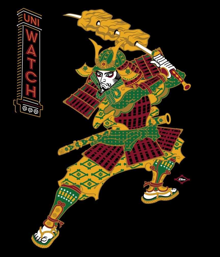
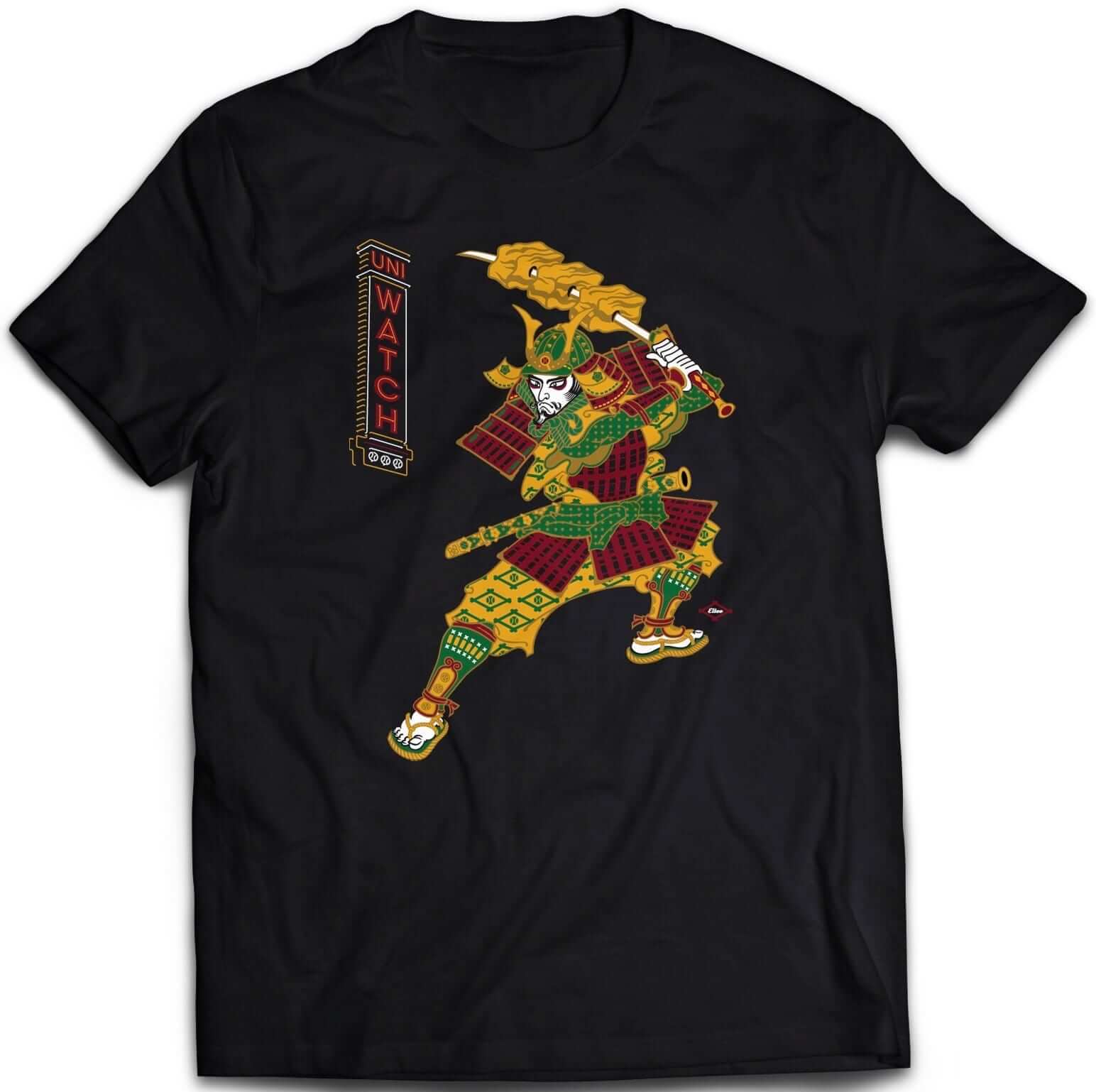
It’s available in three different black short-sleeve options (two of which come in sizes up to 5XL) and one long-sleeve option (up to 5XL). plus I’ve also made the design available as a sticker.
Some of you have also asked why I’m okay with this design if I have issues with Native American-based sports designs. That’s a perfectly valid question, and I’ve created a separate page to address it. Look here.
The shirt is available here through this Thursday, April 6. My thanks, as always, for your consideration.
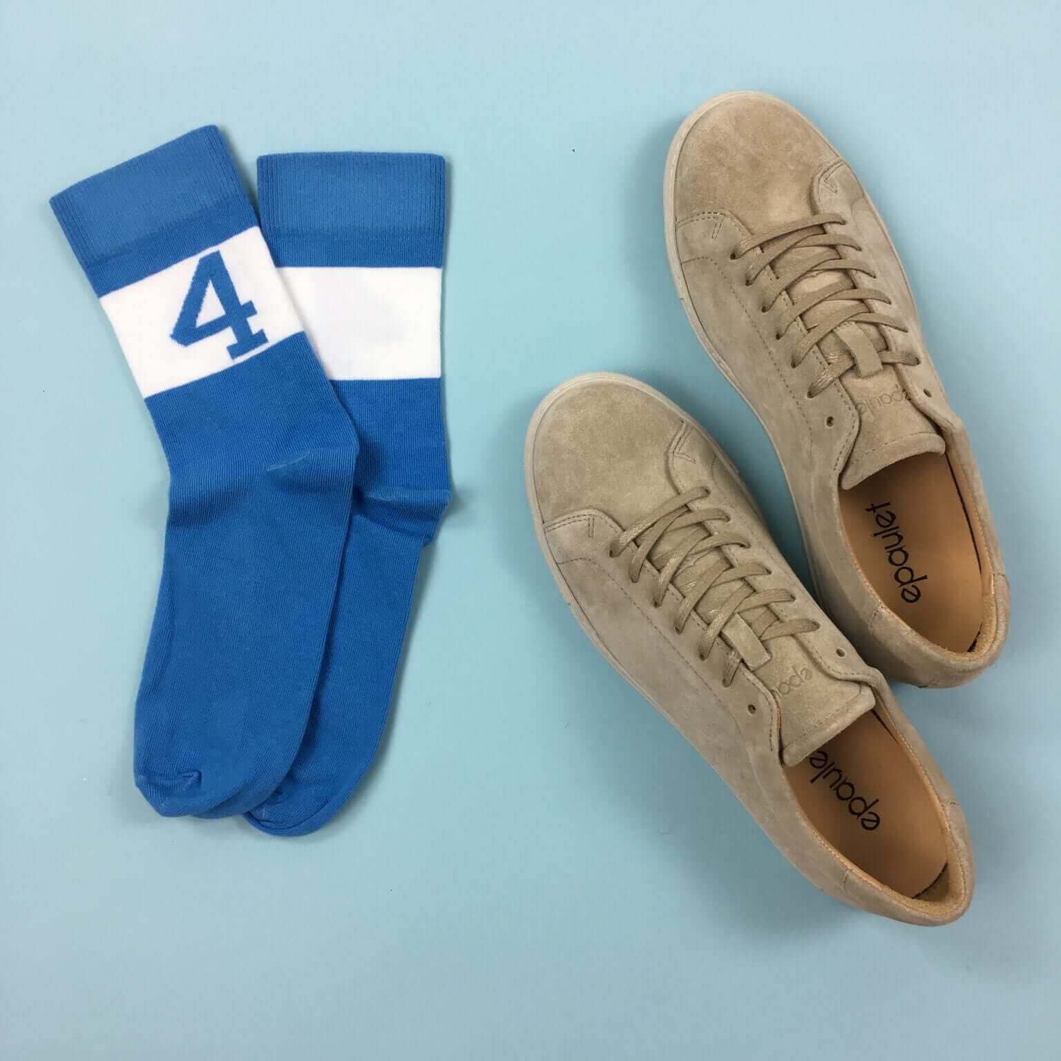
StripeRite sale: We’re continuing our sale on StripeRite socks. From now through April 7, use the discount code FINALFOUR to get 10% off. This applies to any order from our first or second batch of StripeRites. Thanks for your consideration.
Contest reminder: I’m running a new ESPN design challenge to redesign the Raiders for their move to Las Vegas. Full details here.
The Ticker
By Alex Hider

Baseball News: Ever wonder how MLB players pick out their gloves? This video offers some insight (from Dustin Semore). … Lots of players wore special Nike “color burst” shoes made for Opening Day yesterday (from Brinke). … The Wisconsin Timber Rattlers, a Class A affiliate of the Brewers, will wear jerseys inspired by their parent club on Sundays this season (from Scott McMichael). … West Virginia wore navy jerseys and pants yesterday against Oklahoma State (from Vince Mullins). … The U. of Houston’s jerseys have some strange piping near the collar. It’s also strange to see a baseball team wear gray jerseys over white pants (from Garret Heinrich). … Adam Jones of the Orioles has new custom cleats (from Andrew Cosentino). … Someone on Reddit shared photos of his vintage Mets vinyl recordings (from @_ynnhoJ).

NFL News: Former NFLer Chad Johnson wore “Ocho Cinco” as his NOB in a game for the Saltillo Dinos of the LFA in Mexico. Strange choice, as he changed his surname back to Johnson in 2012 and his name was previously “Ochocinco” (one word) (from Hector). … The MGM Grand Casino in Las Vegas was illuminated with a Raiders logo over the weekend.

Hockey News: It appears that at least some Bruins have been wearing the team’s old logo (last used in 2006-07) on their breezers. See a close-up here. Note the lack of serifs compared to the Bruins’ current logo (from James Hayes). … New mask for Rangers G Henrik Lundqvist (from The Goal Net). … The Blues wore their throwbacks against the Predators yesterday. … The Penguins wore their Stadium Series jerseys against the Hurricanes. It was the final time they’ll break them out this season. … There’s a push for hockey leagues to begin requiring players wear socks reinforced with kevlar to prevent injury from skate blades (from Cassian Wykes).

NBA News: Gary Payton II will wear No. 0 for Milwaukee, meaning the Bucks now have No. 0 and No. 00 (Spencer Hawes) on its roster. They’re at least the fourth team to have that combo at some point this season. (from Zachary J. Loesl). … There was a nice-looking color-on-color game between the Thunder and Hornets last night. … The Rockets and Suns also went color-on-color (from Joe Farris).

College Hoops News: Not often you see a double-decker NOB underneath the number. That’s South Carolina’s Mikiah Herbert Harrigan during the Women’s National Championship (from Matt Sampson). … Duke has sent a cease-and-desist letter to an apparel company over a T-shirt that uses Grayson Allen’s likeness. … In the notes section of this story, there’s an anecdote about North Carolina coach Roy Williams banning headbands after his team lost to Gonzaga in the 2006 Preseason NIT (from James Gilbert).

Soccer News: An ownership group trying to bring MLS to San Diego allowed fans to select potential nicknames, and (this being the internet) “Footy McFootyface” received the most votes. As ridiculous a nickname as it as, the ownership groups promised to submit logo designs for the top 10 vote-getters ”” so the group developed an actual crest (and an April Fool’s video).

Grab Bag: Nike has signed golfer Rory McIlroy to a 10-year contract extension (thanks Brinke). … Pope Francis is visiting Egypt, and the Egyptian Catholic Church developed a logo for the occasion. … Here’s the logo for the World Equestrian Games for 2018.

What Paul did last night two nights ago: When it comes to Planet of the Apes, I occupy a sort of middle ground between fanatic and agnostic. I’ve seen plenty of the movies (including most of the original ones, which came out when I was growing up, and at least one or two of the more recent ones), but I usually find the concept more engaging than the execution. Ultimately, I’ve come to think of PotA as a campy element of pop culture, which is why it was so easy to lampoon in that musical treatment on The Simpsons. So when I heard that an art gallery just a 10-minute walk from Uni Watch HQ had a new show that basically treats PotA as fodder for pop-cultural artwork, I had to check it out.
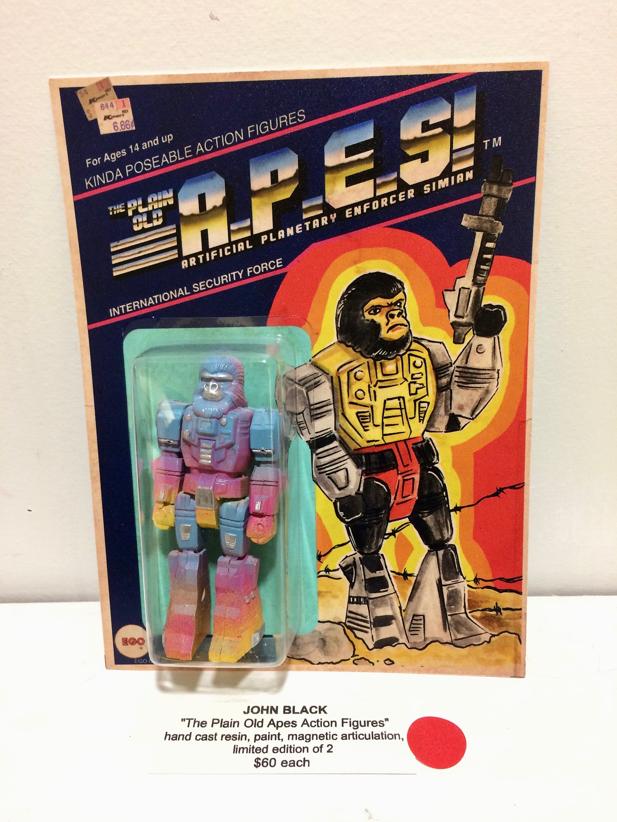
The show’s opening reception was on Saturday night, and it was great. Lots of cool paintings, illustrations, sculptures, and more. My favorite piece was this “kinda poseable” action figure, packaged on a very realistic-looking display card, complete with an even more realistic-looking marked-down price sticker!
I took a bunch of photos, which you can see in this slideshow (if the slideshow doesn’t appear for you, click here):
Happy Opening Day to all!
Davis
That “kinda poseable” action figure originated as a Transformers toy, specifically the Action Masters version of the Dinobot leader Grimlock. The card’s artwork even uses Grimlock’s colors for the robot body.
The Action Masters were a bizarre experiment by Hasbro toward the end of the original Transformers line circa 1990-91. Instead of transforming robots at different sizes, they tried making the characters action figures of uniform size, making them more cartoon-accurate, and giving them transforming accessories and vehicles instead. Kind of silly when you have Optimus Prime, a character who normally transforms into a semi truck, driving a semi instead.
YES! I had that exact figure when I was a kid. Really weird mashup. Even weirder it seems as though they used a very G.I. JOE script for the packaging.
It’s like a 1980’s Neapolitan.
It’s not April without Mets fans chirping about the Yankees. Spring has sprung! ;)
I was surprised to see Paul trolling us Yankee fans today. It s all good. Let the Mets fans dream about 1969 and 1986. We’ll pause, reflect and enjoy our lofty place in the baseball universe and the Yankees rich history as the most successful professional sports franchise on the planet.
It’s Opening Day. A time to dream. ;)
Yep, it’s all good. One of the harbingers of spring, like robins and crocuses. I look forward to it every year. ;)
Yankee fans are White Sox fans with disposable income.
Let’s please confine our rooting and anti-rooting interests to the teams, and not insult or otherwise characterize those teams’ fans. Two people should be able to root for opposing teams without calling each other assholes (or whatever). Thanks.
Aren’t painted windows usually painted from the inside?
Apparently not. I just googled it.
I’ve seen many of them done that way. It would seem to be a good idea in a climate where the outsides of your windows are exposed to extreme weather.
When I got drafted to paint holiday scenes in the windows at the muffin shop where I part-timed for a year in college, I just assumed that they should be painted on the inside, with the colors layered in reverse order from what you’d do on paper or canvas. Never even considered working on the outside of the windows!
I’m blown away by the casual skill on display with those Mets paintings. In its own way, the lines and angles of the NY are just as impressive as the circle and details of the skyline logo to execute freehand.
Hey thanks man! That made my day. Yeah time I’ll try inside painting the weather best it up Monday night, neads a touch up already. That’s a fun spot if you’re ever in Woodside btw. Cheers man.
Hey thanks man! That made my day. Yeah next time I’ll try inside painting, the weather beat it up Monday night, needs a touch up already. That’s a fun spot if you’re ever in Woodside btw. Cheers man.
I hope I paint better than I post lol geez
The first pic is the best, I think I recognize that art/mets enthusiast coming into the pic. You were prob psyched she was around! Great job, & def a better painter than poster!
Hard to watch baseball with the Yankees in matte batting helmets and the Cardinals wearing navy caps at home.
Sigh.
Might be hard to watch, but neither one is new. Yanks have been wearing matte helmets on the road since last May. Cards have been wearing their Sunday cap on Sundays for many years.
But with the Comcast blackout of YES last season many didn’t get to see them.
Huh?
They blackout NYY road games?? That seems strange.
Fortunately, here in the bay area, every single Giants game in on TV, whether home or road. Same with the A’s too.
It always surprises me when I hear of MLB games not being broadcast these days.
Lee
Dodgers haven’t been seen by most of the local Los Angeles TV market for over 3 seasons now because of a cable subscriber fee dispute. (I maybe wrong if it’s the third or fourth year of this ongoing fee dispute)
Comcast doesn’t carry YES at all. This is at least the third cable carriage war involving the Yankees.
YES is back on Comcast this season, at least where I live.
We’ve reached a point, with these carriage disputes, where you’re actually better off living outside your favorite team’s home market. At least you can see the games on the streaming services.
I don’t understand the aversion to matte helmets. Although I think brighter colors look better glossy, dark colors look fine in matte. They make me think of those fuzzy helmets from back in the day.
Now, if the royal blue teams would go back to royal blue, instead of “almost navy”……
Matte helmets are fine with the 3D logos. With the shiny sticker, the clash of the surfaces is disconcerting.
Fair enough. 3D logos for everyone!
Uh, because it’s so trendy, and serves no real ‘function’? (Not that function needs to be the be-all-end-all of course!)
There is no way the Giants look better in matte than glossy (or the Dodgers or Padres or or etc…)
Cap it at 5 teams per league.
Lee
If you agree that function need not be the be-all-end-all then I don’t understand what your argument is. Why would capping it at 5 teams per league make sense? Would you have said the same thing when, say, teams were switching en masse back to button-up jerseys from pullovers in the late 80s and early 90s?
I don’t like matte helmets. That’s all.
Lee
Trends are bad, certainly within the realm we’re discussing. How better things would be if there were a handful of pullover/sansabelt teams, a few teams with vests, three or four brightly-colored uniforms, and fewer me-too clubs with the camouflage/flag desecration.
Agree with walter in his take on uniform variety and his opinion on trends.
Too many jump on the trend bandwagon and oversaturate the landscape with the flavour of the day. I much prefer some real variety. Uniformity should be within teams and not leagues.
A trend or fad, by definition, will be short-lived.
What if these moves are simply the next evolutionary step? What if they become the new norm for a generation? If that happens, it’s not a “trend bandwagon” — it’s just the natural progression of things.
I’m neither defending or decrying these moves. I’m just saying it’s too soon to know if they’re just examples of a “trend bandwagon.”
The Warriors and Wizards also went color vs. color yesterday.
link
Sorry, that link didn’t work. Try this instead: link
The Rangers are also going matte/3D for their batting helmets this year.
link
Oooh, hadn’t seen that one! I’ll add it to today’s text.
“…the Egyptian Catholic developed a logo Church…” in the Grab Bag needs a little word order reordering. And the logo itself has a very militaristic stencil font for a Pope of peace in an Egypt of peace.
Proofreading…
Final ticker item: the word church should be before the link.
Second to last ticker item. Oops
Fixed.
Proofreading:
“Houston’s jerseys have some strange piping near the color.” collar, and you might want to specify that’s the University of Houston, and not the team where the American League logo still seems wrong.
Fixed.
Paul, you finally made it to MF Gallery! I hope you shook hands with Drew and Greg Maillard, friends of mine. Great artists, too.
Expos fans have to spend another Opening Day without. Add to that the Nordiques fans who get to live it all over again via that great little video.
Le sigh.
There was at least a third variation of the Rays’ socks, with the “TB” logo rather than the “sunburst” mark. I tried to Twitter a photo to you guys, but it was acting all squirrelly. Might be able to see it here:
link
That same batter, Mallex Smith, was also wearing number 0, which seemed uncommon enough that I made a mental note of it.
One man’s quest to correct apostrophe catastrophes.
link
I much prefer “Footy McFooty Face” over the incredibly generic “San Diego Surf”!
What’s all this fuss about Matte helmets? He hasn’t played in 45 years!
link
I mean Ocho Cinco makes more sense than Johnson to me if your in Mexico. I just say I’m Patricio when I’m that direction, because most Spanish speaking people can’t say Patrick.
The fact that Phil Hartman could actually sing the brilliantly hilarious lyric “I hate ev’ry ape I see, from chimpan-A to chimpan-Z” without bursting out laughing every single time is a true testament to the man’s genius.
I love you, Dr. Zaius!
Kevlar hockey socks. The assault on the affordability of hockey continues.
I noticed in an interview last night, Mike Matheny is wearing a newly designed jacket with navy stripes on the shoulders, which is different from the all-red jacket they have been wearing for the last few years. I looked up it seems like this is a new design for 2017. This looks like a reversal to what they wore years ago, with colored patches on a mostly single-colored jacket.
old jacket (discounted on just about all the websites)
link
new jacket seen last night (i think)
link
The UH jersey is a Nike stock that a lot of high schools wear. Vapor pro 2-btn.
“A Stance rep had recently told me that we would no longer see mismatched socks on the field this season.”
I don’t understand why anyone would say anything. You know it’s not going to end up being true, and you just sound like an ass when in the very first game of the season, it in fact does turn out to be not true.
Lee
I’m so confused by MLB shoe rules (or lack thereof?) Aren’t teams supposed to all wear the same color (and the Athletics, unless I’m mistaken, are the only one for whom white is their official color)? It wasn’t that long ago that Brian Wilson was fined for wearing orange shoes in a game, and it seems like every year players make a point to wear colorful shoes in the All-Star game because it’s an exhibition. Are these rules just on a team by team basis and some are stricter than others?
Just noticed while watching the Red Sox game that the MLB logo on the back of the jersey collar was chromaflex (or some other type of plastic). Is that new this year, or were they like that before?
That started in 2016.
I vaguely recall that, but wasn’t quite sure.
Probably for the best that the Nordiques moved to Denver, if they were planning on wearing that monstrosity.
That was a classic ’90s style uniform. I would think they would eventually gone back to the classic uniform if they would have been able to stay in Quebec.
I was thinking something about it was distinctly ’90s. Turns out it’s not just the colors, but the triangle as well. A quick run through sportslogos.net, I could only find Pittsburgh as having used a triangle (or Star Destroyer-like, or similar quadtrilateral closely resembling a triangle) prior to that decade.
The ’90s rolled around, and Anaheim introduced it as an element in their primary and jersey logos.
Carolina used (and still uses) it in their alternate logo.
Nashville used it on a few different alternate and jersey logos over their first decade or so.
San Jose initially had a straight-up triangle, but they’ve since tweaked the shape a little for the primary, alternate, and jersey logos.
I’ll put an asterisk next to the Thrashers, too, since the bird was inside a three-pointed shape.
So maybe 5* teams isn’t exactly earth-shattering, but since 4* of them started using a similar design element within about a 5-6 year period, it’s a little unique to the decade.
~
Completely unrelated, while looking over one of my favorite hockey logos, the old Hartford logo that makes such great use of the negative space, it occurred to me that something was amiss with this logo:
link
Namely, when spelled literally, they would be the “Whaleers.” So it should be (~~)rs
Like a worse version of the old Penguins uniforms. And that logo looks like something Northeastern University would wear.
Noticed yesterday that the first base coach for the Yankees was wearing a glossy helmet while the players were wearing matte. I assume it was the same way last year when they switched.
Yes.
Let me state the excruciatingly obvious here. The Blues should go back to those (and the white version of that era) permanently.