Click to enlarge
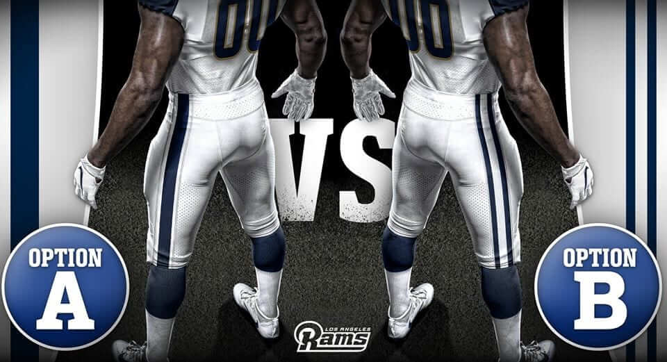
The evolution of the Rams’ identity continues. Last night the team announced several changes, beginning with the news that there will be a new pant design for 2017. The design will be blue and white — no more gold — with either single or double striping. Fans are being invited to vote on which striping option they prefer on Facebook and Twitter. (For what it’s worth: I prefer the single stripe, mainly because I think the double stripe would be too Colts-ish.)
There’s a lot of other information floating around out there, but I got the following info straight from a team spokesperson last night:
Last year, we wore white uniforms at home as a modern nod back to the days of the Fearsome Foursome and our history in the Coliseum and Los Angeles. We received great reception from fans to these changes so we are looking to build on what we did last year.
Our pants will be white with one or two blue stripes, and we are letting the fans decide which ones we should wear by a social media vote. (Note: This removes the gold from our pants, following the blue and white logo that we started using last season and will continue to use moving forward.)
More to come later this week about further modifications to our uniform for 2017. (Note: Due to league rules, we are unable to make any tweaks to our jersey. We will continue to wear the white jerseys we wore last year which contain navy and hints of gold.)
We are continuing to explore a full rebrand, including new uniforms, that will be unveiled in 2019.
Okay, let’s shift into Q&A mode here:
So they’re scrapping the gold from their pants but not from their jerseys? Won’t that create a weird-looking mismatch?
Maybe. Longtime reader/contributor Terry Duroncelet Jr. did a quick Photoshop mock-up of how both of the prospective new pant designs would look with the current white jersey. It’s not terrible:
@UniWatch pic.twitter.com/PbmxiV3f92
— Terry Duroncelet Jr. (@SimplyMoono) March 1, 2017
Isn’t it a little weird to do a uniform change via social media?
Yes. As I like to remind people, there are lots of fans out there who don’t use Twitter or Facebook. Those fans, of course, are mostly older fans, which means this is another instance of older fans being marginalized. On the other hand, it’s still a nice outreach attempt by the team to at least a portion of its fan base, and I’m not sure there’s a better way to do it, especially in the off-season.
What are these “league rules” that prevent them from changing their jerseys?
”¨”¨I asked the team spokesperson to clarify that. The response: “It’s the rule that restricts teams from changing more than once in every five years, since we are planning for 2019.” In other words, they definitely going to have new unis in 2019 (presumably to coincide with the opening of their new stadium, which is what I’ve been predicting all along), so they can’t monkey with their jersey any further until then.
If they can’t change the jerseys, how come they can change the pants?”¨”¨
For one thing, nobody has ever given me a straight answer as to whether the five-year rule applies to pants. But moreover, it’s entirely possible that the new 2019 uniforms will include the 2017 pants. If that happened, the pants and jerseys would be on separate five-year tracks.
What are these “further modifications” to their uniform that will be coming later this week?
I don’t know for sure, although I have reason to believe that they may be going back to the old 1960s-style blue/white helmet (but with blue facemasks this time, not grey). I want to stress that I have not confirmed that, but I wouldn’t mention it here if I didn’t feel at least semi-confident about it. We’ll all see soon enough.
So they might have gold only on the jerseys ”” but not on the pants or on the helmets?
Right. But again, that is not confirmed. Let’s wait and see.
When will they be making that announcement?
All I know for sure is that it’ll be sometime this week — which means I’ll be on vacation when it happens, unfortunately (more on that at the bottom of today’s post). But don’t worry, steps have already been taken to ensure that Uni Watch will be on top of this story as it develops, even though I’ll be away.
When will the results of the pants voting be announced?
I believe this week’s announcement will have more info on that.
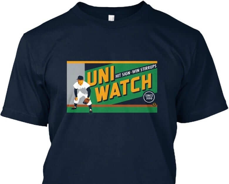
T-shirt reminder: Just a few days left to order our latest T-shirt, designed by the great Todd Radom. Check it out (click to enlarge):
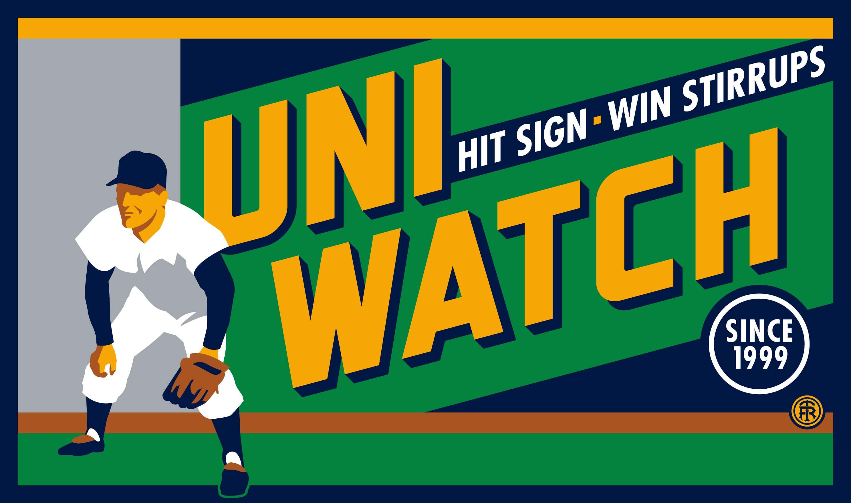
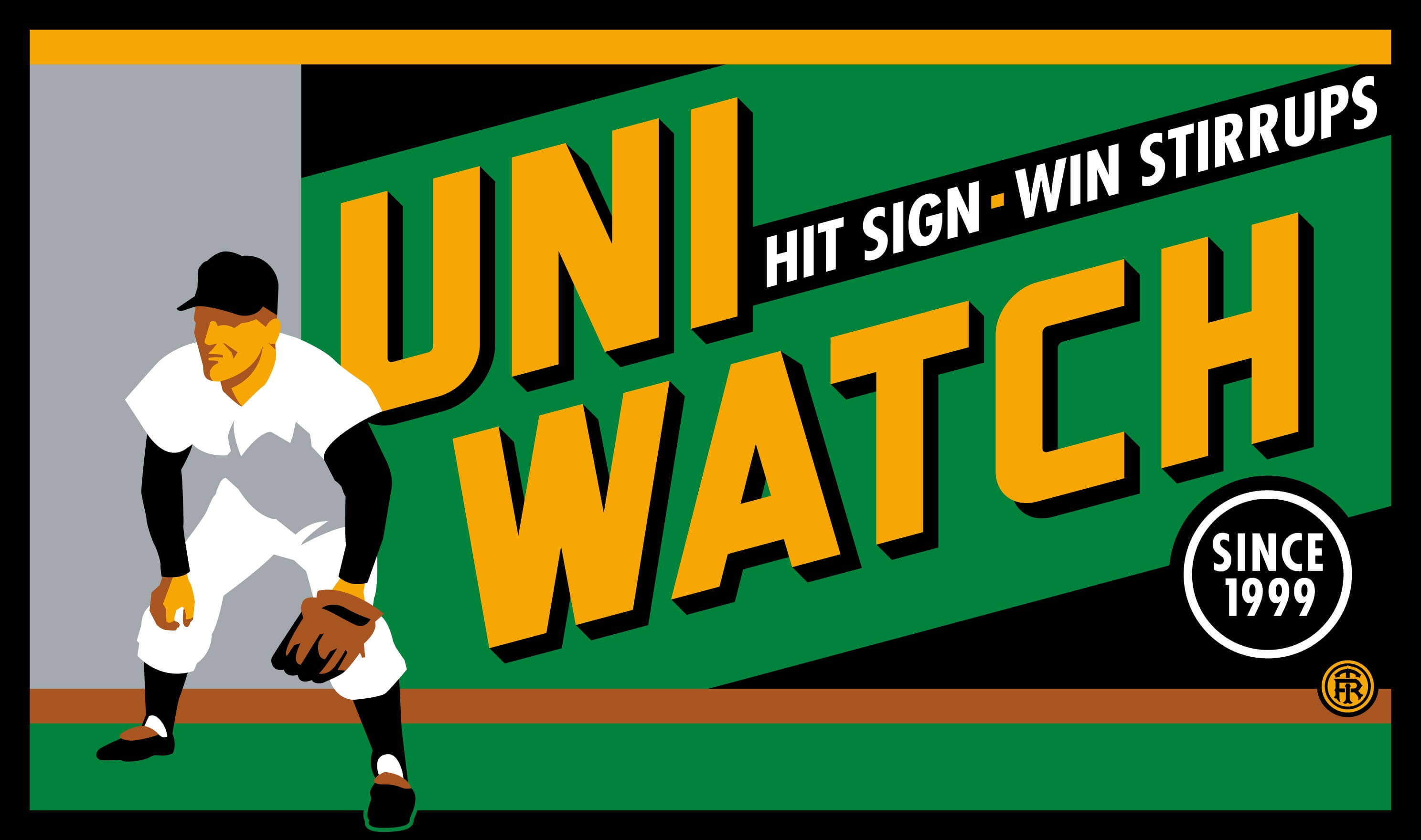
The design takes inspiration from the old Abe Stark sign at Ebbets Field, which read, “Hit Sign, Win Suit.” Please note that we’re using the shirt fabric color to fill in the dark portions of the design — the outfielder’s cap, sleeves, stirrups, and shoes, and also the dark part of the sign behind him. We think it looks best on Teespring’s dark navy shirt, which is the version shown above. But you can also order the shirt in black (yes, go ahead and make all your BFBS jokes), in which case the design will look like this:
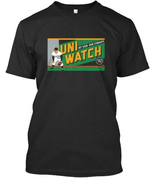
There’s also an American Apparel short-sleeved version and a long-sleeved version, both of which come in a slightly lighter shade of navy. You’ll be able to see all of this on the ordering page. Just make sure you choose the shirt and color you like best.
The shirt is available here through this Friday, March 3. My thanks, as always, for your consideration.
The Ticker
By Alex Hider

Baseball News: Javy Baez inked a Cubs 2016 World Champs logo onto his arm ”” but it’s not the right logo. Whoops. … The O’s and Phils looked particularly good in Spring Training color-on-color yesterday (from Andrew Consentino). … Steve Delabar of the Indians has been painting cleats for himself and his teammates (from Josh Claywell). … Indians guest instructor Jason Giambi didn’t have a New Era logo on his cap. He played for the team in recent years, could be he was wearing an old cap (from Kevin J. Chmura). … Having minor leaguers and non-roster invitees in camp can lead to uni inconsistencies among Indians players (from Adam Vitcavage). … A few Red Sox players explained why they chose their numbers: Jackie Bradley Jr., Matt Barnes, Drew Pomeranz, Brock Holt, Xander Bogaerts, and Blake Swihart (from Joe Giza). … Here’s a good reminder that the Padres’ Swingin’ Friar can do more than swing (from Tony Losoya). … Check out the business card for Tim Grubbs, the voice of the New Orleans Baby Cakes (from Michael). … The Minnesota Golden Gophers will play home games at US Bank Stadium ”” home of the Minnesota Vikings. It’s set up to resemble the Metrodome (from Mike). … Virginia Tech wore their “Hokie on bat” maroon jerseys ”” and some sweet stirrups ”” yesterday (from Andrew Cosentino). … North Carolina broke out navy unis for the first time this year. Extra points for the argyle trim (from J Huck). … Why do people in the UK love brightly-colored baseball caps? (From Greg Franklin.) … Interesting story on New Era and their ties to Buffalo, New York. They may be ruining MLB caps this season, but their commitment to their hometown is commendable. (from Dave Goodfriend). … Very cool Jackie Robinson Day throwbacks for the Biloxi Shuckers (from Wil Bailey).

NFL and College Football News: All NFL footballs will have microchips next season in order to track “next gen stats” (from Phil). … If you saw the story about Adidas potentially giving away a free island to a combine participant and thought, “Wow, that’s too good to be true,” you were right (from Mets Police). … Wisconsin has released a 100th-anniversary logo for Camp Randall Stadium (from Shawn Nissen).

Hockey News: New Kings G Ben Bishop wore his Lightning mask in the first game with his new team last night (from Stefanie Marie). … New Ranger Brendan Smith will wear No. 42. Extra points for the photo frame (from Alan Kreit). … Hockey nerds will love this: Meet the historian behind HockeyDB (from Ted Arnold). … This clip from a 1990 Kings/Oilers game shows a Edmonton player with NNOB ”” No. 27. Even stranger is that there doesn’t appear to be a No. 27 on the Oilers’ roster from that year. A replacement jersey, perhaps? … New mask for Matt Murray of the Fargo Force of the USHL (from Patrick Thomas). … The Canucks wore rainbow-striped warm-up jerseys for a pride night promotion.

Basketball News: Very nice color-on-color game last night for Wyoming and Colorado State (from Rob Montoya). … DePaul, Mike’s alma mater, dressed up a statue on campus in a Blue Demon jersey last week. … Five schools — Michigan, UNC, Georgetown, Cal, and Marquette — have gotten new Air Jordans for March Madness (from @ZanerzasNJ). … More color/color action: last night’s Grizzlies/Suns game.

Grab Bag: Mardi Gras means it’s time for your yearly reminder that the Pelicans have one of the most terrifying mascots in the history of the sport. … Tons of issues all around with SI.com’s scoreboard yesterday. “I do think it’s funny that the Thunder logo is the Avalanche,” said James Hayes. “They are kinda weather-related.” … The Gold Coast Suns and the Port Adelaide Power are set to play the first Australian Rules Football Game in China this season. The Suns want to wear their red and gold home jerseys ”” get it, Chinese flag colors ”” but the Power are the home team. Both teams are bickering, but I say just go color-on-color! … Rugby players will wear these special cleats for the Las Vegas Sevens this weekend (from Josh Gardner). … Muskingum University lacrosse will wear this combo for their home opener tomorrow. … CleanWell is the newest partner advertiser with the ownership group of the Wizards, Capitals, Mystics and Washington’s Verizon Center (from Robert Anderson). … Democratic Party women attending last night’s speech by President Trump wore white — a symbol of women’s suffrage — to indicate their ongoing fight to achieve equal rights for all women.
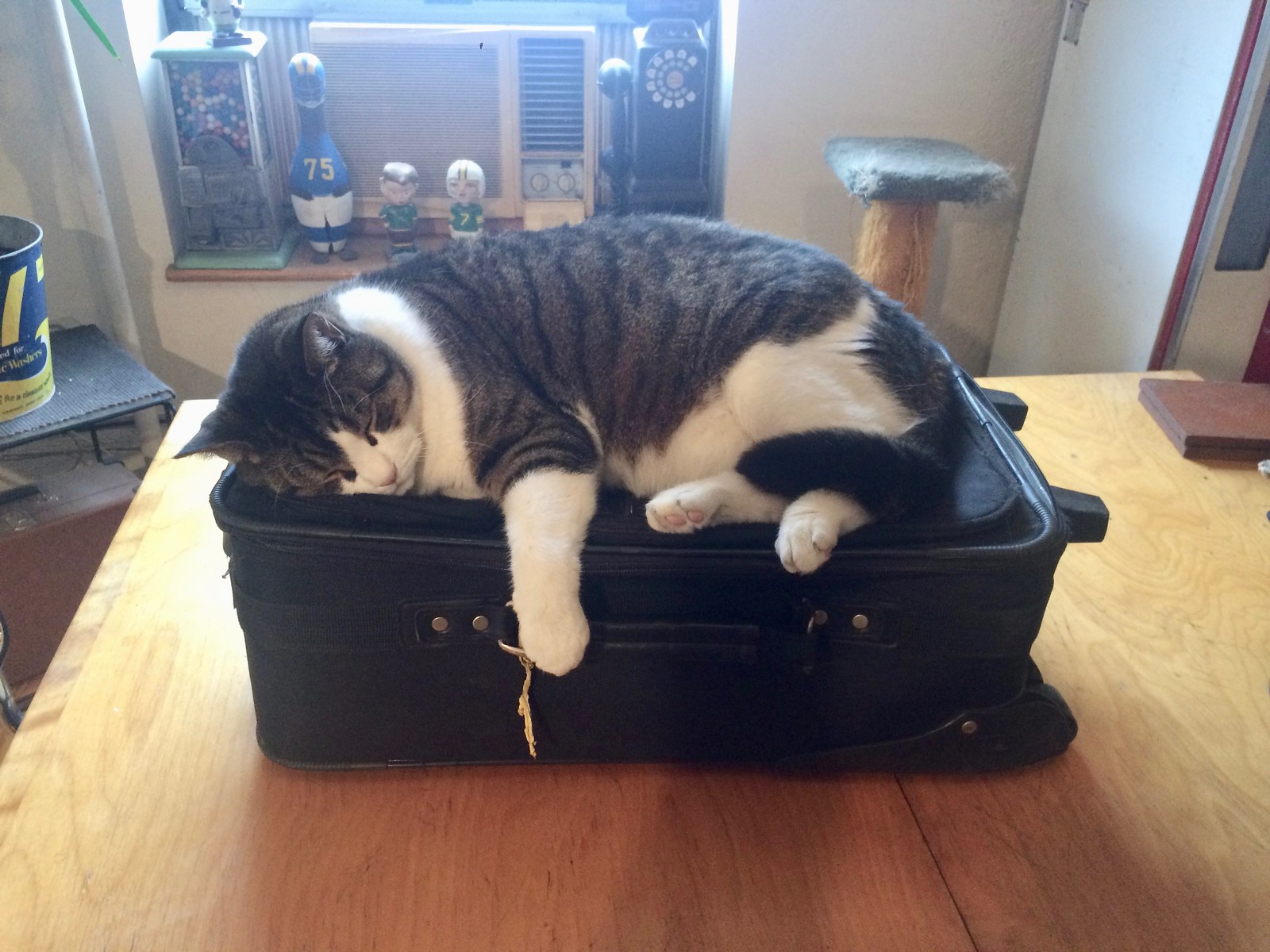
Click to enlarge
My little stowaway: This was the scene yesterday afternoon at Uni Watch HQ, as I was packing for a week-long vacation and Uni Watch boy mascot Tucker wanted to come along. Such a cutie — I’ll miss him, along with Uni Watch girl mascot Caitlin, while I’m away.
That vacation will already have commenced by the time you read this, as I’ll be on a 7am flight to warmer climes. I’ll be spending the next week road-tripping around the Deep South and visiting friends in New Orleans. Looking forward to lots of great food, some nice beaches, and lots of road-tripping enjoyments. Full report to follow after I’m back.
I’ll return to the site next Thursday. Mike, Alex, and Phil will keep things running while I’m away. Treat them nice, and I’ll see you late next week. ”” Paul
Option B – on the Rams pant choice, appears to be lets borrow the Colts pants for a while. A very muddled, drawn out uni change.
Though I know better, the template shows two grey pinstripes on either side of the fat blue stripe (Option A). But yeah, the Rams are moving towards boring + derivative.
Wow…Rams fans have overwhelmingly asked for the blue/yellow combo. They can modify this a bit for today’s standards if they want. But blue/yellow are RAMS colors. And there they are…..completely ignoring the fans except to give us two choices of blue and white. REALLY???? BORING!!!!
This will be a MAJOR disappointment. It will be like watching the Colts in darker blue.
Rams will play in ‘black and white’, while the opposing team plays in color.
Glad Rams are back but I will NOT be purchasing any Ram gear in those colors.
NO WAY!!
I remember the Deacon Jones/Roman Gabriel days of royal blue and white. They wore white at home. That’s my favorite, with yellow being a close second. But either needs to have ROYAL blue and not navy.
I think the fact that they’re embracing the blue/white now pretty much locks in that that Blue and Gold will return full time with the new Stadium in 2019.
Truth be told, if they adopted the blue/white look, then changed the white to yellow down the road, it would be the best they ever looked.
What I’m hoping is that they’re trolling everyone by making all these incremental changes to blue and white, then they blast everyone with a brand new blue and yellow uniform in 2019.
A little jarring on the O’s/Phils link – the O’s are using the #OrangeSpring hash tag, but they are wearing black.
In spring training, the O’s typically wear their regular home jerseys for home games and spring training jerseys for road games. Here it looks like they’re wearing their Friday black alternates. I wonder if they thought an Orange vs Red match-up would be too similar.
Bogaerts and Swihart links both go to the Brock Holt video.
as a Rams fan, very disappointed in the direction of the unis. The blue/yellow combo was what I was hoping theyd return to – the blue/whites are just so plain and boring. Look at the game they wore the white horned helmets for last season. They looked awful; like we were watching them on a black and white TV.
My last remaining hope is that they will at least bring back the shoulder horns on the new uniforms – otherwise I cannot image a more boring jersey for an already boring franchise.
The shoulder horns are the worst part of the uniform. What ram has horns on it’s arms, let alone 4 horns in the first place? Keep the horns on the head where they belong, and leave it at two. The USC style shoulder wedges work better.
Will the microchips in the footballs track the inflation/deflation as the game goes along? Probably not.
Happy vaca, Paul.
Javy Baez’s tattoo may not be THE “official” Cubs WS logo, but I think his ink is cooler than the “real” logo.
I don’t think he was trying to get the actual logo. A good tattoo artist would likely want to draw up something different anyway, rather than just replicate something’s/someone else’s work.
I agree. Who’s to say what the “right” image for someone to put on their own body. He didn’t have to put any logo at all on his arm if he didn’t want to. It is *a* design celebrating the Cubs’ championship, just not the one created by MLB.
The problem with this theory is that the tat is actually modeled/copied from the Rotals 2015 champs logo.
You can’t tell from the picture that was linked but Javy’s tat is very poorly done. Crooked lines, bad shading, just an all around bad tattoo.
I can’t find the exact picture I saw a few days ago but if you click on the link below and look at the line above ‘World’ its as if the tattoo artist sneezed while he was doing that line. Just horrible work.
link
This advertising tumors that’s popping up on MLB and NBA uniforms is cancer. It may sound dramatic to some, but it’s true. The line in the sand has moved. The New Era thing is now OK by baseball, so it’s there forever. The UA on the chest is coming and then what’s to say a little something on the pantleg, or a sleeve. The advertisements on the NBA next year. “We’ve received such positive response from our polls, we’re going to expand the program”. It’s cancer and it will spread. The Philadelphia Union is proof how bad it can get. Beautiful kits killed by Bimbo.
Phoenix & Las Vegas are sun-drenched. Why are D-Backs & G-Knights wearing such dismal, dark, dreary colors? Hockey uniforms can be so great. Is the Vegas entry headed for a uniform disaster?
Partly agree – Phoenix, i.e. why the Suns play around with Grey (maybe they’ve stopped that) seems bizarre. Vegas being black – I actually think may fit, in that it’s a city that comes more alive at night.
Couldn’t agree more. But that’s exactly my problem with what we’ve seen from the Golden Knights so far: Vegas comes alive at night, sure, but it comes alive. Dazzling lights, bright colors: Everything the Golden Knights don’t pair with their black. The black, dark slate blue, and dull tan “gold” of their logo don’t look like midnight on the strip; they’re the colors you see if you wake up hungover at 3am in the desert outside of town with no idea how you got there and have to light your way through the dunes with your cellphone. Black is fine for Las Vegas. The dreary other colors in the Golden Knights scheme, they’re the problem.
Fair point, I’m stating the obvious but the other colors are very much military base, as the owner is in love with Navy. (i.e. I believe he’s ex-West point)
“Since New Era is a private company, Koch can’t comment on how much it cost to buy the naming rights to the stadium but says that the price was “commensurate with markets the same size,” putting it around $5-7 million per year. ”
What kind of nonsense is that?! Since they are a private company the owner of that private company can comment on whatever they want to comment on!
When he says “can’t”, he means “isn’t required to by law”. :-)
Perhaps part of the agreement/contract includes a non-disclosure clause?
I agree with that. Should be more careful with the wording so as to not sound idiotic.
Also, it’s not a “private company,” it’s a privately held company.
That’s the same thing
Every business not owned by the government is a private company. (Public companies include AMTRAK and the United States Postal Service.) Only some private companies are privately held (Koch, Cargill, the Trump Organization, most sports teams, probably your neighborhood auto repair shop, nail salon, or other small business). The distinction between privately held and publicly held companies is the salient one with regard to whether a company may withhold its financial information.
Gotcha. Maybe its a Canadianism.
For us:
Traded on a stock exchange = public company
Not traded on a stock exchange = private company
Owned by the Government = Crown corporation
Typo- you have “HockeyBD” when I think it should be “HockeyDB” in the link from Ted Arnold.
My favorite college this year is the University of Wyoming. Everything I like about the football uniforms has been carried over to basketball. I love the Tuscan numerals.
Option A for me.
Not sure if anyone watched the Yankees game last Friday, but Michael Kay and Ken Singleton were discussing MLB’s attempt to speed up the game. Singleton mentioned reducing the time in between innings and placing ads on jerseys to make up for lost ad revenue. Kay doesn’t think MLB would ever reduce time in between innings, but can see ads being on jerseys as another way to make even more money.
I watched the Yanks and O’s the other day. During the season that would run about 3:30ish. It ended up being 2:15. Amazing how quickly these games run when everyone wants to get their work in and not dick around.
And then people would gripe that the game was took quick and they didn’t get their money’s worth.
At least Paul knows enough to keep the suitcase zipped up. If he’s anything like my yucklebucks, Tucker would sleep inside that bag in a heartbeat. That’s why I end up bringing a small piece (hair) of mine on every trip I take.
What do you all think is the biggest, and most realistic, sports uniform news story that could break while Paul is out on vacation?
MLB, NHL, & NFL all announce uni ads on the same day.
Yankees go NOB.
Raiders add color to unis
Mets add a purple drop-shadow?
4 NBA teams get purple ads.
Leagues create 10 uniforms for each team, put them on sale and whichever ones sell the best becomes the teams uniform.
Bartolo pops a button which goes flying and takes out an eye.
The NFL makes an exemption to the 5 Yr rule and allows the Cleveland Browns to get rid of their hideous uniforms.
The NFL creates an exemption and allows the terrible Cleveland Browns to disband. However, the Baltimore Ravens now have to wear the Browns hideous jerseys.
NFL inks multiyear deal for UA to take over from Nike in 2020.
The Rams “evolution” is so bizarre. They are changing one uniform element at a time. Last year they used blue and yellow logo, and blue and white logo. For one game they through a blue and white helmet on with their regular uniforms. Now they are just changing the pants (and maybe helmet) but not the jersey? Considering that I hate their current uniforms, maybe this will still be an improvement. But it’s also hard to imagine anything “uniform” about this. I don’t believe I’ve ever seen a team take this direction with uniforms. They change things all at once with an overhaul makeover, not a piece-by-piece evolution.
In any case, the bar is pretty low right now. I hope these new elements actually do look good. It’s clear they are going all-in on the blue and white look. Months ago most people thought they would be going back to blue and yellow. But perhaps they wanted colors that were completely unique to their LA time period as part of the branding.
If the footballs are going to have chips to track stats, why can’t the chips track whether it’s a first down or not, instead of using the ancient technology of trotting the stupid sticks out there?
They can change the pants because they don’t sell the pants at retail. The jersey changes are tied to retail merch business, so they have to be more strict with changes.
Looks like #27 on those Oilers was Chris Joseph?
And as an oilers fan from way back, that appears to indeed be him.
I believe that’s Dave Brown, who tore his regular jersey during a fight and wore the nameless 27 jersey for the rest of the game.
That sounds like a very plausible explanation. I was going to suggest if the clip was possibly from the prior season, Dave Hunter and Reed Larson both wore #27.
I always thought that #27 was retired for Dave “Cementhead” Semenko
In stead of raising his numbers to the rafters, they should raise a block of cement with #27 on it
Not sure what the story behind it is, but the Oiler wearing 27 is Dave Brown who normally wore 32. Go to about the 4:42 mark of this video and you can see him escorting Messier to the penalty box with a good view of the blank 27 jersey with 32 on the back of his helmet. link
Good work!
A nice photo of the 1966 Georgia Tech Football Team (Bobby Dodd’s final season):
link
The photo accompanied this (non-uni related) article yesterday:
link
As a Rams fan growing up my first choice is royal blue and white like the 1960s. Then royal blue and yellow. I hope they switch to royal blue from navy come 2019. I also like the look of the 50s, before my time, with yellow jerseys and white pants. You could wear this look almost exclusively, both home and away. Almost every game could be a color-on-color, except when playing teams that wear white at home.
Oh yeah…I like the single stripe to match the 1960s stripe.
Looks like Baez just copied Salvador Perez’s World Series tattoo and switched out the Royals logo for a Cubs logo.
Leave it to the Rams to completely ignore what their fans actually want while still trying to offer a choice.
The Rams should also remove the 2 tone collar from their jersey in the interim. As I recall several teams had the 2 tone collar in 2012 when Nike took over and ditched it in 2013 without it being considered a redesign. Just render the jersey in the vapor template, which doesn’t lend itself to the two tone collar.
Just read on NFL.com that the Rams unveiled the blue helmet with white horns as their primary helmet design and fans are voting on whether it will have a blue or white face mask.
Blue would be better; a white mask would prevent the Ram Horn logo from standing out.
An error regarding the Port Adelaide and Gold Coast uniform controversy. Gold Coast are the home team, not the Power.