Click to enlarge
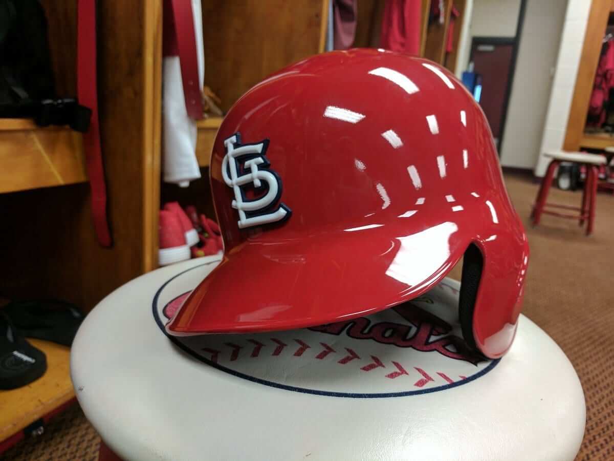
The Cardinals have become the latest team to go with a three-dimensional batting helmet logo, following the Dodgers’ lead from last year. I liked L.A.’s version last year, and I like this version even more. The two-color treatment looks great.
A few notes:
• As you may recall, the Dodgers started with a hard-plastic logo that constantly chipped and cracked, so around the All-Star break they switched to a flexible rubberized version, which worked fine. That’s the version the Cardinals are using.
• The Dodgers also switched from glossy helmets to matte, so their raised logos were made with a matte finish. But the Cards are sticking with glossy helmets, so their logos will have a glossy finish.
• David Sulecki of Pro Helmet Decals, who manufactured the logos, said the “StL” helmet mark was designed to mimic the cap logo as closely as possible. Even the little raised bumps where the white lines intersect were meant to mimic the similar raised areas on the team’s embroidered cap logo.
• There’s also a separate version for the Cards’ navy road helmet (which they still use when playing against a host team that wears red caps, like the Reds or Nationals). I hope to have a photo of that soon.
Meanwhile, you can expect to see several additional MLB teams going with the raised helmet logos this season (and some new matte helmets, too). Some may unveil them as soon as next week, and others may wait until later in spring training or even Opening Day. Stay tuned.
ESPN reminder: In case you missed it yesterday, my latest ESPN column looks at the rise and fall of BFBS. Check it out here.
Party reminder: Uni Watch party this Sunday, Feb. 19, 3pm, in the back room of the Douglass (which is the same place we used to meet at, Sheep Station, but with a new name). Phil will be there, I’ll be there, you should be there. Come join us!
Click to enlarge
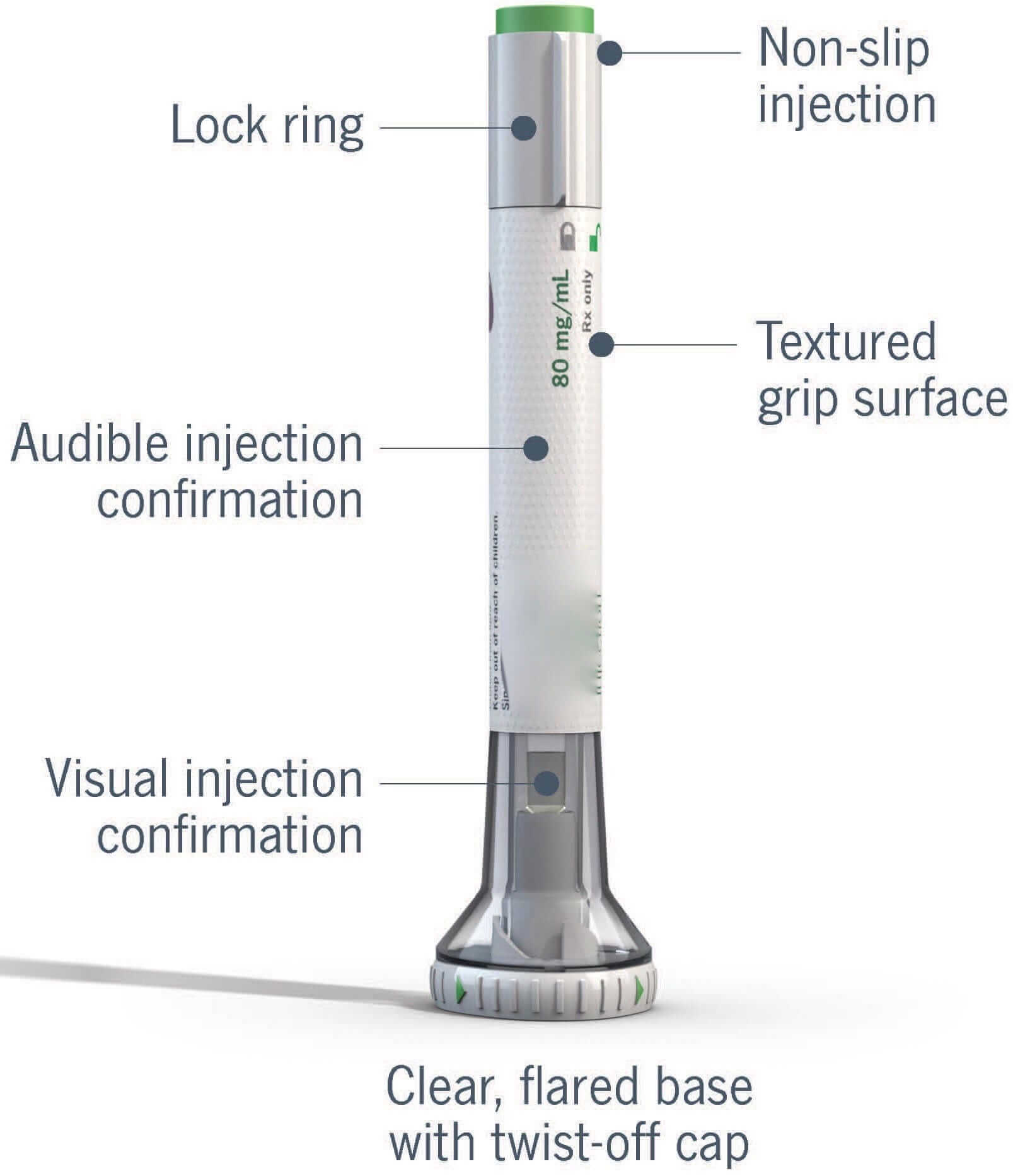
Design this: I have an annoying medical condition (don’t worry, not life-threatening or debilitating) that has so far resisted everything my doctors have thrown at it. Last year we tried a fancy-shmancy drug that I took by using a beautifully engineered auto-injector. That didn’t help, so now I’ve just started taking a new fancy-shmancy drug, which is delivered via an even more beautifully engineered auto-injector (see above).
It’s fascinating to see the differences between the two injectors. The one I used last year was good, but this new one is definitely better ”” more intuitive, more ergonomic, feels better in the hand, and the flared base keeps it from slipping (which was a problem I had one time with last year’s injector). We know drug companies employ lots of scientists and doctors who are trying to come up with cures for diseases, but it’s easy to forget that they also employ teams of industrial designers who create things like auto-injectors, and that some of their design solutions are better than others.
I also like that the top plunger button and some of the typography and graphics are green ”” my favorite color.
The Ticker
By Paul

Baseball News: Looks like the Mets will have a St. Paddy’s Day cap (from Steven Hom). … Stance continues to have problems with striped socks. To be clear, it is impossible to have perfect stripes on a knit sock — the nature of knitting makes it unavoidable that the beginning and end of the stripe won’t align. But they shouldn’t be off by that much (from @LADodgersRich). … Red Sox P Chris Sale discussed his “Edward Scissorhands” meltdown from last year (thanks, Brinke). … Latest college team to go with a 3D helmet logo: Mississippi State (from Dustin Semore). … Did the Rockies change their shade of purple in order to please 3B Nolan Arenado? It’s a fun idea, but the reality is that this change, like all MLB uni changes, was in the pipeline for a while (from Rob Montoya). … More about the Rockies new shade of purple here (from DenverGregg in yesterday’s comments). … Diamondbacks’ new pants look so much better without the stupid gradation on the cuffs. … Speaking of the D-backs, P Fernando Rodney was taking bunting drills while wearing a ring yesterday. … New uniforms for East Tennessee State (from Brandon Keys). … The Single-A Potomac Nationals have a new 40th-anniversary patch. Only problem is that this isn’t their 40th anniversary; it’s their 40th season (from R. Scott Rogers). … The Pirates’ G.I. Joke jersey will no longer be paired with a G.I. Joke cap, which I guess qualifies as a small bit of progress. … Some MLBers are wearing a new (to me) spring training pullover. It’s not the one I wrote about two weeks ago — it’s this (from Zach Loesl). … Also from Zach: Here’s a look at the Royals’ “Ace 30” memorial patch for Yordano Ventura. … LSU-Alexandria is going with purple tequila sunrise jerseys (from Ashley Purifoy).

NFL News: A bunch of old Steelers jerseys are up for auction. Of particular interest are the two Batman designs — one black, one white — and this 1962 design with the gold sleeve panels. I really like the gold outlining on those black numerals, too. Further info on all of these newly available jerseys here (from Jerry Wolper and Chris Weber). … “I was watching a video on the Bears’ website about a couple that had ‘an impressive Bears-themed garage,'” says Ben Obecny. “The woman in the video was wearing a No. 33 Bears jersey with two NOBs — one for Charles “Peanut” Tillman and and for Jeremy Langford. Would this be DNOB, for double name on back?” … Dog bites man: Lions exec Ron Wood thinks fans will like the new uniforms (from Phil). … Yesterday’s Ticker mentioned that the zebras in Supe XXVII changed from short sleeves to long sleeves during halftime. “I was there shooting the game for KVUE-TV in Austin,” says Kenny Kaplan. “I wore a short-sleeve shirt during the first half and had to put on a light jacket for the second half, because it definitely cooled off quickly when the sun started to go down.” … Three different Saints players, three different number fonts, or at least font weights. That’s from a 1977 game (from Mike Selock).
College Football News: Here’s a look back at the history of Minnesota’s uniforms (from Eric S). … Whoa, check out this awesome Iowa State helmet cart (from Andrew Cinnamon).

Hockey News: Teenage Mutant Ninja Turtles-themed jerseys upcoming for the Cincinnati Cyclones (from Bill Fenbers). … Here’s something I hadn’t realized: The NHL All-Star jerseys have the NHL Players’ Association logo on the back-right shirttail. A quick check of NHLuniforms.com reveals that it’s been going on for years, but I just never noticed (from Steven Woj). … The Orlando Solar Bears have a lot of ads on the ice. “It’s quite distracting watching the game,” says Steve Mendygral.

NBA News: Here are all 30 NBA team logos reimagined for Black History Month. Some are really good, others less so, but I like the explanations behind each design, many of which are informative and educational (from Daniel Pedroza).

College Hoops News: SUNY-Buffalo will wear 1950s throwbacks on Saturday (from Brian Wolff). … Oregon wore a new neon design last night. I love how the tweet says, “New uniforms create hype” — hey, at least they’re honest about it. Here’s how the unis looked during the game. … Check this out: Oglethorpe University has black uniforms on a black floor! (From Kirk Shellhouse.) … “Michigan basketball had a Social Media Night,” says Jay Winker. “They gave out shirts with the players’ faces as emoji, and the scoreboard had emoji logos for the teams. It’s a kinda silly idea, but I thought the execution was pretty good.”

Soccer News: New uniform for Real Salt Lake. “Interesting choice to have the stripes stop in the area around the advertiser’s name,” says @bdh_photos). … New secondary kit for the New England Revolution. … The new FC Dallas away jersey has leaked (from Jim Collier). … Ditto for Minnesota United’s inaugural kit. … New logo for the Chicago Red Stars (from Jason Yellin). … New uniforms for the San Jose Earthquakes (from Noah Fischer).

Grab Bag: Love this assortment of Chevrolet speedometer designs (big thanks to Dave Wilson). … The latest project from DIY genius Wafflebored is characteristically weird but awesome. Here, see for yourself. … Looks like NFNS — that’s neon for neon’s sake — has filtered down to Formula 1 (from @VictoryCB). … Here’s the ticket design for this year’s Indy 500 (thanks, Alex). … Funny car driver Robert Hight recently ran a paint scheme that paid tribute to the California Highway Patrol (from David Firestone). … Also from David: New driver suit for top fuel driver Tony Schumacher. … Oooh, I like this: Lego logos though the ages (from Manzell Blakely). … New jersey for the South African Super Rugby team Southern Kings (from Eric Bangeman). … Happy birthday to longtime reader Elena Elms, who sends me uniform-themed holiday cookies each December. She’s also a huge Cardinals fan. What do you think of the raised helmet logo, Elena?

What Paul did last night: I turn 53 next month. Like most people, I’ve slowed down a bit as i’ve gotten older and can no longer keep up the pace I had when I was younger. But last night I had an ambitious agenda — three events in three different locations — and managed to pull it off.
I began at NYU, where my friend Joanna Ebenstein, founder of the recently shuttered Morbid Anatomy Museum, was giving a presentation about how she unexpectedly found a new career as a museum director. As you can see in that last link, one of the key questions she addressed was “What happens when your passion becomes your profession?” — something I can relate to.
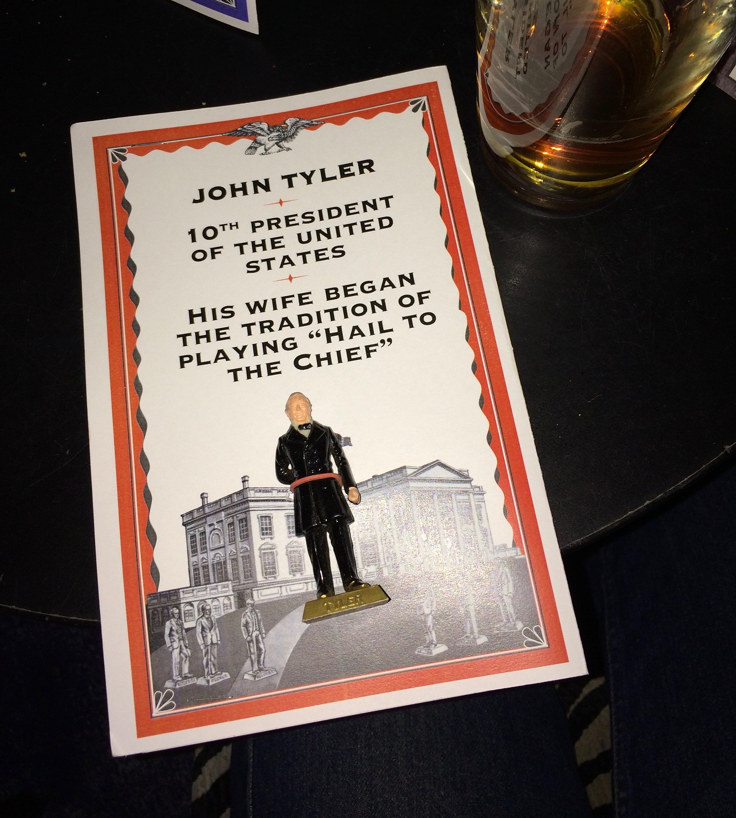
Joanna’s presentation was really, really good, but I had to leave after an hour because my friends Susquehanna Industrial Tool & Die Co. were playing, so I ran about six blocks north, caught a crosstown bus, and arrived just as they were starting. Their show had a Presidents Day theme, with everyone in attendance receiving a custom-packaged presidential figurine. Here’s mine (click to enlarge):
I only stayed for the first set, because I had to scoot over to another club to see my friends the Gowanus All-Stars, who were playing a show of their own. They had four guitarists last night — and it was almost enough:
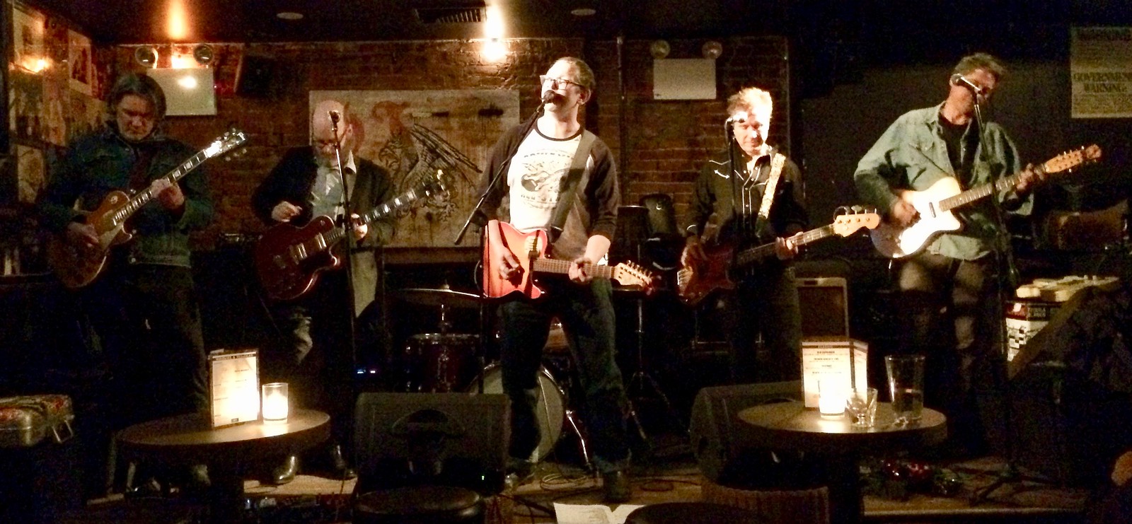
I left the club at about 11pm, grabbed a slice of pepperoni-bacon pizza on my way to the subway, and was home by 11:45 — not bad. Good to know I can still pursue an ambitious evening agenda if I want to.
The one thing connecting all three of these events is that I’m friends with the people involved. I’m lucky to know so many talented, creative people!
However you spent your Thursday night, hope it was a good one. Have a great weekend, and I hope to see some of you at the Douglass on Sunday.
Will Ferrell and Amy Poehler’s new movie is basically about sending a kid to Bucknell University.
link
Several problems here: “These last two are from Zack Loesl: Some MLBers are wearing a new (to me) spring training pullover. It’s not the one I wrote about link weeks ago – it’s ths.”
It’s now the next two, not the last two.
The tagging is wonky.
And the last tag is “ths”, and should be “this”.
All fixed.
Paul…coding issues near the bottom of baseball section of the ticker
That Sharks logo was released back in August. More info here:
link
Speaking of the Cardinals and batting helmets, it’s interesting to look back in time, and see how they used pinstriped helmets in 1976. Only team to do this, including the Pirates.
Upon further review, I’m having a difficult time finding other 1976 Cardinals besides Lou Brock wearing a pinstriped batting helmet. Have no idea why.
Ted Simmons.
link
Keith Hernandez
link
I agree, though, there’s not a lot of images. It makes me wonder if they only tried it out for a few games.
That Sharks logo was unveiled last August 9th, and were mentioned in the Ticker link.
Thanks. I was on vacation at the time and missed some stuff.
I’ve now removed it from the Ticker.
Isn’t the whole logo on a wine glass thing still ticker worthy? Seems a very Bay Area thing to combine hockey with a glass of Chardonnay. Says a guy who usually watches Wild games with a glass of wine in hand.
Cards’ 3D logo is great! I have to admit, when I saw the headline in a feed, my first thought was the NFL Cardinals eschewed the illustrative helmet logo for some CG abomination. Oh Lord… I hope I haven’t given them any ideas.
I’ve been skeptical of how the 3-D thing would look for teams with multi-color or outlined logos. But seeing the Cards helmet pictured here, I can’t imagine why any team would not go for a 3-D helmet logo. Well, maybe not the Marlins, given the particularities of their cap logo color scheme, but boy howdy do I hope the Twins, Nats, and Brewers jump on the 3-D bandwagon and soon.
I smile whenever those presidential figurines pop up. Sometimes you see them painted, often unpainted in army-man green. Rarely do you see the whole set, and I’m not sure whether the manufacturer has added any to the lineup since somewhere around Nixon or Reagan. Or even if they’re still manufactured at all. There’s also an indentically formatted series of American generals floating around out there.
I wonder: Did they make two figures for Cleveland, or just put 22 and 24 on the base of the one Cleveland statuette?
They were made by Marx in the 50’s and 60’s. They have been out of business for years, and the most recent POTUS they made was Nixon. However, if you check eBay, there are people who make reproductions of more recent POTUSes.
Cleveland has one statuette with 22 & 24 on it. See link
For more details go to link
Oh, wow, that’s awesome info. Thanks! And it turns out I’m misremenbering: The unpainted presidents seem to be white; the identically formatted series of generals is army-man green.
Paul got one of the painted ones. Five years ago I got the full set at an estate sale for $7, but in white plastic. I need to get them out for President’s Day; can’t remember what they did for Cleveland. I also found, at a different sale, a Civil War duo, Lee and Grant in their respective uniforms, painted.
The Cards 3d logo would look soo much better on a matte helmet.
Chevy Cruze speedo goes to 220mph, lol!
Kilometers, in that case
I think you’re probably right. Even so, I like that some non-matte helmets remain, just for the sake of variety.
Paul,
I saw this yesterday and thought of you. I don’t know if you’ve seen this before, but the color purple doesn’t exist.
link
“The Single-A Potomac Nationals have a new 40th-anniversary patch.”
I still call them the Dukes.
link
I still call them the Cannons: link
They almost became the Woodbridge Woodchucks when they first tried to build a new stadium by the Wegman’s in Woodbridge. Lately, Art Silber has talked about naming the team the P-Nats if they ever get the new stadium built. As in, the actual name of the team and the script on the jerseys would be “P-Nats”.
If you get on the stick, you could still get that souvenir signed by one of link.
Interesting comment from DJ LeMahieu on the Rockies’ new purple considering he wore purple jerseys routinely when he played at LSU.
link
Question on the Michigan article…Isn’t there some issue or NCAA violation by putting pictures and names of current players on merchandise? Free giveaway or not that is using their likeness.
If I remember correctly, you can give them away, but not sell them. At least that was true several years ago, when Purdue honored their seniors on senior night. Students got the shirt for free, but the University specifically said that they couldn’t sell them.
The Solar Bears ice looks like a Euro ice surface with all those ads. I absolutely hate the hell out of it! I realize minor league teams need all the revenue streams possible, this that’s out of hand right there and yes it is tough to watch.
I totally agree with you Thom…if the NHL ever attempts this television ratings (low as they are) will plummet.
I like the whole St Patty’s day uniform thing- but not a fan of the cap without a matching top. Especially if there are no primary colors of the team included (don’t consider white a primary Mets color).
Happy to see Cards sticking with glossy helmets. The trend to matte helmets has made things look more ‘blah’ at the ballpark, IMO.
Seconded. I like shiny things, I can’t help it.
That pullover Chris Sale looks similar to this model, which Majestic has already offered since at least last year: link
The Tigers have the cap version of the old English D on their new spring training pullovers this year, instead of the version seen on their home jerseys. This seems to correlate with a poll the team ran online last year or two years ago, where they asked voters to pick which combination of old English D’s they preferred on the uniforms.
Correct,
That pullover was introduced for the 2015 season. Majestic produces it in both a short sleeve and long sleeve version.
J.R. Graham, who wore stirrups on the Twins, is wearing them with the Yankees in spring training. link
Congrats on the three-locale night, Paul. It can be easier to do that in New York than some other places, but it’s still an accomplishment.
Also, sorry to hear about the medical thing. It doesn’t seem like something you want to discuss, but know that (I assume) we’re all hoping you and your crack medical staff find a way through it.
Question on the raised helmet logos that I assume someone knows an answer to: Catchers who use old-style masks with flapless helmets — do they get raised logos, too? I would assume not, since it could catch the mask strap in a weird way when a catcher is trying to take his mask off in a hurry, but that’s an assumption. I’d be interested in anyone’s insight.
Also, sorry to hear about the medical thing. It doesn’t seem like something you want to discuss, but know that (I assume) we’re all hoping you and your crack medical staff find a way through it.
Thanks, Dan. Like I said, the condition is annoying but not debilitating or life-threatening. If I end up having to deal with it for the rest of my life, well, I hope it doesn’t come to that, but I could handle it if I had to.
Catchers who use old-style masks with flapless helmets – do they get raised logos, too?
Team-by-team basis. The Dodgers’ catchers did have the raised logos last year. I found that very surprising, because (a) nobody see that logo anyway, and (b) you’d think the mask’s strap would snag on the raised logo, but Dodgers equipment manager Mitch Poole said he (a) he wanted to be consistent, and (b) it wasn’t a problem.
It’s the “heartbreak of psoriasis”…hope the Taltz is woikin’ for ya!
Is it? I have psoriasis, and have for years. At its worst flareups, it can be painful, but mostly it’s just unsightly.
And the one thing you can say for sure about psoriasis is that different things work for different people.
Until now, I was baffled by how the Cardinals blue hats would turn up on the road, infrequently and seemingly randomly. I vastly prefer the red caps (the blue ones, like when the A’s use all-green on the road, is just too aggressively bland), but like the logic of going with the blue ones when the other team wears a red cap. And the raised helmet letters are outstanding. Thanks for clearing things up.
Love the new raised logo Cardinals helmet. I prefer the glossy over the matte. I’m fairly new to this site so this may have been covered in the past, but I hate when players basically destroy their helmets and completely wipe out the logo. Not sure why this became popular among players.
Huge Miss on those Black History NBA logos for the Houston Rockets. Hidden Figures is a pretty popular movie with lots of news/entertainment media coverage. It’s about the black women who did NASA’s computing during the early Mercury days!!! In fact there was an issue with the new IBM computer that John Glenn said, to have the smart girl check it. If she is good, I am ready to fly. A far better history lesson than barbeque…
Guy in the band on the far right is playing a Jerry Jones (not THAT Jerry Jones) 12-string, a super cool and no longer made guitar.
That would be my friend and neighbor Chris Erikson. Quoting from his Facebook bio: “He’s played guitar with Matt Keating, Florence Dore, Tandy, Charlie Chesterman, Will Rigby’s Unmentionables, Jay Sherman-Godfrey, Scott McClatchy, Spike Priggen and numerous others. In 2012 he released his own debut solo CD, the critically acclaimed Lost Track of the Time.”
The album is available on iTunes:
link
Those industrial designers usually know what they’re doing. Green is not only your favorite color, it’s also the color the human eye responds to the most, link.
It’s the reason, I understand, that the light in night vision goggles are green.
I really like those new East Tennessee State uniforms! They rock the pullovers.
I’m curious about the duplication in the helmet logo of a feature in the stitched logo that, if I am understanding correctly, is a result of the materials used and not the objective design. So the 3-D logo has copied a design feature resulting from materiality that wouldn’t occur in use of the new material but is now being duplicated as if it belongs to the logo.
Other examples of this out there? I don’t know if I would suspect a historical corpus of evidence to exist given materials change often enough. I really have no idea. Just curious.
Orlando is a minor league town (as far as hockey goes, anyway), so it’s not surprising to see the ice tricked out with all that advertising. You would think the Solar Bears were trying to get an affiliation with one of those big-time European clubs.
Could it be that when European players started coming to North America, advertising on the boards came with them, as a way to ease their transition to an unfamiliar environment?
No, the answer is much simpler. Advertising on the boards, and the ice, and uniforms (when that happens), and breaks for commercials during the game, and every other source of increased revenue are about putting more money in owners’ pockets.
It’s even simpler than that. It’s about our ongoing transformation from a market economy to a market society.
When the NHL announced its 1967 expansion in 1966, they introduced five owners, and said the sixth city would be St. Louis, with Baltimore as a backup. Why no sixth group? The Blackhawks owned the St. Louis Arena, and wanted to unload it. And when the Salomons became the St. Louis owners, they did indeed buy the Arena.
It’s often as simple as “Follow the money.”
I’ve never seen something on the level of Orlando’s rink, but it’s worth noting that minor league hockey, and especially the ECHL, are not exactly profitable. There is a ton of team movement and outright shutting down. Hockey is an expensive sport to stage, and they’ve gotta pay the bills somehow.
Don’t get me wrong, surely there’s a better way than plastering your ice with ads, but still…
Love the John Tyler figurine! Did you know that our 10th President still has two living grandsons?
Yes, someone else told me that this morning. Amazing!
If your Tyler figurine ever makes it into one of your Fan Appreciation Day raffles, I’m in. He is a distant cousin of mine, as are the living grandsons. I’ll be glad to share the family tree if necessary.
Guess I’m the only non-fan of the raised – too perfectly puffy – precision poppy – batting helmet logos. Will always prefer the pine tar smudged can’t even see the logo look of yesteryear. But, I’m old.
I dislike batting helmets; they are not the equal of baseball caps. But I find myself liking the raised insignia. It’s better than a plain old sticker.
Am I the only one that thinks the Minnesota United jersey is hideous?
The Target logo looks off center, the NOB color looks impossible to read… and on and on
I’m not sure it was supposed to be “on center”.
1992-95 looks to have been the era of jazzy Apex jerseys for the Gophers. Remember the Iowa Hawkeye shirts with the gold wings? Pretty cool, but the 1972-76 Minnesota uniforms are my favorites; those helmets are awesome.
Regarding neon “filtering down” to F1, don’t forget the championship-winning 2009 Brawn GP chassis. The BGP 001 was notable for its neon yellow and white livery (and lack of sponsor logos).
The Univ. of Minnesota football article makes a (historic) BFBS reference. Considering Paul’s ESPN article earlier this week, it looks like the term has jumped out of Uni-Watch into broader usage.
Forex