For all photos, click to enlarge
When I was growing up in the 1970s, our house was full of old copies of magazines like Pro Sports, which had been left behind by my older brothers. I pored over all of them (and still have some of them), absorbing various details about the uniforms.
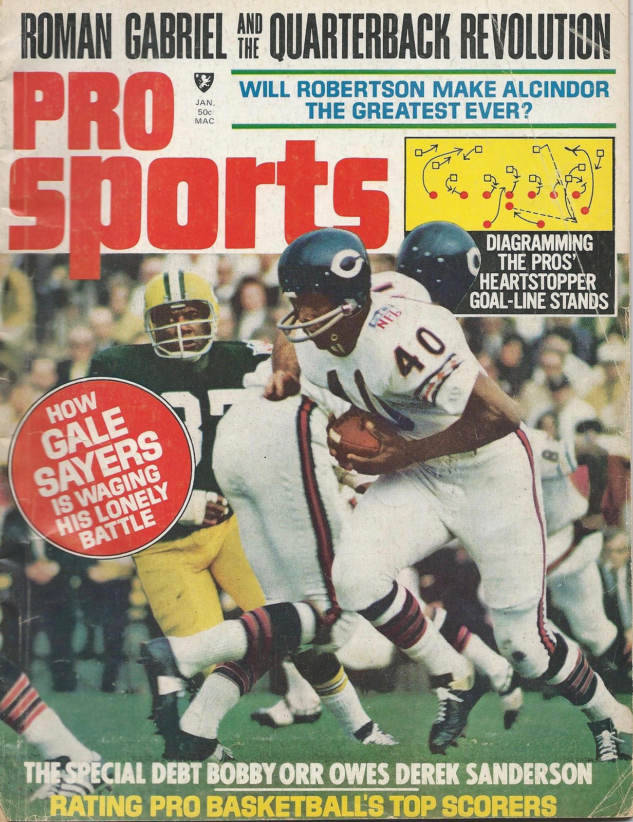
I don’t recall having seen the issue of Pro Sports shown above, but reader Ray Hund recently came across a copy of it, and he came up with two interesting finds.
First: If you look for photos of the black helmets that the Saints wore in the 1969 preseason, you’ll generally find the same shots over and over again — this one, this one, this one, and this one (which also shows an official wearing short pants and stirrups!). But that issue of Pro Sports has a shot I hadn’t seen before:
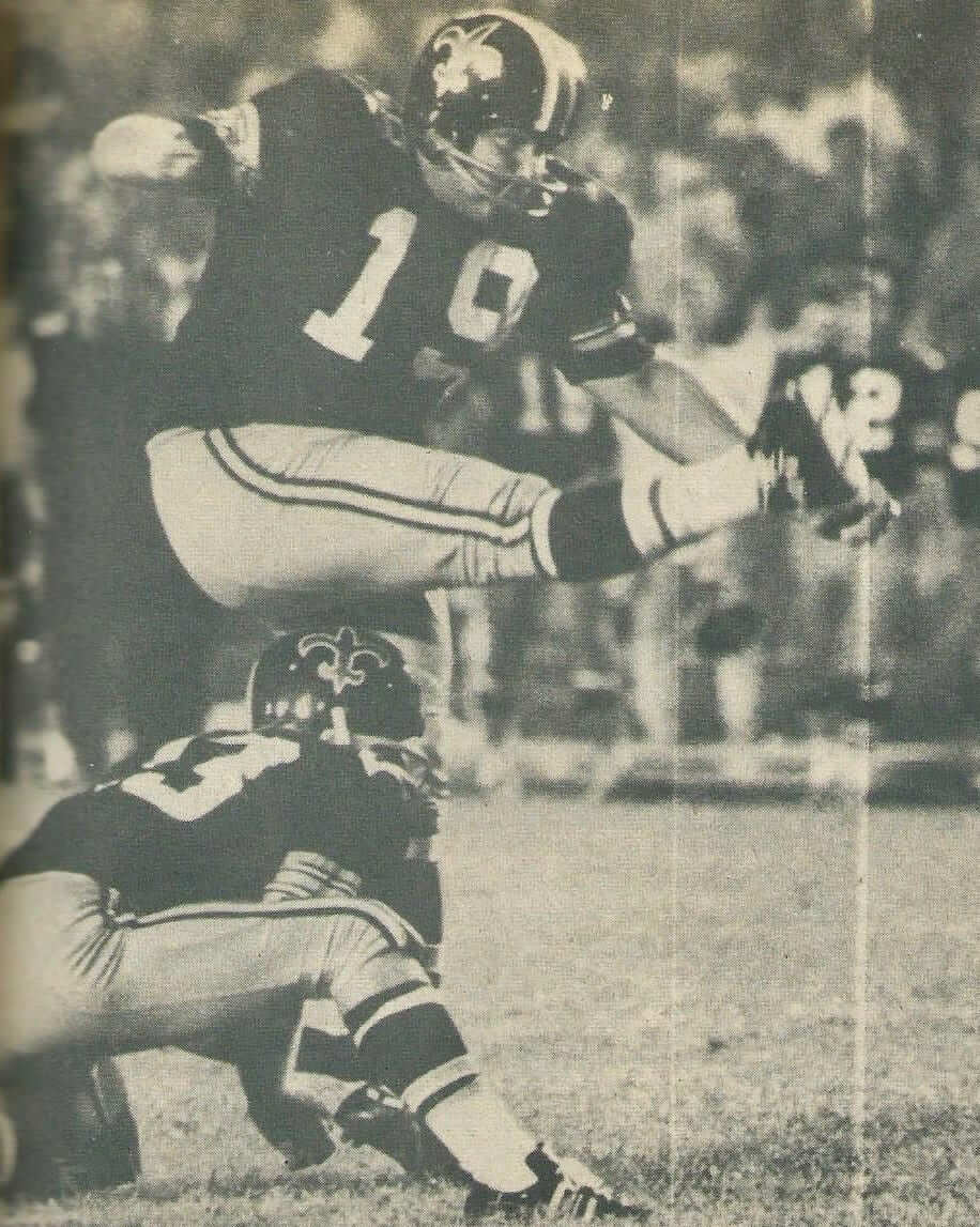
You probably know this, but just in case: The Saints had worn their familiar gold helmets during their first two seasons but were planning to go with the black helmets in ’69. In a move that’s never been satisfactorily explained, they somehow neglected to tell the NFL office, which put the kibosh on the color change and insisted that they go back to gold when the regular season started. They’ve continued to wear gold lids ever since.
That photo is also notable for showing kicker Tom Dempsey wearing a classic two-bar facemask. Photos of his signature career moment — the then-record 63-yard field goal he kicked against the Lions in 1970 — show him with a different mask, so that’s the one I always associate with him. (Of course, as we recently discussed, another Saints player — quarterback Archie Manning — was the king of facemask switcheroos.)
Speaking of facemasks, that same Pro Sports article with the Saints/Dempsey photo also had this shot of Lions kicker Errol Mann and holder Wayne Rasmussen:
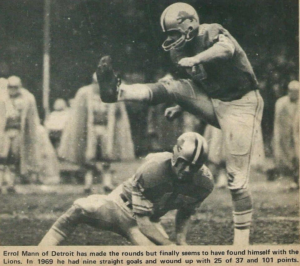
As you can see, Rasmussen was playing without a facemask. That wasn’t unheard of for placekick holders in the 1960s — you can see Steelers holder Dick Hoak going maskless, for example, in this 1967 footage (if the video embed below doesn’t start at the right spot, go to the 1:55 mark):
But if you look again at the photo of Mann and Rasumussen, you can see the NFL 50th-anniversary patch on their shoulders, which clearly dates this photo to 1969 — pretty late in NFL history to see a mask-free player. That might be the latest example I’ve ever seen of an NFL player without a facemask.
(My thanks to Jerry Wolper for his assistance with this section.)
Collector’s Corner
By Brinke Guthrie
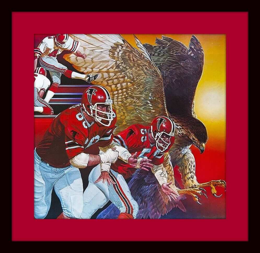
Big Game LIâ„¢ is coming up on Sunday, so this week we’re focusing on the two teams involved, the Pats and the Falcons. First up is this 1979 Falcons poster that fairly pops with contemporary graphics. A beauty!
Now on to the rest of the week:
• Here’s an iron-on Patriots transfer — with a silver helmet, no less.
• This 1960s Falcons milk mug is priced to move!
• This 1970s vintage Patriots helmet bank has held up well. Not the usual helmet back we’ve seen, either — those have a distinct metal facemask that’s different from what’s shown here.
• Those glossy-enameled helmet medallions from the 1970s sure hold up well. My Bengals and Cowboys ones still look brand-new, as does this Atlanta Falcons version. Still has the strip on the back, ready to peel off and stick on.
• Pat Patriot ready to snap the ball on this 1970s jacket made by Chalk Line.
• Here’s a Falcons helmet pencil sharpener, MOC (mint on card) from 1970, and they wanted just 29 cents for ’em back then!
• This 1970s Avon Patriots decanter comes in a nice box with era-appropriate NFL graphics.
• I thought I’d seen just about every graphic representation of a helmet possible, and then I found this CBS/State Farm Falcons promo pennant.
• Nice-looking 1970s New England Patriots promo stickers, from your local Mobil dealer.
• I think the Falcons decal is a little out of place on this 1970s Pro-Football Decorator Plaque from the Sears & Roebuck Company.
Chargers-redesign update: The results of my recent Chargers-redesign contest will run on ESPN on Feb. 7 — a week from today. Sorry about the delay, but my editors wanted to wait until after the Supe. But you can see all the design submissions now — check them out here.
Where there’s smoke, there’s fire deliciousness: Twenty-some years ago I had my first experience with one of those state-border fireworks emporiums. The place was packed with so much cool-looking stuff that I felt overwhelmed and ultimately left without buying anything.
I was reminded of that experience a few nights ago, when my friends Jon and Karen took me to the Euro Market, a big international supermarket in Astoria, Queens. There was lots of good stuff there (nuts, olives, beer, baked goods, canned goods, etc.), but I was entranced by the smoked meat section, which consisted of a long counter with a seemingly endless array of hanging protein. I was so entranced by it all that I neglected to take a photo, but you can get an idea of what’s available in this video clip (not shot by me):
I was determined not to repeat my fireworks experience, so I snapped myself out of my blissful haze of wonderment and bought a few things (although, in retrospect, I wish I’d gotten more) — some smoked spareribs, a link of sudzuk (Balkan lamb sausage), and some suho meso (dried beef, sort of like a cross between corned beef and jerky) (click to enlarge):
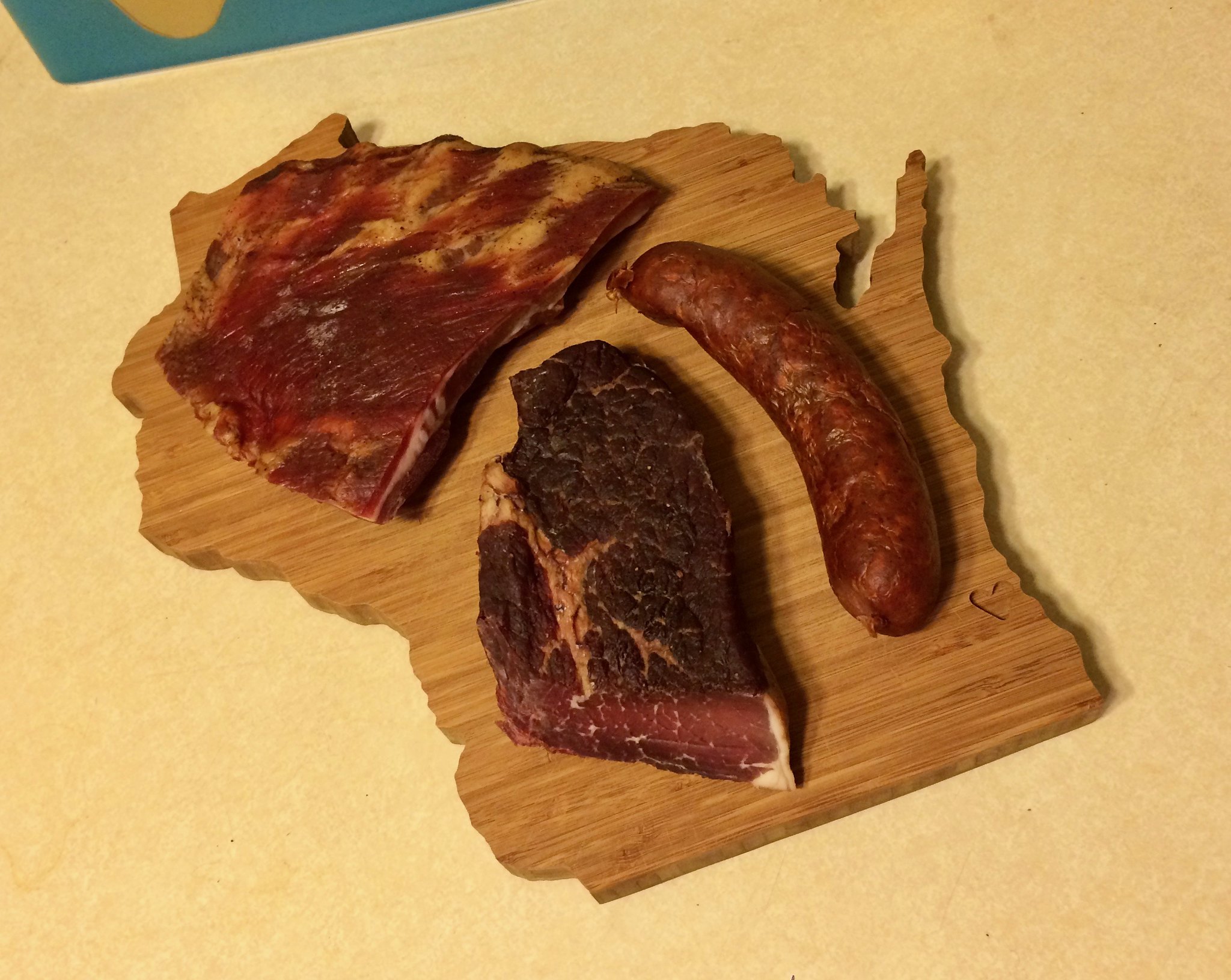
And is it good? People, it is soooooooo good. I wish the internet had a smell-o-vision feature so you could smell the spectacularly smoky aroma. Mmmmmmmmm.
Click to enlarge
Good as gold: When I was a kid, my father used to tell a joke that went like this:
So this guy’s walking down the street, and he comes to a guy standing on the corner with a mangy-looking dog, along with a sign: “Dog for Sale, $1,000.”
“Wow,” says the first guy. “A thousand bucks for that mutt? Good luck — you’ll need it!” And he goes along his way.
A week later, the first guy is walking down the same street, and he sees the guy who’d been on the corner. “Hey,” says the first guy, “whatever happened to the $1,000 dog?”
Second guy says, “I traded him for two $500 cats.”
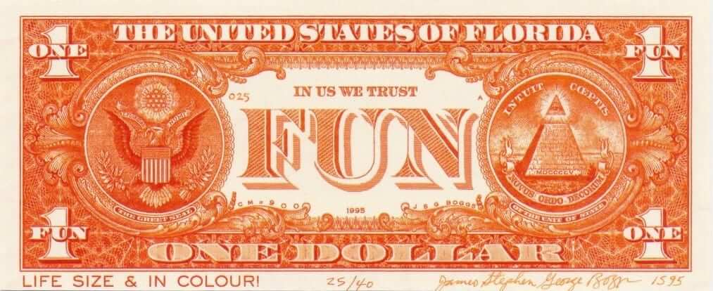
”¨”¨The point of that joke, of course, is that value is a very flexible concept. Really, it’s whatever we say it is. But I never understood the full implications of that until about 25 years ago, when I learned about J.S.G. Boggs, an artist who specialized in making sly variations on various forms of currency (like the one shown above) and then tried to “spend” them at face value with various merchants. The kicker was that he always demanded the correct change as part of the transaction.
Boggs wasn’t a counterfeiter and never claimed that his pieces — “Boggs bills,” as he called them — were real money. His premise, which underscored the degree to which our financial system is based on suspension of disbelief, went something like this: “Let’s say you have a $100 bill. It’s a piece of paper, and you choose to believe it has value. Now here’s one of my artworks, which happens to look a lot like a $100 bill. It too is a piece of paper, and it too has value. Why not believe that its value is $100, and we can go from there?”
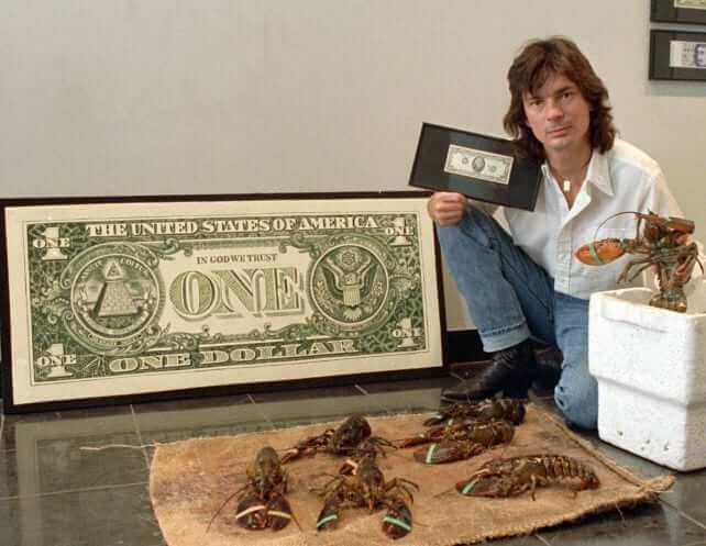
If the merchant agreed, which happened more often than you might think, Boggs would take the change and the receipt from his purchase. Collectors of Boggs’s artwork would then try to acquire all of the pieces of the transaction — the receipt and change (which the collector would purchase from Boggs) and the original artwork (which the collector would try to purchase from the merchant) — in order to assemble the a “complete Boggs,” as it were. That may sound crazy, but no more so than the fluctuations of currency markets, stock portfolios, futures exchanges, and so on. As Boggs once said, “In exchanging money for art, we exchange one abstraction for another.” Or, in some cases, we’re exchanging an abstraction for a shipment of lobsters, as Boggs demonstrated in the photo below (which you can click to slightly enlarge):
Boggs was arrested several times in various countries on counterfeiting charges. He was never convicted (an Australian court actually awarded him $20,000 in compensatory damages), although the U.S. Secret Service did succeed in confiscating a lot of his artwork for a while. At one point he went down to Washington to try to get his art back and stayed in a swanky DC hotel, where he paid his bill by making and “spending” more art, which the hotel proudly displayed in the lobby.
I first learned about Boggs via a sensational 1992 documentary about him, called Money Man. (My favorite part was when Boggs went to a bank and tried to open a savings account so he could deposit his notes. When the bank manager suggested that he simply put the notes in a safe deposit box, Boggs said, “Well, no — I want the account to earn interest.”) Unfortunately, no video from that film appears to be available on the web. I did find this clip, from a recent Discovery Channel show about money, but you’ll have to take my word for it when I say that this doesn’t show Boggs at his best:
I never purchased any of Boggs’s art, but I followed his career and admired the way he fucked around with capitalism. In 2000, he was the subject of a book, called Boggs: A Comedy of Values, which I reviewed for Fortune. (When I pulled out that review from my old clip file, I was amused to see that it started with the same joke from my father that I’d already put at the top of this blog section. I may not be original, but at least I’m consistent.) About 10 years ago I was disappointed to hear he’d been arrested on meth and weapons charges, which may explain why he looked so haggard in that Discovery Channel segment. More recently I’d lost track of him.
All of which is a really long-winded way of saying that I was very sorry to learn that Boggs died last week. He was only 62. He was one of my heroes, and it was great to get to write about him one more time. If there’s an afterlife, here’s hoping he gets to spend it by using his artwork to “buy” as many $1,000 dogs as he wants. RIP.
The Ticker
By Mike Chamernik

Baseball News: After weeks of hints, it’s now official: The Rockies will have a lighter shade of purple this season. The club said that the previous shade had too much variance across caps, jerseys, and other equipment, and looked different under different lighting conditions (from Dan Cichalski). … Yan Gomes gave up No. 10 for new Indians teammate Edwin Encarnacion. Gomes struggled last year and welcomes a change to No. 7 (from Andrew Cosentino). … New uniforms for the Chunichi Dragons. Graveyard Baseball says the gradient uniform will be worn for four games this year. … Japanese players are getting accustomed to the slick baseballs that will be used in the upcoming World Baseball Classic. … Also regarding the WBC, here’s what the USA and other countries will wear for the tournament (from Robert Hayes). … MASN reporter Dan Kolko and Nats OF Jayson Werth are known for their memorable postgame interviews, so the Potomac Nationals will give away dual bobbleheads of them in August. Also, the big league Nationals have packed their trucks for spring training (both from Tommy Turner). … Brandiose strikes again, this time with an angry baby sporting a five o’clock shadow. That’s the new “Baby Bombers” alternate logo for the Scranton/Wilkes-Barre RailRiders, a Yankees affiliate (from Brian Sea). … On yesterday’s date in 1967, the American League debuted a lightweight shirt that umpires could wear on hot days. Home plate umps, though, still had to wear coats (from @BSmile). … New alternate uniforms for the Hanshin Tigers.

NFL News: The lead singer of the X-Ambassadors wore an Adidas jacket for his performance during Super Bowl Opening Night yesterday, but with the Adidas logo covered up. Guess they couldn’t cover up the triple-stripes on the sleeves (from @NYCKING).

Hockey News: Goalies are preparing for the new uniform policy that will be implemented this weekend. In an effort to boost scoring, goalies will have to wear slimmer pants with a contoured design and snug fit. … With the goalie pants about to change, here’s an argument in favor of slimmer goalie pads as well (from Chris Flinn). … The White Bear Lake Bantam AA team in Minnesota wears white pants. “Not a good look, but the best I’ve seen it done,” says Patrick Thomas. … The Ontario Reign will wear pink jerseys on Friday (from @GKG_77). … Paul Sabatini says all the players had the same pant shells with their team logo on them for the All-Star game. “My question is did the players all wear girdles and use the pant shell or were they just slipping on the pant shell over their existing pants? Didn’t see any different color pants peeking out of the bottom. Which leads to how many players use a girdle and pant shells during the regular games?” … The Alaska Aces wore tie-dyed jerseys the other night. “This is the only pic I could find of them in action,” says Brett Thomas. … “As usual, new redesigns for the CHL/NHL Top Prospects Game,” reports Wade Heidt. “Noticeable difference this year is on the main crest. They are using the French ‘LCH‘ logo instead of ‘CHL,” as the game was played in Quebec City this year.”

NBA News: The Hornets will give away Kemba Walker Starting Lineup figurines next weekend. As far as I know, the once-popular toy has been discontinued for years. … Pistons fans will receive a lucite-encased mini Isiah Thomas jersey at the game next Wednesday. … Reader Cameron asks why home teams wear black arm and leg sleeves. “Seems like white on white would be more aesthetically pleasing,” he says. I actually like the black accessories for a bit of contrast. What do you all say? … The rest of these are from Zach Loesl: The Grizzlies wore their sleeved MLK uniforms last night (and as you can see in that shot, JaMychal Green has been wearing a mask). … Remember how the GE logo had been added to the Celtics’ backboard posts in the wake of last week’s uni-advertising announcement? That logo has now been replaced by the NBA logo. … Speaking of backboard post ads, the Mavericks have four of them, and the Gatorade ‘G’ on the edge of their scorer’s table. Meanwhile, the 76ers have the Geico logo plastered on their scorer’s table in two different sizes.

College and High School Hoops News: A basketball coach in Ohio runs his own apparel company that outfits local high school girls’ teams. Ballher Athletic Apparel allows schools to fully customize their uniform designs, unlike Nike and Adidas (from Tom Pachuta). … In the early 1990s, Georgetown players wore blank patches or American flags over the maker’s marks on their jerseys, but during one game in March 1990, a few players had their Nike logos exposed (from Matthew W. Wilson).

Grab Bag: Nike and Adidas are among the companies that have issued statements opposing President Trump’s immigration travel ban (from David Brown). …New uniforms for Phoenix Rising FC of the USL. Note the tilted ads on the left side of the shirt (from Mark Murray). … Mitchell & Ness is fully aware of how pricey its throwback jerseys are (from Phil). … New logo for McKeil Marine, an Ontario-based transportation company (from John Chapman). … This video shows how an automatic pinsetter works (from Brian Schmidtke). … An Iowa sportscaster wants clearer definitions of the differences between yellow and gold (from Luke Adland).
Proofreading:
“which consisted of a long counter a seemingly endless array”
“Jayseon Werth”
Grizzlies item has a broken tag
Fixed.
Big chunk of HTML in the basketball ticker.
“immigration travel band” (should be “ban”)
Fixed.
I feel like all of Brandiose’s stuff looks the same. I’ll never forgive them for what they did to the New Orleans Zephyrs.
Brandiose doesn’t “do” anything to teams. Teams hire Brandiose to deliver a certain kind of product, and team management gets what it pays for. The fault is with the client that accepts the design, not with the designer.
I’d say there’s plenty of fault to go around.
If a merchant is known to be selling shit, then I’d agree that the buyer of said shit bears some responsibility. But the fact remains: The merchant is selling shit! That’s not a blameless position to be in.
Agree with arrScott. What client wants, client gets, and client lives with the results. Brandoise doesn’t really care what the NO fan base thinks. As long as Babycakes are happy, they’re happy. They’ll gladly handle the redesign project if/when it comes!
So if someone is selling shit, you think that’s fine? It’s totally on the client, and the shit-seller has ZERO responsibility to try to sell something other than shit?
Brandi-adios-mio have consistently produced winning designs – If you are 10 years old, myopic and someone else buys them for you. I have no real problem with this, plenty of room in the Uni Verse for cartooning around.
I do have a problem with poor draftmanship passing off as fun. No excuse for bad brand design.
Where in the wide world of sports is the great Todd Radom when you need him? He’s done better work with his feet.
The so-called “shit-seller” in this case is the Babycakes, not Brandoise. The Babycakes signed off on this, and that’s when they became the sellers. The targeted customer of the Babycakes is the Nawlins fanbase, not us critics scattered in all four corners. If New Orleans fans are jazzed (sorry…)about their baseball team and merch/ticket sales are booming, then the Babycakes look great. And Brandoise looks great. Our opinions are just that.
The so-called “shit-seller” in this case is the Babycakes, not Brandoise. The Babycakes signed off on this, and that’s when they became the sellers.
Uh, no. When a company keeps doing crummy work over and over and over and over again, you can’t just blame it on the client, blame it on market preferences, etc. If you do that, you’re basically saying no merchant has any responsibility for anything he/she makes or sells, which is nonsense.
Do the clients bear some responsibility? For sure. But is the merchant blameless? No way.
When the ticker stated,”Brandiose strikes again…” I knew exactly what design company it was, the one who did Baby Cakes. They’re kind of known for this design, it’s awful but it sells. Let me say that a little more slowly, it. sells. No matter what you think, the client gets what the client wants. These guys won’t be hired by the Yankees proper, but they’re making a killing in their niche. Would I buy a Baby Bombers shirt or hat? No. Will a lot of other people? Yes.
If you hire the Three Stooges to put up your wallpaper, expect hijinks to ensue.
What about their work do you guys find poor? The concepts and point of view are way out there, like super wacky, but that’s become minor league sports’ “thing,” for better or worse. These are cartoons, and much more often than not, they’re capably illustrated. They translate well to the types of media used by sports teams (patches, embroidery, etc.) and they engage the target audience (mostly families with kids) very well. These are meant to be fun, and that’s exactly what they are.
Even Todd Radom would be hard pressed to save the brand for a team called the Babycakes, the IronPigs or the Shuckers, don’t you think?
It’s formulaic, trite, boilerplate, repetitive variations on the same theme, etc.
And *they’re the ones* steering teams toward names like Babycakes, are they not?
Do MiLB teams have a lot of discretion in choosing to work with Brandiose, or does someone dictate that Brandiose gets a certain number of overhauls every winter? It seems local design companies could do a much better job, and would better appreciate their hometown team.
…we all knew this wasn’t going to last:
(So what are the options? Back to Nassau? Queens? Quebec?)
link
I live half a mile from the arena. If this means I’ll see fewer bros wearing Isles jerseys in my neighborhood, I’m all in favor of it.
With the team being booted (and the no third jersey rule next year), is this ultimately the end of the black NY jersey?
*Even though they don’t leave until ’18-’19, does the Brooklyn Black NY jersey comeback, or will making the Nets and Islanders look the same be finished?
I’m a Rangers fan, but it makes me sad to see the Isles like this. They belong on Long Island.
Me too…(Rangers fan), we need our nemesis ;)
I’m breaking down their relocation like this:
1) Queens (if the arena deal gets done)
2) Back to Nassau (temp). It’s redone, and no AHL team is going in anytime soon (I think 2018-19 would be earliest), but this is not a long-term solution.
3) Quebec. Though they just got the Laval Rocket (starting next year), the arena is NHL ready, and if they (the fans) show massive support for the AHL, don’t be surprised if a total relocation occurs (just like what happened in Winnipeg).
I’d be willing to bet that the Bridgeport Sound Tigers end up in the refurbished Nassau Mausoleum.
Don’t understand your last point, regarding relocation; Laval is a suburb of Montreal, and has nothing to do with Quebec City. The new rink in Laval only seats about 10,000, far too small for an NHL team.
The QMJHL Remparts play in the new Videotron Centre in Quebec. Perhaps this is what you were referring to?
*Apologies for not being clear
So what I meant to say, QC has an arena ready.
If another AHL moves and goes to Quebec City (though Laval is moving to Montreal, don’t be surprised if QC gets a team too), you could potentially see if QC would support the AHL team in droves like Winnipeg did when they built their arena and eventually land an NHL team too.
Hard to say for certain, but I doubt that Laval will succeed in the long run. In my estimation, in five years the only thing keeping them afloat in Laval will be support from the Habs. For such a “hockey-mad” town, they have a well deserved reputation for killing lower level teams in the major junior QMJHL and minor league AHL.
Quebec City hasn’t supported minor league hockey since the Aces left town in the 70s, and not for lack of trying. Putting an AHL team there to compete with the Remparts could potentially kill both of them.
Have to say I would be extremely surprised to see an AHL team go into Quebec City (prior to them getting an NHL team back) just because Laval is getting a team.
-Laval is getting the team due to their new arena and proximity to its parent team.
-The situation is different than Winnipeg. Winnipeg did not have a major junior team. QMJHL Quebec Remparts have the best attendance of the 50 major junior hockey teams, drawing better averages than some NHL teams.
Arena is ready to go. Extreme support of the major junior team is your proof the support is there. Would be absolutely silly business sense for someone to decide to bring in an AHL team as well.
Seattle?
Milwaukee
Baltimore?
How about Hartford?
The Islanders belong on Lawnguyland. I’d be for some combination of the Ducks, Lightning, Panthers and Yotes moving to Hartford, Milwaukee, Quebec and Seattle.
Everything wrong with having an NHL team in Hartford 20 years ago is still wrong today.
It’s depressing to witness the skidding fortunes of this team. Perhaps that’s a hazard of peaking early.
I don’t really care for that new Rockies purple. I’d never considered their colors inconsistent until they pointed it out. Still, it’s very interesting considering the trend of uni colors in recent years has darker, not lighter.
I don’t hate the Baby Bombers logo.
I don’t like the new purple as much as the old, at least in the kinds of brightly lit retail photos we’ve seen. But the old Rockies purple looks like three varieties of crap in any on-field setting other than a sunny day game, so I’m prepared to find that I like the new purple a lot better once players start wearing it. On the one hand, it’s a bit boggling that it took the Rockies a quarter century to notice and/or deal with the actual and apparent inconsistencies in their purple. On the other hand, these days it’s impressive to see any organization admit to and address a long-standing mistake.
The purple caps and solid purple jerseys haven’t been worn much at all. For the most part purple has been an accent color (cap logo, pinstripes, etc.) with black (base of cap, numerals) much more prominent.
I’d have preferred that the team use the same shade that had been used for the purple caps, but it isn’t my circus.
The purple caps no, but aren’t the purple jerseys worn fairly frequently? Sportslogos.net’s uni tracking feature was not complete for 2016, but in 2015 they wore them 40 times, almost 25%.
Purple caps, no, but they usually wear the purple jerseys at least once a week, although I don’t think they do “Purple Monday” any more. It’s true that the jerseys looked blue under some ballpark lights, so I hope this corrects that problem, at least.
Of course, I’d prefer that they stick to white (with purple pinstripes) at home, gray on the road, black caps, and just use purple as a trim/accent color. If they did that I think they’d have one of the best looks in the game; it’s the alt purple and especially the black vest jerseys that look bad.
Purple jerseys weren’t worn at all until around 1997 then discontinued around 2003 and they were not worn often at all. They were brought back in about 2012. (FWIW Dressed to the Nines doesn’t include them or the other various Rockies alts.) Throughout the years they’ve certainly been worn more than the white vests, but probably less than the black vests (ugh), the gray roadies or the principal home jersey.
I think you’ll see it go the other way, toward brighter colors again. This stuff is all cyclical.
That would be welcome as far as I’m concerned. I’d like to see the Royals go back to royal blue.
That would be Pantone swatch 294, amirite?
Yes. Bye Bye Balboni Blue.
Regarding the first item in the NBA news, Starting Lineup figures are being revived for giveaways. Might have even read that here.
link
I guess Finster got early release and has started rebuilding his life as a minor league mascot. Good for the Railriders giving him another chance.
As long as he doesn’t screw up anybody’s TV reception…
Oh, Finsterrrr. Oh, Finster baby!
Celtics had NBA on backboard instead of GE logo because it was on national TV not local. If I remember correctly same goes with sidecourt ads
I came here to ask that same question: was it because the Celtics – Pistons game was on TNT?
NHL ASG players wore CCM pant shells over their regular pants. You can usually tell when players have their backs turned. Saw Ovie’s blue and McDonough’s red pants underneath. Ovie is a Bauer guy but he rolled with it.
I’m pretty sure I saw some flashes of players’ regular pants colors during the game as well.
Bout 90% of the league I’d say wears the pants and 10% are rocking the girdle and shell. Everyone is rocking a shell for the most part over their stock pants if the design changes from the primary to the third or throwback. I say for the most part because there could be an exception.
I like the contrasting arm and leg sleeves with the basketball uniforms- it defines the actual uniform pieces. The matching arm and leg sleeves blend in to and extend the actual uniform, similar to the the Saints and Ravens when they wear black socks with black pants.
Me too. The white looks fine, and probably looks great on certain uniforms, but I would tend to prefer the bright team color with the white uniform and the dark team color with the road uniform. For example, red sleeves and tights with the Bulls’ white uniform and black sleeves and tights with their red uniform. If the bright team color is really bright, though, like yellow, I might flip that, so blue with the Warriors’ white uniform and yellow with their blue uniform.
If the WBC baseballs are slicker than the NPB baseballs, how do they compare to MLB baseballs? Do Japanese pitchers have to adjust when they move to the MLB?
From what I’ve read, the NPB and MLB use the same standards for baseball size and weight. However this change was made in 2011. Prior to that, the NPB balls were smaller. I’m also assuming that the NPB balls are not rubbed with the MLBs official rubbing mud that comes from an undisclosed location in New Jersey.
I was wondering that myself. Looking at the ball, it appears the WBC ball is just the standard MLB Ball but with different markings – which would make sense, and the MLB baseball has very low seams compared to what you would find at the average sporting goods store for youth through high school use. My bet would be that Japanese baseballs have more in the way of seam height and more to grip, and that is what they mean by “slicker” balls.
Starting Lineup Figurines have been making a comeback of sorts, at least as promotional giveaways. The Islanders had a John Tavares SLF giveaway on Jan. 11 vs Florida, and the Mets have a David Wright one this season
What would I give to see the Falcons and Patriots play the Superb Owl in vintage-1977 uniforms? Their best looks, If you ask me.
I’ll listen to the argument about the 1977 Falcons unis, but 1977 Pats? I think the regular sleeve stripes of the 70s made them look a little more generic. The Pats should definitely have the shoulder loops. I’d say 88-89 was probably their best look, pre-Flying Elvis. (Not a fan of the red pants.)
Objectively, the uniforms you like are the better design. My preference for the Sam Cunningham-era suits is owing to their 1976 season, the year I began following football.
Thanks for posting the Chargers entries, Paul. It’s nice to see all the different concepts, even if we have to wait to see how they actually did with UWHQ.
While there were many good concepts, my votes would go (in alphabetical order) to Messrs. Mazuchowski, McDonald and Moss.
Gene Sanny’s pastel blue uniforms made me weep with joy; utterly beautiful. But I’m glad John Newhouse recycled the Oakland Invaders’ insignia. It’s one of my favorites, and will look great depicting a team called the Thunderbolts, should that ever come to pass.
That Saints/ref in short pants photo must be a training camp/scrimmage of some sort.
Note the trees/forest in the background.
Must’ve been a hot day.
I am just not a fan of the USA on the WBC uniforms with the draped flag for an S. I just don’t care for it.
I’m of this opinion too. Very poor design. Surely there were much better designs to choose from?
$257 for a God-awful looking USA World Classic baseball jersey!? Were the Diamondbacks somehow involved in choosing the charcoal gray color scheme? I wouldn’t pay a single Boggs bill for that thing.
“Pistons fans will receive a lucite-encased mini Isiah Thomas jersey at the game next Wednesday” So the question beckons, what will they do with the leftover 6,500 or so giveaways? Use them as bricks in the new Pizza Joint?
Lots of good Chargers submissions. Thanks for posting Paul!
The Steelers Browns clip showing the holder without the facemask shows the greatness of the old Cleveland Browns uniforms.
I agree with you about the Browns old uniforms, especially when you consider the crap uniform they wear today. Also I want to point out that the great Chuck Thompson was doing the narration on that clip. He was a Hall of Famer, well known for his work on Oriole and Colt games in Baltimore.
Interesting piece about Boggs. When I first saw the picture of him, I thought it was Ian Rankin.
I love the coverlines on that Pro Sports magazine. “DIAGRAMMING THE PROS’ HEARTSTOPPER GOAL-LINE STANDS,” wow! I want to read all six of those articles!
Me too…now I am wondering what special debt Bobby Orr owed Derek Sanderson.
now I am wondering what special debt Bobby Orr owed Derek Sanderson.
That’s why it’s called a teaser!
Educated guess – Sanderson had the first assist on Orr’s famous Cup-winning goal against the Blues?
Later in life, long after this magazine came out, Orr paid for Sanderson’s rehab. The story of Sanderson’s rise, fall, and recovery is one of the most gripping stories I’ve ever read.
Gotta admit, those white breezers as part of the Minnesota Bantam hockey team’s uniforms look pretty good.
Money Man documentary seems to be available for rental / purchase here:
link
Thanks for the recommendation!
Ah, excellent — thank you!
Totally worth it for $2.99. I may watch it again myself!
Your making me hungry :)
Nice cutting board, is that Wisconsin? Which I guess would make it a cheese board.
That Roman Gabriel headline brought back great memories of him & the Fearsome Foursome from watching NFL when I was a kid. Rams should go back to blue & white IMHO…
Thanks for posting that bit on Boggs. I remember seeing him in an interview explaining his take on currency and bartering (which was what he was truly doing). I always thought it was one of the best example of the free market system and capital. I occasionally think of him whenever I hear or see the term Bitcoin.
Sad to hear he died.
It looks like the rumors of the Lions ditching the black are true.
The Facebook page has the logo without black as well as a new wordmark.
Lions’ holder Rasmussen also seems to be playing without a chinstrap. That’s agressive.
Grantland did a really good podcast a while back on the history of Starting Lineups.
link