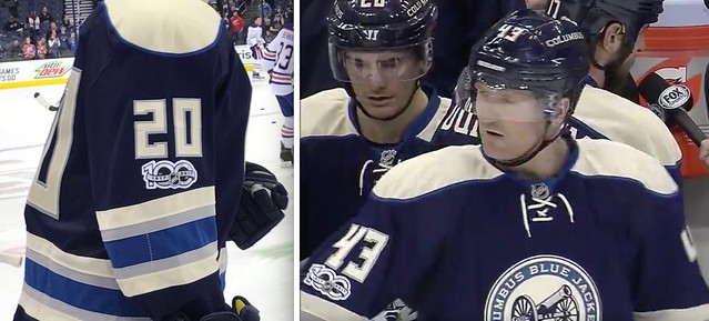
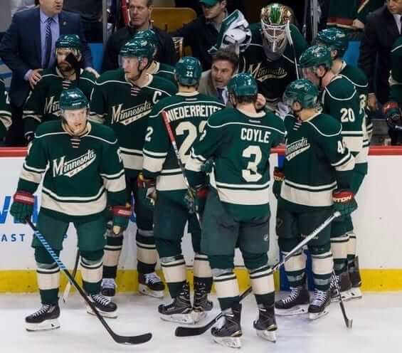
As we were discussing the placement of the NHL centennial patch last Thursday, I found myself drawn to the two Blue Jackets photos shown above. “Huh,” I said to myself, “the white patch really sticks out there, because that uniform has no other white elements.”
Just to confirm that, I looked at a full-body shot of the Blue Jackets’ alternate uniform. Sure enough, no white (unless you count the skate laces, the skate guards, the NHL logo, or the maker’s mark on the helmet, which I don’t):
ӬӬ
And that’s when it hit me: It is very rare to encounter a completely white-free uniform. Sure, there are lots of uniforms that are mostly colored, but they still tend to have some combination of white trim, or white outlining on the numbers, or white NOB lettering. The Blue Jackets’ alternate design is one of the rare exceptions.
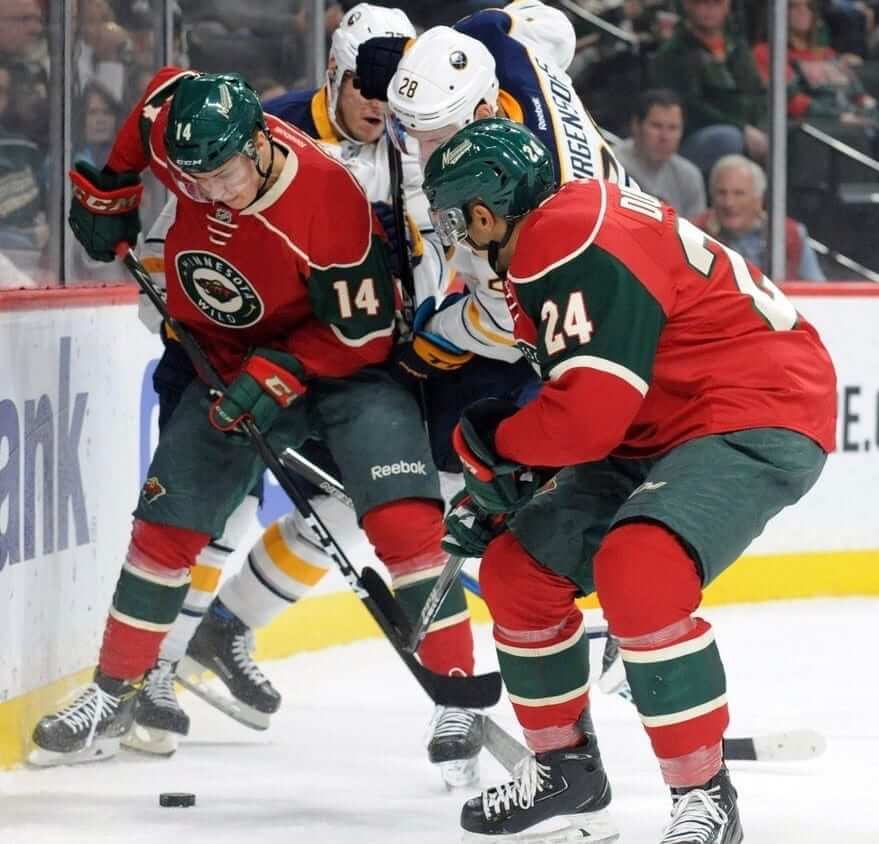
How rare? If we leave aside one-off uniforms and stick to designs that are in teams’ regular uniform rotations, then by my count there are only four other white-free NHL uniforms: the Bruins’ and Senators’ throwback alternates, and the Wild’s home and alternate designs. Much like the Blue Jackets’ alts, these four uniforms all make heavy use of cream (or vintage white, or wheat, or whatever we’re calling it this week) instead of white:
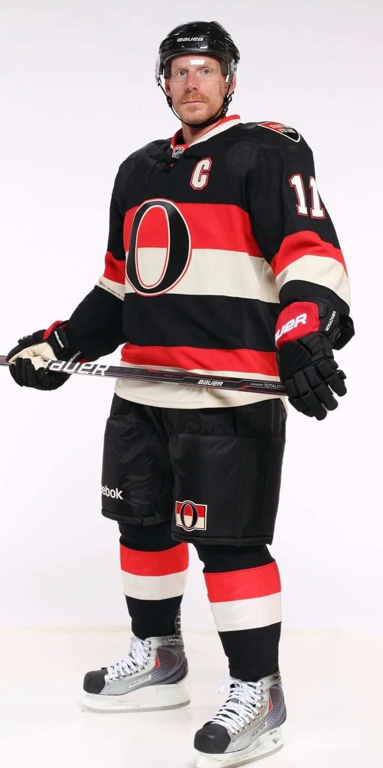
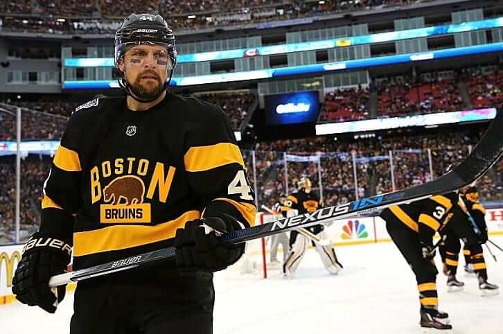
(I know it looks like the Ottawa sleeve number is white in that photo, but it’s not.)
The Rangers’ alternates almost make the cut, but they’re lazy and use their regular white-trimmed pants and gloves. If they really wanted to make that a fully integrated uniform design, they’d swap out those elements for cream-trimmed versions.
Of course, we could also do a count of how many uniforms don’t have blue, or red, or whatever. But white is different — it goes with everything and it tends to enhance everything it touches, so it’s interesting to see which uniforms don’t include it.
What about other sports? It’s impossible for a standard NFL uniform to be white-free, because all the socks are white from the mid-shin to the shoe (or at least they’re supposed to be). But the sock rule is waived for Thursday-night games — are any of those uniforms white-free? The 49ers’ design comes close, but the Niners have white in their helmet design. Ditto for the Seahawks and Vikings. So by my count, there are no white-free NFL uniforms.
I suppose one could also says it’s impossible for an NFL uniform to be white-free because of the chinstraps and nose/neck bumpers, but I don’t consider those to be part of the uniform. That’s admittedly a somewhat arbitrary distinction.
I was too busy with other projects to do a uni-by-uni check of the NBA and MLB, but longtime reader Warren Junium generously offered to help me with that.
For the NBA, I imposed another arguably arbitrary standard: I decided that we’d look only at the jersey and shorts. We wouldn’t heabands, socks, or sneakers, all of which seem to have become more like uniquipment, rather than true uniform elements.
With that standard in mind, Warren found six NBA uniforms that don’t include any white: the Hawks’ road and alternate designs (for those two, neon basically stands in for white); the Cavs’ three alternates; and the Pacers’ Hickory throwbacks (if you can’t see the slideshow below, click here):
For MLB, I decided not to count sanitary socks, since most players no longer wear stirrups (and baseball hosiery in general now falls into the uniquipment category. But I decided that we would count sleeve patches — they’re part of the jersey design, after all — and it turns out that a lot of MLB teams have white-inclusive patches. For example, I initially thought the Mets’ road uniform is white-free — but I forgot about the sleeve patch. To my mind, that counts.
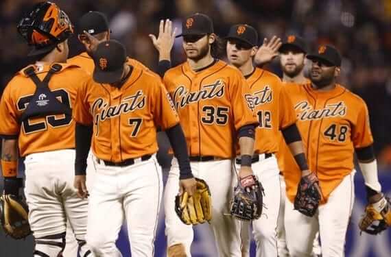
With those ground rules in place, Warren found only two white-free MLB uniforms — the Giants’ black alternates and orange alternates (it doesn’t really matter whether they wear these jerseys at home or on the road, because the Giants’ home pants are cream, not white):

So out of the Big Four pro leagues, which cumulatively have 122 teams and something like 400 home, road, and alternate uniforms (I’ve never done an exact count — would anyone like to tackle that one?), Warren and I found at a total of 13 white-free designs. Did we miss anything?
For the sake of argument, I wondered how many additional MLB teams would qualify as white-free if we didn’t count sleeve patches. By my count, another nine uniforms would then make the cut: Rays fauxbacks; Cleveland road; Mets road and blue road alternate; Pirates road; Diamondbacks road and teal-trimmed road alternate; and Giants home (which is cream, not white) and road. All of those uniforms are shown below (if you can’t see the slideshow, click here):
One thing I’ve learned from exploring this topic: White is really powerful. A little of it can go a long way — some outlining on the numbers, say, or a hairline stripe — but it makes all the surrounding colors look brighter and tends to make things “pop” a bit more. I think many of the white-free uniforms (or, in the case of the NFL Thursday designs, almost white-free) could have been improved with a touch of white here or there.
The Ticker
By Alex Hider

Baseball News: The A’s will be giving away a Bob Melvin bobblehead this year ”” and it appears they mistakenly included headspoon piping on the home jersey (from The Golden One). … Check out this incredible Cubs sweater from 1916 (from Phillip Santos). … Remember when the Padres almost moved to Washington in 1974? The controversy birthed this weird Willie McCovey card and a few others (from BSmile and SportsCollector).

NFL News: Piggybacking on an item from yesterday’s Ticker, it was apparently pretty common for NFL players to wear MLB caps on the sideline: Here’s a Pats coach in a Red Sox cap, Washington’s Sonny Jurgensen in a Senators cap, and some Steelers in Pirates caps (from William F. Yurasko). … A group of Seahawks fans from the Baltics gave Earl Thomas a custom Russian fur hat (from Dustin Jensen). … Ryan Arave was poking around Facebook and found someone selling a mattress with NFL logo creep.
College Football News: Spotted at the Tampa Airport: Alabama championship merch, sold at a steep discount (from Mike Feld). … From the Lord Jeffs to the Hamsters? Amherst is looking for a new nickname (from Andrew Hoenig). … Players in the Polynesian Bowl — a high school All-Star game — will wear these Polynesian-themed Riddell SpeedFlex helmets (from Rob DeMello). … ASU Uniformity is counting down the Sun Devils’ best combos this season.

Hockey News: The Tucson Roadrunners of the AHL will be wearing U of Arizona unis this weekend. They’ll be auctioned off after the game (from Dane Drutis). … According to this story, a Canadian bank altered one of hockey’s most famous photos ”” Paul Henderson’s game-winning goal against the USSR in the ’72 Summit Series ”” for an ad campaign (from Ted Arnold).

NBA News: Unusual-looking game last night in Toronto, as the Raptors wore their Toronto Huskies jerseys and the Celts wore their sleeved gray alts (from Funhouse). … Meanwhile, the Nets and Hawks went grey vs. black — not exactly the best kind of color-on-color action (from Pat Costello). … The Hawks will wear their racing-stripe throwbacks on Friday (from Chris Brueckner). …

College Hoops News: Indiana wore the striped/camo jerseys from the Armed Forces Classic last night at Maryland. They’ve only worn their traditional red unis once this season. … Brandon Daley points out that Kansas’ jerseys last night had a different style of trim than their normal jerseys. Anyone know why? … Pitt will be going BFBS — with illegible chest scripts and NOBs — on Jan. 28 (from Michael).

Soccer News: “Here’s a story from the League of Ireland in 1993,” says Denis Hurley. “Cork City decided to launch a new black away kit that clashed with the match officials’ shirts, but they failed to inform the league. Luckily, a referee read about the new jerseys in a newspaper article and alternate shirts were procured for the referee and linesmen.”

Grab Bag: Couple of racing items from David Firestone: John Hale of the NHRA has a new sponsor. Also beginning in 2018, NASCAR’s Toyota Camry will get a makeover. … Michigan state police are giving their cruisers a makeover for their 100th anniversary (from Josh Medroe). … When your sweatshirt betrays you (from Alex Shedden). … New rugby uniform for England (from Andrew O’Brien).
In the ’60s, Packers equipment manager Dad Braisher wore a Los Angeles Angels cap during training camp. That’s because once the Packers’ season was over, he’d head west to work with the Angels during spring training.
The Cubs sweater is actually from 1916, not 1906. Also, Pacers, not Packers throwbacks.
Fixed.
Are we sure that Cubs photo is from 1906? They didn’t use a logo with a cub until 1908, and the pic looks like a wishbone C that wasn’t used until 1916. Whatevs, it’s a cool pic.
The Cavs standard road uniform is, for all intents and purposes, white free as well. The white in the tiny shorts logo is all that’s there. Of course, if you’re going to count that as white, you have to discount all those Cavs uniforms, because there’s a little white highlight on the hilt of the sword in each of those little logos on the shorts.
White, for me, is sometimes needed, sometimes not. When it’s not needed, it really makes a uniform unnecessarily complex. I look at that Indians road uniform above and I see a clean design with no extra noise. Compare it to the Tigers road uniform which has white outlines on the grey background, and it just looks overdone.
Baseball uniforms rarely need white. The same colors generally show up very well on white and grey. Other sports may find it more necessary, but I still think it’s overused, a kind of crutch that is not always needed and nearly always decreases the cohesion among elements (lettering, numbers, logos, stripes, etc.).
You just had to lead off with that horrible abomination, didn’t you, Paul?
I’ve never been a fan of the off-white in the NHL, and I never will be. It. Just. Looks. Dirty. Period. And the whole idea of the Blue Jackets trying to have some faux-vintage jersey, but have those ugly-ass and decidedly not-vintage fonts on it, continues to offend me to no end.
The Blue Jackets third jersey numbers really are horrible. The zero is like a square. The full vintage white shoulder yokes look really bad during the game when compared to their opponent’s white jersey.
“…found someone selling a mattress with NFL logo creep.”
Not to be confused with the Simmons Beautyrest mattresses that Tom Brady is hawking.
link
OK, speaking of mattresses. I stumbled on some vintage NFL wall art available at the Mattress Firm.
link
The orange Giants alt you showed has a white outline around the lettering and numbers. Does that count?
That’s gold outlining, not white.
Actually, it looks like there’s gold AND white (unless it’s cream, but it doesn’t appear to be)
link
link
Official MLB Style Guide shows it as cream:
link
And the same pattern on the back numbers
link
O’s Friday black jersey would be white-free when worn on the road, if not for the jersey patch
link
Unless you count the fact that they have to wear their regular road helmets when batting, with the white-eyed cartoon bird.
Yes, that would qualify — good one.
If you count sleeve patches in baseball, shouldn’t you also count the NBA logo? It isn’t a team element, sure, but it is right there on the jersey and shorts, and is particularly glaring on an otherwise white-free look.
The proper comparison to the NBA logo would be the MLB logo.
But I’m not counting league logos. Or maker’s marks.
Yeah, I get it, and like you acknowledged several times, some of these restrictions are arbitrary. But when I look at those jerseys, I see white.
My mom would tell me about her trip to San Diego to visit her sister that yea; the team was preparing to move. When she went to see the game, they had almost every souvenir marked down. Even some club package (jacket, button, hat, bumper sticker; your typical fare) could be had for $20.
She says my dad still kicks himself he didn’t buy it.
Interesting topic.
The other day I was reading about how Marvel movies look bland because they don’t use a “true black” which makes colors stand out more in films.
Thinking about football (soccer), I believe it is more common for teams to have white free uniforms like Barcelona’s home, Pumas UNAM, Liverpool away and Inter Milan home to name a few
Do you have a link to that article about the Marvel movies? I’m curious
I really can’t stand the current aesthetic in films of washed out colors. I was watching the Indiana Jones films the other day and commented to my wife how great they look, and how the colors really pop. Except for Crystal Skull, natch. ;)
It mentions it in the twitter thread, but the ticker entry remains misleading, those Alabama shirts are National Championship participant shirts, not winners shirts. Probably had the same design in orange for Clemson somewhere in that store as well.
But it should go without saying not many Alabama fans will buy that shirt AFTER the game because they may not want a material memory of the loss.
Inititially when I read this I thought of the Arizona Coyotes and their “Desert Sand”. But they outline with white, along with the NOB appearing to be white.
The numbers and sleeves are also white. The only sand color is on the logos themselves.
Their former black alternate, though, lacked any white. The logo was outlined in the sand color, and the numbers and NOBs were also sand.
The KU Uniforms were this years version of the Blue versions of the Iced Out white Uniforms from last year. Similar to Louisville’s Red Iced Out Uniforms. link
The near relocation of the Padres to Washington in 1974 was because original team owner C. Arnholt Smith was in financial meltdown after the authorities accused him of and eventually imprisoned him of a wide range of financial crimes related to his ownership of a bank and tying into the Padres and other ventures. Smith’s crimes were significant enough that they came up in a business school text book of mine that had no connection to sports. McDonald’s magnate Ray Kroc bought the team instead of the D.C. interests and kept it in San Diego instead. C. Arnholt Smith’s contribution to the Uni-Verse was making brown part of the Padres color scheme. It was his favorite color and he wore brown suits and used brown in the logos of his other businesses.
It’s a uni-crime that the Padres won’t Bring Back The Brown full-time.
If we’re searching for wholly non-white unis, it doesn’t seem right to not count “cream” as a kind of white. Casual observers tend not to notice the difference. Also, its use in throwback unis seems mostly designed to evoke an era when it was harder to achieve a true white in such fabrics, and that was what passed for “white” at the time.
So if we look for teams without any white OR cream, I want to say that leaves us with three NBA uni combos: the Hawks, and the Cavs & Pacers alternates.
Go back to the top of today’s post: This entire topic was started by the Blue Jackets’ alternate uniform, which uses cream instead of white. No, it is not the same thing as white.
I understand the premise that inspired the article. I’m just not 100% sold on that premise. To the casual viewer, and from the broad standpoint of design (color composition/contrast, etc.), it’s not clear there’s much functional difference between white and cream.
I had the same thought. I understand where Paul is coming from and what the post is about, but in my mind cream is a shade of white.
Is that fact? Many of the jerseys Paul highlighted in this article are really white. Check out the Bruins jerseys especially
link
At least, they look more white than the cream/off-white being produced now.
The off-whitedness we associated with older clothing may be due due more to cleaning procedures (or lack thereof) of the material than in actual manufacture.
does anybody have any tips for DIY painting football helmets? I’ve seen some people on here do fantastic job.
Follow @HelmetAddict on Twitter.
Thank you
Packers throwbacks
Ah, yes — good one! I missed that one.
The Broncos brown and yellow throwbacks…unless you count the white numbers and stripe in the helmet.
Well, yes, why wouldn’t you count two of the uniform’s major design elements? :-)
Michigan home football unis have no white. When down at field level when they come charging out of the tunnel it is quite scary.
I don’t believe the USC Trojans home unis have white, either. Neither do Wake Forest’s, at least most of the combinations they wear at home.
I’m not sure you can count those SF Giants unis. The black jersey left sleeve has the Giant’s wordmark and ball logo as a patch. The baseball is white. The orange jersey has a similar logo featuring the SF on a baseball.
link
link
Those two jerseys you’ve linked to are both out of commission. Each one has been replaced by a new jersey that (a) has a completely different chest design and (b) does not have a white-inclusive sleeve patch.
The orange and black jerseys do NOT have the patch with the baseball.
The orange jersey has a simple “SF” patch; the black jersey has a patch showing the Golden Gate Bridge. Neither patch has any white.
The grey and cream jerseys *do* have the baseball-inclusive patch. That’s why I included them in the subsequent roundup of uniforms that could be considered white-free only if we don’t count sleeve patches.
The white-in-the-patch thinking reminds me of the New Era creep on this year’s hats. If there’s white in the team logo, the New Era logo is white. If there’s no white, then it’s the color of the team logo. Good example is Cleveland: Wahoo has white, so NE logo is white. The road hat is a red logo with no outline, so the NE logo is white! Mildly interesting :)
I find it very strange to have a Michigan State Police cruiser being any color but blue.
Of course they still have the awesome legacy feature. The cherry top light.
link
Well, most of the cars will still be blue.
Seeing diagonal stripes on that car, though, makes me think of the trooper’s car in the train crossing safety short Last Clear Chance, which was immortalized on Mystery Science Theater 3000, as seen link.
Did Earl Thomas check if his hat was made from Nutria?
When excluding patches, the Orioles black alternates would also count, but only when wearing them on the road, when they wear them with grey pants. They also don’t wear the white paneled hats on the road, but the black alternates are typically worn on Friday’s when they wear the apostrophe catastrophe O’s hats anyway.
Actually the O’s regular road uni would count as well, unless you count the white’s of the cartoon birds eyes on the cap.
For the white-less NBA uniform gallery, the current Grizzlies roads and alternates feature no white:
link
link
Nope.
The road uni has white in the side panels:
link
The alternate uni has white inlining on the chest lettering:
link
Come on, people — check your mock-ups against real-world photos before posting!
I don’t see the white in those side panels…
Those side panels are silvery-blue yo
The Celtics/Huskies game looked great. I like the NBA sleeved jerseys. I also wish Toronto could adopt the Huskies nickname and the royal and white colors.
I don’t think the Rangers are lazy for wearing their regular gloves/pants. I’d call it practical. After all, the program in question is often referred to as “alternate jerseys” or “third jerseys”, not “third uniforms.” Seems silly to me for a hockey team to have on hand an entire extra set of gloves, helmets, pants, and socks just because a team is wearing a slightly different shirt. The socks seem easy enough to have an extra set for, OK, but it never bothered me that the Rangers wore their regular gloves. The fact they wear off-white in any way, shape, or form is the annoying thing to me.
It would be an issue for traveling, but not as much at home, which is where the thirds are usually worn. And several teams do have alternate sets of gear for their thirds.
the program in question is often referred to as “alternate jerseys” or “third jerseys”, not “third uniforms.”
That’s just a bullshit shorthand for “please buy this jersey already.”
A uniform design is just that — a uniform design. It should be fully integrated.
If I had a say in it, the Rangers would not be wearing the navy thirds with vintage white as a third uniform. The design is too similar to the primary and because the glove/pant colours do not match the uniforms.
The blue version of this would be my Rangers third uniform:
link
Not sure but I’m thinking some of the Diamondbacks alternate road uniforms. Their dark gray with teal trim comes to mind, since the teal takes the place of white. Also maybe their red when worn with gray pants, since I think the trim is a sand color instead of white.
Paul, to you vintage white or cream is NOT the same as white,
but gold IS the same as yellow, to the point that you often cross out the word gold and place the word yellow next to it. Gold and yellow are just as different as vintage white and white.
Good point, although tons of people in the sports world are guilty of this. The Steelers, for example, continue to list their team colors as “black and gold”.
It seems to me that sports types simply don’t like the word “yellow”, perhaps due to its association with cowardice. Whereas “gold” is associated with prestige and success.
“My high school colors were scarlet and gold. It was red and yellow, man.” George Carlin
Paul is right that from a design standpoint, “white is really powerful”.
I think the best example of this is to check out how different the NY Yankees’ road uniforms look before and after they decided to add a white outline to the letters and numbers.
Cream is cream.
You can add the Blues new retro-jersey to the white-free list since it’s using the off-white in its place.
Personally, I think they should not be using off-white since they wore white in ’67. If they just tweaked the logo to look like the modern one I’m pretty sure it would be the best uniform in sports.
link
How about the Rays Faux-backs? A lot of powder blue, trimmed in yellow and dark blue. No white to be found.
Someone didn’t read today’s entry very closely! ;)
In my view, the only flaw in the Seahawks’ home uniform set is that the helmets have a good amount of white (compared to gray and green), while the jerseys and pants have no white. That is why their helmets seem to go much better with the white jerseys.
The Mariners wear cream uniforms on Sundays. Their hats stand out, because the outline of the logo is in bright white, rather than cream.
Unlike the Seahawks, I don’t think the white outline on the Raiders’ helmets detracts from their overall look, even though the home pants and jerseys do not have white on them. That being said, the white outline really pops with their white jerseys.
The Mariners wear cream uniforms on Sundays. Their hats stand out, because the outline of the logo is in bright white, rather than cream.
The cream uniforms also have white on the jersey — the baseball/compass symbol.
Yes, the baseball on both compass roses (above the “M” and on the sleeve patch) is white, which makes sense, at first, because baseballs are white, right? At least until they are rubbed with Mississippi Mud, at which time they turn…cream colored.
I’m not too crazy about Amherst going with Hamsters as the school name? Maybe Disney could give them permission to be called the Amherst Boba Fetts or even The Mandalorians
Has anyone noticed the Michigan basketball uniforms tonight? The jerseys are cut really differently around the arms and back…
Have you watched much college basketball this season? If not, read the first few grafs of this:
link
Thanks. Not a huge college basketball fan, but I love my Illinois (who Michigan played tonight). For what it’s worth, I HATE them.
The New York Rangers alternates originally had pants shells and gloves that included cream in them but they only wore them one or two games. I uploaded pics onto the Creamer board way back… if I can find the link I’ll add it here.
Here’s the link to the Creamer post I mentioned… it shows the Rangers wearing vintage white pants shells in the first game. I thought they had cream gloves too, but it’s inconclusive. link
Funny you mention the white – it took me a few minutes earlier this year to figure out what was different about Michigan’s home football uniforms – no white! Jerseys and pants as traditional, but items typically white on the helmet – chin straps, bumpers, etc – all not white.
The Wild use white in the eye of the “bear head” logo.
Under the stipulation that hosiery doesn’t count…the grey versions of the Atlanta Black Crackers uni’s that the Braves wear are white-free, I believe.
link
Nice gallery here…
link
The USC Football home uniform is totally white-free, as well.