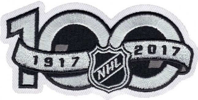
When the calendar turned to 2017 this past Sunday, all NHL teams began wearing the league’s centennial logo as a right-sleeve patch — usually, but not always, below the TV number. This caught everyone by surprise, because there had been no mention of a patch when the centennial logo was unveiled back in September.
I’ve seen a lot of grumbling about the right-sleeve placement, because NHL sleeves already have TV numbers and, in some cases, stripes and other patches, so the addition of the centennial patch has created too much of a jumble. But have some teams handled this better than others? With that question in mind, I’ve tried to collect photos that will let us take a team-by-team look at the centennial patch.
Before we get started, a few quick notes:
• I’ve tried to stick to game shots (as opposed to something like this), so we can see how the patch looks on the ice.
• As you’ll see, a few teams still haven’t played a game in 2017, so we don’t yet know how the patch will look on their jerseys.
• Most teams that have played at least one game in 2017 have only worn one of their jerseys, so we still don’t know how the patch will look throughout the rest of their respective wardrobes.
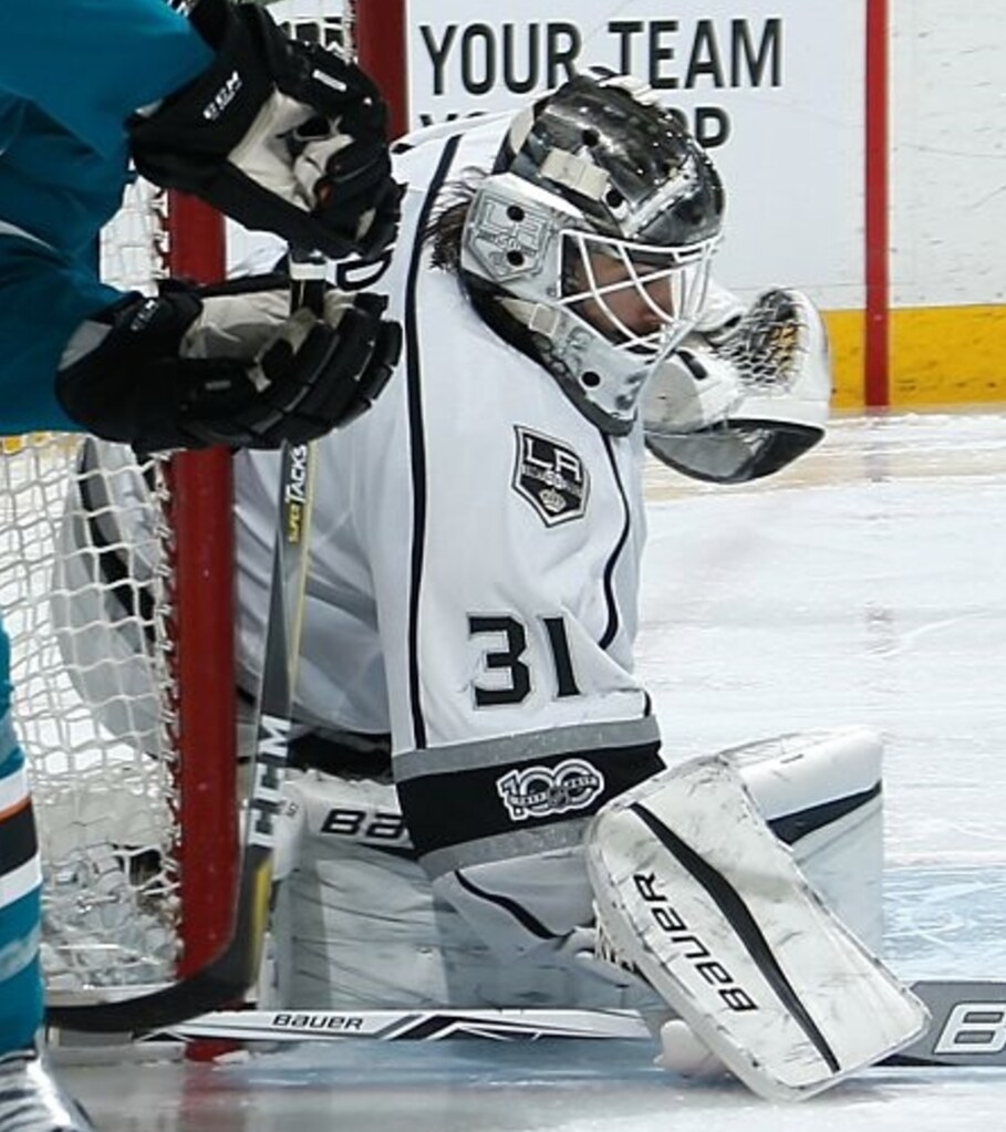
• Goalies’ jerseys tend to have a different cut, with a more compressed space between the TV numbers and stripes, so that sometimes makes the patch positioning even more problematic on those jerseys.
Okay, here we go, one team at a time, in alphabetical order (for some of these photos, you can click to enlarge):
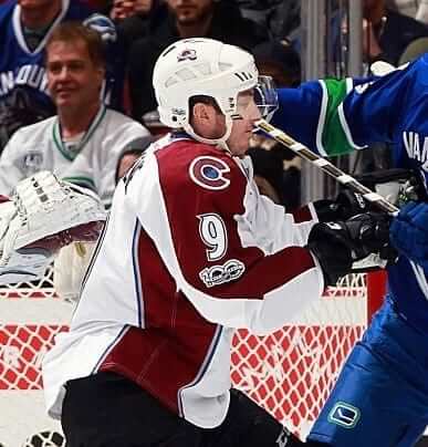
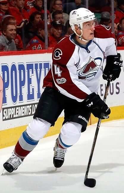
Avalanche: The Avs have no stripes on their sleeves, so the patch isn’t wedged into a tight space and has plenty of breathing room. Not bad.
Blackhawks: Haven’t yet played in 2017 except for the Winter Classic, which had its own patch.
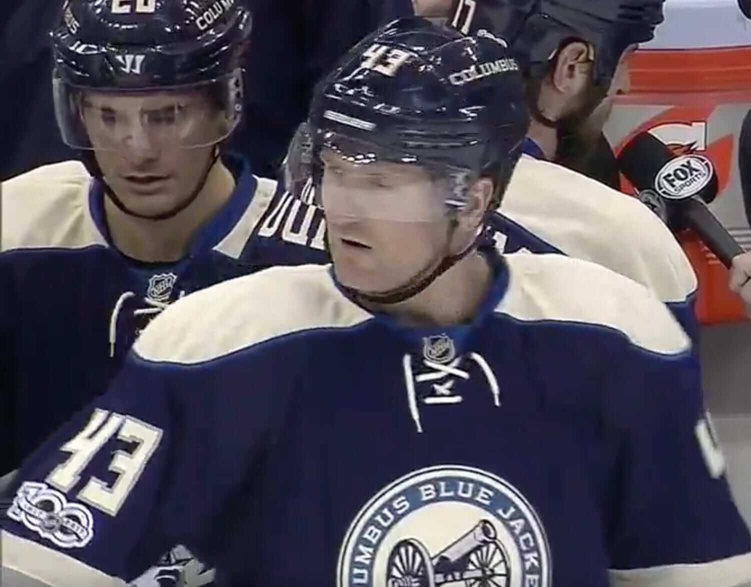
Blue Jackets: So far we’ve only seen the patch on the team’s alternate jersey, and it looks awful. The patch’s colors and typography clash with the jersey design, and there isn’t enough space for it. A lose-lose-lose.
Blues: Haven’t yet played in 2017 except for the Winter Classic, which had its own patch.
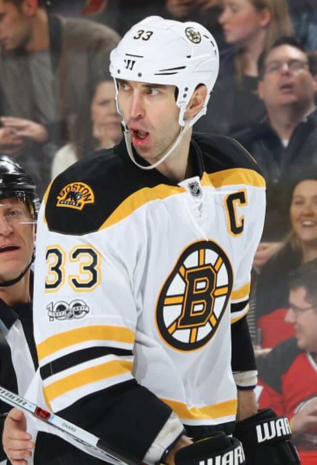
Bruins: The Bruins’ color scheme already includes black and white, and the sleeve has just enough space to allow the patch to breathe. Not bad.
Canadiens: The patch tends to look best on sleeves that don’t have any striping. The Habs’ jersey is a prime example.

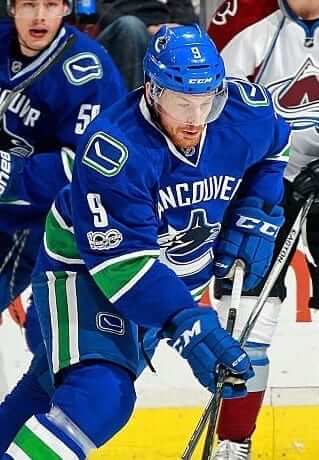
Canucks: A jersey that already includes a thick sleeve stripe, a TV number, and a shoulder patch shouldn’t have to deal with an additional patch. On the plus side, the white patch pairs well with the white TV number.

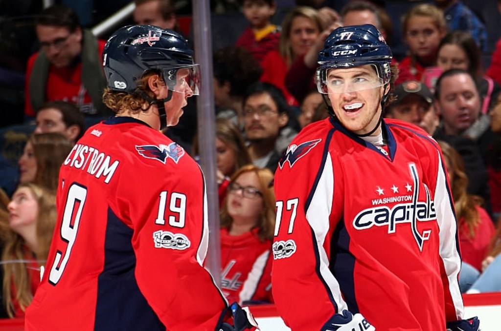
Capitals: The Caps’ sleeve design gives the patch plenty of breathing room, but I still don’t like how it looks, maybe because I just don’t like the Caps’ jerseys to begin with.
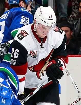
Coyotes: This sleeve design is too busy to begin with. Shoehorning the patch into a tight space makes it worse.
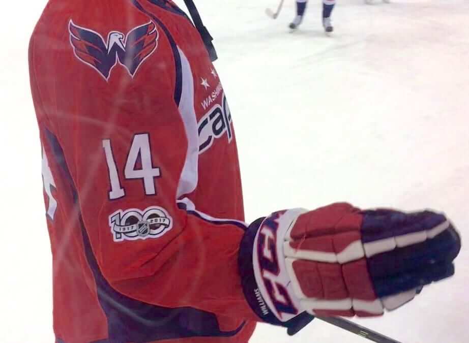
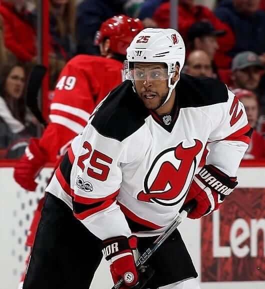
Devils: The Devils are the rare team that has worn the patch on both their white and colored jerseys. In both cases, I’m surprised by how good it looks. This may simply be the inverse of the Capitals situation — I like the Devils’ jerseys, so maybe that somehow makes the patch look better.

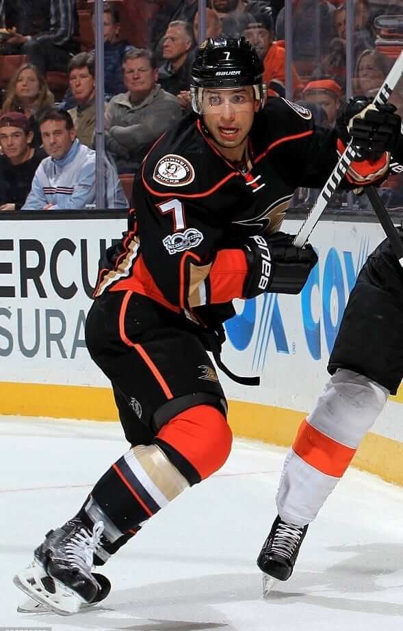
Ducks: Ugh — looks way too cramped, way too busy. One of the worst of the bunch.

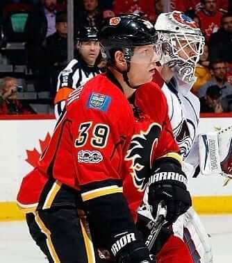
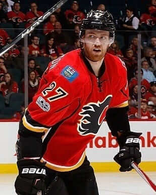
Flames: No stripes to deal with on the upper sleeve, so there’s plenty of space for the patch. Could be worse.
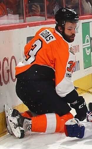
Flyers: No stripes to deal with, so that’s good, although adding a sleeve patch to a jersey that already has two shoulder patches is a bit much.

Hurricanes: A nice, clean jersey design can easily handle the addition of a sleeve patch. Not bad at all.

Islanders: Haven’t yet played in 2017.
Jets: Way too much going on here — two thick sleeve stripes, a two-tone sleeve, a shoulder patch, a TV number, and now the centennial patch. Too much!


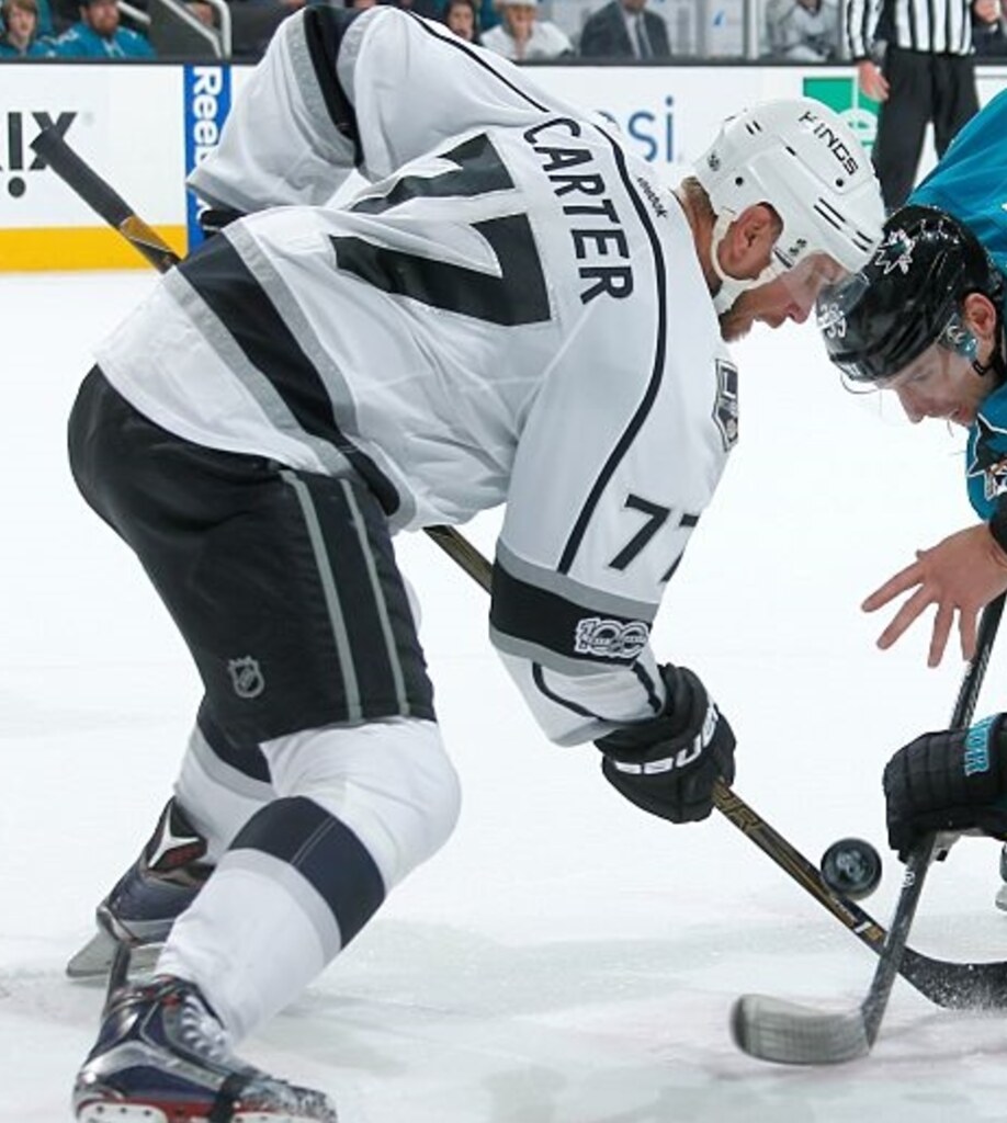
Kings: The Kings have taken the unusual step of putting the patch inside their sleeve stripe. In theory, I disapprove of this, because it takes a serious liberty with an element of the jersey design; in practice, it probably looks better than other option they could have taken, especially given the fact that they’re already wearing a franchise anniversary patch on one shoulder and the All-Star Game patch on the other shoulder. Longtime Uni Watch pal Bob Halfacre is on the Kings’ equipment staff, so I asked him about this. His response: “The anniversary and All-Star patches presented a placement challenge for us. We made a decision to position the centennial patch in a place where it would be most visible.”
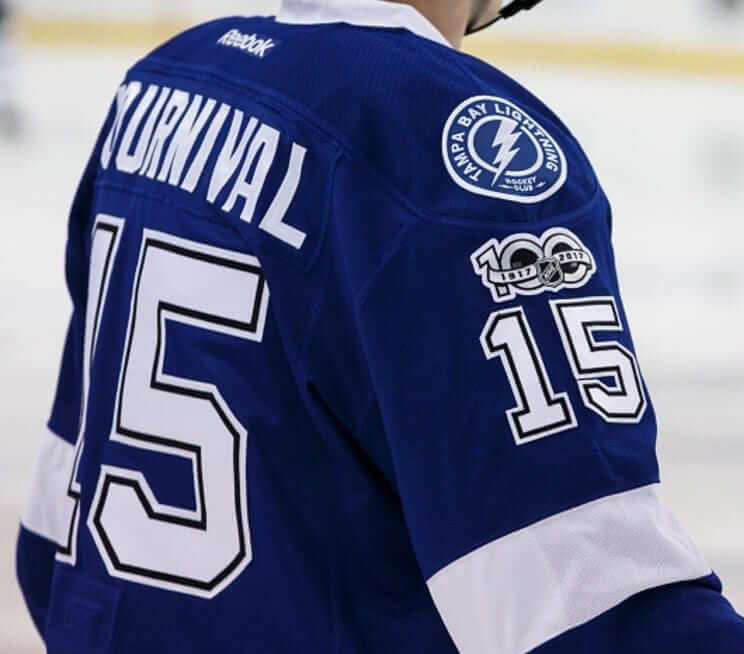
Lightning: The Lightning didn’t have enough room between their TV number and sleeve stripe, so they’ve chosen to put the patch above the TV number — which, unfortunately, puts it too close to their shoulder patch. They might have been better off putting the patch within the stripe, like the Kings did.
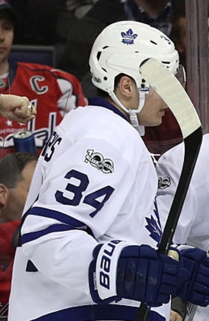
Maple Leafs: The Leafs are another team that’s chosen to put the patch above the number. Since they have nothing on their shoulders — no patches, no yoke — it looks fine there. Much better than trying to wedge it in between the number and the striping.
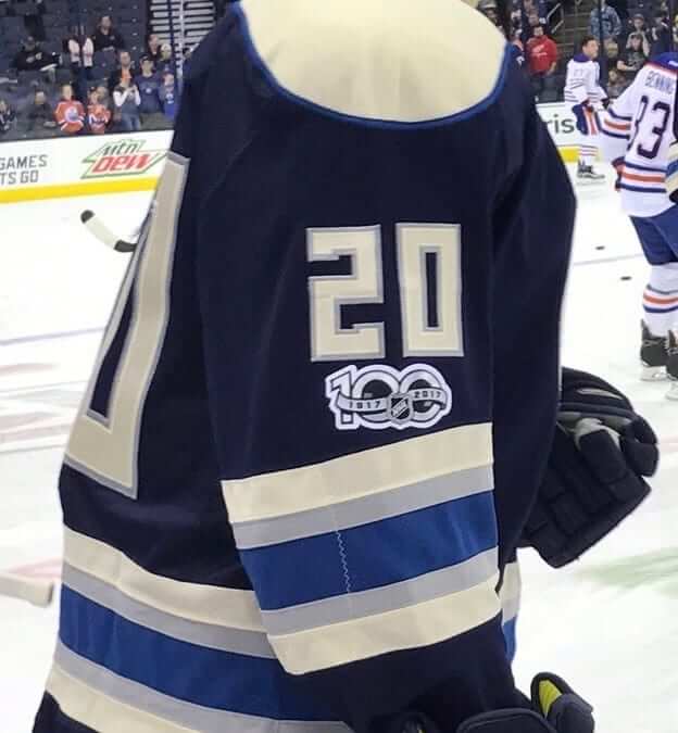
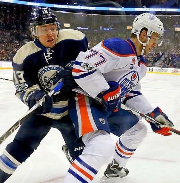
Oilers: The Oilers have taken the most interesting approach of any team: They’ve put centered the patch on the top blue stripe of their three-stripe sleeve pattern. Would centering it on the orange stripe have been better? Hmmmm.
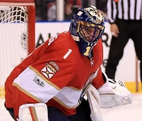
Panthers: The Panthers are unusual, because their TV numbers are on the shoulders, not on the sleeves. But they have big sleeve patches — so where should the centennial patch go? They decided to put it within a sleeve stripe, but they didn’t vertically center it, which looks awful.
Penguins: Haven’t yet played in 2017.
Predators: Not terrible, but not great. If we took all of the centennial patch treatments and put them in a blender, I feel like this is what would come out.

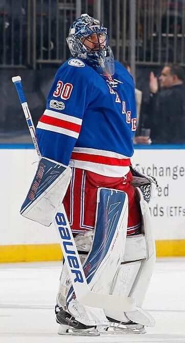
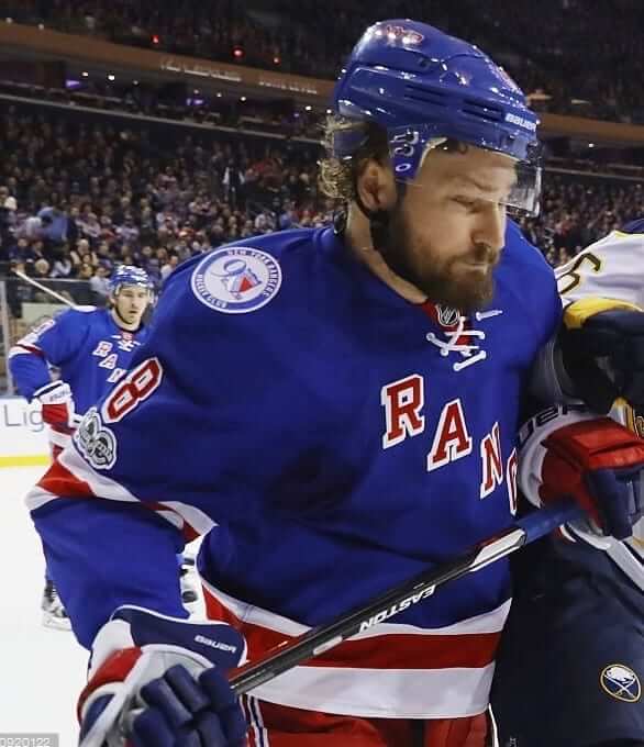
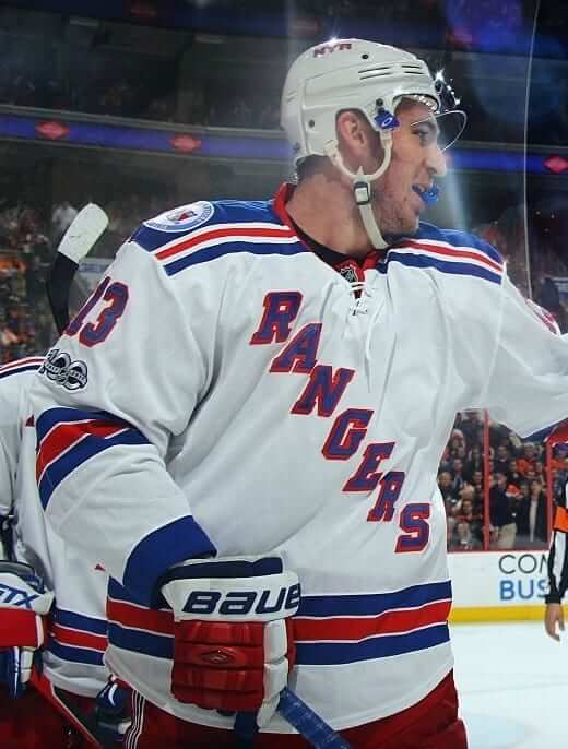
Rangers: The patch on the blue jersey has too tight a squeeze between the number and the stripe, especially when you toss in the shoulder patch. The treatment on the white jersey is even worse, because of the contrasting yoke. Too busy!
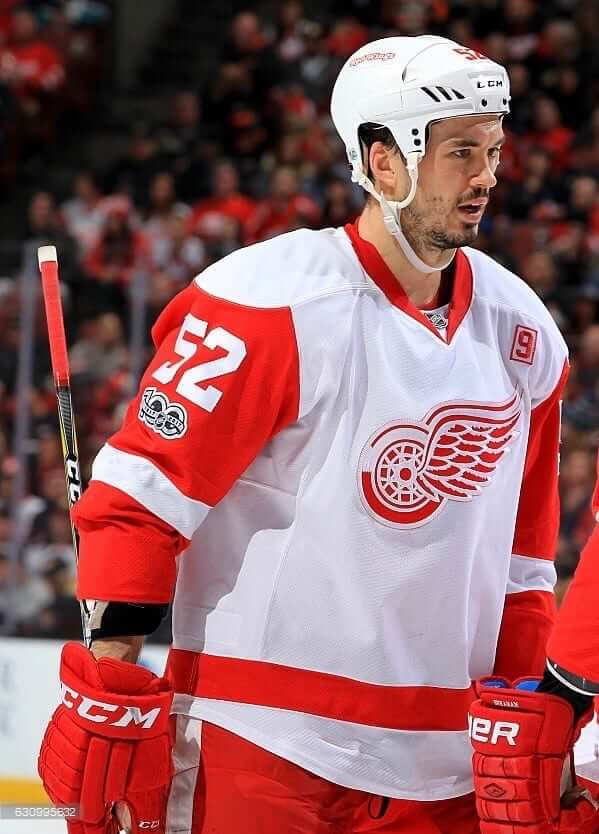
Red Wings: Not a terrible fit, but the patch sullies the elemental simplicity of the Wings’ uniform just a bit:
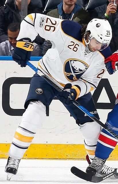
Sabres: The Sabres have a bit more space between their number and striping than most other teams have, so the patch doesn’t feel quite as crowded. If anything, they could probably have positioned it a bit lower instead of putting it quite so close to the number.

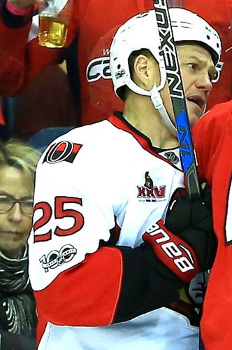
Senators: This one feels like it has just enough space to work fairly well. The white background helps — the shoulder patch, number, and centennial patch each seems to be “floating” in its own reasonably well-defined space.

Sharks: The Sharks are another team with a bit more space than usual between their number and stripe, which provides enough of a window for the patch to occupy without being too visually jarring.

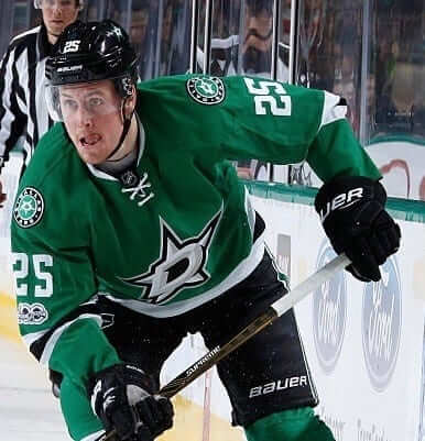
Stars: Your basic mishmash of stripe, TV number, shoulder patch, and centennial patch.
Wild: Haven’t yet played in 2017.
———
And there we have it. Interesting that the league mandated a sleeve treatment for the patch, instead of letting teams decide where to wear it. Some clubs would definitely have been better off going with a chest placement.
Raffle reminder: I’m currently raffling off a custom-painted baseball bat from the Pillbox Bat Company. Details here.
The Ticker
By Mike Chamernik

Baseball News: A new Michigan independent league team, the Westside Woolly Mammoths, revealed its logo, uniforms, and mascot (from Bill Shea, Timothy Pontzer, and Phil). … New jerseys for Bowling Green (from Rick Blanc). … A Cub and and a Pirate endorsing the Phillies? Yes, in these 1964 newspaper ads showing Ernie Banks and Bill Mazeroski promoting Phillies cigars (from Jerry Wolper). … New 35th-season logo for the Las Vegas 51s.

NFL News: The Titans are planning to update their uniforms for the 2018 season. … “I’ve been looking for this equipment bag, featured on the Steve Largent Legacy poster, for quite some time,” says Michael Princip. “Finally found it a few weeks ago!” The bag has “Hester” on it, which is odd, because nobody by that name has ever played for the Seahawks — until now. … In honor of the playoff appearance, the Spirit of Detroit statue is wearing a Lions jersey (from Phil). … The Packers, who only wear captaincy patches for the postseason, named six captains for this weekend’s Wild Card game against the Giants (from @JohnnyOeleven). … We’ve seen this before, but in case you missed it: A fish shop in Iraq is named after Donald Trump and uses his likeness as a logo. As you can see, his hair is the Chargers bolt logo. The illustration was taken from an Uproxx story that worked Trump’s face into every NFL logo (from Chris Kier).
College Football News: Many readers sent this in: New logo package for James Madison. The school unveiled the new logos three days before the Dukes play in the FCS Championship game. … Top high school players will wear black and yellow unis in Saturday’s U.S. Army All-American Bowl. More photos here. … A pest control company poached the AAC logo.

Hockey News: This Saturday the Knoxville Ice Bears will wear a Predators-themed jersey that was designed by Tyler Earles. … The Regina Pats will wear Blue Jays jerseys on Saturday (from Rob Bartlett). … The Ontario Reign, the Kings’ AHL team, will wear silver-and-black Kings fauxbacks for the outdoor game at Memorial Stadium in Bakersfield on Saturday. Also, players in the Alumni-Celebrity game on Friday will wear a memorial decal for Alan Thicke (from Kristopher Sharpe). … The Devils will induct former owner Dr. John J. McMullen to their Ring of Honor tomorrow night and will wear this patch for the occasion. The patch is shaped like the old Colorado Rockies logo, which reflects how McMullen brought the franchise from Colorado to New Jersey, and the patch’s color scheme reflects the Devils’ original colors. Also, here’s McMullen posing with a prototype Devils logo. … The Blues’ Winter Classic jerseys were such a hit that they’re going to wear them for six more weekend games this season (from T.J. Patton).

NBA News: The Hawks will retire Pete Maravich’s No. 44. I was surprised it wasn’t retired already. … The Cavs wore orange throwbacks at home and the Bulls wore white on the road. The Cavs didn’t have the gold championship tab, though (from Kevin Chmura). … The Hornets wore their black Buzz City alts at home, and the visiting Thunder wore white. … The Delaware 87ers will wear R2-D2 jerseys tomorrow night. … Russell Westbrook has “Why Not?” written on the toe of his shoe. It’s the name of his education foundation. … Giannis Antetokounmpo appears on the most recent cover of Sports Illustrated. He’s the first Buck to be on the cover since 1982.

College Hoops News: Florida will wear black uniforms on Saturday (from Hunter Gold). … Last night, Louisville wore “Iced Out” uniforms that have reflective areas that illuminate when hit with a flash (from Kenny Klein). … Tariq Owens of St. John’s has been tucking his uniform shorts into his compression shorts. “Diaper look,” says Brandon Davis.

Soccer News: Which boot is most popular in the pros? The Adidas X 16.1 is worn by more than 10 percent of the 3000 players studied, including Gareth Bale and Luis Suarez (from Geoff Holm).
Proofreading:
“it probably looks better than other other option” (Kings)
“Giannis Ant” Should his last name be spelled out?
Fixed.
Oops. I was going to paste his name in but I forgot.
Maybe it’s just me, but if the NHL would dump the Reebok wordmark (not going to happen, I know) on the back of the sweater, that’d be a great place for the 100th anniversary patch, no? A little less visible, of course, but it wouldn’t be look so cluttered there, and every team could wear it in the same spot.
I will say that the NHL’s placement of the manufacturer’s mark is the least offensive of any sport. I’m guessing manufacturers dislike it because it gets covered by many players’ hair and because it only occasionally shows up in game and promo photos.
I think the helmet would have been a good spot for the 100 logo. Just put it on the sides where many teams have their own logo.
I think the issue is more fundamental: Teams need flexibility on the anniversary logo placement. Some teams have space on the right sleeve above or below the numbers where the logo looks good, or at least doesn’t look bad. But many teams do not, and most of them have space elsewhere on the jersey where the logo would be unobtrusive but still visible. Let each team find its own spot on the jersey, and let the variation be part of the commemoration: It would be a bit of a throwback to the pre-1990s spirit of what used to be the least centrally planned of the big four leagues.
That, or put the anniversary logo on the front of the left leg of the breezer, near the hem. But since that was wouldn’t put the logo on retail merchandise, the NHL would never consider it.
I was thinking that maybe putting the patch on the forearms and with a 90 degree rotation would look good.
Since players normally have their forearms perpendicular to the ice, the patch would look right in pictures and video.
On the shoulder/in the shoulder yoke, when available, makes the most sense to me. Right chest/front-shoulder (as with the NHL 2000 patch) would also have been a good spot. An elbow patch is just very odd on all the teams.
In watching some of last night’s Sweden/Canada semi-final world junior hockey, I noticed something that I hadn’t fully realized with Sweden’s uniforms, a complete lack of sleeve stripes. I was reminded of that this morning scanning the above pictures.
link
In international hockey, changing uni look is very much aligned to the philosophy of the San Diego Padres in the 1970’s, with the one noticeable exception Sweden.
Stripes, sleeve or waist, have disappeared on many jerseys in recent years. Few teams had them in the 2014 Sochi Olympics.
I was poking around the web this morning and stumbled across this fantastic SI article from 1989 on the history of baseball uniforms: link
The Regina Pats will wear Blue Jays jerseys on Saturday (from Rob Bartlett).
It would have made more sense to center the team crest like the Blue Jays’ 1977 uniforms.
Westside Wooly Mammoths: Fine logo, excellent non-scowling mascot, but the uniforms? Good lord. And is the nickname Wooly Mammoths really necessary? You say “Mammoth,” people think, wooly. And while other species of mammoth were more widespread in what is now the United States than the wooly mammoth, the wooly mammoth was probably the only mammoth species in modern Michigan before the genus went extinct in North America. So “wooly” is doubly redundant in the nickname. Everyone is just going to call them the Mammoths anyway, so if the adjective isn’t descriptively necessary, drop it.
I’d go the other direction. Drop Mammoths, call the team the Westside Woollies.
That would work too!
The New York Mammoths were the baseball team in “Bang the Drum Slowly.”
The latest meta-study of mammoth ranges (2015) suggests that mammoths in prehistoric New York would have been the Columbian species, not the wooly species. So good call by Mark Harris naming the team without an adjective!
Hey Ontario Reign, cut the crap and just make those yer regular sweaters already!
Almost across the board, I think the patch looks bad for teams who already had a shoulder patch and okay for the others. I found the presence of 3 patches more visually offensive than how much room the patch had to “breathe”.
Any chance the Bucs change uniforms anytime soon?
If you mean the Buccaneers, no. Even if they wanted to change (which I’m pretty sure they don’t), they’ve only worn the current design for three seasons and are obligated to wear it for at least two more.
Perhaps God willing the Bucs will see the horror they created and begin planning for 2019 or 2020. We can dream of a return of the creamsicle.
Love the Phillies ad.
Ernie and Bill are thinking…
“Sawed-off shotgun hand on the pump, lifting on a forty…”
Left hand? For real?
Swore it was “Liftin”.
I wonder if Keith Murray got “left hand”.
I imagined Ernie thinking “Let’s smoke two.”
The Centennial patch looks like garbage on the various jerseys. The NHL should have gone Euro, and placed it on the front of pants.. there is enough room for it to work and look ok.
The thing that stood out to me about the Donald Trump fish shop was their use of a carp on the sign. They’re generally known as a “trash fish” – bony and muddy tasting.
The Penguins are on a bye week, so we haven’t seen them in action yet, but equipment manager Dana Heinze posted photos of the patch’s placement on the team’s sweaters on Twitter and said that “The league mandates where we wear it.” He might be worth reaching out to for more info. Bob Halfacre with the Kings, too, considering their unique arrangement.
link
Looks like garbage on most of the teams, if you ask me.
the NHL has bye weeks?
Yep…between 1/1 and the end of next month, each team will be given a five-day break in their schedule:
link
Incorporating the patch into sleeve stripe designs looks sharp to me when done well.
I wonder how much the elbow bend influences placement such as in the decision to not vertically align within the stripe?
Looks like crap on the Red Wings, simply because of the poor placement. TV numbers are in the wrong place; they were originally vertically centered, but moved way up with the Edge sweaters. You’d think they would have looked at all that empty space between the numbers and the stripe and centered the patch… and you would be wrong.
The placement of the NHL’s centennial patches on many of the teams jerseys is an OCD nightmare. Not centering them between the TV number and sleeve or not on the middle sleeve stripe is painful to look at.
CONSPIRACY THEORY ALERT
What if… the league is putting the patch on the sleeve as a test, to gauge interest and feedback to determine if… that’s the best place to put advertising? League can take the high ground with not putting ads on the front or back of the jersey, but the sleeves are fair game.
Nah, they’re not that creativity, are they?
Why would they need to? They could look at AHL or European jerseys to see how it’s done.
Just saw the Blues shared a couple of images on Facebook that depict the location of the centennial patch on their home jersey, on the white stripe:
link
Looks a little weird since the stripe is thinner than the patch, which is therefore partially set against a blue background, which I presume they were trying to avoid by putting it on the stripe in the first place. There’s definitely ample space for it directly below the TV numbers.
All of this begs the question, why didn’t the league just come out with a version that would blend a little better with every potential jersey, even if it’s not necessarily rendered entirely in team colors.
The other image they posted:
link
Blackhawks wearing their centennial patch below the number but above the striping (on their home reds)
Being a hockey and baseball fan, the Blue Jays hockey jerseys remind me of the idea of cross-promoting uniforms across the two sports. I would love to see more baseball team logos on hockey jerseys. And, it might be a way to push baseball merchandising in the winter months?
Has anyone done any mock-ups of MLB-themed hockey jerseys, for all the teams?