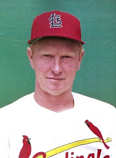
As many of you are probably aware, there’s a new book about the history of the St. Louis Cardinals’ uniforms. I listed it in my recent holiday gift guide and gave away two copies in our recent year-end raffle. I’ve looked through my own copy but haven’t pored over every word, so I missed something that reader Paul Gardner spotted.
Some quick background: 1964 was the year the Cardinals introduced their now-familiar red caps for home games. Up until then, they had worn navy caps at home and on the road, but in ’64 they wore red at home while maintaining the navy caps on the road.
But here’s the thing: According to the book, the red home cap for the ’64 regular season had a blue “StL” logo. Then, according to the book, they switched to the more familiar white logo in the World Series.
Here are the two pages of the book that spell this out (click to enlarge):
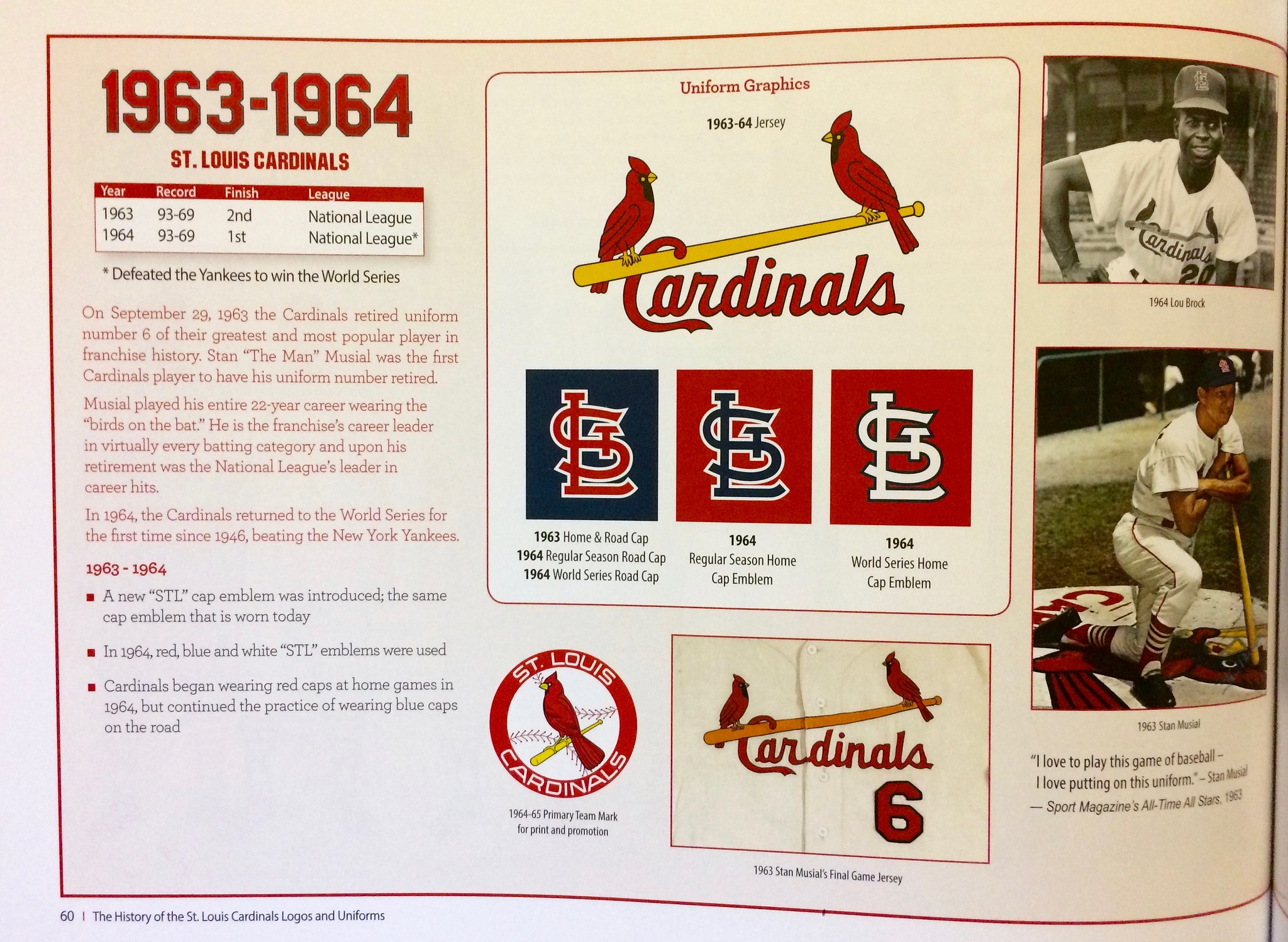
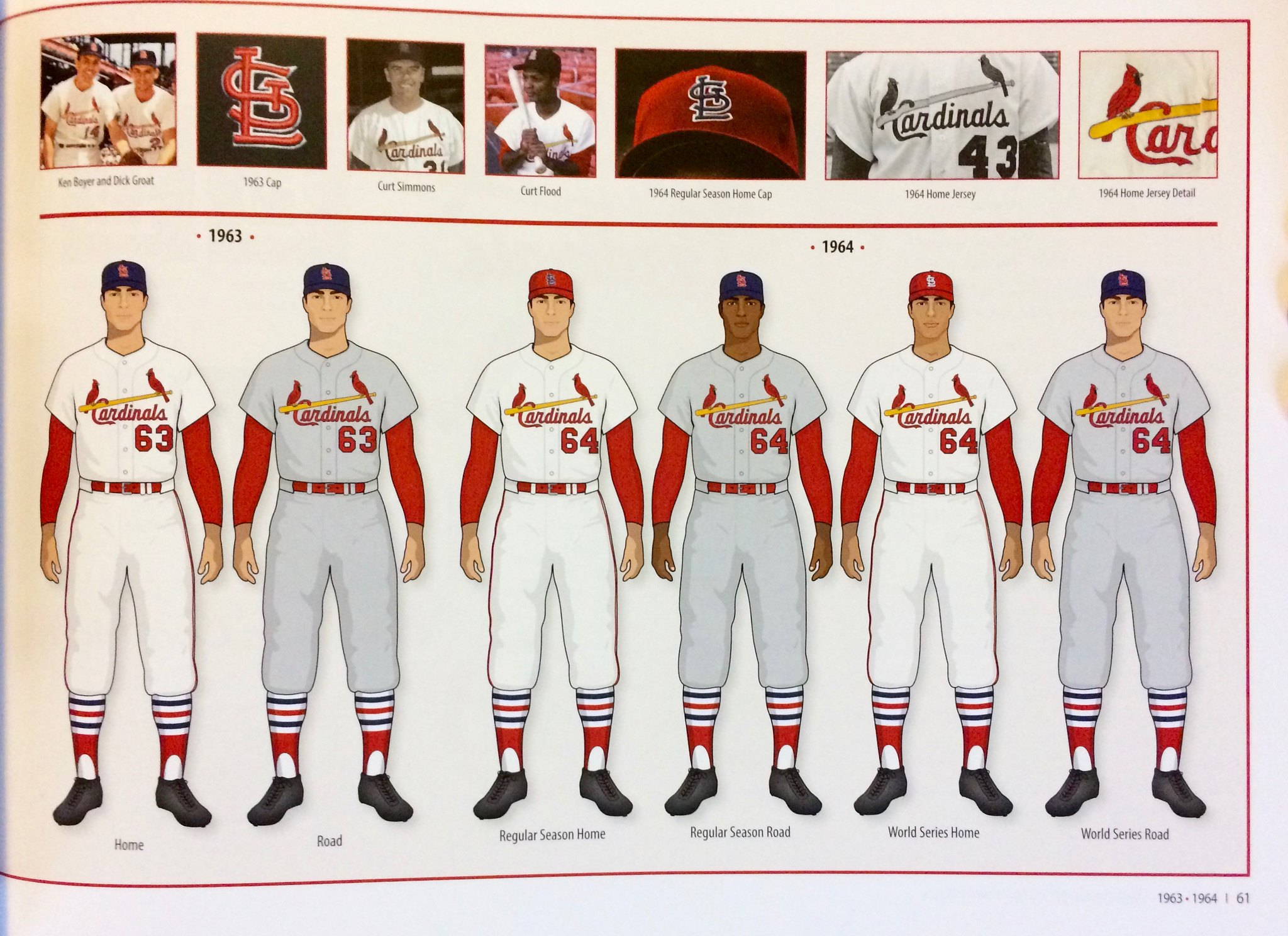
As you can see in the center of the first page, the book claims that the blue logo on the red cap was used during 1964 regular season home games, with the white logo being used in the World Series. But the only photographic substantiation of this claim is a staged black-and-white photo of Lou Brock (upper-right corner of first page) and a context-less color close-up of the cap itself (top-center of second page). There are no game photos.
I had never heard of this red/blue cap before. Had I somehow missed the boat on it? I checked Dressed to the Nines, which, as I suspected, showed the cap with a white logo. But as we’ve learned over the years, Dressed to the Nines is not infallible, so I checked for game photos in three wire service databases. Unfortunately, none of them had a good shot of the Cards in a 1964 regular season home game.
So then I contacted my usual go-to guys for this sort of thing — uniform designer/researcher Todd Radom and Baseball Hall of Fame curator Tom Shieber. By coincidence, Tom had just been emailing with one of the authors of the Cards uniform book, Gary Kodner, so he looped him into our discussion.
After a lot of back-and-forthing among us, here’s what emerged:
1. There are lots of 1964 photos floating around that appear to show a red cap with a blue logo. Most are in black-and-white, some may be from spring training, and none are from game action (if you can’t see the slideshow below, click here; as an aside, the first photo shows outfielder Curt Flood with his jersey sleeves tailored v-e-r-y short):
2. We all agreed that these photos are interesting, but none of them qualified as a smoking gun — we wanted a game shot. We came closer when Gary provided this newspaper clipping showing Cards third baseman Ken Boyer wearing the blue-logo cap while standing in the dugout during a game on July 5, 1964:
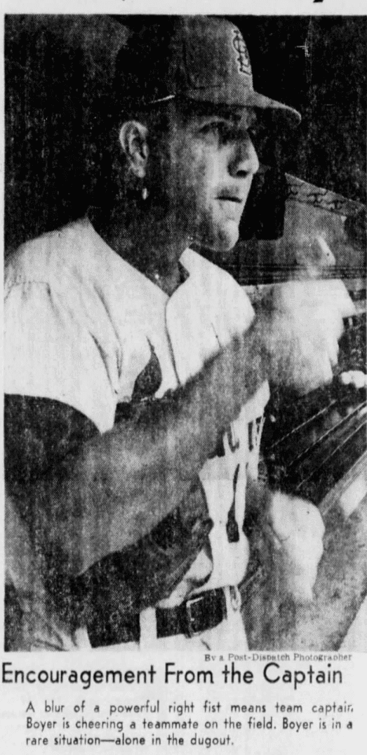
But while that shot was taken during a game, it didn’t show Boyer on the field. We still wanted to find evidence of that.
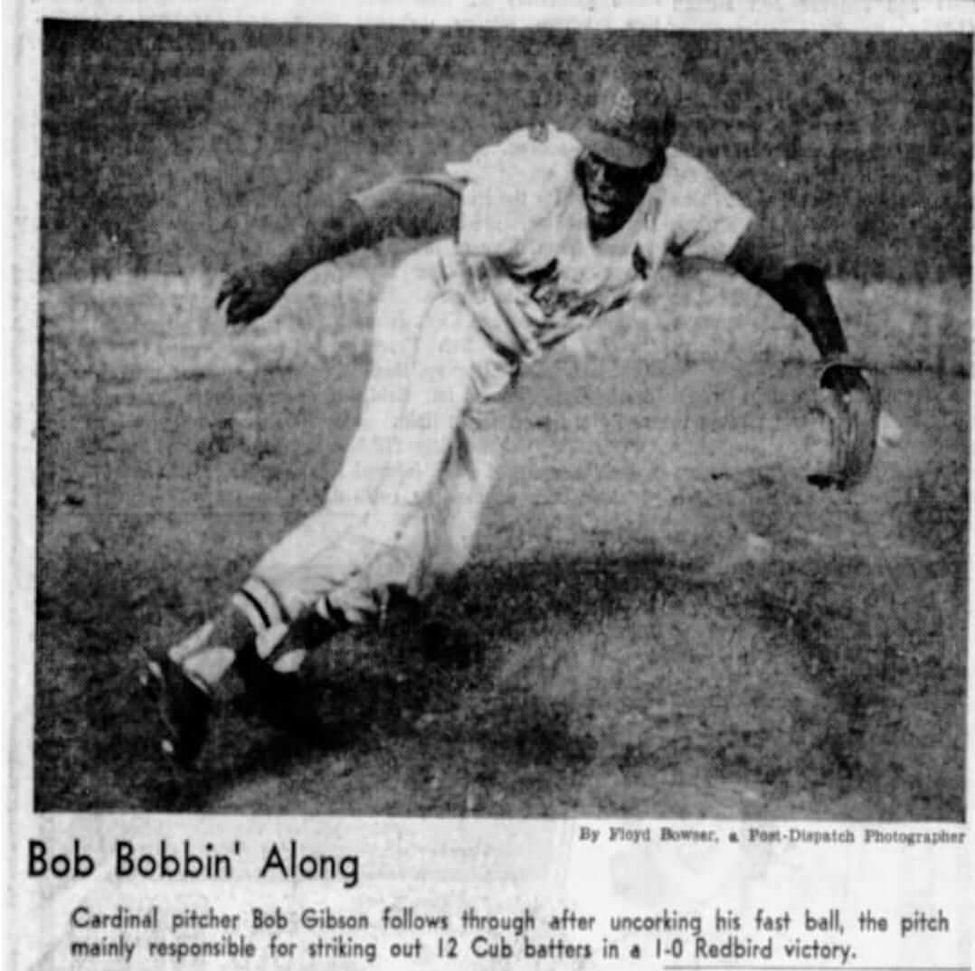
3a. Tom finally provided the clincher with this shot of Bob Gibson from May 21, 1964. While the shot is a bit blurry, the cap logo definitely appears to be dark, not white (click to enlarge):
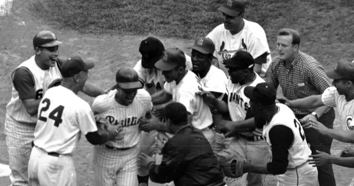
3b. Gary then provided a shot from the 1964 All-Star Game. It’s a photo I’ve looked at many times over the years, because it shows Johnny Callison of the Phillies completing his home run trot after winning the game with a walk-off shot while wearing a Mets helmet. I’d never noticed that the photo also includes several Cardinals wearing the red cap with the blue logo (click to enlarge):
And from that same All-Star Game, here’s a shot of Ken Boyer wearing a batting helmet that appears to have a dark (i.e., blue) logo (click to enlarge):
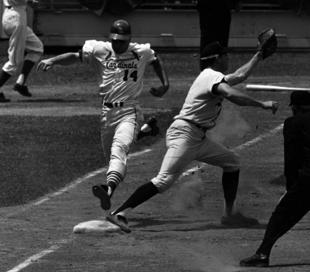
Granted, an All-Star Game isn’t the same as a regular season game, but we already had the Gibson photo from May 21 and all the posed non-game shots. The All-Star photos seemed like good supporting evidence.
4. We had now established that the Cardinals did indeed wear a red cap with a blue logo during the 1964 regular season. But did they wear it for the entire season, and then switch to a white logo in the World Series, as the book claimed?
One part of this is easy enough to confirm: The Cards did indeed wear the white logo in the ’64 Series.
Gary then found this shot of Cardinals manager Johnny Keane wearing the white logo on Aug. 25, 1964:
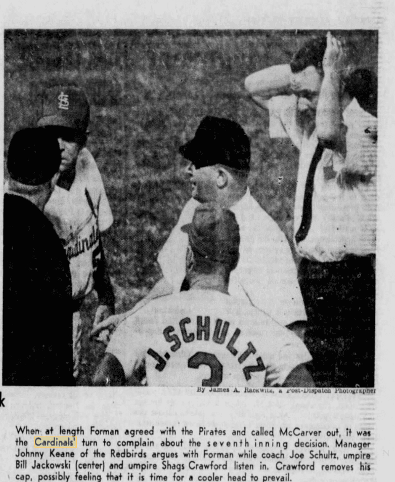
Now, Keane was the manager, not a player. Still, nobody in our discussion group was aware of Keane and/or his coaches wearing anything different from what the players wore. So based on this photo, it would appear that the Cardinals switched from blue logos to white logos at some point between July 5 (the date of the Ken Boyer dugout shot) and Aug. 25. Gary is still working to confirm the exact date, and the reason for the change. (As an aside, the Keane photo also shows coach Joe Schultz — who would later become the Seattle Pilots’ first manager and have a starring role in Jim Bouton’s seminal book Ball Four — wearing FIOB. That’s presumably because the team’s 1964 roster included pitcher Barney Schultz.)
5. In the course of our discussions, Gary produced this newspaper clipping from March 2, 1964, about the new red home caps. It doesn’t mention the color of the logo, so it wasn’t really germane to our investigation, but it’s still interesting. Among other things, it mentions that Stan Musial’s retirement was part of the impetus for changing to a red home cap:

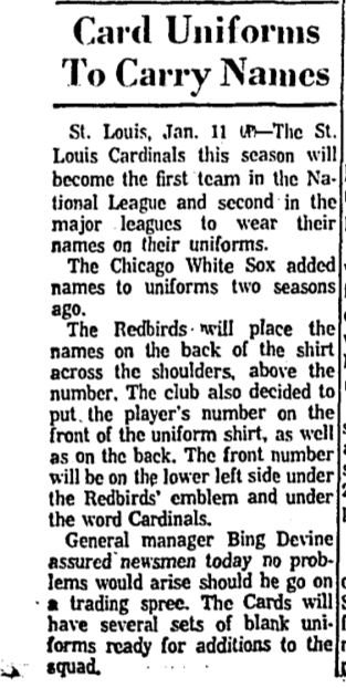
Also of note: The final graf of that story says, “Most recent change in the Cardinals’ uniform came two years ago [i.e., in 1962], when [general manager Bing] Devine decided that the Redbirds would become the first National League club to display the players’ names on the back of their shirts.”
So the 1962 Cards were the first NL team to wear NOBs! I had thought the Braves, who were still in Milwaukee in those days, held that distinction (although I no longer recall why I thought that). I mentioned this to Todd, who promptly provided a 1962 AP item on the subject:
So we mostly solved a history mystery and got lots of other good uni-related tidbits along the way — all because reader Paul Gardner asked me about the book’s reference to the blue logo. Big thanks to him for getting this ball rolling.
Click to enlarge
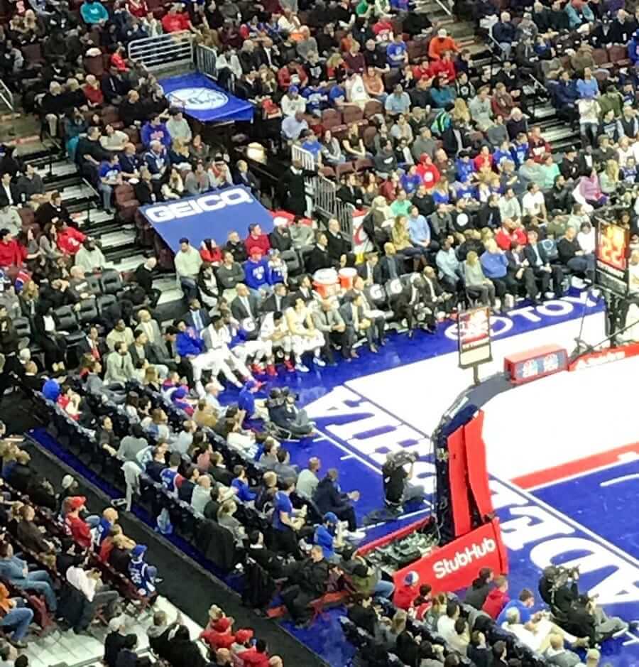
Idiocracy, continued: The 76ers, apparently not content to sell space on their jerseys to corporate sponsors advertisers, are now doing likewise with prime seating. That’s a photo from last night’s game, with a big Geico ad occupying a set of fifth- and sixth-row seats.
Yeah, I know — ha-ha, the Sixers stink, they can’t even get fans to buy those seats, ha-ha-ha. But the reality is that this is yet another example of advertising spreading into every nook and cranny of the sports experience. It’s also worth asking what would happen if you or I wanted to buy those seats and use them to showcase our own message promoting a given cause (like, for example, “Too Many Ads”). Would that be allowed? If not, why not? What if some fans sitting next to the Geico ad happened to be wearing Progressive or State Farm T-shirts — would that be allowed? If not, why not?
Then again, it could be worse. In 2014, Bayern Munich had fans dressing in white to form a Deutsche Telekom ad.
(My thanks to @hclint4444, Robin Griffiths, and our own Alex Hider for their contributions to this section.)
Collector’s Corner
By Brinke Guthrie
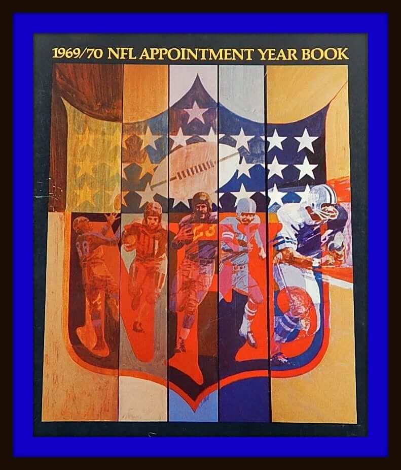
Let’s roll out the first Collector’s Corner of 2017, shall we? Hope everyone had a good holiday season and that Santa was as good to you as he was to me. As we begin the new year, let’s start out with this 1969-1970 NFL Appointment Year Book. Plenty of space to jot down your appointments, and it has the 1969 NFL schedule for those cool-named Central, Coastal, Capitol and Century Divisions.
Now on to the rest of the week:
• I don’t think I knew the great Carl Eller played for the Seattle Seahawks after his legendary run with the Vikes. Yet here he is on a Seahawks promo drinking glass.
• Here we have a 1970s St. Louis football Cardinals helmet plaque, which looks like it’s in pretty good shape. Made by Gresh Enterprises of Indianapolis. Always wanted a Cowboys one back in the day.
• This Philadelphia Eagles glass shows off that unique font they used back in the 1970s. And the classic kelly green and silver, too.
• This 1960s-1970s Packers jersey from Champion features No. 11. Didn’t they usually just make jerseys with star players’ numbers on them? I could see them doing a 5, or a 15, or a 31. But 11 is a mystery.
• Browns fans, it’s been a long season. So treat yourself to some ice cream in one of these 1970s Dairy Queen promo helmets. Bengals fans, here’s a set for you, too.
• Did the Brewers have a beaver as a mascot back in the 1970s? Or a gopher? This bumper sticker would seem to support that theory.
• Interesting rendition of the classic Cincinnati Reds “running man” logo on this 1976 pendant.
• Converse had their logo on one side of this 1960s-1970s vintage Chicago Black Hawks puck. It also says “Dist. by CCM” and “Art Ross Tyer.”
• Here’s a 1970s K.C. Chiefs “nap sack.” I think they coulda made the helmet logo just a tad bigger, but that’s just being nitpicky.
• Here’s another Chiefs item: a book titled Quarterback Technique, from a rather intense Len Dawson.

New raffle for the new year: Our friends at the Pillbox Bat Company have generously agreed to give away one of their beautiful custom-painted baseball bats to a lucky Uni Watch reader. The winner will get to choose from any bat in the Pillbox catalog.
To enter, send an email with your shipping address and your bat choice to the raffle address by next Monday, Jan. 8, 7pm Eastern. One email per person. The winner will be announced on Jan. 9. Good luck!
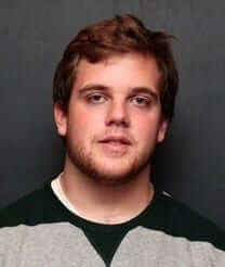
Uni Watch HR announcement: Back in May, Alex Hider (that’s him at right) joined the Uni Watch team, creating the Tickers that run on Mondays. His work has been excellent, and I’m happy to announce that as of today, Alex is now compiling the Wednesday Tickers as well. Please join me in congratulating him on his expanded role here at Uni Watch.
With Alex’s promotion, our Ticker schedule now looks like this:
• Mondays, Wednesdays: Alex
• Tuesdays, Thursdays: Mike Chamernik
• Fridays: Me
• Saturdays, Sundays: Phil Hecken
These daily assignments sometimes fluctuate, as we occasionally cover for each other or trade days depending on our personal schedules. (Mike, for example, has some outside obligations next week, so I’ll be covering both of his days.) The Ticker is always bylined, so you can see who compiled it.
The Ticker
By Alex Hider

Baseball News: Check out all the awesome stuff at this souvenir stand in a vintage photo of old Comiskey Park (from Bob Andrews). … Lots of cool artifacts ”” including an awesome neon sign ”” at Joe Marty’s, a recently restored sports bar in Sacramento (from Damon Hirschensohn). … BSmile found a photo of this 1923 World Series press pin. … The Sioux City Explorers have a new 25th-season logo (from Mitchell General).

NFL News: The Seahawks’ new long snapper, Tyler Ott, will wear No. 69. Insert all the obvious jokes here (thanks, Mike). … This shot from 2012 shows that Washington repurposed Kirk Cousins’s jersey when he switched his number from 12 to 8 (from Steve B.). … Michael Metzger points out that Dolphins QB Dan Marino did not have an NFL 75th-anniversary patch during the famous “Fake Spike” game in 1994. … Here’sa strange ’90s mini-helmet collection: Mike Monaghan points out that the LA Raiders and Rams, the Phoenix Cardinals, the Jags and the Panthers never existed at the same time. … We may have seen this before, but a Bills lineman had non-matching pants striping during the team’s miracle playoff comeback against the Oilers in 1993.
College Football News: Following up on yesterday’s lede regarding William VanDeSteeg’s odd NOB, it turns out that his college NOB at Minnesota was all-caps — sometimes with spaces and sometimes without (from Cork Gaines). … Reddit took on the task of ranking the uni matchups of the 2016-17 Bowl Season (from Ben Whitehead). … Clemson’s football facility has a whole wall of cleat and glove options (from Harrison Huntley).

Hockey News: Expect to see the Devils wearing white at home on Friday against Toronto, in honor of Dr. John J. McMullen’s induction into the team’s ring of fame.. … Robby Fabbri of the Blues had blue tuuks on his skates during the Winter Classic Monday. For those (like me) who don’t know what tuuks are, they hold the blade to the skate (from Matt Doyle). … There’s a new sound at Rangers games, because Madison Square Garden has a new organ.

NBA News: The Warriors will break ground on their new San Francisco arena on Jan. 17 (from Brinke). … There’s a new sound at Knicks games, because Madison Square Garden has a new organ. … Jimmy Butler of the Bulls forgot to take off his warmup shirt when re-entering the game Monday night (from Mike).

College Hoops News: Pitt will debut its gold unis for tonight’s game against Virginia (from Adam). … This 1975 matchup between North Carolina and Clemson looks like a dandy in black-and-white. Imagine what it looked like in color! (From J. Huckel.)

Soccer News: Check out the fauxback jerseys Patrick Cummings created for the NASL’s Indy Eleven. … The official mascot for the 2017 African Nations Cup is a black panther named Samba (from Mark Coale).

Grab Bag: Frederick Douglass High, a school set to open later this year in Lexington, Kentucky, has reversed its decision to nickname its teams the Stallions after complaints claimed the team name was inappropriate and sexist. A stallion is, by definition, a male, and female athletes didn’t want to play under that name. The school will pick a new horse-themed name soon (from Josh Hinton). … You want to see color vs. color? Check out this cricket match that featured bright green vs. bright green.
Bayern still has those “fans“ forming the T.
Linked story says that those seats are filled by DT apprentices and grad students (so interns, I guess). It isn’t like DT is co-opting ordinary fans into putting up an ad. If my company gave me free tickets to a highly sight after event, on the condition of wearing a certain color to create the corporate logo, I’d do it too.
The company probably asked for those seats as part of their sponsorship, but even if they bought them on the open market, they are using those seated without creating a disturbance for those in the vicinity.
It makes me wonder – if UPS managed to get its hands on a bunch of seats at FedEx and had their employees wear clothing that created the logo, would the NFL make a stink about it? What if it was the Pepsi or other competitor to an iconic league-wide sponsor?
So is that what New Era caps are named for?….
“1922: “E. Koch Cap Co.” was renamed the “New Era Cap Company”. New Era would produce a full line of men’s casual and uniform caps, but few sporting goods products. New Era’s line in the 1920s included caps like the “newsboy”, an eight panel wool cap with a short bill and a loose fitting crown top, as well as fedoras.”
1934: New Era’s first Major League Baseball (MLB) caps are produced: the Cleveland Indians Home and Away caps
1979: New Era tried a direct marketing tactic. The company runs an ad in The Sporting News offering pro fitted baseball caps to anyone who sent in a check or money order for $12.99. The response is overwhelming and helps shape the future of the fan-driven pro licensing business.
– link
Carl Eller played for Seattle in 1979.
Following in the footsteps of Bob Lurtsema in 1976…
Benchwarmer Bob!
Re: Stallions nickname. Ever notice that there are a lot of horse-themed nicknames (Colts, Broncos, Mustangs, Stallions, etc.), but nobody is ever just called “The Horses”? I wouldn’t want that name either, but I think it’s interesting.
Congrats on the promotion Alex!
-One interesting nickname for a horse-theme team arose in the CFL in 1994. That was during the 3 years of the ill-fated attempt to put expansion teams in the US (which I despised – a topic for another day).
The Baltimore CFL Colts were born in 1994. However, the NFL went to the courts and was able to get a legal injunction against the team using Colts in their name just before their first game.
It was a bit late to change the name and uniforms. So they were often called the Baltimore CFLers or Baltimore Football Club in 1994.
During 1994, they were also referred to in the media as the “Horse With No Name”, which is also a reference to the song by Canadian singer Neil Young.
The did settle on the name Baltimore Stallions for 1995. Then the CFL went back to being all-Canadian again in ’96. The Stallions relocated to Montreal to become the reborn Montreal Alouettes, version 2.0.
“A Horse With No Name” was by the band America. Neil Young had nothing to do with it.
Your right – my bad – got confused there. It was America. There was some controversy about the song sounding like Neil Young’s work.
Easy mistake. It sounds a lot like him. When I was a kid I thought “Ruby Tuesday” and “Mrs. Robinson” were Beatles songs, and when I first heard “Walking in Memphis” I thought it was Eddie Money.
America vocalist Dewey Bunnell sounds a lot like Neil Young.
The Baltimore CFL franchise was actually quite successful drawing 30,000 or more quite frequently. They still have some fans that attend the Grey Cup every year. The rest of the U.S. teams…not so much.
Stallions facts!
* The Stallions are also the only US based team to win Grey Cup.
* O. J. Brigance will probably be the only player to ever win a Grey Cup and Super Bowl for the same city.
The reason why the Baltimore Stallions relocated to Montreal was because the Cleveland Browns moved to Baltimore and became the Baltimore Ravens in 1996. If that had not happened, the Stallions would have probably remained in Baltimore for the 1996 season.
They used to sell some CFL Colts stuff in Baltimore before the name change. I had this cap.
link
And America is nothing like Neil Young. They’re listenable.
Saratoga Springs, NY High School – Thoroughbreds (Summer meet of thoroughbred racing in the town)
I take that back – Saratoga High School are the Blue Streaks; Skidmore College, located in Saratoga, are the Thoroughbreds
I’d root for a team called the Horses.
The Cousins photo is from preseason, FWIW. He’s had an *interesting* time with that franchise.
Proofreading:
“Souix City Explorers”
“has >reversed its decision”
Fixed.
The varmint on the Brewers bumper sticker looks like a walrus to me. Perhaps i will now google to see what the connection night be.
OK, best I can tell, there is/was a bank in Milwaukee called Marine Bank who had a mascot named Wally the Walrus. He wore a tie with a ship’s wheel on it. I *think* that is who is depicted on the Brewers bumper sticker.
Collector’s Corner: That’s a sponsor’s logo on that Brewers bumper sticker, and neither a beaver nor a gopher. It’s Wally the Walrus from Marine Bank in Milwaukee. The bank used Wally during the ’70s and into the ’80s if memory serves.
Most of the NHL teams are wearing the 100th patch in the same spot as the Rangers
I actually meant to remove that item when editing the Ticker (and have now done so). I’ll have a deeper look at the NHL’s centennial patch soon — possibly tomorrow.
*Actually, I believe all the teams are wearing it there…just a quick peak on NHL.com can verify in pictures:
Sabres, Caps, Habs, Canes and Devils…
That Packers jersey … Punter David Beverly wore #11 for the Packers from 1975-80 (per the Green Bay all-time numerical roster on the team website). Would be a weird guy to highlight.
For a 50-year stretch or so, Beverly and later, kicker Eddie Garcia, were the only Packers to wear #11 for more than one season.
Great info on the Cardinals. Just when I thought I knew everything about the Redbirds’ uniform history!
Wouldn’t it be a hoot if this was an elaborate April Fools joke and someone actually went through and planted some photos and newspaper cut-outs and photoshopped other photos? I would be very impressed.
RE: St. Louis Cards items – Let’s not forget the Father of the NOB movement for all sports, Bill Veeck.
The Stallions item made me realize that my alma mater (Delaware) plays under a female-gendered nickname, a fact that had never occurred to me before. I couldn’t come up with any other similar teams, but I’ve (thankfully) never heard any sort of mention or controversy over it at UD.
Teams at Pomona-Pitzer (in California) are called the Sagehens.
What about Bulls? Does any school take umbrage over that gender-specific name?
Maybe they should. Or maybe some female athletes do, but the name was already established decades ago and there’s nothing they can do about it. The Stallions situation was different, because it’s a new school with a new name.
Simple thought exercise: What if they had chosen Mares instead of Stallions? “That’s silly,” you say, “because they’d never choose Mares.” Exactly.
If this dustup rids us of the Gamecocks, then it’s all for the good.
IIRC, when I was in college the men’s teams at SUNY-Buffalo were called the Bulls, whist the women’s teams were the Royals.
When I went to Hofstra, the men were the Flying Dutchmen and the women were the Flying Dutchwomen (although I always referred to them on-air as the “Lady Dutch”).
Delaware was the Blue Hens, and the women, again IIRC, were referred to somewhat redundantly as the “Lady Blue Hens”.
Hope College in Holland (MI) is also the Flying Dutchmen for men’s sports, and Flying Dutch for women’s
My alma mater, Wheaton College in Massachusetts, is the Lyons, after the school’s founder, Mary Lyon. The logo and mascot is, as you might expect, a lion. Interestingly, it’s a female lion. I can’t think of any similar examples.
The school was an all-female college until 1988, and I’m pretty sure the name and logo predate 1988, so that’s probably important to note.
My Cousin’s HS in Rondout Valley, NY is the Ganders (Male Goose) and their women’s teams are the Lady Ganders. I always thought that was pretty dumb.
My High School’s rival team was the Johnstown, NY Sir Bills (after Colonial lord, Sir William Johnson), The women’s teams, The Lady Bills.
Bauer TUUK is a brand name associated with blade holders as well as skate blades. Other companies also make blade holders.
Always liked that [football] Cardinals logo better than the current one. Still can’t figure out why they felt the need to change it.
Regarding that mini-helmet package showing teams that “never existed at the same time,” I would guess that the package was designed and printed some time in 1994 (note the copyright notice in lower RH corner) before the L.A. teams relocated and before the Cardinals’ geographic-name change (or so soon thereafter, before the season began, that the designers simply failed or neglected to acknowledge it), and included the Panthers and Jaguars whose franchises had already been awarded and named and were about to begin play the following year. I’d love to see which Jaguars helmet design was included in this set, viz., the final ’95 version or or one of the prototypes.
I recall that the Raiders were still the L.A. Raiders at the 1995 NFL Draft (referred to simply, and for the first and only time, as “Los Angeles” since the Rams by then had moved), and I kept seeing the phrase “L.A. Raiders” in various places during the 1995 season well after they should have been “Oakland.”
Looking at the mini-helmet package again, it appears to be a package for a single mini-helmet, not a set (I was thinking gumball helmets). The legend, “COLLECT ALL NFL TEAMS!” at the top and the inclusion of Jacksonville and Carolina suggests that either the mini-helmets for those teams were already available in early 1994, or that they would be coming out shortly.
Looking back now, there was a lot of upheval in the NFL between the end of the 1993 season and the beginning of the 1995 season. Anything producted during that period is likely to have glitches like this.
Just about to make a comment about this, but you covered it all.
The only thing I’ll add is that there might not be any glitch in this packaging, at all.
Per the Cardinals own website, the name change from Phoenix to Arizona didn’t occur until March 17, 1994. link
There was also definiely tons of Jags and Panthers merchandise circulating by this time.
It’s only a “glitch” to the extent the actual league of actual teams actually playing each other never actually looked the way it appears, even though all of the information was technically correct at the time it was printed.
Meaning, prior to March 17, 1994 it would have been perfectly reasonable to expect that in 1995, there would be an NFL that included the L.A. Raiders, L.A. Rams, Phoenix Cardinals, Jacksonville Jaguars and Carolina Panthers. Or, in the alternative, one could argue that the latter two were already in the league even though they hadn’t begun play yet, thus the information was correct as to how the NFL was constituted at the time of printing.
The item is a curiosity because so much changed between the beginning of 1994 and the middle of 1995 — two teams moved and one changed its name before two expansion teams took the field — that it ended up being a snapshot of a league that never actually existed.
Tuuk is a specific brand of blade holders that comes standard issue on every Bauer skate. You can however buy a different brand of skate, like CCM, and remove the CCM holders in favor of Tuuk. The blade that holders hold is the blade/runner/steel (synonyms) that makes contact with the ice and gets sharpened every so often.
Robby Fabbri is a CCM athlete, those are CCM Ribcor skates, and I’m pretty sure those runners are CCM also. So not quite ready to call then Tuuks.
Blue Tuuks were often used by the 1980’s Oilers who were really really good at hockey, so now they have a bit of a throwback connotation.
Just for the record.
Gretzky wore Perfecta blade holders when he played for the Oilers.
Those are Tuuk holders that Fabbri is wearing. Matt Duchene, also a CCM guy, wore special blue CCM blade holders for last years Stadium Series. You can tell the difference based on the hole pattern in the plastic.
link
Great info all around, thanks.
Actually, it’ looks like he’s wearing Reebok Ribcor skates. Reebok stripes on the inside of the boot, and the green name just before the toe cap definitely looks more “reebok” than “CCM” Must’ve got them before CCM switched all branding to CCM from Reebok.
I’m aware of this little tweak because I managed to get a pair of Reebok Ribcor skated for less than half price because of the CCM switcheroo.
As pointed out, the are not CCM “speedblade 4.0” holders, standard issue on Reebok/CCm skates. They are Tuuk lightspeed edge holders. The little black spot in the last “hole” is a trigger for quick release of blades You can see it better here:
link
RSB
The STL cap story is uni-watch gold. Thank you!
Just guessing here, but that helmet collection is probably from 1994. The Jaguars and the Panthers were formed at the end of 1993 while the Raiders and Rams still played in Los Angeles (last year in LA was 1994 I believe. The Cardinals moved to Arizona in 1987 and only changed their name from Phoenix to Arizona in 1994.
That sounds about right. Everyone knew the Panthers & Jaguars were coming into the league. It’d be interesting to see the actual helmets… did that set have the Jags in silver?
“But the reality is that this is yet another example of advertising spreading into every nook and cranny of the sports experience.”
And will it ever recede? Do you think they will ever have any conceivable reason to pull back on any of it? It seems that all of us who notice it and are bothered by it still turn out.
I suspect there’s a healthy percentage of potential new fans coming up who are instead turned off by what appears to be just a parade of bland corporate signage, and never develop an interest in sports. But I know there’s a generation coming up that has virtually no relationship with baseball because MLB allowed it to be cordoned off onto cable TV, at the right price, because the current crop of owners and executives aren’t really concerned about the revenue streams of the ones ten or twenty years from now.
To be fair, if you look at old photos of cities or ballparks, you’re bound to find a *lot* of advertising. In many cases, it’s charming and better looking than today’s advertising, but it’s still advertising. This is nothing new.
A fitting nickname for that Kentucky HS would be the Geldings
James Madison players are Dukes. The women’s teams don’t go by Duchesses or Lady Dukes (not that I know of anyway).
The women’s basketball jerseys just say JMU.
Any chance that advertising is like a batter’s eye in baseball? If you are shooting from the corner, that spot is visible, so it is possible? Just a theory. Is it on every corner?
The Curt Flood sleeves in the St. Louis cap story reminded me of Deion Sanders in 1997 when he shortened his sleeves as a tribute to Jackie Robinson. MLB insisted that that the Reds’ uniforms had to be “uniform” so the rest of his Reds teammates shortened their sleeves to bring the team into compliance with the MLB directive.
Paul wrote about this in 2000 for the Village Voice; link
And again for Slate in 2003: link
New Titans unis in the works. link
Nooooooo…….
Here’s hoping they don’t screw things up too badly. I actually like their current uniforms, mostly.
Same.
Lee
They just have an add mix of traditional and modern elements. Tapered helmet stripe, traditional pant stripe, flames, techy numbers. They could definitely clean things up. Here’s hoping they do it well.
Before looking at the article’s accompanying graphic, I had forgotten that the Titans went by Oilers during their first two years in Tennessee.
link
Good. Fix the helmets, get rid of the contrasting shoulder yoke. Colors are fine, number fonts are fine, they should keep those.
The number font is the first thing that should go!
Keep the contrasting shoulder yoke (on the white jerseys at least) and change the number font to a solid block. De-emphasize the navy and change the horrible logo.
I really like how the unis look with the with the Nike update. Slightly deemphasized the shoulder yoke. I’d love to make the logo on the helmet simpler and more visible from far away, change the early 2000s number font, and make the navy over white primary again.
The quotes from owner Amy Adams Strunk are mostly encouraging, until this:
“It’s a great process with the people at Nike and NFL Properties, the creative director there, it’s fantastic. They have great ideas.”
Sloppy pronouns, so we can’t be sure which creative director she’s talking about, but it sort of doesn’t matter. The point is that the ideas are coming from outside the organization, not from within. Given Nike’s penchant for subverting client needs and identities to promote Nike brand messages, Titans fans should be very worried. Any design process in which Nike is generating “ideas” is likely to produce a very bad outcome for the client.
The way that sentence is structured, it seems she’d be talking about the creative director at NFL Properties (granted, that might not be much better.)
For the Packers jersey- could it be number 11 after the team’s number of championships at the time?
Yes, Super Bowl II was their 11th!
Getty’s got some pictures showing Marino not wearing the 75th Anniversary patch the week before in Pittsburgh as well
link
Sixers actively put ad over fans. Sickening
Never knew about the St. Louis Cardinals red hat with blue “STL”. After seeing that, it’s my firm belief that the Cards should go back to that style.
Really? I find that much too hard to read.
I think it looks pretty snazzy. Although, at this point, it would be heresy to replace the red cap with the white logo, this one would make an awful damn good alternate.
The blue StL makes for a much better match between the home and away caps. And in color, it’s perfectly legible. After all, it’s precisely the same degree of contrast as between red lettering on a navy cap. But in black and white, the blue logo is nearly invisible on the red cap (as the red lettering is nearly invisible on the blue cap). If the Cards were to have only one cap, I’d choose red with a white logo. If they’re going to have red caps at home and navy on the road, I’d rather see the blue logo at home.
So I have a personal observation regarding visible advertising in sports, or in this case, “sports entertainment,” or as I prefer to call it “professional wrestling.” And I should note that I am coming at this as someone who loathes advertising, logo creep, and corporate douchebaggery on the whole.
WWE historically has never had in-ring logos, designs, etc. on their mat. Their mat is blank. They are the biggest pro wrestling outfit in the world by a wide margin. They are a publicly traded company who lives and dies on corporate sponsors and tie-ins. They are “the big leagues.” And yet their in-ring mat has nothing on it.
Conversely, New Japan Pro Wrestling (NJPW) does have sponsor logos on their mat. Now, their entire televised presentation is much more “sports”-like and “legitimate.” Their titles are valued far more, and are steeped in tradition more so than WWE. You might assume they would see the corporate logos and such as devaluing all of that.
But in my mind, for whatever reason, I see their ring and it feels more like real sports to me. It has a “big league” feel. And the logos don’t bother me in the slightest. I don’t always know what the logos are, but sometimes I do. But they just fade into the background and lend themselves to the overall aesthetic of NJPW.
Over the summer, WWE held the Cruiserweight Classic (CWC), a tournament for wrestlers 205 lbs. and under, who work a style very different from WWE’s house style. To further differentiate it from the stock WWE programming, they added in-ring mat CWC logos in the four corners, likely influenced by NJPW or other more “sport-like” promotions. The whole tournament was presented far more legitimate and “professional” than WWE’s normal soap opera style programming. Those ring graphics were a small part in that presentation, but they did make a difference.
So I guess I’m wondering that without corporate logos, sponsorships, etc, do sports look less “big time” and less “professional?” To me, they sort of do. And I hate myself for thinking that.
This may be somewhat age-related. My first ballgames were at Forbes Flied, which had no advertising. (As Andrew points out above, that was unusual.) Three Rivers had very little for its first couple decades. I watched a lot of hockey without any advertising on the boards or ice (or even, at the Civic Arena, elsewhere in the seating area). So I don’t associate in-venue logos with major-leagueness. I associate them with greed.
Today was uni watch gold.
It seems obvious that the Cardinals would have red hats.
That Riddel mini helmet box. I had many of those. That was the back of a package that contained one of those helmets. Which in pre internet days, made me ask why don’t they just switch the Cowboys with the Panthers? I HATED playing the East teams back then. But alas….
I don’t think it would be a set. They sold those small almost gumball size helmets by conference.
I think I still have one of those helmets unopened at my folks house. Houston Oilers. I’ll check next time I visit.
Congratulations Alex on the promotion!
By saying one of those helmets, I should say it was one of those about the size of a grapefruit.
Interesting info on the Deutsche Telekom “T” at Bayern’s home matches. I instantly thought of that when I came across the Sixers/Geico bit, and recalled that I remembered hearing that DT employees are the ones who get to sit there. The story you linked to indicates it dates back to ’05, and DT’s apprentices & grad students (some 9000 every year) are eligible to apply for the 58 seats required to make up the T. So it’s not as simple/reprehensible as forcing fans in certain seats to wear a particular item; depending on the cost to the trainees, I could see why it might be so popular/tolerable.
Poor wording on my part — I should have made it clearer that the fans were Telekom employees. Thanks for pointing that out.
But yes, it’s still reprehensible, because it’s a sneaky way of imposing advertising into a(nother) spot where it doesn’t belong (not to mention reducing one’s employees to human billboards). Just another component of the marketing-industrial complex that treats every conceivable surface as a advertising canvas and every waking moment as a branding opportunity. It’s gross, it’s bad for our society, and it needs to stop.
Ahh, nothing like a souvenir stand to make a uni-fan’s heart flutter… takes me back to my first game at Shea Stadium in 1969 and seeing that glorious display of hats. I got my dad to buy me a beautiful orange Houston cap with the star in the “H”. In subsequent visits, I picked up caps of the Cardinals, Padres and Expos. I was a Mets fan but never owned a Mets cap!!! Met caps were everywhere; I was way too enthralled with the caps of the rest of the league!
-Jet
Similarly, when I went to Fenway as a boy, I would get souvenirs, such as bobbleheads, but always of different teams. Now all you can find at and around Fenway are Red Sox stuff. Boring.
I distinctly recall, in the 1980s, going to places like Stan’s outside Yankee Stadium and being able to buy merchandise from just about any team. That’s not the case anymore. I stopped going to pro games for a while, so I’m guessing it was in the mid-1990s that most stadiums and nearby stores began to sell home team-only hats and shirts etc. I wonder if that really was bottom-line driven or if teams collectively decided they shouldn’t be selling merchandise of other teams.
I went to a Yankees-Mariners game at Safeco Field a few years ago and I was surprised to find Yankees shirts sold in the Safeco Field team store! I later learned that they actually do have merchandise of other teams that is sold when other teams come to visit. I think it’s a clever tactic to get some extra business. I don’t know if other teams do this as well.
I was too young to remember 1964, but what I remember of the Cardinals in the 70s were red hats for both home and away. Is that correct?
Here, you can look that up yourself:
link