Click to enlarge
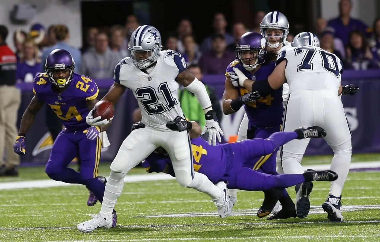
As I watched last night’s Cowboys/Vikings game, a thought occurred to me: Players in monochromatic look smaller, at least to me. Smaller and narrower. I’m not sure why this is — maybe because the solid-colored uni looks sleeker and more streamlined? — but it’s something I’ve instinctively thought for many years but have never fully articulated, even to myself, until now. It doesn’t matter if the uniform is mono-white, mono-purple (ewww), or mono-anything else — the players just look smaller, like they’re little video game figures.
Does anyone else experience the same visual effect?
Click to enlarge
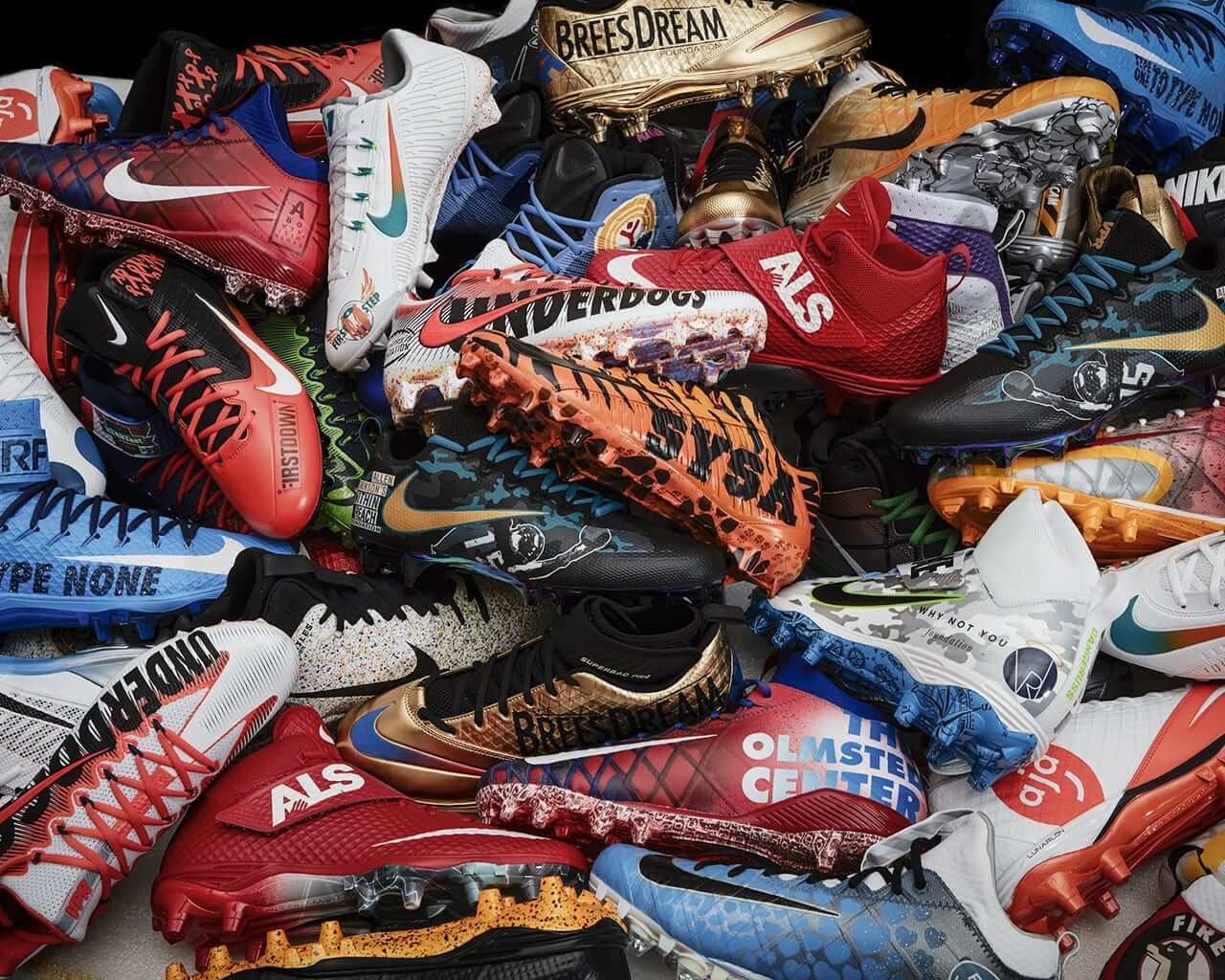
Do-gooder footwear bonanza: As you’re no doubt aware by now, hundreds of NFL players will be wearing custom-designed cleats to support various nonprofit foundations and other charitable causes this Sunday. I had hoped to have an ESPN column today about some of the people who actually designed and painted some of those cleats, but some very annoying circumstances conspired to make that impossible. So instead I’ll have a piece in which I showcase some of the more notable designs (which is, you know, what pretty much every other sports media outlet is doing, which is why I wanted to do the other piece about the people who created the designs, but that didn’t work out, grrrrr). Check it out here.
Actually, there is a story I can tell you — or at least link to — about someone who designed some of the cleats: The participating players on the Raiders had their custom footwear designed and painted by the team’s longtime equipment manager, Bobby Romanski, who’s also an artist. There’s a really good article and video about him here. Highly recommended.
Romanski has been the Raiders’ equipment guy for over 20 years, but I confess that I’ve never been aware of his name. He comes off as a really interesting guy — thoughtful, soft-spoken, humble. And an artist to boot! Good for him.
Click to enlarge
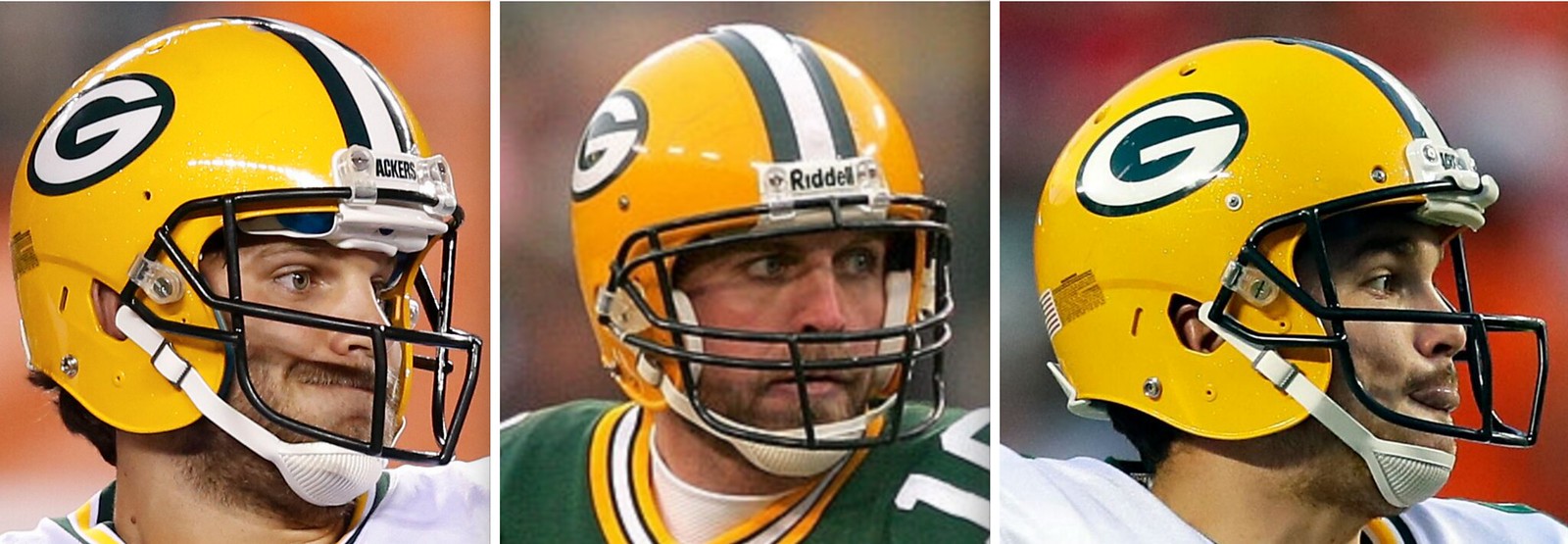
Pack straps, continued: In response to yesterday’s entry about Packers quarterbacks Brett Favre, Aaron Rodgers, and Brett Hundley all wearing the same old-school two-point chinstrap, Twitter user @Kodison12 informed me that the trend goes beyond those three players. At least three additional Packers signal-callers — Graham Harrell, Craig Nall, and Joe Callahan (all shown above, from left to right) — have worn the same antiquated strap in recent years. And then reader/commenter Randy pointed out that yet another recent Green Bay quarterback has worn that strap: B.J. Coleman. So that makes at least seven Packers wearing this strap, during a period in which almost nobody else in the league has worn it.
It’s worth noting that a few other recent Green Bay quarterbacks have used the more conventional four-point strap, including Matt Flynn, Scott Tolzien, and Seneca Wallace, so the old-school two-pointer hasn’t been a universal Packers thing. But it’s still definitely a Packers thing.
Unfortunately, my request to discuss all of this with equipment manager Red Batty was turned down (the team doesn’t make its support staff available to the media). But I’ve asked the PR to see if they can get some info from Batty to pass along to me. Still waiting on that. Fingers crossed.
Meanwhile, as I mentioned in yesterday’s post, it’s entirely possible that there are punters and kickers out there who wear the old two-point rig — I haven’t done a close inventory on them. And readers wasted no time in finding just such a player in last night’s game: Vikings kicker Kai Forbath.
Footage from the vaults: Reader John McMunn recently came across the video shown above, which features game highlights from Weeks 1 and 6 of the 1954 NFL season. I’ll let John take it from here:
Of note is that in Week 1, the Bears/Lions and 49ers/Redskins games were color on color. So was the 49ers/Bears game in Week 6. That same week, the Eagles and Packers played a night game that was color on color. One of the neat features was the use of a white football for the night game.
Also: Despite warm weather in Week 1, the players’ jerseys had long sleeves.
One other note is that all the officials are wearing white caps, unlike today when only the referee wears white and the rest of the crew wears black.
T-Shirt Club reminder: In case you missed it yesterday, the Uni Watch T-Shirt Club’s final design of 2016 is now available for ordering. The design is a mash-up of uniform elements from all of our previous 2016 shirts (click to enlarge):
The only new element is the baseball cap (which didn’t appear on our baseball-themed shirt because the player was wearing a batting helmet). It’s comes in four color options — our usual grey, black, green, plus a new “military green” (that’s what the manufacturer calls it, although I’d just call it light olive) — and is also available with either short or long sleeves.
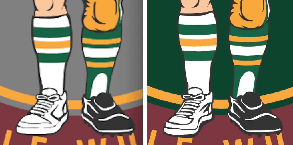
One note: Yesterday a few people said they thought the guy in the photo was wearing a left sneaker on his right foot, and maybe a right cleat on his left foot. There’s a story behind that (not worth explaining, trust me), but I could see what people meant, so we’ve adjust the footwear like so — old version on the left, new on the right:
The shirt will be available through next Friday, Dec. 9. The shirts are due to ship right after Christmas, so they should arrive in time for you to wear them on New Year’s Eve. (I had hoped to have them delivered in time for Christmas, but it just wasn’t possible to get things finalized in time for that. Sorry.)
If you’ve ordered all five of this year’s previous shirts and also get this one, you’ll be eligible for our year-end “Collect ’Em All” prize, which will be a patch based on the jock tag design used on this year’s shirts. To qualify, please send me proof that you’ve bought all six shirts. The proof can either be (a) a photo showing all the shirts or (b) screen shots of the “Thank you for your order” emails you received from Teespring and Represent.
Big thanks, as always, to my creative partner, Bryan Molloy, who executed this design and then patiently endured my dozens of picky fine-tuning requests.
This is our final shirt of the year. Will we do the T-Shirt Club again next year? I’m not sure. I’d definitely like to do some more shirts, but maybe in a more random, less programmatic way. We’ll see.
Once again, the new shirt can be ordered here.
The Ticker
By Paul

Baseball News: Best thing to emerge so far from MLB’s new labor deal: Home-field advantage in the World Series will no longer be tied to the All-Star Game. Helle-freakin’-lujah. … Also: The new deal bans smokeless tobacco for new players. … Speaking of smokeless tobacco, the list of cities that have banned its use in their ballparks now includes Milwaukee. … New logo for the short-season Single-A Northwest League. … Here’s an MLB nickNOB I don’t think we’ve seen before: Ruppert Jones of the 1979 Mariners with a “Rupe” nickNOB (from Mickel Yantz, via @ChrisRichardsPD).

NFL News: Here’s a place where I’ve never seen the Jags’ original phantom logo before: on a tree ornament. … Dallas QB Dak Prescott suffered a torn jersey last night. Then it got worse, and they stitch it up later (screen shots by Joey Breeland and Zak Meyer). … Cowboys DE David Irving wore the wrong (i.e., right) socks last night. And if you look in the background of that photo, you can see that someone in the secondary was doing likewise (from Jonathan Dodd). … Former Vikes coach Bud Grant was at the game last night and was wearing an NFL helmet necktie (from Chris Rabalais).
College Football News: Here’s Clemson’s jersey patch for the ACC championship game (from Mark Johnson). … In that same game, Virginia Tech will go mono-maroon (from Andrew Cosentino). … Looks like Ohio will be wearing matte black helmets for the MAC championship. … According to a note roughly midway through this story, Purdue players warmed up in black jerseys before the 1986 Old Oaken Bucket Game against Indiana and then returned to the locker room to find gold jerseys waiting for them, which apparently got the team all excited. “We’ve heard similar stories before, but it goes to show the influence of retail jerseys,” says Aaron Parish. “Could you imagine any surprise switch like that today? It would be announced way in advance and have a big ‘story’ behind it.”

Hockey News: A low-level junior team has poached the Niagara Ice Dogs’ logo. I’m always amazed by how brazen people are aout this kind of thing. Also amazed that they’d settle for using someone else’s logo instead of wanting one of their own. … New ugly sweater jerseys for the Springfield Jr. Blues.

NBA News: LeBron James, having lost a bet on the World Series, will be wearing a Cubs uniform when the Cavs arrive to play the Bulls in Chicago today (thanks, Mike). … Brook Lopez of the Nets wore a Craig Sager tribute warm-up top prior to last night’s game against the Bucks (from Mike Horowitz). … This is pretty amazing: World Chess Champion Magnus Carlsen was wearing NBA socks during his recent match against challenger Sergey Karjakin the other day. Wonder if he’s actually an NBA fan or if someone paid him to wear the hose (from Jay Bracken).

College Hoops News: Here’s a time-lapse video showing the creation of Louisiana-Lafayette’s new floor design. … The NCAA has revealed the logo for the 2018 Final Four (from Ed Kendrick). … Pretty cool skyline alternate design for Missouri-Kansas City (from @powerandfinesse, who was the first of many readers to send that one in). … Bizarro shorts this season for Warner University. … Arkansas’s home court has a mark where the first slam dunk was launched (from Matt Snyder).

Soccer News: Looks like Paxton Pomykal, who plays for the MLS team FC Dallas, was wearing his shorts backwards the other day (from Mark Dancer).

Grab Bag: MLB destroyed the Indians’ championship merch, but Hillary Clinton victory merch is still being sold, albeit at a discount. “I guess it’d be weird to send something like that to needy countries,” says ”@callmew1lly. … The federal Dept. of Transportation says hundreds of signs promoting tourism on highways throughout New York State are illegal, because they’re so big and info-packed that they pose a distraction hazard. … Nike is trying to bypass retailers by selling more items directly to consumers. … The son of a Texas police officer who was killed in the line of duty was given teddy bears made from his father’s uniforms. … Jared Law notes that all-star game logos for assorted sports and leagues usually have one thing in common: they use a star in place of the hyphen in “All-Star.” Has this become such an established trope that it’s essentially an imperative? If an all-star logo used a conventional hyphen instead of a star, would that be a design sin? Discuss. … Monster recently signed an endorsement deal with Tiger Woods, but don’t expect them to do similar deals with other golfers (thanks, Brinke). … Reprinted from yesterday’s comments: If we ever add more states to the union, how will we add stars to the American flag? Here’s a good exploration of that topic, including this amazing flag-builder app (with big thanks to R. Scott Rogers):
1. The Vikings kicker is Kai Forbath, not Kaci. 2. The Vikings punter, Jeff Locke, was also wearing a two-point chinstrap last night.
Typo fixed.
I’ve thought the same thing about mono football uniforms, but in different terms. Mono-color football uniforms make players look collegiate to me. Not in design terms like, that looks like something an NCAA team would wear, but the athletes themselves look like college or even high school players. When I was a kid, and actually watched college football, players weren’t as bulked up as pro players. You could look at any group of players and tell whether they were college or pro just based on the width of their shoulders, legs, and forearms. Something about the Color Rash uniforms makes the players look physically narrower to me, and so they look like college players to me. I suspect I wouldn’t see it this way if I still watched college football, since college players these days seemed to be more bulked up than they used to be.
Yes — narrower! I’m adding that word to the text.
I agree with arrScott. It does make the guys look smaller, narrower, sleeker. It looks OK on the WRs and CBs, but usually looks silly on linemen. I feel like the contrast in colors and the traditional striping patterns make players look bigger and stronger.
I always associated the monochrome look with HS and college, and never thought it would make headway in the NFL. I thought it looked too amateur. I was obviously wrong about that.
I always hated when the Giants wore their all-white roads in the ’80s and ’90s because it made them look like snowmen. I guess I’ll have to see that when they wear the retro unis on TNF in a few weeks.
I remember a Jets coach in the ’80s (Joe Walton, maybe?) saying he wanted the team to wear white at home because it made the players look bigger. It’s why the Jets wore white at home through much of the mid-’80s.
Typo under Soccer News, ‘weawring’
Fixed.
Today is Dec. 2 not 1. Have a wonderful day.
OK, going to try this again – neither of my comments on this topic posted yesterday… Not sure why…
Regarding the Packers QBs chinstraps… I’m pretty sure (not 100% certain) that I heard a broadcaster say that Rodgers wears this chinstrap as a way to try and get more roughing the passer calls. It’s a looser fit, so any kind of hard hit will move the helmet around and help him ‘look the part’ of victim when pleading his case to the officials. Perhaps this is a strategy the Packers have implemented with their QBs to try and get more calls over the years…
Faaaaascinating.
Ah, glad it posted!
Just found this:
link
That one picture speaks volumes.
May be some truth to that.
link
I remember noticing it during this game. If he has a four-point strap on tight, no way does this ‘face mask’ get called. But since he had such a loose strap on, the helmet twisted around with the slightest amount of contact, and the Packers won the game on the next play.
link
I also notice that both Favre and Rodgers (maybe the other GB QBs?) are fond of snapping their chinstraps the opposite side of the helmet while in the huddle/between plays.
not sure why they bother.
link
Under NBA, Brooke Lopez: Brook shouldn’t have an ‘e’
Fixed.
I’m still a bit perplexed by the “slip-on” cleat on the shirt guy’s left foot. Is there such a thing? Are they just for old folks?
Not a slip-on. Laces aren’t shown. Tongue is the fold-over design, like this:
link
Hey, Paul -I know you hated the Vikings all purple, but what about the yellow numbers – did they make it more worse, or less worse? (forgive the deliberately incorrect grammar)
For me, it made them look worse. Really hate that particular shade of purple and that particular shade of yellow. Very, very off-putting, at least for me.
Oddly, I thought the Ravens’ recent Thurs-night uniforms, which had gold numbers, were an improvement. But not these Vikes unis.
But that’s just me.
I’m not Paul, but here’s what *I* think….
Some number/jersey combos just need some sort of outline. I think this is such a case. Perhaps if the Vikes’ numbers were outlined a bit, they wouldn’t look so “high school”.
I thought they would have looked better with white numbers.
Probably they are referencing the type of cleat that has a lace cover flap.
Man, I really love those Cowboys double star jerseys. I’m glad some players wore the blue socks, it was further proof they need to wear that jersey with navy socks and silver pants next year. I love that each of the Cowboys’ jersey designs are different.
The new uniform template Nike has been using in college and now for the color rush uniforms is interesting. It looks to be a tad loose fitting compared to the elite 51 jerseys. It does have a lot less mesh so the jersey looks like one solid piece, making the jersey look cleaner.I guess more polished would be a way to describe it? I’ve always loved both collar designs; the flywire on the elite template (which looks so much better without the contrasting collar colors) and this new thing on the new template that houses the shield that looks like an upside down triangle (I’m sure Nike has some techno sleek term for it). Nike needs to stick to classic uniform designs on modern and sleek uniform templates. So much better than that garbled NFL Equipment Reebok crap. I wonder if Nike will transition teams to this new template next year?
Paul, any scuttlebut about any NFL teams getting new uniforms next year?
I’ve only heard rumors, nothing concrete. I’m sure it’s coming soon.
I agree with you on the Cowboys uniforms. I liked the all white with the navy socks more than with white socks and I am sure it would look good with our silver pants as well (as it did in ’94, though the socks we wore with the ’94 unis were striped I believe). In any event, I would not mind the white pants as an alternate option in our regular uniform rotation as long as it is worn with the contrasting navy socks. The jersey would look pretty good with both silver or white pants I think. I also like how our jersey designs are all different as as well.
Vikings uniforms would have been much nicer if they had white in the numbers somewhere. One of the better looking match-ups that was part of the color rash.
Thinking the same thing. Vines uni would be okay, with a white outline on the numbers, and white instead of purple pants. Like the asymmetric pant stripe. Not usually a big fan of “wacky” typography but the number font is consistent with the Viking imagery, so it works.
Fun flag widget! I instantly thought of the Philadelphia Phillies’ “manifest destiny” futuristic flag patch on their Turn Ahead the Clock jerseys. I forgot that the markup called for a 77-star patch but the real-life production only had 60 stars. On closer inspection, the 77-star mockup has the stars in the “long” formation (five 9’s, four 8’s = 45+32), but the 60-star patch is unlike anything we see in the widget. That patch has ten 6’s, but each row is offset. Ironically, the “long” formation would have been valid. I’d like to think that the offset pattern was chosen in order to make the difference in the flag look self-evident, but I’ll bet it was just so that the flag wouldn’t be too large of a patch.
The app does not allow for a 69 star flag!
Weird, because a modified Oregon works fine for 69: Three rows of 10 on top and bottom, with a single row of 9 in the center. The app also doesn’t allow for an 87-star flag.
One thing the widget makes clear is that if we go above 50, we’ll have to consider adjusting the width of the canton.
69 stars could also be done with six alternating rows of 11 and 12 stars. 87 stars could be done with a row of 9 stars, three rows of 10 stars, a row of 9 stars, three rows of 10 stars, and a final row of 9 stars.
For those who don’t know what the hell Mike is talking about…
Here’s the Style Guide mock-up of the Phillies’ 1999 futuristic uniform:
link
And here’s the actual patch:
link
I moved to central NY a few months ago. Those road signs have seemed oddly huge and wordy to me.
Typo under Do-gooder section: “As you’re now doubt aware by now…”
Fixed.
Jared Law notes that all-star game logos for assorted sports and leagues usually have one thing in common: they use a star in place of the hyphen in “All-Star.”
Ha! That is a world-class observation.
Don’t you mean “world★class”?
;)
I’m wondering how long before they put that in their style guide and all “broadcast and media partners” have to use it.
Anyone watching Fox’s series Pitch, especially looking for uniform oddities? I figured since the show has the blessing of the MLB, the uniforms they used would look exactly like the ones on the field. But if feels like the Padres jerseys the players wear, both game and BP, have oddball lettering that makes them look more like replica jerseys (the BP jerseys especially look odd, as the names are too low on the back).
Another thing I noticed in a BP scene: a guy with “Melky” on the back of his jersey. Is that a FNOB or a NNOB?
Whoa, whoa, you’re way off-base there, Joel! Let me set you straight:
FNOB = full name on back
NNOB = no name on back
Obviously, neither of those would apply to someone wearing “Melky.” I think what you’re asking is whether “Melky” would qualify as FiNOB (first name on back) or nickNOB (nickname on back).
And the answer is FiNOB, at least if we’re talking about Melky Cabrera. That’s his given name.
(Side note: FiNOB [first name on back] should not be confused with FIOB [first initial on back].)
I stand corrected, Paul. Not like I read those terms every single day of my life :).
“No Valid Pattern” for 69 and 87 stars in the Flag Builder app. Hmm, interesting.
Scott Tolzien started last weeks gane fro the Colts versus the Steelers. He was wearing the 4-point strap as he has since preseason games. Here are a couple of links:
link
link
But I also found a picture of him while he was still with the Packers. He is wearing a 4-point strap: link
Paul spends alot of time apologizing for missed deadlines, no story, and reporting other people’s news… but don’t worry he has time to sell more stuff!!
I’m sorry, was there a criticism couched within that comment? Would you care to explain it more fully?
You should definitely ask for your money back, then.
Perfect response.
Yes, good, good “Wow”, let the butthurt flow through you. Embrace it, and your journey towards being a full on douchebag will be com-plete.
I know I’ll take heat for this but some countries don’t want the phantom championship clothing. Just because you’re donating it doesn’t mean someone else does. Besides the reason in the article that countries want to boost their GDP, it costs a lot of money to send.
link
Excuse me. Just because you’re donating it, doesn’t mean someone else wants it.
Not unlike Elaine’s muffin stumps in Seinfeld.
I’m running into that issue with used books I want to give away. Bookstores and libraries around Chicago don’t take donations.
Wow.
Local library where I am takes donations – ones they want they put in their system, ones they think they will sell go to the Friends of the Library store, the rest get recycled. The one used bookstore will give store credit on the ones they want.
How about local thrift stores or little free libraries?
link
Not uni-related, but rule-related — interesting that in the 1954 NFL, to be considered down you really had to be wrapped up and controlled, not just knocked off your feet. You can see a couple of instances of guys getting knocked down and either rolling into the end zone (ref signals TD) or getting up and having to be brought down again. I remember my dad, in the 60s, telling me it used to be that way. I just checked and the modern “down by contact” rule started in 1956.
Yeah, that’s one thing that often strikes me watching old footage.
I wonder if it wouldn’t be better to go back to that rule; there seems to be a rash of “knock ’em down” hits at the expense of tackling. link: no attempt to wrap up the receiver, just hit drop him to the turf with a single hard hit.
The more hard contact, the more opportunity for players to develop CTE. Get back to tackling, and the game might become just a little bit safer.
law in rugby that the nfl took awhile to get rid of i guess
Restoring that rule and getting rid of or minimizing helmets would go along way to help player safety. The tackles would be less forceful and jarring if you had to actually wrap the player up instead of just launching at them and if you had to worry about protecting your noggin during the act.
Today’s ESPN column is up:
link
Interesting bits about the chin straps. Up until probably a year ago, Riddell themselves sold the classic two-point strap on their website.
I did a mock-up of several star layouts overlaid to compare 48, 49, 50, and 51-star flags.
link
Actually there is science to the mono unis looking smaller
If you are a portly fellow you want to wear colors of the same shade .. i.e. All dark, all light etc as opposed to a white shirt and black pants.. it gives you an illusion of being thinner..
Reason being if you have a dark shirt and similar shade dark pants your eyes don’t notice the break in the outfit, the outfit APPEARS longer since there is no break point.. however when you have a white shirt and dark pants you create and line, – horizontal one- where the shirt meets the pants and the eye sees that line and it makes the outfit appear wider..
It’s an optical illusion.. same reasoning behind ,”if you are fat, you shouldn’t wear horizontal stripes…”
Regarding the Purdue jersey swap. Michigan did this in 2011 at Michigan State (link). Team warmed up in normal uniforms came back into the locker room and found new jerseys and white pants. Players hated it since they didn’t have to prep with coaches. Fans hated it since the jerseys were ugly. It was all a stunt by then AD Dave Brandon. Thanfully with him gone and Harbaugh in place this won’t be happening agajn anytime soon.
I’m surprised I don’t remember that story from the time. It’s hard to imagine with the retail engines of today, but maybe were still innocent back in the halcyon days of 2011.
I’m of the opinion that swapping jerseys before kickoff is pretty much over with, because of the tailoring of jerseys today vs. what it was 20 years ago or longer. Now, the jerseys are placed on the shoulder pads…then everything goes on the player. Before, you could simply swap jerseys out in a matter of seconds.
Also, the point about the players not liking it because it cut into prep time with coaches….I’m sure coaches now wouldn’t like a 10 minute distraction pregame involving players taking off pads, peeling off jersey from pads, stretching new jersey onto pads, and players putting pads back on.
Next time a team wears a throwback uniform, have the officials also wear throwbacks. Also, it would be a nice touch to have an old fashioned analog time clock at the game.
The NHL actually did that in the 1991-92 75th Anniversary season.
link
I agree it should be a regular thing.
I kinda dug the Vikings uniforms
I’ve always thought mono-colored togs made the wearers look like yoga girls in tights, so I guess “smaller” would be part of that. I wish I was four years old again, so I could bug Santa for a Vikings color rush uni for Christmas.
Whoa — the mighty Rev. Nørb commenting on Uni Watch!!
Now *that,* people, is a major event. My day is made!
I like Bud Grant’s NFL helmet necktie…looks like something that would be offered on “Collector’s Corner.”
Wait long enough and it might turn up at one of his garage sales.
Seneca Wallace is misspelled as Senaca in the chinstrap discussion.
Fixed.
Always loved that name — Seneca Wallace. Sounds just right.
I did a bit more research on other Packer quarterbacks and chinstraps. These guys are a bit older, so that may be part of the reason for their two-point chinstraps.
Jim McMahon:
link
Doug Pederson:
link
Ty Detmer:
link
Matt Hasselbeck:
link
link
It appears Ty Detmer wore a four point strap at BYU.
The Univ. of Louisiana at Lafayette goes by “Louisiana” for athletics and the Univ. of Missouri-Kansas City goes by its abbreviation, UMKC, campuswide.
link
link
The Univ. of Louisiana at Lafayette goes by “Louisiana” for athletics…
Many media outlets — including Uni Watch — use Louisiana-Lafayette and Louisiana-Monroe for those two schools. I’ll continue to do it that way.
Wasn’t there an agreement in place that neither school could go by only Louisiana and Louisiana-Lafayette is just blatantly disregarding it?
No affiliation to either school or Louisiana here, but I appreciate you making the distinction, Paul.
Sebastian Janikowski is another current kicker sporting the old 2-point chinstrap
Note sure if it’s been covered before, but I thought I saw this a couple weeks back, but have confirmed it last night; the Captain patches in color rash only show the number of stars of service, and they’re centered (e.g. first year has only one star centered below the “C,” unlike on the regular jerseys where there are four stars with the left-most one being gold.
For an example: link
I’ve noticed that too but kept forgetting to mention it. Good spot!
NFL captain patches are dumb, but that is definitely a better way to do it than the normal X out of 4. Why four stars? It looks too empty for almost all players wearing it, and it’s inaccurate for the few players with more than four years of captaincy. Worst of both worlds.
Just another bit about SF Dons 50s throwbacks game – it sounds like their opponent, SF State, will also be wearing throwback shorts.
The Cowboys pants with the grey stripe would look great with their blue jerseys. If the Cowboys would let go of their wacky mismatched colors tradition they could have some great uni combos.
Mangus Carlsen is a celtics fan
link
Haha…Of course mono colored uniforms make them look smaller, or at least more slimming. But it actually makes you look taller. Ask any clothing expert why you should wear a matching suit instead of a sport coat and contrasting pants.