Click to enlarge
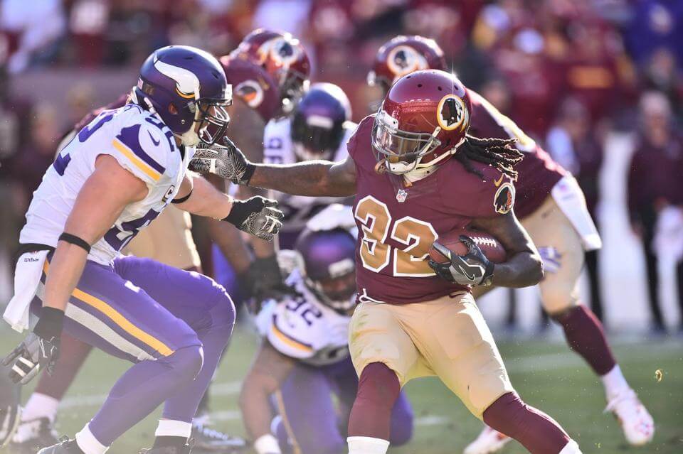
Washington wore their 1930s throwbacks yesterday against the Vikings. We’ve seen this uniform before, but this time around there was a subtle alteration: In the past they stuck with their regular yellow facemasks, but yesterday, as you can see above, they went with grey. Additional photos here.
In other news from around the league yesterday:
• Big day for monochromatic uniforms, as the Jaguars went mono-black, the
Titans went mono-blue, and the Saints went mono-black. Not a good look for any of those teams.
• Chiefs quarterback Alex Smith wore a Speedflex helmet for the first time. He had previously been wearing this non-Speedflex model. And no, that doesn’t violate the league’s one-shell rule, because players can always swap up to a newer/safer model.
• Another new Speedflex convert: Cowboys wideout Dez Bryant.
• Speaking of Cowboys helmets, running back Ezekiel Elliott had some trouble with his striping tape.
• Here’s a great catch: The star was missing from Patriots cornerback Malcolm Butler’s Flying Elvis sleeve patch.
• Only one team wore white at home: the Buccaneers.
• Players participating in postgame jerseys swaps included Zach Ertz (Eagles) and Levine Tollolo (Falcons); Tony Lippett (Dolphins) and Melvin Gordon (Chargers); Michael Thomas (Dolphins) and Griff Whalen (Chargers); Dez Bryant (Cowboys) and Antonio Brown (Steelers); Kelvin Benjamin (Panthers) and Terrance Smith (Chiefs); and Tedd Ginn Jr. (Panthers) and Travis Kelce (Chiefs).
• Here’s a list of players who protested during the national anthem. One notable addition to the list was Buccaneers wide receiver Mike Evans — the first Tampa Bay player to protest during the anthem this season. He said he did it specifically as a protest against president-elect Donald Trump, not as a statement regarding racial equality.
(My thanks to all contributors, including Gabe Cornwall, @kingstudog, Alex Liggett, and of course Phil.)
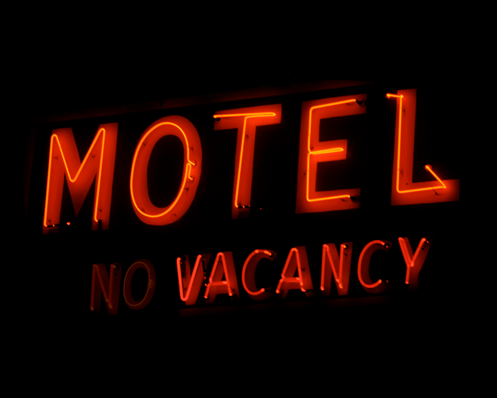
Pretty Vacant: I’ve been fascinated by “(No) Vacancy” signs since I was a kid, and now I’ve finally written an article about them. The piece, which I wrote for Bloomberg Businessweek, is available here. I hope you’ll give it a look. Thanks.

Membership update: Longtime reader Omar Jalife recently came up with an interesting membership card request: He wanted his card to be based on the soccer jersey shown on the Uni Watch T-Shirt Club’s soccer design. Of course, we didn’t show the back of that jersey, so membership card design Scott Turner had to imagine how the rear design would look. You can see the results at right — pretty cool!
As always, you can order your own custom-designed membership card here, you can see all the cards we’ve designed so far here, and you can see how we produce the cards here.
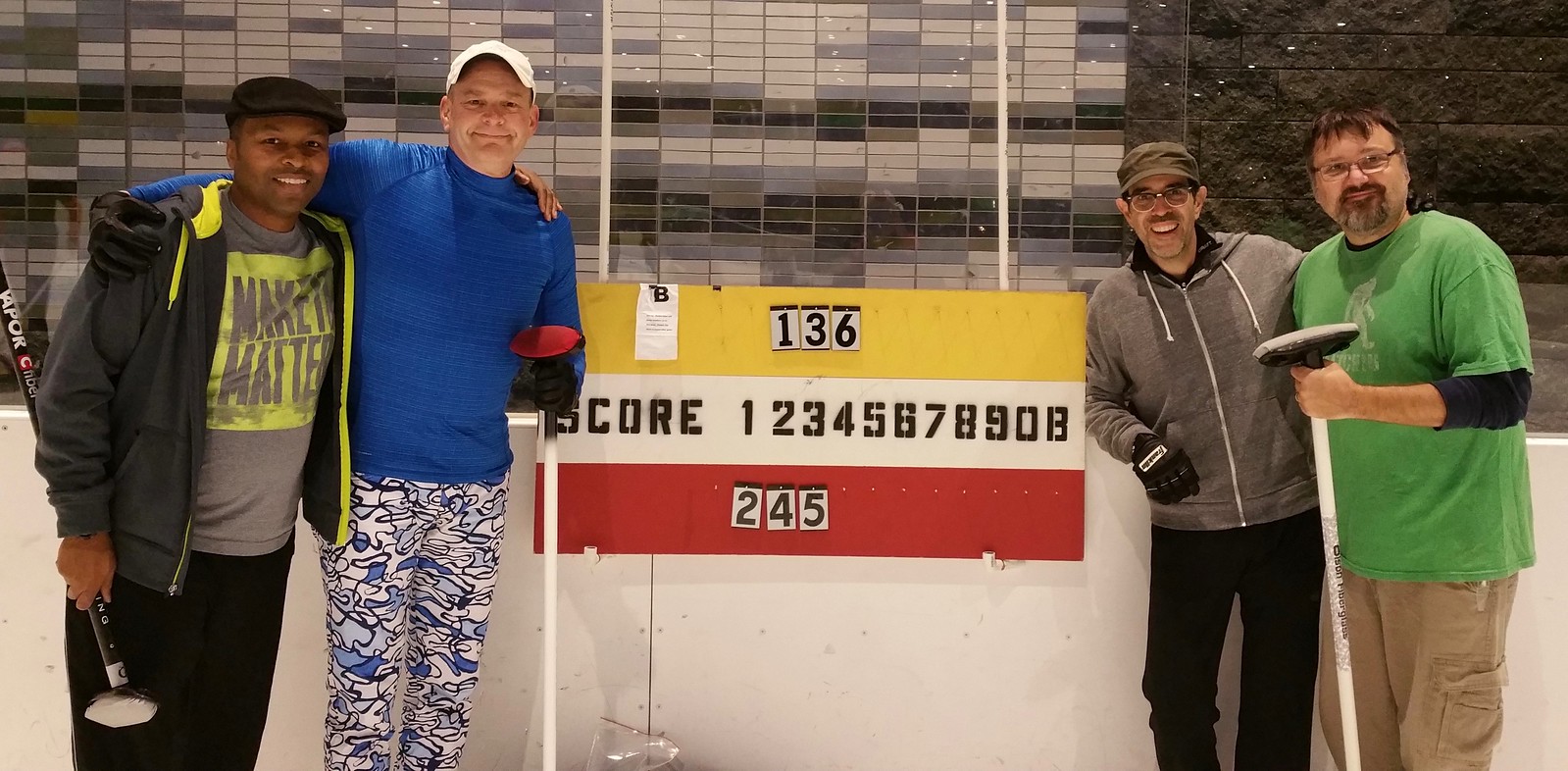
Click to enlarge
Two games, two wins: Our curling team won again last night, making us 2-0. From left, that’s Omoy, Phil, yours truly, and Doug, moments after Phil delivered a killer shot that sealed our 4-3. victory. Nice shot, Skip!
The Ticker
By Alex Hider

Baseball News: The Cardinals are selling two books perfectly suited for Uni Watchers: a new illustrated history of the team’s uniforms and logos, and a book that came out last year about some of the items in the team’s Hall of Fame (from Marcus DePew). … Apparently, Johnny Cueto likes to wear his shirt in the pool.
College Football News: According to Kenny Kaplan, there’s been uni-quirk under our noses all season long: Iowa quarterback C.J. Beathard and punter Ron Coluzzi both wear No. 16, meaning it’s common to see two different players wearing the same number take back-to-back snaps. … More number fun: Michigan State got flagged because two players were both wearing No. 22 on the same play on Saturday (from Tim Dunn).

Hockey News: There’s some great stuff in this story about the Blues’ Winter Classic sweaters. Apparently, the team only had 45 days to submit a design and was considering basing the design on this late-’60s prototype. … B.Q. sends along this shot of this gorgeous Edmonton Mercurys sweater from 1952.

Basketball News: The Thunder wore their orange “OKC” alts last night, and the Warriors wore their “Run TMC” fauxbacks (thanks, Mike). … Anyone know the story behind the three stripes on some of the Kentucky basketball player’s shoes? (From Nate Hargis). … Speaking of Kentucky, their practice floor still has the school’s old logo (from WC).

Grab Bag: The Hamilton Tiger-Cats wore white at home during a playoff game this weekend. “It is extremely rare that a CFL team wears white for a home playoff game,” says Uni Watch CFL expert Wade Heidt. … Felippe Massa drove in his final Brazilian Grand Prix race yesterday. His sponsor, Martini, put his name in their logo on his car as a tribute (from David Firestone). … Is Dora the Explorer using the Cleveland skyline in its closing credits? Sure looks like it (from Chris Spisak). … Adidas and Under Armour are battling it out to see which one will be Nike’s primary American competitor. According to that article, Adidas “has all the momentum” for now (from Brinke). … At the NHRA Finals, Jack Beckman and John Force raced BFBS cars, John Hale had a throwback car painted onto his car, and Bo Butner brougt back the General Lee (from David Firestone).
Confusing “yours truly and me” in the curling snapshot caption.
Fixed. “me” should have been (and now is) Doug.
Dontrelle Inman of the Chargers had on camouflaged tights against the Dolphins.
In response to the Kentucky players shoes, the stripes are just part of the design of the Nike Kobe shoeline. It’s suppose to represent the Achilles surgery he had a few seasons ago.
Also, there are 4 red stripes.
yup! Seconding this, these are the Kobe 11’s, and the stripes are the stitches from his achilles surgery.
As a northeast Ohioan, I can say that’s 100% the Cleveland skyline.
Paul’s a bit (well, more than a bit) too kind on his description of my final shot — the result was killer, and sealed the victory for us. But I didn’t quite throw the rock exactly as planned; instead of sliding into the house between two of our opponents’ stones, I ended up ticking off one of their rocks, and that shot nestled nicely into the house. But it was Paul’s call (to go for that shot) instead of the one I wanted to try that resulted in the winning try. The kudos here really belong to Paul!
The mark of a good shot call at the league level seems to be whether it offers a good Plan B. I made the best shot I’ve ever thrown last night, but it wasn’t the shot called. Skip wanted me to tick a guard off the center of the 8-foot ring to open up an opposing stone on the button. But I missed wide and my weight was a little down, so I managed to just get around the guard and remove the shot rock. If skip had called that shot instead, I probably couldn’t have made it once in 100 tries, but he called an approach to the easier guard takeout that gave him a couple of decent options if I missed.
You know, Paul, if you’re looking for a lede or some filler one of these days, I’d be interested to read about exactly how that scoreboard works for curling and maybe how it got that way. I could do the research myself, of course, but I have a feeling I’m not the only curious one.
The way it works is simple (although, I agree, counterintuitive):
The number of points is denoted by the white stripe in the center. The yellow team’s score is on the top, and the team’s score is on the bottom.
Our games are six ends (an end is similar to an inning in baseball). If you look at the photo in today’s entry, the yellow team got two points in the 1st end (hence the “1” tag hanging over the “2 points” numeral), a third point in the 3rd end, and a fourth point in the 6th end.
The red team got a point in the 2nd end, a second point in the 4th end, and a third point in the 5th end.
So yellow won, 4-3.
A simple baseball-style line score would be much better. I don’t know why curling uses this format, or the history of it. I agree that it would be a good topic to research.
I’m not sure why it started this way (though likely due to the number of “tags” we have available — we have wooden numbers going from 1 thru, I think, 9, and each of those denotes an “end” — like an inning in baseball), but it’s the “old school” scoring system. So, after each end is played, the score (either gold or red rocks) is tabulated, as Paul described above.
Modern curling uses either electronic or analog systems that look like a baseball scoreboard, where the number of “points” scored in each end is recorded in that end, and then totaled in a final column. For those of us used to baseball scoring, this is much “easier” to read. It would also necessitate having a LOT of “1” and “2” tags. The way BLCC (and most) clubs score things, we only need numbers for each end.
Admittedly, that can get confusing — as that final score is 6-3 gold, not 8-7.
A couple quick primers on scoring are here and here.
That’s exactly the reason Phil – you only need one of each number from 1 to 10 (or however many ends you play).
Tournament scoreboards are more like baseball but you need twice as many numbers. And a ton of zeroes instead of hanging blank ends over to the side.
I knew I kept thinking “Man, I don’t think curling was this hard to follow during the Olympics.” Now I know why. Thanks!
Can’t do better than this illustrated guide, from the Potomac Curling Club in Maryland:
link
Had an interesting moment in league play in Madison last night: In the sixth end, I noticed that the score of our game read correctly whether you read the scoreboard properly or incorrectly. The other team lead 5-3, and since they’d last scored in the 5th end and we’d last scored in the 3rd, a non-curler reading the numbers hanging at the top and bottom would see the score as 5-3, while a curler reading the numbers in the middle would also see the score as 5-3.
Something from over the weekend…
Can Duck Tracker be shut down? Nikegon isn’t relevant anymore.
I was honestly wondering the same thing yesterday morning.
We might as well be tracking what Rice University wears every week.
Are you saying that they’re no longer uni-relevant because their on-field performance has tanked? Or something else?
That, and because everyone else does the same thing with costumes. Its a fad whose time has come and gone. And like everything else, was/is way overdone.
I used to read up on all the uni and helmet changes. Now there are so many I scroll right past most of them.
The more things change, the more they stay the same. – Huey Lewis
1) Their on-field performance is not relevant to Uni Watch. If they’re wearing interesting uniforms, that’s what’s relevant.
2) This may come as a shock to you, but that phrase predates Huey Lewis by, oh, just a little bit.
I would argue that a reason against focusing on the Duck Tracker is that we’ve been tracking all of the Power 5 teams for a few years now, thus making the focus on one team from one of those conferences a little bit on the redundant side.
As the current Ducktracker (I did not start it so am not offended by talk of killing it) I can see the point that since I also do the Pac-12 and use the same image, there is less unique content now. On my actual blog that that link points too, I do try to give some detail, commentary and background, including non-sunday posts when it is relevant. I also try to give more Pac-12 detail on that blog. But as you say, now that every team has copied Oregon, they are not a trendsetter anymore. Since I am not in charge around these parts, I leave that to Phil and Paul, but even if the link from Uni-watch is downplayed I’d still be putting up content on my blog.
Fwiw, I skim right over it. I suppose part of why it seems more relevant is because they’ve been pretty bad, but it also seems like (to me, anyway), well why shouldn’t Baylor or any other number of schools have a tracker. But if someone’s willing to put in the work on it, I’m not going to judge.
Yeah, maybe I’ll kill it for next year (since like 1/10th of the schools out there now wear a different costume each week, so it’s not like it used to be). There’s also the redundancy factor, as Dennis points out.
But for the remainder of the season, it stays.
Like everything else on Uni Watch, if you don’t like it, just skip over it. It’s not like it is a huge section and it’s one day a week, only after a Ducks game, and only during the NCAA season.
I’m glad the Blues aren’t going with the prototype logo. That arrangement of text is pretty hard to look at. The way “Blues” is shaped, it looks like a cow catcher to me.
Anyway, I like the Blues’ WC uniform. I especially like that they went with the original crew-neck collar, and didn’t add gratuitous laces to it. The navy arch-logo jersey is the only one they’ve worn that has had those laces. I also don’t mind the off-white as much on this uniform, because it’s not that noticeable. It seems to work best when paired with blue and gold, as it did on the Sabres’ 40th anniversary alternate. I’d still prefer actual white, though, but this is okay.
Whoa, someone actually raced in a car with a confederate flag on it in 2016?! I would expect this to be a pretty big story/controversy. I am aware of and understand the arguments in favor of the flag, but it is still considered highly offensive to many people.
Not to 48.6 percent of the population.
Then again, it would have made more sense if the car was a Dodge and not a Chevrolet.
Vacancy signs – reminds me of one of my favorite lyrics which comes from the Death Cab For Cutie song “I Will Follow You Into the Dark”
“If Heaven and Hell decide that they both are satisfied
Illuminate the no’s on their vacancy signs
If there’s no one beside you when your soul embarks
Then I’ll follow you into the dark”
First glance at Notre Dame gave me a flashback to my model building days using Testors paints. The helmet especially. Overall not crazy about the uniform, but the vivid memory was really cool.
Also like the Redskin’s throwback look. Grey facemasks definitely a nice touch. Am I wrong or is that shade of grey a bit darker than the original?
I’d like to see those Washington throwbacks with the “spear” helmet decal from the 1960s.
Agreed! Though I’d rather see the team bring back the feather helmet, which I think was one of the very first NFL helmets decorated with anything other than simple stripes or a logo on the side. Clean up the colors a bit – perhaps white and gold on the feather, no burgundy – and they’d look good enough that I’d almost be willing to put aside my revulsion at the nickname and root for the team.
I’m not advocating swapping one racial image for another but I’m surprised that with the effort put in to remove the stripe and change the facemask they didn’t replace the helmet decal with one to match the image on the jersey sleeves.
Bo Bunter sure went for an authentic General Lee look; even the terrible movie from a decade ago clowned on the battleflag’s adornment. Surprised NHRA allowed it in competition; something like that would never run in NASCAR anymore.
Also interesting to me is that Mr. Bunter is from Indiana; many of us loved the show and I get being authentic, but he must be aware of the implications of running that flag in 2016. He’s no dixieboy, not Southern; must be living with a shambolic mind.
Do the gray facemasks on Washington’s helmets look darker than the standard going-for-the-traditional-look gray? Like the Giants or Cardinals?
It’s not just you. They appeared to be the darker gray that helmet and facemask manufacturers call “gunmetal”.
Paul!
University of Miami also has a similar situation with uni numbers- QB Brad Kaaya and kicker Michael Badgely (He is the back up punter) also wear 15. A little different since the kicker does not actually take the snap. Btw this is the third season they have both been starting.
The three stripes on the back of the Kentucky’s player’s shoes are part of the design of the kobe 11. Ever since the 9, kobes have had three stripes to represent the stitches for his achilles injury he suffered while wearing the 8s
Did you notice that the Edmonton Mercurys jersey looks very similar to the original Oilers and current third jersey?
Too similar. It has to be connected.
My first thought was that it resembled the Edmonton Oil Kings WHL team sweaters
The Warriors played the Suns (wearing orange) yesterday, not the Thunder.
link
So, is the answer to accurate throwback NFL uniforms right here on this page? A loophole? It says about Alex smith that changing to speed flex isn’t a violation because players can always switch to a newer, safer model….. so…. for one throwback game, EVERYONE on the team gets issued a speed flex helmet, whether they like it or not…. VIOLA!
And then the next week… ?
I haven’t thought it that far through, I’m just trying to get proper throwbacks…. I’ll leave that to the experts :)
The “whether they like it or not” part is what the NFL is banning. By leaving it to the players to choose whether or not to change helmets on their own, they shift liability to the players, and away from the organization.
CELLO!
OCTOBASSE!
Very interesting piece on vacancy signs.
For what its worth, we spend a lot of time in a small resort town on the Columbia River in B.C. and the motels in our little town (and most other towns up and down the valley) still have vacancy signs.
I’d always been curious about why they survived and after reading your piece I realized – there’s no cell service in the mountains outside of the small towns. You go through a town, have signal for a couple of minutes, then go “dark” again. There’s no opportunity to check vacancies in the next town, so signs are still needed for travellers passing through.
I’d love to see an article on how they settled on the Chicago Blackhawks WC uni’s this time around
Paul, I really enjoyed your article about ‘No Vacancy’signs although I wish you would have mentioned perhaps the most famous ‘No Vacancy’ sign ever, at least in movie history: the Bates Motel sign in Alfred Hitchcock’s “Psycho”.
Good point! A missed opportunity on my part.
Your story was actually printed in my local print paper (Santa Rosa Press Democrat) and I figured that it must be you!
Couple questions regarding the soccer t-shirt club graphic that I noticed due to the membership card:
Is the player supposed to be wearing a v-neck jersey? Looks that way to my eye, and that the stripes are yellow one side of the V and green on the other, which would put the “seam” of the two colors as the middle. If that’s the idea, then is the font number off center, since it’s entirely in the green stripe? Or does the weight of the magnifying glass move “center”?
What would the implications then be for the back of the shirt/card? right now green is center, which does follow front number placement, but is that wrong?
Have to disagree on the Jaguars mono-black. White pants looks way out of place for the color scheme. The black pants makes for a much more solid uniform look with the black jersey. However, I do think contrasting socks (stripes or different color) would be a much better option
Paul: I was on th Bloomberg website over the weekend and noticed your piece was at the top of the “most popular” column. Do they give you feedback on how well the article did etc.? Great piece right up my alley.
They didn’t even tell me the story had been published! Apparently it went up on Friday (a day when I was traveling), but nobody told me, and I only found out when I started getting some email feedback that evening.
Sent a note to my editor, thanking her for posting the piece. No response. Some editors are, well, better than others when it comes to communication.
I was in touch this morning with Bloomberg’s internal publicist, who likes the story and will pitch to the NPR show “Marketplace,” which might want to have me on for an interview. They had me on for my previous Bloomberg piece, about bacon packaging.
p.s. Thanks for the research assistance you provided a few weeks ago!
For some reason, I somehow perceive the Cowboys’ star logo as larger on the Speedflex. Weird.
Does anyone else think the Cowboys are subtly experimenting with different shades of their silver/blue/green pants on various players? They spoke about doing that in 2011 right before Nike took over because fans were complaining about the green, but that never happened. In fact, I would argue they appeared MORE green after Nike took over. Someone posted that pic of Sean Lee a few weeks ago who was wearing pants that looked a lot more silver-blue than silver-green so I’ve been paying close attention to see if that continued. I know the look of those pants can change significantly depending on if they are being filmed, where they look more silver-blue, or photographed, where they look more silver-green. However, yesterday I noticed many of the pants looked a lot more silver than usual and had less green in them, while the offensive linemens pants still looked like they had the green tint. Maybe the pants are playing tricks on my eyes or they use a different camera lens that makes them appear different on various formats, but I swear they are using different shades of silver/blue/green. Or maybe it’s such a unique combination of colors Nike isn’t totally consistent with the product. Who knows.
is that the first Sex Pistols reference in Uni Watch history?
Not sure. I hope not!
PL / PH – does anyone in your curling league wear uniforms?
Nope.
Related question: how common are the batting (or similar style) gloves?
I think Paul and I may be the only two who wear them.
“does anyone in your curling league wear uniforms?”
~~~
That is true…this season. Last year (Paul was out due to injury) there was at least one team who played in the late Sunday League (there is also a Wednesday League) who had custom t-shirts.
The difficulty with wearing unis, at least in a (basically) outdoor league is that unless your unis are sweatshirts or jackets, you never know if you’ll even see t-shirts, since it can get very cold out there. We play on a covered (but open) rink, so while not exposed to the rain/snow elements (although I recall one time it snowed, and the wind was blowing some of the snow onto the sheets), we’re entirely at the whim of the temperature.
If you’re playing any position but skip, you do sweep a fair amount, so if it’s warm enough (as it was Sunday night) a t-shirt or a t-shirt over a long sleeve shirt would work. Anything colder and it might be tricky. At least one person in the league last night was wearing short sleeves.
I’ve also curled once or twice when the outside temperature was well below freezing, probably closer to 0F, and many of the players were dressed like Randy on his way to school in Christmas Story.
Question for Paul:
While I understand your position against using the Washington NFL team’s nickname as a protest against what you feel is the team’s racist nature, I kind of wonder why then you are still willing to show the team logo in photos? Same with the Cleveland “Chief Wahoo” logo. And why no campaign against the Kansas City football team’s nickname and logo? I get that “Chiefs” is not a slur, but they are still appropriating and cheapening Native American imagery and culture (or so the argument goes).
Sorry in advance if you’ve already explained this.
I understand your position against using the Washington NFL team’s nickname as a protest against what you feel is the team’s racist nature…
I have not and will not use the term “racist” in this debate. Please do not attribute it to me. Thanks.
I would prefer the cessation of all use of Native American imagery by sports teams. Yes, that includes the Chiefs. It also includes the Braves, who you didn’t mention. Blackhawks, too.
I boycott the NFL team’s name because it is a dictionary-defined slur. For all the other stuff, I try to minimize their exposure on Uni Watch, but I don’t pretend that they don’t exist. Not using the NFL team’s name is a way of making a statement; there are other statements that can be made regarding all the other stuff. I have made, and will continue to make, those statements, in various forms.
Not interested in relitigating the entire debate here — we’ve already done that countless time. Just answering your question. Let’s please move on. Thanks.
Cal football last year (2015) had Jared Goff at QB and Cole Leininger at punter both wearing 16. They took advantage of that fact to try to fool opposing teams on occasion.
The Miami Heat are wearing one unusual looking uniform tonight, the game almost looks like a white on white game. The Heats shorts are a army drab green, so I assume it’s some sort of military salute.
I can’t get enough of those old-timey neon hotel signs.
There are a lot of old hotels along Sepulveda Boulevard here in LA, from the San Fernando Valley all the way down to the airport and probably beyond – although two of them near me have been demolished just in the past couple of months. I keep telling myself that I need to take a day – or better yet, an evening when the signs are illuminated – and take pictures of all of them.
RE: NHRA black cars:
I think Beckman had wrecked his primary car and had to go to a backup, which was a blank body with the decals slapped on.
Force’s team is rich enough that a spare body would have looked identical to the primary. Heck, he’s won the Funny Car title 16 damn times!