Click to enlarge
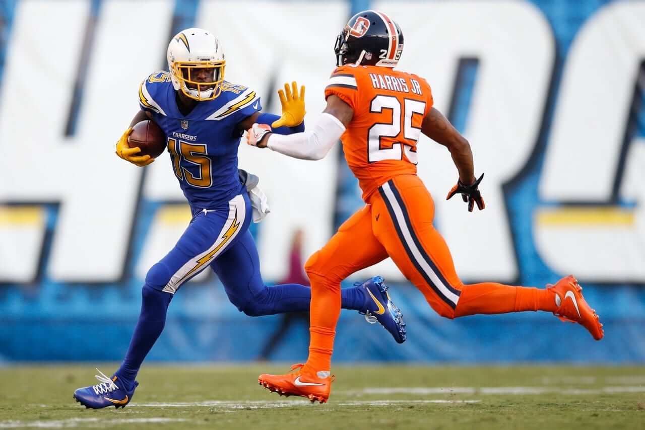
Now that’s how it’s supposed to work. After a bunch of Thursday-night games that all featured one team wearing white, we finally got a true color-on-color game last night. I caught some of the game at a bar (where I was attending a going-away party for longtime Uni Watch reader/neighbor/pal Marty Buccafusco, who’s leaving town shortly — dang) and basically thought, “Eh, not bad.” Here are some additional photos and highlight footage.
In a sign of progress, only two people emailed or tweeted me to say, “Isn’t Denver’s helmet violating the NFL rule?” I think people are finally learning!
Next Thursday’s uni match-up, mono-blue Bears vs. mono-white Packers, will have the distinction of being Green Bay’s first time wearing white at home since 1989, but otherwise has little to recommend it.
Click to enlarge
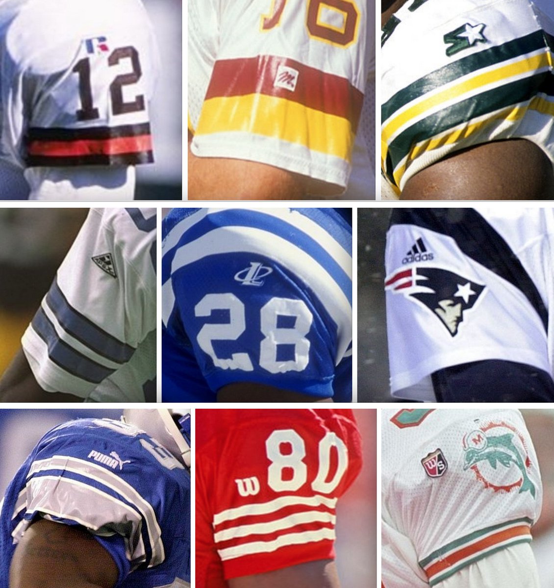
Friday Flashback: With the New Era logo now appearing on MLB caps, my latest Friday Flashback column on ESPN looks at the history of maker’s marks on pro sports uniforms (including the surprisingly large variety of NFL examples that appeared from 1990 through 2000, shown above). Check it out here.
In case you’re wondering, those logos are (left to right, top row to bottom): Russell Athletic, MacGregor, Starter, Apex, Logo Athletic, Adidas, Puma, Wilson, and Wilson Staff. Nike and Champion also appeared during the ’90s. Teams were still cutting their own deals, so it was a free-for-all out there.
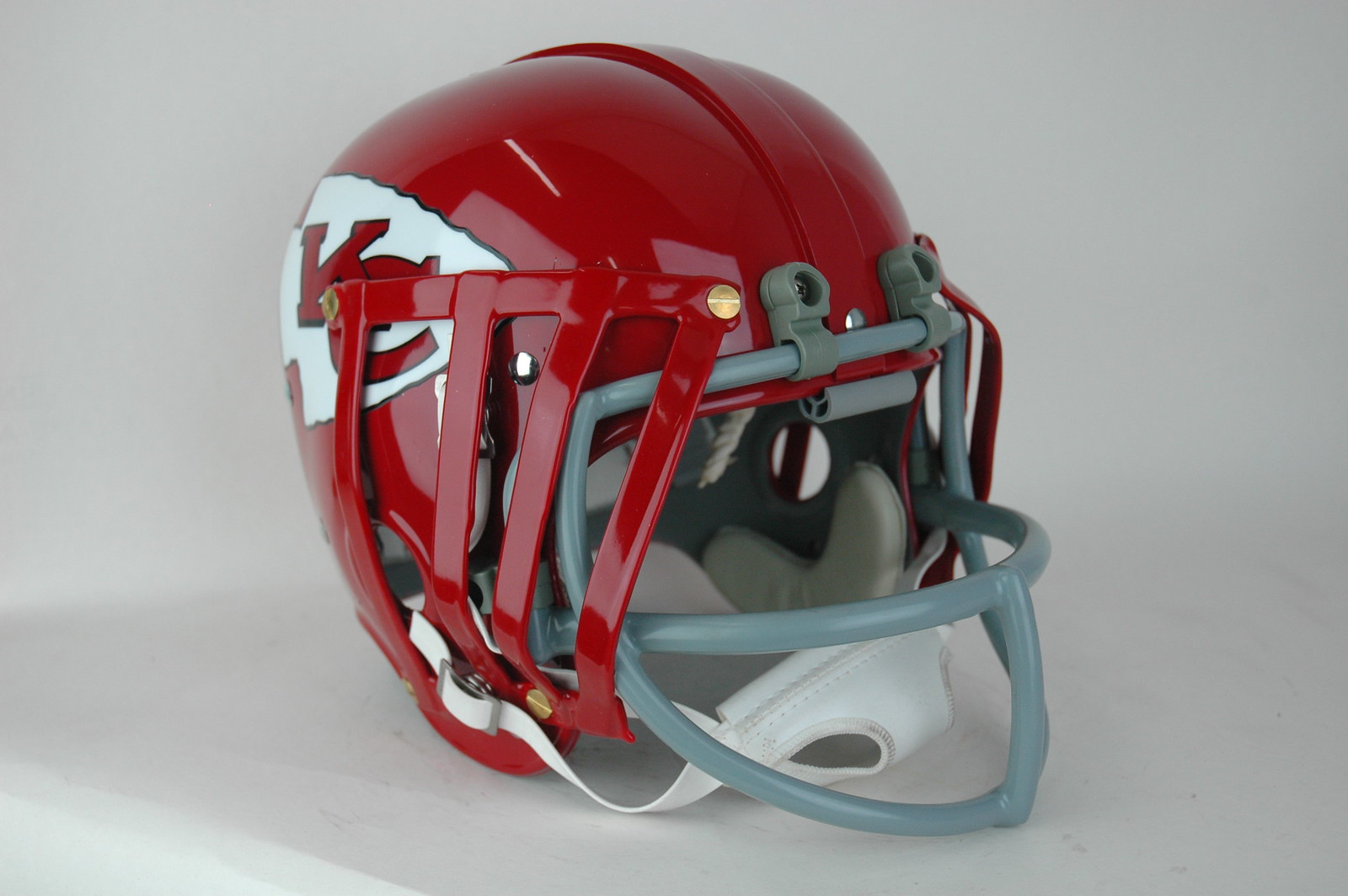
McClinton update: In Wednesday’s entry about Curtis McClinton’s oddly modified Chiefs helmet from Super Bowl IV, I included several quotes from helmet historian Curtis Worrell of Helmet Hut. He sent me a follow-up note yesterday, saying that the entry inspired him to try to re-create the bars that had been added to McClinton’s helmet. The results look pretty sharp (click to enlarge):

The Ticker
By Paul

’Skins Watch: With the Indians and Blue Jays set to face off in the ALCS tonight, it’s worth noting that longtime Jays radio announcer Jerry Howarth has not said the names of the Indians or Braves on the air since 1992. He also avoids phrases like, “They’re having a powwow on the mound” (from Iain Landon). … The Indians’ postseason success has also led to increased scrutiny for Chief Wahoo. … For last weekend’s football game against Dartmouth, Yale created a program cover featuring a montage of Yale/Dartmouth program cover images from decades past. Those old programs were from the days when Dartmouth’s teams were known as the Indians, and many of the cover designs featured indefensible caricatures of Native Americans. Yale officials ended up apologizing.

Baseball News: Did you know the Giants were considering a move to Toronto in the mid-1970s? Here’s a prototype “TG” cap that was produced at the time. Further info on the proposed move here and here (from Tim Buckley). … A photographer at last night’s Dodgers/Nats game was wearing a bike helmet. … Here’s a new one, at least to me: Nats Park had electronic bunting last night (from Tyler Kepner). … With the Dodgers’ victory last night, the NLCS will feature the only MLB team with a raised, rubberized batting helmet logo vs. the only MLB team with an embroidered batting helmet logo.

NFL News: Titans QB Marcus Mariota has his suits custom-made (from Wade Harder). … The Bills are going mono-blue this Sunday. … If you’ve been waiting for a new line of Dallas Cowboys underwear, today’s your lucky day (from Tommy Turner).
College Football News: Louisville wil go BFBS tonight. Here’s a close-up of the helmet. … Miami might get new green and/or black alts at some point down the road (thanks, Phil). … New “SEC Graduate” patches for two Florida players (from Moe Khan). … Here are this weekend’s uni combos for LSU, NC State, and Wake Forest. … LSU’s live tiger mascot died this week, so they’re wearing a memorial decal for him. Has any other animal ever been uni-memorialized? (From Wesley Eustis.)

Hockey News: The Oilers appear to have changed the gloves that they wear with their orange alternate jersey (from Wade Heidt). … With goalie Mike Condon moving from the Canadiens to the Penguins, the Pens’ equipment staff painted over the red stripes on his pads (from Jerry Wolper). … The Stars wore a helmet decal last night to honor the victims of last summer’s Dallas police shootings. … The Penguins have updated their Stanley Cup championship banners (from Ryan Connelly). … Another cross-sport José Fernández memorial in Miami, this time by the Panthers. They wore that jersey during pregame warm-ups last night, and also added that helmet decal. … Meep-meep! Very nice new uniforms for the Tucson Roadrunners. … The Hurricanes have released their third jersey schedule (from Gabe Cornwall). … Justin Williams of the Caps was missing his helmet number during last night’s game against the Penguins. … In that same game, Evgeni Malkin of the Pens was missing his alternate’s “A” for part of the third period. “It was loose, so he just pulled it off his sweater and handed it to a ref, who stuffed it in his pocket!” says Rob Ullman (screen shot by Mike Reilly).

College Hoops News: New uniforms for Wake Forest. … New uniforms and court design for South Carolina (both from Joel Mathwig).

Soccer News: “TSG Sprockhövel of the Regionalliga West (German 4th division soccer, which is pro but just barely) wears the exact same jersey numbers used in MLS,” says Bernd Wilms. “What’s even stranger is that their kits are made by Erima, not Adidas. As far as I know, Adidas custom-designed that font for MLS in 2013, so there’s no plausible reason why it should pop up in a German regional league.” … Chelsea is switching from Adidas to Nike next season (from Steven Fitzgerald). … Here’s one of those “What if soccer teams were actually American football teams?” projects.

Grab Bag: A local school board in Augusta, Ga., was deciding whether to allocate money for new marching band uniforms when a board member proposed that all band members, cheerleaders, and athletes wearing school-provided uniforms should be suspended if they don’t stand for the national anthem. The motion was set aside to allow the board time to study how other districts are handling the issue. … Kansas State’s logo will be featured on the hood of the Textron Aviation NASCAR for tomorrow’s race. … Wichita State is selling a bunch of uniforms and other gear from various sports.
No more Nationals = another blue World Series champion.
So with the Chargers sporting yellow facemasks (to go along with Denver’s “throwback” decals), is this possibly the first time since the advent of the 1-helmet rule that both teams in a single game have had a modification to their helmets?
How did the Bronco’s helmet violate the rules?
It didn’t, and that’s the point Paul’s making – more people are getting that they’re the same helmets, just with the decals replaced. Next game they’ll be re-decaled back to their usual configuration.
Which is too bad, because I think the classic “D” logo looks better, and I’m not even a Broncos fan!
Great job from Helmet Hut on recreating Curtis McClinton’s modified SBIV Chiefs helmet!
Saying “Smurf Time” for the Bills going mono-blue is just wrong. The Smurfs wear white pants (with a couple exceptions).
That’s pretty clearly tape, not paint, on Condon’s pads.
Have to say I’m amused by Malkin handing the loose “A” over to the ref.
The “tape” is a product called PadWrap, which allows goalies to change the coloring on their equipment quite easily. I’m sure each equipment manager has some stashed away in case of a trade.
PadWrap or PadSkinz (they claim to be the original outfit), either one; they apply an adhesive backing to synthetic leather, which can then be cut to size. One manufacturer (not in the NHL because of the licensing fees) actually offers the material that has been die-cut to fit the accent areas on their pads perfectly.
Yes! I was just about to say that. Paul l mentioned me about a year or so ago when I showed him that online.
From the knee up, that was a great looking game. I still hate the stupid socks though.
I did a double take at first when I read that the Nationals used electronic bunting, thinking it referred to when a player bunts the ball. :-)
I had the same theought when I saw the subject line of that email when it was sent to me!
Some Color Rash helmet observations.
-I liked the yellow facemask the Chargers wore last night. Looks good in combination with the white helmet and a blue jersey. I would not mind seeing them use it with the regular uniforms.
-I do enjoy seeing the classic D and helmet stripes for Denver. However, it did look uncomfortably odd on the navy helmet.
The classic D on the navy helmet reminded me of how the Milwaukee Brewers have been putting the ball-in-glove logo on their navy caps. The Utah Jazz are another example. These teams are resurrecting old beloved logos, but integrating them into the darker color schemes they switched to in the 90s/00s.
Denver decided to use the cut tape approach for Speedflex users like Von Miller.
Their regular helmet doesn’t have issue with the panel because the stripe starts there so there is nothing to cut.
Seems like the Chargers always have a 3rd jersey that looks better than what they normally wear.
Reebok also made NFL jerseys in the 90’s.
link
I know the University of Georgia has memorialized the death of the live bulldog mascot Uga on its helmets at least twice.
I’m not the most technologically adept person, so I’m sure a fellow Dawg will find a photo or two somewhere.
And as most of you know, the former mascots are interred within Sanford Stadium.
And I found one of them-
link
It looks to me like the Broncos weren’t the only team with a different logo on their standard shell. Besides their gold face mask, the Chargers’ bolt last night was retro, too.
Good catch on the Chargers’ bolt. They eliminated the powder blue outline last night.
Normal bolt: link
Last night: link
Excellent catch indeed — I missed that!
The Chargers needed blue hats.
And yellow pants.
The stupid monochrome combinations looked as embarrassing and high-school-y as usual, but each individual element (helmet, jersey, pants) from last night’s football game was pretty great. Denver moving to these (again, not in stupid dark-over-dark combination) would be one of the greatest upgrades in uniform history.
This ^^
Kind of nitpicky but is Louisville really “going BFBS” since black is one of their primary colors? I see folks on twitter doing this constantly, but didn’t think Paul would do the same on the ticker.
Exactly. For what sake is Louisville wearing black? For the sake of wearing actual, established team colors. Wearing black when it’s not a team color can be BFBS. Adding black as a new team color can be BFBS. But wearing black when it’s long been a team color cannot, by definition, be BFBS.
The Mike VI decal is fine, but they should have used this much cooler wordmark: link
That is cool.
Has anyone analyzed exactly which color of blue was used last night and whether it matched the blue that was worn during the peak years of Air Coryell?
For comparison:
link
link
To me, the blue they wore last night looked a little bit lighter/brighter.
That Chiefs helmet is superb! Great job Helmet Hut!
It’s weird how beauty is indeed in the eye of the beholder…to me, last night’s game was an absolute nightmare to watch, two awful uniforms that when mixed together create the mother of all eyesores.
Then Paul evaluates them as “not bad”.
Go figure.
I will say that Denver’s quasi-throwback helmets were an upgrade over their current design.
MacGregor on an NFL uniform? That’s a first, never knew that one. Would love to know more on that.
Coupla teams wore MacGregor around 1990. You can look it up on the mighty Gridiron Uniform Database:
link
The Indians will never change Chief Wahoo and the ‘Skins will stay the ‘Skins. Unless teams with Native American nicknames are affected financially, nothing is going to change.
I also don’t like how teams are being cherry picked, like the Braves don’t get lambasted, nor do the Kansas City Chiefs. Why? A tomahawk and a arrowhead aren’t offensive.
I do think the ‘Skins should go back to the Sonny Jurgensen helmets, with the spear on the helmet. Those are better helmets anyway.
I also don’t like how teams are being cherry picked, like the Braves don’t get lambasted, nor do the Kansas City Chiefs. Why?
Actually, some of us — myself included — are opposed to the Braves’ and Chiefs’ use of Native imagery as well.
It’s true that Washington and Cleveland get more attention, because an ethnic slur and a stereotyped caricature are essentially the low-hanging fruit of this debate. But the issue doesn’t end with those teams.
We’re not going to relitigate the whole debate here. I’m just answering your question and explaining the situation.
Sorry Paul, I know this has always been a sensitive topic for you and I’m not trying to start a fight. I love this site and what you guys do.
I was just thinking out loud and giving my opinion. I won’t mention it again.
I did think the Broncos helmet rocked, and the Chargers should always have gold numbers, like the early 80’s Air Coryell Chargers.
It is not a “sensitive topic,” and you’re welcome to mention it again. You raised the question of the Braves and Chiefs, and I addressed it. Simple.
Tomahawks and arrowheads aren’t exclusive to American Indigens.
To have a beef over a tomahawk, an arrowhead or a feather is pretty peevish, if you ask me. These symbols are part of a larger culture and have applications outside of the sacred. And the Brixton Apparel Company, to mention one, forfeited a bargaining chip by putting an Indian chief on their hats.
Whether the word “Redskin” is an appropriate name, or the Chief Wahoo caricature is an appropriate symbol, for a professional sports franchise, are separate and distinct questions from whether American Indian names, symbols, images, motifs, &c. are appropriate for sports franchises more generally.
Not entirely related, but I had to laugh at one of the comments posted on Deadspin about the whole situation.
C. Columbus: We’re in India. Therefore, you are Indians.
Native: Actually, we’re in North America, or if you prefer, the Caribbean. Way to read a map, honky.
Columbus: Nah, I’m just going to go with Indians.
Ignorance Trumps the truth every time!
Anyway, Scott, the Braves got an earful the year they played the Twins in the World Series, escalating to the point the tomahawk was subtracted from their insignia on the Metrodome dugout. And don’t let’s forget their misbegotten efforts to revive the Laughing Brave logo recently. The Chiefs have kept a lower profile, but still managed to create a dustup when a poster posed Kansas City players in headdresses.
Regarding the first item of the soccer ticker — erima actually belonged to adidas as it has been bought by them back in 1976, and is only on its own again since 2005. So it might be possible that they are allowed to offer the font for local teams after all. This needs to be confirmed though, as the erima teamwear catalog — Flash version available at link — unfortunately does not provide any details about customization.
One more thing — the German 4th division is semi-professional, not “pro, but just barely”, as there are a lot of amateur teams especially in the North and Bavaria divisions. Could the wording be fixed? :-)
To critique just a minute for the sake of “amateurism,” the German 4th division is “professional.” The poster probably said, “pro, but just barely” because the players also have other jobs — not full-employment through their soccer team.
The term “semi-professional” gets thrown around way too much here in the States when it should only be: professional or amateur. Amateur sports revolve around that specific difference. Especially important in regards to collegiate sports associations — the use of the term “professional” with any involvement from a student-athlete would deem ineligibility.
I get why “semi-professional” is used (part-time employment, not full-time pay, etc.). But it’s a term that muddies the water.
“Did you know the Giants were considering a move to Toronto in the mid-1970s? Here’s a prototype “TG” cap that was produced at the time.”
The Canadian Baseball Hall of Fame has an example of a different logo, from team letterhead produced at the time. With proposed colours of green and blue.
link
No idea how official any of this was.
Cutline says that’s Anthony Davis modeling the hat. Is that Anthony Davis the former USC tailback? He was in the WFL in 1975 and the CFL in 1976 before signing with the Tampa Bay Buccaneers in late ’76 to take effect in ’77.
So if that’s him – and I can’t tell for sure because of the angle – this would place the photo in either February ’76 or ’77, given it’s a Toronto Sun photo.
Getty’s image info says February 11, 1976.
Big fan of this week’s Color Rush game. Why even call it that if a team wears white. The Packers could wear all yellow. I love the Chargers light blue, but I thought this royal blue really worked. Loved the yellow face masks. I thought yellow socks would have looked great with this, but I know the Color Rush is pretty mono-chromatic. I also prefer the Broncos throwback helmet.
With the Tribe being 3-0 so far in their Wahoo caps, it will be interesting to see if they continue wearing them at least until the streak is broken.
I love that Yale has apologized for another school’s mascot. That’s terrific!
I love that Yale has apologized for another school’s mascot.
No, they did not apologize for that. They apologized for their own depictions of that mascot, and for presenting those depictions in 2016. Please do not distort the issue. Thanks.
As a purchaser of hats from places I used to live, the only Cleveland hat I have is a blue body, red bill Chief Wahoo hat (the one now available on MLshopB.com but without a postseason logo or a New Era logo.
I really like the Chief Wahoo logo. It’s unfortunate that some people are offended by it. My brother in law is about 1/3 Native American. His brother lives on a reservation. My brother in law has some neat Indian culture imagery in art and sculptures at their house. For the record he hates the term “Native American” and he has no issues with Chief Wahoo, the Redskins, the Braves etc.
I don’t blame you for liking Chief Wahoo. For the record, the first time I saw him, I was thirteen years old and I responded warmly to his toothy smile. First impressions will shape your opinion for the rest of your life. What seems to go unsaid during these (often heated) discussions is the bonds between us and our favorite teams are usually formed in childhood when we see things without guile. Folks wanting to do away with disparaging mascots are appealing to our sense of guilt and shame, and can seem cruelly meddlesome when they attempt to tamper with something we keep in our hearts. It’s no mystery why sports symbols and mascots make such enduring tattoos; these are loyalties we’ll probably keep forever.
Folks wanting to do away with disparaging mascots are appealing to our sense of guilt and shame…
Or your sense of decency and right vs. wrong.
It’s all about how you choose to frame things, eh, Walter?
I agree that emotional bonds and formed in childhood are powerful — no argument there. I trust you can agree that part of being an adult, as opposed to a child, is the ability to assess situations with intellect as well as emotion.
I can’t disagree with a word of that, Paul.
Re: Prototype “TG” cap
Sure looks like a repurposed Tokyo Giants cap. The serifs even seem to match.
link
This makes the most sense.
Interesting that Anthony Davis, the former USC football player, is modeling the prototype Toronto Giants baseball cap. I know that he played baseball for USC, and he was also playing for the Toronto CFL team at that time (though he was traded in 1977).
No, he came stateside and signed with the Bucs for ’77.
I always found the Wilson Staff branding odd, considering it’s a golf brand. And during its short usage in the NFL, it didn’t completely replace the regular Wilson brand, either. Just weird.
Definitely the oddest outfitting arrangement the NFL (or maybe any pro league) has ever had!
The Friday Flashback is up:
link
For the football fans of the game north of the border:
I do believe that a maker’s mark was first was seen on CFL uniforms in 1987. The Champion logo (full word) appeared on the right side of the chest on every CFL jersey.
link
If any fans know of an earlier date and example, we look forward to the additional knowledge.
Before The Hockey Company (the parent company of the CCM and Koho brands before Reebok bought them out) had their deal with the NHL in 2000, CCM was the sole provider of NHL uniforms from the 1989-90 through 1994-95 seasons. CCM had previously merged with Maska in 1983, and many CCM jerseys still had Maska on the inside-collar tag well into the 1990s.
The 1995-2000 period once again had manufacturer diversity, with Starter, Nike, Bauer, and Pro Player marks appearing in this period. Starter was the original uniform provider for the Colorado Avalanche starting in 1995, and expanded to several other teams in 1996, when Nike picked up a few teams as well. Bauer supplied the Nashville Predators for the 1998-99 season, their only foray into NHL uniforms. For the 1999-2000 season, though, the league was split between CCM and Pro Player, with Starter having collapsed and Nike simply backing out from making jerseys.
If I recall correctly, Pro Player was even set to be the official supplier for the Minnesota Wild and Columbus Blue Jackets for the 2000-01 season, and even had started selling replica jerseys. I don’t recall if it was anything that happened with Pro Player, but that ended up not happening, as the NHL began its deal with The Hockey Company for that season.
I admittedly skipped over big sections of NHL maker’s mark history in today’s piece. Column was getting too long. Thanks for the info!
Understood. It is a lot to break down, after all, especially when covering multiple leagues.
Hey Paul would you consider doing a Friday Flashback piece on the NFL’s use of the fishnet mesh jerseys? I find them interesting and would like to know more. Example the Bosworth era Seahawks. Thanks.
Not a bad idea — thanks!
Really good idea Wafflebored. I graduated high school in 1985, and the combo of mesh and “half jerseys” ruled the 80’s. I’m biased of course, but i always thought that was a great era of Unis for college and pro football.
Besides the monochrome silliness, that was a nice looking football game last night. At least from the waist up.
What made those Chargers uniforms really stand out was the yellow numbers. Man, that pops so nicely on royal blue. Lose that silly number font and those would be amazing.
Denver’s classic helmet logo/striping and classic jerseys can’t come back fast enough. Super Bowl stigma be damned.
Interestingly, my wife said that the Broncos’ throwback logo looked high school or college, and thought its old fashioned feel didn’t fit the modern vibe of the Color Rush program.
Beyond just gloves, Oilers appear to be going with their usual home pants with the orange thirds too. Last season the pants matching the orange jersey were solid blue, but they had the side stripes on the pants for this year’s opener. I think I prefer the toned down elements of last year’s orange uniform set.
I had mentioned the pants in my ticker submission as well, but it looks like just the gloves got mentioned on the site.
The Oilers did wear alternate solid blue gloves and solid blue pants with the orange uniform, which I preferred as well. I think they had done this as it did tone it down a bit, as you had indicated you liked. Still like the orange trim on gloves and pants with the regular blue uniforms. I have not heard any explanation why they have made the change this year.
It’s somewhat odd that they had plain pants last year and are now just wearing their regular flared-stripe pants. After all, the pants from the uniform they’re emulating link from the more familiar flared stripes.
If only they had contrasting pants, both teams’ uniforms last night would easily be drastic improvements over what they actually wear regularly.
This is how you do color-on-color and all the way from India?
link
Regarding yesterday’s ticker item about the pink cricket ball:
It’s easy to see why one would think the ball was another Pinktober prop, as the West Indies Cricket Twitter page shows a pink ribbon on its avatar.
Guess the thinking behind the pinking is, since old fashioned daytime “proper” cricket uses a red ball and newer T20/evening cricket uses a white ball, this is a blending of colors that could be used any time of day.
Looks like the NFL gave the Chargers and Broncos a special Color Rush dispensation from Pinktober. At least they got that right!
What’s the big deal about Yale using historic images to report on history? Yes, the images were offensive, but we shouldn’t be hiding from our history just because it’s unsavory. Would it also be offensive to use racist but relevant images in a history textbook when discussing the Civil War or the segregation era? Would it be offensive to show images of swastikas in a textbook about the Holocaust? Surely not.
Yeah, but this wasn’t a textbook, and it wasn’t just about teaching or “report[ing].” A program cover is promotional and celebratory by definition — it carries the implicit endorsement of the team or school that produces it. Context matters.
Let’s say a 1920s program cover had some sort of Sambo-ish depiction of black people, which was (sadly) acceptable back then. Is there any way you’d want to reprise that cover illustration for a program cover today, even in a “historic” context? Of course not — because, again, a program cover is promotional and celebratory by definition. Same thing applies here.
Even I thought the Yale program was tacky. Things like that are better shown in the context of evolving attitudes toward American Indians, like a museum.
Loved the maker’s mark overview, Paul.
Another maker’s mark on NHL uniforms quirk that I always found interesting.
If I go out and buy a retail hockey helmet, the maker’s mark is displayed on the front and the sides.
However, an NHL helmet only has the maker’s mark on the front, leaving the sides for team logos. It’s an established standard for all 30 teams.
At some point that had to be established as a rule.
It was once common to see the mark on the helmet side. Marty Lapointe in the ’91-’92 season:
link
Even as late as the ’97-’98 season I’d see the new Bauer ‘B’ logo on the side: link
Going back to the ’80s some teams would cover the front logo with a team decal.
link
The retail versions of the helmet stickers, at the very least, have extensions on the logo decals to cover up the maker’s marks. link
I must be missing something, but Mr. Worrell’s helmet handiwork above strikes me as strange since the placement of the bars seems like it would interfere with the chinstrap.
If only the Chargers had that jersey and helmet look (retro bolt/yellow mask) coupled with white pants… that would be a sweet home uniform. Too many drab, dark uniforms in the NFL these days… time to brighten things up a bit.
Could not agree more on bringing back some brighter colors to the league. Way too many dark blue unis.
Efforts to rebrand Indian-themed sports teams would go down a lot better if they didn’t do such a shitty job. And why aren’t professionals of Indian ancestry ever involved with the new results?
Love, love ,love the unis on Denver and SD last night! Both teams need to go to those full time (minus the mono pants).