Click to enlarge
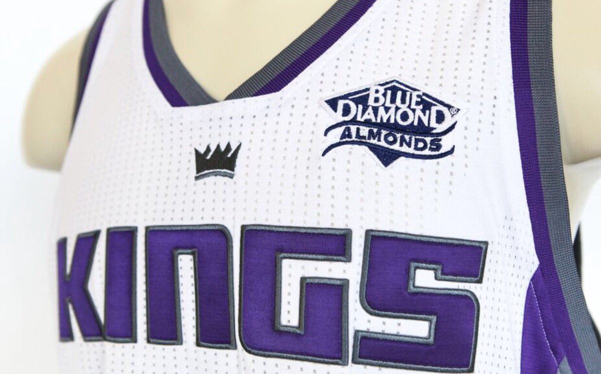
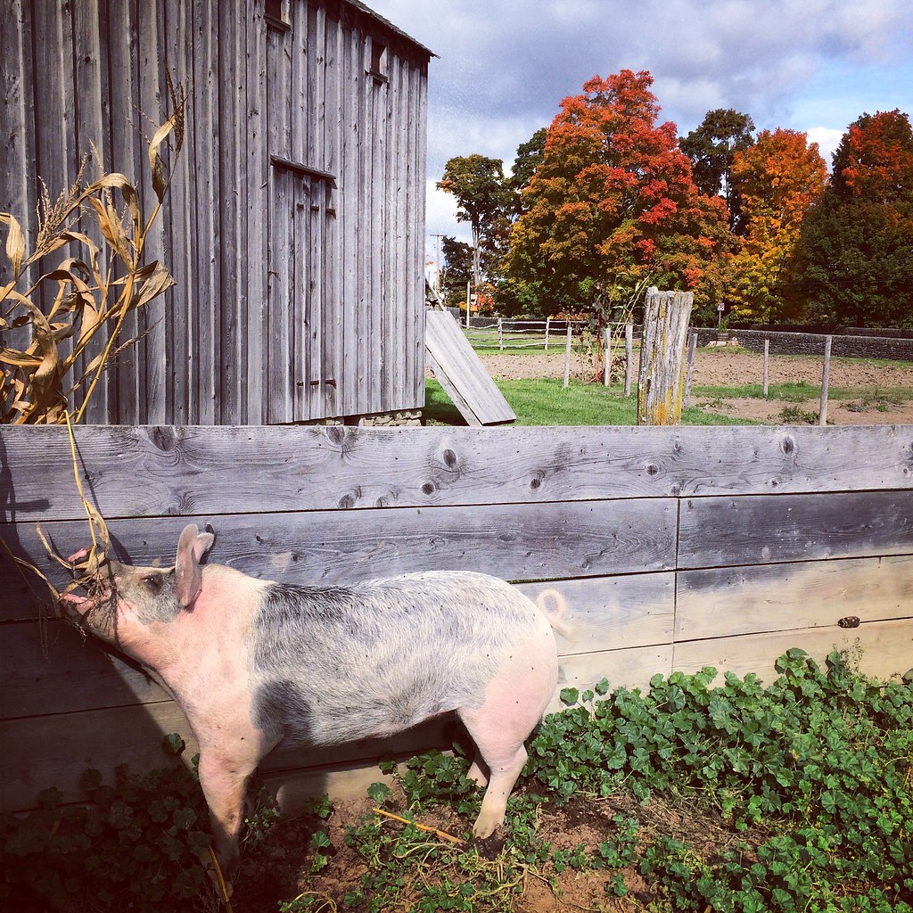
The number of confirmed NBA uniform sponsors advertisers doubled yesterday, as the Kings announced that they’ve sold space on their jersey for the next three years to Blue Diamond almonds. Although the company’s logo won’t appear on jerseys until next season, it will appear on the Kings’ court apron this season.
Obviously, any uniform advertising is lame and unacceptable. With that caveat in mind, a few thoughts:
• Blue Diamond is based in Sacramento, so the Kings are going with a local partner, which is nice.
• Back in April, when the Kings unveiled their new logo set, I interviewed team president Chris Granger, who stressed the importance of the color purple to the team’s identity. So it seems a little odd that they’d choose an advertiser whose name includes a color other than purple. Similarly, you’d think Blue Diamond might prefer to partner with a team that wears blue. (Yes, I realize blue and purple are somewhat similar, but they’re definitely not the same thing.) The Kings do have a set of blue throwbacks, so there’s that. Will Blue Diamond come out with a special edition of purple-themed nuts, just for the Kings?
• Of all the products or services one could choose to do business with, almonds seem like a pretty good one. I like almonds; you probably do too, unless you have serious nut allergies (in which case you have my most profound and sincere sympathies). Almonds aren’t an annoying lifestyle brand, or a totem of douchebag frat-boy culture, or some generationally leveraged trend targeted at millennials. They’re just a natural food that’s actually pretty good for you. They are, in other words, completely non-loathsome, which is something I didn’t expect to be saying about any of the NBA’s uniform advertisers. (As an aside, almonds also the subject of a rather hilarious ode by my man Hamilton Nolan. Highly recommended.)
To recap: Uniform advertising is lame and unacceptable. But this particular one could’ve been a whole lot worse.
Click to enlarge
Collector’s Corner
By Brinke Guthrie
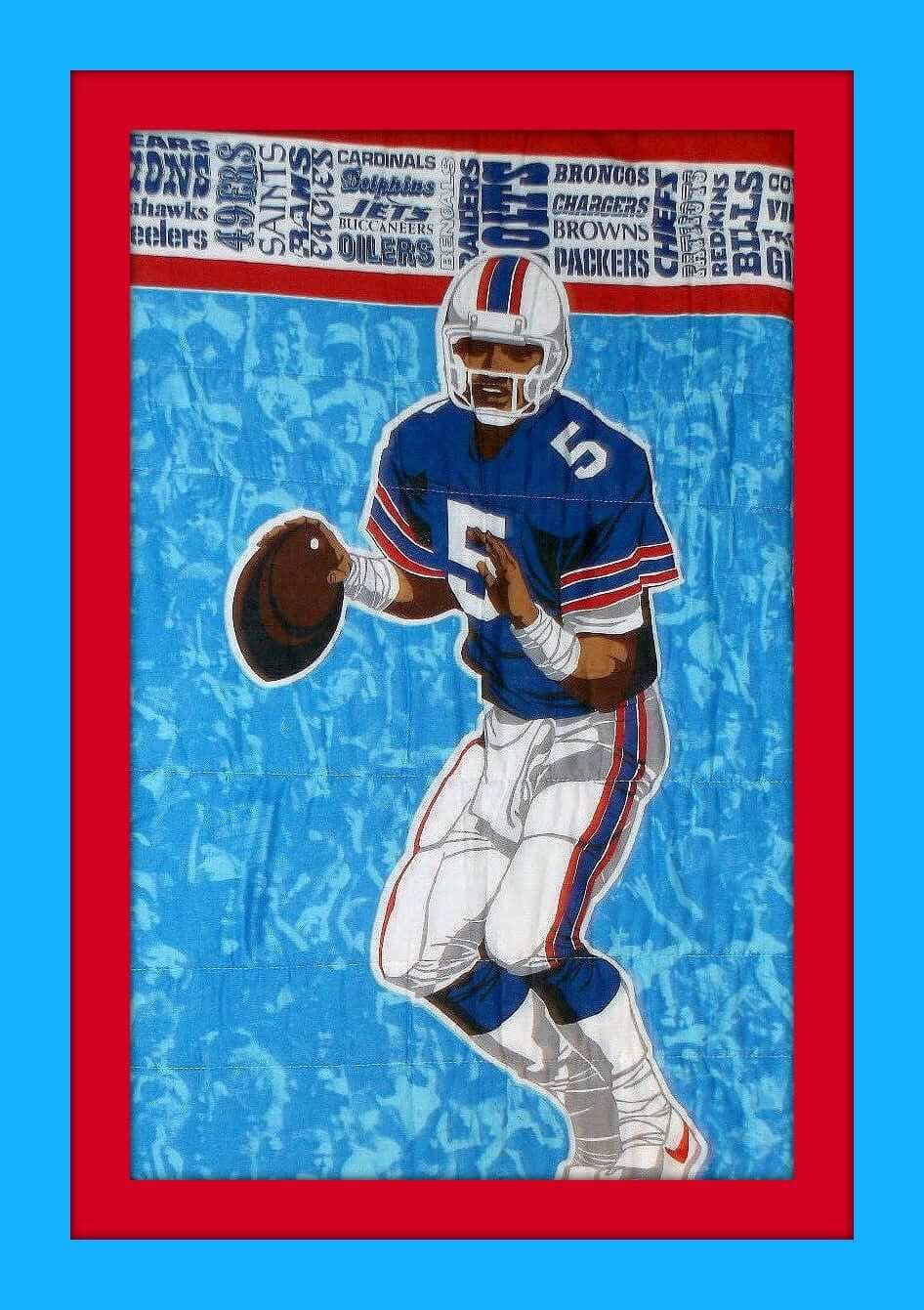
The quarterback on this 1975 NFL sleeping bag looks like he’s kinda in the Buffalo Bills/NY Giants vein, right? Can anyone suggest who he might have been? Interesting that the graphic designer put this fellow in Nikes as opposed to plain white or some generic stripe. This one also comes with the period-appropriate wordmarks for all the teams in the league.
Okay, on to the rest of this week’s picks:
• Sportoys Helmet Buggy alert! The Detroit Lions are represented here.
• The Brewers’ old ball-in-glove logo is showcased on these vintage MLB wristbands.
• Nice look to this old “Go Pack Go” embroidered patch, courtesy of Pabst Blue Ribbon.
• Classic Brownie mascot, along with the early edition of the NFL shield, on this 1960s Cleveland Browns glass.
• Brownie shows up again on this 1960s NFL seat cushion, featuring all 14 teams broken down into Eastern/Western Conferences.
• Here’s a great-looking 1960s Kansas City Chiefs poster!
• Plenty of old-school ABA logos to be found on these 1960s curtains.
• Before I discovered soccer, I played plenty of youth football back in the day, and I can’t say I recall this type of facemask as shown on this 1960s Ray-duhz helmet from Franklin.
• Vikings fans, your team is off to a fast start, so why not celebrate with this 1960s bobblehead.
• Gonna say early 1970s for this NFL Frozen Coca Cola helmet board. Eagles were in white/green at that period, no?
• Another contemporary-looking poster from the 1970s — how cool is the look to this one for the Minnesota North Stars?

KRC update: Today’s installment of Key Ring Chronicles might be my favorite one so far. It’s about the little shrimp-shaped whistle shown in the photo above. Get the full story here.
The Ticker
By Alex Hider

Baseball News: TBS threw all the way back to Coco Crisp’s first stint with the Indians for a graphic last night (from Todd Bell). … David C. Murphy took a behind-the-scenes tour of SunTrust Park, the new home of the Braves. … Speaking of the Braves, Douglas Ford’s son got a Braves-themed Cub Scout patch for attending a game at Turner Field. Ironically, it was made in China. … The postseason sleeve patch worn by the home plate ump in last night’s Giants/Cubs game was peeling off, and then it was completely gone.

NFL News: Check it out: Mike Ditka in a basketball jersey! (From Jeff Flynn.) … A good visual history of the 49ers begins at the 5:56 mark of this video (from Gilbert Lee). … Pinktober has spread to peewee football in Alberta, Canada. Buford Grimes says his son was issued pink socks prior to his game (in the snow!) this past weekend. … The New England Patriots made a veiled appearance on The Simpsons two nights ago as the “Boston Americans” (From BSmile). … The Panthers wore their blue alts last night.
College Football News: Georgia State will switch to Under Armour starting next year (from Chris W). … Youngstown State will wear silver decals this weekend to commemorate the “Silver Anniversary” of their first FCS national championship in 1991 (from Michael Moamis). … Here’s the scoop on those “SEC Graduate” patches that have been showing up lately (from Clint Richardson).

Hockey News: The Avalanche have posted their uniform schedule (from Phil). … The old signage has come down at the “New Igloo” in Pittsbugh (from Brian S). … Kind of hard to tell, but the backup goalie for the Des Moines Buccaneers of the USHL wears a regular hockey helmet instead of the typical cap on the bench (from John Cristiano). … Check this out this awesome 1970s leather hockey jacket (from J. Daniel). … The Milwaukee Admirals of the AHL live-streamed the installation of their center ice logo ”” or as Dan Pfeiffer puts it, “literally watching paint dry, but cool, detailed paint.”

NBA News: The Wizards have used a blue basketball as the logo on their waistband for several years, but now it looks like they may be adding a red background (from nicefellow31). … Bucks fans can pick up new team-branded license plates, thanks to the Wisconsin Department of Transportation. The use of light blue was a nice touch (from our own Mike Chamernik). … The concourse at the Kings’ new arena has lots of vintage neon signage from the Sacramento area.

College Hoops News: Arizona released seven new basketball uniforms yesterday ”” most of them heavy on gradients (From Phil). … Very minimalistic new unis for Wake Forest (also from Phil). … We also got a look at SMU’s unis yesterday at the team’s picture day (also also from Phil). … Think we’ve seen this before, but Maryland has tweaked its collars for the upcoming season.

Soccer News: Gerard Pique of the Spanish national team ”” who is often jeered by Spanish fans for his support of Catalonian independence ”” was criticized by fans on Sunday for cutting his long-sleeved jersey in a way that removed the cuffs bearing the colors of the Spanish flag. Pique says he cut his sleeves only because he didn’t like the fit of the jersey, and that he’ll retire from the team following the 2018 World Cup (from Josh Hinton, thanks to everyone else who passed this along). … RFK Stadium has added a DC United jersey history in one of its tunnels (from Scott).

Grab Bag: A CNN commentator had a Texas Longhorns decal on his tablet on Sunday night (from D.C. James). … NASCAR’s Elliott Sadler is going all out for Pinktober (from David Firestone).
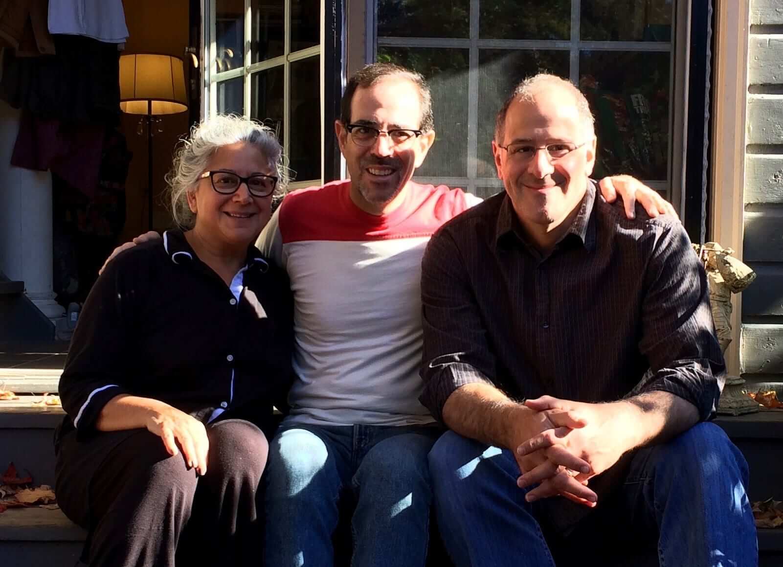

What Paul did last night weekend: Back in college, I was friends with this guy named Jeff Katz. We knew each other from the student-run record store and talked almost exclusively about music. Nowadays Jeff is a baseball author and the mayor of Cooperstown (which basically means we can now have geeky discussions about baseball as well as music). He comes down to NYC semi-regularly, but I hadn’t visited him in Cooperstown since 2009, so the Tugboat Captain and I went up and stayed with him for the Columbus Day weekend. That’s Jeff on one side of me and his lovely wife, Karen, on the other. Yeah, the lighting could’ve been better.
Naturally, we paid a visit to the Hall of Fame, which was great. But we had an even better time at the Farmers’ Museum, which featured, among other things, lots of live animals and a bunch of vintage tractors, one of which had been rigged up to create a sort of Rube Goldberg-ish crosscut saw:
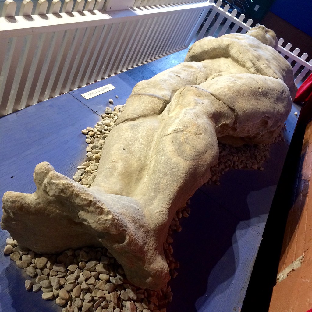
The Farmers’ Museum is also the unlikely final resting place for the Cardiff Giant, one of the great 19th-century hoaxes. It’s a bit of an odd fit for the museum, but whatever — fun to see:
Hall of Fame senior curator and longtime Uni Watch pal/ally Tom Shieber doesn’t work on weekends, so he wasn’t at the Hall when we stopped by. But he and his wife, Liane, joined us at Jeff’s house for dinner that night, and then we all watched some playoff baseball.
We took a scenic, backroads-y route home yesterday — not much traffic, lots of autumn colors. Big thanks to Jeff and Karen for being such tremendous hosts, and for giving us a sorely needed long-weekend getaway (and bonus thanks to Uni Watch intern Alex Hider for pinch-Tickering yesterday, when made everything much less stressful).
My guess of the NFL player image on the sleeping bag from the Collector’s Corner is Dan Pastorini and I believe the bag is later in date as the Jets logo is from 1978.
By looking at the Rams and Chargers script, I’d say the sleeping bag is from around the mid-80s.
Nice catch with the Chargers word mark. I was too busy racking my brain over when the Rams added the LA to theirs. Knew it was fairly recent (in comparison to the 1970s). Possibly mid-to-late ’80s, I had a sleeping bag that was of a similar material around that time.
Using Chris Creamer’s site as the only source I can find quickly, the Rams used the logo here from 1984-94. The Chargers used this logo from 1988-2006. The Patriots wordmark is from 1971-1992, so we have a range of 1988-1992. I can’t get anything narrower at a quick glance from looking at the other wordmarks on the page.
No Bill or Giant wore #5 during that time frame, at least not amongst players who threw a pass. Nor did any Oiler, the next closest team to that color scheme as far as I can tell.
The 1975 reference appears to come from the tag, which claims that the bag meets the standards of a 1975 California law. The presence of giant swoosh Nike cleats strongly suggests that the product come from much later than 1975, probably early 1980s.
In addition to the Nike swoosh, check out the helmet. I’d say mid to late 80’s.
Good point. The overall aesthetics of the thing seem really 1985-87 for me, but for a retail product like this, that means it’s probably from several years later, like 1989-91. I was a kid back then, and stuff like this (sleeping bags, lunch boxes, Trapper Keepers &c.) were always a few years past style.
There’s also a Seahawks wordmark. They began in ’76. Yeah, it’s feasible that it could have been on there in ’75 (I remember seeing Diamondbacks merchandise as early as ’95-96) – but along with all the other notes above, it’s definitely not from 1975.
Isn’t Georgia Tech also outfitted by Russell?
I’m now assuming that’s supposed to say “Tech” – not “State” – in the ticker… Looks like Ga. St. is Nike.
Kee-reck. My bad, as noted in an earlier comment.
I was about to write this too, however you click on the link and see that Georgia State is switching to Under Armour. Just not from Russell.
My bad. When editing Alex’s Ticker, I mis-read Georgia State as GaTech and inserted the language about Russell. Wording now adjusted.
“Speaking of the Braves, Douglas Ford’s son got a Braves-themed Cub Scout patch for attending a game at Turner Field. Ironically, it was made in China.”
As an assistant scoutmaster for a troop in Michigan let me give you a little insight into the craziness of patch prices for scouts. When you want to do an event, you want a quality program first and trinkets second. Usually the council takes up to 40% (generally 20%) of the event fee as upkeep for themselves because you have to use their equipment/time/resources in some way. You are also responsible for creating your own patches and paying for them with the funds you collected. If you go through the “official” patch supplier of BSA (I can’t remember their name anymore) a patch like that would probably set you back between $1 and $2 each. If you go through a Chinese supplier you can get the same quality of patch nowadays, the American supplier is no better than most of the Chinese ones for scout patches, for less than $.10 each shipped. So if you have a day event you’re charging $10 for, of which you only get to use $8 for your program. Would you rather have a more expensive patch, or another program area plus a free hot dog?
Agreed
link
BSA National is such a good ol’ boys club that they can’t get their heads out from their backsides. I did the 2010 National Jambo for one of the Trading Posts and when I asked the retail head for the then Central Region he said “most of the crap here I got no say in, it was created by yes men.”
That is why we had tons of broken/returned spray bottle fans and 6 oz pouches of gummies in a burlap sack (candies packed inside of that in plastic) that cost $10.
Doesn’t Georgia Tech also wear Russell Athletic uniforms?
My bad, as noted in an earlier comment.
I read Jeff’s book, Split Season: 1981, this summer. Very good book.
Did the powers that be at Arizona collectively decide that they were cool with being known as “the gradient school” and told Nike so? Gradients weren’t cool when it was a thing; now it isn’t a thing again and they’re jumping all over it. Why?
Gradients were cool, or they wouldn’t have been “a thing” in the first place. Now they’re retro-cool.
Everything that’s “a thing” is, by definition, cool?
Within the context of sports uniform design, and assuming that being “a thing” means that it was trendy and multiple teams did it… then, yeah, pretty much.
Don’t you think some design concepts worn by multiple teams were just gimmicks foisted upon us by uniform manufacturers and were never actually “cool” but were basically just dumped into the marketplace? Case in point: Nike’s super-baggy “System of Dress” college basketball shorts. Nobody liked them, they were never cool — they were just a thing.
I’m okay with it because it means at least one school has a visual trademark and won’t be taking an off-the-rack Nike template.
Proofreading:
“almonds also the subject”
“Plenty of old-school ABA logos to be found on these 1960s curtains.” 1970s, as the listing says (and the San Diego Conquistadors logo confirms)
Tagging on the “The concourse at the Kings’ new arena…” item is broken.
And calling the current Pittsburgh arena the “New Igloo” completely misses the point. The Civic Arena was round with a white dome, so “Igloo” made sense. The new building isn’t Igloo-like at all. “Schmigloo” would be OK.
As insane as it seems to me to ditch a perfectly good ballpark after 20 seasons, Sun Trust Park looks pretty sweet to me. I’m smacking my forehead for not thinking of the ventilated seats first. There’s nothing worse than standing up and having to unstick your sweat drenched back from your seat. It will be interesting to see how durable they turn out to be vs regular stadium seats.
Just a note, I got my Uni Watch soccer shirt yesterday and it is a beauty! Thanks.
That longhorn logo is on Paul Begala’s computer on the CNN set. He was a former UT student body president (though he lost one election there to a cartoon character), taught there briefly, married another UT alum, and has a son currently attending the University of Texas.
I think we should call the penguins new arena the paint can.
What went south with Consul Energy to have their sign so hastily deposed?
Coco Crisp never wore that Indians uniform. It was a Photoshop job. He was traded prior to the 2006 season. The Indians used silver as their accent color from 2002-2007, and didn’t switch the the superfluous white layer (as I like to call it) until 2008.
Although, it could just be the way the light hits the silver. I never liked that look, personally.
Well, you would think almonds are an uncontroversial product. However, with the drought here in California (“Now In Its 5th Smash Year) there has been attention paid to the amount of water almond orchards consume, which is estimated to be as much as 10% of the state’s water usage. (See, for example, link)
I was thinking along the same lines – I read somewhere that they take a lot of water to grow and you confirmed it for me!
I have a suggestion for the name of the football guy on the next shirt: Chuck Pigsken. Works best if he’s a quarterback, also, his number should be 17. For obvious reasons.
I agree that advertising on jerseys is lame, but what do you mean by “unacceptable”? Does this mean you wont be able to stomach watch Sacramento Kings games going forward? That you will not review or post photos of the jerseys?
“Unacceptable” means it’s the wrong thing to do and there’s no excuse for it.
I would add to you almond discussion that the Central Valley of CA is the largest almond/walnut producing region in the world. Hence, here in Modesto, CA (about 70 miles south of Sac.) we have the Modesto Nuts. Which was the Colorado Rockies’ single A farm team. Currently, the almond and walnut harvest is just wrapping ip and my allergies are still killing me.
But that addition of the jersey add is BS.
Looks like the braves are going to start recognizing pennants before their Atlanta days. That’s a crazy amount of pennants- all the way back to the 1870s.
If you need a reason to loathe almond advertising, almonds are one of the most “thirsty” crops, and the almond industry is a big part of California’s drought issues.
link
Well, they DO sell BLUEberry flavored almonds in a purple packaging…
link
It could be worse, they could be walnuts. (4.9 gallons per nut vs. 1.1 gallons) link
There’s no way that sleeping bag is from 1975. Look at the guy’s shoes. One, they are white, and the NFL was still wearing black cleats in 1975. Two, that looks a lot like a swoosh to me. Also the facemask is way too modern. I put the date nearer 1982. If you look at the stance he has taken with the ball it’s my guess that this is a heavily edited and recolored Bill Kenney from the Chiefs.
The latest episode of Pittsburgh Dad includes detailed comments on the Steelers’ 2008 throwbacks (starting at 1:43):
link
Wondering if the goalie in the skater helmet reflects a new rule about all players on the bench needing to wear a helmet. In which case, it would certainly figure that a skater’s helmet would be a whole lot more comfortable for spectating than wearing one’s regular mask. I know there are rules about helmets in lower levels of hockey and just don’t know where they stop.