For most of today’s photos, you can click to enlarge
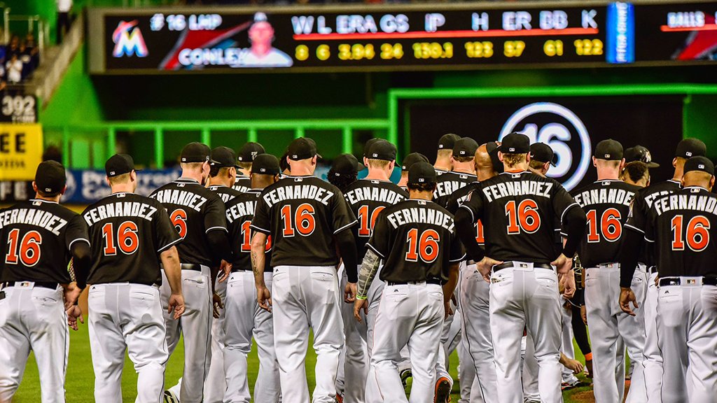
Unprecedented move yesterday evening in Miami, as the Marlins memorialized fallen teammate José Fernández by having every member of the team wear his No. 16 and his NOB for last night’s game against the Mets. To my knowledge, it marked the first time a contemporary player has been saluted in this manner. (Obviously, everyone wears No. 42 on Jackie Day, but that’s a whole different thing. And yes, I suppose you could say everyone’s wearing the “same number” when the jerseys are blank on the back, like when the Yanks and Bosox wore numberless 1912 throwbacks to celebrate Fenway Park’s centennial in 2012, but that too is a category unto itself.)
A few notes from the game, and some related items from around MLB:
• Much like on Jackie Day, there were some odd visuals, like a batting order comprised entirely of 16s.
• Although Majestic hurriedly prepared new game jerseys for the occasion, the players wore their usual BP jerseys with their usual numbers:
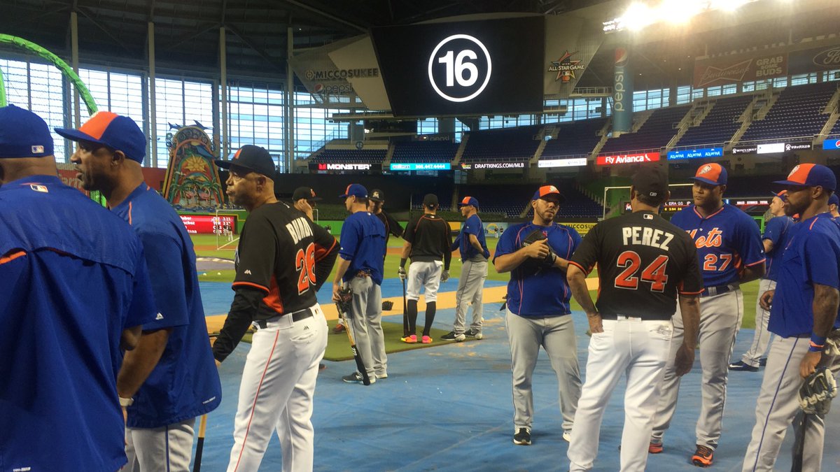
• Marlins second baseman Dee Gordon was wearing a powerful “Fernández RIP” T-shirt before the game.
• Speaking of Gordon, he normally bats left-handed. But when he came to bat to lead off the bottom of the 1st, he stepped into the right-handed batter’s box and mimicked Fernández’s stance. He was also wearing Fernández’s batting helmet for that pitch: Check that — I’m now told he was wearing a right-handed helmet in his own size, with “16” on it:
Dee Gordon stepping into the right-handed batter's box wasn't the only tribute to José Fernández — he mimicked his stance/load too pic.twitter.com/3KNrUKgzuT
— Cespedes Family BBQ (@CespedesBBQ) September 27, 2016
Gordon then switched to his normal helmet, moved to the left-handed batter’s box, and homered. You can see him swap out the helmet in this video:
• Gordon also had “16” shaved into his hair.
• Most of the Marlins and some of the Mets had memorials inscribed on their caps. The most flamboyant one was definitely worn by Marlins pitcher Jose Urena. I couldn’t keep track of all of the others, but you can see a few of them here:
.@Giancarlo818 offers some parting words to pay respects to #JDF16: https://t.co/Xe2MPo9qRf https://t.co/D8LAdT8YhH
— Cut4 (@Cut4) September 27, 2016
Baseball is family. #JDF16https://t.co/8xWmNoIBbi
— MLB (@MLB) September 27, 2016
• The Mets, who had hung a Fernández jersey in their dugout for Sunday’s home game, took that jersey with them to Miami and displayed it again last night (creating the odd sight of a Mets throwback home jersey being showcased on the road):
For a second day, the Mets' Jose Fernandez jersey hangs in their dugout. They carried it with them to Miami. pic.twitter.com/cOA6dc6RdO
— Anthony DiComo (@AnthonyDiComo) September 26, 2016
• After the national anthem, the two sets of players, who had lined up along the baselines as is typically done for the World Series or Opening Day, approached each other and embraced, and then the Marlins circled the mound, where Fernández’s number had been inscribed, and kneeled down:
Bigger than baseball.#JDF16 pic.twitter.com/VAnZXVBh1j
— Miami Marlins (@Marlins) September 26, 2016
What a moment.#JDF16 pic.twitter.com/iT7KLTEmaQ
— Miami Marlins (@Marlins) September 26, 2016
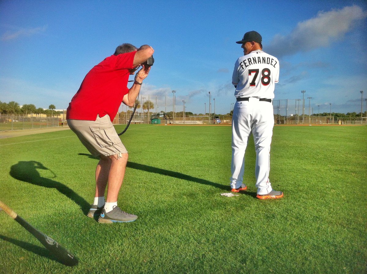
• Little-known fact: During spring training of 2013, Fernández wore No. 78:
• The Marlins’ wives wore Fernández T-shirts.
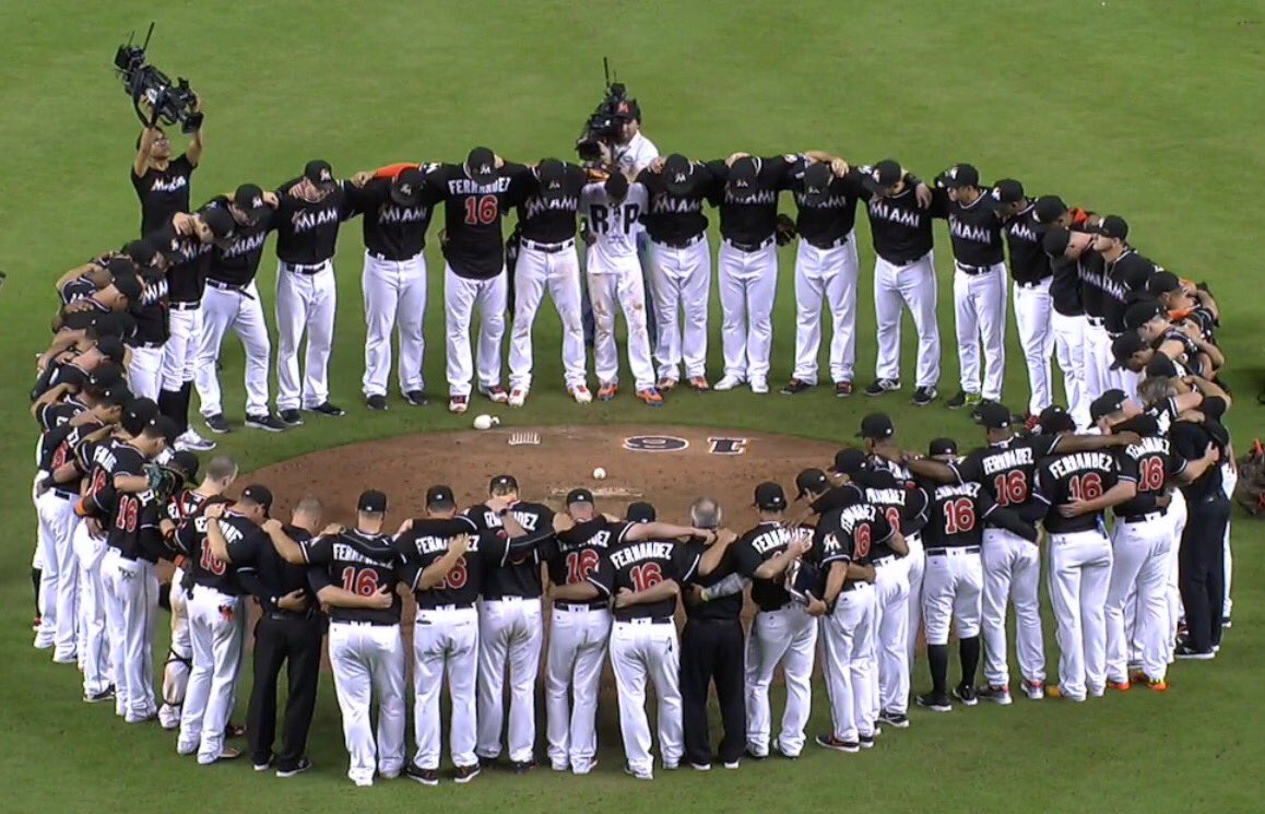
• When the game ended, the Marlins once again circled the mound and then left their caps on the mound:

• And in a move that was widely expected, Marlins owner Jeffrey Loria said that the team will retire Fernández’s number. So while many players wore it last night, nobody will wear it again.
• Meanwhile, at least two teams honored Fernández by hanging jerseys in their dugouts: the Astros and Rays.
• And players around MLB continued to salute Fernández by inscribing messages on their caps and other uniform elements, including Rangers pitcher Martin Perez and White Sox first baseman Jose Abreu.
I’m sure there were other Fernández-related gestures last night that I missed. Feel free to post them in the comments.
A final thought: This was one time when black jerseys seemed appropriate.
New Era logo creep, continued: Yesterday I filled in the final blank regarding the three instances of New Era logo creep on MLB game caps in 2005 (Padres on April 20, Twins on July 3, and White Sox on Sept. 9). I thought that might have closed the book on previous instances of New Era logo creep, but reader J.A. muddied the waters yesterday afternoon by posting the following note in the comments: “The Padres wore two cut panel retros in 2010 as part of [a] weekly home game throwback promo[tion], and both versions had tonal [New Era logos] on them.”
That sounded fishy to me — I certainly had no memory of it — so I did some photo digging. And sure enough, look what I turned up:
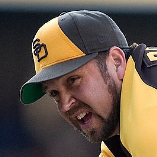
That’s pitcher Heath Bell wearing a throwback cap that definitely has a tone-on-tone New Era logo (i.e., the logo stitching is the same color as the background fabric).
According to Bill Henderson’s guide, the Padres wore that throwback uniform, including the cap, four times in 2010: May 27, July 29, Aug. 12, and Aug. 26. They also wore a different throwback uniform, with a slightly different cap, on April 15 and Sept. 30. Did that cap also have the tone-on-tone maker’s mark? Yup.
I’m fairly certain I wasn’t aware of this back when it happened in 2010. It’s impossible to see except in close-up photos. Too bad the New Era logo creep that’s about to infest MLB won’t be tone-on-tone.
Collector’s Corner
By Brinke Guthrie
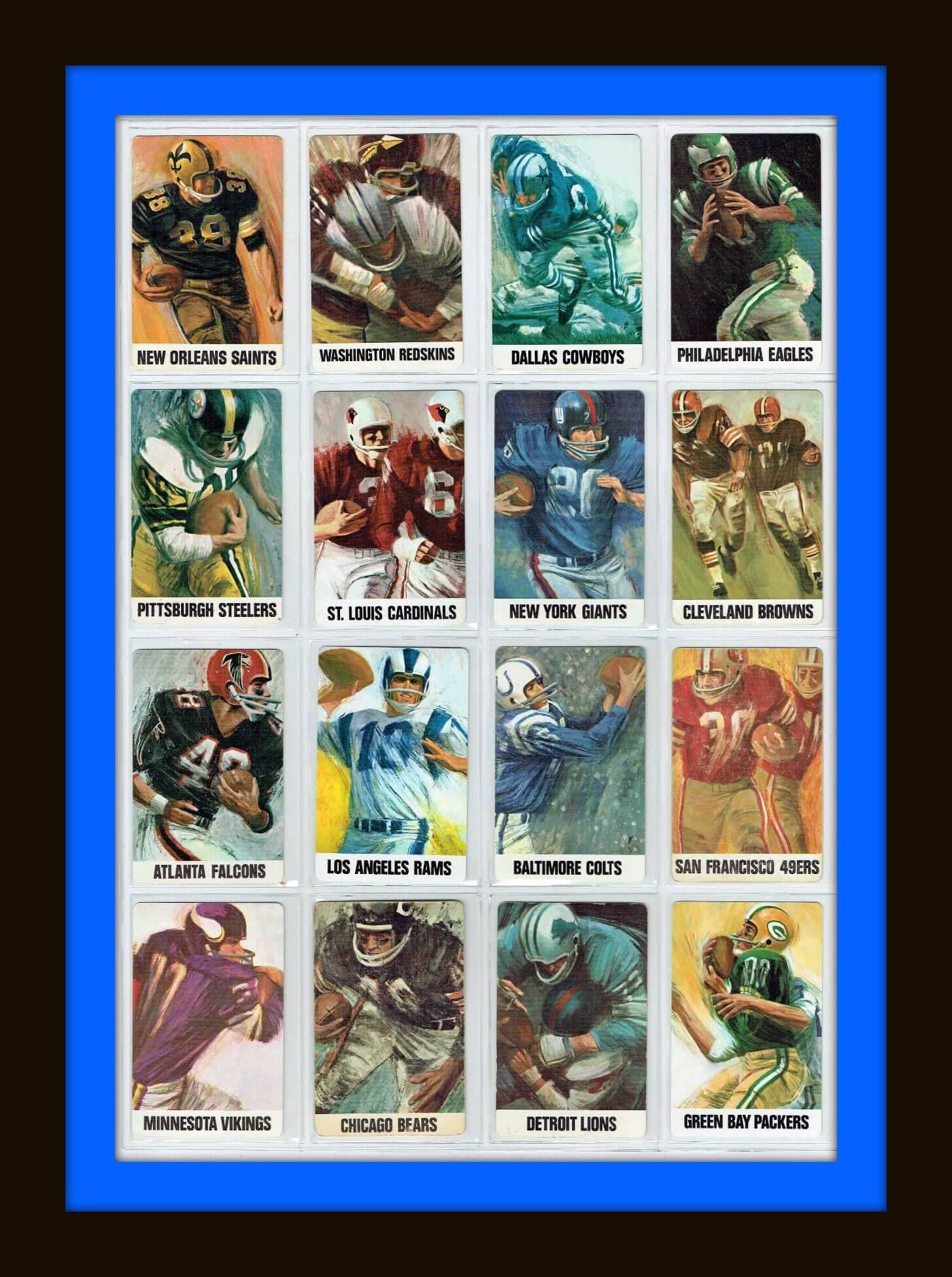
Ah yes, the Master himself: Dave Boss. His very name conjures up memories of the late 1960s and early ’70s. Take a peek at this set of NFL playing cards with his artwork on the back. These would all end up on other items like posters, of course.
A few more Boss gems for you: How about this New York Giants painting. This 1973 Giants yearbook has some typical classic Boss on the cover. And here’s a 1966 matted Niners print.
But you can’t live exclusively on Dave Boss artwork (although don’t think I haven’t tried!), so here are the rest of this week’s picks:
• Here’s a 1978 NFL Properties Team Shop Brochure for retailers.
• Back in the day, I think I would have snapped this 1970s Bengals gear bag right up.
• This 1967 NFL electric football game from Tudor shows the Browns “CB” logo on the side.
• 1970s Chicago Blackhawks wristbands, right here!
• Helmet plaques are a regular Collector’s Corner feature, but we rarely ever see one for the St. Louis Cardinals. (Yes, kids, they used to be in St. Louis — and Chicago before that!)
• This wooden 1970s suitcase has all the appropriate MLB logos of the period.
• This late-1970s NFL poster is from Damac, featuring Saints quarterback Archie Manning.
• Stancraft also did a great job in the 1970s with NFL posters, like this one for the Chiefs and this one for the Cowboys.
• Had this! The 1971-1972 Pro Football Hall of Fame Appointment Calendar Book. Great art inside, as I recall. Of course, when I was 11 I didn’t have any appointments other than being at the school bus stop on time.
• Great art on the program cover for the first-ever Phillies game at the Vet.

Click to enlarge
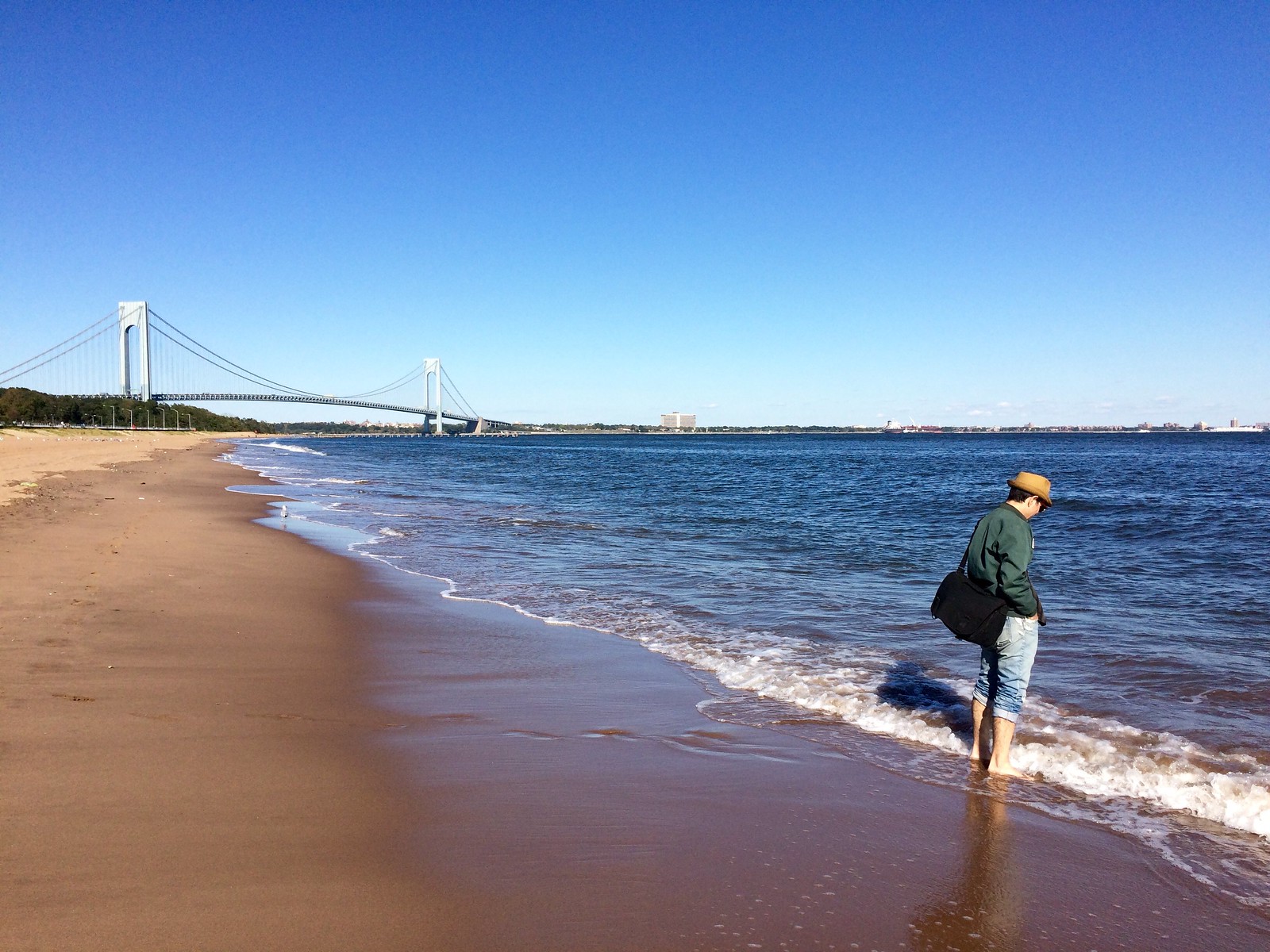
Best Summer Ever, continued: The Tugboat Captain and I have spent a lot of this summer in or on the water: fishing on Independence Day, kayaking on the Hudson, all the beaches we visited during last month’s California/Oregon vacation, etc. On Labor Day weekend we walked in the surf from Brighton Beach to Coney Island and figured that would be our last beach walk of the summer. But the next weekend we were invited to a friend’s beach house on Fire Island, so we had another final summer walk on the beach, which turned out to be so nice that we decided to keep having “one last” beach walk for as many additional weekends as possible. The next one was at Fort Tilden Beach in Queens, and then this past weekend we had a very nice stroll at Midland Beach on Staten Island (see photos above), which is the only NYC beach that provides a view of the Verrazano-Narrows Bridge.
Not sure how long we can keep this up, but it’s been a very nice ritual over the past four weeks.
Midland Beach, incidentally, has a series of flat-top concrete jetties that are full of cracks and gaps. We saw a fisherman on one of them, biding his time before he threw his net. While he stood there, water kept shooting up through a nearby fissure in the jetty ”” part blowhole, part geyser. Sometimes the spray from the water created a mini-rainbow in the sun. Magic.
The Ticker
By Mike Chamernik

Baseball News: The Indians are using a custom design for their AL Central title logo. It incorporates the lights at Jacobs Field. Other teams are using a logo from this template (from @Believeland1994, via Phil). … Pesapallo, a baseball-like sport that’s popular in Finland, puts a ton of ads on its unis (from Ted Arnold).

NFL News: The Redskins’ burgundy pants were a hit on Sunday. They reminded fans of the team’s glory days (from Rob Bergeron). … Scott Rogers recently stayed at a Kentucky bed and breakfast that was once the childhood home of Phil Simms. Scott found a neat 1967 NFL kids book there, along with a football signed by Simms. … More details are behind a paywall, but it looks like Steelers WR Antonio Brown got an ultimatum from the league over his baby blue cleats on Sunday: Change, or stay in the locker room (from @redbuppy). … Bills RB LeSean McCoy changed his helmet and gloves during Sunday’s game (from Sunny Moon). … Miami Marlins OF Christian Yelich has a Patriots helmet in his locker (from Jared Buccola). … The Bucs will once again wear white at home this Sunday (from Phil). … All the players from the Saints and Falcons formed a circle and joined hands after the national anthem was played prior to last night’s game.
College Football News: Really neat details on the Junction Made 1956 Texas A&M throwback helmets: Classic Riddell logos on the chinstraps and KRA-LITE logos on the back of the shell. … Miami will wear green jerseys only once this season, on Saturday (from Bill Schaefer). … McNeese State will wear delightful throwbacks on Saturday (from Chris Mycoskie). … Youngstown State will wear mono red on Saturday (from Robert Hayes). … In 1981, a Central Oklahoma State player dressed up his helmet for a few postseason all-star bowl appearances. The Bronchos had blank helmets, and the player wanted to be easily identified on TV. So, he got decals from a school bookstore to put on his helmet (from John Fitzgerald).

Hockey News: The Oilers introduced a lynx mascot named Hunter. He will wear No. 72, the year in which the team was founded. Here he is in action. … The Ottawa Senators are moving their AHL franchise from Binghamton, N.Y., to Belleville, Ont., after the upcoming season. The farm team will still be known as the Senators (from Wade Heidt). … The Milwaukee Admirals will wear Slap Shot-inspired jerseys for a night this season (from Brian Kerhin). … Here’s a cool time lapse that shows how crews painted the Flyers ice (from John Kelemen). … The Stars added a bunch of banners to the rafters at the AmericanAirlines Center (from Kyle Brynsvold).

NBA News: The Nuggets will wear their rainbow skyline throwbacks for their opener, when they’ll retire Dikembe Mutombo’s No. 55. … The Warriors will wear a memorial band for Hall of Famer Nate Thurmond. … The Pacers will have their 50th-anniversary logo on their court. Here’s how it looks on the jerseys (from @HawksPacMan and Phil). … After winning their first title, the Cavs will now have a gold tab on the back of their jersey collar. … Teams are having problems whittling down potential advertisers and determining dollar values for jersey patch ads (from Phil). … The Lynx will wear purple shoes in the WNBA playoffs in memory of Prince. He was, of course, a Minnesota native (from Brett Stone).

College Hoops News: BYU has new shorts with a mountain theme that looks a bit Jazz-ish. … New uniforms for Western Washington, a D2 school (from @FroggySeattle).

Grab Bag: A Michigan field hockey player from the early 1970s finally received a legit varsity jacket. Back in 1974, the school didn’t want to give women actual varsity jackets (under the logic that it would devalue the “M”), so they gave them jackets with smaller, off-color patches (from Jason Hillyer). … Church basements don’t just host Bingo nights and fish fries. A few hundred of them still have bowling alleys (from Steven Zerhusen).
Touching experience by the Mets and Marlins.
Hard to watch; I couldn’t fathom being in the players’ shoes. The Mets were in the unenviable position of trying to beat a team whose hearts were shattered and had the sympathies of a nation.
In last night’s debate, Hillary Clinton opted for mono-red, and Donald Trump went with a black suit, with a royal blue tie.
Something I’ve noticed is that the candidates in debates always wear red and blue (for obvious reasons), but it’s always red vs. blue in a 1-on-1 debate, and it doesn’t always match our traditional pairing (red for Republican, blue for Democrat). Obama wore a red tie once and a blue tie twice in 2012. Do candidates coordinate this before the debate?
I also looked at the 1992 first debate with Clinton, Bush, and Perot, and they wore matching red and blue striped ties (Clinton’s had thicker red stripes than the other two).
link
Minor quibble: the red/blue pairing for Republicans and Democrats, respectively, is not traditional. It dates to the 2000 election, which was disputed for many weeks after Election Day, and so media coverage froze in place that year’s most common network map colors as shorthand for the parties. But from the dawn of color TV until 2000, most networks used blue on their maps to denote the incumbent party and red to mark the opposition party, just as American military maps typically use blue for our forces and red for the opposition. Democrats held the White House, and so were blue on most 2000 maps; Republicans were the opposition party, and so were red. But just eight years earlier, Democrat Bill Clinton had won by turning states red, and eight years before that incumbent Ronald Reagan turned 49 states blue for the GOP.
I don’t typically care for conspiracy theories, but I’ve always enjoyed this one: For years the Democrats, as the more left-leaning party, were associated with red because red = communism. So the liberal media decided to assign red to the GOP, and blue to the Democrats, as a way of fucking with the typical red = Dems = commies narrative.
Probably not true. But still a fun idea.
Except that’s not really true:
link
Surprising fact: America has more than one TV network. The blue for the incumbent, red for the opposition thing wasn’t universal. Networks varied from election to election and didn’t always agree with one another. (And from the 1980s on, newspapers also often used color maps that didn’t always agree.) So while there was no single government-mandated practice, and even a given network might not be consistent from quadrennial to quadrennial, the commonplace habit was to depict the incumbent in blue, the challenger in red. Smithsonian had a nice writeup on the question of pre- and post-2000 partisan color identification here:
link
Note the image at the top of Reagan turning the country blue for the GOP in 1984.
In Canada, we’re up to five major parties. The two major parties are red and royal blue, the smaller parties are orange, green and light blue.
Most newscasters wear purple on election night.
the rendition of “Take Me Out To The Ballgame” from last night’s Marlins game was so tragic sounding.. never thought it could be played that way until now
On first note, I thought it was “Taps”, but instead it became even more appropriate and heart-breaking at the same time. Such a beautiful rendition of this classic song, I still tear up just thinking about it.
I’m not a Marlins fan because they’re division rivals of the Nationals, and I don’t think I ever saw Jose Fernandez pitch, but that bugle rendition of “Take Me Out to the Ballgame” had me sobbing.
Honestly, between the Vin Scully tributes here in LA and the tragic loss of Jose Fernandez, baseball has turned me into an emotional mess these past few days.
Antonio Brown tweeted link. Those are his children, Antonio Jr., Autonomy, Ali, and Antanyiah, on the shoes.
Autonomy? Really? OK…
At least they’re not all George.
I’m a bit disappointed that the Admirals are going for a lace-up collar on their Chiefs-based throwback. I’m pretty sure none of the teams in Slap Shot had lace-up collars, especially the Chiefs.
None of the teams in Slapshot wore lace-up collars.
Broome County Blades were my favourite uniforms in the movie. The green uniforms with red and yellow trim.
Paul, just a small item – should “Florida Marlins OF Christian Yelich” read “Miami Marlins…”?
Thanks for that — I still forget sometimes. Now fixed.
I know what you mean about the typo, but no it “shouldn’t”! I’ll always be a Florida Marlins fan and will never be happy with this change, nor the logo. F>M
This is interesting: Do you dislike it because it changed, or because of an intrinsic preference for the inclusive “Florida” appellation? Teams that relocate or rename usually get stuck with a worse-sounding nomenclature, such as “Dallas Stars” or “New Orleans Hornets”; painful phrases to say. “Miami Marlins” is tinny; “Florida Marlins” is woody:)
Caribou gone!
One of the first responders speaking at the press conference on Sunday morning also referred to him as “Florida Marlins pitcher Jose Fernandez”. Old habits die hard, I guess.
The Miami Floridians!
It’s not just one Michigan field hockey player who received a new varsity jacket – according to the article about 800 women who lettered at Michigan between fall 1973 and spring 1991 got new jackets.
That was an absolutely great article. The perseverance of the women toward the dinosaurs of the Michigan athletic department, including Schembechler and Canham, was great.
Proofreading: you write “Florida Marlins OF Christian Yelich…” but it should be “Miami Marlins OF.”
Oops! Don’t know how I missed the comment before me that said that.
The camaraderie between baseball teammates has to be the next profession behind Fire, EMS, Police, and Military. They spend more time together than they do their own families for most of the year. Really hard to watch any of that and not get choked up.
And great call, Paul. Black definitely was appropriate. RIP,JF.
Watching the Mariners / Astros game last night, the Stance logo on the solid color socks is really annoying.
Yup. But it’s not just the maker’s marks — those socks also have the MLB logo. It’s all too small to see in any kind of detail, so it just looks like little white spots on the socks. Grrrrr.
I though I saw that Gordon said in a post game interview that it wasn’t Fernandez’s helmet he was wearing for first pitch, but instead was a right handed batting helmet in his size with José’s number on it.
OK. Will adjust text.
Marlins jersey tribute last night – beautiful.
Disappointed in the Indians Division Champs logo. Two light standards look weird to me. They’ve used three in the past and two just seems wrong. That said, I do like that they’ve ordered a design that’s not on the menu. Too much boilerplate in pro sports these days.
Though not in game use, back when the Nationals honored Andre Dawson, the Nats wore Expos hats during BP. The hats had the New Era logo on them. I couldn’t quickly find a photo of the players, but both Dawson and Garry Carter wore the same hats.
link
It was in 2010.
“Bills RB LeSean McCoy changed his helmet and gloves during Sunday’s game (from Sunny Moon)”
How does that not violate the league’s stupid ‘one-shell per season’ rule????
Isn’t it nice that I created this page a few days ago?
link
The Red Wings are adding a Gordie Howe patch to their jersey for this season: link
In the Marlins post-game picture, why is the one player (2 over from Dee Gordon) wearing his jersey backward? Is it similar to having the boots positioned backwards on a riderless horse?
“New to the Ads promotional list this season include a tribute to the 40th Anniversary of the iconic hockey movie Slap Shot. The team will wear specialty jerseys that look those worn by the Chiefs in the 1976 smash-hit movie and the team will show the movie on the video board following the game. In addition, the infamous Hanson Brothers from the movie will be at the game to meet fans and sign autographs.”
They should keep them permanently. One of my all time favorite uniforms!
I wish the ‘Skins burgundy pants had a 3-stripe pattern (a la their gold pants). I never cared for the 2-stripe look.
or the three stripe pattern with burgundy spacing like their helmet… keeps it altogether. I know that is an old AFL stripey thing, but would be a nice touch uni-formally speaking.
I prefer the gold pants, but am OK with the burgundy ones so long as they continue to be paired with the correct socks. Toward the end of the red pant run the players went full unitard with the solid burgundy socks.
Well, tonight’s the first preseason game for the Red Wings. Which means a flood of people complaining erroneously yet again that Detroit got rid of their vertically-arched NOBs, because they don’t understand that the Wings don’t put the VA-NOBs on in the preseason, only when they get to the regular season (much like the Steelers players not wearing helmet numbers in the NFL preseason).
So…if a baseball game can be played with all players wearing the same number…then why do players wear numbers at all?
I love the idea of all the Marlins wearing Fernandez’ number (and his name!) for one game like this, and big props to the Majestic employees who made all those jerseys — the Marlins’ custom number font looks like a big hassle.
But I’m really against the retirement of his number. And (much like with 42) it’s very difficult to argue against it because it makes you look somehow heartless or insensitive.
My team, the Chicago Cubs, lost a number 16 while he was still very young: Ken Hubbs. Everybody remembers him even with many future players wearing his number. What is accomplished by banning future players from wearing a number of a special player? Why not encourage people to wear it so that it will be better remembered?
You’re swimming upstream if you try to get people to mourn/honor in a standardized way. It’s the same with teams and businesses. Tragedies can affect society poignantly in one era, glancing off of it in another. When Ken Hubbs died, people tended to be stoic about such misfortunes. Obviously, society is a lot more emotional about these setbacks, nowadays.
My bigger concern would be that the Marlins won’t keep Fernandez’ number retired. This is the team that unretired the number 5 a few years ago.
Didn’t they only “retire” number 5 because the executive they retired it for was a big admirer of Joe DiMaggio?
That was a really pathetic reason to permanently take a number as important as 5 out of circulation forever.
I have suggested a time or two that one solution the the retired-number situation might to be to only have one retired number at a time. This would be a good solution for Fernandez; take away 16 until some future great player’s retirement (or, God forbid, another untimely death) causes that person’s number to move into the “retired” slot.
i think teams should only retire numbers in cases of death or a career ending injury before a player has finished their
honor a legend with letting stars wear that number forever, retire that number if a player never had a chance to be a superstar
The Warriors tribute band to Nate Thurmond does not look straight. It is angled weird. Am I wrong in that?
Regarding churches with bowling alleys, in the movie The Big Lebowski, The Dude’s bowling rival was “the Jesus man”, so maybe it’s not so strange after all! …The Dude abides.
Nobody fucks with the Jesus.