Yesterday’s post about the New Era logo being added to MLB game caps prompted a lot of comments from people who said they routinely remove the company’s logo from fashion caps with the aid of nail clippers, seam rippers, scissors, and other tools. There’s even a video on YouTube, embedded above, that shows how to do it with scissors.
But that apparently won’t be possible with the new logo-emblazoned MLB caps, because the New Era mark isn’t actually embroidered into the cap. Three readers who’ve purchased Cubs or Rangers postseason caps described it to me like so yesterday:
• From reader Jon Robertson: “The New Era logo is pressed on like a patch. On the inside of the cap, there’s no stitching on the underside of the logo. … I feel like it could eventually come off with wear and tear. Also, the stitching on the logo is beveled further out than on other New Era caps.” You can see what Jon means in the side-by-side comparison below — the logo on the left is from a fashion cap, and the one on the right is from one of the Postseason caps:
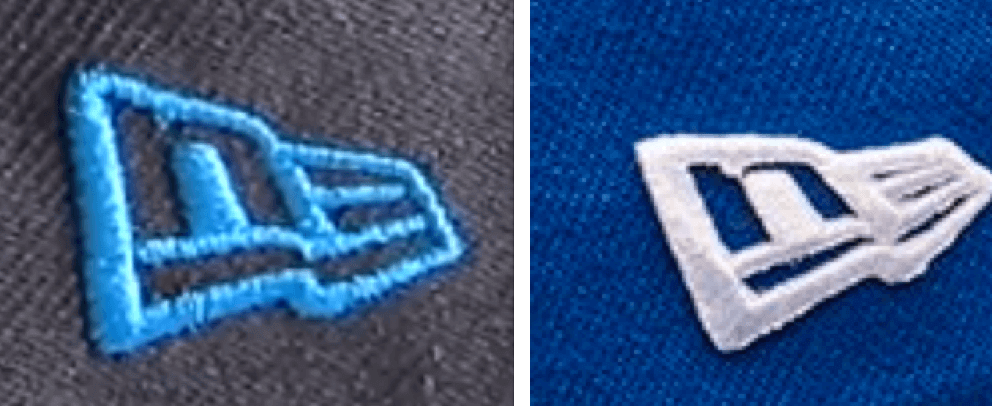
• From reader Emilio Vialpando: “The New Era logo is a patch, not stitched. On fashion caps, you can see the logo stitching on the inside, but not on the Postseason cap.”
• From reader Kevin Wright: “The New Era logos on the Postseason caps are basically stickers and are not stitched into the hat. The best comparison would be a Chromaflex patch. Definitely was not stitched to hat. I wiggled it, but it was definitely on there. I gotta imagine if you really want it off, you could get it off without damage to the physical cap.”
Interesting. This isn’t a huge deal to me either way, because I mostly care about what the players wear (and they’re obviously not going to be removing their cap logos), not what’s sold at retail. But I’m generally in favor of less corporate advertising and influence in the public sphere, so I’m hoping those of you who like to remove the maker’s mark from your caps will still be able to do so.
Another NHL anniversary jersey: Three weeks ago we saw the Flyers’ 50th-annivesary jersey, and yesterday the Kings did likewise (can the Blues and Penguins be far behind?):
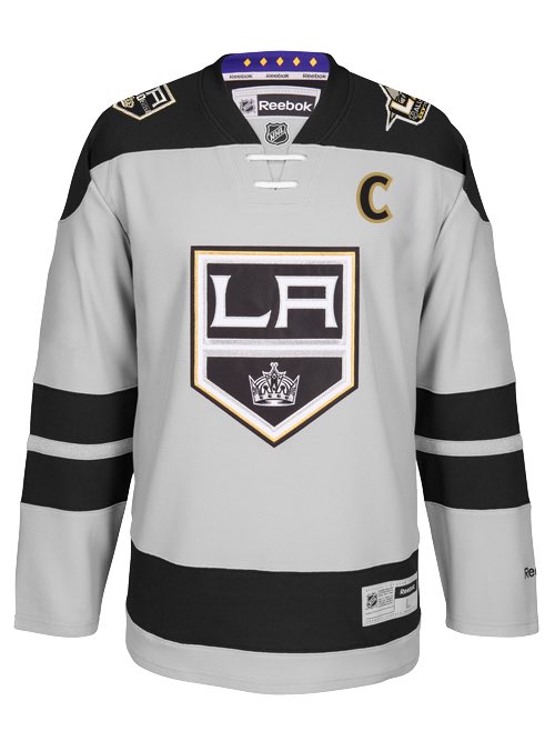
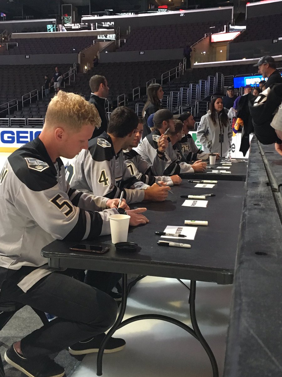
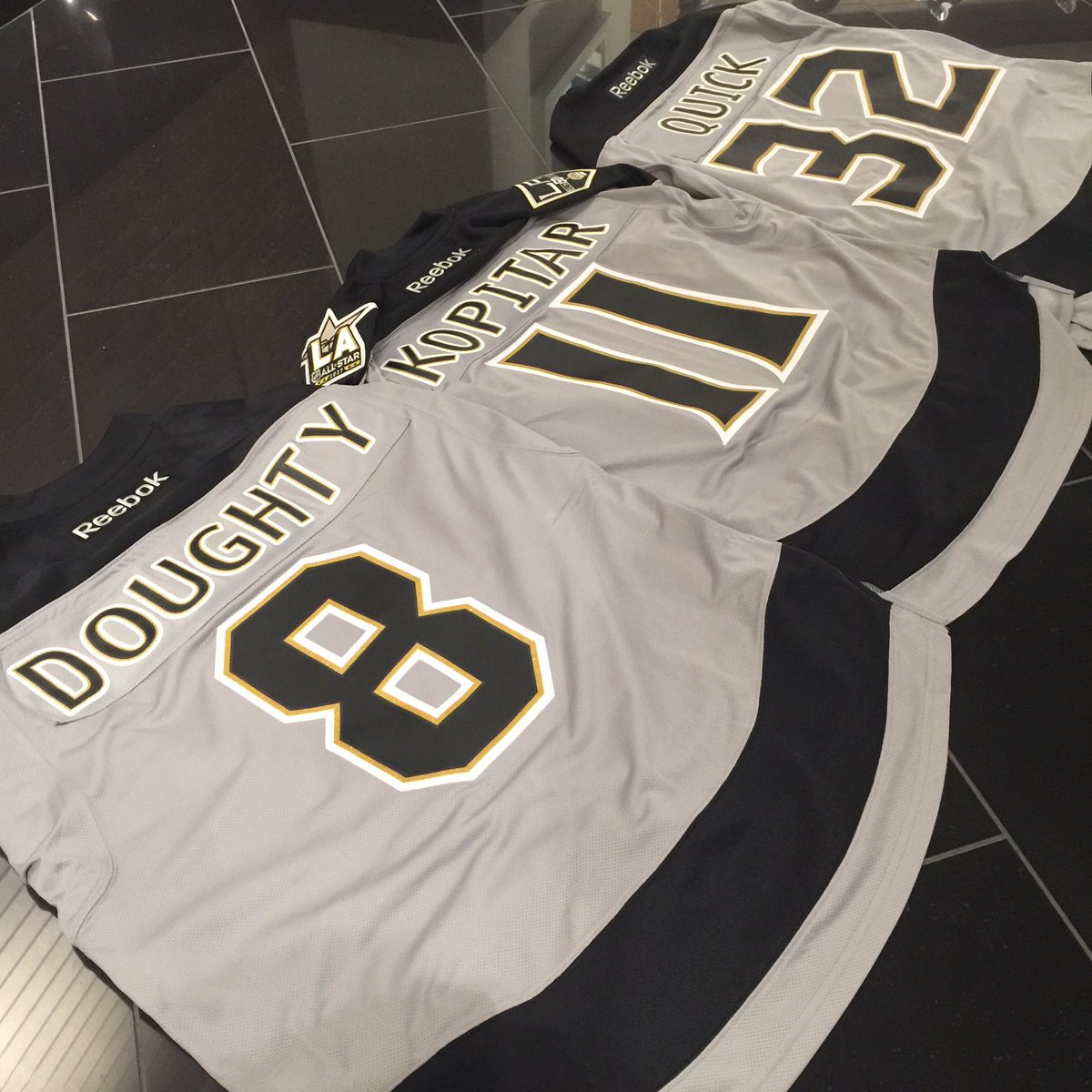
When I first saw that mock-up yesterday afternoon, I definitely wasn’t in love with the grey base color, although I do think it looks a bit better in some of these photos that surfaced last night (click to enlarge):
There’s also this infographic, which provides additional information on the jersey’s various elements (click to enlarge):
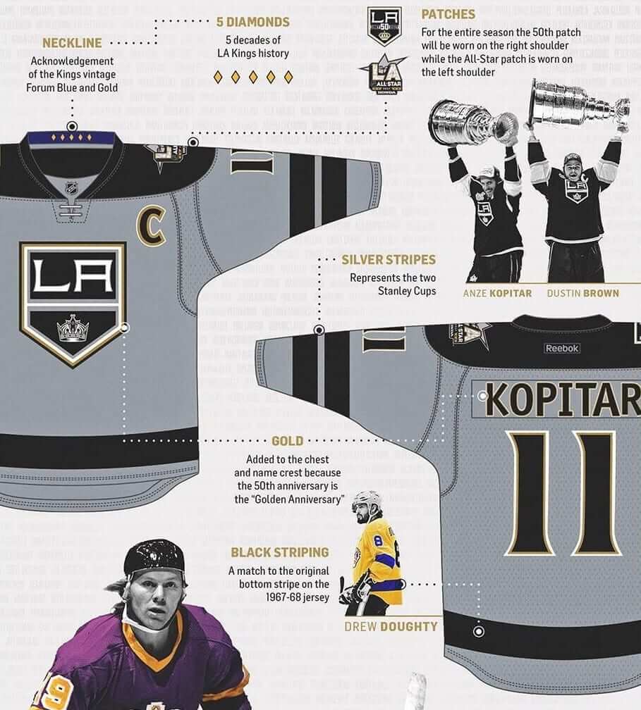
And there’s a promo video and additional information, including the dates when the uniform will be worn, on this page.
Incidentally, it would be nice to see the full uni, including the helmet, pants, and socks, but that isn’t shown in any photos, graphics, or video footage that’s been released so far. Kinda tells you everything you need to know about the thinking at work here — it’s not a uniform, it’s just merchandise.
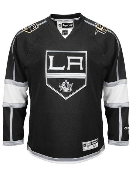
Also, if you look again at the mock-up at the top of this section, you’ll see that the jersey has two shoulder patches — one for the team’s 50th-anniversary logo on one shoulder and the NHL All-Star Game logo. That’s also going to be the case with the team’s standard home and road jerseys this season:
The Ticker
By Paul

Baseball News: Good spot by Tristan Ridgeway, who noticed that Ron Cash appears to have had a hypen, rather than a period, on his FIOB in 1974. Here’s a close-up of the hyphen. The Tigers also had Norm Cash on the roster at the time, which explains the first initial, but I’m not sure I’ve ever seen the hyphenated format before. … Jerry Wolper found some great video of Angels 3B Doug DeCinces playing — and homering! — while wearing a numberless batboy’s jersey. His own uni had apparently been stolen. … Tim Tebow’s new team colors as a Met are very close to what he wore as a Florida Gator. … A restaurant in Provo, Utah, has a painting of Don Mattingly in a Mets uniform. … Andy Garms recently went to the Skirball Cultural Center in Los Angeles to check out a temporary baseball exhibit called Chasing Dreams and took these photos. … Pakistan’s WBC helmets are pretty cool. Also: The CoolFlo lives! (From @Bryant_rf.) … Infinite regression alert! Check out this baseball card of a player holding the selfsame card (thanks, Mike). … Font inconsistency on Phillies P Joley Rodriguez’s NOB. … Last night’s episode of Jeopardy! included an answer featuring a Cardinals helmet (from Douglas Ford). … A Mets fan made a quilt out of Mets T-shirts. The Tugboat captain, who is quilting-savvy, was thinking of doing the same thing with a set of Uni Watch T-Shirt Club tees but hasn’t had time to get started.

NFL News: Nice find by Jerry Wolper, who came up with this shot of the Steelers’ 1967 basketball team, plus their cheerleaders. … Here’s a good look at the Broncos’ Color Rash helmets (from Mark Johnson). … A Chicago-area store is inviting customers to wipe their feet on a Colin Kaepernick jerseys (thanks, Phil). … Washington Wizards player John Wall is in hot water with DC fans because he wore a Cowboys jersey to last Sundays Dallas/Washington game (thanks, Phil). … Lots of NFL-related M&M’s items here (thanks, Brinke). … An upcoming estate sale in Buffalo will feature an item I’ve never seen before: an NFL vest. Looks like the kind of thing that would be perfect for Collector’s Corner (from Matt Willcott). … Vikings WR Stefon Diggs practices in short shorts (thanks, Mike). … Former Rams RB Eric Dickerson wants the team to go back to its old royal/gold colors (thanks, Phil). … Here’s a very detailed look at the science behind the Deflategate controversy.
College and High School Football News: Regarding Miami’s excellent new back-to-basics uniforms and new merit decals, Austin Gillis writes: “I don’t think I’ve seen anybody note that this is completely consistent with what new Miami coach Mark Richt did at his last coaching stop at UGA. When Richt was hired at Georgia after the 2000 season, their helmets included a superfluous black stripe, and the uniform numbers had a drop shadow. Both of these features had been added in the 1990s. In Richt’s first year, the team lost the black helmet stripe and added merit decals (specifically, black and white bones); by his second season, the drop shadow was gone as well. These are the only two head coaching jobs Richt has ever had, so it is hard to call it a trend, but it’s interesting that Miami is making the same types of uniform changes that Georgia did back when they brought Richt on board.” … Man, the uni numbers on Adidas’s 7v7 high school jerseys are really big. How big? Like, really big (from Kevin Driscoll). … Army is adding a memorial decal for Brandon Jackson, the cornerback who died in a car crash two weekends ago. … Minnesota’s game notes now show the team’s record broken down by uniform. … SMU’s helmet logo for this Friday’s game against TCU will feature the Dallas skyline inside the familiar pony logo, as a tribute to fallen police officers and first responders. … Looks like Tulane will be wearing the Angry Wave this weekend. … LSU placekicker Colby Delahoussaye was a survivor in the car crash that took the lives of Nebraska punter Sam Foltz and former Michigan State punter Mike Sadler. Now Delahoussaye is honoring them with these custom cleats (from Daniel Fontenot). … White alternates on tap this weekend for Nebraska (thanks, Phil).

NBA News: The upcoming season will apparently feature a lot of striped socks. They’d look great if not for those side panel thingies, right?

College Hoops News: Here’s an old Jim Valvano business card (from J. Huckel). … Anyone know the story behind this Big 10/Pac 10 all-star jersey with a “Vaughn” NOB? “I have done a lot of research and haven’t found anything so far,” says Elan Rodman.

Soccer News: Reader Trevor Williams notes that FC Barcelona press conferences feature coach Luis Enrique standing in front of a wall full of ads, plus there’s an ad and two beverages in front of him. “I fear that American sports will soon reach this level of saturation,” he says.

Grab Bag: If you’ve ever been to Chicago, you know it’s a great town for hand-lettered signs, especially at supermarkets. Here’s an excellent article about that (big thanks to Luis Aranda). … In a related item, I love-love-love the super-stylized 1s and 9s on these Brooklyn bodega signs, which I saw the other day while on my way to meet friends for Mexican food. … Oh baby, check out the amazing typography and logos on these vintage work clothes buttons — spectacular (big thanks to @Univers47). … New volleyball uniforms for the Japanese women’s team Toyota Auto Body Queenseis — blue and white — and also for the men’s teams Sakai Blazers and FC Tokyo (from Jeremy Brahm). … New rugby league uniforms and logo for the CanAm Grizzlies.
Not pleased with the New Era patch, i was actually upset back in 89-1991 range when the MLB logo went on the caps’ back, so this is 1000% worse.
Unless the New Era logo is sublimated into the cap fabric, it can be removed. Take heart.
Every Minor League team cap has the NE logo on it. I have several, so I’m going to see if I can peel one off…
But aren’t the minor league ones stitched on?
Yes. The minor league ones are embroidered.
Actually, I think a sublimated logo would be much less obtrusive. I’d take that over the other types. But I’ve only seen it done with the Diamond Era caps.
Which brings up another point. I believe it’s only a matter of time before MLB switches to Diamond Era caps for in game use. What do you all think?
thos Kings jerseys are not good. Still look like a unlicensed Los Angeles video game team.
Compared to the garbage the Flyers trotted out, these are pretty, pretty, pretty nice.
Agreed. The Flyers would have been better off doing nothing. It’s bad.
Agreed, they’re DREARY. C’mon, you coulda done so much better!
Would be cooler if all original 6 expansion teams wore their first season jerseys this season
Looks to me like that’s a poorly placed period and not a hyphen on Cash’s jersey.
That’s what I think, too. It’s way low for a hyphen, but a bit high for a period. May have just been a sloppy job, which has been known to happen from time to time.
Any ideas how that infinite regression card was done? Wouldn’t the picture need to be taken with him holding another card a and then photoshop the smaller card in its place? If that’s the case, then the card inside the smaller card isn’t the same picture but we can’t see it because it’s too small. Perhaps I’m overthinking and missing an obvious way to do it.
He was likely shot holding a plain white card and the final card image was Photoshopped in.
Isn’t that what I said? That means it’s not a true infinite regression since it is impossible to photoshop it infinitely.
I recalled that something similar was done with Gary Pettis’s 1989 Upper Deck card, but what I forgot in the 27 intervening years is that on Pettis’s card, the picture on the front showed him looking at the back of the card, a pretty easy trick to pull off even in 1989. What I never realized until now though, is that the card-back “prototype” seen in the image had glaring differences to the back of the actual “production” card, which in my mind makes this gimmick (retroactively) lame even by 1989 standards!
link
Response Ticker Time!
The Phillies have never used a lettering don’t that thick, but I see poorly-made replicas with those letters on them more than one would think… that Mike Perez infinite regression card is brilliant, I wish baseball cards would get some of their creativity back… I agree with Eric Dickerson, yellow gold > metallic/Vegas gold… I wish the Kings had put the old crown on the anniversary sweaters and brought back some purple… it’s purple, “Forum blue” my arse… I know the UGA helmets without the black stripe are more steeped in history but I think it looks like something is missing with just the single stripe… I wish the Broncos made the D logo their permanent helmet logo and got rid of the Nikefied horse head… Peyton Mansell is the Texasest high school QB name ever. It’s like the parents knew what their boy would me from the delivery room…
If Rawlings puts their wordmark on the batting helmet, they won’t be the first one to do it. ABC (American Ball Cap) used to have their logo on batting helmets through the 80’s into the 90’s before Rawlings purchased them.
link
link
Those workwear buttons are fantastic! My wardrobe budget only allows me to buy what fits in WalMart’s menswear collection, but given the means, I would only buy clothing with artistic, detailed buttons. Even underpants and socks.
logo creep on MLB uniforms seems to be the least noticeable of all the major sports leagues. I would hate to see the Majestic logo somehow make its way to the players chest, but it feels right with it on the sleeve.
Not a fan of the logos you have been showing us on the socks, but I don’t know if the tradeoff for players going high cuff vs pajama pants is worth it. I kind of think it is.
Definitely don’t like the logo on the hat. I liked thinking that fans know the make and model of the hats worn on the field and the logo is unnecessary.
I know someone who owned an old Champion Dallas Jersey (Aikman) they found at Goodwill who managed to get the Champion patch/stitch off without damaging the material, glad to see other people removing the crud.
Those Grey Kings jerseys may just be GFGS but it’s definitely not that bad compared to other grey-base samples.
My first thought: try a heat gun to soften the patch adhesive and then peel it off. You may need some sort of industrial solvent if there is any adhesive left on the hat, though.
Agreed.
I was going to say purchase (if you don’t already have one, and I mean…who doesn’t) one of those hand-held steamers and give that about 2 minutes worth of blast. See how that works at loosening it up. Or try AndyHarry’s trick with the heat gun. Either way, I bet that would work (or at least facilitate the neutering process).
If it’s a polyester cap, would that make it melt?
Steam or heat? (Difference). The steam might actually serve to shrink the cap (if it’s fitted) slightly, but I don’t think it would melt it. Heat gun might not fare so well in that regard.
Of course, the simplest solution is … DON’T BUY A CAP WITH THE LOGO if you don’t want a cap with the logo on it.
Certainly a possibility. Polyester doesn’t melt until you get up above 450 degrees Fahrenheit or so, but some of those heat guns go well beyond that. Craft store guns are usually lower temperature than hardware store guns. My advice would be to warm it up slowly, keeping the gun moving, etc. An iron on the back might work, too. At least you can dial in the temperature to not melt the polyester that way.
What’s with the all-caps, Phil? Are you mad at him for buying a hat?
The pseudo-quest against retail jerseys is a little puzzling to me, but at least it’s rooted in mostly justifiable rhetoric. But I don’t think it’s worth yelling at people for buying a hat. Hats are great AND actually serve a function from time to time.
I’m not even really sure your all-caps advice is really sound advice anyway, because there are now literally no major hat brands that don’t put their mark on the side of their hat anymore. ’47 added theirs a few years ago, TotW added theirs back in 2012 or so, and Reebok/Nike/Adidas have always put theirs on the side. These New Era authentic collections were all that was left.
(And don’t forget to remove the frickin’ shiny stickers from the hat brim)
Re: “FC Barcelona Press Conferences” – Product creep is nothing new, here are three coaches with their OLD teams
Louis Van Gaal:link
Jose Mourinho: link
Pep Guardiola: link
Also, American sports press conferences would never stoop to advertising…
Oh wait
NFL (Patriots) – link
NBA (Lakers) – link
and convienient Gatorade bottles – link
MLB (Yankees) – link
Well, you get my point…
If the Penguins want a golden anniversary jersey, they could just unretire their Vegas gold jersey from last year… though, I’d rather if they go throwback, they go with the link. As for the Blues, how about their link
Overall, I find the Kings’ “anniversary” jersey underwhelming. It doesn’t help that I’ve hated their graphics package ever since they introduced it in 1998. I find their fonts ugly, and the only logo I’ve liked is the crown. I much prefer the purple-and-gold and Gretzky-era looks; hell, I even like the “Burger King” jerseys better.
Regarding John Wall, when I see link, I can’t help but think that the expression on his face is one of “I don’t want to be here”. It’s just a really awkward-looking expression.
I hope the New Era patches are fairly easy to come off, because who doesn’t love an in game snafu?
CanAm Grizzlies are a rugby league team. :)
Fixed.
Being reminded of the Broncos’ “D” logo, I wonder what it would look like if the horse was always facing forward (sort of like the Raven head or Arrowhead of the Chiefs), so the left side decal would not be the same as the one we are used to.
I’m sure someone out there can whip up a version of that for us, right?
link
On the Japanese volleyball team photo – I think the lady on the far right photobombed!! ha!!
What I do with the New Era logo on my caps is get a Sharpie and color in the logo to either make it not stand out as much or blend in with the cap itself
Of course, the best thing one could do is purchase these older clean caps and boycott the authentics with the New Era logo. Your Money is your most powerful tool when it comes to million dollar organizations and advertising.
A second, probably less effective option would be sending New Era cap an email through their contact us form (link)
While they probably won’t respond and it probably wont amount to much, you’ll at least get someone at New Era to hear your opinion.
I’m guessing the Postseason hats are just regular stock and they simply slapped on a Postseason patch and a New Era patch. Next year, when the NE Flag flies, I’ll bet it will be embroidered like the Minor League caps.
Ugh, those uniforms are horrible for the Kings. The Yellow, Black, Grey? The Kings got rid of Yellow and Purple for one reason. Gretzky.
Gretzky? You wanna bet? Silver and black in LA in the 1980s… LA Raiders… NWA… the early days of gangsta rap, the beginning of BFBS… it wasn’t Gretzky, who made orange and blue work in Edmonton and never made any other team change its color scheme.
I was apoplectic when baseball added the batter logo to the back of the hat. I still don’t like it, but it hasn’t stopped me from buying hats.
Oh, and those new Kings’ sweaters are a crime against art and hockey.
Just a heads up to any British Uni Watchers – there’s a documentary about the history of replica football shirts called “Get Shirty” on ITV1 tonight at 10:40. From the ITV website:
“Documentary telling the story of how a small underwear company from Leicester turned the football world upside down when they invented replica kit. The company gave birth to an industry that is now worth billions of pounds – only to lose it all. The programme charts the rise and fall of this unlikely company, featuring interviews with people who were there – including the extravagant owners, the young female designer who knew nothing about football and yet was responsible for a whole new flamboyant look to the game, and the football stars like Peter Shilton, Norman Hunter and Mick Channon who wore the shirts.”
Sounds interesting!
” Tim Tebow’s new team colors as a Met are very close to what he wore as a Florida Gator.”
And a Denver Bronco.
I find it very interesting to hear how many people don’t like the MLB logo on the back of the on-field caps. Granted, this might partially be because I have little to no recollection of a time before them, but overall I like them. No pun intended, I like the sense of uniformity they add with all teams having them.
I don’t see the problem either, it’s the league they play for, just like NFL has the shield on the helmet and jerseys, the NBA on the jerseys and every soccer team has one patch on the shoulder
This cap decision reminds me of when MLB glued on American flag patches a decade ago instead of stitching them on. Will we be seeing some upside down, distressed New Era logos?
link
That Kings infographic says the silver stripes represent the team’s two Stanley Cups. Except the two stripes on the sleeves are not silver. They’re black. Um….
Has anyone seen the new Saint Louis University Billiken Mascot? It’s absolutely horrible/terrifying!
link
Don’t get me wrong, I enjoy the modern logo and new branding, but the two toned head just doesn’t work. Had it been all white or even all great it would have been years better than it currently is. Hopefully they realize this and fix it asap.
All I can think of looking at that is this:
“He’s white on the right–all his people are white on the right side!>/a>”
Do I win nerd points if I know what that is without clicking on the link? :)
“I reach botany.”
Yes, you get 100 points.
Regarding the picture of the pre-Richt Georgia Uniforms…
– The helmet actually looks better with the black stripe than just the single white one
– I may be alone here, but I kind of miss the drop-shadow on football uniforms. I remember it was a sudden trend in the 90’s and now almost nobody has one. My alma mater, UNC, had them for a few years and I thought they looked great:
link
link
Fellow UNC alum, I still have a gamer with the drop shadow from the heady days at the end of the Mack Brown Era. And I agree.
A UNC grad…initials MJ…could it be?
The best part, the absolute best part, of that Kings poster is that it prominently features Butch Goring and his infamous helmet.
link
If the Kings are serious about commemorating 50 years, they’ll play a throwback game in Butch Goring throwback toddler helmets.
I don’t know if I’ve ever liked any of the “add gold accents to existing jersey designs” things, either in hockey with anniversary jerseys or baseball world series celebrations. But if you took away the gold on this Kings jersey I think it’d be a winner. I really dig the two thick sleeve stripes and the one hem stripe. I like the grey too.
It would be weird for the Penguins to do an anniversary jersey seeing as they’ve already got a new regular uni set this year and it’s kind of a throwback set in itself. Although I wouldn’t be shocked, seeing as it’s an excuse to have one more thing to sell..
another note on the Kings jersey: I like tie down collars, I was so happy when the Rangers brought it back (I believe they were the first NHL team to bring them back), but it is always weird to me when expansion teams who never had them in the first place start adding them to their uniforms
The Rangers were the first team to bring them back… much to my eternal consternation.
You might like the way they look, but I find them to be an ugly kludge that serves no practical function on a modern jersey.
But that’s all I’m going to say about that. Everyone has their own opinions.
I do not like the new bar style laces like on the Kings anniversary jerseys. Minnesota, Anaheim and Arizona have them now too. Looks like a fake lace up jersey. It is like the equivalent of a clip on necktie.
Problem with the traditional looking diagonal laces is teams do not tie them anymore. Looks silly with the end flapping around. There is a problem with too many teams having them.
The only NHL team that is tying them is Calgary. They knot it. It looks much better that way. Lace is meant to be tied like in the old days.
Though, that will be the only time I will ever compliment the modern day Flames uniform, as that uniform is a complete dumpster fire.
Florida’s new unis have bar style laces as well. In that case it’s actually kind of a cool touch as (at least on the white away jersey) the red lacing is supposed to evoke the Florida flag
Scratch that, I misunderstood what you meant by bar style
Pretty cool to see Mike Adamle in the video of Doug DeCinces homering. I’m surprised a(nother) reboot of American Gladiators hasn’t happened
Was anything said about Texas A&M not actually being 9-0 in 1956 (their patch says 9-0 but they in fact were 9-0-1)
Looks like there’s another one of those NFL vests, or something very similar, down in the bottom right corner of that same photo.