Click to enlarge
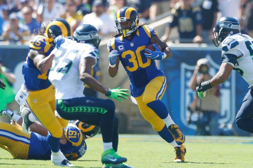
Yesterday the Rams played their first regular season game in Los Angeles since 1994, and they marked the occasion by wearing their royal-and-yellow throwbacks — a nice move for their home opener (which was greeted with the usual chorus of “Why don’t they wear these full-time?”). Lots of additional game photos here. The Red Hot Chili Peppers even wore throwback Rams attire for a pregame set.
In other news from around the NFL yesterday:
• I’ve been surprised all year long that the Vikings haven’t come out with an inaugural-season patch for their new stadium. Last night was their home opener and they pulled a surprise move by wearing a new patch. No fanfare, no advance notice, not even a pregame tweet — they just showed up and wore it. Not yet clear whether they’ll also wear it on the road. (If they do, that would create an inconsistency, since they didn’t wear it on the road in Week 1.)
• Speaking of the Vikings, Adrian Peterson changed helmet models.
• The Cardinals wore their new memorial decal for Nancy Bidwill — the wife of team owner Bill Bidwill — for the first time.
• We got our first 2016 look at the Giants’ new home look — white pants and white shoes. They’ll continue to wear this for all regular season home games. They had worn grey pants at home during the preseason.
• The Browns unveiled a Jim Brown statue at their stadium prior to yesterday’s game against the Ravens. There’s a video about the statue here.
• I love that the Raiders still play on a baseball diamond for the first month of the season. Yes, this is just kneejerk nostalgia on my part, because it reminds me of how the NFL looked when I was growing up in the ’70s. And no, I’m not similarly nostalgic for any other aspect of that era’s cookie-cutter multipurpose stadiums. But the sight of dirt infield at an NFL game still makes me smile:
Derek Carr para Clive Walford e… Touchdown para o @RAIDERS #RaiderNation #NFLBrasil #ATLvsOAK 21-14 4 ºqto https://t.co/k9pefa1YUq
— NFL Brasil (@NFLBrasil) September 18, 2016
• Bengals cornerback Pacman Jones is still honoring fallen teammate Chris Henry by wearing Henry’s No. 15, instead of his own number, on the back of his helmet. He began doing that last year.
• I have definitely noticed an uptick in the number of players with untucked undershirts. Not sure if it’s simply a fashion trend, or if there might be a competitive aspect to it (i.e., to make holding penalties more apparent), but it looks like shite.
• During the Cowboys/Washington game, Fox mistakenly used a Browns helmet icon for Washington — and it wasn’t even the Browns’ current helmet.
• I don’t usually worry about jerseys worn by fans, but this is pretty funny.
• Three teams wore white at home: the Panthers, Chargers, and Browns.
• Players engaging in postgame jersey swaps included Steve Smith of the Ravens and Corey Coleman of the Browns; Ezekiel Elliot of the Cowboys and Su’a Cravens of Washington; Dak Prescott of the Cowboys and Preston Smith of Washington; Lamar Miller of the Texans and Jaye Howard of the Chiefs; Vonn Bell of the Saints and Eli Apple of the Giants; Michael Thomas of the Saints and Sterling Shepard of the Giants; John Jenkins of the Saints and Rashad Jennings of the Giants; Quinton Jefferson of the Seahawks and Aaron Donald of the Rams; Tyler Lockett of the Seahawks and Todd Gurley of the Rams; George Fant of the Seahawks and Tyler Higbee of the Rams; and Kemal Ishmael of the Falcons and Latavius Murray of the Raiders.
• According to this team-by-team report, at least 16 players protested the national anthem in some manner yesterday — some by kneeling, others by raising their fists, and one by standing behind his teammates instead of being in formation along the sideline. The Eagles are reportedly planning a protest of their own for tonight’s game against the Bears.
(My thanks to all contributors, including Braden Claassen, Andrew Cosentino, Chris Flinn, @LandArchGamer, Matt Peachey, and our own Alex Hider.)
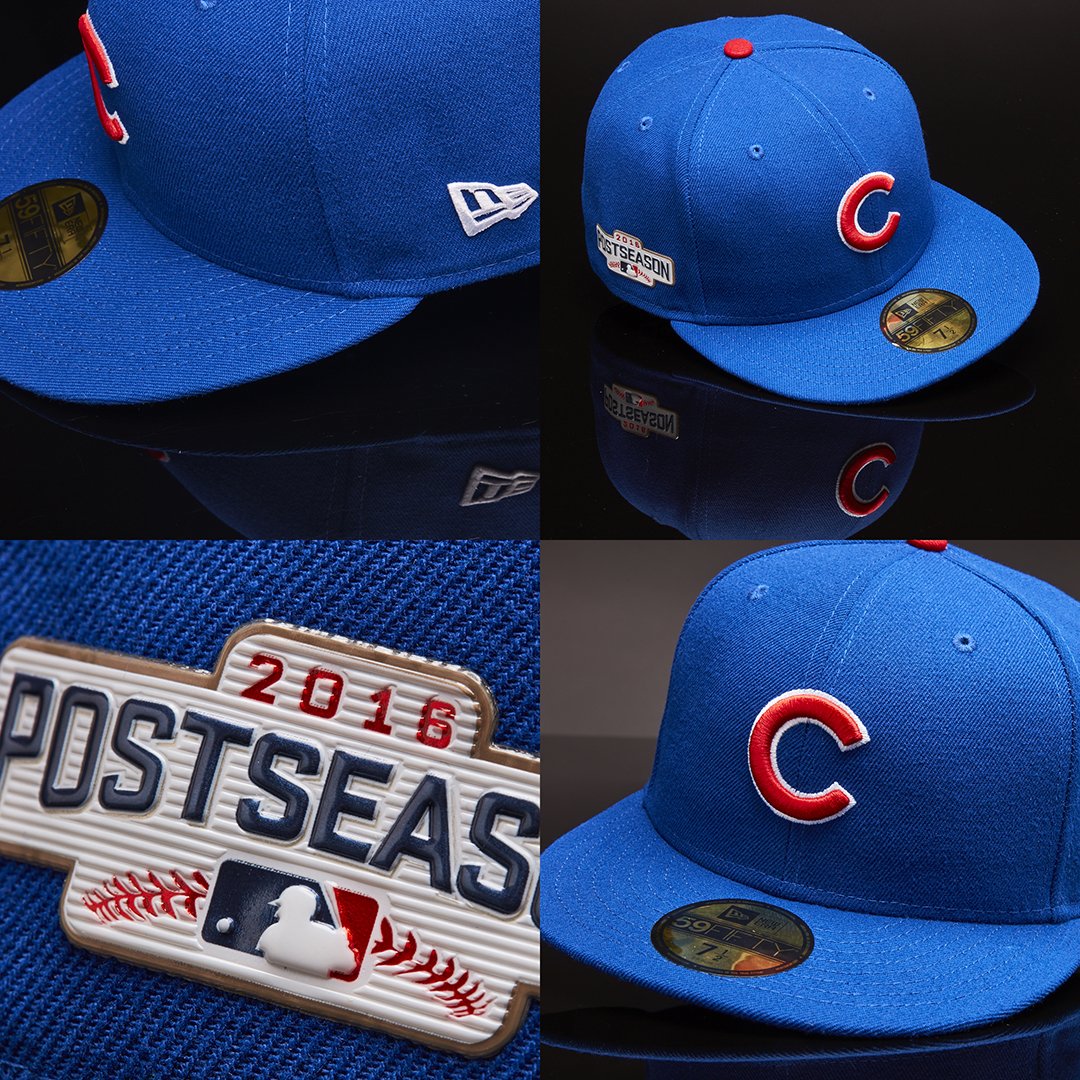
Click to enlarge
MLB logo creep getting creepier? After the Cubs clinched the National League Central Division title last week, the MLB merch machine kicked in and began selling these Cubbies caps with the 2016 postseason patch (see above). No surprise there — but as many people have noticed, the cap also include the New Era logo on the other side. Does this mean MLB caps are suddenly going to have a maker’s mark when the playoffs begin next month?
I’ve asked that question far and wide over the past several days and have been unable to get a straight answer out of anyone. There’s a lot of chatter — on Twitter, on the SportsLogos.net forums, etc. — that the New Era logo will not only appear in the postseason but that it will also be worn for all games starting next season, but all of that chatter appears to be of the “Some guy at Lids told me…” variety. That doesn’t mean it’s wrong, but I have not been able to confirm any of it, so let’s not panic just yet. There’ll be plenty of time for that if and when we know the full story.
I’ll say this much: I’m somewhat surprised MLB caps have managed to go this long without corporate logo creep. Just about every other part of the uniform has a maker’s mark — the jersey, the pants, the undershirt, even the new Stance socks — so the New Era folks have probably been saying, “What about us?!” for years now. I’m still holding out hope that logo is only appearing on the retail caps, not on-field, but it does seem like a plausible development. Stay tuned.
Meanwhile, here’s a little quiz for you: If it turns out that the New Era logo is indeed being added to on-field caps, everyone will say, “That’s never been done before.” But that is false! I know of at least one regular season MLB game that featured one team wearing caps with New Era logo creep (and I have two game photos to prove it), and I have the nagging feeling that there have been others. Can anyone out there name the game I’m thinking of, and/or come up with other examples?
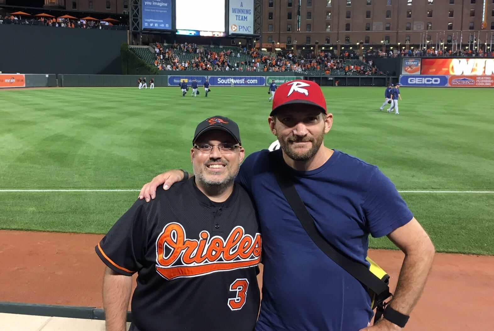
Click to enlarge
Meeting of the uni minds: It’s always nice when members of the Uni Watch community can meet up. That was the case on Friday night in Baltimore, as two looongtime readers/contributors — Joe Hilseberg (left) and Rob Ullman — took in an Orioles game at Camden Yards.
Joe’s involvement with Uni Watch goes back to April of 2005 (more than a year before this blog existed), when he let me know that Orioles shortstop Miguel Tejada had emerged from a head-first slide with the “1” on his jersey partially torn off and then played the rest of the game as No. 0 — a great spot that cemented his status as a uni-watcher par excellence. I later learned that he’d worked as a stitcher for the Orioles, and over the years I’ve recommended him to many people who were in search of custom stitching services.
As for Rob, I first became aware of his amazing cheesecake-style uniform illustrations in 2008. His work has been featured on the site many times since then, and many Uni Watch readers have hired him to do jersey-clad cheesecake illos of their partners — or themselves.
I’ve had the pleasure of meeting both Joe and Rob, and they’re both great guys. Very happy to hear that they connected. Our new slogan: Uni Watch — Bringing People Who Get Itâ„¢ Together.
The Ticker
By Alex Hider

Baseball News: The Reds wore their St. Patrick’s Day alts on Irish Heritage Night (aka halfway to St. Patrick’s Day). …Ben Zobrist of the Cubs rides his bike to Wrigley in full uniform, and even dangles his glove from his handlebars! (From Phil). … The Braves wore Rockford Peaches uniforms ”” skirts and and all ””on their getaway day yesterday (from Steve Vibert). … Folks in Kinston, North Carolina, aren’t happy with the new potential names for their hometown Kinston Indians. Potential monikers include the Down East Eagles, Down East Hamhocks, Down East Hogzillas, Down East Shaggers, and Down East Wood Ducks (from James Gilbert).
College Football News: Cleaning up from Saturday: Colorado State wore orange ”” this time, with green pants (from Steve Foster). … UNC painted the 22-yard line Carolina blue in honor of former RB Charlie Justice, No. 22 (from James Gilbert). … Looks like Michigan has added Jordan logos to its visor clips this year (from Matt). … New field design for Georgia Southern (from Austin Kohler). … Miami will unveil new uniforms today. Paul will have full coverage tomorrow.

Hockey News: The Kings will use their 50th anniversary logo at center ice this year (from Moe Khan). … Russia and Sweden played a nice color-on-color game Sunday in the World Cup of Hockey (from Ted Arnold). … Couple of shots from the Predators/Lightning preseason game yesterday from Bill Curran: a pair of homophone names and the first in-game shots of Tylor and Tyson Spinks’s NOBs.

Soccer News: The MLS game of the week was Toronto FC versus … Jacksonville Jaguars FC? (From Bud Brooks). … Megan Rapinoe of the USWNT knelt during the National Anthem again on Sunday, despite rumors the team would punish her if she continued to protest. … Looks like Alexis Sánchez’s Premier League patch was floating a bit high over the weekend (from Ricky Schumaker).

Grab Bag: New hoops unis for Appalachian State. Here’s close-ups of the road blacks and the fauxback golds (from friend of the site Steve Uhlmann). … Belle Vernon Area High School in Pennsylvania has gold turf (from Jamason Wiant). … Winnipeg Blue Bombers QB Matt Nichols has some sort of wedding band thing going on. Might be one of those silicone rings, might be tape over a real ring (from Daren Landers).
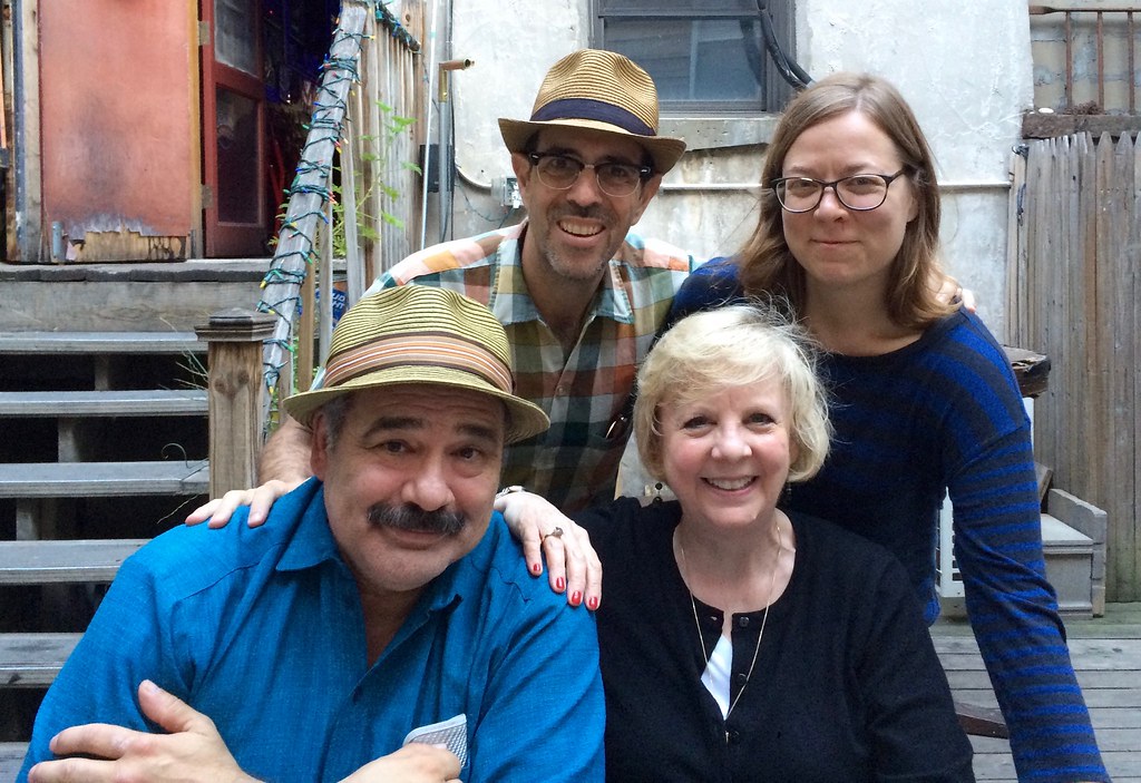
Click to enlarge

What Paul did last night two nights ago: On Saturday I finally got to meet the great Eltee of DC — that’s Larry Torrez, the guy who did all those caricatures of me — along with his lovely wife, Jo Carol. They live just outside of Washington but were in town for an NYC getaway, so we met up in the backyard of a bar not far from Uni Watch HQ.
Larry’s had quite a life. He got his start while he was working as a janitor at Disney Studios in California, where someone noticed him sketching during his work breaks and said, “Hey, you really know how to draw!” He was soon transferred to the animation department and has had a great career as an illustrator/animator (along with a seven-year stint in the Air Force).
Our get-together wasn’t exclusively social. Larry and I have been discussing a book project that would definitely be of interest to Uni Watch readers, and he wanted to propose some new elements that would take the project in a very different direction. I really liked his ideas — more on all of that soon.
I know the Color Rush uniforms are a polarizing topic here, but I noticed something last night in a Nike group shot on Twitter (I forget if Paul, Phil, or Chris Creamer RT’d).
The Patriots are the only team with no TV numbers on their jersey. I thought that was against the rules, and it’s funny that it’s only 1 team that this occurred with. Pats are playing this Thursday, so I don’t have to wait too long to find out the outcome.
The lack of TV numbers on the Pats’ Thurs-night jersey was noted here last Weds. NFL rules state that the jersey “should” have TV numbers, but there have been exceptions. During the 1994 season, the 49ers wore their TV number-less throwbacks all the way to the championship.
The Bears third/throwbacks don’t have TV numbers. They’ve been wearing them for a few years now. Maybe they get a pass because they are throwbacks?
They must – the Packers’ throwbacks link (nor did they when first introduced link). Neither did link.
“Should” doesn’t equate to “Must.”
Therefore, I don’t think a pass is needed. If a team doesn’t wear TV numbers, they are not breaking any rules. They are just going against 2016 convention is all.
I submit that one reason the New Era logo hasn’t appeared on-field yet is that the vast majority of the targeted consumers of the hats already know the name of the company. Putting the logo on the MLB hat doesn’t therefore serve the same purpose as say swooshifying the collar on the undershirt worn beneath the jersey. From that perspective, it doesn’t really *need* to be there. Plus, the NE logo is already all over the field, and in the MLB dugouts. Does NE think that people *want* the logo on for aesthetics?
No, that is not why. You’re overthinking it.
this is a classic Eli Manning face
link
“I love that the Raiders still play on a baseball diamond for the first month of the season.”
So do I.
Ditto! I loved the look of the flattened mound with a goalpost stuck in it at old Cleveland Municipal Stadium.
Marc, you beat me to it! I loved that about Cleveland Stadium. As I was watching the highlights last night, I thought the exact same thing about the Raider game. Something special about that they play on the diamond. Paul hit it on the head – brings me back to when I was a kid of the late 70s
Speaking of the Vikings, Adrian Peterson changed helmet models.
Wait, I thought that the one-helmet rule was supposed to keep players from changing helmet models during the season? So if a player chooses to change his model of his own volition, that’s okay?
Ugh. The NFL makes no sense to me.
We don’t know why he switched. For example, maybe there was a defect or problem with his previous helmet. In that case, obviously, he’d *have* to get a new helmet.
It’s important to remember that the rule is not designed to *eliminate* helmet changes; it is designed to *minimize* helmet changes.
I am neither defending nor critiquing the rule here. I am simply explaining it.
I suspect the NFL is okay with a player changing to a more protective helmet model. VSR4s have been discontinued for several years.
Then, if he couldn’t get any more of the old one, that makes some sense.
I admit, I don’t really keep up on football helmet models.
On the other hand, the switch may be moot for the rest of this season anyway if AP’s knee is done.
The one-helmet rule is to protect the NFL from being sued by a player. Take the Patriots for example. If Tom Brady WANTS to change helmets (models) during the season, that’s his choice. If he gets a concussion wearing the helmet HE chose to wear, that’s on him. If the Pats still had their red throwback, then he would be FORCED by the NFL to wear the white helmet. If he were to get a concussion while wearing a helmet he was FORCED to wear then the NFL could be held responsible. Despite what the NFL says, the one-helmet rule is more about protecting themselves than it is protecting the players.
This is an interpretation and speculation, not established fact.
It is not *unreasonable* speculation, but it is nonetheless speculation.
No, not a “known” fact. But if you consider the timing that the NFL came up with this rule (facing multiple lawsuits from players who suffered head injuries), I’d say more reasonable than “not unreasonable.” But, as you said, all speculation.
But you did not present it as speculation. You presented it as a statement of fact. And that was not (and still is not) warranted.
Sweden’s games are always color vs. color, because their “light” jersey is gold. If the Tre Kronor have ever worn white, I certainly can’t recall it.
Also, correction: the Spink twins don’t have an s at the end of their last name, which is evident in the linked picture.
Sweden might never wear white, but their opponents sometimes do so not all of their games are colour vs colour
Yeah, I had a brain fart on that one. My bad.
From St. Louis – I for one would rather see the Rams only in this. The Navy and Gold, good bad or indifferent was a St. Louis thing, should remain ours. The Royal and Yellow is more LA even though the Rams won a Super Bowl for St. Louis in them.
Regarding the trivia question about New Era, I want to say that it was an early military appreciation game in San Diego, and the special hats made for the game “mistakenly” had the New Era logo on the side.
You are correct!
Yes! (Pumps fist)
Wait. Is this the cap with the SD replacing the star in a US aircraft roundel?
No.
When the Nationals wore Virginia Tech caps in the aftermath of the shooting on campus, did they have a maker’s mark on them? I know they had the ACC logo on the side, but I can’t find a picture of the back of the caps to see if there’s any logo creep on them.
Since somebody correctly guessed a San Diego game, can you show us the pictures? It sounds familiar, but I don’t vividly remember it.
My guess for the logo creep snafu would have been a White Sox green hat day for halfway-to-St. Patrick’s, but that could have been a Spring Training game on real St. Patrick’s instead, and we all know spring training doesn’t count.
Saving Padres pics for now.
Chisox halfway to St. Paddy’s is an *excellent* idea. But some quick photo research has not turned up any New Era logo creep on those.
So why isn’t “Halfway to Christmas Day” (June 25th) a thing? It’s right smack in the middle of the season and it would give MLB even more of an excuse to market this as an excuse for early Christmas shopping, Santa sightings, elf sightings, We Three Kings, reindeer, selling club themed fruit cakes, etc.
Please don’t give them any ideas.
Does anybody else think the V in the Vikings endzone looks like the Longhorn Steakhouse logo?
Sigh. If they’re gonna put the NE logo on the caps (which I wish they wouldn’t) then I’d much rather have it on the back, above the batterman. It’s totally obnoxious on the side.
It’s obnoxious anywhere. Front, back, side. All bad.
Seconded.
I don’t like the batterman on the back, but at least that’s the league’s logo.
This is the most egregious of all logo creeps and it’s the only one that’s ever deeply bothered me. The MLB caps are, in my opinion, the most sacred uniform element in all of American sports. I’m going to be deeply (and perhaps irrationally) bothered if these actually show up on the regular season caps.
NFL untucked tee-shirts may be a by-product of the pants being so tight and form fitting that adding an extra layer of material makes it uncomfortable? Probably not but makes a good excuse.
this what i was thinking… you have padded compression shorts plus real tight compression pants(aka football pants that are basically thicker leggings)
not much room for a loose t shirt to fit
I can see the players arguing this but I seem to remember when Nike were promoting the new NFL uniforms how base layers, leg sets and jerseys all worked together. This seems to be in contravention if this and I think it is unfortunately just a precursor to loads of Nike t-shirts going on sale with a grey back box. I’m sure they will become the most desirable thing in the world soon
Similar to how everyone was desperate for a mock collar with and underarmour logo poking out circa 2004.
I think it looks **** and having looked at the uniform violations posted a couple of days ago i’m pretty sure it is a breach. Also when I played (in the UK so at a casual level) you firstly would fail the prekit inspection if your base layer was visible at the waist and you would be *****slapped by your coach if you got tackled by your base layer.
All in all I think it is safe to assume I’m not a fan!
On a plus note I love the Giants look in the white pants. Other than white over purple for Minnesota it may be my favourite look.
One thing I have never understood about NFL (actually most football pants, NFL, NCAA, High School etc) is this. Why is part of the pants material a darker shade and virtually unable to be seen through? I’m referring to the area of the pants that covers the players ass crack and front private area but the rest of the pants are mostly see through especially when a players begins to sweat. It seems as if it’s a different material or extra stitching on the pants. I don’t really care to see another guys ass but is it some strange marketing thing to get woman into the uniform look? Why not just make the entire pants the darker shade and not see through? Anyone have any idea on this ?
Pure speculation: they make the pants out of the lightest, most breathable and flexible material possible, but add a second or thicker layer to prevent their jocks from being on display (i.e. Lululemon).
Yeah, this is pretty obviously the reason. They’d make everything out of the see thru stuff if they could (it’s all about being lighter, more breathable, more stretchy, etc.) But fans don’t want to see the players’ privates, so they have to add a modesty panel. It just seems so self evident to me that I’m surprised that anyone is wondering about it. It’s like asking, “Why is that woman wearing a bikini?” Answer: “Because if she wasn’t wearing it, she’d be naked.”
While watching the Giants – Saints game, did anyone else notice Drew Brees is wearing three shades of gold (his helmet, anniversary and captains patch)?
I would have thought the Saints would have matched them for consistency sake.
Love the all white Chargers uniform. Hate when they wear navy pants with white jerseys. All white always looks good when a team has white helmets. This is my second favorite uniform for SD, with their light blue being my favorite. I wish the Cardinals went to all white at home, and get rid of the red shoulders on their white uniforms.
The Red Hot Chili Peppers even link for a pregame set.
Rare case of link there on Anthony Kiedis.
Had a a Chili Pepper/Rams logo mashup link, too.
The MLS game of the week was Toronto FC versus … <a href="link Jaguars FC?
What’s really strange is that the Toronto game was link. Kind of hard to mix those two up.
I’ve noticed a couple times link that Arsenal tends to put their Premier League patch pretty high – link. Wonder if it’s link.
what I like about MLB unis is that I hardly notice any kind of brand markingss on them. The MLB logo is more prevalent than anything else and even that doesn’t bother me too much.
“Some guy on Reddit” just pointed out that Sam Bradford has now started for all three teams in the NFC that don’t use their primary logo on their helmet.
The Eagles, the Rams, and now the Vikings.
link
Man, it was so great to finally spend a night at the ballpark with ol’ Joe H…just an awesome dude. If there’s a finer companion for an Orioles game I can’t imagine who it could be.
At the risk of sounding like a total sap, barely a day goes by that I don’t correspond on a personal level with some member of my Uni Watch family. I feel so privileged to be part of this exemplary group of humans.
And bonus that it was the high sock give-away night!
link
-It wouldn’t surprise me at all if New Era added the logo to MLB caps. Honestly, it’a always shocked me that they weren’t there years ago. (In fact I believe I may have asked Paul about in on twitter at some point.) I don’t like seeing. Them added, but aesthetically it bothers me even more that they’ll (presumably) be on the (facing front) right side of the cap as they are on retail, which means hat patches will have to be on the left. That’s a look I really don’t care for.
-The Rams really do look great in those royal blues.
The Vikings’ matte finish helmets made for a purple mismatch that drove me nuts last night. Would’ve looked much better in a gloss finish.
Agreed!
I like the design of the Viking’s patch, but it’s too big and looks like crap on some of the jerseys because it’s crowding the shield and wordmark in middle of the jersey.
I mentioned the prevalence of untucked jerseys to my wife yesterday and got the usual “why do you care about these things?” look.
I thought it was interesting that Steve Smith Sr. is not exchanging his game worn jersey, but Corey Coleman is.
The silicone ring that Matt Nichols is wearing is from Qalo.com. Silicone wedding bands meant to be worn while doing activities. Also worn by decathletes Ashton Eaton and his wife Brianne Thiessen-Eaton and CFL stand out [and good friend of mine] Chad Owens of the Hamilton Ticats.
Way ahead of ya, Edward — ;)
link
Are tattooed wedding bands still a thing?
Technically, the last time the Rams played a regular-season home game in Los Angeles was 1978, not 1994.
From 1979-1994, they played home games in Anaheim. :)
Slightly pedantic, but those who don’t think there’s a difference don’t remember LAMCC v. NFL.
Oops, check that, they moved in 1980. Last LA game was 12/16/79.
That is true. Though, it was first regular season game at the L.A. Coliseum since 1994, as the Los Angeles Raiders were the tenants back then.
Does anyone know who is in charge of coming up with the lists of new team names in all of these “rebranding” efforts? I admit that I like a couple of them (Yard Goats, Blue Wahoos), but most of the possible names are ridiculous. The nearest team to me is the New Orleans Zephyrs, and there was a similar outcry when their potential new nicknames were announced. It seems this is happening in various parts of the country. Is there a single marketing entity behind this conspiracy of foolishness?
I believe it’s the firm of Bialystock & Bloom.
The Great Satan in this fight is the availability of domain names. If the fans were allowed to name the team, the likely winner would be “Wildcats”, “Bulldogs”, or some such; very hard to copyright. Narrowing the choices to the likes of “Rat Pizza”, “Plaster Chimps” or “Tile Pandas” virtually guarantees an easy path to clearing the name.
Was another time possibly when the Red Sox wore their earth day jerseys?
Another good guess. But photo research suggests no.
It may be that the Padres game already referenced is the only instance. That’s definitely the only one I’m sure of.
The Giants look so much better with the white pants than with the old grey ones. That could’ve been a perfect uni game if the Saints had worn the gold pants instead of black. Still, both teams looked pretty good.
I prefer the grey myself.
As do I. By a mile.
I thought I was the only one that preferred grey…
Prefer the grey, but with the original striping pattern the did away with a few years ago. The Giants identity is a total mess right now.
I like the white pants better, but the need to get rid of the grey in the stripes in those pants. It is hardly noticeable, but would look better if the grey stripes were white.
I’m pretty sure on those rare occasions that it was cold enough, I’ve seen players wearing New Era stretch fit caps. These caps have/had an internal drop down neck/ear flap thing. They were definitely not 5950 style caps, but probably modified 3930s. They certainly had the NE logo on the side…
I hate the NE logo on any of my NE 5950 low crowns. I always take the time with a seam ripper to cut and remove the logo. It is a pain in the ass, but worth it. I would certainly be annoyed to see that logo on the field regularly.
I think the Rams/Seahawks game yesterday would have been much better, sartorially, had the Seabirds worn White/White or Grey/Grey
I don’t understand the NFL’s one helmet rule. Why are the Rams allowed to use a different helmet?
It’s the same helmet. Different-colored ram-horn decals.
You guys should just cover Oregon’s uni’s..they basically set the trend and everyone follows. They’ re actually dressing like the mascot this week. You aren’t really a good site if you don’t have this on yours. just wait… everyone else will copy.
There will be coverage tomorrow. We post once a day. Thanks.