It’s a big day for NBA uniforms, as the Grizzlies, 76ers, Knicks, and Nets have all made uni-related news. Let’s start in Memphis, the Grizzlies have unveiled of a new alternate uniform honoring history’s greatest American, Martin Luther King Jr. (click to enlarge):
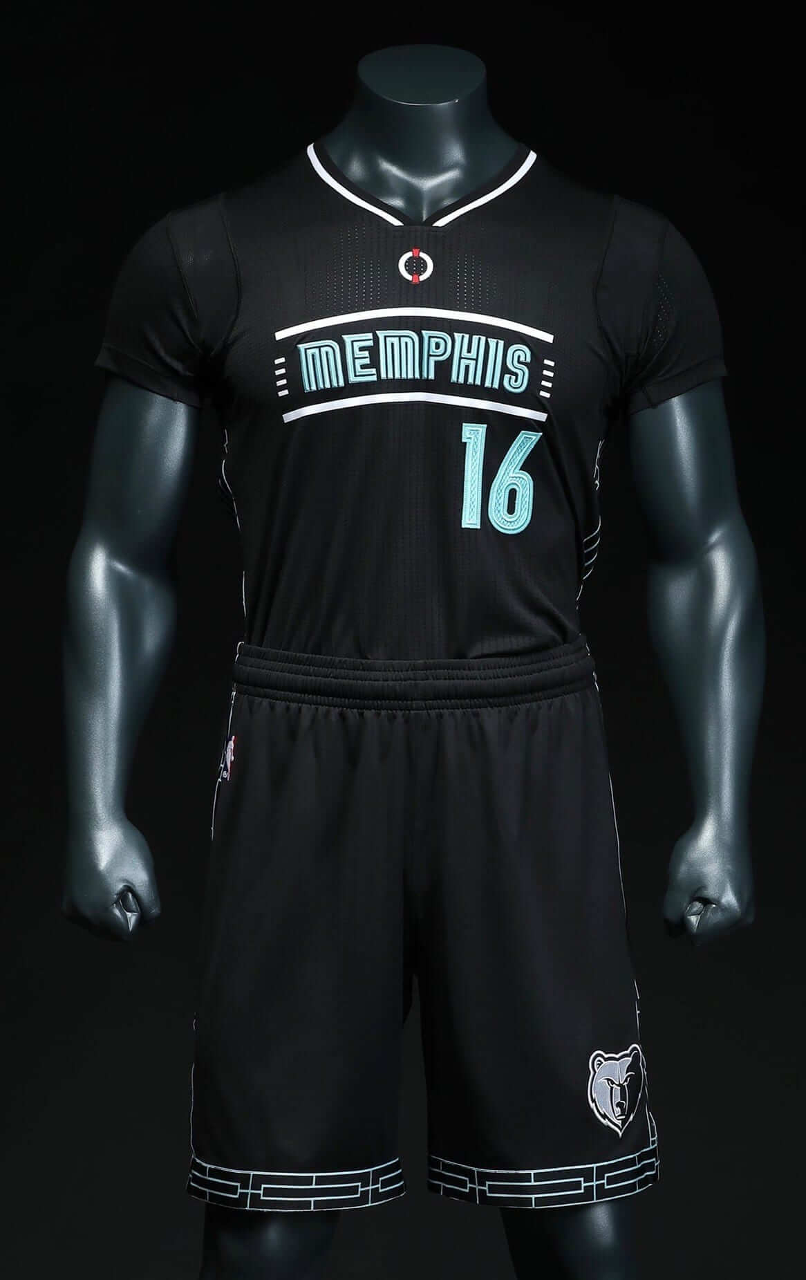
The uniform includes many visual references to the Lorraine Motel in Memphis, where King was assassinated in 1968. It was later converted into the National Civil Rights Museum, which is where the uniform was unveiled last night. Among the details:
• The chest lettering is based on the motel’s sign.
• The icon above the chest lettering, at the base of the collar, was inspired by the memorial wreath that was hung outside Room 306 — King’s room — after his murder.
• If you look again at the wreath photo, you can see that the motel’s railing design served as the inspiration for the trim on the shorts (which also runs up the sides of the jersey).
As you know, I generally take a pretty dim view of uniforms with “storytelling” elements. That’s because they usually seem forced, like someone in the marketing department said, “Okay, you have to include at least four storytelling elements, and so far you only have two, so come up with two more!” The reality is that most uniforms don’t have a story to tell (or, perhaps more to the point, they don’t have a story worth telling), but this one does — it’s a history lesson. The details feel well-considered and well-executed. Too bad about the sleeves. Overall, though, nice job.
The uniform will make its on-court debut on Jan. 15 and then will be worn for various games during Black History Month in February. Additional info and photos are available here.
Meanwhile, over in Philadelphia, the 76ers will announce today that they’re marking the 50th anniversary of their 1966-67 championship by wearing throwback uniforms for six Saturday home games (dates not yet finalized):
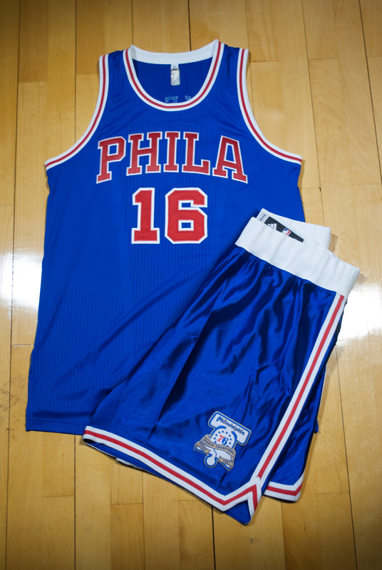
Thanks to various leaks, we’ve known about this throwback for a few months now, but this is the first time we’ve seen photos of it. Here’s a side-by-side comparison of the throwback and the original uni:
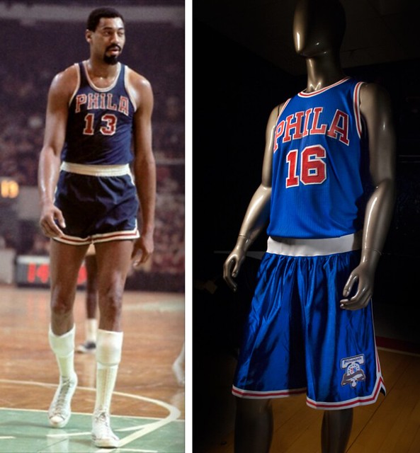
The shades of blue don’t seem to match there, although that could have to do with lighting, sweat, etc. And speaking of blue, the Sixers are using Pantone 294 for the throwback, instead of their usual Pantone 293. Here’s a side-by-side of those tones — current blue on the left, throwback blue on the right:

The throwback includes a commemorative patch, which I’m pretty sure was not shown on any of the leaked mock-ups that have been circulating, so this is our first look at it:
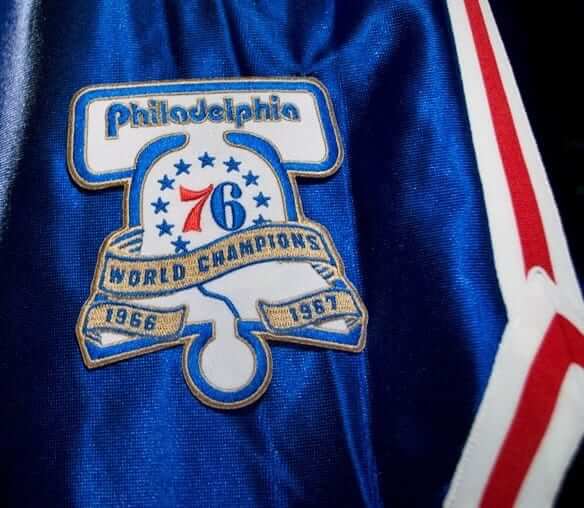
For the six throwback games, logo shown on the patch will also be used at center court:

Although not shown in that image, the center court design will also feature the signatures of all Sixers season ticket subscribers, which according to the team will be “the first time in NBA history that fan signatures will appear within the playing surface of an NBA court.”
The team is also celebrating the 1966-67 championship team on its ticket stubs (click to enlarge):
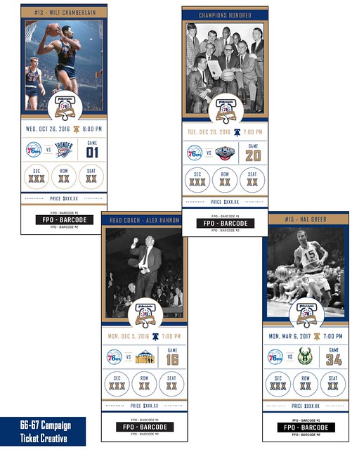
Next up are the Nets, who’ve released a retro-themed alternate uniform (click to enlarge):
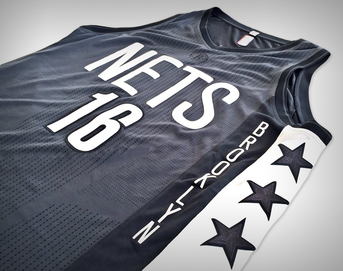
This is basically a dark version of this alternate uni, which they’ve had for the past two seasons. They’ll wear this one for the home opener on Oct. 28, and for 12 additional games — some at home, some on the road. The dates are listed here, and there are additional photos here.
That press release, incidentally, includes some first-class corporate nonsense. For starters, it says that the five stars on the jersey “dually represent the team’s fifth season in Brooklyn, and the five decades of the franchise.” Compare that to the Grizzlies’ MLK uniform and you can see the difference between real storytelling and bogus/forced “storytelling.” And then there’s this quote from team exec Brett Yormark: “By combining elements from the team’s most iconic uniforms, we’ve created a modernized look that emphasizes our heritage and defines today’s lifestyle brand.” How does anyone say (or, more likely, type) that kind of thing with a straight face?
In happier news, the Knicks have a new 70th-anniversary throwback, which they introduced yesterday via a short video clip that’s informative, entertaining, and blissfully free of corporate brandspeak:
Here’s your exclusive look at our Hardwood Classic jerseys this year! 42 days until the opener! #NYK70 pic.twitter.com/W7B4zwP5zB
— NEW YORK KNICKS (@nyknicks) September 14, 2016
It’s not quite as much fun as the throwback they wore last season, but it’s still pretty good. It will be worn for eight games (six at home) — the dates are spelled out midway through the video.
And speaking of storytelling…: Shifting to college football for a sec, Arizona is hosting Hawaii this Saturday, and the Wildcats will be wearing a uniform that honors the USS Arizona, which was stationed at Pearl Harbor in Hawaii when it was bombed and sank by the Japanese on Dec. 7, 1941. Arizona and Hawaii, get it?
Okay, so it would be better if the game were taking place closer to Dec. 7, but the uniform is a good one. Much like the Knicks (see above), Arizona has put together a really good video that explains all of the details, although you might want to mute the soundtrack (and all the info in the video is also available in this PDF):
#WeRemember 🇺🇸
We will recognize, remember and honor the memory of the U.S.S. Arizona and its crew.#BearDown pic.twitter.com/ahkKMfkLKg
— #Forever65 (@ArizonaFBall) September 15, 2016
Lots of good stuff there. But ugh, that neck bumper — a glaring apostrophe catastrophe. Punctuation illiteracy strikes again.
Madden-ing: Reader Josh Claywell was poking around on Madden yesterday and found the new Thursday-night uniforms for all 32 teams, with colored and white versions for most of them.
Normally I’d embed a slideshow here, but Flickr’s slideshow function seems to be balky today, so instead I’ll just link to the set of Josh’s screen shots.
As you’ll see there are no colored uniforms for the Bengals, Cowboys, Giants, Packers, Saints, or Raiders. Those are the teams that are wearing new white uniforms on Thursday nights. I’m pretty sure all the other white unis shown here (whether they’re slated to be worn on Thursday nights this season or not) are just the teams’ regular white unis.
Also, the Pats, Niners, and Steelers are all shown wearing colored pants with their white jerseys. That’s because those teams don’t have white pants in their wardrobe, and new Thursday-night white pants have not been created for them (at least not for this season).
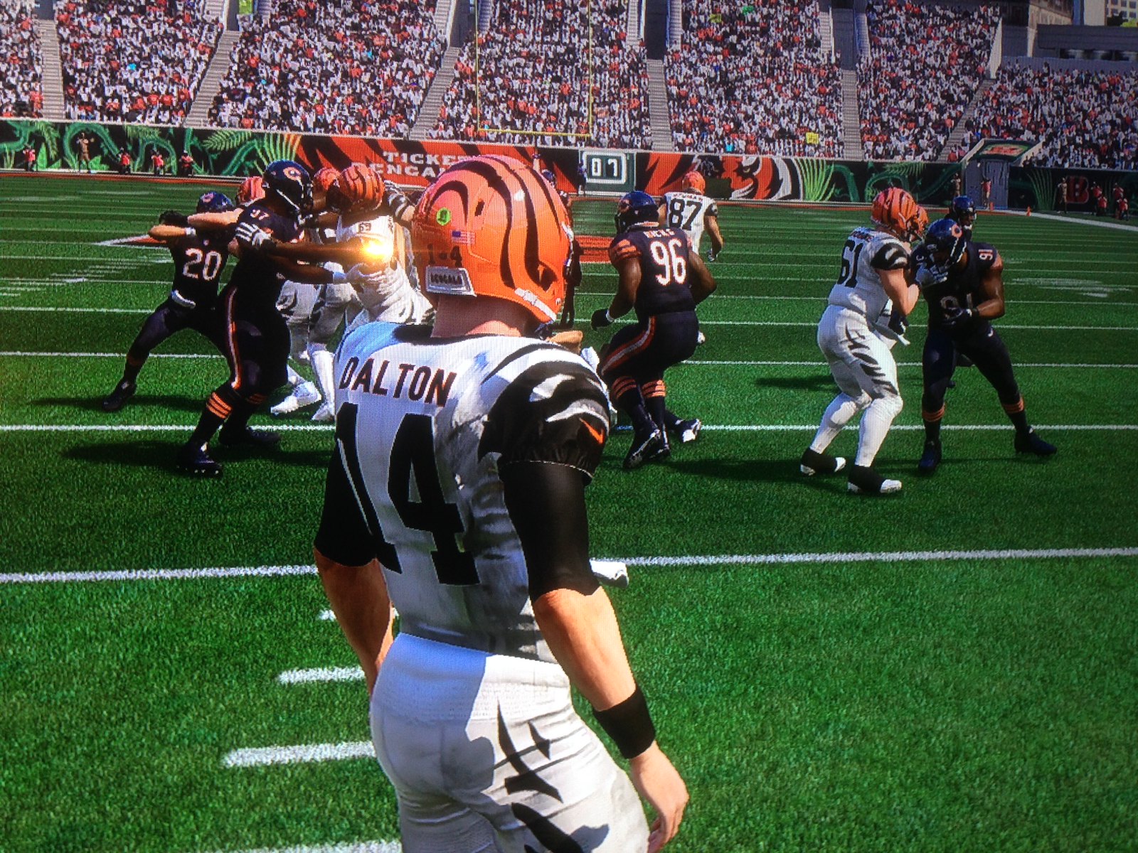
In addition, reader Brian Spiess’s son was playing Madden and got a good screen shot of what a Bears/Bengals game would look like (in reality, they’re both facing other teams in Thursday-night games). He also confirmed that the Browns’ white Thursday-night uni features their regular (i.e., awful) pants:


Mighty Mike: When not compiling our Tuesday and Thursday Tickers, Mike Chamernik has a day job at a trade magazine and also moonlights at the sports section of The Chicago-Sun Times (plus he’s a just an all-around great guy). He recently had two articles in the Sun-Times: a preview of the Chicago Football Classic (an annual game between teams from two historically black colleges, played at Soldier Field) and coverage of the game itself.
Both articles are highly recommended. Congrats on the bylines, Mike!
Bacon update: I appeared on the radio show Marketplace yesterday, discussing my new Businessweek article about the nuances of bacon packaging. If you missed the article, it’s available here, and the radio interview is embedded below. (I haven’t actually listened to it myself — I hate hearing myself on the radio — but I’m told it sounds pretty good.)
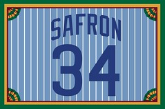
Membership update: A new batch of membership cards was mailed out on Monday (including Jonathan Safron’s late-’70s Cubs throwback treatment, complete with reverse pinstripes and vertically arched NOB lettering, shown at right), so those of you who’ve been waiting for your cards should have them momentarily. We’re now fully caught up on orders.
As always, you can sign up for your own custom-designed membership card here, you can see all the cards we’ve designed so far here, and you can see how we produce the cards here.
The Ticker
By Mike Chamernik

Baseball News: The Orioles’ new schedule revealed a 25th anniversary logo for Camden Yards. Paul has confirmed that it will be worn as a patch next season, complete with silver metallic thread for the ballpark’s silver anniversary (from Scott Pika). … Check out this 1924 scoreboard. It looks like it was a Playograph, a scoreboard that, as Paul explored here back in 2009, displayed real-time out-of-town game updates (from John Muir). … Lots of stirrups were featured on last night’s episode of Big Brother (from Chris Flinn). … They’re expensive, but here are some pinstriped pencils in honor of Joe DiMaggio’s 56-game hit streak (from Rob Ullman). … Great story here: A Texas man filled out a nearly 60-year-old Bazooka promotion card for a new baseball glove, and the Bazooka people honored it (from Brinke). … Remember Marlins OF Giancarlo Stanton’s custom faceguard with the stylized “G”? Turns out he broke it right around the time he went on the DL last month. Now that he’s back in action, he’s wearing the standard face flap (from Mike McLaughlin). … Here’s a great old Lou Brock sneaker ad (from Joel Paylor).

NFL News: The Bills will retire Bruce Smith’s No. 78 tonight. Crews painted his number on the field yesterday. … The Cardinals will have “NJB” decals on their helmets in memory of Nancy Bidwill, the wife of owner Bill Bidwill. … Packers CB Damarious Randall wore long base-layer sleeves in 100 °F heat in Jacksonville last weekend. He says he wears long sleeves because it improves his range of motion. It’s like the flip side of when Bengals linemen went sleeveless in -59 °F windchills to intimidate the Chargers in the Freezer Bowl in 1982 (from @HawksPacMan). … The Chargers will wear their powder blue alternates on Nov. 6 and Dec. 18. … Sean Marenkovic‘s girlfriend knitted a pair of very good-looking striped Browns socks. “She had to labor through them, as she is a Steelers fan,” he says. … Also regarding the Browns, beck in 2006, Scott Bogunia put together a marketing brief (PDF) that featured a redesigned home uni. … The NFL Shop is forbidding customized jerseys with “Harambe” on the back. That was the name of the ape in the Cincinnati Zoo who was shot and killed back in May, and has since become the cause célèbre on the internet. Other leagues still offer Harambe jerseys, though (from Phil). … A Virginia couple decided to stake the fandom of their infant daughter on the outcome of Monday’s Steelers/Washington game. … Here’s a pamphlet that details uniform rules and violations for all 32 teams (from @manonwire22). … Giants WRs Odell Beckham Jr. and Victor Cruz will not be fined for their 9/11 cleats (from Phil). … What would a blue Thursday-night uniform for the Cowboys look like? Perhaps like this.
College and High School Football News: Louisville painted a Muhammad Ali memorial behind one of the endzones. It’s a butterfly with “Ali” in it (from @DaveDoop). … Virginia Tech will wear white at home with Navy template helmets this Saturday (from Andrew Cosentino). … Here’s more on Miami’s new merit decals (from David Leiphart). … Minnesota also awards helmet stickers (from MKE_Gopher). … In reaction to North Carolina’s House Bill 2, a measure seen as anti-LGBTQ, the ACC will move its title game out of Charlotte. … Marshall will wear a West Virginia-shaped helmet decal as a tribute to victims of flooding in the state this summer (from @cDubya242). … A small town in Michigan has been having an annual pink-uni game, for cancer awareness, for nine years, and it’s become a big part of the community (from Joe Hollomon). … Here’s this week’s uni combo for Florida Atlantic.

Hockey News: The Predators will now wear gold helmets for every home game, instead of only on Saturday home games (from Nick Griffin). … New uniforms for the Toledo Walleye. … New jerseys for Michigan State (from MikeTPhD). … The Sharks will give away a Warriors-colored jersey.

Basketball News: A Portland coffee shop made Trail Blazers-themed ice cream sandwiches. … The Bucks’ Mickey Johnson went double-decker FNOB for a time in the 1980s. Marques Johnson did the same (from Reinis LÄcis). … Kentucky revealed a new home jersey with checkerboard-patterned side panels (from Drew O’Neal). … Tony Parker recently hosted a basketball game on top of a glacier in Switzerland.

Soccer News: Here’s a collection of all of the home, away, and third kits in the UEFA Champions League this season (from Josh Hinton). … Portland Timbers CB Steven Taylor normally wears No. 27, but for some reason he wore 72 last night.

Grab Bag: The ACC is the latest athletics organization to pull out of North Carolina due to the state’s anti-LGBT law. … The James Bond 007 logo has evolved since the early 1960s (from Brinke). … ESPN has inked a deal to televise the Drone Racing League. The uniforms appear to be black T-shirts with the team names (from Jay Wright). … Here’s how the British Army’s uniforms have changed since the redcoat days (from Mark de Socio).
A couple of those Madden shots seem to be different colors than what we’ve seen unveiled. The Seahawks’ green, for example, looks like their current neon trim color, while photos of it aren’t nearly that bright. The Chargers have the opposite problem, appearing to be nearly navy rather than the lighter blue we’ve seen.
That might be the result of lighting and taking a picture of a TV screen with a smartphone.
Looks like the Lions are also in silver pants for the color rush alts.
Looks like it’s just the white jersey with silver pants. lame.
Yeah, they appear to have not made any new white pants for those teams. That said… unless they’ve since been removed for this version (haven’t bought yet, played last year’s), the Steelers, 49ers & Patriots all have white pants of some kind in their options so those ones can be “fixed” via the mix-n-matching. The Lions would seem to be the only team that can’t do the mono-white.
Congrats Mike!
Thanks!
Proofreading:
“most uniforms don’t have a story tell”
“Nancy Bidwell, the wife of owner Bill Bidwell” Bidwill
Fixed.
I noticed the NFL uni violation pamphlet has teams listed in alphabetical order. However, the Rams are still in the “St. Louis” slot.
I know nothing about guns. Are any of the ones shown in the 007 logos real guns, or just stylized representations?
They’re stylized representations incorporated into the wordmark. James Bond famously carries a Walther PPK, and those are not Walther PPK’s.
To be pedantic, the Walther PPK is the gun Bond uses in the movies exclusively. In the first several novels he uses a Beretta 418 (w/a Colt as his spare) before being forced in Dr. No to turn it in for the PPK b/c the PPK possesses greater stopping power. Dr. No, of course, was the initial Bond movie, and includes that scene from the book:
link
There were also competing US & UK versions of the 007 logo, though over time the superior US version won out. The 007 logo was incorporated w/Roger Moore’s name was really clever, IMO.
link
Ah, the original Q.
From “Tomorrow Never Dies” to the end of the Brosnan run, Bond carried a Walther P99. In “Casino Royale,” Craig’s Bond mainly carried a P99, but the rest of the Craig movies have seen a return to the PPK.
Interesting that two of the most famous cinematic firearms are a German pistol carried by the English hero Bond and an English revolver carried by the American Indiana Jones. At least Dirty Harry carried an American gun!
Wonder what Harry Callahan thinks of American servicemembers carrying link?
Is Indy’s Webley really that famous?
I’ve not met an American serviceman who likes the M9, and I’ve known several who have bucked regulations to carry Colt 1911s on deployment. Detective Callahan would not be alone in his opinion on the matter!
I don’t think Indy’s gun is famous as a Webley the way Bond’s gun is famous as a Walther, but it’s featured in what surely must be one of the most famous scenes of gunplay in movie history. Any list of most famous movie guns has to include Indy’s revolver for that scene alone, just as Dirty Harry’s “do you feel lucky?” monologue puts his magnum on the same list.
The 1987 one is probably my favorite. The current one would top it for me had they not changed the trigger part.
Hey Paul, maybe I’m missing something, but any idea why that ‘Sixers commemorative patch/court logo says “Philadelphia 76” and not “76ers?”
Never mind. I jumped over to Chris Creamer’s site and saw it’s a nod to the original logo. Hadn’t ever paid much attention to their logos.
Good question!
I’m glad the Browns didn’t entertain that marketing brief back in 2006. Both the writing itself and the work inside it is very unpolished.
While the Memphis jersey is both visually appealing and focused in its message, I can’t help but think that focus is squarely on King’s death rather than the great things he accomplished and catalyzed in his life.
It seems ironic that a jersey honoring the man who helped birth the civil rights movement is all about his death.
That’s because the uniform is being positioned as part of a year-long commemoration, due to start next year and culminate in 2018, of the 50th anniversary of King’s assassination.
The uni is also about publicizing the Nat’l Civil Rights Museum in Memphis. It’s one of the most surreal places you’ll ever visit. Step into that parking lot and you’ll feel like you’re transported back to that fateful day.
I’m sure it has something to do with “Heroes live forever” which is kind of cheesy but understandable. Maybe pitch your idea to the Wizards and they can do an “I have a dream” uniform.
MLK was indeed a great American, but if we had a top 20 in this category, I couldn’t put him above the likes of George Washington, Thomas Jefferson, and Abe Lincoln.
It’s hard to compare people across eras. Best to judge them against their contemporaries, and MLK is certainly one of the giants of his era, if not the entire 20th century.
Whoa, buddy.
I’ll give you Lincoln, but the mention of Jefferson makes it impossible to take the objection seriously. I’m possibly as big a fan of George Washington as anyone alive today, but even I wouldn’t put Washington ahead of King or Lincoln. As for Jefferson, you’d have to get down the “greatest American” list a ways to where folks like Duke Ellington or Walt Whitman show up before I’d even consider giving Jefferson a number. Well below the top 20.
I agree that Washington and Lincoln are the only others who are even in the conversation.
But I’ll still take King, whose greatness was predicated on love in the face of hate, and peace in the face of violence.
Don’t forget Hamilton, who is only now starting to get the recognition he long deserved. If we’re going to discuss 18th century.
But, yeah – if we’re talking 20th, MLK is right up there with Gandhi and Mandela. Pretty exalted company, men who changed their nations and the world by meeting violence with peace.
I think I’d probably rank Mandela ahead of King if I had to order that list, and I’d definitely put Havel right there too. But it’s telling that King is the only American on the list. In the twentieth century, I’m not sure I can name another American that I’d even consider ranking with King as a possible “greatest American.” Maybe Norman Borlaug, but I’d have to argue the point pretty hard even to persuade myself.
The chronology is also interesting: Without Gandhi, King’s nonviolence probably doesn’t take the form it does. Without King, Mandela may not have renounced the ANC’s violent campaign. If Mandela’s greatness exceeds King’s, it’s only because he had King to learn from.
Unfortunately, Memphis’ association with Dr. King boils down to his shooting. His achievements are associated with other cities.
That is not accurate. King was in Memphis to support the local sanitation workers, who were on strike. While he was there, he gave one of his most famous speeches, the “I’ve Been to the Mountaintop” speech.
It’s like if the Dallas Mavericks decided to honor JFK with a jersey that evoked Dealey Plaza or the grassy knoll. Just seems…off.
Do you also think it’s “off” that the National Civil Rights Museum is located in the motel where MLK was murdered? And that the museum will be promoting a big campaign to mark the 50th anniversary of his murder?
This is part of Memphis culture, history and heritage. Yes, it was a terrible event, but one that has been transformed into a museum and a repository for history.
That’s like the Texas School Book Depository. It now functions as a government building of some sort. However, the 6th & 7th floors are a Museum dealing with the Kennedy assassination. Why wouldn’t you want to put history museums where the history was made?
There is a certain justice in reclaiming the site of violence as a museum dedicated to peace.
Thanks for explaining the reasons behind the Memphis jersey, Paul. Given that context, I think it’s perfectly done and it’s focus makes much more sense to me now.
Yes, I absolutely do think it’s off that the National Civil Rights Museum is located in the motel where MLK was murdered, as do Coretta Scott King and MLK III, who didn’t want King’s name used on the museum.
I would also think the merchandising aspect of this would bother you, but I guess not.
link
+1, judging by the responses here, bit of a bubble here in Uni-watch world
Nate Silver and 538 mentioned your bacon article today.
link
While checking on the 1966-67 76ers, I came across link from the 2/7/67 game against the Warriors in Pittsburgh. It looks like Wilt is wearing dark shorts there, and I don’t have access to any other photos to confirm or refute it. (There’s no mention in the Pittsburgh papers.) In other games, the shorts link.
So I wonder what he’s wearing there. I also wonder if one of this year’s tickets commemorates the six games in the Civic Arena.
I think the Sixers’ center court logo in that picture *is* showing all Sixers season ticket subscribers!
Great story about the Bazooka baseball glove offer. It costs a company so little to do something like this and it creates so much goodwill.
The Michigan State hockey uniforms look horrible. If you’re going to have green going down the sides and no other patterns on the body of the jersey, at least have the green go all the way down, instead of stopping abruptly halfway down. That oversized collar is hideous too.
Why can’t the Nets just wear blue throwbacks? Forcing this black/white nonsense
Clearly, you are not in touch with what “defines today’s lifestyle brand.”
Forcing this black/white nonsense
I actually appreciate the Nets keeping their alternates on their regular palette. I’m so burned out by teams like the Padres and Brewers throwing out a constant glut of contradictory colors to appeal to everyone.
Their grey and blue sleeved uniforms don’t follow this logic.
And I hate those.
I think it’s a great idea that the Memphis jersey has sleeves. It’s a jersey with a good story behind it and you want people to waer it (the sleeves will help sales) so that when they are in the street, other people can ask them about why it is so different than the regular jersey and they can share the story. If it was sleeveless, it would have a lesser chance of spreading the story.
Also, I hope all sales from the jersey go to some charity like the King Center
Sigh.
No, the point of a uniform is not (or at least should not) be to sell it. The point of a uniform is for the team to wear it.
That is the difference between uniforms and merchandise.
I know and agree that sales shouldn’t drive the on field uniform program.
For this specific case, I think the sleeves increase the chances of the story being spread.
You assume that people wearing the jerseys would actually know the story, rather than simply thinking it “looked cool” when they bought it. I doubt that would be the case in most instances.
Yeah, I’m very skeptical of the notion that a one-off uniform really generates much conversation. Certainly not nearly enough as it generates revenue.
the Bazooka Joe/Louisville Slugger link made me pretty happy this morning. Very cool they honored the giveaway. Probably pretty easy for the dude to google each of the games too. Well done! I am going to go searching through my old cards now :)
So no more navy blue helmets for the Predators?
Though I think yellow helmets look better with yellow sweaters, the yellow lids would also look pretty good with the white jerseys. I’m using the history of the Pittsburgh Penguins as precedent. Navy helmets with the gold sweaters is passable, but probably should be on hiatus until the Preds introduce a navy jersey. At least in hockey, it seems more color is better than less color, probably in contrast to the ice.
Do we know all the NBA jerseys for the 16-17 season?
Someone working retail at a Grizzlies authorized merchandise place told me that Memphis will have a throwback this year, in addition to the MLK uniform. Could someone confirm this?
To my knowledge, Memphis does not have a throwback this season. This season’s throwback teams are:
– Pacers (Hickory design, same as last year)
– Hawks
– Cavs
– Sacramento
– Lakers
– Knicks
– Mavs
– Raptors
– Sixers
Pretty sure all of this has leaked (I believe Conrad Burry was the first to get his hands on it), although I don’t have time to look for the images at the moment.
Ok. Thanks alot man. You guys do great work!
Now all we need are the corresponding short shorts!
Conrad had it right, except for the color on the Knicks’ jersey: it should be orange on top and blue on the bottom.
link
Bear Down Arizona! I graduated from the U of A, back in the 80’s the uniforms were some of the nicest in the Pac 10. But now it seems like the uniforms get worse every year, now they are a red mess that looks more like a high school uniform. These USS Arizona uniforms look great, too bad the numbers aren’t thicker. Most of all I like the thick red A on the helmet, the Cats haven’t worn a thick A since 1989. The current A they wear is in it’s 26th season and a little played out, would love to see them go back to this style A next season
Paul,the description aside, you didn’t actually say what you thought of the jersey’s. I personally think they look really good.
Paul,
Do you think the NBA is finally moving towards a full-blown Black History Month uniform? I’ve always found it a little odd that a league which honors Hispanic Heritage (MIA, NYC, PHX, LAL), Chinese New Year (GSW, TOR, DC), and St. Patrick’s Day (CHI, BOS, NYC) with on-court uniforms has essentially disregarded MLK Day (until now) and Black History month. Given the racial composition of the league and it’s cultural relevance with Black America, this seems odd.
I wonder if the league worries about backlash from the (anti?)PC Police if teams in predominantly black cities (DC, ATL, NO, DET, etc.) roll out such uniforms. Wizards fans have for years questioned why there isn’t a “Chocolate City” alternate uni when the Pistons have “Motor City”, the Blazers “Rip City” and the Hornets have the awful “Buzz City” on the front of their unis.
Your thoughts on this? I know you don’t typically take guest posts, but I’d love to write something up about this if you’re interested. Either way, I’d like to hear your opinion.
As (presumably) one of the few Black Uni-Watchers, I can’t help but wonder about why the league’s sidestepped this.
Interesting analysis. Will give it some thought.
Thanks for the consideration.
I really love the idea of taking a step forward for black history month but some how i cant shake the fact they used King’s assassination as inspiration for a jersey to honor him a little off putting. I feel like thats a slight of hand that we are taught to only remember he was murdered. I get the hotel help styalize the font and other aspects (really adore the wreath and think its a positive touch). Just wished they would focus less on the fatel loss and more on the motivation for america to treat each other equal and respectful. Not saying the jersey is bad. Just think with a man of stature of Martin Luther King more grace should be took into his name and legacy. he was much more than a victum of murder and i wished there was a bit more brought to the jersey to represent that. Hope i dont offend anyone or ruffle feathers. Its all love here for all the uni-watchers just want to spark discussion.
i cant shake the fact they used King’s assassination as inspiration for a jersey to honor him a little off putting. I feel like thats a slight of hand that we are taught to only remember he was murdered.
The uniform was created in conjunction with the National Civil Rights Museum, which is located in the motel where MLK was assassinated. The museum will be undertaking a year-long initiative to mark the 50th anniversary of MLK’s murder. Do you also find that to be “a little off-putting”?
Memphis is where MLK was murdered. That’s the city’s connection to his legacy. The city has embraced that connection — that’s why the National Civil Rights Museum is located in the motel. It’s an attempt to transform a horrible, violent act into a teachable moment about heritage and history.
Acutally i find that interesting that it is not the forfront of the discussion but if you noticed all the article harps on from the jersey is his assassination and its connection. So yes thats off putting to use a mans death to garnish atraction to a Museum. Museums are great but to use a 50th aniversy of the death of human as advertisment is the exact reason why its little weird. but heck at the end of the day its advertisment and i think most people know what thats all about.
1) Your assertion that the point of the uniform is to “garnish attraction to a museum” is far, far off-base.
2) Do you also feel that the museum’s very EXISTENCE, at the site of the murder, is off-putting?
According to ESPN, you can order a Harambe jersey from the NFL now.
link
The Knicks used the Raptors’ old logo in their video, in the schedule bit…
I wore those Lou Brock sneakers when I played little league in the mid ’70s and I loved them. My Dad would buy me a pair right before the first game and I only wore them for games, never practice. I am a Pirates fan but I liked Brock because he was a base stealer and I was fast (back then).