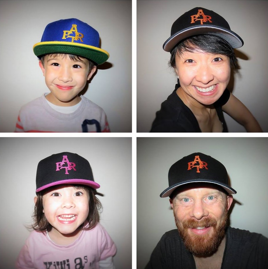
Click to enlarge
[Editor’s Note: Today we have a guest entry from Camryn Brown ”” that’s him at lower-right in the montage shown above ”” who’s going to tell us about a great DIY project he created for himself and his family. Enjoy. ”” PL]
By Camryn Brown
We’re a family of four Giants fans who lived in San Francisco until 2013, when we moved to Auckland, New Zealand. In 2014 we started doing annual “Family Adventure Road Trips” — FART — in as a way of seeing a bit more of this beautiful country. The kids have always enjoyed the scatological acronym — and, to be fair, so have my wife and I. It has provided a humorous theme to the Facebook updates we make for friends and family who follow our travels.
This coming August we’re returning to the U.S. for a month to see friends and family, mostly in California. One of the highlights will be going to see the Giants play the Braves at AT&T Park on Aug. 28, and that somehow morphed into the idea that we should create some Giants-themed FART caps for the occasion.
The process for making the caps was fairly simple.
First I sketched a FART monogram in the style of the Giants’ cap logo in orange felt, to make sure that the letters could fit together reasonably well. I found a website that identified the Giants’ font, and then I asked my wife, who’s a graphic designer, to mock up the monogram electronically. She went through several iterations as we tried to develop something reasonably visually appealing (balanced, legible) that fit within the constraints of a cap.
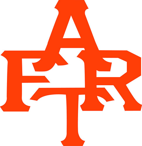
The hard part was getting it to fit within the available vertical space. The S and F in the Giants’ cap logo overlap considerably, so each letter can be almost two inches tall. We had to fit four letters and couldn’t get them to overlap that tightly, so we had to reduce them to about an inch tall. The main sacrifices here (in terms of departures from realism) were some horizontal stretching of the letterforms and changing the feet of the A.
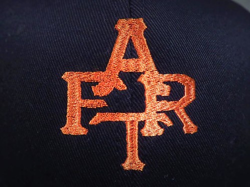
Once we had the FART logo, I looked into getting the caps made. I took four blank caps and the digital logo file to a small, local embroidery shop near us. We decided on flat stitching, rather than 3D, due to the smaller letterforms and to save money. We used my actual Giants cap to match the thread color for the orange and black adult caps, and made guesstimates for the kids’ caps. The shop was able to turn around the caps in about two days.
I had intended for all of the caps to be in standard Giants colors but was somewhat constrained by the limited selection of blank cap colors and sizes here in New Zealand. Also, I decided to let the kids have different colors if they wanted, as long as it was similar to some color combination that the Giants actually sell (which, admittedly, is not much of a constraint). My son chose their blue/yellow Warriors crossover cap and my daughter likes anything pink, so those served as our inspiration.
Although it’s not a fully independent craft project, we certainly had fun doing it, and it’s been a nice activity in the lead-up to actually departing on our FART.
———
Great stuff, Camryn — thanks for sharing. Just wait until you wear your FART caps on the BART!

Raffle results, and today’s new raffle: The winner of the Pirates cap is Dean Guse. Congrats to him, and thanks to all who entered.
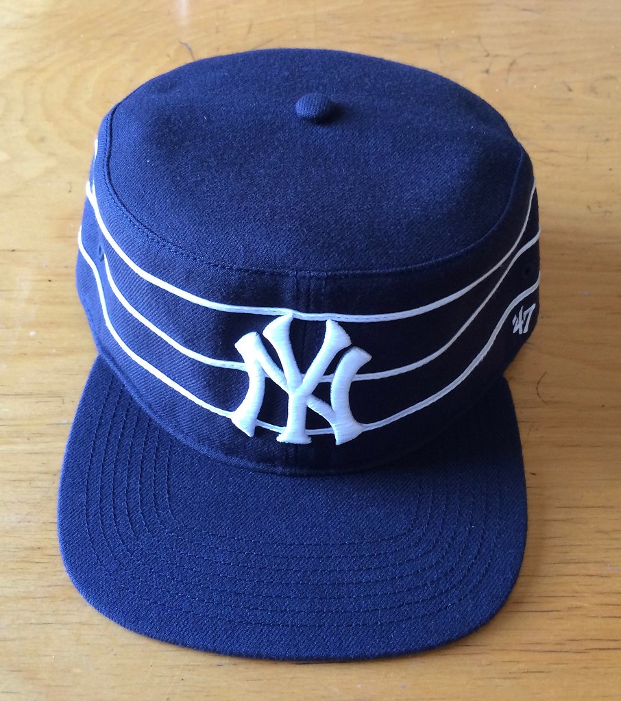
Our next ’47 cap up for raffle is this Yankees pillbox snapback:
To enter, send an email with your name and shipping address to this address (not to the usual Uni Watch email address, please) by 8pm Eastern TODAY. One entry per person. I’ll announce the winner tomorrow, and I’ll also announce tomorrow’s raffle cap, and then we’ll keep repeating that process for each remaining weekday this month. If you win one of the raffles, please be nice enough to step aside and stop entering the remaining ones. Thanks.
StripeRite reminder: In case you missed it earlier this week, I’ve partnered with Scott Turner and American Trench to produce a new line of crew socks with great stripe patterns down toward the ankle, where everyone will be able to see them:
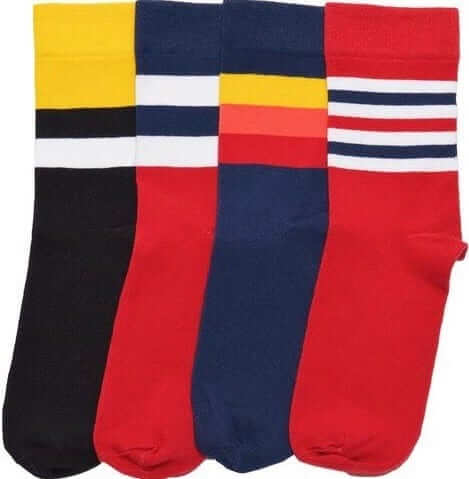
As I mentioned yesterday, we sold out the initial production order — 60 pairs per color — in the first two days (thank you!). But it turns out that the mill hadn’t actually started producing the order yet, so we were able to double the quantity. We should still be able to start shipping the finished product during the last week of this month, as originally planned.
Thanks again for all the support. The socks are available here, and there’s lots of additional info here.
The Ticker
By Paul

’Skins Watch (a day early this week): You’ve heard of the curse of the Bambino? Jay Grieco wonders if there might also be a curse of Wahoo. “The Indians have not won a championship since the inception of the current red-faced version of Chief Wahoo,” he says. “People in Chicago and Boston would call that a curse.” … Last night’s ESPYs had a ’Skins joke, as comedian Hannibal Buress appeared “from the year 2026” to inform everyone that the ’Skins had been finally renamed as the Washington Jews. As you can see, NFL jerseys in 2026 will also feature advertising patches.

Baseball News: Retro baseball unis are becoming more popular (thanks, Phil). … The Brooklyn Cyclones are honoring Mike Piazza’s upcoming induction into the Hall of Fame by wearing Piazza-era-style caps on July 24 (from nebula nine). … The Orioles will give away this Chris Davis bobblehead on Aug. 20 (from Andrew Cosentino). … You can see the very nice All-Star Game press pin at lower-left in this group shot (from Chris Edwards). … The Angels will wear 1970s throwbacks this Friday and Saturday (from Kristopher Sharpe). … Here are some photos from the Frisco RoughRiders’ recent Salute to 8-Bit & Arcades Night. “We wore Game Boy-themed jerseys and had vintage arcade games set up around the ballpark,” says a team spokesman. “Because this happened the day after the Dallas Police Department shootings, we received Dallas PD caps for the players to wear for this game and the next day as well. Those hats were auctioned off, with all proceeds from the jersey and hat auctions donated to the Assist the Officer Foundation and the Carry the Load Foundation.” … An artist in San Franscisco is making artwork out of spiked baseball bats (from Rob Walker). … Here are the jerseys from last night’s Prospect League All-Star Game (from @MLRMKRdave). … And here are the mound and plate-area groundkeeping details from the Eastern League All-Star Game (from Cody the Chicken). … Boston’s famous Citgo sign, visible over the Green Monster at Fenway, may be landmarked. … Good interview, with lots of great photos, on the history of women’s softball. … On the 1987 A’s, 1B Mark McGwire and coach Dave McKay had differing McNOB styles (great catch by Mike Miller). … Yesterday I linked to some shots of the decal that appeared on the side of the Cardinals’ batting helmets in 1975. Now Pete Hoelter has taken a shot at giving us a clean version of that logo. “Love this bird,” he says. “I used photo-editing software to un-skew it, presuming the big circle was round. Then I used the same program to roughly trace it. (I should probably learn how to draw curves.) The original probably is more feathery on the edges.”

NFL News: Check it out: Princess Di in an Eagles jacket. Explanation and background here and here (from Michael Hicks). … Markus Kamp knows a drum manufacturer who made this cool Dolphins-patterned kit. Click through the pics to get the full effect. … FNOB alert! … The market for game-worn NFL memorabilia is apparently poised for dramatic growth (thanks, Phil).
College Football News: Kentucky’s new uniforms are shown on this poster. “They were released back around Feb/March, but this is one of the first times they’ve been on something printed and given out,” says Josh Hinton.

Hockey News: New 50th-anniversary logo for UMass-Lowell (from Dan Droper). … This is great: a a Rick Martin trade tree (chart made by Chris Ostrander, and sent my way by Joseph Pitirri). … “Interesting situation at NJ Devils Development Camp on Wednesday,” writes Steve Wojtowicz. They had a four-team 3-on-3 tournament with the teams wearing red and white game jerseys. When it came time for two like-colored teams to play each other, one team had to switch jerseys but they didn’t switch helmets or socks. The championship game featured the two teams that wound up changing jerseys, so the fans were treated to white jerseys with black helmets and red socks versus red jerseys with white helmets and white socks.” … A designer has taken it upon himself to redesign all 30 NHL teams, beginning with the Metropolitan Division.

NBA News: Dwight Howard, now with the Hawks, will wear No. 8. … Fun video about an NYC shop that sells all kind of vintage/throwback merch, with an emphasis on the NBA, although lots of other sports and leagues are covered.

Soccer News: Andreas Ulmer from RB Salzburg was wearing a RB Leipzig jersey in the second half of Salzburg’s Champions League qualification match on Wednesday. “The jerseys are identical, since both clubs are owned by Red Bull, but on the team crest one says Salzburg and the other says Leipzig,” explains Anthony Zydzik. … New away kit for Everton (from Casey Hart). … “This article is in Polish but it basically says that beginning this season (starting Friday), all teams in the Polish Ekstraklasa (top tier in Poland) will use the same number and name font,” says Tom Gronek. “For what it’s worth, the number font is called Ekstraklasica Bold and the name font is called Klavika Condensed Bold.” … Alex Muyl of the Red Bulls had his nose bloodied last night and switched to a numberless blood jersey (from Drew Stiling). … New uniforms for St. Pauli. “The home is safe, the away is meh, and the third is to sell,” says Robert Marshall. … Also from Robert: New uniforms for Pumas.

Grab Bag: Good article on how the Olympic beach volleyball dress code has changed over the years (thanks, Phil). … Check out this shot of Rory McIlroy practicing for the British Open. That’s some serious color-coordination there, what with the blue club head and all. … The golf bags from an upcoming celebrity golf tournament at Lake Tahoe will be auctioned off for charity. … MEAC — the Mid-Eastern Athletic Conference — has inked a new deal with Nike. … Here’s a sneak peek at the U.S. gymnastics leotards for the Olympics (from Phil). … In America, we now have corporate personhood. But in New Zealand, rivers and stretches of land have legal personhood. “NZ for the win,” says Phil. … Here’s a video on the importance of a drag racing helmet strap (from David Firestone). … For the first time in over four decades, Ivor Robson won’t introduce the golfers at the British Open.
I think you’ve shown the Princess Di/Eagles photo, etc before on here. However as an Eagles fan I can’t see it enough either. Especially since it’s from the Kelly Green era.
When I think of NFL teams that would benefit from a uniform change, I think of the Eagles. Plain and simple, they need to go back to the kelly green and silver.
That’s a great jacket, and she looked great in it.
agreed 100% and also Princess Di always looked beautiful but she looks fantastic in this pic- love how the jacket and her eyes kinda match.
Small editing error.. the link for the beach volleyball bleeds into the “check out this shot” for the Rory McIlroy link.
Fixed.
Proofreading: “The Brooklyn Cyclones are honoring Mike Piazza’s upcoming induction into the Hall of Fame by wearing Piazza-era-style caps o July 24”
Fixed.
LOVE the UK football design for this season. Not sure about the checkerboard – what with neighboring Tennessee using it to much greater acclaim and all – but I know they are trying to claim that as their thing, so whatever. One thing, though – the number 2s differ. Compare #82 at left with #42 at right. It’s not to make the numbers nest better, Nike-style. The squared corner on the middle bar looks wrong. More to the point though: why does EVERY school needs it own proprietary font? It’s basically a standard football Block Varsity with the angles changed a degree or two. Are these markedly different from the numbers used for Minnesota or Wake Forest? Moreover, is the distinction that meaningful, Nike? Sometimes, distinctive numbers work (Chicago Bears, Denver Broncos). Most times, they don’t (Tampa Bay Bucs, Minnesota Vikings, most of these ridiculous college fonts). STOP IT, NIKE.
Preach. If everybody is special, then nobody is special.
Kentucky should just accept who they are and put a basketball net pattern on their sleeves. I went to a game there once to watch the Vols crush them, and of course the best smack talk their fans could come up with was, “Well, just wait ’til basketball season.”
Everton link isn’t working. Here’s link.
Thanks. Fixed.
The whole time I was reading the lead article I was thinking I had to make a FART on the BART joke in the Comments but of course the clever Paul Lukas was all over it. Funny how guys in their 50s still laugh about the word Fart.
not just the word
link
Camryn — loved this DIY project! As a father and Uniwatcher with an August road trip in the offing (camping in northern Israel), those caps got my creative juices flowing…enjoy your FART, buddy.
Thanks! I hope your trip and your creative endeavor both go well!
I am intensely curious as to what the Giants cap font is, as well as what site you were able to identify it with…
Hi Eriq… we actually went with an approximation of their word mark font from link since the cap S and F are likely custom letting (IMHO). You can see the differences in our F compared to the true one but since it’s still *a* Giants font it seems OK. Luckily our logo didn’t have an S as I think that’d be more problematic.
Most of those NHL redesigns look really really nice
The Capitals and Blue Jackets need to change to those uniforms – like now!
I don’t believe in sports curses, and I especially don’t buy into the Wahoo curse. The earlier version was worse than Red Wahoo, and they won the Series with that one. They’re more than welcome to ditch him and see what happens, though.
You know when two people show up at a party wearing the same outfit?
Barcelona and Real Madrid both unveiled purple away kits today.
Presumably, in American sports, the league would oeep that from happening.
If they are both away kits, then they will never have a potential conflict facing each other. They won’t show up to the party (game) wearing the same outfit since one of them will be the home team. American sports have teams with the same color road uniforms all the time (white in the NFL and NHL, gray in baseball, and the NBA has multiple teams with red or blue road jerseys).
Glad to see there’s a change in the Olympic beach volleyball dress code. Now I can watch and enjoy without people thinking I have an ulterior motive.
Wonder if they got their inspiration from the NCAA. They started beach volleyball this past school year, with players wearing a respectable tank top jersey.
link
link
I can’t understand why people say they will “redesign” jerseys, then throw their hands up and say about a team, “there’s not much to fix” or “it can’t be touched.”
You’re a designer, for Pete’s sake. They’re just pretend jerseys. If the Yankees came to you and said, “Design a uniform without pinstripes” are you really going to pack up and retire?
Think outside the box. Throw something up on the wall and see what sticks. You miss 100% of the shots you don’t take. Insert your own saying.
I totally get what you’re saying: Experiment, explore possibilities, etc. All good advice! But what if the designer really thinks there’s nothing he/she can do to improve a given design? If it ain’t broke, why should he/she feel obligated to fix it? Is it wrong to say, “First, do no harm”? Is it wrong to avoid making changes just for changes’ sake?
I realize these are just online concepts we’re talking about, not real-world makeovers. In that context, your position is probably the right one. I’m just saying I can understand the reluctance in some instances.
The sad thing is, teams are changing for changes sake. The Yankees with baby blue, pink, stars and caps with white front panels.
The Red Wings are one of the “untouchable” designs. But, they came out with throwbacks and fauxbacks and fans love them.
Another is the Lakers’ gold and… um… Forum Blue. They came out with whites and they weren’t that bad. Black is another thing.
Personally, it’s sacrilegious when the Celtics wear green and brown. Yes, I say brown.
Nice project today, Camryn! Hope you and your family have a gas on your next trip.
Thanks! The kids are almost bursting at this point, so we’re really looking forward to getting it underway.
You call it “BART” not “the BART”
and we don’t say “on the 680” either. That’s SoCal.
Child of the 70s that I am, I miss the Pirates’ pillbox cap, and wish one or two teams would adopt the pillbox. Pirates or Reds, maybe A’s. But my goodness is that ’47 Brand Not Brand Yankees cap a thing of beauty. Yanks ought to be wearing that right now, if only New Era could figure out where their patterns for good-looking pillbox caps disappeared to. As much as I believe the Yankees are a slightly-above-mediocre uniform set that is vastly overrated, the team’s uni-conservatism is an asset and a huge and valuable part of their identity. So I’m not generally quick to think the Yankees should make changes. But adopting this cap, even if only as a gimmicky Sunday home-game alt, would look so good it would justify the hit to the team’s we-don’t-do-that-sort-of-thing image.
So, please tell me the Yankees hat is actually blue, not black like yesterday’s Pirates hat, right? :-P
I don’t ever catch AL baseball games, so I may not know what I am saying. But did anyone else think the pinstripes on the Yankees at the ASG look thick? They were a lot thinner in the past, weren’t they?
I actually don’t mind the new Kentucky FB uni. I’m iffy on the checkered shoulders, but love that they went with a traditional number font.