With the Stanley Cup Final(s) match-up now set to go with the Sharks vs. the Penguins, longtime reader Mike Engle sent a list of uni-related things to watch for and consider.
Under normal circumstances, I would have worked with Mike to find photos of everything he referred to, and might also have asked him to clarify a few points. But he sent his email late last night, and I didn’t get home until even later, so I didn’t have a chance to do any of that. Still, I think most of this is pretty self-explanatory, even without photos. Take it away, Mike:
1) Penguins left wing Carl Hagelin’s all-black gloves with the black jerseys: not standard, not enough white.
2) The Penguins logo on the ice won’t match the jerseys: Vegas gold on the ice but Steelers gold on the jerseys. If I had to guess the last time that happened, probably North Stars 1991?
3) The Penguins are the first team since Philly in 2010 with playoff jerseys that don’t quite match. That’s how it goes when you elevate an alternate.
4) Speaking of which, San Jose had a mini-tradition of “Black Armor” for the playoffs [until this year, when they wore teal at home in the postseason instead of black]. Pathetic advertising and marketing. Are hockey gods Uni Watchers? I think so.
5) The Sharks have to be the most patched jerseys in the Cup Final since … the Penguins in 1992! Those Pens had a 25th-anniversary patch and a Badger Bob Johnson memorial patch.
6) If the Sharks take off the 25th-anniversary patch to make room for the Cup patch, it will be the first time a team patch has been replaced since the Avalanche in 2001.
7) As other have noted, both teams’ main logos are on triangles and incorporate sticks.
8) Maybe this is just me, but I think it’s awesome how No. 7 Matt Cullen in the throwback Penguins jersey reminds me of NO. 7 Joe Mullen. Somebody put a clover on his helmet!
9) For the eighth year in a row, the Cup winners shall have black helmets in the equipment room. Gotta go back to Red Wings in 2008 to break that streak.
10) Assuming the goalies are Martin Jones and Matt Murray: Both wear Vaughn, and Jones has a very traditional old-school look on his equipment, but Murray only goes old-school with the throwbacks. On the road, Murray’s gear looks more distinctively Vaughn from a distance. But Murray’s throwback pads have little Penguins logos on them.
Thanks, Mike! Game 1 is Monday night in Pittsburgh.
Click to enlarge
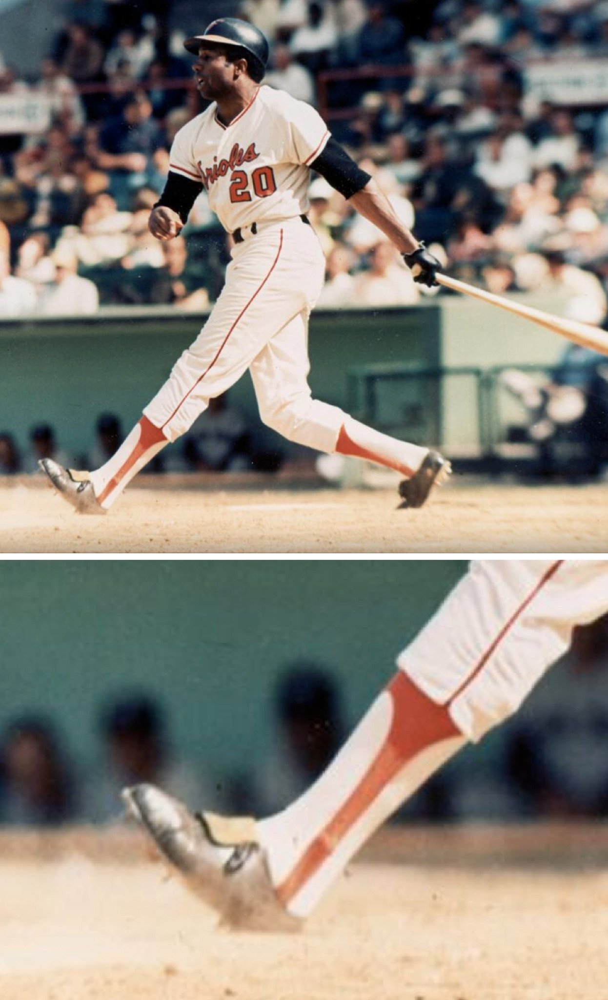
Friday Flashback: With MLB having announced its new sock deal with Stance earlier this week, my latest Friday Flashback piece on ESPN looks at the history of baseball hosiery (including the late-1960s trend of players lengthening their stirrups by having extra fabric sewn into them, as exemplified above by Frank Robinson). Check it out here.
Incidentally, in the Skype-recorded video for that Flashback, I’m wearing the Uni Watch T-Shirt Club’s 2016 baseball-themed shirt, because I used the ballplayer’s stirrups as a visual aid. (I considered actually wearing stirrups, but getting my foot in front of my laptop in the middle of a live video seemed a little dicey.) After the video shoot, ESPN anchor Cary Chow, who had shot the video with me, asked were he could get that T-shirt. I explained that, unfortunately, it was a limited-edition design that was now out of print.
After thinking about it, though, we’ve decided to re-launch the shirt, but without the jock tag graphic (which means it’s a little less expensive, plus we’re now able to offer a hoodie, which wasn’t possible with the jock tag). This version will not count toward this year’s “Collect ’Em All” status. You can get it here.
Stencil sharpener: It’s well-known that the world’s best ground-level graphic can be found on the Roberto Clemente Bridge bike line near PNC Park in Pittsburgh. But reader Lyle Huber has come up with one that’s almost as good. Here’s the deal:
I work at New Mexico State University. For the third year in a row (maybe the fourth), a pair of Swainson’s hawks has decided to build a nest in a tree near the middle of campus. Beautiful birds. And also a bit defensive. Especially when their babies are young, the hawks will dive-bomb passersby to the point of actually striking them. A couple of dozen reports of minor injuries have occurred over the last two years, in addition to many unreported strikes. Last year I got hit once — I thought I was out of their range so I wasn’t looking around, took 10 steps from my car, and got whacked in the head. It felt like someone had thrown a football at the back of my head. No damage, though.
Last year the university started putting up signs warning people about the hawks, like so [click to enlarge]:
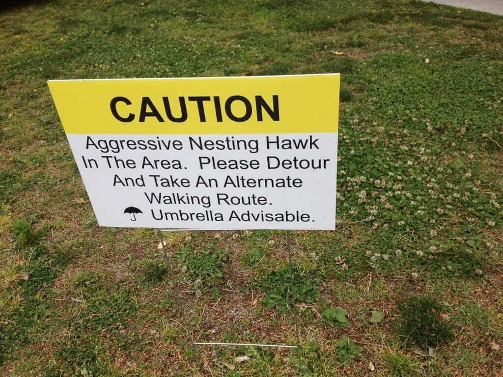
There’s also a version in Spanish. The university made some attempts this year to “discourage” the hawks by cutting down a tree branch after the hawks started building a nest, but it appears that the hawks have won and are staying. (Yay!) But because many people on college campuses these days don’t pay much attention to things going on around them and pay a whole lot more attention to items in their hands, the university has done this [click to enlarge]:
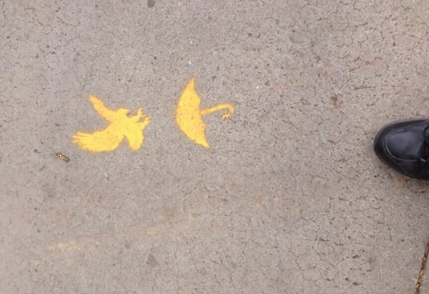
They’ve painted these symbols every 10 yards or so along the sidewalk in the “danger zone.” I have no idea who created the stencil for them to paint through but I’m sure you will agree that it is glorious.
Indeed! Great story, Lyle — thanks for sharing.
The Ticker
By Paul

’Skins Watch: The Fort Wayne school district in Indiana has unveiled its new logo and team name, which was created to replace the old Indian-head logo and “Redskins” name (thanks, Phil). … Here’s how SI’s Peter King and NBC’s Bob Costas have reacted to The Washington Post’s recent “redskins” poll. … This article provides a two-pronged critique of the WaPo poll. The first line of attack is largely methodological (which, as I explained on Monday, is an argument that I don’t find entirely persuasive) and the second chides the Post for ignoring studies that show real psychological damage done to Native American youth by Native mascotting (which, as I said on Monday, is the poll’s most serious blind spot).

Baseball News: Wade Boggs wore a Yankees World Series ring to a 1986 Red Sox event. … Purple Prince-themed jerseys upcoming for the Columbia Fireflies (from Joel Mathwig). … Check out this 1959 White Sox team portrait with equipment manager Sharkey Colledge wearing a T-shirt with the team’s old winged logo. That’s him in the third row, far left (from BSmile). … Brutal uni match-up in Pittsburgh yesterday, as the Pirates went G.I. Joke and the D-backs looked like the umpires. … The St. Lucie Mets have managed to combine flag desecration and G.I. Joke-ism into a single godawful design. … MLB’s new sock supplier is wasting no time jumping on the G.I. Joke bandwagon. Thankfully, those are just for retail, not on-field (from Mark Lackinger). … Here’s something you don’t often see: navy stirrups with light-blue sannies. That’s Spring Valley High School in West Virginia (from Brice Wallace). … Astros SS Carlos Correa has some pretty snazzy cleats. … Bryce Harper started last night’s game wearing batting gloves. After going 0-for-2, he went bare-handed last night as a slump-busting move and promptly hit a home run, after which he took a scissors to his batting gloves (from Steve Dodell and Jason Mott). … Harper also wore cleats featuring the logo of teammate Ryan Zimmerman’s MS foundation (from David Raglin). … The Fresno Grizzlies’ mascot is now authorized to perform marriages (from Nick Lineback).

NFL News: Pretty funny: Someone at a Bernie Sanders rally in San Diego was wearing this Chargers-style Sanders T-shirt (from Seth Shaw). … Hey, remember Saranac wristbands? Randy Williams found an old pack of them at a thrift store warehouse.

Hockey News: Here’s a 1961 flier promoting the Charlotte Checkers’ first game. Interesting that the first photo they chose to promote their new team was an image showing a fight (from John Muir).

Basketball News: Just what the world has been waiting for: team logos in your coffee. … Paul George of the Pacers is wearing his own jersey while on vacation (thanks, Mike). … Michigan State coach Tom Izzo, a self-declared sneakerhead, is excited about a new Nike store in Detroit.

Soccer News: Here’s an article on the Champions League trophy. … “With Mikel Arteta leaving Arsenal, the team’s No. 8 shirt, traditionally worn by a central midfielder, is being taken over by Aaron Ramsey, who up until now has worn No. 16,” says Laurence Holland. “Looks like the team, which just released next season’s shirts, will be reimbursing fans who bought a new shirt with Ramsey’s NOB and old number.” … Did you know Mexico’s 1978 World Cup kits were made by Levi’s? (From @_Bones).

Grab Bag: Adidas is selling off Mitchell & Ness (from Steve D). … New uniforms for Quebec police officers. … This is completely awesome: a photography project based on foodstuffs arranged in gradient-style progressions. There’s even more here. Don’t miss (big thanks to Judy A). … Four library branches in Queens, NYC, are loaning out neckties to people who need them for interviews or other occasions. … Here are the updated liveries for this weekend’s Indy 500 (from Tim Dunn). … Meanwhile, here’s the logo for next year’s Indy 500, along with a video about the design (from Clark Ruhland and Tim Dunn, respectively). … Great article+slideshow on the world’s best female duckpin bowler, and what’s left of the dwindling ducks scene (from Tommy Turner). … F1 drivers will now be allowed one helmet design change per season. … Brutal blue camouflage paint scheme for NASCAR driver Chris Buescher (from David Firestone). … Also from David: Brad Keselowski is running a scheme based on the 1972 can of Miller Lite. … To one and all: Have a great holiday weekend. See you next week.
A business deal in the uniform-industrial complex…link
In the beginning, Mitchell and Ness made some nice throwbacks that tried to stay true to the original jerseys. The last few times I checked their site, graphics and fonts on many throwbacks had degraded from the originals and from what Mitchell and Ness had done years ago. I guess it is cheaper to do less research and pay less attention to detail and that improves profit margins. I hope they return to their roots, as I cringe to see a classic jersey botched…it is like defacing a work of art.
Sorry…wrong link
link
Will add to Grab Bag.
A good example of M&N inaccuracy: link. For comparison, link.
Among the differences:
* The collar. On the original, the red part of the collar went to the seam. On the M&N replica, they have a slight band of blue on the collar fabric at the seam.
* The elbow reinforcement was stitched on with red thread on the actual jersey. On the replica, it’s blue.
* The shoulder patch text is the wrong font on the replica.
I remember talking with one of the older guys at the current store who had been there before the move from Walnut Street. They do want to be somewhat true to the originals but they don’t want to be too accurate because some of their jerseys wound up becoming fake game-used memorabilia in auctions.
Also, the collar is correct on the replica. That blue you see there is the seam itself. The collar rib ends at the blue and there is a double line of stitching. Zoom in on the back view and you can see that the blue section around the collar is the same mesh as the jersey.
Also, the accuracy is actually better now than it was back then. We have more and better research material available now to recreate these things, and that means both more opportunity to get an authentic recreation as well as more opportunity to find the little flaws.
hyperlink not linked
found link
Fixed.
Roberto Clemente Bridge link missing a tag.
I love the Paul George picture. Maybe it’s reverse psychology to avoid autograph-seeking fans. “Nah, it can’t be PG13. He wouldn’t be wearing his own jersey off the court.”
Could it be a Mark Jackson replica? Still, pretty funny.
I considered actually wearing stirrups, but getting my foot in front of my laptop in the middle of a live video seemed a little dicey.
That would make for a great “This is Sportscenter” commercial
Saw the blue camo and thought of this because of sponsor.
Had an uncle work for Chessie Systems/CSX for 25 years in Michigan as a conductor for the coal line to the Caern/Weadock power plant. Until CSX sold off that line to Canada National (the US group) you had the interesting mix of a CSX Blue/Yellow/Grey engine and a dusty gold Chessie caboose.
CSX Engine: link
Chessie Caboose: link
Now when you see a train go by there is no caboose. I also live in one of the few towns where you can get stuck by two trains and a boat within two miles: link
God, I miss the old Chessie System livery.
Proofreading: “Brad Keseowski” Keselowski
“5) The Sharks have to be the most patched jerseys in the Cup Final since … the Penguins in 1992! Those Pens had a 25th-anniversary patch and a Badger Bob Johnson memorial patch.”
They started the season with the team’s 25th anniversary patch on a sleeve and the league’s 75th on the chest. After Bob Johnson died in November, they added the “BADGER” patch on the other sleeve. For the Final, they replaced the league anniversary patch with the Cup patch.
And you can argue that last Thursday’s Pirate game against Atlanta was even worse than this week’s, since the the Braves wore their unreadable blue-on-blue alts against the Pirates’ camo. (Heavy sighs all the way around.)
Yes of course, I knew it was the 75th anniversary so everybody had that patch for the regular season! But this is a Cup preview, so I wanted to limit the scope to how the Cup Finals looked.
You could say the Penguins’ center ice logo hasn’t matched the jerseys all postseason long–not just now. ;-)
No criticism was intended, Mike. Just remembering all that from 24 years ago. (I even saw the Blackhawks wear their throwbacks at the Igloo during the regular season, with no expectation of seeing their regular sweaters during the Final.)
For me, any discrepancies with the center-ice logo are more than counterbalanced by the superiority of the Penguins’ throwbacks.
Another bit of Penguins uniform trivia, the young goaltender, Matt Murray, was wearing a mask very similar to 1980s goalie Denis Herron. It seems more than just a coincidence, I don’t know the backstory.
Lastly, in addition to the white retro jerseys which will be coming back next season, I’m hoping the gold jerseys will appear later on.
link
The Pens didn’t just replace the 75th patch, they covered it up! So did the Blackhawks on their jerseys, and the Habs and Kings followed suit in 1993 with covering up the Stanley Cup Centennial patch.
I doubt we’ll see the likes of that again.
“ignoring studies that show real psychological damage done to Native American youth by Native mascotting”
If this is one of the key elements of your opposition to Native imagery/mascots – how can you approve of the Seminoles, Chippewas, and Utes?
He mentioned that those are groups that have gotten permission from local tribes to use what the tribe considers to be acceptable imagery. Hence the Central Michigan Chip’s dropping the Indian cartoon.
The “permission” argument has some merit, but it seems to me that if polls constantly show that 90% of American Indians have no problem with “Redskins”, then that more or less constitutes at least a passive form of permission.
Don’t overplay your hand, Dan. There are no “polls” (plural) that “consistently” show anything.
There is ONE poll. It is powerful, and should be taken seriously, but don’t overstate the situation.
I know the chatter has been about a recently published poll but I seem to recall these results more or less match results found in polls taken in the past. That’s just my recollection, however.
The question still remains, however…if you’re cool with native American imagery being used if permission is given, what constitutes permission, especially when you’re dealing with general Indian imagery instead of tribe-specific?
Even if that stat was true, it isn’t, how is that a “passive form of permission”? A specific group of people have the right to the term Seminoles or Chippewas. No group of people have the right to give permission to the term “Redskin”. Also Seminoles or Chippewas is an actual name of a tribe and the term “Redskin” is historically a negative slang for a Native American. You point is basically “Hey a bunch of African American people said they’re okay with me saying the N word so you can’t get upset about it.” NO, it’s not their term to okay.
But if studies consistently show that having your heritage used as a mascot is psychologically damaging to children, why would name changers be okay with that in any situation? Does having permission make the psychological damage acceptable?
How do you even prove psychological damage at this point? You’d need to actually have a control group of children who *haven’t* been exposed to Redskins/Indians/etc, and with the teams having existed for 80+ years and the sports being so popular, that group doesn’t exist.
From what I recall, the study basically showed some sort of correlation between having low self worth and supporting the mascots. Which… in my armchair psychiatrist opinion could just as easily mean that kids with self esteem issues turned to sports as something to take pride in, as people commonly do.
How do you even prove psychological damage at this point? You’d need to actually have a control group of children who *haven’t* been exposed to Redskins/Indians/etc, and with the teams having existed for 80+ years and the sports being so popular, that group doesn’t exist.
It is fascinating to see how people who are completely willing to accept the validity of a 504-person poll are only too eager to poke holes in a psychological study, despite having no professional training in psychology (or polling). Could it have anything to do with the respective results?
I’m not disparaging the poll — on the contrary, I accept its results and take it seriously. It would be nice if people on the other side of the debate could be as even-handed with data they find inconvenient to their own positions.
Simple: Seminole, Chippewa etc is the name of a tribe or nation of people, it’s like “Irish” or “Canadiens”. Redskin is a slur, like if you called a sports team the N***ers or Polacks
It’s certainly not that simple. In fact, the whole question hinges on whether or not, in modern society, “redskin” is a slur or just the same of a football team?
It’s been pointed out of course that teams generally choose nicknames/mascots based on qualities they find admirable. So it makes no sense that the Washington Redskins would vigorously defend their nickname if they thought a “redskin” was a negative thing to be.
Seriously – is there any example of a pro or college team intentionally selecting a nickname that was meant to be negative?
I thought it curious that the Sharks had been perennial playoff underperformers in their 3rd jersey, and got out of the funk by switching to their regular jersey; while the Pens have been regular playoff underperformers (since 09) in their regular jerseys, and got out of the funk by switching to their 3rd jersey.
And that it sort of looks like the Sharks logo is the result of the shark eating the Penguins logo.
But, in both cases, those jerseys are what the Pens and Sharks *should* be wearing (Pens in black and yellow, Sharks in teal). Order has been restored to the uni-verse (well,a small part of it).
The Friday Flashback is up:
link
Taking note of all the differing perspectives concerning the WaPo poll (and the way it mirrors all the parsing of arguments pro/con the Redskins), it reminds me of a hoary phrase: Divide and conquer.
But here’s another old saw: First do no harm. The best argument you’ll see for putting the Washington NFL nickname out to pasture.
This assumes that “harm” is done by having “Redskins” as a team name. I’d say that’s inconclusive at best.
Put it this way; if you’re face-to-face with a group of 10 people and you say something that offends 1 of them do you think that’s a desirable result if the other 9 are OK with it? You’ve still NEEDLESSLY offended someone. Extrapolate that out to the literal millions of American Indians who DO have a problem with the appropriation of their imagery, and even if they’re only one in ten of all American Indians, why doesn’t what they think count?
You’re not hurting anybody by changing it, the only person who has anything to lose is a billion-dollar sports team and their owner who’ll have to pay for some new design work and uniforms.
It’s a gesture you can make that’ll make a lot of people very happy and inconvenience practically no one (and anyone who is pro-keep-the-name have no rhetorical ground to stand on here). Why wouldn’t you do it?
“Somebody put a clover on his helmet!”…Shamrock, shamrock. It’s NOT a clover, lol.
Right you are, I stand corrected. It’s three leaves and a stem for a shamrock, four leaves for a clover. Should have looked beforehand.
link
My Dad switched to Lite beer (probably because Dick Butkus did a commercial for it) from Black Label back in the 70’s. I never saw that original can/logo before.
link
The 1991 North Stars had two N logos at center ice, and the STARS logo (green STARS and yellow inner star) near the boards, as shown in link (best I could do from work on such short notice). Oddly enough, they had an all-gold STARS logo on a black background on the boards.
Good work, thanks.
Wonderful Friday Flashback, but I do have one nit to pick. The current Cincinnati Reds actually have no connection to the original Red Stockings. That team disbanded after 1870 and the nucleus of it, including player-manager Harry Wright and his brother George, went to Boston and played in the National Association from 1871-75 as the Boston Red Stockings. They joined the National League as charter members in 1876 and later became known as the Braves. So it’s today’s Atlanta Braves that actually trace their lineage back to the original Cincinnati Red Stockings.
Fun flashback today, not least of which for inclusion of two of my dad’s idiosyncratic terms “high-toned” and “persnickety”.
Love the falcon silhouette. Reminds me of an old logo my high school alma mater used up until recently (we were the Hawklets).
link
The Keselowski car isn’t actually based on a Miller Lite design, since Miller Lite wasn’t introduced until 1973. It’s a Meister Brau Lite:
link
Meister Brau sold its branding to Miller in 1972, so it’s more or less the same beer, though.
Re: Pollmageddon
Why put any credence in “studies” that use unscientific methodology? It’s impossible to create a control where you can isolate the effect of Native American mascots on Native American youths. There are countless known and unknown variables that aren’t/can’t be controlled for.
I remember sewing elastic extensions into my Stirrup socks when I was playing little league so that I could have the thin single stripe like the Major Leaguers did. Great topic for an article.
The link to the Peter King piece on “Redskins” I think brings up an interesting question…
As a journalist, should King decide to base what he does and does not report/write based on his personal moral beliefs?
In other words, if the name of the team he’s covering is the “Redskins”, isn’t he letting his own biases come through by deciding to pretend that it’s not? What exactly is he accomplishing by not reporting the truth?
You make a leap from “personal moral beliefs” to “biases.”
Both are somewhat loaded terms; the second is accusatory and very slippery. The reality is that “biases” inform everything that journalists and media enterprises do, from the topics they cover to the headlines they write to the quotes and information that they choose to include and exclude from a story. There is no perfect way to cover a story — one person’s professional news judgment is another’s “bias.” We tend to perceive the former for decisions and opinions we agree with, the latter for those we disagree with.
The bigger problem I have is the WaPo Opinion Piece masquerading as a news story. This article should be in the Opinion section rather than in the “Sports Blog”
I don’t know if you should be expecting objective facts-based reporting from anything that labels itself a “Sports Blog” in the first place
I had no idea the Charlotte Checkers name dated back to 1961. The name (and geographical location) screams 1990s.
there was a team in Indy called the Checkers from the late 70s through the 80s as well.
Does anyone else have script issues with Uni-Watch that freeze up or dramatically slow your computer? It happens on both my desk top and my laptop, no matter which browser I use.
It does on my PCs at work; no problems like that on my Mac at home.
Does lock up on my laptop occasionally but never in iPad
iPad all the way for uniwatch and most internet surfing anymore
In regard to the Washington football squad and to use of imagery as mascots, I still agree with the test to see if a word describing someone is offensive, that is to refer to that person by that word, as directly calling a Native American a “Redskin”. I know I wouldn’t, and would have hell to pay from my family.
It’s a false test. In our language it’s generally offensive to refer to someone by their race, even if it’s completely accurate. You wouldn’t go up to a Jewish person and say “Hey, Jew.”, but that doesn’t make the term itself wrong.
So you’d be cool with naming a team The Jews as well?
I agree with The Jeff’s point that you can’t determine if a word is offensive based on whether it is appropriate to call someone that word to their face, as Poppy Nurse implies. I wouldn’t say to a black man “Hey, Black Man!” or “Hey, Black!” or “Hey, African-American!” or even “Hey, Person of Color!” But that doesn’t mean those terms are inappropriate in other contexts. That said, I also agree with Dovey that I wouldn’t call my sports team the African Americans, either. The Blacks might not be a bad name (Cincinnati has the Reds, and New Zealand had the All Blacks, after all), but I would avoid putting a picture of Frederick Douglas or George Washington Carver on the helmet as the logo, no matter how respectful an image it was. It would have to just be a reference to the color, not the people.
Do you say things like…?
“The Jews were decimated by the Nazis.”
Now how about this…?
The redskins got screwed during Westward Expansion.”
The note about the Charlotte Checkers flyer is interesting in that the team was originally known as the Baltimore Clippers, and moved to Charlotte on an emergency basis due to a roof failure in the Baltimore arena. For a few years, the team was the Charlotte Clippers in the old Eastern Hockey League. Then, when the Charlotte team did well, the EHL expanded to other Southern cities, including Greensboro, Nashville, and down to Florida.
“3) The Penguins are the first team since Philly in 2010 with playoff jerseys that don’t quite match. That’s how it goes when you elevate an alternate.”
Nah. The last team with playoff jerseys that don’t quite match? Blackhawks — link.
Rephrase. Flyers 2010 and Penguins 2016 have “mismatched” jerseys because the normal homes and roads went together, the third was much different and not just a color swap (because they happened to be throwbacks), and then the third became one of the playoff jerseys. The Blackhawks however use their normal homes and roads in the playoffs.
So I’ll rephrase even more clearly. Penguins are using a regular season third in the Cup Final. First team to do so since Philly 2010.
Thanks for keeping me on my toes!
Rather than “don’t quite match”, “don’t match at all aside from the logo” would be the more accurate way to put it.
IN 2012 the LA Kings used the Black 3rds (current regular jersey) at home and the white with purple at home.
IN 2012 the LA Kings used the Black 3rds (current regular jersey) at home and the white with purple on the road.
No. In 2012, the purple-trimmed black jersey was the alternate. The regular home and road jerseys had no purple.
link
link
Correct. Year before, black and silver was the third, and black and purple was mothballed for the playoffs. That Cup year, a white version of black and silver no purple was the new road, no purple alt was new home, and black and purple became an alt that got phased out well before the year actually ended. I remember Tyler Toffoli scored his first goal on the last day of that black and purple jersey.
I read the WaPo piece about King’s and Costas’ response to the poll. Then I read some of the comments to that piece. It’s clear that those commenting either didn’t read the piece or didn’t comprehend what they read. Anyway, please continue “‘Skins Watch”. It’s one of my favorites.
Nobody looked cooler in a baseball uniform than Frank Robinson and a big part of it were his socks.
In little league I wore my stirrups the same way because of him.
Reading what Izzo earns from Nike, I have to laugh at reading “izzo is a sneaker head” and would prefer a more honest headline like “Nike employee promotes the douchebag company he whores for”
link
Maybe Paul George is wearing a Mark Jackson or Kenny Anderson jersey?
It’s definitely from the Reggie Miller era.
The Royals wore their gold script “Wearethechampions” jerseys tonight, so I guess they’re keeping them around for the season and trotting them out whenever.
I wonder if the yawnkees using the matte helmets will open the flood gates. Personally, I’m ok with that as I feel like the matte helmets are very similar to the original flocked helmets.