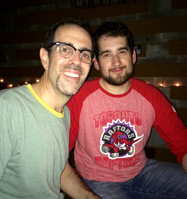
Great time last night at the Fourth Ave. Pub here in Brooklyn, as SportsLogos.net poobah Chris Creamer (that’s him above) and I were joined by a bunch of our readers. I also got to meet Chris’s wife, mother, and father — lovely people, one and all.
This was the first time I’d convened a Uni Watch party in Brooklyn on a school night instead of on a Saturday or Sunday. Most attendees were therefore coming straight from work, and many of them were simply dressed in their work attire — a big change from past parties, when most people have worn jerseys. (It was great to see several readers wearing Uni Watch T-Shirt Club tees, however.)
My thanks to everyone who showed up, including Alex, Jay, the other Jay, Marc, Marty, Jeff, Brian, Brian’s friend in the Sonics tee whose name I can’t recall (sorry!), and of course Phil. Doubleplusthanks to Archie for the beer, the designs, and all of the enthusiastic and kind words (please send the photo of you, me, and Chris, which I’m pretty sure turned out a lot better than the one shown above). And my apologies to everyone whose name I didn’t get or retain. If I left you out, feel free to let me know and I’ll add your name.

Uni Watch reaches age of consent, whoop-whoop! It was 17 years ago today — May 26, 1999 — that a column called Uni Watch debuted in the sports section of The Village Voice. I was very happy about the column’s debut but had no idea of the degree to which it would change my life.
I’ve told the story of how the column came about before, but here it is again, for those who don’t know the history (the text that follows originally appeared here on the site two years ago today):
Toward the end of 1998, I got an idea.
I had spent the previous five years writing about detail-obsessive aspects of consumer culture, marketing, advertising, branding, and design, and I had spent most of my life maintaining a detail-obsessive interest in sports uniforms. At some point it began occurring to me that I could ”” that I should ”” combine the two.
The idea took shape in stages. At first I thought I’d write a short piece about baseball stirrup styles. (I think I actually pitched this idea to The New York Times Magazine, where it was quickly declined.) Then I thought, “No, that’s too limited” and decided to write a long, feature-length piece on baseball uniforms. I spent a few weeks tinkering with that.
Then I thought, “Why do just one article? Why not create a column devoted to uniform and logo design?” True, nothing like that had ever been done before, but that made the idea all the more intriguing. It fit squarely into the realm of what I called “inconspicuous consumption” ”” the small details that infiltrate our brains and shape our lives, often without our being aware of them. The more I thought about it, the more I became convinced that a column about uniforms was the ideal project for me. On Jan. 1, 1999, I made the first (and still only) New Year’s resolution of my life: “I will create and place a column devoted to sports uniforms.”
I had plenty of contacts at design magazines and could have pitched the idea to them. But I didn’t want to create a design column that focused on sports; I wanted to create a sports column that focused on design. I wanted to make the world of uniforms and logos into a legitimate sports beat.
So I began cold-calling sports editors. Some of them dismissed the idea out of hand. A few were interested in the concept, but only as a one-off novelty or as comic relief, which wasn’t what I had in mind. Weeks turned into months, and by the spring of 1999 I was getting a bit frustrated. I still believed in the idea, but I was having trouble finding a sports editor who was willing to take it seriously.
I had been focusing primarily on big, high-profile sports media outlets ”” Sports Illustrated, ESPN The Magazine, The Sporting News, The New York Times, and so on. Since those weren’t working out, I reluctantly decided to set my sights a bit lower, which meant it was time to contact Miles Seligman, the sports editor of The Village Voice. The bad news was that the Voice was a local alternative weekly with a teeny sports section that was buried amidst the phone sex ads in the back of the paper; the good news was that its sports section was unusually creative and intelligent. They had a column devoted to hockey fights (that may not sound like a big deal now, in the blog/YouTube era, but in 1999 it was a brilliantly demented idea), they had some of the smartest baseball writers I’d ever read, and they routinely called bullshit as bullshit.
As it turned out, Miles was familiar with my work and loved the idea of a uniform column. He had only one concern.
“We can do this once every four weeks,” he said. “But are you sure there’s actually enough uniform-related material out there to support that?”
“I think so,” I said, trying to sound confident. In fact, I had no idea.
The column needed a name. I don’t remember the specifics of my discussions with Miles, but I do recall that I suggested “Uni Watch” sort of as a fallback ”” something we’d use only if we couldn’t come up with something better. I know we kicked around a few other possibilities (one of them was some sort of riff on “The Emperor’s New Clothes”), but none of them seemed better than Uni Watch, so that’s what we used. I remember feeling a bit disappointed by that at the time because I thought it was a rather boring, cop-out name. (I’ve since come to like the name just fine.)
So that’s how Uni Watch was born. The first installment, published on May 26, 1999, was essentially the first iteration of my annual MLB season “preview,” even though it was published nearly two months after the season had already begun (click to enlarge):

It’s been a fun ride since then. Thanks for listening.
Membership update: Five new designs have been added to the membership card gallery (including Tristan Andrew’s 1990s Patriots card, shown at right). These cards will be printed, laminated, and shipped when we fill out the current sheet, which as of now has three open slots.
As always, you can order your own custom-designed membership card here, you can see all the cards we’ve designed so far (over 1,700 of them!) here, and you can see how we produce the cards here.

KRC update: The latest installment of Key Ring Chronicles is about a rather ferocious-looking can opener (see above). Check it out here.
I’m very much in the market for additional stories for this project. If you have a special object on your key ring with a good story behind it, send your story (ideally no more than 350 words) and a photo (ideally showing the entire key ring with everything on it, including the special object, like in the photo shown above) here. Thanks.
The Ticker
By Mike Chamernik

Baseball News: White Sox 2B Brett Lawrie changed out of his white/gray Nike high-top spikes during Tuesday night’s game. Charles Noerenberg says that he thinks more players are wearing white spikes now. … The Twins’ team president says that the club will still give away Eddie Rosario kids jerseys in early June, even though the LF was demoted a week ago (from Jimmy Lonetti). … The Brewers, during a current road trip to Atlanta, posted a photo of the team taking BP at Turner Field on Facebook. The fisheye lens made the Braves tomahawk look like a, well, you know (from Jeff Ash). … You might recall that Astros 2B Craig Biggio wore a Sunshine Kids pin on his cap during warm-ups and in spring training during the course of his career. Mike Klug notes that Biggio’s retired number display has the charity’s logo on it, too. Very nice touch. Sunshine Kids provides activities, trips, and events for young cancer patients. … Here are the jerseys for the Triple-A Baseball Home Run Derby hosted by the Charlotte Knights in July (from Carson Dockery). … Alex Rodriguez is playing a rehab stint for the Trenton Thunder, a team that has a golden retriever for a bat boy. … CC Sabathia put on a Tim Couch jersey during an appearance on Intentional Talk yesterday. Some folks on Twitter thought it was a Johnny Manziel jersey because the two QBs share a team and uni number. … You’ve seen plenty of “Sox in shorts” photos, but how often do you get to see video? … With the Mets honoring their 1986 championship team this Friday, Saturday, and Sunday, the team will wear its ’86 throwbacks for all three games — not just on Sunday, as is the usual protocol.

Pro Football News: Vikings QB Teddy Bridgewater switched to a Speed Flex helmet with a visor in practice (from Phil). … The IFL’s Iowa Barnstormers will wear these unis for Military Night tomorrow (from Phil).
College Football News: Ball State has two new helmets: a matte black and a stars-and-stripes design. … Rutgers is planning to hold a game at Yankee Stadium. … Auburn will have team-logoed thigh pads this season (from Preston Hornsby).

Hockey News: Fans in San Jose at Game 6 of the west finals last night received a towel with a shark destroying a saxophone. It reminds me of the dreaded seaweed shark. … This 1999 photo shows Google employees wearing Google-themed hockey sweaters. They look like they’re repurposed Blues jerseys (from Andy Kling). … Refs wore legit sweaters back in the day (from Charles Noerenberg). … With the Sharks advancing to the Stanley Cup Finals last night, Tom Davis offers this observation: “If the Pens manage to beat the Lightning on Thursday, the finals will feature two teams with a distinct triangle in the background of their logo.” … A potential Sharks/Pens match-up also has food chain implications (from @flyersfanindc). … Meanwhile, the Sharks have a crowded jersey, so where will they put the Finals patch? Will they just remove the 25th-anniversary patch?

Basketball News: FIBA unveiled the logo for EuroBasket 2017. … During free throws, players who aren’t lining the key are forced to stand behind the 3-point line. A Redditor asks an excellent question: Where would such players stand before the 3-point line existed? What was the rule? I watched a few NBA clips from the 1960s and ’70s and players could stand just a few feet behind the guys on the key, even closer in from the free throw line. Anyone know more? … New seats will be installed at Virginia Tech’s Cassell Coliseum. Also, Clark Ruhland created a nice Hokies court design (both from Andrew Cosentino).

Soccer News: New kits for Hannover 96. Further info here (from Nick Burczyk and Robert Marshall, respectively). … These maps show which areas are within 45 minutes of an MLS stadium by public transit (from Randy Williams). … “Club de Fútbol América’s centenary kit is a real killer diller,” says Robert Marshall. … New logo Reno 1868 FC (from Phillip Foose).

Grab Bag: With the Indy 500 this weekend, NASCAR driver Kyle Larson will have an IndyCar paint scheme for Sunday’s Coca-Cola 600 in Charlotte. Danica Patrick will have a camo paint scheme (from David Firestone). … Also from David: “The amount of time spent picking a set of tires for a Pro Stock quarter mile run is amazing.” … Fashion designer Jason Wu launched his own grey Pantone color (from James Gilbert). … Office dress codes have relaxed over the years. … Set aside some time and take a deep dive: Recipes based off of food items featured on The Simpsons. … Nike has released Starbucks-themed sneakers (from Pete Clark). … A blogger has a problems with Indian Premier League cricket unis that have multiple sponsors (from Jeremy Brahm).
Typo check: “I also got to meet Chris’s wife, mother, and rather”
Thank you! Fixed.
Happy 17th! Best blog on the web. One thing about the uni world is that it constantly changes.
I’ve always wondered which teams have gone through the most uni changes in pro sports. Like the White Sox maybe. Not many NFL teams since they have so many uni rules. Not sure on NBA either. Soccer teams update every year some sort of way.
In the Grab Bag, it’s “Kyle Larson”, not “Lawson”
Fixed.
Proofreading: “CC Cabathia put on a Tim Couch jersey” Sabathia (Otherwise, he’d be CCC.)
Fixed.
Re: Biggio’s number. It always bothers me when teams put a retired players number in the current uniform font and colors instead of the ones they primarily wore in their careers
It’s the current colors, but technically not the current jersey font. The horizontal stroke is too thick, the serif off that stroke is too narrow, the vertical corner of the 7 is too short, and there aren’t any serifs at the bottom of the diagonal stroke.
Aesthetically it bothers me too. But both practices make sense. Your preference and mine is about remembering the player in the past as he was. The other practice of keeping retired number displays current with team uniform changes is more like saying that the honored players remain a part of the team forever. Sort of like how Congress and the Army retroactively promote George Washington and John Pershing every time they create a new general’s rank. Washington retired at the equivalent of today’s three-star rank of Lieutenant General. But in order to ensure that Washington is always the most senior general on the Army’s all-time list, Washington has been posthumously promoted to the six-star rank of General of the Armies. Displaying retired numbers in current team style is sort of the baseball equivalent of George Washington’s extra three stars.
The message inherent in using current number styles for retired players actually makes more sense to me, intellectually, at least in terms of being consistent with retiring numbers. I prefer to see displays rendered in the style the player actually wore, but if you’re going to do that, why retire the number at all? As long as the uniform has changed significantly enough, nobody wearing the number today will look like they’re wearing the old star’s number.
I get Washington, but what’s the logic/justification behind doing the same with Pershing, as opposed to say, Eisenhower?
Folks loved Pershing. Congress had to establish new general ranks in WWI and then WWII so that American general’s could be of equal rank to European field marshals and whatnot. When the five-star rank of general of the army was created in WWII, Pershing was still alive and beloved by the public, so reporters questioned the War Department about how some jumped-up newcomer like Ike, who had only recently been a mere colonel, could outrank Black Jack Pershing. So Pershing was promoted to general of the armies, plural, even though he was retired, so as to remain ceremoniously the highest-ranking American officer. Which led eventually to Congress formalizing general of the armies as a rank and promoting Washington to it as well.
It bothers me more with hockey and basketball where they hang banners than in football and baseball where the number is displayed largely by itself. Being from the St. Louis area all their banners are in the recent style but it makes no sense.
Good info on the Generals though, I knew Washington and Pershing are both General of the Armies but never looked further into it
The Washington Capitals have changed the look of the retired numbers banners based on team uniform. When they retired the first two (labret & langway), they used the “classic” stars & stripes look. When they changed uniforms, they redid the banners (player picture on blue background ~ hunter & gartner bAnnes were). When the caps, went to “rock the red” they redid all the bannerns to the current font (white numbers) on red background.
Vancouver Canucks are really guilty of this. They have modern jersey colours and font for all retired number banners.
Does not seem right seeing the retired numbers of Pavel Bure and Stan Smyl in the blue and green.
Congratulations Paul.
I don’t know other guys, but I started reading Uni Watch when I found it on ESPN’s page 2 (maybe about 8 or 9 years ago). At first it was something like “how does this guy notice such things?” And then it turned into a daily visit to your blog bypassing ESPN altogether.
great stuff
Sharks jerseys and patch placement. Good question. I’m thinking about it: the last time a patch got replaced must have been the 1993 Habs, taking off the ASG patch for the Cup centennial and then for the Stanley Cup Final patch. (I guess the Kings too, at that rate, with the Cup patches.) Of course, the Sharks are literally modifying their jerseys by swapping out those accursed front jersey numbers which should never come back in the first place.
I’ll take a random guess and say the 25th patch gets replaced for the Cup patch. Maybe it becomes the helmet sticker for the occasion.
Oops, nope! 2001 Colorado Avalanche. ASG patch went away early to make way for the Final patch.
I find it interesting that the 1992 and 1993 Cup finalists actually covered up the anniversary patches for the Finals. Then again, just a couple of decades earlier NHL teams were giving their prior season’s jerseys to their farm clubs as hand-me-downs.
These days I’d be surprised if the Cup finalists didn’t get brand-new jerseys just for the Finals.
As I replied on Twitter, my bet is they’ll put it next to the captaincy patch, as they did with the all star logo. Still crowded, but at least no front numbers. Example: link
Skills competition patch, WHATEVER
As observed by someone I follow on Twitter, it looks like the Sharks logo ate the Penguins logo.
Congratulations on another milestone! I started on Page2,many moons ago, when curiosity led to intrigue, then amazement at all the elements in the Uni-verse. Go Green.
I really love how the first UW column delves into squatchees and BFBS. Little did anyone know 17 years ago that names like these would be bestowed upon such details of athletics aesthetics and be part of the everyday lexicon in the ever-expanding Uni-Verse. Congrats, Paul, and thanks! I Get It.â„¢
I’m so nostalgic for those 90’s Patriots jerseys that Tristan Andrew has on his membership card. Those are the jerseys they wore at the first NFL game I attended with my dad when I was a little fella, so it brings back some great memories.
I actually found a team issued jersey from that era at a tent sale a couple years back at Gillette that I had to grab: link
I did a Friday Flashback on that design last fall:
link
And I still must take exception to this remark…
…and this…
…given that no USFL jersey ever had any of these features.
;) :D
Happy birthday uni-watch!!!! Part of my daily readings! Keep up the great work!
Hate to complain but your site has been freezing my browser the past few days. Don’t know if it is a particular ad, an update, or what. Anyone else having issues?
I’ve had intermittent issues with the site at work for several months on IE9. (We’re locked down enough that I can’t get a different browser for the work desktop.) Not as bad in recent weeks as it had been in March and April.
However the site has worked fine all along on both ad-blocked Chrome and Opera at home as well as on Chrome on the phone.
Sorry I meant IE11. They did finally upgrade.
Paul- thanks for the story about how Uni-Watch got started. I am glad you continued to believe in the idea despite the initial frustrations.
This remains one of the best sites on the net, not just for the uni-related info that can’t be found elsewhere, but for your high standards of writing and thought-provoking opinions on both design and social issues – even if I disagree with you on a number of them.
Re: office dress codes. Very noticeable yesterday. I work in a large academic medical center. Was in a meeting yesterday with some of my business office peers, human resource staff and a bunch of nurse managers. I was astounded at how casually some of the nurse managers were dressed for this session: tank tops, yoga pants with crop tops, shredded jeans, baggy t-shirts, a nightclub-esque black minidress . . . Even just a couple of years ago none of that would have flown. NB: not expressing disapproval, just surprise. Were I clinical staff, I’d wear scrubs to work at every opportunity as they’re so comfy.
Some people have advanced theories the Sharks logo was designed as some kind of response to the Pens logo, but I tend to believe it would be practical to show a shark attacking a hockey stick.
I’ve heard Sharks fans theorize since their franchise has a partial lineage from the old Minnesota North Stars, that could have influenced the Sharks logo. The original owners of the Sharks had owned the North Stars, and Minnesota was coming off a Stanley Cup Finals defeat to Pittsburgh. I don’t see it that way, from a design perspective, having a triangle is an interesting way to frame a logo. We see diamond shapes framing baseball logos as well.
Pretty sure the Sharks had their logo by the time the 1991 Finals rolled around. The Gunds sold the North Stars and acquired their expansion franchise in May 1990, a full year before that series took place.
I thought the triangle (a three-sided symbol) symbolized the three big cities of the Bay Area: San Jose, Oakland, and San Francisco.
The triangle on the Sharks logo refers to the “red triangle” off the SF coast where 7 different species of shark live. I know early iterations of the logo had red as the primary color, but instead they decided on Pacific Teal.
More important than the new kit, Club América has finally dropped Bimbo as a sponsor and replaced it with the much more aesthetically pleasing (though still intrusive) Huawei.
They should do like Pumas UNAM who forced all sponsors into the team’s color scheme.
Bimbo is almost as aesthetically pleasing as the old Welsh Rugby Jersey which had Brains (a Welsh Beer) written across it.
link
I did a quick search through my inbox, and see that on 4/4/06 I asked you to add me to your “uniwatch mailing list”.
So I have been around at least 10 years, obviously was already reading you somewhere before that.
Anyways, congrats, keep it up, and thanks!
Lee
ESPN2?
I meant Page2…..sorry…..
I don’t remember the entire history, but that sounds probable.
Lee
Proofreading: “The IFL’s Iowa Barnstormers will were these unis for Military Night tomorrow (from Phil).” SB “wear”.
Fixed.
Paul: I moved to New York for school at the end of December, 1999, and first read your column in the late Dec edition of the Voice about the Dolphins’ (now throwback) helmet and have been a fan of yours ever since. Congrats on 17 years and many more to come!
“The little dolphin on the helmet is wearing a helmet” -Homer Simpson
I used to have a P-38 on my key ring. Also had a bunch of them when I was in the military. Still keep one or two with my camping gear.
Danica Patrick’s camo paint scheme is to try and hide her constant wrecking of her car.
I should have invested in her sheet metal supplier 3 years ago. I’d be rich by now…
I really like those MLS / public transit maps. I don’t have any numbers in front of me, but I would suspect that, at least for this league (that wisely decided to stop targeting soccer moms & focus on grabbing the attention of, basically, yuppies about a decade ago), team on-field performance notwithstanding, it’s a good idea to have a sizable chunk of your population within a reasonable distance of mass transit. Many of the recently-built stadiums have been smack-dab in the downtown area, or close nearby, and the league seems to be doing well enough that expansion is still on the table. What really blows my mind is that Sporting KC built theirs so far away from the population center; in fact, while the population is growing that direction, I’m not sure I would even describe its location as “suburban.”
The Chicago map shows the absolute insanity of building Toyota Park outside of the city. Pretty much have to drive there and there is nothing around the stadium for any kind of game day experience.
Had they built the facility anywhere along one of the CTA L lines, the Fire would be a much bigger deal in the area.
Who the heck wants to drive to Bridgeview? You chase the tax-breaks and all that stuff, you get stuck with an empty stadium.
Congratulations on 17 Years, Paul.
On FTs you had to be behind the imaginary extended free throw line, but you were prohibited from purposely trying to position yourself or move in a way to distract the shooter.
Greg is right. Imaginary line extended through the free-throw line. Then again, when you were in high school and college, the defense always had all five players on the lane, and the offense would have the shooter and three players, meaning that you would only have one teammate behind the shooter.
Then, when they changed the free-throw rules to put the first two opposing defenders behind the blocks, that changed things.
Just curious…are the Bay Area’s original hockey team acknowledged anywhere at the Shark Tank?… a display, anything? If not, it’s a damn shame. Happy for former fans of that team to see a Stanley Cup final in their region!