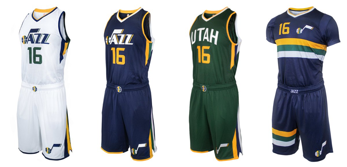
Click to enlarge
As expected, the Utah Jazz unveiled new logos yesterday, and they matched the designs that I had already reported after obtaining them from an industry source. But in an unexpected move, the Jazz also unveiled a new uniform set and a new court design, both of which I figured would be coming later this summer. There’s full info on all of this on this excellent interactive page. (As an aside, NBA teams have been doing a really good job with these web pages that showcase their new designs. The pages are attractive, playful, and informative — kudos.)
You can see my thoughts on the new uniforms in this ESPN piece, which was posted yesterday afternoon.
Worth noting, incidentally, that the Jazz went ahead with this redesign without waiting for the Adidas-to-Nike changeover. Imagine that.
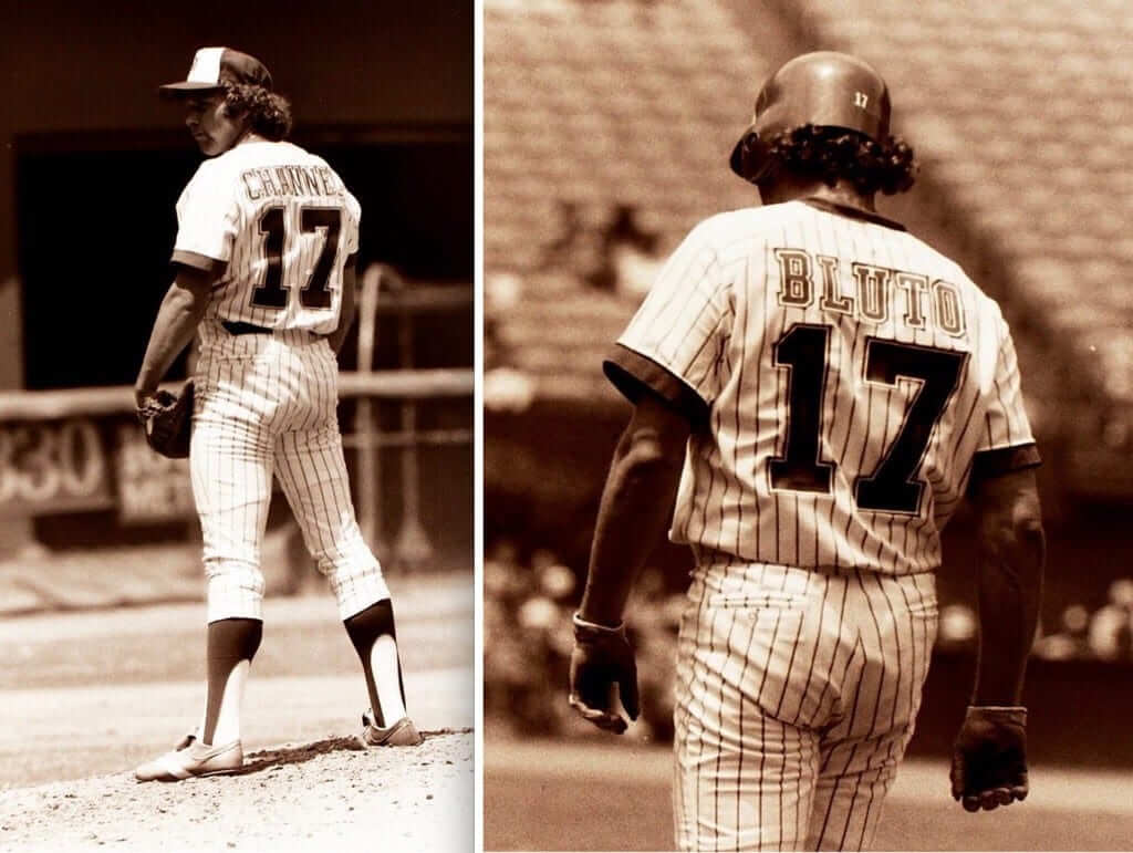
Photos courtesy of Braves Museum Archives; click to enlarge
Friday Flashback, and it’s a doozy: For years our only photo of Braves pitcher Andy Messersmith’s infamous “Channel 17” nickNOB from 1976 was this one. But now, as you can see above, we have an in-game shot — along with the first photo of I’ve ever seen of Messersmith’s “Bluto” nickNOB, which he switched to after National League prexy Chub Feeney put the kibosh on “Channel 17.”
Those two photos are from a trove of never-before-published shots of the Braves nickNOBs that I was recently given access to by the Braves. The team’s researchers also provided me with lots of new (to me) information, including the story behind Messersmith’s “Bluto” and a key aspect of how the nickNOB promotion came about in the first place.
As longtime readers are aware, the Braves’ nickNOBs have been a favorite topic of mine over the past four years or so (look here, here, here, and here). The newly discovered photos and information have helped to fill in most of the gaps that remained from those blog entries.
I’ve cobbled together all of the old and new data into my latest Friday Flashback piece on ESPN, which I believe to be the most comprehensive treatment of the nickNOBs ever published. Check it out here.
And in case you missed it yesterday, I had an ESPN piece about the increased use of umlauts, accents, and other diacritical marks on NOBs these days. It includes news of a previously undisclosed MLB memo on this topic. Check it out here.
Click to enlarge
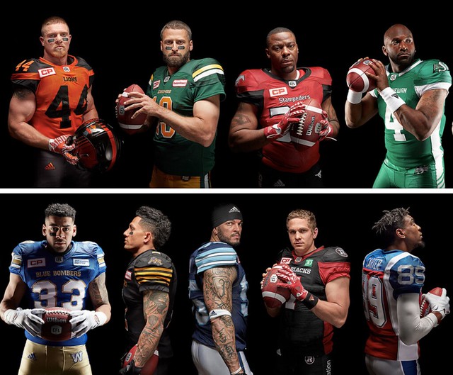
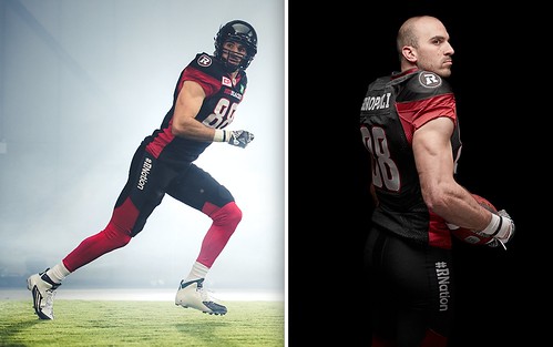
New CFL uniforms: The CFL is now being outfitted by Adidas, and all nine teams unveiled new uniforms yesterday (although several of the looks are just minor tweaks). The most significant move, or at least the one that the league really wants you to know about is that the Ottawa Redblacks have become the league’s first team to wear a hashtag on their pant leg (click to enlarge):
My apologies for not providing more in-depth coverage, but yesterday was a crazy day and I just ran out of time. You can see pics of all nine teams’ uniforms in the slideshow below (if you can’t see the slideshow on your mobile device, click here):
• • • • •
Click to enlarge
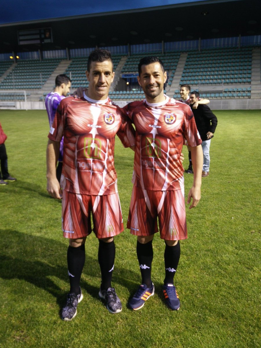
Under your skin: Club Deportivo Palencia, a fourth-tier Spanish soccer team, got people chattering yesterday by unveiling a new uni design that shows what the human body would look like without skin. Let’s see you top that, Oregon!
Here’s a closer look at the chest design:

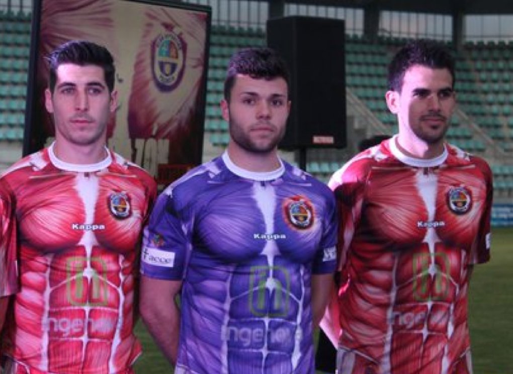
This is the part where I say that the new design is an improvement over the team’s regular uni, which is purple. They’ve maintained that color in the new flesh-themed kit by dressing the keeper in purple flesh:
There’s further info here. And now, if you’ll excuse me, I need to dig an old educational toy out of the closet.
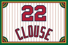
Membership update: A few more cards have been added to the membership card gallery (including Thomas Clouse’s card, shown at right, which is based on the uniforms worn by the 1966 Reds — pretty cool, right?). This batch is now done, and the printed/laminated versions of these cards will mail out early next week.
Speaking of which: Remember, Purple Amnesty Day, the one day of the year when I’ll accept purple-inclusive membership card orders, is next Tuesday, May 17 (which is also the 10th anniversary of this website). We will also have a special T-shirt available that day — and only on that day. Mark your calendars!
As always, you can order your own custom-designed membership card here, you can see all the cards we’ve designed so far here, and you can see how we make the cards here.
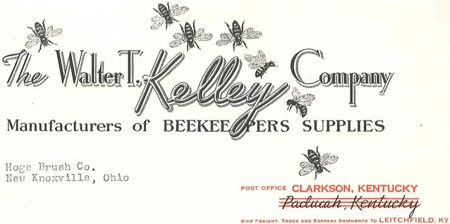
PermaRec update: What does a beekeeping supply company (with a really awesome letterhead design, as you can see above) have to do with a uranium-enrichment facility? Find out over on Permanent Record.
The Ticker
By Paul

’Skins Watch: “My high school has been affected by California’s ‘Redskins’ name ban,” says Scott Seeger. “At first I was hoping they would change it to Miwok, the local native tribe, but that’s not an option now and maybe still offensive to have a group of people as a mascot. Now it is up for a vote online, and the options are Reds (boring, copying name and symbol of the baseball team), Redhawks (I like it generally, second choice), Calaveras High School (extremely boring and a cop-out because all the imagery would stay the same), and Skulls (‘Calaveras’ means skull, it’s a little edgy, my favorite, but maybe a little too morbid for a high school name).”

Baseball News: For the Mother’s Day game at Wrigley, the home plate ump wore a blue shirt while the other umps wore black (from @MBDChicago). … A New York Times sportswriter was sitting in the Yankee Stadium bleachers the other night and caught Royals OF Lorenzo Cain’s third home run ball of the night. Fans wanted him to throw back the baseball, but he did something else with it instead. … New cream alternates for Washington University. … Credit where it’s due: Yesterday Majestic sent out a tweet saying MLBers would be wearing G.I. Joe uniforms on Memorial day to “honor those who serve.” After Phil and I both pointed out to them that this is bad civics, because Memorial Day is for mourning those who perished, not honoring current service members, they deleted the tweet and replaced it with this one. Still a brutal design, of course, but at least they’re not misrepresenting the holiday. Good for them for responding to our concerns. … The FBI is seeking a bank robber dubbed the “Ball Cap Bandit” (from Tommy Turner). … Negro Leagues throwbacks last night for the Jacksonville Suns (from Blake Pass). … “This pitching tutor at a New Hampshire Little League field got me thinking,” says Tris Wykes. “The last great field player to wear No. 41? Might be Eddie Matthews. Tom Seaver, if you include pitchers. I wonder if the guy who invented this device or the graphic designer who created the illustration wore No. 41 in their playing days? Strange choice when viewed without a backstory.” … Yesterday I suggested that we do a census of MLB high-cuffers but mentioned that it might be tricky because rosters are always in flux. As if on cue, the Mets called up pitcher Sean Gilmartin, who goes high-cuffed with stirrups.

NFL News: Here’s something I didn’t remember: ABC’s scorebug for a 2000 Vikings/Packers game listed the team names as “Vikes” and “Pack.” … Looks like newly acquired Jets RB Matt Forté will have an accent on his NOB this fall. Very timely, given my ESPN piece yesterday about the increased use of accents, umlauts, and so on (from Michael Mrozinski).
College Football News: In a move that seems a little messed up, Notre Dame is trying to entice recruits with their own ND trading cards, complete with fabricated “career highlights” on the back (from Warren Junium). … I often complain that today’s uni designs look too much like superhero costumes. But damn, check out this shot from the 1933 Wofford College yearbook — now that’s a superhero outfit! (Great find by Ronnie Poore.) … I’m no fan of GFGS, but Purdue’s new two-tone grey uni is pretty good. It’d be a lot better without all that nonsense on the shoulders, though (from Sean Pellatz).

NBA News: Strong article on the crying Jordan meme (from Jorge Cruz). … Here’s an assessment of Golden State’s “Strength in Numbers” campaign (from Ian B). … Stunning journalistic revelation: The NBA’s move to allow jersey sponsors advertising “could generate significant income for the league’s teams.” Insightful!

Soccer News: New home kit for Everton (from Johnny Hockey). … New kits for Borussia Dortmund (from Eric Shaver). … Here’s Crystal Palace’s new home kit and away kit (from Jim Collier).

Grab Bag: A design contest is looking to improve Milwaukee’s flag (from Jason Goede). … The Malaysian flight attendants’ union thinks Malaysia Airlines’ plan for new uniforms is a waste of money. … The Australian rugby league team Parramatta has lost two uniform sponsors advertisers. … Olympic runner Nick Symmonds will have a T-Mobile ad temp-tattooed onto his shoulder for upcoming races (from Tim Dunn). … Interesting discussion of how Nike fits in on the list of the world’s most valuable fashion brands (from Jason Hillyer). … The latest Aussie rules team to showcase its new indigenous guernsey is North Melbourne (from @Doyoubaseball).
On the Rhode: People, I don’t mind telling you that I am totally fried. Been working way too hard while coping with two separate medical situations (neither is serious but both have entailed a annoying amount of appointments, procedures, insurance bureaucracies, etc.). So later today the Tugboat Captain and I will be hopping in the car and heading up to Rhode Island for a badly needed weekend getaway. Expecting to eat a lot of hot weiners, stuffies, and johnnycakes, and to drink a lot of coffee milk, Awful Awfuls, and Del’s Lemonade (and, uh, alcohol), among lots of other enjoyments. Hope your weekend is as much fun as I expect mine to be. See you next week.
Wouldn’t that be purple muscles instead of purple flesh? :)
Muscles *are* flesh. When you see a raw steak, that’s muscle — and flesh.
Ah! Fair enough.
Happy travels!
-Lookinng at those Jazz uniforms, I think they’re okay. Irocially the only one I really like design-wise is the sleeved one, of course that’s ruined by said sleeves.
-I love that Times story. Good on the writer for giving the ball to a kid. I DESPISE the whole “throw it back” thing and I HATE the fact that it’s become prevalent at Yankee Stadium in the last 5 or so years.
Should be *ironically.
Also have a good trip Paul.
“Throw it back” is one of those things where, if it had stayed in Wrigley where it started, would be a fun quirk. (The fact that Wrigley is a good home run park doesn’t hurt, either.) But when it spreads elsewhere, it’s just obnoxious. Me, I’ve been waiting more than half a century to catch a baseball. I’m not throwing it back, no matter who hits it.
Excellent thought, Jerry!
When I was in my earlyish 20’s, I got my first (and still only) foul ball. There was no fight/scramble, as I was seated in the first row of a section and the ball landed in the walkway and I simply reached down and grabbed it. A kid seated next to me said, “hey mister” (I’ll never forget he called me “Mister”), “can I have that ball?”
I explained that I’d been going to games for years (this was probably my 50th game or so) and that it was my first foul. I promised if I ever got another, I’d give it to him (or away), but I was keeping this one. He wasn’t happy about this but seemed to accept my explanation.
Of course, in stereotypically classic Phil fashion, I ended up having a catch with that very ball in the street later on, and the idiot with whom I was having a catch threw the ball well over my head, and it ended up rolling down into a sewer, lost forever.
Not sure why I was 20+ and having a catch in the street, or why I chose to use the ball I’d caught at a game, but…
I love that the act of throwing a ball back an forth is still known as “having a catch”, rather than “playing catch” or just “throwing the ball.”
“Having a catch” must be regional. I’m 42 and we simply called it “Pitch and Catch”… never having or playing catch.
Also, a game my cousin called “pickle” we called “hot box”.
I have been lucky enough to get 5 balls & everyone is special. I will never throw back a ball. BTW the throw the ball back thing is relatively new to YS. It rarely happened across the street. Probably the same fans that are more interested in starting the wave then watching the actual game.
I was at an Indians game earlier this season and a college age girl the row in front of me caught a home run from the opponent. She gave in to the “throw it back” and was promptly removed from the stands by police. I saw them taking her info, and she was handed a $500 ticket for throwing objects on the field.
“Throw it back” is obnoxious at Wrigley, too.
It’s also obnoxious to automatically assume you have to give a ball to a kid in the stands. What if you have a kid who couldn’t make it to the game and you want to brighten up his or her day? What if the kid who asks you for the ball has been a brat the whole game? I’ve been to games where kids (who don’t have seats there) hang around the rails blocking the view of people who have seats there, and their sole purpose is to get a ball…whether it’s foul or caught by the left fielder with one out in the inning. They’re not getting squat from me. Now if it’s a foul ball, I’m probably going to give it to a nice kid, but if it’s a home run ball? If it’s a huge milestone I’d give it to the batter. Otherwise it’s mine…especially if I caught it on the fly.
I called it “playing catch.”
The sleeved Jazz uni looks like it could be a soccer uni from the 70s. Maybe an NASL team during the big expansion. Even the name sounds like some of the NASL teams of that period.
I was thinking along similar lines, looks like something MLS would come up with. (The Chicago Fire has something somewhat like it.)
Nice set across the board, except for that minimalist one. Not crazy about those.
Real Salt Lake is now the 2nd best looking soccer team in town!
All kidding aside, I like that Jazz alt.
Funny thing happened last year when Arod hit a home run at Fenway. A fan that was booing him insanely happened to catch the ball. Fans chanted for him to throw it back, but he refused. He went from angry booing to jumping up and down in excitement. Albeit it may have a milestone HR for Arod, hence the excitement $$.
Proofreading: “Under your skin:” should be big and bold.
In the awesome ESPN piece, “Paciorek would settle hamburgers” should be “settle for”
Also ESPN: “Manager Dave Bristol his coaching staff wore their surnames” should be “and his”
Have a great trip!
“I need to dig an old educational toy out of the closet.” link doesn’t work.
Fixed.
Thank You! Nice!
re: Milwaukee’s flag. The current design must have been put together by the same committee that “designed” the Wisconsin state quarter:
link
ed
The Milwaukee flag redesign project grows out of this 99% Invisible episode: link
Looking forward to seeing the finalists. Hopefully the city of Milwaukee will adopt the winner and not pull a kiwi. And hopefully Wisconsin will be inspired to follow suit and give itself a non-crappy state flag at some point.
BC Lions new logo on helmet a distant cousin to the Michigan Panthers?
Then good on them! The USFL wore some of football’s greatest helmets.
Notice a lot of NBA teams now going with a circular logos in their latest redesigns (Hawks, Raptors, Wizards, 76ers, Bucks, Nets, etc.). Just a modern trend or is there something deeper going on?
I think it’s a trend. I know it’s a trend in hockey. One thing about circular logos is that they look perfect at the center court jump ball spot, or center ice face off dot.
They look perfect AS the center court jump ball spot, too (i.e.: the small circle in the center circle that you don’t see so much anymore).
To be fair the Pistons have had one almost exclusively throughout the franchise (even 96-05 with the art was based in the wheel)
Monday Night Football scorebug also had a nickname for the Dolphins in 2000.
“https://i.ytimg.com/vi/wxReQva42eM/maxresdefault.jpg”
That wasn’t the only game in that general time period where ABC went a little informal with the team names. I remember a game where Miami was playing where they put “Fins” in the score bug; I’m sure there are other examples but I can’t think of any off the top of my head.
Reminded me the late night host mention of the use of Fins for the Dolphins and Vikes for Minnesota. Said he couldn’t wait until the Titans played.
I seem to remember a Skins vs Gmen scorebug as well.
Don’t forget the clam cakes and enjoy your stay this weekend in the biggest little state in the union!
Yup, clam cakes too. And doughboys, and more!
Way back in 2002 I wrote a NY Times article about Rhode Island food. One of the most enjoyable things I’ve ever worked on:
link
We go to Olneyville and we love the weiners, but it’s a little too real for me at the original location (having a now five year old I’d prefer not to expose him to casual swearing just yet lol). Last time we were there, my wife was pretty sure one of the employees was talking to another person about a drug deal in coded language. But we’ll keep going back! Frankly, I had lived in southern MA my whole life and had never known about RI style weiners until a few years ago and Paul had written about it.
I had lived in southern MA my whole life and had never known about RI style weiners until a few years ago
As noted in that old NY Times piece I wrote, it really is amazing how self-contained the RI food scene is. Very intense within the state, but everything changes the moment you step across the border.
That is a fascinating article – makes me want to visit RI too! Perhaps my favorite part was the slogan for Eclipse: “You’ll smack your lips when it’s Eclipse.”
That RI food article is fantastic. Thanks for providing the link. I grew up in CT, and never heard of any of those foods. Speaks to how insulated they are. As you said, the “weiners” are not unlike a Coney in the Midwest. They look awesome from the Google photos I saw!
So where does the jersey ad go on the Jazz sleeved jersey? On the sleeve?
You realize that jersey ads are permitted but not required, right?
I do. However it doesn’t seem logical to me that a team would brand only certain jerseys in their set. Isnt this the only sleeved version where ad placement might be an issue because of the team logo placement?
However it doesn’t seem logical to me that a team would brand only certain jerseys in their set.
Sigh. By “brand,” you mean “put advertising on,” right?
The endless use of “brand” (and branding, rebranding, etc.), and the reluctance to refer to advertising as, you know, advertising, is a depressing triumph of newspeak.
Of course, Paul–that’s what I meant–advertising. I’m typing this out on my iPhone and trying to work at the same time. Sometimes that results in a less than spot-on response.
I agree that the sleeved Jazz jersey doesn’t seem to offer an obvious place for an ad. (The sleeve isn’t ideal, since it wouldn’t be clearly visible during a free-throw attempt, which is the whole point of the ad program.) So: Maybe they won’t have an ad on that jersey; or maybe they’ll change the design; or maybe they’ll stop wearing that jersey.
We shall see.
But if the advertising is on the sleeve, perhaps they would begin showing free throws from the side. The advertising placement might change the way the game is shot and shown by television cameras. (Man, these ads can affect a whole slew of things unrelated to the ads themselves.)
On a semi-related note, watching old Daytona 500’s, I realized how differently the race was shot and shown by television cameras back in the 80’s. Back then there were longer shots (both timewise and distance) where as today most shots are short and close ups of a few cars. Could be somewhat related to the advertising on the cars and the agreement between NASCAR and advertisers, that more close up time is provided so viewers can see the ads.
In response to the ‘skins watch entry. I know nothing about the region or community, but on the face of it, it appears they are complying with the legislation to remove the name, but not bothering to examine the spirit of why the legislation was written in the 1st place.
Of course, the mention of “under the skin” would be totally incomplete without including “Super” Mario Cipollini’s glorious “Muscle Suit” from the 2001 Giro d’ Italia link
You beat me to the Cippo reference. He was never one to back down from a fashion challenge, but he had the sprinting chops to back it up.
I like how most CFL teams get it and use a proper number font.
Just for my understanding, what is the bluish/purple color that the Jazz are using? Blue? Purple? What color does it actually fall under? Thank you.
Currently? It’s not purple at all; it’s navy blue.
The Utah Jazz primary colour is a dark, midnight purple.
I don’t know if you’d consider him a “great” player, but Victor Martinez is pretty good & wears #41.
Oooh, good one! Hadn’t thought of him.
Yadier Molina wore #41 in his first two seasons with the Cardinals, before switching to his current #4 in 2006.
A catcher with a lifetime batting average over .300? Dunno if that’s great but it’s definitely pretty darn good.
Am I the only person who saw those Club Deportivo Palencia kits and immediately thought of link?
Nope.
This has probably been covered on here already, but will the sleeved jerseys continue after the change over to Nike? The new Jazz sleeved jersey is solid, hopefully they keep it past next year.
Not clear. We’ll all find out soon enough.
The Milwaukee city flag is not a flag; it’s a crying towel [insert your own “cries” here].
All I have to say is that Redblacks is still one of the stupidest team names in North American sports.
My Dad’s HS (Rockford Central HS) team nickname (back in the 40’s/50s) was RABS, which actually meant “Red and Blacks”.
Apparently the school split when it got too big– to East and West. “West” is now defunct.
From Wiki: “The school’s colors were red and black with a nickname based on those colors: the ‘’’RAB’s’’’ for Red And Blacks. Rockford East continues to use the nickname, adding an E to the front, creating the word “E-Rabs”.
Skinswatch:
“Redhawks (I like it generally, second choice)”
Granted “Red Skins and Indians” are pretty easy/boring choices,
this is the #1 reason I’m against re-naming teams with Native American imagery. They always end up choosing a boring bird of prey!
University of Miami RedHawks, Eastern Michigan University Eagles, North Dakota Fighting Hawks. All forgettable.
If you’re going to name your team after a bird, at least make it an obscure local thing.
The results usually do disappoint, but the change is still worth making. Hopefully this particular school will do the smart thing and go with the Skulls or something on that theme. Morbid? Hardly! A memento mori is actually life-affirming and uplifting.
But yeah, there are so many terrific birds and animals that any team calling itself “hawks” or “falcons” or equivalent generic name is disappointing, whether they used to be the Redskins or not. In California, they’ve got condors, teals, scaups, eiders, goldeneyes, buffleheads, ptarmigans, chukars, albatrosses, petrels, shearwaters, fulmars, herons a-plenty, swallows, kites, harriers, goshawks, caracaras, gyrfalcons, merlins, avocets, greenshanks, yellowlegs, redshanks, pipers, red knots, surfbirds, curlews, whimbrels, dowitchgers, godwits, tattlers, snipes, phalaropes, skuas, jaegers, gulls of all sorts, whip-poor-whills, kingfishers, pipits … there’s just no excuse for generic or made-up bird names like redhawks.
There are a bunch of cool birds that are unused as athletic mascots (Swifts, Magpies and Thunderbirds, offa the top of my head); please refer to an Audubon guide before renaming your team. In fact, let’s put a moratorium on all -Cat, -Dog and -Hawk nicknames. Astronomy would be a good field to explore, too.
Walter,
Some of those get a run in Australia:
Collingwood Magpies – AFL
Sydney Swifts/Adelaide Thunderbirds – ANZ Netball Championship
Jerseys were usually nothing to write home about but back when we had the Whiskey Jacks ball team (bird is aka Canada Jay, Gray Jay & Grey Jay. Whiskey Jack name comes from trickster in Native mythology) the caps and logo looked very good to me.
link
Some more basic info on the bird here:
link
No new or old videos from hww of the gray jay, but here’s a hww spoof on curling ;)
link
“expecting to eat a lot of hot weiners, stuffies, and johnnycakes, and to drink a lot of coffee milk, Awful Awfuls, and Del’s Lemonade”
I am now officially jealous of you and the Tugboat Captain Paul.
Signed a displaced born and raised Rhode Island native living in California
Here’s a good photo of the inspiration behind the pride uni.
link
So you’re saying that the sleeves aren’t long enough? ;)
With the long arm sleeves and the leggings they wear now, they’ll have the full warm-up!
In Rhode Island, if you’re going to Providence, East Side Pockets (on Thayer St. at Brown) has great, quick Mediterranean wraps. And you probably know all about Federal Hill, but a great place to find great food and atmosphere.
“….a new uni design that shows what the human body would look like without skin”
and without fat!!!
First glance at the new CFL uniforms: big plus for the return of royal blue for the Blue Bombers, big minus for the simplified striping for the Eskimos. Ottawa – hashtags should stay in the Twitterverse, replace with plaid. B.C. – quite a radical change for the logo; don’t dislike it.
No unveiling of the road jerseys?
Some teams had their players show off road unis.
-Roughriders have white pants too, so they have the option not go all green at home. The green jersey over white pants look with the new uniforms is appealing. A return to traditional green and white – no more black or silver trim on uniforms.
-Lions road unis adds another layer to radical. Quite unexpected. It has orange helmets and pants. Road uniform is basically orange and white with no black trim.
He did WHAT?
My goodness, I need to find myself some coffee milk ASAP. Enjoy the trip Paul, well deserved!
Paul, come out to the Revolution game tomorrow at Gillette Stadium! Free parking! Tailgating! Beer!
I’ve seen mention of the letters for PermaRec, but up until now I’ve just scrolled past them. This morning I read through the whole site and WOW. I especially liked the ones where the broom/brush world intersected with the sports world. Fascinating stuff.
I don’t care much about the NBA, so I have no quarrel with the Jazz uni. What’s interesting to me is that they still use the color palette associated with Mardi Gras. The Pelicans’ colors may match the city’s flag, but I associate the green/purple/yellow scheme more with New Orleans.
Utah unis are blue, not purple.
The last time the NBA introduced an engaging and interesting uniform was the yellow Denver Nuggets alternate. Since then one snooze after another. Rip Van Winkle, NBA Creative Director must be woken up out of his design slumber. ZZZZZZZ.
The Braves nickNOBs and numbers were interesting in that they were not all twill…the red outer layer is actually embroidery thread sewn all the way around the characters. (Thanks Bill Henderson). Gives them a unique look. Also interesting is that the period in J. Dog is round and not square…I would have predicted it would have been square, as the letters are mainly squared.
Love the Braves nickname NOB research project. The Braves have a nice team museum at Turner Field; hopefully they can incorporate a section on this brief era into a similar museum at their new park when it opens next season.
What was Wilbon talking about? I see Utah on a jersey