Last week I wrote about how Iowa’s basketball team had worn unitards (well, at least in practice, although not in a game) back around 1989 or ’90. Today we can add another school to the unitard list: Seton Hall. But as you’ll see, their unitard was different than the ones worn by N.C. State, Oklahoma State, and Iowa.
Credit for this one goes to reader Jon Volpe, who began by sending me this photo of former Seton Hall player Anthony Avent:
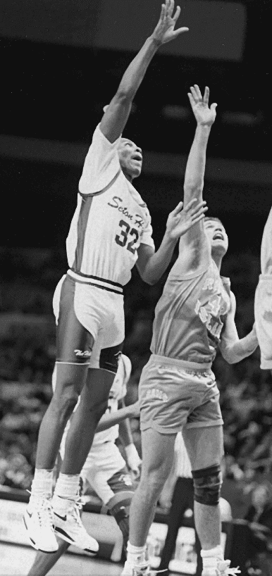
As you can see, Avent was clearly wearing compression shorts. But the jersey doesn’t look like it was that tight, and it’s not clear whether the jersey and shorts were joined together in a one-piece uni.
Volpe then followed up with two additional photos:
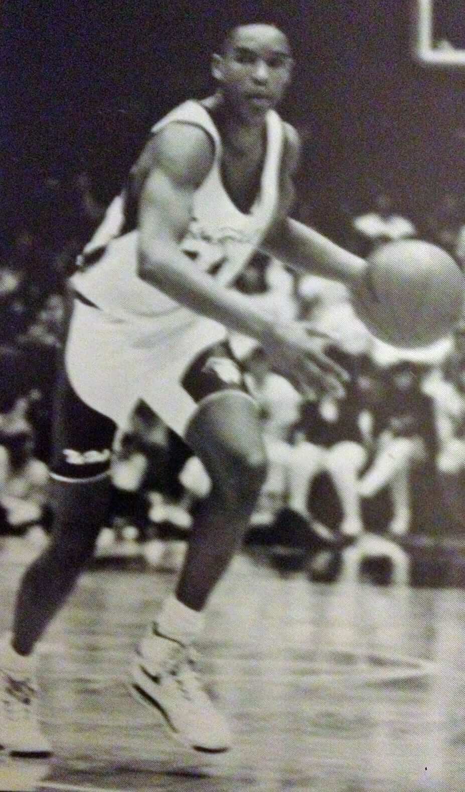
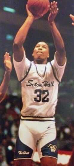
These shots (the second of which was on the cover of Seton Hall’s 1990-91 media guide) show pretty much the same thing: compression shorts, non-compression jersey, uncertain connection between the two.
I presented all of this to Seton Hall communications honcho Thomas Chen, who said he’d look into it. He got back me with four additional photos, which provide our best look at this uniform (for these four, you can click to enlarge):
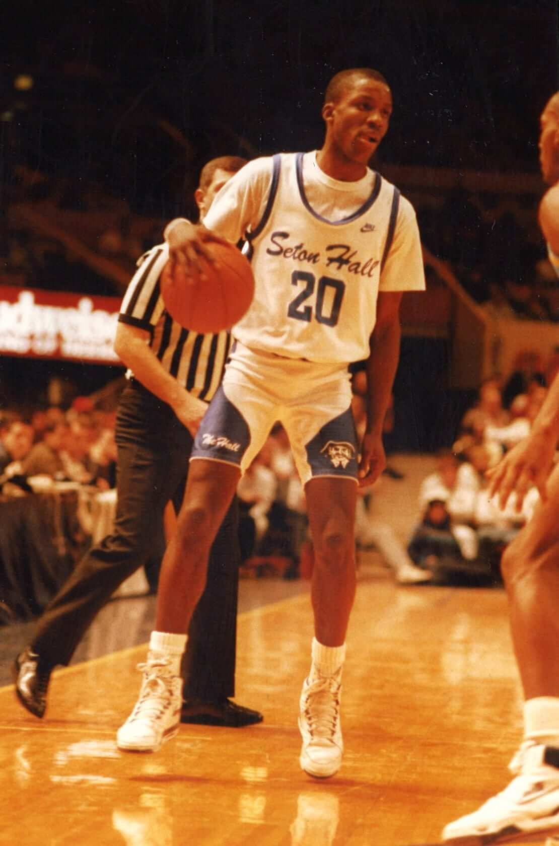
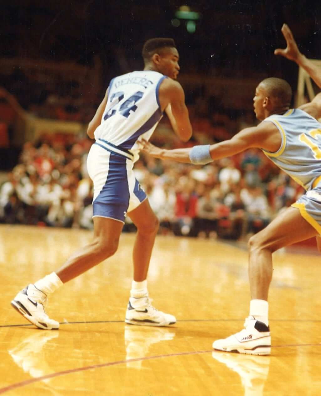
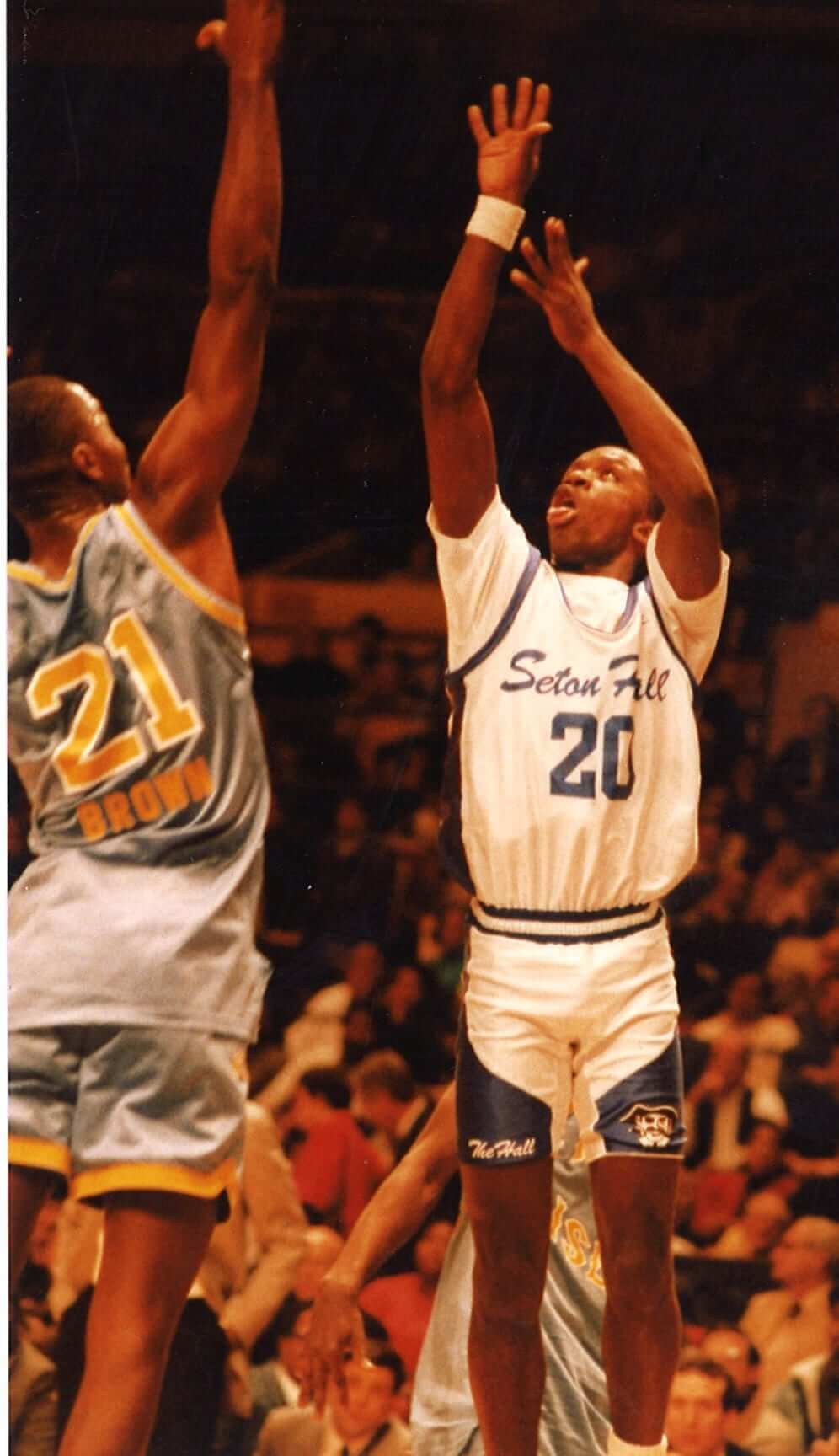
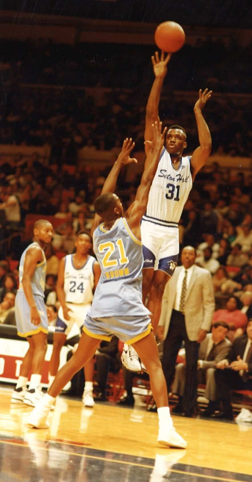
Those pics are all from a game against Rhode Island (who, as you can see, wore drop-down NOBs and had at least one player who went untucked). Again, it’s not clear whether the jerseys and shorts are connected. Frankly, it wouldn’t even occur to me to think that this might be a one-piece uni if we didn’t have the background context of other schools having worn compression unitards. Based on the photos alone, I’d just think, “Hmmm, they wore compression shorts instead of regular shorts — odd.”
But Chen, the Seton Hall communications guy, provided the answer:
I checked with a former player — Anthony Avent — who said the uniform was a one-piece. He said it lasted around four games, but I could not find any pictures outside of the Rhode Island game, which took place on Dec. 27, 1989.
And there we are. That wraps up our unitard investigation, unless anyone knows of any additional schools that might have worn the one-piece design.
(Big thanks to Jon Volpe and Thomas Chen for making this post possible.)
A mystery hiding in plain sight: When the Mets opened up their Hall of Fame and museum in 2010, one of the big attractions was a mannequin wearing an original papier mâché Mr. Met head that dated back to the live mascot’s debut in 1964. (The cartoon version of the mascot had been introduced the year before, but that’s a whole ’nother rabbit hole.) Phil and I visited the Hall while attending Sunday’s Mets/Giants game, and the mannequin with the first-generation head is still there (click to enlarge):
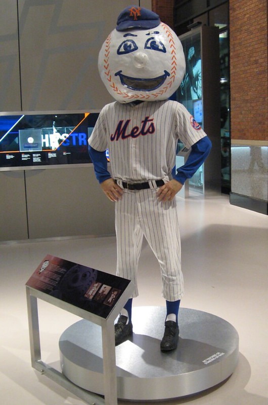
As you can see, the mannequin is accompanied by a placard with some background info and a few photos. I’ve probably looked at that display at least half a dozen times over the last few years, but this time one of the photos jumped out at me:
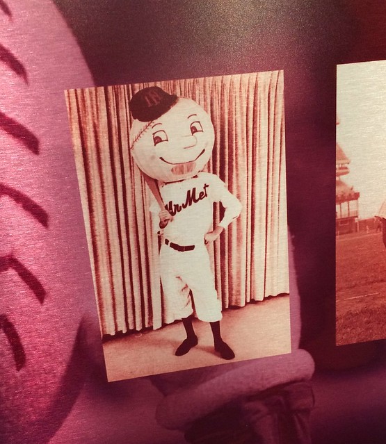
The thing that caught my eye was that this photo shows Mr. Met wearing a jersey with a “Mr Met” script (no period after “Mr”). In all my years of following the team, I’ve never seen Mr. Met — either the live version or the cartoon character — wearing his own name on his chest. He’s always worn the basic Mets script, or some other variant based on what the team is wearing.
I wanted to know more, so I contacted Mets creative director Mike Zulla. He was able to come up with the original photo (click to enlarge):
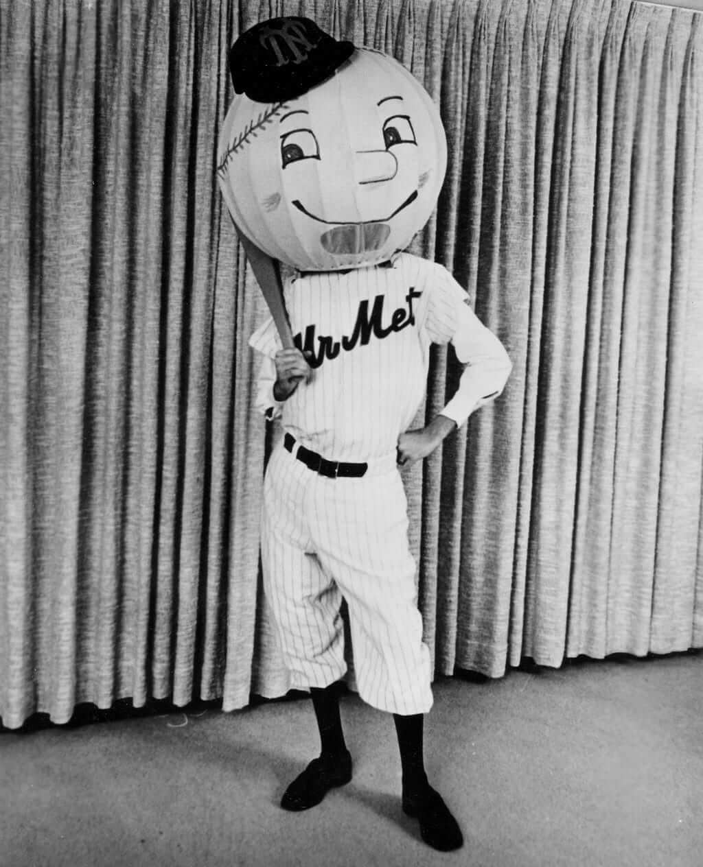
Obviously, this photo also shows a different and probably earlier version of the head, complete with what appears to be a ventilation panel. But it’s the jersey that really interests me — when was it made? Did Mr. Met ever wear it at the ballpark? What happened to it?
Although the Mets have the original photo in their files, they don’t have any info regarding when, where, or under what circumstances it was taken. If anyone knows more, I’m all ears.
T-Shirt Club launch: It took a while, but we finally have the Uni Watch T-Shirt Club’s second release of 2016.
Just to refresh everyone’s memory: We’re doing six shirts this year, with a different sport each time around. We already did baseball, and now it’s time for hockey.
We kinda agonized over whether to do a goalie or a regular skater, ultimately deciding to go with the skater, in part because we wanted to show the full uniform without having part of it obscured by the pads, and in part because we wanted our player to have a captain’s “C,” which wouldn’t be appropriate for a goalie. Here’s our base design (click to enlarge):
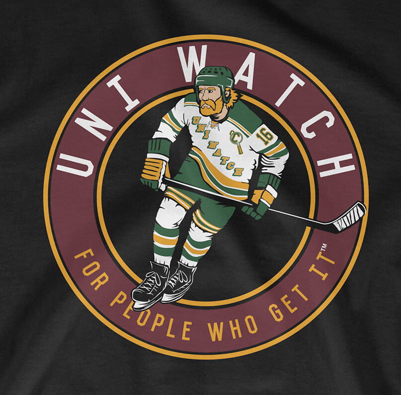
As you can see, our skater has an old-school helmet, a lace-up collar, a captain’s “C” in the Uni Watch magnifying glass motif, and — of course — a playoff beard.
We’re offering this shirt in three colors — black, grey, and white (all of which are available in both short and long sleeves):
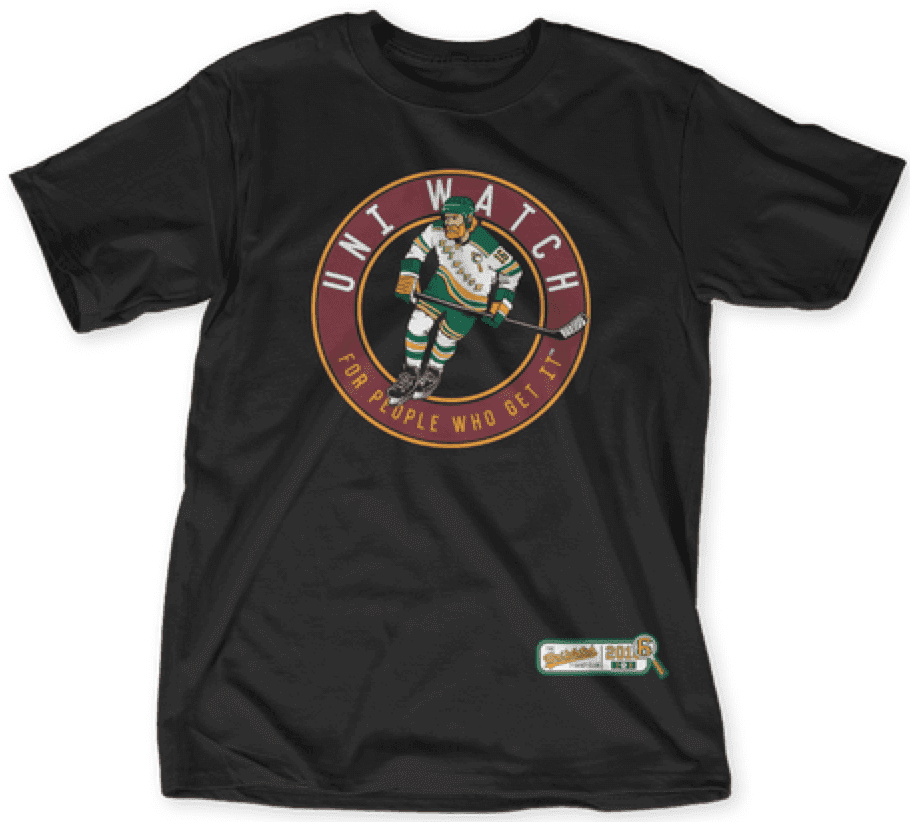
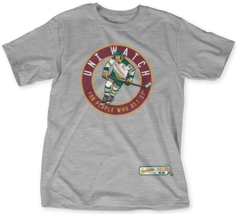
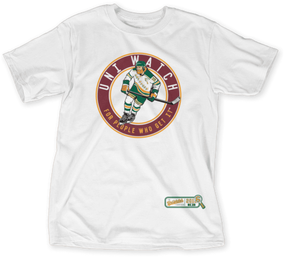
The shirt is available here from now through next Tuesday.
As I mentioned, we toyed with a goalie design as well — it was too much fun not to. Here’s how that turned out (click to enlarge):
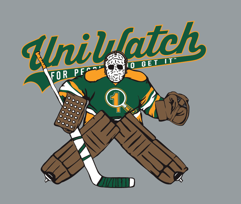
If there’s enough demand, we’ll make the goalie design available as a bonus shirt offering. It will not be part of the T-Shirt Club, will not have the jock tag graphic (which means it’ll be a bit less expensive), and will neither count toward nor be required for “Collect ’Em All” eligibility. Just a fun “extra” design. Speak up in today’s comments if that interests you. (And no, sorry, we will not make the goalie design part of the T-Shirt Club — only the skater.)
Also-also: Purple Amnesty Day is less than two weeks away (May 17). Just like last year, we’ll have a shirt for the occasion, which will be available for only one day.
Again, the hockey shirt is available here. As always, big thanks to my Teespring partner, Bryan Molloy, for all his help and dedication with this project.
The Ticker
By Paul

Baseball News: Here’s a really nice touch I hadn’t been aware of regarding the Mets’ 1986 Sunday throwbacks: The bat boys are wearing No. 86 and their first names, just like back in the day. The bat boys’ non-throwback have no names or numbers — just a big “BB” on the back (big thanks to Jeremy Posner). ”¦ Got seven or eight hundred bucks that you don’t know what to do with? Give it all to me already Allow me to suggest spending it on this century-old baseball uniform catalog, complete with swatches. Looks to be a real beauty! Back in 2013 we had a guest post by Jim Lonetti about his glove-repair business. Now DIY genius Wafflebored has created a vintage-style jersey based on Jim’s glove-repair operation. Brilliant glove-shaped buttons, too! ”¦ Andy Pettitte bobblehead on tap for the Rochester Red Wings. ”¦ “You must wear the ribbon!”: Marshall players will wear caps with cancer-awareness ribbons, with each ribbon representating a cancer that has affected that player’s life in some way (from Fletcher Keel). ”¦ Check out this shot of Brooks Robinson wearing the “Star-Spangled Banner” sesquicentennial patch, which the O’s wore in 1964. Here’s a closer look at the patch design (from BSmile). ”¦ There’s pants piping and then there is pants piping. That’s Greenup County High School in Kentucky (from Brice Wallace). ”¦ I always thought Vida Blue wore FiNOB with the Giants, but not with the A’s, and most photos of him during his time in Oakland do indeed show him wearing a conventional NOB. But Gary Gage found a shot of him going FiNOBwith the A’s. Good one! ”¦ Nats OF Bryce Harper has inked a massive extension with Under Armour (from Tommy Turner). ”¦ Louisiana-Lafayette is saluting Ron Guidry with some weird hybrid jerseys. Never seen anything like that before. ”¦ Padres-style fauxbacks this weekend for the El Paso Chihuahuas (from Brady Phelps). ”¦ Love the uniforms worn by these girls’ teams who got a visit from Babe Ruth in 1939 (BSmile again). ”¦ D-backs pitching coach Mike Butcher wore teal shoes last night (from @ZJL00). ”¦ Coupla Twins players appeared to be wearing striped stirrups last night. Look closer, though, and you can see they were actually two-in-ones. Pfeh (from Gary-O). ”¦ Orioles’ media notes last night included a logo commemorating the 50th anniversary of their 1966 championship. Hadn’t seen that before (from Tyler Kepner).

NFL and College Football News: Lions rookies have received their uni number assignments (from @YourFoodSherpa). ”¦ This week’s Sports Illustrated cover photos show NFL first-rounders with gold-logo NFL footballs. I’m assuming those won’t be used this season (good spot by Micah Tannis). ”¦ For those who choose to believe stuff that’s posted on Reddit, Jason Greening offers this: “The Broncos and NFL subs on Reddit have both had posts today about either a Nike summer catalog leak or someone doing URL manipulation and finding images on the Nike website. No pictures for the the NFL stuff, but the guy did call the Browns uni change last year. He found the Color Rash images last year, too (but only a few hours before they were announced). In the post, he hits on a number of other teams, like an all-black Vikings uni, and an all-white Saints, and a throwback to the red-blue horizontal stripes Giants from the ’20s or something. For the Broncos, the uniforms supposedly look like the 1968 preseason uniforms (orange, blue sleeve, blue helmet) but with the old Crazy Horse logo. No mention of pants. This does kind of mesh with that white-orange-white stripe on a navy helmet that I saw on the Paxton Lynch welcome video on Friday. The user has no history [on Reddit], but it looks like his username is a not subtle hint at working at Dick’s. Normally I’d just ignore it, but coming on the same day as the other guy is just odd timing.” … New uniforms for Rutgers. That’s part of a revamp of all of their sports (thanks, Phil).

Hockey News: Lots of people noticed that a fan at last night’s Islanders/Lightning game was wearing an Isles jersey with a “Jewish” NOB. So if he has a playoff beard, maybe he’s just Orthodox, eh? ”¦ NBCSN showed a graphic with an outdated Blues jersey last night.

NBA News: Why would a Canadian team have a T-shirt with an American flag design? (From Andrew Daniels.) ”¦ Steph Curry had a workout yesterday, and the Warriors tried to protect his privacy with a partition — which, surprisingly, had a really outdated team logo (from Piero DePaoli). ”¦ Menswear magnate Alexander Julian, who designed the Hornets’ first uniform set, is reviving his clothing brand (from Tommy Turner).

College Hoops News: A reader who prefers to remain anonymous write: “According to Jason Scheer of wildcatauthority.com (an Arizona scout.com recruiting website), he was told by a basketball recruit that Arizona will have a full new set of basketball uniforms next season. You need a subscription on the website to see his message board post, unfortunately.” ”¦ New unis for Rutgers (from Michael Lipinski).

Soccer News: Here’s a list of EPL champions and their kit manufacturers. Leicester is the first Puma entry on the list (from @TheLupineOne). ”¦ New black anniversary kit for PFC Beroe Stara Zagora (from Ed Å»elaski).

Grab Bag: One observer’s opinion: The skirt suit needs to go. ”¦ Howard University has entered into a new multi-year deal with Under Armour. ”¦ Here are some hints at Virginia Tech’s upcoming rebranding redesign across several sports (from Andrew Cosentino). ”¦ A Chinese sports apparel company whose logo looks an awful lot like Under Armour’s insists that it has nothing to do with Under Armour (from Sean Spitzer). ”¦ New rugby union jerseys for the Wallabies.
typos
The Broncos look is from 1965 rather than 1968.
Bud Grant link isn’t working.
Huh — not sure what happened to that Bud Grant tweet. Now removed.
The reason I say 1968 is because of the helmet. The 1964/1965 uniform used an orange helmet, which we all know can’t be used this year due to the archaic one-helmet rule.
However, in 1967 and 1968 the Broncos still wore the orange uniform with blue sleeves and white stripes during the pre-season along with the new blue helmets.
link
In 1967 the helmet was logo-less, while 1968 is the first appearance of the ‘D’ logo. While this guy apparently says we will use Crazy Horse instead, it is still the closest comparison I could think of.
Shame if it’s color rush it’ll mean orange pants too. Stupid NFL.
Did a quick mock up to show what that could look like:
link
Tagging issues between Bryce Harper and Ron Guidry.
Fixed.
I want a Paul Lukas hockey player caricature T-Shirt. Let’s make it happen!
I saw a uni catalog with swatches just like the one linked in the Ticker at the Ephemera Society show six years ago. It was incredible; I asked the guy how much it was, he said, “Twelve fifty”. I said I’d take it, at which point he clarified that he meant $1,250 :-(
I have several old catalogs like that in the Uni Watch library:
link
Tempting to get more, but I can’t really justify the expense.
Mr Met…..
“…earlier version of the head, complete with what appears to be a ventilation panel.”
Um, that would be a VISION panel. Note that the mouth is closed. The later versions have an “open” mouth with mesh to see through.
Admittedely it would add some ventilation.
And I forgot to add that he looks “Fab-U-Louuus!!!”
you mean that isn’t some kind of beatnik soul patch?
One additional hint that the Seton Hall uniforms were once piece is evident in the second to last photo with #20 and #21 Brown. The gathers in the fabric of the jersey at the waistband are probably too uniform to be achieved through tucking.
That baseball jersey catalog with the swatches is amazing and probably worth the money. Would love to have it.
And of course the Uni Watch goalie design is great!
The consistent gathers are the strongest visual clue for sure.
RE: Brooks Robinson photo:
Where are his personalized batting gloves? Where is his elbow guard? Where are his tattoos? Whose bat is he using? No beard??
Sun Glasses? Eye black? Jewelry?
All kidding aside, that photo of Brooks Robinson is gorgeous.
Goalie shirt: Yes!
+1
+1000
Goalie stick is way to big!! Ruins it
The only thing I don’t like about the goalie is that the mask is obviously Gerry Cheevers’. The player shouldn’t be recognizable.
He’s not Cheevers; he’s tributing Cheevers. And so are we.
Seems a bit… redundant to have the Rangers-style text on the jersey when the circle around the player also says UNI WATCH on it. I think you should’ve used a magnifying glass logo (similar to the goalie version) instead.
So I guess you thought the baseball design was redundant as well, since the ballplayer had “Uni Watch” on his jersey and then “Uni Watch” also appeared on the circle?
Yes… but not as blatantly? Baseball jerseys commonly have script on them. Hockey jerseys, not so much.
Ah, I see what you mean.
Fair point. But a Rangers-style treatment of “Uni Watch” is something I’ve wanted to do for a long time. Couldn’t resist! And hey, there’s always the goalie design, which it looks like we *will* be offering, since a bunch of you have already responded positively to that idea.
If I hadn’t been told that was unitard, I would have thought it was just a shirt tucked into compression shorts – interesting.
the Twitter links don’t seem to be working for the cancer ribbons and the outdated Warriors logo on the partition
For whatever reason, the “a” in “status” was missing from the Warriors tweet. Here is the correct link: link
Thanks, Rob. Link in Ticker now fixed.
I would like the goalie Uni Watch shirt.
The Warriors partition tweet was deleted. Anyone grab a screenshot?
Yes
Those Rutgers uniforms are a huge upgrade. But the helmet looks strange in this photo:
link
Is it just me, or is that “R” logo really far back on the helmet? It looks like that particular facemask design forces it to be moved back to avoid overlap, but I think I might actually prefer part of the logo to be covered rather than have the logo on the back of the helmet.
The hockey player shirt would be great, but one thing wrecks it for me – that garbage lid. I don’t care that Wayne Gretzky wore it, the Jofa 235 is still an ugly piece of junk. The link would’ve been a better choice, in my opinion.
The goalie shirt just looks awesome, especially with that Gerry Cheevers mask.
Agreed. The player on the shirt looks like Lanny MacDonald, but the helmet Lanny wore was even uglier than the Jofa 235.
I don’t know who Bryan based the face on (although MacDonald seems like a plausible guess). I do know who the body was based on, however. Anyone..?
Yeah, Lanny had that Northland “bubble” helmet, which Mike Foligno also wore.
As for the player model, I’m guessing Gretzky.
Looks like Mike Rogers when he was with the Rangers.
+1
I also just realized the player has a lace-up collar. I’d be a little more forgiving of that if it were a true old-style collar, but since it’s got a yellow insert in there, it suggests the modern Reebok Edge version of the lace-up collar, to which I have to say “BOOOOOOOO!”
Not using the “cool” CCM is what makes it better. The Winnwell/Northland is almost perfect. An XL7 “Skydome” would have been my #1.
link
Upon further review it’s a Jofa anyway..just as good.
The unitard is interesting to me. It was at a time just before the shorts got so long. To me, it could have gone either way and the unitard had its merits. Mainly, dribbling between your legs. I recall some uni shorts that were so long that it inhibited this move. So if they tight shorts would’ve caught on, the basketball landscape today could look entirely different.
Not a huge fan of the new Rutgers football uniforms, although the rest look fine and the Scarlet Knight logo is pretty cool. My only problem with the last kits were the helmets. If you just repainted them, everything else was pretty good. As it is now, it looks like a pretty standard stock uniform that anyone could get out of the spring Nike catalog for you JV football squad.
The NFL football has had a gold NFL logo on it for as long as I can remember.
All photos are from seasons before 2015
link
link
link
link
Oh — well, there you go.
I guess the “golden anniversary” promotion had a great effect on me (and, I suspect, on others) than I realized!
Paxton Lynch looks a little like the Anonymous mask…
The Anonymous mask looks like Guy Fawkes.
In a neat piece of trivia, that Andy Pettitte bobblehead the Rochester Red Wings are giving away is for when Pettitte played for the Triple-A “Empire State Yankees.” For one season when the Yankees affiliate in Scranton, previously known as the Scranton-Wilkes Barre Yankees, was renovating their stadium, the team, without a home, played their home games in Buffalo, Rochester, Batavia, and Syracuse. Wherever they could fit in. They introduced logos, uniforms, hats, etc. all for the one season. By the next season the stadium had been finished, and the team was reborn the Scranton-Wilkes Barre Railriders.
(Un)fortunately the 2016 bat boy doesn’t have a throwback ’86 hairdo as in that photo . . .
That early Mr Met head looks as though he’s just out of some serious brain surgery.
Phillies TV broadcasts have been promoting “Weekends with Schmidt” for the past couple of years where Mike Schmidt is the third-man in the booth on home weekend games. This past Saturday, during a discussion on Indians pitcher Trevor Bauer’s pitching style, Schmidt makes the comment “You know what else is weird about Bauer? Look how he wears his socks.” This coming from someone who wore stirrups then gradually went pajama pants. Bauer’s uniform was looking pretty sharp. Can’t say the same about Michael Jack’s broadcasting skills, but that’s another topic. (link)
As an old goalie, I’d go for the goalie shirt, especially for the “old school” equipment and that he’s wearing California Golden Seals colors. But if I may make the following suggestions –
no stitches on the mask, identifying him as Gerry Cheevers. Maybe a UW if you have to have something on the mask
the goalie stick needs to be a little wider
skate blades just a tad longer
and if he’s going to be old school, he shouldn’t be posed in the modern drop-to-your-knees butterfly style. But it probably makes for a better overall design shape on the shirt
and finally, he’s obscuring too much of the crucial wording…
-Jet
no stitches on the mask, identifying him as Gerry Cheevers.
He’s copying/tributing Cheevers.
he shouldn’t be posed in the modern drop-to-your-knees butterfly style.
A hybrid of old/new. Also: Tony Esposito!
he’s obscuring too much of the crucial wording
You know what the words are, just like you know what’s being obscured here:
link
I also love the goalie shirt. My only comment is that, if we’re going for an old school look, the leg pads should be shortened. Back in the day they only came up a few inches above the knee. Now they go right up to the crotch, completely covering the “five hole” when the goalie goes down in the butterfly. It’s one of the several goalie equipment size reductions that have to be made to bring athleticism back to the position.
The Brooks picture was taken at at YS Old Timers Day!
Interesting pic of the ‘original’ Mr Met -taken at a TV show maybe?
Loving the goalie design, almost exclusively because of the magnifying glass. That little logo is how I feel, and how I imagine many uni-watchers feel when they see something uni related on TV.
I’d buy the goalie shirt if made available.
Perhaps I am in the minority, but I really like the non-goalie shirt, and am not a fan of the goalie shirt. The former shows the concentration and determination of the player; the latter looks … well, it could be a mannequin, for all we know. It’s just kind of blah.
I’m looking forward to adding another shirt to my ever-growing Uni Watch collection. Great work, Paul!
Love the hockey shirt, but (and this shocks me for this site) the player’s jersey and socks don’t match! The jersey hem striping is yellow-green-yellow, while the socks are green-yellow-green. While there are exceptions, the striping on the hem of the jersey typically mimics the striping on the socks. Indeed, one thing that used to drive me nuts about my youth club was that we had custom jerseys and there wasn’t an NHL team with socks that matched our striping pattern, just a similar pattern (that was when I knew I was one who “gets it”). :-)
Can’t believe I missed that.
Let me see about possibly getting it fixed.
Thanks Paul. And thank you, thank you for striping the pants. How you feel on stirrups in baseball I feel regarding stripes on hockey pants.
Love the Cheevers tribute mask, but if it was me designing it when you zoomed in on the image you would see they aren’t stitches, just little hand drawn words that say “aesthetics.”
Who says they’re not?
please, please, please the goalie shirt!!!!!!!!!!!!!!
Put me down as another in favor of the goalie t-shirt. I’ll order one if it’s offered.
Thanks to those compression shorts, Anthony Avent did not struggle to find a girlfriend on campus
Whoa, just noticed that vintage baseball jersey catalog offered red flannel with white pinstripes! I have seen photos of all red uniforms but never red with pinstripes. What a bold look that would have been!
If the Phillies want to wear a red alt, that’s what they should wear.
Or the Twins, assuming the Twins had the good sense to go back to wearing pinstripes home and away, and also the bad sense to want a red alt.
There’s a 1000% that I’d buy that goalie shirt!
The goalie shirt is amazing. Would buy it. Nailed it.
The Mets should wear upside down 8’s like they mostly did in 1986.
link
link
link