Click to enlarge
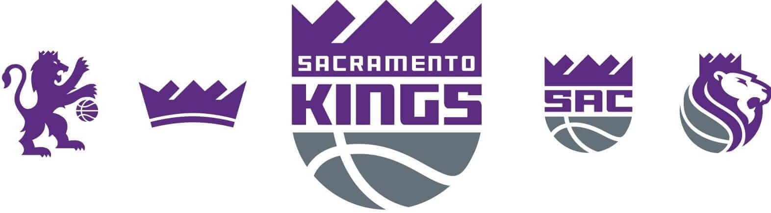
The Sacramento Kings unveiled a new logo set yesterday (see above). I was given early access to this one and have all the particulars in this ESPN piece, which includes some exclusive quotes from team president Chris Granger.
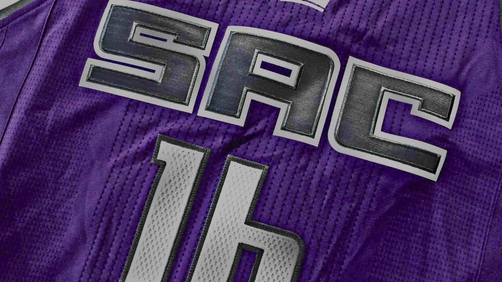
The Kings said new uniforms that go along with the new logo set wouldn’t be unveiled until later this summer. But their interactive web page about the new logo includes a background image of a new purple jersey with “SAC” lettering — presumably a new road or alternate jersey (click to enlarge):

Here’s the background image by itself, without the overlaid graphics, and brightened up (click to enlarge):
Okay, then, what do we think? Let’s go one thing at a time:
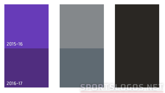
1. The colors. Obviously, I’m not a fan of purple. But I like their new deeper shade better than the previous one, and I really like how it pairs with their new shade of slate grey (which they’re calling “granite,” but whatever), at least in the new logos. Chris Creamer has provided a good look at how the new colors compare to the old ones:
2. The primary logo. Again, I really like the color pairing. I also like that they’re reviving and updating a logo from their past, something I wouldn’t necessarily expect from this franchise.
But I think the execution is mixed. The basketball at the bottom looks good, and I’m fine with the typography (although it’s odd that the “S” in “Kings” doesn’t match the one in “Sacramento”), but the crown looks like a mix of an arrow pointing down and to the left, the Titanic sinking, and a collapsing building. The diagonal white lines of negative space feel too thick. All in all, this part of the logo isn’t working for me.
But hey, if it’s working for you, here’s an opportunity for ya: The Kings will actually pay you to get the new logo tattooed onto your body. Any takers?
3. The “SAC” logo. As we all know by now, the NBA loves its three-letter city abbreviations. Granted, “Sacramento” is a long, unwieldy word, so going with an shortened version makes a certain amount of sense. I have no idea whether people in Sacramento actually refer to the city as “Sac,” however — do they?
4. The lion logos. In theory, I love the idea of a lion dribbling a basketball — but wouldn’t that be better for a team called, you know, the Lions? Also, as lots of people quickly pointed out yesterday, the lion designs look a lot like the logos for the Premier League, the NHL’s Kings, Lowenbrau, and lots of other stuff.
5. The stand-alone crown logo. I actually like this one better than the crown on the primary mark, because the curved base makes it feel more crown-like. Would’ve been interesting if they’d tried something like that with the primary. Anyone wanna take a stab at how that might look?
6. The purple “SAC” jersey. Too soon to say — we need to see the full design. Not nuts about that “6,” though.
Finally, there’s this, which is pretty brilliant:
HAH! Upside down Hawks & Kings logos look like pacman! -> https://t.co/t196QUGOGA pic.twitter.com/4TtYDlcerX
— Phil Hecken (@PhilHecken) April 26, 2016
Meanwhile, over in the NHL”¦: Is the mark shown at right the new Florida Panthers logo? I’m pretty sure that it is. Sorry, can’t share any details on how I obtained it.
As you may recall, a description of the Panthers’ new logo and jersey was circulating back in January. According to someone who’d seen the design at the time, the logo featured a panther that was “more natural,” with “red eyes” and “bared teeth.” This new leak doesn’t quite match that description (no bared teeth). But after I tweeted this new logo yesterday, SportsLogos.net honcho Chris Creamer told me that his own sources had confirmed that it is indeed the new Panthers logo. So there you go.
The Ticker
By Paul

Baseball News: Oh, baby, check this out: David Kendall sent along a scans of a 1977 article about the Pirates introducing their mix-and-match bumblebee set. Great photos — start here, and then go here, here, and here. ”¦ Interesting to see that UNC’s softball team has big inseam stripe panels (from Elena Elms). ”¦ Here’s a ranking of each MLB team’s bobblehead giveaways. ”¦ That didn’t take long: The Nats are selling “Make Baseball Fun Again” merch. I’m curious: If you’re a Nats fan but don’t like Donald Trump, does this merch interest you? What about Trump fans who aren’t Nats fans? (From Tommy Turner.) ”¦ New uniforms for the Sioux Falls Canaries. ”¦ Just what the world has been waiting for: a team wearing Fruity Pebbles jerseys. ”¦ The Rays apparently have traditional “Tampa Bay” road greys in the works, along with late-’90s throwbacks (from Jonathan Arnholz and Jeff Easterling, respectively). ”¦ The D-backs are letting their social media followers vote on which uni the team will wear this Friday. I guess fans who don’t follow the team on social media don’t matter. ”¦ Check this out: a Blue Jays/tequila sunrise mash-up! ”¦ Good spot by @AZJoshM, who noticed that one Arizona player has pinstriped belt loops while the rest of the players don’t. ”¦ Rays minor leaguers are now permitted to have facial hair and wear pajama pants. Depressing quote from Charlotte Stone Crabs manager Michael Johns: “With the pants down, we look better. We look like better athletes. It’s the truth. Scouts told us. They said, ‘You all look like a small team with the pants up.’ It’s weird. It’s like an optical illusion. So it’s a lot more comfortable” (from Nick Hanson).

NFL News: It appears that the Cowboys are the latest team whose players wear jerseys with big honking ad patches when making community appearances. Really disappointing to see a goodwill gesture turned into just another billboard opportunity (from Chris Mycoskie). ”¦ Are reporters who work for league websites or individual team websites really free to report the bad along with the good? Are they free to ask tough questions? Are they compromised by inevitable conflicts of interest? Those issues are addressed in this fascinating piece about an NFL reporter who recently left NFL.com and joined TheMMQB.com. Highly recommended reading. ”¦ This year’s NFL training camp caps apparently look like this. ”¦ Buncha new uni number assignments for the Ravens (from Andrew Cosentino). ”¦ A Bills fan has donated his collection of team memorabilia — 100,000 items — to the Buffalo History Museum (from Mike Cline Jr.).
College Football News: I’m still calling it the Citrus Bowl (from Calum Johnston). ”¦ Cool shot of UNC players getting 3D scans of their heads so their helmets can be custom-fitted (from James Gilbert).

NBA News: Who could blame ’em: Clippers coaches are using binders with the team’s old logo (from Brian Love). ”¦ In a related item, ESPN’s Zach Lowe said in a podcast yesterday that the Heat created the Clippers’ new logo and that the league is “embarrassed” by it. The segment about the logo starts at the 23:20 mark (from Alex Hider). ”¦ Here’s an article about how Steph Curry’s rising stardom is and isn’t affecting the sneaker wars (from Tommy Turner).

Grab Bag: Michigan’s new contract with Nike has finally been finalized. ”¦ And here’s a closer look at Wisconsin’s new deal with Under Armour (from Jesse Zakshesky). ”¦ And Yale’s new uniforms from Under Armour are almost ready (thanks, Phil). ”¦ New uniforms for Boko Haram fighters. ”¦ The U.S. Navy has a new, more permissive policy regarding tattoos. ”¦ Here’s an article about what your T-shirt says about you. No mention of Uni Watch tees, alas. ”¦ Here’s one observer’s salute to the original X-Men costumes (from John Muir). ”¦ Oh man, I might have to go out to L.A. just so I can bowl at this amazing-looking place (big thanks to everyone who sent this one my way). ”¦ Rugby sevens is an Olympic sport this year. Here are the Great Britain uniforms (from @Stumpy7780). ”¦ Additional Great Britain Olympic uniforms for various sports here, and the South Korean uniforms — with long sleeves to protect against Zika-carrying mosquitos — are here.
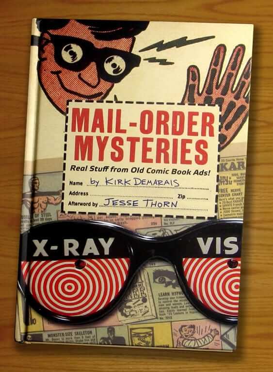

What Paul did last night: Kirk Demarais is a writer and artist who’s obsessed with the ads for novelty products that used to appear in comic books — X-ray specs, sea monkeys, dribble cups, sneeze powder, magic tricks, etc. Last night he gave a two-hour presentation on that topic at the Parsons School of Design, and I could easily have sat for another two hours — that’s how good it was. I was joined by the Tugboat Captain and our friends Jon, Karen, Shane, and Friederike, and afterward we all went out for eats and drinks at a local Spanish tavern. Such a great night that I didn’t even mind missing the Mets’ stirring late-game comeback.
I love the new color scheme for the Kings, seems more regal and classic instead of loud and out there. The logos are much cleaner than the complicated scroll/crown/ball/lances/wordmark.
With the colors, the Kings are basically telling the Rockies, “This is how you do it.”
Purple Amnesty Day should be busy this year…
Does that mean if they get stolen from the clubhouse, we need to put an APB out on Barney Rubble?
Err… brain fart. I used the wrong markup text – it was supposed to put the quote in italics, but I made it a link instead… DERP
This is what it SHOULD have been:
Just what the world has been waiting for: a team wearing Fruity Pebbles jerseys.
Tupac called it Sacktown back in “California Love”. They should have put that on the jersey.
I thought it was Sac Town.
it might be. I looked it up on a lyrics site and it was spelled Sacktown. I have no idea.
Thought it was Sac-Town, as well.
Just weighing in that I’ve also heard Sacramento referred to as Sac-town.
It is indeed known as “Sactown” to natives and locals. link..69i57j0l5.1048j0j1&sourceid=chrome&ie=UTF-8#q=sactown
I was just going to post the same thing about “California Love” and “Sactown,” and I think that actually makes this element work nicely.
I agree, although I do recall hearing catcalls when the very good Vlade / Webber teams played the La Lakers… Sac-O-tomatoes.
When I worked in the biz, PR people and reporters would refer to it as “Sac” all the time. As in, “We have a northwest road trip: Seattle, Portland, and Sac, then back home next Thursday.”
I wouldn’t have imagined you LITERALLY meant Fruity Pebbles.
I was thinking that to be a cute descriptive, like the Bucs’ Creamsicle uni.
So basically a big advertisement for the cereal. Maybe the NBA can learn something about how to put advertising on uniforms.
Rampant lions: are cool – I wouldn’t mind the Detroit Lions using one. That Sac. lion looks like a small child, mouth gaping, slapping a ball in an attempt to dribble. A little silly.
Panther logo: looks nice. I am glad they didn’t go overboard and I am a fan of simple crests. I hope they don’t use that Vegas looking gold on the uniforms.
Harper Hat: I don’t like politicians or care about these election – nonetheless, selling merch based on Harper’s clubhouse shenanigans is fun. I do not see it as political.
selling merch based on Harper’s clubhouse shenanigans is fun. I do not see it as political.
Just to be clear: I don’t see it as a political move on the Nats’ part. But the inspiration, obviously, comes from Trump’s campaign slogan (which itself is taken from an old Reagan campaign slogan, although most people aren’t aware of that).
I interpret it as a parody of the Trump slogan, and a subtle shot at the Goose Gossage’s of the world, but I could be wrong. I’m about as far politically from Trump as one could be, and I think the Harper hats are really funny.
If there is one place that is acutely aware of the Reagan slogan and that Trump’s slogan is based on it, it is DC. You can hardly walk around without tripping over something Reagan related here.
That said, I think “Make Again” is generic enough that it isn’t so linked to Trump yet. I wouldn’t buy the merch either way, but that’s because I tend not to buy stuff like that.
I didn’t think you were implying it was.
I think the lion would look much better with the ball positioned as if the lion is shooting, not dribbling.
I agree, it just looks like a cut a paste job in Microsoft Paint the way it is. Guess it would look that way if positioned as being shot as well.
agreed
Cat + Ball = Fierce
link
I am neither a Nats fan nor a Trump supporter, but I like what Bryce is saying. I love personalities in the game of baseball. I would buy the shirt.
As a Nats fan, I am able to separate Donald Trump from “Make Baseball Fun Again.” If I wanted to buy the merch, I would. But I don’t really need. …Especially since it’s basically a plain white shirt with a few red words on it. …Boring.
Can’t stand Harper, and I hate the slogan. Never connected it to Trump, anyway. Baseball already is fun, so this kind of stuff just irritates me. If you don’t think baseball is fun, find another job. [not a Nats fan, but they are the closest team to me geographically and I have been to games there to see the visiting team]
Exactly, baseball is already fun!
I’m neither a Nats fan nor a Trump supporter (the horror…), but I like these t-shirts and the sentiment. Elena, I think baseball is fun, but I hate all these crusty old jerks like Goose Gossage who think you should always abide by these unwritten rules. Should Harper pimp every home run? Probably not. But if he launches a particularly big one, or hits one off an ace like Kershaw, let the kid have some fun. It won’t ruin the game, it will just spice it up.
I’m a Nats fan, a Harper fan and decidedly NOT a Trump fan, and I never would’ve made the connection between Harper’s hat and Trump’s slogan if you hadn’t mentioned it. If I were inclined to buy over-priced t-shirts, I’d consider buying one of these just because I like Harper and the way he plays.
When I first saw the new Kings logo, it was in isolation on a white background, like it is shown at the top of the page, and I thought the top off the crown looked really weird. It doesn’t look like mountains, it looks like slanted rectangles. But then I saw it in the image where it is placed over the picture of the jersey. With the white outline on a dark background, all of a sudden the mountains become clear. I think the outline is really critical to how the logo reads.
Interesting point. Here’s a note from the team’s style guide:
link
Are they supposed to be mountains though? Their arrangement on the logo was exactly the same going back to when the team was in Kansas City and Cincinnati (not exactly the most mountainous regions). If they are actually mountains, it’s nothing specific to that area of California, which makes that part of the logo all the more awkward to me.
In all likelihood, it’s just a poorly rendered crown.
Maybe they weren’t originally supposed to be mountains, but really, what makes an abstract shape representative of something? Somebody simply thinking they look like mountains and understanding the connection to Northern California, the fact that they’re purple mountains (not only a team color but a widely known American song lyric that happens to work perfectly with the Kings’ name), etc. The artist doesn’t need to intend for them to represent mountains if enough people understand them to be. Sometimes things just work out.
I thought the same thing. In isolation it looked like a slanted skyline, not mountains, and looked really awkward. Looks better with the white outline.
I see mountains. Without associating it with KC or Cincinnati, I’ve always thought the crown was cleverly designed to look like mountains. This made sense to me, because when you drive to Tahoe, from the Bay Area, you drive through Sacramento. There’s even a road through the Sierra Nevadas called King’s Grade. Additionally, the King’s had/have a huge fanbase in the Tahoe/Reno area (they were definitely the number one team before Currymania.)
The font of “SACRAMENTO” is only similar (not the same) as “KINGS” OR “SAC” .
It’s the same. They’ve just removed some of the details because the type is smaller.
Like I said….. not the same.
We do call it Sactown. The SB Nation site for the Kings is Sactown Royalty. There is also a Sactown magazine. When we refer to an area we say ‘East Sac, South Sac’, etc. I also wish they weren’t so literal in copying the old Kansas City Kings crown. Those wide negative spaces freak me out. Since it came from KC I doubt they’re supposed to be mountains. Overall it’s quite an improvement though.
Ah, I didn’t realize the old logo went back to Kansas City. But since it’s in Sacramento now, they COULD be mountains.
The old Crown/Ball logo went back to Cincinnati.
We use Sactown way more than Sac. I would have preferred “Sactown” on the jerseys.
And the Sacramento Rivercats have recently embraced “Sactown” and “Sac” for some of their merchandise and alternate jerseys.
Jersey
link
Hat
link
Of course the Sacramento lions resemble lots of other lions including the Premier League and Lowenbrau. They’re the Kings and they’re going for an heraldic lion.
What’s wrong with the crown on the primary logo? I thought it was supposed to be a crown that also incorporates points of mountains. I don’t see “an arrow pointing down and to the left, the Titanic sinking, and a collapsing building.”
Regarding the Kings:
I think there are too many logos. I know it’s the norm to have several, but there really should be only two at most. Honestly, how often would one use just the crown or the lion rampant on something? if it is done, it’s not going to be instantly recognizable, so to me those are a waste
Speaking of the lion rampant, it’s the worst of the bunch. As stated by others, it’s very static and stylistically it looks pasted together. There are a lot of minor executional flaws across the collection, and simple, geometric logos like these magnify those flaws.
The type is pretty nice. The kerning needs work, though, and there are a few character width issues that could have been dealt with a little better if you ask me.
Overall, nice work. One of the best in the league.
Paul: Any update on the next t-shirt release date or mock up? Thanks!
Soon.
I’m still calling it Locash.
Not to be too crude… but that is clearly an icon of a “Ball Sac”
To “celebrate” the unveiling of the GB uniforms for the Rio Olympics, the BBC Sports website is asking the public to showcase some truly awful uniforms, with an emphasis in soccer and rugby. The shirts are mixed in with a lot of other sports news, but it’s worth scrolling through to see how terrible some of them look – link
I don’t get the hate for that brown Coventry kit from the ’70s, but then I would have to know something about the team. In a vacuum, they’re fine.
I think the main issue is with the color. Brown is a very unusual color in soccer (I think St. Pauli in Germany is perhaps the only major club to use it as a color).
#MakeSoccerBrownAgain
Obligatory:
link.JPG
And for sheer badass-ery, this may take the cake:
link
Grrr.
link
That’s not brown on the Philadelphia Union jersey; it’s supposed to be old gold (or whatever color passes for it in the Adidas catalog)
I would have to agree with DJ. I can’t think of another case of a British team wearing brown like that.
Wait a minute – is there anyone, anywhere, who thinks pants are NOT part of the uniform? Seriously?
Well, apparently the University of Arizona. I also caught a softball game between Tennessee and Oklahoma this Saturday where a few of the Vols had orange trim on the trousers and the others went plain white. There are some here among us who see the pants as a neighborhood play. Though cost may figure into it, I disapprove.
When I was little, I remember it was always a big deal when we played a team where they actually wore uniform pants (as opposed to the jeans we played in) because none of us could actually afford the pants. I also remember the first time we played on a field that wasn’t dirt all the way to the outfield. Sliding on the same field they had a tractor pull on the week before was always interesting.
The Sac Kings redesign looks like an alternate universe 1990’s LA Kings redesign, right down to the colors and crowns. Just switch the basketballs out with pucks.
Also, in one of that third Pirates pic…that’s a mustard-colored, stripeless pillbox cap, inn’it? I don’t think I’ve ever seen one of those before!
Interesting to see that UNC’s softball team has big inseam stripe panels (from Elena Elms).
One could see the inseam as an overlooked space, but I get the vibe teams aren’t all that keen on drawing attention to the crotch.
The Pirates not having permanent numbers assigned in spring training back then is just bizarre.
I get the feeling they were made to share one uniform! All the yellows are #16.
Those were most likely samples that they used for photo shoots. Note that the other players in the action shots are wearing the ’76 unis.
I have a mental picture of Tampa Bay road uniforms, and think that’s probably a bad idea. There’s a straight-across Tampa Bay wordmark which follows an unsavory trend toward jersey lettering that doesn’t arch. Bleah! A better option would be the “TB” monogram a la the Giants.
Hmm, yeah, a straight-across treatment like the home jersey would be something of a nightmare. But team history has a couple of promising treatments to draw on: the stacked upward-tilt of the original unis, and the arched treatment of 2001-2007. And the latter road uni was paired with a home jersey that had Rays straight across the front like the current unis.
Best-ever Rays’ grey jersey is the 2001 version with the drop shadow. Something imitative of that design would be splendid.
How about a road jersey with St. Petersburg? I know some minor league teams have used their actual location on jerseys, even when not in their formal name, such as North Little Rock on Arkansas Travelers jerseys and New Britain on Hardware City Rock Cats jerseys.
Hah, I like everything about the new logo, the colors, the imagery, EXCEPT the typography.
The first thing that came to mind when I saw the points on the crown was ‘mountains’. While the angle on the old logo was less than 90, this nearly right angle (maybe exactly right angle) on the new crown does elicit a more mountainous feel.
And I agree with those who’ve commented about the ‘lion rampant’ and it’s connection to royalty and heraldry. I wonder if there was a discussion whether or not to give it a tongue like those seen in a Google image search.
Don’t know if this was covered above, but I get the lion reference in the logo. Lions are the kings of the jungle. And I think purple is the color associated with royalty.
I’m not a huge fan of purple, either. But I think it works in that context.
Not sure if this has been mentioned, but it looks like the crown logo sits above the “SAC” wordmark on that new jersey.
It was also on Conray Burry’s mockup of that pride jersey over at Creamer’s but supposedly it’s not on the other three jerseys.
I could be wrong but in the third pirates picture, doesn’t Tanner’s hat look like a pill box in the old color without the 3 stripes?
Yes it is Jason. The Pirates had some of those stripe-less mustard pillbox hats produced before the 1976 regular season, but wisely added the stripes just in time. The hat in the picture you mentioned must have been a leftover from spring training 1976.
The Kings’ new primary logo is beautiful. I am pleased to see another team returning to a more appropriate logo from its history, following the lead of the Sixers and the Jazz, not to mention the Blue Jays, Orioles, Astros, and Brewers. It shows that good taste has not gone extinct in this Oregon-Duckified world.
I hope that this encouraging trend continues, and that the Nets will eventually decide to follow it.
The alternate logos are superb, as well. They are so good that they could appear on the crest of an English football team. Very, very well done.
But the idea of “Sac” on the jerseys is pretty weird. The name “Sacramento” is a little too long to comfortably fit on a jersey. (The team has recently had jerseys that prove this.) So, the solution should be to have “Kings” on both the home and road jerseys.
“Sac” is very bad, if only for the easy mockery that it promotes: “Sac of sh–“, “ball Sac”.
Agreed. SAC is way to close to a word that rhymes with duck but begins with the letter s. I thought SAC was a misspelling…
One of the few things I liked about the old identity was the “Sacramento” wordmark.
That wordmark was OK link, but it was unreadable link.
I’m not a huge basketball fan, but when I saw the alternate Kings logos, the first thing I thought was, “The lion is double-dribbling – isn’t that a no-no?”
The Pac-Man thing with the Hawks and Kings logos is classic.
I like the Kings’ new logos. Granted, I also the lion imagery might work for the LA Kings, too.
I don’t like new logo. It is not eye catching.
I’ve seen multiple stories about how the Heat actually designed the new Clippers logo. Interesting.
Who’s 1b for the Kings?
Hopefully the rest of the numbers look good. If so, then I won’t complain. Everything else about the new look is mighty fine with me.
Did you just ask who’s on first?
;)
Ha! That hadn’t occurred to me.
I was also thinking it looked like the abbreviation for “pound”
Dr. Who’s on first.
link
I like the basketball/crown logo and the lion head profile.
‘Sac’ is used by Northern Californians and those hailing from the state capital as a nickname for ‘Sacramento,’ but I don’t like it used in a logo or on the jersey. Then again, maybe that’s why I don’t like basketball that much.
I don’t really care what the logo or color scheme looks like. It is results on the court, and behaviour off the court that matter to me. The rest is for the marketing folks.
Nothing wrong with that point of view, Robert. But I think you’ve come to the wrong website.
This reminds me of how taken aback I was when someone said, “So what you’re saying is, you watch sports just for the uniforms?” Don’t they have websites where people can talk about sports for, y’know, the actual competition?
The Rays already wore 90s gradient throwbacks, in 2009 for a ’90s Night promotion: link
Also as a Northern California resident I have absolutely heard people refer to Sacramento as simply “Sac” in both verbal and written form many times.
That Panthers logo looks mighty soccerish to me.
I disagree about the width of the lines in the Kings crown… They match the thickness of the lines in the basketball. If you want to thin them both down, fine. But if the lines on the crown were thinner than the lines in the basketball, the logo would look bottom heavy and odd.
None of the new logos include black, which has been pretty heavily used by the Kings over last couple of decades. Hope they avoid using black on their new uniforms.
Thumbs up on Sacramento, hopefully they keep their uni simple and don’t water it down by having black in it.
I too thought the logo was slanted building, any chance the white outline is a very stylized s a (^) c (<); the s is there, the A and C is more dubious. So I'm probably wrong.
-I like the new logo set for the Kings.
-I’m as far from a Trump supporter as one can get, but I like the Harper hats/tees. To me, it’s just having a bit a fun with people like Goose Goassage who insist that the game has changed for the worse (even though players who were 20 years older than Goose said the same thing in his day.)
-That new Panthers logo is so bland. Doesn’t fit at all.
I guess there’s no sense in doing something a little inclusive . . .
“The D-backs are letting their social media followers vote on which uni the team will wear this Friday. I guess fans who don’t follow the team on social media don’t matter.”
By that standard, all of the fans of every other team don’t matter to their teams either.
My point is that this is the latest in a long string of team maneuvers that give more power and privilege to a certain subset of the fan base — the subset that lives on social media, which mostly means the subset that is younger.
Is it good to involve younger fans? Sure.
But should younger fans be privileged above older ones who aren’t on social media? I don’t think so.
Younger fans’ tastes already drive uniform design thanks to merchandising. Adding uniform voting via social media further skews the balance.
A fan who isn’t on Twitter (or who doesn’t buy merch) can be just as passionate a fan as a Twitter-savvy fan. But only one of those fans is being catered to by this maneuver.
It’s one thing to use social media to engage with fans who choose to use social media; it’s another thing to use social media TO CHOOSE THE TEAM’S UNIFORM — the uniform that all the fans will have to look at, whether they live on social media or not.
I frequently can only skim the content here until later at night. I’m sure glad I returned because I just clicked thru to that story of that amazing bowling venue in LA. It might be worth the travel cost just to hit that place up.
I for one give the Kings’ new color scheme and logo a solid A.
The “Make Baseball Fun Again” hats where actually introduced by Barstool Sports. The guy who runs the blog “El Presidente” told a story about how the Nationals called them to order a bunch of them at wholesale. Since he was a Bryce fan he gave them to the team for free and was surprised to see them for sale by the club. Thought they would just give them to the players so the website could get some free advertising.
Funny story about those hats from at the Washington Nationals store.
link
BTW, did anybody else notice in the background of the “UNC player getting a head scan” twitter picture the large number of non-UNC college helmets on a shelf in the background?
At first I assumed that meant the photo was not taken in Chapel Hill but rather at Nike HQ (or the HQ of whomever makes the teams’ helmets), but then it occurred to me that there is no way they’d fly the entire team to Oregon (or elsewhere) instead of bringing in somebody to do the scans.
Anybody have any idea then why UNC would have a large collection of opponent’s helmets just sitting around?
Not uncommon for teams to swap helmets, or for teams to display the helmets of the schools they’ve defeated.
Makes sense, thanks. Although from the photo, these helmets are not exactly on display, but rather just kind of in storage.
Although I was able to identify helmets from Utah, LSU, and Texas, and as a UNC grad and fan I pay pretty close attention to our football program and I don’t recall UNC beating any of those schools in recent years.
I am proud that UNC has taken the lead in utilizing technology to make the game safer. I believe the Heels were among the first teams to put sensors in the helmets to measure the force of impact absorbed during games.
Now, if we could only get a fair shake from the officials (and yes, I am talking about that phantom “offsides” call during the onside kick versus Clemson during the ACC title game).
Am I the only one who is bothered by the relative height of the points on the crown?
For the non-outlined version (when on white background), the three middle points are slightly higher than the two outer points. I think this looks fine.
However, with the outlined version, because of the thickness of the white outline, the two outer points are higher than the middle points. I feel like it throws off the overall aesthetic of the main logo.
Maybe this is pretty nit-picky, but it really bugs me.
I’m an outsider who lived in Sacramento briefly, and I heard plenty of locals referring to the city as “Sac town” “Downtown Sac” etc. It was more common to call the western suburb “West Sac” though. I have a feeling the jerseys with just SAC on them will be very very popular to locals.
I was pretty apathetic about the new Panther’s logo but the fact that they were originally going for the cliched and dumb “aggressive animal”-style logo and moved away from that to something a little more restrained raises it several notches in my estimation
At least a Panther is a dangerous animal, but I’m mighty tired of pissed-off looking ducks or beavers or wombats or whatever in sports logos
It DOES look like Pac-man chasing a ghost! (Purple Inky?) It works, too, with their old logos!
link