A few Fridays ago I wrote a piece about NC State basketball’s infamous 1989 unitards, which were worn for two days before being scrapped. Toward the end of that piece, I wrote, “[T]he NC State unitard never caught on with other schools.”
But it turns out I was wrong.
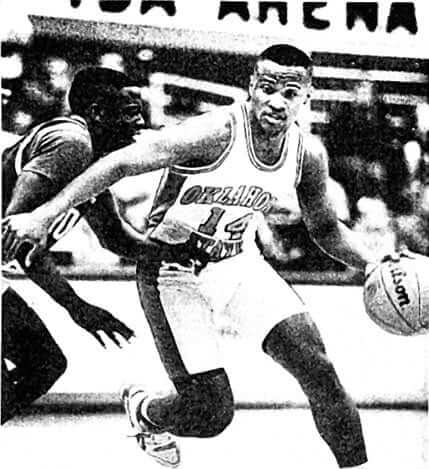
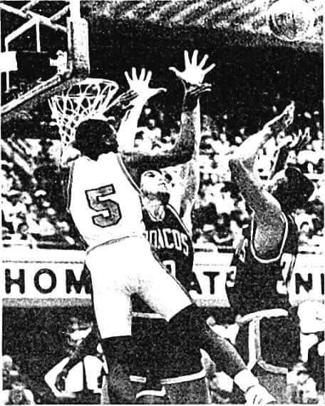
Shortly after that piece ran, reader Brad Hardy got in touch to tell me that Oklahoma State had also worn unitards in 1989. Frankly, I was skeptical — I’d never heard or seen anything about that, and it had never come up during any of my previous discussions of the NC State design. I asked Brad if he had any photos, figuring he probably couldn’t come up with any.
Shows what I know:


The image quality isn’t great, obviously, but the shots definitely appear to show Oklahoma State wearing a unitard very similar to NC State’s (and without the fig-leaf shorts that the Wolfpack had resorted to!). Brad said the shots were from a 1989 NIT game against Boise State. Several people on Twitter backed up his account; some claimed that they actually attended the game.
I contacted the OSU media relations folks and asked if they had any additional photos or info. After combing through their archives for the better part of a week, they said they’d come up empty, which isn’t so surprising when you consider we’re talking about a single game from more than a quarter-century ago. I also contacted Boise State — no word back from them yet, but I’d say it’s highly unlikely they’ll have anything, especially since they lost that game.
And there’s more — or at least there might be. On the day that my ESPN piece about the NC State unitards ran, reader Dave R. posted the following comment here on this site:
I want to say that three other Nike schools were given the singlets to try that season, one of which was Iowa. Like the Wolfpack, the Hawkeyes wore regular game shorts with them. Also want to say that at least one school changed their mind before gametime and didn’t wear [the singlets] at all. Don’t remember the other schools, though.
Again, this was all news to me, so I contacted the folks at Iowa. The response: “Our equipment manager for basketball, who was here at the time, says Iowa did not wear a unitard.”
So for now, Oklahoma State is the only school we can add to the unitard roster. If anyone has better photos from That OSU/Boise State game, and/or if you have information on any other school having worn the unitards, you know what to do. Thanks.

Big mystery news: An MLB team is going to make history today by doing something with its uniform program that no other team has ever done. It’s a fairly small thing — small enough so that people who don’t care about uniforms will probably say, “Who cares?” But for those of us who Get Itâ„¢, it’s a very interesting move.
I have an exclusive on this story, with good background info from the team and the vendor/supplier on the project. Here it is, with additional info to follow on the blog tomorrow.
Never too old: The Granny Basketball League has occasionally come up here on Uni Watch. The video shown above provides a good look at the sport, including its impressively uniform uniforms. Further info and photos in this article, which ran over the weekend.
(My thanks to Patrick Chippeaux for this one.)

Click to enlarge
Collector’s Corner
By Brinke Guthrie
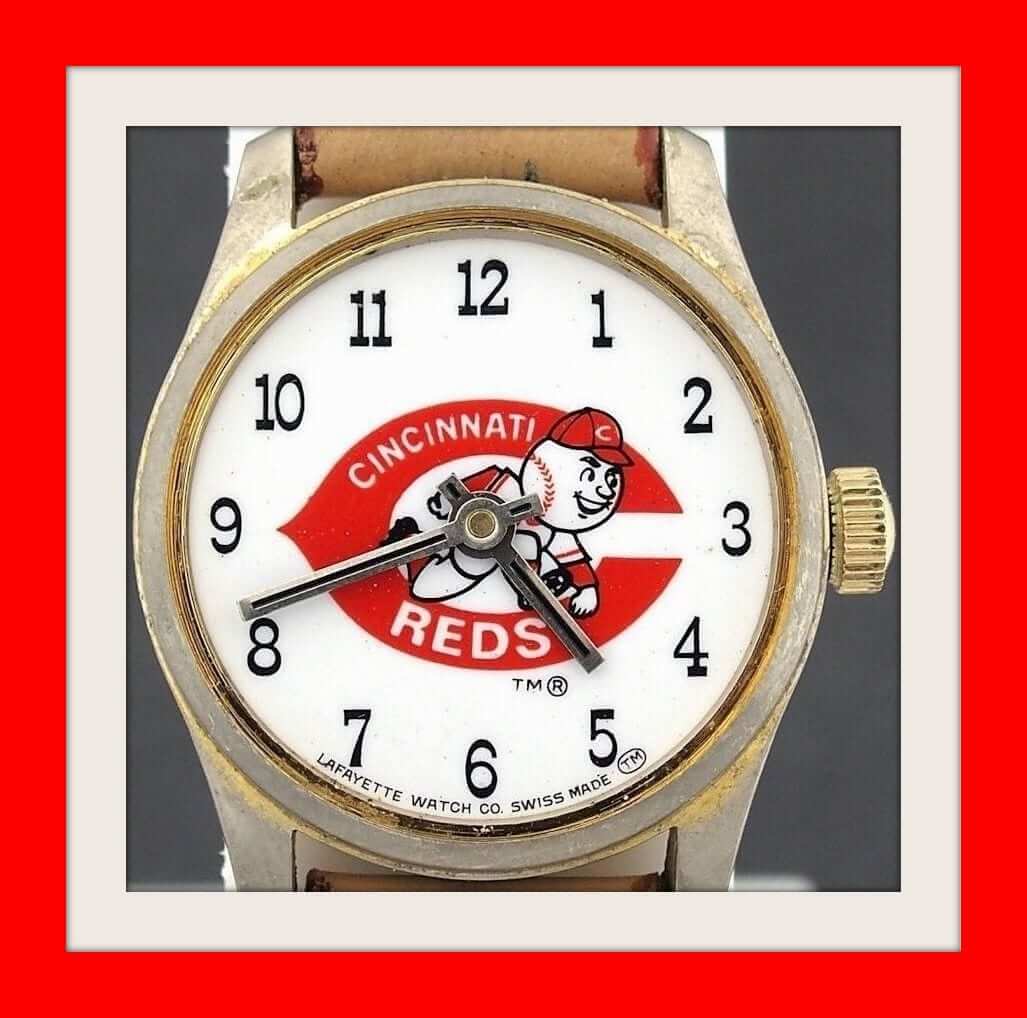
Reds fans! Do you know what time it is? If you have this 1970s Reds watch by the Lafayette Watch Company, you surely will! The ad says the crystal is in good condition. Speaking of time, did anyone else have one of these Team-Mate Alarm Clocks by Westclox? I had a Reds one and surely wish I still had it now.
Now for the rest of the week:
• Fan the (Atlanta) Flames with this 1976-77 bumper sticker c/o Days Inn.
• Check out these 1970s NBA-branded high-tops. Sure look like Chucks, don’t they?
• Seems like this 1970s Buffalo Bills belt buckle would be pretty hefty around your waist, would it not?
• Here’s a set of American League pennants from the 1970s ”” 12 teams included. You can “String ’Em Up,” too.
• Here’s a similar item, a “National League Sports Series Decal Sheet” for “Easy-On decoration.” Note that it lets you know about “Strategic decorating points.”
• Here’s a 1970s Vikings stocking cap and scarf set. Judging from the helmet on the left (pointing to the left, a rare thing), I think that one at least is from Sears.
• Nice cover art on this book about Joe Willie and the Super Bowl III Jets: Count-down to the Super Bowl.
• The listing for this set of NFL Marbles says it’s from the 1970s but it has to be from ’80s due to the Bengals helmet.
• Dust off your turntable and drop the needle on this three-album Miami Dolphins set. Included are “The Dynamic Young Dolphins” and how-to LPs by Griese and Warfield.
• I don’t think this Packers “Gang Green” shirt was licensed. And I thought “Gang Green” referred to the Jets. Or wait, was it the
Eagles? [Green is clearly a fickle hue. ”” PL]
• Did your 1970s sets of NFL electric football players from Tudor come in this nifty little box with terrific graphics? Not me, mine were in a plastic bag in a plain box. And I even remember the address: 176 Johnson Street, Brooklyn.
The Ticker
By Mike Chamernik

Baseball News: Paul noted last week that the Braves made an unannounced change to their home jersey. They did the same for their road grays. As you can see, the “A” in particular is a little less pronounced. A few people sent that in, but Robert Kittle also included this note: “I’m pretty sure the Braves are the only Major League team with piping on the belt loop. The new MLB logo looks extra terrible squished in between the piping.” … Yesterday, all umpires wore “EA” patches in honor of Emmett Ashford, the first African-American MLB ump. He made his MLB debut 50 years ago (from Phil). … Orioles 3B Manny Machado’s baggy pajama pants earned him a HBP yesterday. … Fans can see the reverse green side of the Wrigley Field marquee (from Bob Gassel). … Also for the Cubs, they put some classic old logos on a brick wall near the bleachers (from Zach Pearson) … And, the Cubs flew an Ohio flag outside of Wrigley Field yesterday. The Reds were in town (from Dan Pfeifer). … The Cardinals’ scorecards have featured retro cartoon artwork for the last several years. Here’s what they had yesterday for the home opener (from @GMMohr). … A few readers sent in this story on the history of Mississippi State’s uniforms. The article includes the original sketches of the unis from 30 years ago. … The A’s flew back to Oakland from Seattle in a Giants-branded plane (from Brinke). … Paul reported last week that personal logos on bat knob decals are now verboten, but that didn’t stop Bryce Harper from putting “100” emoji decals on his bat knob. Guess he’s testing the limits of the rule (from Brinke). … Also regarding Bryce, he stole a bag yesterday with his batting gloves in his mouth. … Here’s a good piece on the Rangers’ emergency tailor, Aman Li. The Rangers go to him when a player is acquired in a trade or called up to the majors, and Li can sew a name and number on a jersey in under an hour (from Phil). … Eric Juergens found a green-and-black Red Sox jersey. It’s part of the baffling True Fan series. … The Binghamton Mets will wear heartbeat line jerseys for American Heart Night in late May. … Abilene Christian softball will wear throwback jerseys today (from Chris Mycoskie). … Our guy Wafflebored made a neat art deco baseball jersey. …Steve Flack‘s dad recently got a 1939 booklet about baseball’s centennial. It includes a two page spread on the history of baseball uniforms. … A Toronto artist redesigned the Blue Jays logo as a raccoon. ”¦ The Astros are keeping things looseby wearing football helmets during interviews. Isn’t that what Ricky Williams used to do? (From Chris Flinn and Phil.) … A team in Italy will wear Charlie Brown jerseys this year.

NFL News: Bears QB Mike Phipps wore a running back-style facemask in the late 1970s. Neither Peter Fredrickson nor I have seen that before. Through an image search, I found that Phipps typically wore conventional facemasks, but he did wear one with a center vertical bar at least in one other game. … Notre Dame prospects Ronnie Stanley and Jaylon Smith have their pictures in the linings of their jackets for the NFL Draft (from Andrew Cosentino). ”¦ Here’s what might be the earliest rendition ofthe Buccaneers’ creamsicle uniform (from John Turney).

Hockey News: The Penguins will wear their throwback alternate for every home game during the postseason. This is just fueling the rumors that the Penguins will ditch Vegas Gold in favor of the yellower Pittsburgh Gold (from John Muir and Ryan Zundell). … The Flyers will wear a memorial patch for Ed Snider, the team’s co-founder who died on Monday. … Brian Codagnone found a photo of North Stars center Bill Masterton from very early in the franchise’s history. “The crest isn’t even sewn on,” he says. “Must have been an early prototype.” … In February, Oregon’s club hockey team unveiled new uniforms. Here’s more information on Rebirth Sports, the company that outfits them and other America Club Hockey Association teams (from Steve Ceruolo).

NBA News: Here’s how the Bucks equipment manager lays out the key with athletic tape for walk-throughs at the hotel for road games (from Phil). … Someone named the five worst uniforms of the 1990s (from Phil). … After the league intervened in March, Cavs PG Matthew Dellavedova stopped wearing a biometric wristband. Now the device’s manufacturer, Whoop, is meeting with the NBA players’ union in an effort to legalize biotrackers. They are currently prohibited during games, but players can wear them in practices and shootarounds (from Brinke). … Raptors PG Cory Joseph has been wearing a mask.

Soccer News: Check out all the shirts Sporting Kansas City has worn over the last 20 years. I’m not a big soccer guy, so I was surprised the club had a technicolor motif early on (from Keenan Soto).

Grab Bag: Here’s the 15 best club rugby shirts of the 1990s (from Josh Gardner). … Dixie State University will now be known as the Trailblazers (from @BYUAllBlue). … A new book will show the history of cycling jerseys. It comes out in May (from Craig Ackers). … Whitman College, a school in Washington State, will no longer be known as the Fighting Missionaries (from Mike Weston). … Guns N’ Roses is bringing back its bullet logo. ”¦ The National Weather Servicewill stop screaming at us in all caps (from Ted Anthony).

Click to enlarge

What Paul did last night: If you’ve been a fan of a certain strain of indie-rock over the past 20-odd years, you’re probably familiar with Chris Brokaw and/or Geoff Farina from their various bands and solo projects. They have a new record and are promoting it by doing a tour of shows in people’s living rooms, and last night that tour came to my friend Liz’s house. So a few dozen of us paid $20 apiece to pile into Liz’s living room and watch them play. They were really, really good.
You might say, “Twenty bucks to sit in a cramped living room in Bed-Stuy? That’s nuts!,” and you’d be right. But I might then counter with, “I got to see two professional musicians in the most intimate setting imaginable, which was really special,” and I’d be right too. (Also, the Mets were getting slaughtered, so it’s just as well that I was doing something else.) An excellent evening.
I’d hope you would reconsider calling Ed Snider the Flyers’ co-founder. While that may be correct on a technicality – he was the sole driving force behind bring the franchise to life.
Call him the founder.
Heart, soul, founder. Best owner in Philadelphia history.
If TohKay were to do living room shows, I’d pay much more than $20.
I’m not a big soccer guy, so I was surprised the club had a technicolor motif early on.
Of course. “Wiz” was short for “wizards.” As in Wizard of Oz….over the rainbow…
As in “I’ve a feeling we’re not in Kansas anymore.”
One could argue that the Wizards didn’t have the worst uniform during the first MLS season. There were a lot of ugly uniforms in the early years.
Oh wow… I missed that completely. Never in a million years would have linked rainbows to Wizards – even in Kansas, much less Missouri. Is that a state rivalry thing where Missouri tried to rip off Kansas?
That Baseball Centennial spread is a nice encapsulation of baseball’s 1939 celebration: Fun, but complete hokum. I’m not aware of any evidence that anyone played baseball in anything like a uniform in 1839, or even prior to the 1850s. And pitchers certainly did not use an overhand motion as depicted in the 1839 illo. The earliest record of knickers and stockings that I’m aware of is from 1869, though I believe I’ve read arguments from circumstantial evidence that sox may have appeared in 1868. In either case, not in 1864, when anyway most young men in the nation were otherwise occupied. And pitching was still underhand through the 1860s. For the 1914 illo, only one team in pro ball was still wearing pillbox hats (the Philadelphia Athletics).
On the other hand, it’s interesting to see that there was some awareness of and interest in baseball uni history in the 1930s. The unis depicted in the spread are reasonable representations, even if nobody seems to have known quite which decade a given style came from. People in 1938 were saying, “Hey, remember when baseball players used to wear those funny flat-top caps?” and others were replying, “Sure – that was before the Great War, right?”
That was a YUUUUUGE war. Tremendous war.
That’s exactly what I thought when I flipped through the book. The whole pamphlet is filled with wacky things like that. I was just surprised that people were into this stuff in 1939.
Santa Claus, Easter Bunny, Tooth Fairy, Cooperstown…it’s all good!
RE: Vikings cap/scarf…
I received a Redskins cap with no logo (like the Vikings scarf) when I was a kid.
Even then I was like “WTH??” I guess I was “getting it” even as a youngster.
i know dan fouts wore a mask with a vertical bar like that the game after he broke his nose, because i watched it on tv, but i can’t find any pictures. i remember thinking how strange it looked on him, and wondered how much the bar in front of his eyes affected his vision.
“Five worst 90s uniforms” and nothing about the teal-mobile Pistons?
Re: The Ohio flag at Wrigley, to my recollection the Cubs have traditionally flown the visiting team’s city flag next to the marquee. Maybe they also do the state flag too (blocked in the picture?) I can’t remember specifically right now. Or maybe they couldn’t find/didn’t have their Cincinnati flag and flew the Ohio instead?
“I have an exclusive on this story, with good background info from the team and the vendor/supplier on the project.”
There goes my afternoon! I’m intrigued.
link
Paul you failed to mention/notice that the extra “l” is also missing from the new Phillies script. Previous seasons, when players had their jerseys unbuttoned, it gave the illusion of three “ls” on the jersey.
PUCKBOY
I actually *did* mention that in a follow-up item in the Ticker the next day (or maybe the day after that, I forget).
Right near the bottom of the Baseball section on link, to be precise.
For UniWatch readers’ edification:
link
Already covered on Uni Watch days ago…
Mike Phipps switched facemasks after his nose was broken. A lineman swiped him going for a tackle (defensive linemen in the Bear’s backfield was a common occurrence at the time). He used the facemask with the full center bar to provide a bit more protection. It is interesting because the modern day protection against this for QB’s is a clear eye shield. The technology was not developed yet.
Actually, I believe Ken Anderson of the Bengals tried to introduce a motorcycle type of helmet that feaured a clear face shield.
So Dixie College no longer Rebels…
I’d never heard of Dixie State University. Now after checking out the attached article and photo gallery, I’m kinda wishing that was still the case…
link
I am predicting that the diamondbacks will wear their gray tops with their white pants and somehow in the days of alt jerseys with white pants, we’ve never had a gray jersey with white pants….
My guess is the Dodgers. The only team to not have played a home opener yet, with a scheduled game time of 4:10 (eastern).
Maybe Vin Scully related?
A sleeve patch embedded with one of those motion-sensing computer chips they use in “talking” greeting cards that plays Vin shouting “And she. Is. Gone!” when the wearer pumps his arm like Kirk Gibson?
The “earliest rendition of the Bucs’ creamsicle uniform” reminds me of the World Football League’s Southern California Sun (that team used orange and purple in its unis). It certainly looks better than anything the Sun did wear during the WFL’s short existence.
My old folk singer friend Brian Cutean played a “house concert” at a couple’s place in Wicker Park. Totally fun. I even found a parking space. If the performer has a bit of a following/e-mail list, they can (hopefully) make a few dollars. Eventually the neighbors put the kibosh on such endeavors, but folks willing to produce living room concerts can get a few in before that.
At least the five worst uniforms of the 90s didn’t have sleeves.
Was the University of Evansville Aces still wearing their sleeved jerseys in the 90’s? I think early on they were.
There is so much to love about this Swamp Dragons story.
Has anyone reached out to ESPN for a 30 on 30 Episode on the Swamp Dragons? This is beyond spectacular in so many goofy over the top ways. And now the video game version… Paul Lukas as Ken Burns…
link
link
It really is a tremendous story. Wish it had been mine!
Normally best/worst lists make me mad, but that worst of the 90s was pretty spot on. Maybe should have found a way to get the Pistons on but otherwise good job.
Re: Brinke’s memories of his electric football playin’ youth – not sure if this is common knowledge among the cognoscenti, but 176 Johnson St. in Brooklyn, the former home of Tudor Metal Products, is now link.
Today’s EPSN column, about something unprecedented in MLB uniform history, is up:
link
3-D printing seems like a very LA thing for the Dodgers to do. Would make cultural sense in Seattle, too, but probably works better with the simpler Dodgers logo. I’ll be rooting for the new helmet logos to work and not chip or fall off all the time.
Except the 3D printing was done by the vendor in Florida. And the vendor didn’t do it himself — he had to outsource it to a local company.
Dodgers did not specifically request 3D printing — they simple requested a raised logo. 3D printing turned out to be the solution the vendor came up with.
The raised logo is interesting, but it seems to me that the serifs would be vulnerable to chipping I wonder if a simpler logo (say, the Reds’) would be more durable.
Now the whole NL West has link, er matte helmets.
The LA monogram pops off the helmet. Looks very nice.
Curious to see how the lids look during a night game under the lights.
Quick thought about the Penguins wearing “Pittsburgh Gold” at home: Marc-Andre Fleury used to wear yellow pads back when he entered the league in 2003, but changed after 2005 or so because he was told that the yellow pads made it easier to pick out their position, and by association, where not to shoot. He switched to white pads under the assumption that they were less distinct, and he continues to wear white pads to this day, except with the current alternate (now playoff) jerseys, because they go well with the color scheme. Will Fleury continue to wear yellow pads at home (as he’s done during the regular season with this jersey)? And if so, does that give the Penguins a disadvantage, however slight, due directly to the uniform choices of the team/Fleury?
The Royals received permission to wear the gold trimmed uniforms for Friday home games for the rest of the season. And Phil’s tweet made the article in the KC Star.
link
I am not a D’Backs fan but I must say those charcoal grey roads look pretty sharp!
Re: Oregon Ducks hockey jerseys…..ACHA….American Collegiate Hockey Association not American Club as stated in the article
Very cool 3D printed Dodgers decals! A next logical step is to give all the MLB logos that appear on helmets a similar puffy feel that we already see on the field caps.
Ugh, no. All the puffy effect does is mimic an embroidered profile without offering the jewel-like quality of thread. Blocky is good; it’s plastic and crisp, like the helmet to which it is fastened.
I offer no judgment. I plead indifference. But I am a Uni Watcher who could tell the difference, and I recognize the monkey see monkey do ethos in sports, so I predict that it will happen.
The new matte helmets for the Dodgers didn’t affect my enjoyment of watching the game one way or another, though I think glossy helmets look a little better under the California sunshine.
Haven’t the Cubs had a 3D logo on their helmets for decades?
yes, I realize the Cubs were mentioned in the article, but I’m just saying that calling the 3D logo something unprecedented is a bit of a stretch.
It’s not a stretch at all. How many teams have had a plastic 3D-printed helmet logo? Zero. How many teams have had a helmet logo that projects off of the helmet as far as this one does? Zero.
I don’t think it’s like the Cubs logo at all. From a distance the Cubs logo just looks like a flat decal — you can’t tell the diff. Not the case with this new Dodgers logo.
3D, yes. Well, kind of. 3D printed, no. It’s an adhesive embroidered patch, as mentioned in Paul’s article. link
As for if they’ve worn it for decades, I have no idea when it started.
Those picture of Mike Phipps in the 70’s with the Browns (got to see him in a game at the Mistake by the Lake in 1974) tells me how big a mistake the Browns have made in their recent uniform decisions.
LOVE, LOVE, LOVE the Bears uniforms in that video clip. The all whites and a gray facemask on the helmet. Sweet!
Am I losing it, or is that Vin Scully calling that Bears/Eagles game? it sure sounds like him!
Buffalo Bulls announce that trying to become the New York Bulls was a bad idea.
link With the link this time.
The other team wearing unitard basketball uniforms that year was Seton Hall University. I’ll do some digging.
Apparently, UNLV and Iowa were in on this as well, per this article:
link