Click to enlarge
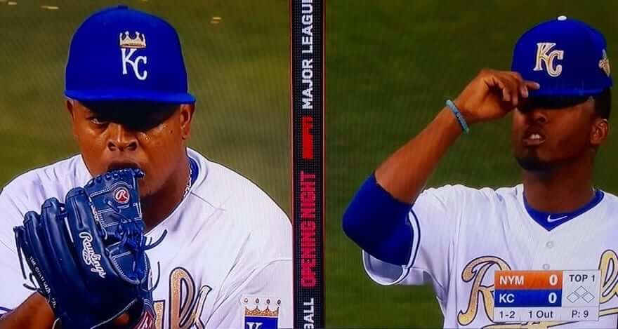
Funny development in last night’s Mets/Royals season opener, as Royals starter Edinson Volquez began the game wearing the wrong cap! As you can see above, everyone else was wearing the gold “KC” caps, but Volquez wore the team’s spring training cap — the one with the crown. He had already worn it while warming up and while coming in from the bullpen, leading to a flurry of emails and tweets sent my way. Everyone was waiting to see if he’d still have it on when the game started, and he did.
After ESPN mentioned the cap snafu on the air during the top of the 1st, someone told Volquez about it between innings. He came out for the 2nd inning wearing the proper game cap, so it was just a one-inning glitch.
In the postgame presser, Volquez said he just grabbed the wrong cap and that he had no idea until someone told him in between innings:
In a surreal development, a big Royals fan named Jeremy Scheuch tweeted during the 6th inning that he had purchased the game-used 1st inning cap, which he said had been put up for sale by the Royals in their stadium shop soon after being taken out of the game. I actually snagged an exclusive interview with Jeremy after the game and will have a story on that soon — either today on ESPN or tomorrow here. Stay tuned.
Personally, I love the crown design (it’s easily the best of the spring caps) and wish the Royals had gone with that instead of the gold “KC” for the first two games — it has much more of a championship feel, and it’s just a great-looking cap.
As for the rest of the Royals’ look: I’m generally not a fan of the gold-trimmed unis worn by World Series champs (or, more specifically, I’m not a fan of how they’ve now become a rote, annual thing, which ruins any sense of suspense of “special”-ness), but this is one of the best-looking versions we’ve seen. Gold is already a Royals team color, so it totally works. I especially liked the gold numbers on the back (click to enlarge):
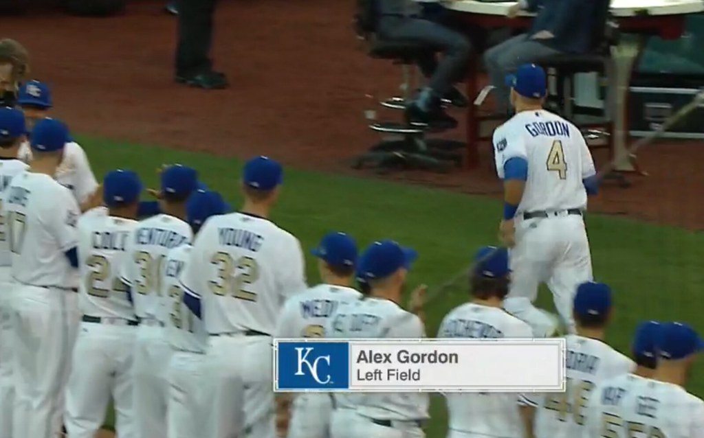
But Twitter-er @MetsFanVI brought up a good point about the gold “KC” cap: Shouldn’t the squatchee be gold, instead of white?
Royals catcher Salvador Perez got into the act by having gold kneecaps on his blue shinguards.
And then there were the Mets. Matt Fratboy was pitching, and they almost always wear the blue alts when he’s on the mound, so that’s what they did. Miserable to see my team opening the season wearing softball tops, but whaddaya gonna do.
Interestingly, I got close to 100 emails and tweets from people who mistakenly thought the Mets were wearing “special jerseys with silver lettering” to go with the Royals’ gold lettering — the silver medal to go with the gold medal, so to speak. A few people liked this idea, but a lot more people took the Mets to task for “celebrating second place,” or words to that effect. (Rumors that Donald Trump tweeted, “Terrible — losers shouldn’t celebrate. I like teams that win it all, OK?” are almost completely untrue.) Had to explain to everyone that it was just the standard grey lettering they’ve been using for years. Let’s hope MLB doesn’t get any ideas from that.
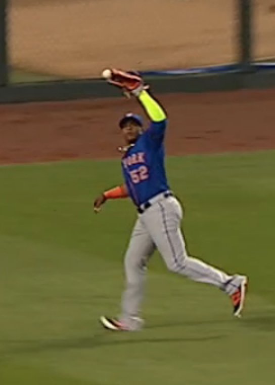
Meanwhile: Mets outfielder Yoenis Cespedes wore the same neon compression sleeve he frequently wore last year. Turns out it looks even worse when he’s dropping an easy fly ball:
One additional note from this game: When the Mets’ starting lineup was being introduced, the Kaufman Stadium ribbon boards misidentified the Mets as the Tigers.
There were two other games yesterday. Let’s start with the Blue Jays and Rays at the Trop:
• Remember last year when we noticed that Rockies SS Troy Tulowitski still had the MLB hologram decal on his belt, and then he kept on doing it after being traded to the Blue Jays? I’d forgotten all about that, but I saw part of yesterday’s Jays/Rays opener at a bar in Queens yesterday, and I immediately noticed that he still has the decal! Felt good to know my uni-watching radar was in good working order for Opening Day.
• Speaking of the Rays, disappointing to see that they opened the season in softball tops. Chris Archer sure looked good in those stirrups, though.
• Speaking of Archer, ESPN analyst Curt Schilling had some choice words for his hair.
And now let’s look at the Cardinals and Pirates, who squared off in Pittsburgh:
• The Pirates have those new 1979 throwbacks for Sunday home games, but they wore their standard home whites for yesterday’s season opener. Good for them.
• Speaking of the Pirates, it looks like Starling Marte may have been wearing teammate Francisco Cervelli’s batting gloves.
• More from the Pirates: It looks like this will be a long season of intra-tream sock striping inconsistencies. Stripes are nice, but sticking to one design for the whole team would be nicer.
• About a jillion readers noticed that Cardinals catcher Yadier Molina was wearing a pom-pom hat under his catcher’s mask. Here it is from another angle.
• If you look at that last photo of Molina, you’ll see that he now has his personal logo on the collar of his chest protector. He used to have “Yadi 4.”
• And speaking of the Cards, their front uni numbers look like they’re sitting too high.
Finally, it’s worth noting that Uni Watch pastry chef Elena Elms celebrated Opening Day in her usual manner, but baking a bunch of baseball-themed cookies. “For anyone superstitious, the Mets and Marlins cookies both had the sleeve break off,” she says.
Not bad for the first day. Let’s see what MLB does for an encore.
(My thanks to everyone who sent emails and tweets regarding yesterday’s games.)
Click to enlarge
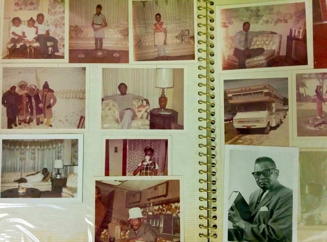
PermaRec update: A pair of photo albums (including the one shown above) salvaged from a derelict storage unit have been reunited with their rightful owner. Get the full story over on Permanent Record.
Hey, Brian Ross: Brian, if you see this note, please email me. Thanks.
Caricature T-shirt reminder: Larry Torrez’s caricature of me is now available as a T-shirt. We’re offering it in a variety of colors and styles — grey, black, white, and a white baseball shirt with green sleeves. We’ve also added women’s sizes. Further details here, or just order it here. Thanks.
The Ticker
By Paul

Baseball News: In case you missed it in yesterday’s Ticker, here’s our first good view of this year’s pandering caps for Independence Day. What a joke. … The Empire State Building observed Opening Day by lighting up each MLB team’s color scheme last night (thanks, Mike). … Nasty weather predicted for Opening Day in Cleveland today, so the Plain Dealer ran this uni-centric cartoon (from David Feigenbaum). … Nasty weather or not, the annual Opening Day protests against Chief Wahoo and the team’s name are schedule to proceed as usual. … More Cleveland news: We saw during spring training that the team’s navy socks and stirrups now come with stripes. Turns out that the stripes are also being featured on the red socks (from @Believeland1994). … Check out this pendant based on the ’69 Orioles A.L. championship ring design. Mark Notterman says he bought it off a trucker years ago, when he was working at a gas station, for about five bucks back in the ’90s. I showed the photo to Bruce Menard, our resident expert on sports jewelry, and asked if he thought the pendant was based on the ring or might actually have been part of a ring. “Tough to say,” he responded. “Teams do generally make pendants as well as rings (for wives, etc.), but I’ve seen rings cut apart to make other jewelry. Here’s a 1969 Orioles ring that was cut apart and put back together as a bracelet!” … Speaking of the Orioles, they had a last-minute uni number change yesterday (from Andrew Cosentino). … In a related item, Mets 3B coach Tim Teufel has changed his uni number from 18 to 11, which is the number he wore as a player. That number had been worn in recent seasons by SS Reuben Tejada, who was recently released. … Astros players Jose Altuve (who is rather short) and Carlos Gomez (who is not) traded pants (from Joanna Zweip). … Maryland went G.I. Joke yesterday. … The head of Papa John’s “Pizza” has his own baseball jersey (from Nick Hanson). … Here’s a pretty cool GIF showing Opening Day team logos through the years (from John Di Bari). … Here’s something I’d never noticed before: The Blue Jays’ roster on the team’s website lists the players’ birthdays in a day/month/year format (good spot by Brian Cheung). … Here’s an article on the new protective netting being added to MLB ballparks. … Here’s a good view of just how bad the Cubs’ pinstriped home jerseys look in the Flex Base format (from Jordan Cutler). … Some Royals fans explained why they wear a particular player’s jersey. … Here’s a pretty cool video of the D-backs’ grounds crew applying the Opening Day logo to the field. Interestingly, it’s not done with paint (from Matthew Crooks):
Applying the finishing touches at Chase Field for #DbacksOpeningDay.https://t.co/ZlriKN9oWl
— Arizona Diamondbacks (@Dbacks) April 4, 2016

Football News: Here’s a great find: The entire Rams/Vikings “Mud Bowl” playoff game from 1977 is available on YouTube — with Vin Scully doing the play-by-play! (Big thanks to Alan Tompas.) … Here’s a great story of a commemorative football that was signed by members of 1967 high school championship team in Pennsylvania and was later found at a yard sale and then returned to the school. Some of the players on that team still live in the area and were thrilled to see their signatures on the ball. By coincidence, longtime Ticker contributor Art Savokinas happens to be the school’s principal.

Hockey News: Oilers fans are preparing to say goodbye to Rexall Place. … The Penguins wore white at home yesterday. … In a related item, a local TV newscast mistook the Penguins for the Pitt Panthers. … The national anthem singer at that game wore a Pens jersey with a clef note instead of a uni number. … The latest ECHL team will be called the Worcester Railers (from Patrick Thomas).

NBA News: The Nets wore their grey sleeved alts yesterday. … Ditto for the Rockets. … Black sleeved alts yesterday for the Cavs. … Here are some early Magic logo concepts.

College Hoops News: No photo, but I’m told that the right side of the trophy is missing on the Final Four logo at center court. … Here’s a closer look at the Final Four patch. … A brewery in Houston has the 1971 Final Four court, from the Astrodome, in their tap room (from James Gilbert).

Soccer News: The Chicago Red Stars of the NWSL debuted their away uniform in a preseason game against Northwestern (from Saurel Jean Jr.). … 20th-anniversary warm-up shirts for the San Jose Earthquakes. … Barcelona and Atlético Madrid will wear their away kits against each other (from @YellowAwayKit).

Grab Bag: Several different U. of Kentucky caps worn in this very informative video about how to cure a country ham (from Chap Godbey). … Election poll workers in Malaysia may get new uniforms. … A website for corrections officers ran an April Fool’s story about how prisons, facing mounting budgetary squeezes, were planning to sell ads on prisoners’ uniforms. They somehow neglected to include a quote from Adam Silver (from Michael Scuillo). … Several NHRA items from David Firestone: New helmet for Courtney Force; new firesuit for Tim Wilkerson; and several drivers honored NHRA Chief Starter Mark Lyle, who died earlier this week, with memorial decals on their cars. … New logos possibly in the works for the University of Georgia. … Here’s your chance to vote for the NASCAR paint schemes of the week.
Here’s a pretty cool video of the D-backs’ grounds crew applying the Opening Day logo to the field. ”
WOW!! That is cool. All by hand. Wow!
1871 Final Four?
Fixed.
The Mud Bowl video is great. I skimmed to the start of the second half where many came out in new/clean uniforms. Some just to change their jersey. An odd sight–filthy pants; pristine jersey.
Also, great because there were ZERO graphics parked on the screen. No stats, no time, no ticker, no TV show promos. Just down and distance would pop up then go away.
That plus Scully commenting that maybe 30,000 people were in the Coliseum for the game. Times really have changed.
Soccer story in ticker should say ‘Atletico Madrid’ not ‘Madrid’.
If any team gets called just Madrid it’s Real Madrid.
OK. Done.
I’m guessing that floor is not from 1871, though I’m sure that tournament would have been a real barn burner!
Ah, I took too long to read.
Just so I contribute something worthwhile, then, let me also add my vote that the KC crown cap seemed much more appropriate for the occasion and is a pretty fine looking cap anyway. I don’t pay much attention to spring training apparel, so I hadn’t really noticed this cap before, but I would buy that if I were a KC fan.
If there’s a crown in your insignia, and gold in your color scheme, the championships are built in:)
Huh, the right side of the trophy was indeed missing from the logo Saturday night:
link
I’m surprised you didn’t catch the Women’s Final Four court floor in Indianapolis. It’s a nice design.
Wait…there’s a Women’s Final Four?
.
.
.
.
.
(kidding).
Seriously though…and I’m a guilty of this as anyone…we really don’t give much consideration to women’s sports/unis, and we should (at least to the extent that we acknowledge that [I] women play sports, sometimes as well or better than men, relatively speaking; [b] in those sports, they wear uniforms, and [iii] unfortunately, those uniforms often suck, due to a variety of reasons, none of which are the ladies’ faults).
The NCAA is trying to generate additional interest/attention this year by having a women’s basketball “festival,” i.e., they’re playing the D-II and D-III championship games on the off-day b/w the D-I semifinal and finals games (by which I mean, today).
This has resulted in the unfortunate scheduling anomaly of the D-III finalists having had to wait two weeks to play tonight’s game. Which will make it interesting to see how (if at all) the layoff affects the odd’s-on favorite, Thomas More, which is attempting to go undefeated for a second straight season. Even more intriguing is that More is led by Randy Moss’s daughter, who starred for a season at Florida before transferring there to be closer to home.
The NCAA did that with the men’s game a few years ago…
Starred for a season at Florida and then transferred to a DIII school – isn’t that usually done for reasons other than geography. . . ?
Yes, I did like that. Bricks for the brickyard. I was waiting for crowdshots to determine whether the game was in BankersLife Fieldhouse or Lucas Oil Stadium, but then I remembered which country and century I live in.
Would this country sell out Lucas Oil for the Women’s Final Four? Would any other country sell out an NBA-class arena (17,000-plus) for a top-level women’s sporting event?
Someday….the sooner the better.
Speaking of women athletes, I had never noticed before that women’s height but not weight is listed on rosters of college women sports, whereas men’s rosters have always listed height and weight. I don’t follow any women’s sports, but thought that was an interesting distinction.
That is fascinating.
Elena, how do you, as a woman, feel about that?
Off topic, but kinda like how ladies Levi’s don’t have the size on them either for all to see.
Mixed. I can understand women not wanting their weight shown to one and all, but some men may prefer that too. But it’s kinda paternalistic, protecting the delicate little women’s feelings.
I’m gonna guess that it’s at least as likely to be maternalistic. The guys who put out the men’s rosters would probably use the same format for the women if there weren’t some input.
I coach soccer, it’s typical to have height/weight for basketball and football. Most SIDs I’ve worked with continue to do the same “stats” for male athletes.
I’ve asked to have all my athletes’ height/weight removed…it’s just not necessary.
Nathan Bryson has a screengrab of the Final Four logo at center court.
link
It looks like they took some artistic license with the design. There’s the big drop shadow from the NCAA logo, and the drop shadow from the arch seems a little off too. With the amount of folks in on such a design, I’d figure that’s the way it was designed. No doubt many folks noticed it was “off” after it was painted on the floor.
If they start giving the WS losers silver trimmed uniforms for coming in second, it’s only a matter of time before they start having the NCLS and ALCS losers play a third place game and give them bronze trimmed uniforms.
Something to contemplate: The next time the Yankees win a title, do think they’ll go for the Opening Day gold trim? I’d like to think “no”, because championships are expected in the Bronx. They might be pressured by the powers that be, though, because it seems the thing to do, nowadays.
Excellent point! Good question to ponder.
No. If they didn’t do it in 2010 (after their 2009 WS Championship), I doubt they’d do it today. As much as there is to criticize about the Yanks (and there is much), they don’t fuck with the unis.
I was surprised the Cardinals opted for the gold shenanigans after their 2011 title. St. Louis is the closest thing the National League has to the Yankees, in terms of continued excellence.
It’s always a little shocking to me when the Yankees wear the July 4th and Memorial Day hats and jerseys. I feel like George Steinbrenner would not have stood for that.
I suspect that George Steinbrenner, who was born on July 4th and was generally fond of jingoistic messaging, would have loved to see the Yankees wearing stars/stripes on Independence Day (although he probably would have preferred less garish designs than the ones MLB typically comes up with).
I don’t want to get blown up by this but I don’t think “jingoistic” is the right word. In my view, “jingoism,” and the practice thereof belongs to the political state or subdivision and not the polis or certainly not the uniforming of a team or sport. To me jingoism is a form or means of foreign policy. Also “jingoism” suggests something far more nefarious than a sports franchise wearing red, white and blue on Independence Day. I think its use here is a little too casual. My 2 cents.
The White Sox also didn’t wear a gold trimmed jersey after winning in 2005, though ones were made up and I believe worn at a presentation ceremony. The gold thing was still new back then. However, I like the championship gold uni’s. It’s not in the same ballpark of offensiveness as the red, white and blue crap, and it’s a nice variation on the established uniform style of the team doing it.
Just because I think the Yanks shouldn’t wear gold doesn’t mean I haven’t pictured how they should go about it. I like the concept of one golden pinstripe encircling the player, centered behind the interlocking NY. But, yeah, those should never see the light of day.
For what it’s worth they made and sold “authenitc” gold-trimmed jerseys and caps after 2009, but didn’t wear them in the field.
I’m wondering if Salvador Perez was wearing the gold shin guards because he was the gold glove winner as well? I can’t find any pics but I’m pretty sure his chest protector had gold trim and the gold Rawlings logo on it. It is kind of a cool 2-for-1 coincidence.
Pretty sure the Metropolitans are the only team using grey tackle twill to designate their “New York” alternates specifically as a road jersey. (Unlike, say, the White Sox, who use grey twill because it’s a team color, or Kansas City, who have a road alternate but there’s no grey in it.) The 1983 road alts have the same color scheme, so maybe they think of it as a tradition, such as it is. Grey and orange have the same brightness, so it makes for an interesting contrast in hue.
I just find those Mets road alts ugly. The gray lettering and numbering simply does not work for me at all. It makes me think of link.
I was watching the Baseball Tonight pregame show before the Mets / Royals game and it appeared that they were wearing the old BP tops.
I thought that those were eliminated and teams were using this year’s spring training template (without the FL or AZ patch) for BP.
Paul, can you confirm or deny that the BP jersey template used for the previous few years is still being used this year?
Same BP tops. The spring training tops are a completely different (if just as unnecessary and ridiculous) product line.
Thanks.
I had no idea they were keeping those. I agree, completely unnecessary to have different spring training jerseys.
The Empire State Building observed Opening Day by lighting up each each MLB team’s color scheme..
Fixed.
Wow. $28 for a t-shirt? For a guy with a strong stance against “overpriced polyester shirts”, that seems a bit steep just to “get it.”
Meh. It’s an amenity. Buy it or don’t. No biggie.
Voquez’ cap was not the spring training cap, as those had the highway patches on the side. He was wearing the BP/warm-up cap, which players often wear before their games, but failed to switch to the game cap.
Holograph = a manuscript handwritten by the person named as its author.
Hologram = a three-dimensional image formed by the interference of light beams from a laser or other coherent light source.
I think you meant hologram.
Correct. Fixed.
I wonder if Harrison’s 3 stripes on socks have anything to do with his Adidas endorsement.
That ECHL team is being named the Worcester Railers? Did they know that if they say the team name fast enough, it sounds like they’re the “worst derailers”?
Aren’t there, like, a dozen or so words associated with railroads that would make a better nickname than “Railers”? What gets into people??
I much prefer the KC cap with the crown – in theory. In practice, on the field of play, it looks either like the regular KC logo is on fire, or like someone melted a slice of cheese above the KC logo. The gold KC cap logo looks much better to me on the field.
Though the white outline is all kinds of wrong. If it were just the gold KC, no white outline, I’d almost favor making that the team’s regular cap. But the white outline around an already light logo turns one of MLB’s better cap logos into a muddled mess.
I think there was a picture on these very pages to suggest the Royals were tinkering with a gold hat monogram at the team’s inception.
I bought one of the gold Royals hats (If sample size proves, this is the only chance I’ll get to gloat like this) and I agree. It’s especially noticeable because the batting helmets didn’t have the white outline, and they looked great. That being said, the white squatchee would have looked even more out of place without the white outline on the KC.
I know you are just repeating what the tweet said, but there is no such thing as a “clef note”. Technically, that symbol (not that I can actually see it in the photo) would just be called a clef, but you could call it a clef sign or clef symbol if you want.
If you insist on referring to him as “Matt Fratboy” every time, why not just go with “Frat Harvey”?
You can use your nickname for him, I’ll use mine.
Someone on Reddit this morning pointed out that the Mets’ blue jersey has a Mr. Met patch on the left sleeve, which would appear to be a rules violation. Has this already been addressed here? Is it legit? I definitely could see it being an issue – the patch would clearly be visible to the batter on a LHP’s follow-through.
link
Did the person on Reddit mention that the Reds have worn Mr. Red and Mr. Redlegs patches for years?
Paul, that point (along with several other examples of round-ish white logos/patches) was brought up in several of the comments to the original post. If it is indeed a rule, I guess it’s one that isn’t really enforced as long as no one complains about it. It is sort of interesting though, considering there have been issues with pitchers’ undershirts, tattoos, gloves, etc. I guess for whatever reason batters must find those things more distracting than a shoulder patch – maybe it has to do with the shoulder being relatively stable as opposed to other parts of the arm that are more in motion.
Did we know the Giants would be wearing matte finisg batting helmets?
:-(
Lee
No. Surprise move today.
Other surprises not announced until today:
– Joe Garagiola memorial patch for the D-backs
– Red outlining on Twins road NOB lettering
– Dave Henderson and Tony Phillips memorial patches for A’s
Not a fan… and wondering why A) they did it in the first place and B) why they waited until Opening Day to reveal.
I have a feeling that someday in the future, whenever we see matte finish helmets (baseball, football), we will be able to pinpoint the date of the photo as the 2010’s.
Lee
I’m surprised a Cubs fan hasn’t said anything yet, but there was another MLB game yesterday, Cubs vs Angels.
Nevermind, I guess it didn’t count.
Regarding that Diamondbacks field logo application … does anybody know if it just stays that? It just can’t be finished like that. Seems one player walking across the logo would destroy it. What is the finishing process?
Great summary of everything wrong with Chief Wahoo, and why he needs to go. Including a Uni Watch mention:
link
Man, the Brewers looked terrible today with their no-stripe pants. Such a little thing, but that stripe of blue-gold-blue piping down the legs really tied the uniform together. Was also a nice nod to older Brew Crew uniform styles.
Funny, I thought I heard the Brewers broadcaster say during the game, when he finally got around to talking about the uniform change, that he thought the team looked more professional without the pant stripe.
Maybe I’m seeing things, but I think the Phillies jerseys sport an ever so slightly thicker font for the Phillies word mark on the fronts. Something seems different about it. Maybe Bill Henderson might weigh in and confirm/deny.
The Dodgers have one of the best looking road jerseys with the script LA yet they choose to open the season with the script Dodgers. Looks like the script LA roads are headed for extinction. Ugh!
Either jersey looks great. I grew up with the Dodgers script on the road jerseys, but the current version of the LA script is nice, as well.
“Finally, it’s worth noting that Uni Watch pastry chef Elena Elms celebrated Opening Day in her usual manner, but baking a bunch of baseball-themed cookies.”
You might call her Home Run Baker!
New batting helmets for the Rockies…switched from the satin purple to matte black.
I was looking forward to the KC gold but it didn’t work at all. I love the idea but it ruined KC’s great unis. I would like to see a League issued jersey or hat patch given to the ‘defending champs’, of any league, to wear game 1.