Click to enlarge
MLB hasn’t yet announced its uni-related plans for Memorial Day or Independence Day. There’s nothing unusual about that — those announcements (or leaks) usually don’t come our way until mid-May, at the earliest.
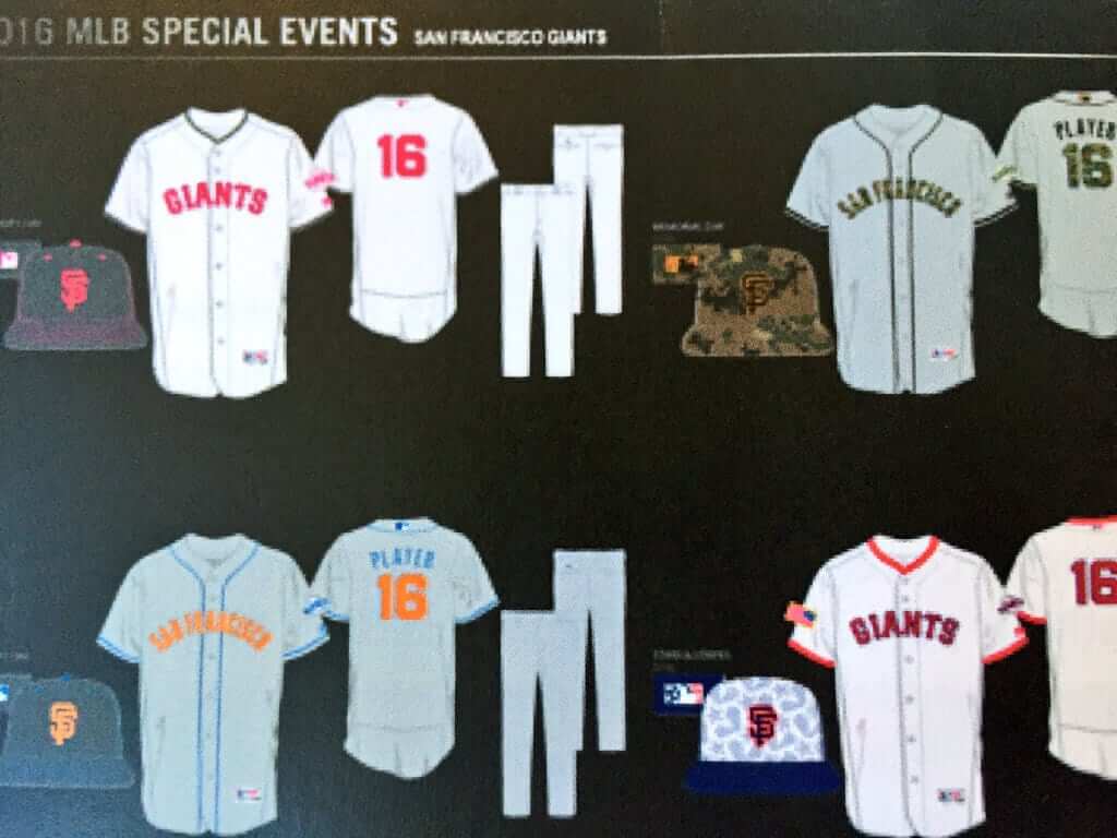
But the Giants appear to have spilled the beans yesterday by tweeting a few new designs (see above; I took a screen shot of the tweet in case they take it down). Let’s go one jersey at a time, clockwise from top-left: Update: Even though it’s plainly stated right on the Twitter page, I somehow overlooked that this tweet came from a Giants fan account, not from the Giants themselves. That doesn’t necessarily mean these designs aren’t legit, but it definitely calls their legitimacy into question. My bad for missing this very obvious detail (which was pointed out by our own Mike Chamernik shortly after today’s post went live).
Still, these designs might be legit. Let’s take a look:
1. Mother’s Day. If this info is accurate, the Giants — and, presumably, all the other MLB teams — will be wearing pink-lettered and -numbered jerseys for Mother’s Day (May 8). That would take pinkwashing to a new level for MLB. In past years, MLB teams have worn pink ribbons and pink accessories on Mother’s Day, but the uniforms have been untouched. I note with particular dread that the Padres, who usually wear camouflage for Sunday home games, are home on Mother’s Day. You do the math.
2. Memorial Day. Looks like a camouflage-lettered/numbered jersey and a camouflage cap. In other words, the same G.I. Joke mix of bad design and bad civics that they’ve been peddling for several years. Disappointing, but not surprising.
3. Independence Day. It’s hard to tell for sure, but the jersey appears to have the same star-spangled pandering pattern that we saw last year. Too soon to know what to make of the cap, but it doesn’t look good.
4. Father’s Day: Just as everyone will be wearing pink unis for Mother’s Day, it appears that there will be blue-trimmed jerseys for Father’s Day. Given the number of MLB teams that already have some shade of blue as a team color, it’s hard to envision how this one will play out.
Update: The Giants fan tweet has been confirmed. All this stuff is happening. The photo shown in the tweet was taken at a media event yesterday. Another person in attendance took a (slightly better) photo of the same graphic:
Mother's Day, Father's Day, Memorial Day and 4th of July themed uniforms across MLB this season. #SFGiants pic.twitter.com/a4gHvniVvy
— Third and King (@ThirdandKing) March 29, 2016
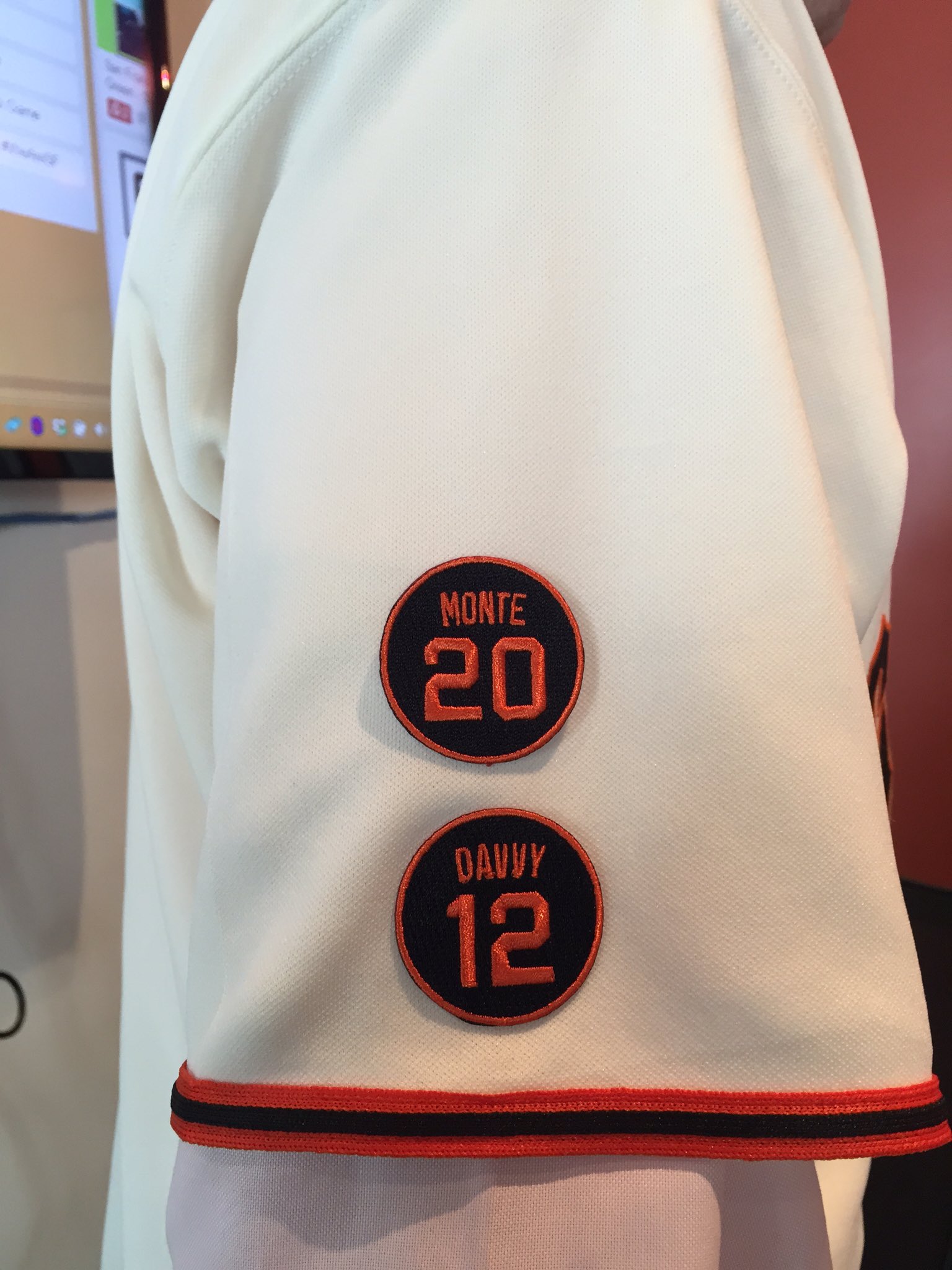
Meanwhile, as long as we’re talking about the Giants, they announced two new memorial patches yesterday — one for Hall of Famer Monte Irvin and one for coach Jim Davenport (click to enlarge):
My full rundown of all the uniform news for the coming season will be in my annual MLB season preview, coming on ESPN this Friday.

KRC update: The latest installment of Key Ring Chronicles is about an old key to the “Star’s” dressing room at a long-defunct nightclub. Get the full story here.
Caricature T-shirt reminder: In case you missed it yesterday, Larry Torrez’s caricature of me is now available as a T-shirt. We’re offering it in a variety of colors and styles — grey, black, white, and a white baseball shirt with green sleeves. We’ve also added women’s sizes. Further details here, or just order it here. Thanks.
The Ticker
By Paul

Baseball News: Guaranteed smile-generator: Check out this awesome shot of Orlando Cepeda Jr. in the on-deck circle back in 1968. What a cutie! … A sign in the UNC softball dugout has “Tarheel” as one word, which is wrong (from Josh Claywell and James Gilbert). … Here’s a rundown of some of the new looks in minor league baseball this year. … I’d Rather Not Know More Dept.: The Nats have created a “gathering spot for millennials” in their ballpark (blame Brinke). … The Nats also have lots of new food items (from Tommy Turner). … Here’s a new one: LSU wore powder blue helmets (or are they actually teal?) for prostate cancer awareness yesterday (from @TulaneSportsGuy). … G.I. Joke caps yesterday for Auburn (from Josh Claywell). … Creighton has pullover jerseys with their logo centered on the torso — an unusual look for baseball (from Bryan Holdcroft). … The College of Charleston’s caps look a lot like last year’s MLB All-Star caps (from @willchitty4). … Yesterday was superhero day at Mariners camp, with lots of players donning superhero T-shirts. You can see photos by scrolling down to the middle of this page (from @SpoonT12). … Speaking of superheroes, check out these old comic book covers that show Batman, Robin, and Superman playing baseball. …Nebraska has SLOB — school logo on back (screen shot by David Feigenbaum). … You can own Babe Ruth’s high school glove (from Chris Flinn).

Pro Football News: Yesterday was the 20th anniversary of the Ravens’ team name being selected (from Andrew Cosentino). … Something new in the works for the Giants, although that might just mean Color Rash. … When Sen. Ted Cruz did the ALS ice bucket challenge two years ago, he did it while wearing a red J.J. Watt Texans jersey. … Browns WR Darius Jennings has given up his No. 10 so Robert Griffin III can wear it (from Rob Datoc). … New uniforms for the Arizona Rattlers (thanks, Phil). … Just what the world has been waiting for: a toy NFL injury cart.

Hockey News: Some robbers stole a bunch of Blackhawks souvenirs from a shop near the United Center. … The Blues wore Cardinals-themed warm-up jerseys last night (from @jmgorla32). … Gotta love this old NHL logo bedsheet. Someone snap it up! (From Ryan N.) … Penguins trainer Chris Stewart worked his 1500th game, so the team gave him a No. 1500 jersey (from Jerry Wolper).

Basketball News: Last week the NBA threatened to pull next year’s All-Star Game from Charlotte in response to North Carolina’s new anti-LGBT law. Now North Carolina’s attorney general says he won’t defend the new law from legal challenges that are already being filed. (North Carolina’s anti-LGBT law should not be confused with the anti-LGBT bill in Georgia that had led the NFL to threaten to withhold the Super Bowl from Atlanta before the governor announced earlier this week that he’d veto it.) … The Cavs wore their sleeved “C” jerseys last night, forcing the Rockets to wear white on the road. … Western Kentucky gave new coach Rick Stansbury his own jersey (from Josh Claywell).

Soccer News: Ghana’s under-17 girls’ team had to play while wearing badly oversized jerseys, which had to be trimmed with scissors during halftime. … Shocker: Soccer traditionalists in England are unhappy with Nike (thanks, Phil). … The Netherlands added a “14” chest mark for Johan Cruyff. … If you’re enough of a print nerd to know what CMYK means, you’ll appreciate this goalie shirt. “Wonder if they approved the proof,” says Matt Busch. … Belgium wore a memorial strip for the Brussels terrorism victims on their warm-up tops yesterday. … “A picture has been leaked, apparently showing the Orlando Pride’s new away jersey,” says Saurel Jean Jr. “It is an Ajax-style template that Nike has used since 2014.” … Also from Saurel: “Brazil wore a very rare (if not unprecedented) yellow/white/blue uniform combination in a World Cup qualifier against Paraguay, and Mexico brought back their traditional “El Tri” look green top, white shorts, and red socks — in their World Cup qualifier versus Canada.” I don’t know jack about soccer, but I love that Mexican combo. … No.13 for Guatemala had some issues with his number peeling off during yesterday’s game (from Roger Smidstra).

Grab Bag: Wanna know why a blazer is called a blazer? Read this. … Australia’s new uniforms for the opening ceremonies of the 2016 Olympics include a cell phone pocket. … You know the real problem with capitalism? Brands haven’t fully capitalized on April Fool’s Day, that’s the problem. … Great story and slideshow about an Alabama sock manufacturer. Recommended (from Tommy Turner). … Also from Tommy: Good story about a British hat manufacturer.
Guessing the Creighton pullovers are an homage to the old Toronto Blue Jays jerseys of the ’70s and ’80s.
Love the Mexican kit. That’s what El Tri should wear. None of this BFBS mierda…
Indeed. It seems that for this cycle Adidas has gone with very traditional color combinations: Germany (white shirts, black shorts and socks); Hungary (Crimson shirt, white shorts, green socks); Spain (red shirt, Royal blue shorts, black socks).
Proofreading: “Creighton has pullover jerseys their logo centered on the torso”
Fixed.
The CMYK jersey link didn’t work for me on my first click, it auto-redirected me to the UK Soccer Shop front page. It worked just fine on a second click, though.
RG3 jersey not yet updated (as of now) on NFL Shop site.
link
OYO makes trainer carts for all teams apparently.
link
Didn’t work because the auto-filter changed the 800x1000 to 800×1000.
link.
Thanks Mr. Gore!
Not unprecedented; Brazil wore a similar combination in a 2002 World Cup group match against Costa Rica:
link
That Australian “cell phone” pocket looks an awful lot like a typical inside jacket pocket. You might even find them on most blazers whether the boaters had them for Queen Victoria’s visit or not. Based on that caption, note to self: don’t buy jackets from Australian garment makers.
I would love to watch an MLB game on a holiday and have the players wearing their normal uniforms, not some goofy bastardization of it. And I’m with Paul, I don’t want to know more about the millennial a gathering area at Nationals Park. That sounds like somewhere I’d choose not to be.
And good work as always by @bsmile.
Darn straight! On a weeknight, I kind of don’t care if a team wears a clown shirt. But on a weekend, especially a day game or on a holiday, I’m always a little pissed off if the home team isn’t wearing either crisp white home unis or reasonably accurate throwbacks. No team’s alternate jersey qualifies as its “Sunday best.” And this being America, there is nothing more patriotic for a national holiday than a baseball team wearing its finest home white or road gray uniform.
You know, it’s not that hard to use that same argument, but in favor of the alternate uniforms. One’s “Sunday Best” is typically something that they don’t wear very often. It’s a “special” outfit, is it not? A baseball team’s most common uniform, in most cases, is in fact that white or gray uniform. Therefore, the special alternate for a holiday makes perfect sense.
Just saying.
“Sunday best” carries some general connotations that tend to point toward home white or road gray unis in baseball. The term “Sunday best” is about formality and neatness, not just “different from the rest of the week.” The model of formality in our culture has been, and maybe just barely still is, the suit. Matched pants and top, crisply pressed. As such, a baseball team’s home whites and road grays tend to read as more formal in the traditional sense.
Now, this is clearly evolving rapidly, and I suspect that in another 20 years it will be obvious to everyone that one’s gaudiest, most mismatched ensemble is one’s “Sunday best.” (And I’m guilty here: I habitually wear a nicely pressed Hawaiian shirt to church on Sundays.) But for now, the paradigm of formality remains the suit, and so that points to a team’s home whites or road grays.
The Nats have been trying to figure out what to do with the scoreboard bar area since they opened. There is a pre-game happy hour there that isn’t bad and they put a Shake Shack there as well. People just seem to congregate there and in the “Red Porch” area out in center. Before they had cornhole boards set up and couches. There is so much unused space in that park. It just doesn’t have its own identity.
Where’s the “KEY TO MY HEART from Paul?
Key Ring Chronicles is about *other* people’s key rings, not mine. Those aren’t my keys.
Seeing all the MiLB rebra – er, new designs all in one place, I’m pleasantly surprised by the consistent quality of this offseason’s changes. It’s long been the case that in baseball, the minors have had more interesting unis and logos. But increasingly, the minors have just plain better logos and unis than the majors.
here’s all this upcoming season’s draft hats
link
“Here’s a new one: LSU wore powder blue helmets (or are they actually teal?) for prostate cancer awareness yesterday (from @TulaneSportsGuy)”
LSU alum here who will point out that the Tigers deservedly got their asses beat last night in this game. Stick with your regular uniforms.
I’ll say the NY Giants will go all red (a la Bills) but with blue numbers for the color rush game.
I hope you’re wrong. I am by no means a Giants fan but they are Big Blue. Their road jerseys look odd enough with no traces of blue on them. And blue numbers on a red background cause a disturbing 3-D effect that would be a bad idea.
According to the New Era Cap Talk message boards, the Mother’s Day & Father’s Day caps will be graphite for all the teams with pink and blue stitching.
Link?
That does seem to match what’s shown in the Giants fan tweet.
Sorry! Here you go…
link
Once again the Blues missed a golden opportunity to have those Cardinal-themed warm-ups have the birds on a hockey stick instead of a bat.
It’s possible that the Cardinals would not allow any modification of their mark, which the Blues would surely need permission to do.
I get it, but it would add to the fun. I mean, they do a promotion where the Cardinals StL cap logo is done in Blues colors.
A fan can wish.
Here’s the promotion…
link
Hockey sheets. I have the matching comforter and curtains
Update: The Giants fan tweet has been confirmed. All this stuff is happening.
The photo shown in the tweet was taken at a media event yesterday. Another person in attendance took a (better) photo of the same graphic:
link
You can practically date the NHL bedsheet. Somewhere between the creation of the KC Scouts logo and the Capitals’. There is only the word “Washington” under the Canadians logo. Both teams started in the fall of 1974, but production deadlines must have demanded a go date before the Capitals logo existed.
On the tag the pattern shows no logo for Atlanta but ONLY a logo (no city) for the Kings. The Seals logo is also on the tag but not the sheet.
oddness.
It appears they only used team names in plain text with logos that didn’t already include the team names. The price sheet appears to be from 1972, given that it uses the Finley-era Golden Seals logo, and has no logo for the Flames (which is only described as Atlanta). For the sheet from 1974, the Flames logo had been added but “Atlanta” hadn’t been changed to “Flames”; the Seals’ logo was changed to the wordmark, removing the plain-text name; and I’m guessing that’s a prototype version of the Scouts logo with the team name on it.
Incidentally, the Scouts logo on the sheet replaced the Maple Leafs’ logo. Wondering if Harold Ballard’s parole and return to the Leafs had anything to do with that.
Re: Babe Ruth’s high school glove
As the article mentions, it’s a right handers glove, and he (being a lefty) had to transfer the mitt and ball to opposite hands to throw.
Outside of Jim Abbott, I have never heard of this. was this common practice back then? Did gloves for lefties not exist in that era?
St. Mary’s Industrial School, you have to remember, was a mish mosh of being an orphanage and a school for incorrigible kids, and they made a lot of what they used in everyday life, including clothes and what little athletic supplies they had. I am sure a left handed catchers mitt would be beyond their abilities, and means to produce and/or buy.
This might be old news here, but I found this Tampa Bay Rays fauxback jersey on eBay: link
…and the set number is given as “Set 1970”. Very clever… but I always thought this promotion was supposed to be from the late 1970s — 1979, perhaps — and not 1970, when uniforms were still flannel and not in any style like this one.
Do the Rays officially call these uniforms their “1970” throwbacks?
I don’t know if anyone has mentioned this, but there is a new logo for Bells Brewery.
link
The USMNT’s home kit didn’t look so bad in action yesterday, so I don’t hate it as much as when the original images leaked:
link
(On a totally depressing note, I came across the kit I was hoping for while searching for images: link)
They can’t get rid of the BFBS pile of poo that is the away kit fast enough, though.
Also, I’m a little surprised Canada don’t have a better option, or a third choice. Playing in Mexico City, El Tri were entitled to their gorgeous green/white/red kit. I guess Canada wore a combo of both their kits–solid red is their primary and white is their change kit. But that didn’t make a whole lot of sense to me with Mexico wearing both colors in their kits.
Any chance we will get a caricature tee with a football design?? I know a regular football design will be released in the fall but the caricature one would be so much better!
I’m not really a uniform “traditionalist” most of the time (I like the concept of team’s Gavin third jerseys, enjoy SOME out there deisigns, etc) but I really dislike the holiday specific MLB jerseys. A jersey/cap patch combo would be much less annoying. Hell, just wearing the special hat would be better even with how bad that has looked in the past.
link
The Durham Bulls will wear a uni designed by a local clothing company on June 9, “the first time the Bulls will wear a uniform that wasn’t designed by the team or a sports apparel company.”
Love the cap. Not wild about the faux stirrups, but I prefer them to pajama pants.