I want to go off-uni today to explore something that’s been on my mind. As most of you know, I like to go on road trips. I’m particularly fond of stopping at national parks, state parks, wildlife refuges (when they’re not being occupied by armed seditionists), and the like. I also like going on tours of factories, breweries, and so on.
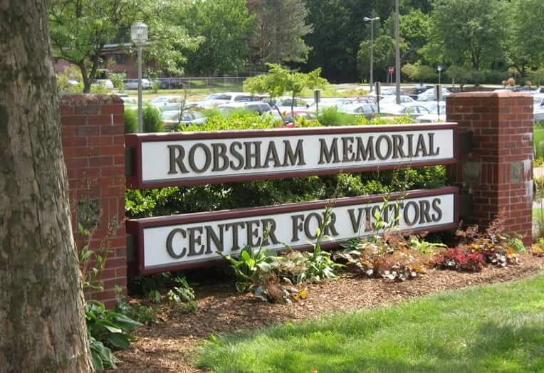
Each of these places has a building or space that serves as a center for visitors. But what is the proper name for such a space?
There are at least four very similar but distinct answers to that question, each with its own treatment of the root word “Visitor.” For example:
1. The root word “Visitor” can be singular and non-possessive. This is probably the most common format, like so:
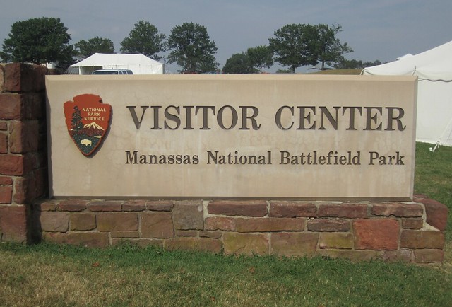
2. The root word “Visitor” can be plural and non-possessive. This style is also fairly common, like so:
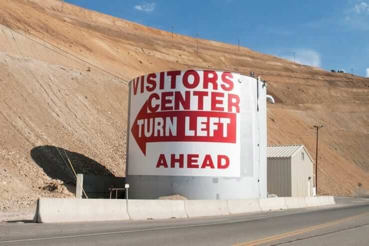
3. The root word “Visitor” can be singular and possessive. This style is uncommon but not unheard of, like so:
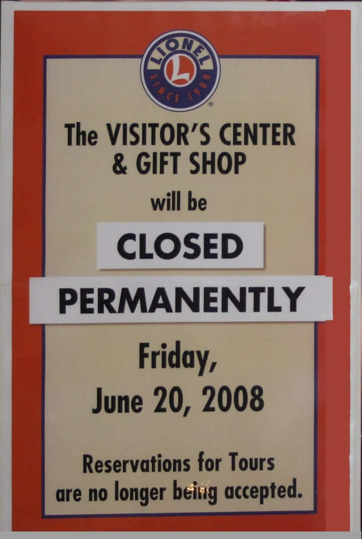
4. The root word “Visitor” can be plural and possessive. This style is extremely uncommon. In fact, I’m not sure I’ve ever seen it “in the wild,” so to speak, although I did find an example on the web:
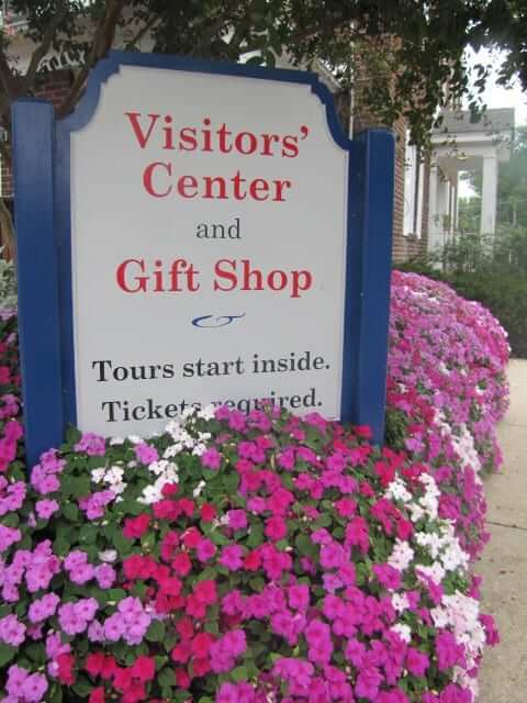
It’s odd that there are so many variations, right? I think part of the reason for this is that all four of them sound exactly the same if spoken out loud. So one person can say “Visitor Center” and another can say “Visitors’ Center” without even realizing they’re saying two different things, which leads to confusion and the lack of a standardized signage style.
Which version is best? From a strictly grammatical standpoint, I think No. 4 — plural possessive — is most accurate. Just as “men’s room” and “women’s room” are plural and possessive, it seems like this one should be as well. But having that apostrophe hanging there after the “s” doesn’t look or feel too great, eh? It kind of upsets the equilibrium of the sign. So even though No. 4 is the most correct option, I don’t think it’s the best option.
I’d vote for No. 1. Technically speaking, it’s the equivalent of “Man Room” or “Woman Room,” but it looks good on a sign and, as noted above, still sounds the same as the more correct No. 4.
Then again, one could avoid the issue altogether by going this route:
Discuss.

Click to enlarge
Friday Flashback: Many of the articles about the NBA’s move toward possibly allowing uniform advertising mistakenly say that none of the major-level North American pro leagues have ever used uni ads for a regular season game. But as Uni Watch readers know, that isn’t true — Major League Baseball has used uniform ads on four separate occasions when opening its season in Japan (including in 2004, when the Ricoh logo was worn by the Devil Rays and the Yankees, shown above). My latest Friday Flashback piece on ESPN takes a look at these four series and their advertisers. Check it out here.
Design contest reminder: In case you missed it earlier this week, I’m running an ESPN design contest to redesign the Detroit Lions. Full details here.

Click to enlarge
Looking good: I’m turning 52 in a few weeks, but people tell me I don’t look nearly that old. Maybe I get that from my mom, who’s turning 92 next month but you’d never guess it by looking at her. The photo shown above is from yesterday afternoon, when we had a very nice lunch at an Italian restaurant near her home. Love you, Mom.
The Ticker
By Mike Chamernik

Baseball News: The White Sox will wear navy 1976 throwbacks, the untucked ones with the big collars, for a game in July. No shorts, however. The Sox wore the white version of these uniforms last year. … A few people sent this in: Texas A&M will wear red, white, and blue jerseys in honor of George H.W. Bush on Saturday against Yale. Bush attended Yale and played on their baseball team but has a library and school of government named after him at A&M. … Here’s a gallery of notable winter MLB acquisitions in their new uniforms (from David Firestone). … Doc Woods, the Yankees’ trainer during the 1920s, wore a jersey with his title on the front of it (from Alan Tompas). … The Brooklyn Cyclones released their promotional jersey schedule. Since they’re a Mets affiliate, the Cyclones will wear their own version of the 1986 Mets throwbacks. … A family going through their late great-grandfather’s house found seven T206 Ty Cobb trading cards from around 1910 which could be worth more than $1 million. … The Yankees have quite the boastful on-deck circle at their training camp. Not sure if other teams have the same slogan on theirs (from Tyler Kepner).

NFL News: Check out the Pats logos on the sleeves of this Jamie Collins replica jersey ”” the red stripes are twisted upwards. Eric Lavallee found that in the Patriots’ online shop. … Eagles QB Sam Bradford explained why he likes longer sleeves on his jerseys (from J. Walker).
College Football News: The new Oklahoma State jerseys include the school’s retired numbers on the trim (from London Nagy). … Here’s the logo for the Lambeau Field College Classic, a game between LSU and Wisconsin in Green Bay on Labor Day weekend (from Lee Wilds).

Hockey News: Looks like the Oilers’ Patrick Maroon had an upside-down “W,” instead of an “M,” in his NOB. Those must also be zeroes instead of “O”s. He was acquired by Edmonton on Monday. … The Flyers wore Snyder Hockey patches on their warm-ups, in honor of the Philadelphia youth hockey organization (from J. Walker). … If you look near the blue line of this photo, you can see that an Arizona player was missing the blue outline around the “A” on his front crest during last night’s game (from Dane Drutis).

NBA News: Maybe you all knew this, but I just learned that Grizzlies F Matt Barnes has the California Angels logo tattooed on the back of his neck. … This headline is a little misleading, but the point remains that Stephen Curry is worth a lot of money to Under Armour.

College Hoops News: New court design for the Horizon League tournament. It will be held at Detroit’s Joe Louis Arena, which hasn’t hosted a basketball game since 2006 (from Joel Mathwig).

Soccer News: The Colorado Rapids unveiled a new primary jersey (from Phil). … Under Armour struck a uniform deal with the New York Cosmos, the first time the company will sponsor a U.S. soccer team. Under Armour will also manufacture soccer balls for the NASL (from Phil). … Juventus’s Leonardo Bonucci is wearing a captain’s armband with Piermario Morosini’s face on it. Morosini, Bonucci’s friend and a player for Livorno, died of cardiac arrest during a game in 2012 (from Tim Cross).

Grab Bag: This is neat: A display of Kansas City’s sports logos with the teams’ inaugural years worked in. … Several people sent this in: A woman was caught using a hilariously fake New York license plate. … Belgian cyclist Tom Boonen wears legwarmers during unimportant races from the end of February to the end of March. He ditches them in April when the races become more prestigious (from Bernie Langer). … Republican presidential candidate Ted Cruz’s American flag lapel pin turned sideways during last night’s debate, but he later fixed it (from Stephen Hayes). … Cruz also had something weird on his lip at one point.
There’s a similar thing with licenses to drive. I always call mine a “Driver License” because I’m from New York and that’s what it says on mine. I got a lot of grief for this at college in another state, though, because most say Driver’s License or something else. (Operator’s License in Ohio, maybe?)
Ohio’s say Driver License. Looking at mine now
Mine (Michigan) says “Driver License”, but I’ve never heard anyone around here actually say that without the possessive; it’s always “driver’s license”.
Did you also know that Michigan’s old drivers license design had the alphabet embedded into the Mackinaw Bridge?
FL has “Driver License” as well
Maryland has “Driver’s License”
Pennsylvania says driver’s license
[Checks wallet] Wisconsin’s says “Driver License,” which is the worst conceivable name for it. Thanks a lot, Scott Walker! (Joking.) But Driver License really is the worst, just as is Visitor Center. The card in my wallet is not a general category or type, it is an individual document. So it is one particular driver’s license. Singular, possessive. Or if we insist on omitting the apostrophe, it is a Driving License, in that it licenses me to drive.
Similarly but in reverse for Visitors Centers. Singular, non-possessive is simply wrong, unless the intent is that the place will never admit more than one visitor at a time. Which is the practical reality, if not the actual intent, of many of the obscure sites I like to visit. Still, either it is a center for all visitors, plural non-possessive, or it is the visitors’ center, plural possessive.
Illinois licenses say “Driver’s License.”
Indiana – “Operator License”
Colorado — Driver License. I agree it should be Driver’s License. Everybody says that anyway.
NC: “Driver License”
Ontario, Canada:
“Driver’s Licence”
(with “Permis de conduire” below that)
Manitoba, Canada: Driver’s Licence
(Note: in Canadian English, “licence” is a noun, while “license” is a verb.)
Alberta: Operator’s licence
(note the correct spelling: licence, not license)
California (best place on earth) checking in: Driver License
Lee
Down Under reporting in.
The State of South Australia: Driver’s Licence
CA: Driver License
Georgia checking in- “Driver’s License”
Curious question: Is there a difference in terminology in a regular DL and a commercial one? Do CDL’s use different words to describe the licensee?
In South Carolina my CDL is a “Commercial Driver’s License” and my wife’s is a “Driver’s License”. No difference.
AZ has Driver License
MO: Driver License… though mine was issued shortly before they redesigned them a few years ago. Based on everyone else’s response, I presume they left the title alone.
Minnesota is “Driver’s License”
Indiana’s says “Operator License”
I’ve noticed the same thing with Farmers Markets. Or Farmer’s Markets. Or Farmers’ Markets.
A typical outing for our family:
“We shouldn’t go to the Farmer’s Market because there’s only one farmer!!!”
“Cut it out, Dad”
The driver/driver’s license can easily be fixed. If they change it to Driving License, that’s how it is in Mexico
“Daylight Saving(s) Time”
Kills me when I see “savings” but I see it all the time (including in ads, which really bugs me). Maybe, similar to “visitor(s) center” it rolls off the tongue better, but spoken is different than written. But it’s wrong.
DST needs to be abolished. Just saying.
What The Jeff said.
Just out of curiosity (and I know where THE lives) — but do you reside in the ‘western’ end of your time zone (also, are you somewhat ‘northern’)? In other words, does the sun rise and set later for you than for many others?
See…I reside damn near the beginning of the Eastern zone, so DST is a yuuuuge benefit…I hate that the sun sets at 4:30ish in December/January, and I don’t particularly give a crap that it “rises” earlier. I’d like DST to be year round.
But those of you who live to my west, especially as you approach the CTZ, you get the sun “later” so I can see why it would be less of a big deal. It’s why some states, like Arizona, don’t even observe Daylight Saving Time — they’re basically in the Pacific Time Zone anyway.
I think you’d both feel differently (and I could be wrong) if you lived closer to the eastern end of your time zone than your western end.
The thing with DST is that it’s basically backwards. The Earth’s orbit and rotation already dictate that summer days are longer and winter days are shorter… and then we mess with the clock to further increase those aspects. We artificially make summer days even longer and winter days even shorter. In what way is that actually beneficial to anyone today? Just move the clocks 30 minutes and leave ’em alone.
I agree with Phil about the desireability of having Daylight Saving(s) Time year-round. The sun should never be setting before 5pm in New York. If we had DST in winter; the earliest sunset would then be 5:30pm.
And we should have an additional hour of DST in the summer. This way, we’d have the sun until 9:30pm in late June ane early July. This would be beautiful.
But I don’t agree with him about the name. For me “Daylight Savings Time” makes just as much sense as the officially-recognised “Daylight Saving Time”. It’s a matter of two different analyses:
“Daylight Saving Time” – “saving” is a present participle. So “Daylight Saving Time” is the time for saving daylight, just as “apple picking time” would the time for picking apples.
“Daylight Savings Time” – “savings” is a noun (a singular noun, despite the fact that it ends with S). So “Daylight Savings Time” is the time for this savings, just as “dinner time” is the time for dinner.
“The Earth’s orbit and rotation already dictate that summer days are longer and winter days are shorter…”
~~~
I know you’re not from this planet, but days on earth are still 24 hours long, no matter the season.
Lousy Farmers
““Daylight Savings Time” — “savings” is a noun (a singular noun, despite the fact that it ends with S). So “Daylight Savings Time” is the time for this savings, just as “dinner time” is the time for dinner.”
It’s not a bank account. You’re not stashing the extra hour away until when you need it in the future. It’s just a different timekeeping protocol: the time for the saving of daylight.
Wrong (again).
Lee
The UK calls it “Summer Time.”
They also say “maths” and “at hospital” or “at university.”
This is one of the rare cases where all four versions are correct. Version 3 may be the most awkward because it implies that they only get one visitor at a time. (I guess that explains why that one example had to close down.)
Proofreading: “Must”, not “most” in that Patrick Maroon note in the ticker.
Paul. I’ve been a longtime fan of your site and agree with you often.
You seem like a wonderful and devoted son to your Mother which supersedes any talk of logos and uniforms by far.
Many more happy birthdays to your lovely Mother.
Today’s entry reminded me of the discussion a while back about the proper way to indicate a possessive on a vertical sign. I’d always meant to submit this image as part of that discussion.
There’s a brewpub in Decatur, GA called Twain’s. The vertical sign clearly says Twains’, though, which seems like an odd “compromise” to where to put the apostrophe in the vertical representation. (Note that the horizontal sign over the door and the website confirm Twain’s is correct.)
link
EVERY MLB TEAM HAS THE “TRAIN TO REIGN” MANTRA. Not all on their on deck circles maybe though.
Yes. You can see the Brewers wearing hoodies saying that in a Brett Phillips (the one with that laugh) video.
Yuck. If your team was in playoff contention last year, “Train to Reign” is a bit of jerkface bragging. If your team was not in contention last year, “Train to Reign” is more like a slap in the face of your own fans.
The only exception is the Royals, who actually are the reigning champions, and whose team name is actually about royalty.
Agreed. This is especially true if you’re the Natinals.
“The only exception is the Royals, who actually are the reigning champions, and whose team name is actually about royalty.”
~~~
Actually…you probably knew this but…
To be fair, the name is indirectly tied to royalty, in a Six Degrees kind of way.
All of these league-wide slogans are asinine. Let each team have their own thing.
All the best to your Mom. Good genes, clearly.
The Friday Flashback is up:
link
Not about Visitors Centers, but about the ticker. I hope it doesn’t come as a nasty surprise to reader Will H., but the autograph on his Mark Brunell Jaguars jersey is screen printed, not a real autograph. I have the identical jersey – they were sold that way. I’ve often thought about locating a replacement “8” to ride the jersey of the fake autograph.
Sorry – “rid” not “ride”
The rigatoni on Mom’s plate look as big as rolls of half-dollars! Bet it was delicious. A lovely woman with a good son.
The Visitor/Visitors/Visitor’s/Visitors’ issue I have never thought about / noticed. Now I will henceforth pay too much attention to that and point that out to others and co-opt it as my observation to them.
Your mom look terrific for 92! God bless
Grammatically, the only acceptable one is Visitors’ Center. Possessive for all who come and not just one at a time. But since America doesn’t understand apostrophes or because it throws off the graphic design, I’ll begrudgingly accept Visitors Center. Analogize it with Veterans Stadium, I suppose? I mean, unless your visitor’s center is literally a phone booth with maps and a pay phone inside of it, then it could be for just one…
Bouncing off of this thought: in Chicago, it’s SOLDIER FIELD. No plural, no possessive.
And yet, at Harvard and on the adjacent highway in Boston, it’s SOLDIERS FIELD.
Your Veterans Stadium example is an interesting one. As a kid growing up in North Jersey, I always found it interesting that one local stadium was called YANKEE STADIUM (singular), and another was called GIANTS STADIUM (plural).
(I suppose the latter was inevitable, since “Giant Stadium” would’ve been kind of like calling it “Massive Stadium” or “Enormous Stadium”…)
Yuuuuuge Stadium.
Coming soon.
“Yuuuuuge Stadium” would’ve been the perfect name for the proposed stadium that I first heard about the other day on a Sully Baseball podcast.
In the 1950s, borough president Hulan Jack suggested a link (on stilts, because only an unimaginative schmuck would put a 110,000-seat domed stadium on the ground) as a way of keeping the baseball Giants New York & also luring events such as the Army-Navy game and the 1960 Olympics.
CORRECTION: “keeping the baseball Giants *IN* New York”
#HappyGrammarDay
I just don’t think the visitors OWN the center. It is FOR them and should not be possessive…
But it is theirs to use, regardless of actual ownership, so the possessive form still works.
Not everything that is for someone’s use warrants a possessive: Faculty Dining Hall; Student Union; Employee Entrance; Customer Parking. Some do: Nurses’ Lounge; Doctors’ Lounge; Legislators’ Elevator; Residents’ Parking.
It seems to depend upon to the first noun. (I was going to say the “noun as adjective” but that’s not what this is, is it? Those are always singular, like “dog food” or “beer can.”) Some nouns seem to beg for a possessive, some sound strange with possessives, while others can go either way.
Just wanted to point out the Kansas City logo display is at a new bar called No Other Pub, just opened by Sporting Kansas City.
Thank you for pointing that out! I was hoping I’d see someone give the credit where it is due.
I know the White Sox uniforms are a novelty, but I always liked the type treatment on those uniforms. I would like to see it resurrected someday. I think it’s stronger than the script “Chicago” away jersey treatment.
Agree!
Actually, I’d like to see the leisure suit unis without the stupid collars. Which would basically be the road uniforms from 1902 to 1916. And that same font – I believe it’s a Tuscan font – was also used in red with navy trim on the roads from 32 to 38. It’s a nice change, but it’s also the Red Sox font, along with many other teams, past and present.
I like the block font with the red trim (like that’ll happen again) and another favorite is the 67 thru 75 script with the team name in the underline. (Which were on GREY uniforms in 69 and 70, despite Colorwerks and even Chris Creamer getting that embarrassingly wrong! Whoops – I don’t know what made me mention that… I need to breathe… )
Have you tried a Dam tour? Fits right in with the road trip, national parks and visitor centers.
There are several flaws with that Mark Brunell Jaguars jersey that indicate that it could NOT have been game worn.
1. the number font is wrong. The 1995 Jaguars had little notches inside the 8s as opposed to perfect squares.
2. THe NOB is too blocky, more like what you find on the Chinese knock-offs.
3. It also looks like the fabric is off, but I can’t confirm that.
As someone else has already said – it isn’t game-worn.
In ’95, their uniform had the ‘Wilson Staff’ logo, not the ‘W’ logo that’s pictured.
Here’s a road uni, but you get the idea. The number font does appear to be off, as well.
link
And here’s their ’95 home uni:
link
Not Brunell, but you get the point.
You all are correct. I dug into it this morning and found similar evidence. I removed it from the Ticker.
The “Train to Reign” slogan is an MLB slogan as I have seen this with several teams in spring training. It is definitely not Yankee specific.
I vote for Visitor Center, with “Visitor” serving as an adjective.
I have a similar stuggle with that holiday on the second Sunday in May: is it Mothers Day? Mother’s Day? Or Mothers’ Day? I always have to look it up. (And I think the “official” formulation is “Mother’s Day,” which seems the least “correct” to me!)
“Reader Will H. has a neat game-worn Mark Brunell autographed jersey from the team’s first season.”
Looking at those photos I do not believe that jersey is game worn… or even team issued. Granted, they are kind of blurry, but the lettering on it is stitched too perfect, which mean they were made by an embroidery machine and not a human being. And the twill looks like the knock-off version of twill used on the fakes from China.
Look at this to compare – link
The twill is flat and not shiny/bubbly. The edges of the letters are crisp (look at the E specifically). The stitching is clearly done by a human. The easiest way to tell is in the corners. A seamstress will overlap their threads while a machine will just cleanly wrap around the edge in perfect symmetry… because it’s a computer.
Visually there are some detail clues too. The tagging is wrong. They did not have front jock tag that year that I can find. And finally, the 8 is wrong. This 8 is squared off in the inner hole, but they used angled corners – link
I would seriously question this jersey with whoever sold it to him and 100% get it authenticated form a trusted industry source, or demand my money back.
The Mark Brunell jersey is not game worn. I own the same jersey, same size and autograph and everything. It’s a retail version sized 52 and doesn’t have any game-style cut to it at all.
I know a few with “drivers licences” but they’re from Canada.
To me, “Visitors’ Center” and “Visitor’s Center” imply that the center belongs to the visitor(s). “Visitor Center” removes the possessive aspect but implies that there is only one visitor, which is inaccurate (if you’re building a center, you’ve probably got more than one coming). That’s why I’d go with “Visitors Center,” which does not imply possession but implies that the building is a center FOR visitors, as the sign at the end of the entry made very clear.
Agreed. “Visitor’s Center” looks like a reference to a person’s abdomen.
God Bless your mom Paul. Mine is 88 and I cherish her everyday.
The Mormon Church uses “Visitors’ Center” for each of its centers located near temples/historic sites:
link
But interestingly, the Mormon temple in Kirtland, Ohio, owned and operated by the Community of Christ (formerly the Reorganized Church of Jesus Christ of Latter Day Saints, which separated from the Church of Jesus Christ of Latter-day Saints in the 1840s, before the Mormons moved west to Utah) uses “Visitor Center”:
link
I enjoy a good Visitor Center for the same reason I also like museum gift shops. They are often great places to find specialized books. (Now I’ve got to check if my city has a Government Printing Office store anymore. Home of the obscure publication.)
@Clint Richardson (love the name, my favorite unheralded Sixer of the ’80s) – Sam Bradford’s jerseys don’t have any game cuts either, technically…
Happy birthday to Paul’s Mom.
I am so happy the White Sox will revive the collared uniform for a game this Summer. I love those unis but I am glad they’re skipping the shorts.
Early Happy Birthday Uni Watch Mom! And to you Paul!
That fake license plate, while hilariously bad, is not entirely without precedent: in North Korea, you routinely see hand-stenciled license plates.
link
link
Cue joke about how the entire nation is a giant license plate making prison…
The story also turned up several times in license plate collector pages I belong to.
It’s obviously fake and creatively done. She didn’t have insurance and something else – but these days everyone goes to jail over little shit that should have just been ticketed. And I’m sure they took her car, which will cost her a fortune to get back. Which she doesn’t have because… so she’s out of the transportation game and therefore the job market that at $10 an hour didn’t give her enough to keep her car legal.
I’m older than Paul (and still look good – most of the time (sigh)) – anyway, I remember when people didn’t go to jail for minor shit.
Your mom looks great, Paul. Good stuff.
That cardboard plate might’ve been considered legal in 1901, at the infancy of automobile registration. Back then, license plates were very much a DIY affair.
Took my wife to Clayborne Farms in Kentucky which is where Secretariat was. We took the tour, saw the stables, Saw (and petted) Kentucky Derby Winner “Orb”. Saw Secretariat’s grave (among others). We enjoyed it and had our wallets ready only to find out they DO NOT have a gift shop. Talk about oversight! The tour was free (though it’s custom to tip the guide). Highly reccommended but you do have to reserve your spot and yes, people were from all over the country, which shocked me.
Will the White Sox 1976 throwbacks have the mesh tail?
For a model-train concern like Lionel, does “Visitor’s” center suggest only one visitor can fit in it at a time?
Re: your cited precedent of advertising for American pro sports in exhition games in Japan, I would argue that nearly all sports leagues, professional and not, have used advertising for many years, with the application of corporate outfitter logos on jerseys, hats, undershirts, socks, etc. Even if it’s small, and perhaps relatively unubtrusive, it’s still advertising. Nike, Addidas, Under Armour, Reebok, Majestic, Riddell, Russell and the like have been applying their marks on uniforms for decades. I understand the distinction between this practice and the additiion larger outright advertising patches or printing for enhance revenue for individual teams/leagues, but the supplier logo is something that was standardized long ago.
I’m not saying I’m OK with advertising on unis and the logo creep we continually see. I just want to point out that it already exists in that form, and we have become inured to the appearance. And although MLB, for instance, has an explicitly written rule against advertising on unis, they have been happily tolerating the exception of corporate logos on uniforms in the form of a swoosh or whatever for quite some time.
I’m very late to the game here, but I’ll throw in two points:
1. Google’s massive search of digitized books shows that “visitor center” separated itself from the pack starting in the 1960s, and especially since 1985. (link).
2. What’s often called the possessive form (but what linguists include in the genitive case) does not imply literal possession. Examples abound, but obvious ones include “men’s restroom,” “my surroundings,” and “Uni Watch’s fans.” (link)
Similar question arises when talking about fan names. Is Joe Schmo a “Yankee fan” or a Yankees fan”? I always say the former–Cub Fan, Steeler Fan, Knick Fan. Although some sound odd–Red fan?