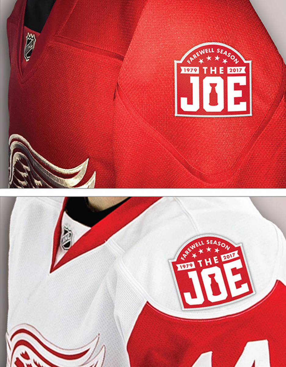
This is shaping up as quite a week for NHL patches. First we had the 1967 expansion teams announcing their anniversary patches a few days ago, and now the Red Wings have announced that they’ll be wearing a Joe Louis Arena final-season patch for 2016-17 (further details here).
Not a bad design, although it would’ve been cooler if the “Farewell Season” lettering at the top had been vertically arched, to match the team’s NOB style. Then again, maybe that wouldn’t look so good on such a small item. Any of you Photoshoppers wanna take a stab at how that would turn out?
Meanwhile, here’s our first look at how the Kings’ new anniversary logo looks in patch form (although not on a jersey, at least for now; click to enlarge):

Incidentally, as long as we’re talking about the anniversary of the “second six” expansion teams, check out how Hockey Pictorial magazine depicted the new teams’ arrival on the cover of its October 1967 issue:
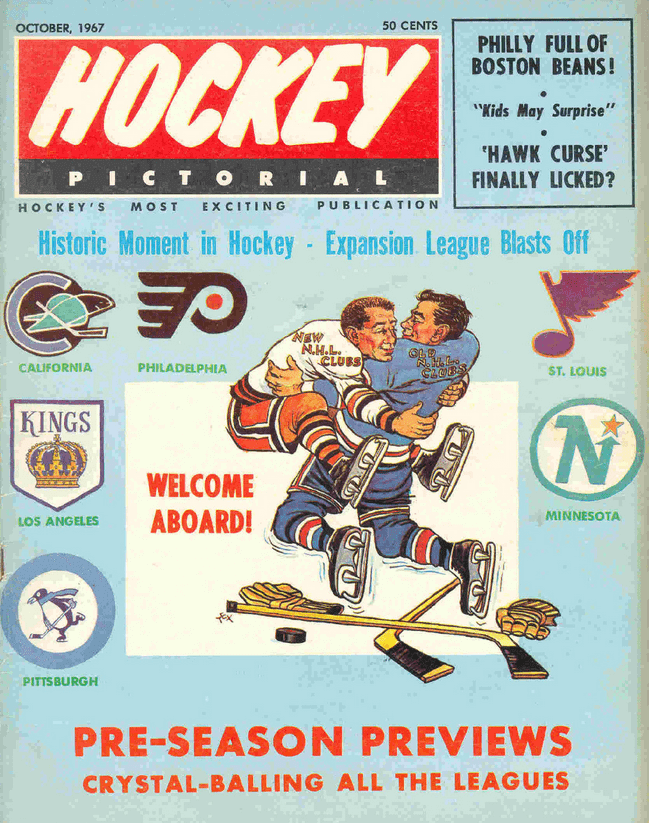
I think it’s safe to say that sports graphics have changed juuuuust a bit over the course of 50 years, eh?
(My thanks to reader Jason Terzis for the patch photo and to Jeff Byrniarski for the magazine cover.)
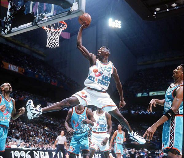
Friday Flashback: The NBA All-Star Game is this Sunday, so my weekly Friday Flashback column on ESPN takes a look at the history of NBA All-Star unis (including the bizarre 1996 design, shown above). Check it out here.
And speaking of the All-Star Game: As you may recall, this year’s NBA All-Star uniforms will have Kia advertising patches — the first ad patches ever to appear in an NBA game (although the game is, obviously, an exhibition). Now it turns out that we may be moving a step closer to other jersey ads.
According to this ESPN story that broke last night, there will be an owners’ meeting on Sunday in Toronto, where the All-Star Game is taking place, and that meeting will include a committee that will consider adding a corporate jersey ad proposal to the agenda of the Board of Governors meeting scheduled for April.
(So, yeah: a meeting to consider adding a proposal to the agenda of another meeting two months from now. And you thought Washington bureaucracy was bad.)
The system being proposed would reportedly allow corporate advertising patches to begin in the 2017-18 season (when Nike takes over the league’s uniform contract, not-so-coincidentally). That’s in keeping with what had been reported back when the Kia patch was announced. At that time, the word was that they’d do the Kia patch for two All-Star Games — this year’s and next year’s — and then see about going with advertising patches for regular season unis after that. So in that respect, this latest report isn’t really anything new. It just shows that the gears are continuing to turn apace.
The new thing, at least to me, is that this proposal includes revenue sharing: 50% of the fee for an ad patch on a team’s uniform would go to the team, with the other 50% going into a revenue sharing pool. That’s presumably to get small-market teams on board (they had reportedly been concerned that uni ads would just make the rich teams richer, because big-market teams would command higher prices for their patches), although it may be a turn-off for big-market teams, since it means their uni ads will essentially be subsidizing the little guys.
That type of big vs. little conflict is precisely why NBA uni patches have now been “inevitable” for about five years running. What with all the greed and competing interests and so on, I continue to have faith that they’ll manage to mess this up yet again. Still, there’s always the chance that they could actually get their shit together this time around, so we need to stay vigilant. Send emails and tweets to the league, and to your favorite team, tell them in no uncertain terms that you’re opposed to this nonsense, and use the hashtag #NoUniAds. Thanks.
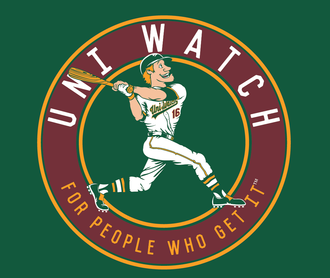
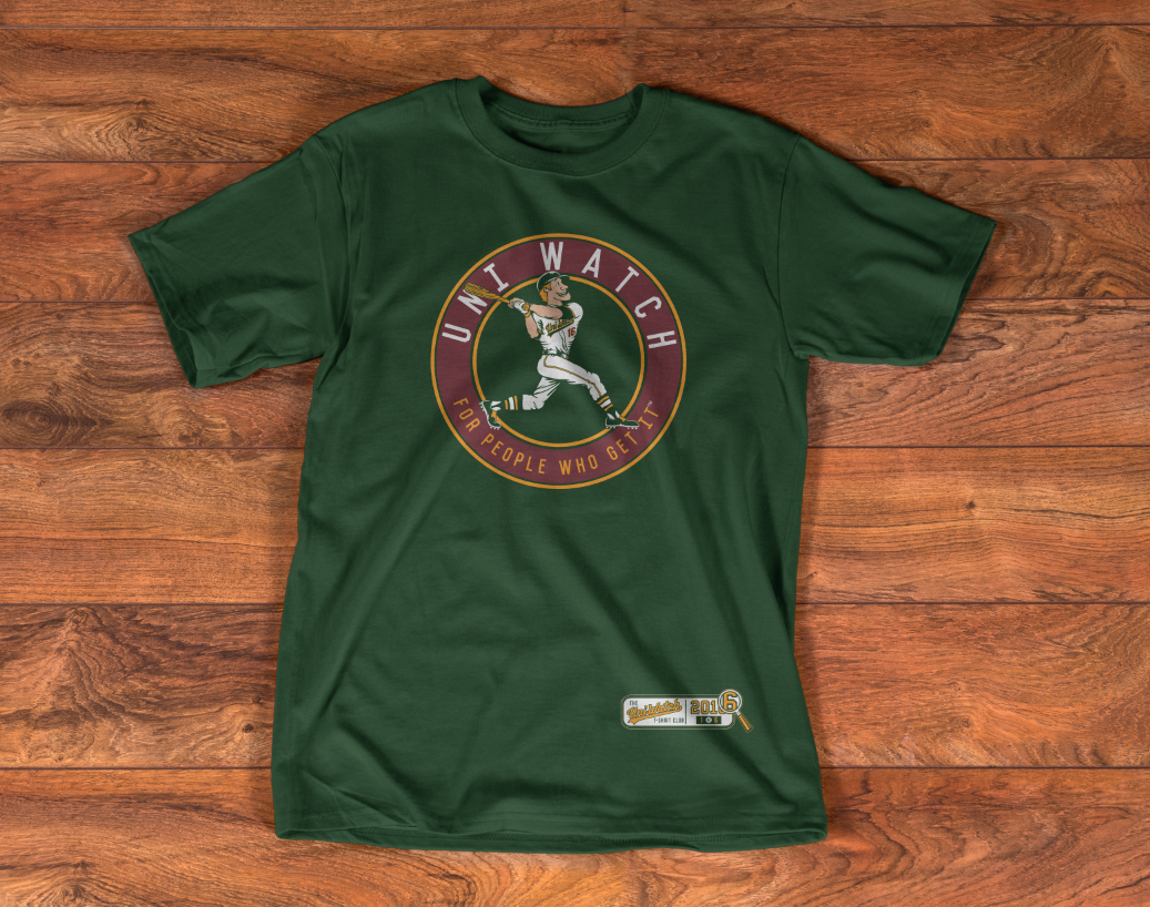
T-Shirt Club reminder: In case you missed it earlier this week, the first Uni Watch T-Shirt Club design of 2016 is now available for ordering. Here’s the design (for all of these, you can click to enlarge):
Here’s how it looks on a shirt:
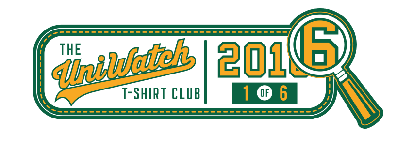
And here’s a closer look at the jock tag graphic, which will be appearing on all six of our shirts this year:
The Uni Watch ballplayer shown on the shirt is intended to evoke a time when sports graphics and mascots were built around fun, not ferocity. And as you can see, our ballplayer really Gets Itâ„¢ when it comes to wearing his uniform. Allow me to point out some of the details:
• He’s wearing a flapless batting helmet. (I wanted to have him also wearing his cap under his helmet, but that turned out to be too subtle a detail to render.)
• He’s wearing only one batting glove, on his bottom hand — an old-school style that was popular in the late ’60s and early ’70s (and is still used today by Hunter Pence).
• He’s written his uniform number, 16, on the bottom of his bat knob. No newfangled knob decal for him!
• His jersey is modeled after our 2015 “Home” T-shirt.
• His high-cuffery, blousing, and stirrups are all picture-perfect.
• His spikes feature that old-school flap over the laces.
The shirt is available here. For further info on how the T-Shirt Club will work this year, click here. Thanks for your consideration.

Click to enlarge
Gromm•It update: Sunday is Valentine’s Day, which calls for a special grommeting project. You can see an additional photo, along with all the other foods I’ve experimented with, over on Gromm•It.
The Ticker
By Paul

Baseball News: The Great Lakes Loons will mark their 10th anniversary by unveiling new uniforms and logos tomorrow (from Alex Dewitt). ”¦ You’ve probably seen this shot of Reggie Jackson wearing a Mariners uniform for the 1979 A.L. All-Star team portrait. Reggie’s Yanks uni didn’t arrive in time for the photo shoot, so the M’s, who were the host team, hooked him up with a Seattle uni. It’s a pretty well-known story by now, but I’d never seen this shot from that same photo shoot until now (big thanks to Vinnie Donati). ”¦ Someone has ranked the new spring training caps (Alex Dewitt again). ”¦ Lots of interesting giveaway items on the Orioles’ 2016 promo schedule (from Andrew Cosentino). ”¦ Speaking of promo events, the Phillies will be giving away these socks on June 5 (from William Hall). ”¦ I’m opposed to pointless retail slop but am generally in favor of anything involving geography, so I’m conflicted over this new line of MLB caps that combine team logos with state outlines. The Nats one is the most interesting, if only because the shape of DC is much less familiar than any of the 50 states’ shapes (from Jason Hillyer). ”¦ Here’s a look at A’s caps through the years. ”¦ Maryland continues to define “pride” in very unusual ways. ”¦ Pro golfer Spencer Levin wore an MLB.com cap at Pebble Beach yesterday. Meanwhile, ESPN broadcaster Chris Berman wore a straw hat with a Giants logo. ”¦ Love this ad for socks featuring Willie Mays and a buncha disembodied shins at Shea Stadium. ”¦ Pretty cool new softball helmets for Youngstown State (from Robert Hayes). ”¦ Doesn’t get much better than Clara Bow in a baseball uni (from Bill Francis). ”¦ Rainbow Warrior throwbacks for Hawaii softball (from Aaron Wigg). ”¦ Check out the Philippines’ WBC uniform. Odd that the cap logo has a white outline but the jersey script doesn’t (thanks, Phil). ”¦ I think this might be our first look at the new version of the Padres’ new tan camouflage jerseys, which they’ll be wearing for two games this season. They’ll be going with blue camouflage for most of their G.I. Joke games.

NFL News: Here’s a rare sight: Dick Butkus wearing No. 78 (presumably at a practice). Leather chinstrap, too! (Thanks, Brinke.) ”¦ Supe50 MVP Von Miller has been announced as the face of Adidas’s new FREAK initiative. Yes, that’s FREAK, in all-caps. Innovative! C’mon, people, try to have some dignity out there. ”¦ Check out this old shot of Falcons QB Steve Bartkowski. At first I thought his base-layer shirt had striped/ribbed cuffs (which would have been fucking awesome), but then I realized they were actually just wristbands. Either way, it’s a great look (from Mike Nessen). ”¦ In case you hadn’t heard, the Raiders aren’t moving. ”¦ Electric football maven Gene Sanny has done an awesome job painting a set of 1980s Jets figures.
College Football News: Here’s a look back at how Kentucky’s uniforms were unveiled in 1990 (from @seacatfan). ”¦ New turf design for Central Michigan. Additional info here. ”¦ Penn State is the latest school to announce that it will offer only a few uni numbers on its line of retail jerseys (from William Yurasko).

Hockey News: This is awesome: Check out the artwork on these vintage NHL pocket schedules (big thanks to Chris Mizzoni). ”¦ Yet another cool item: Devils G Cory Schneider’s new mask pays tribute to two Devils greats. ”¦ Canucks fans are buying lots of retro/throwback gear apparel. ”¦ Flyers D Shayne Gostisbehere used an Avs player’s stick last night.

NBA News: Kobe Bryant played his last game in Cleveland two nights ago. After the game, he signed his game-worn sneakers and gave them to LeBron James (thanks, Mike). ”¦ Also from Mike: The Pistons, fresh off of retiring Chauncey Billups’s number, plan to do the same for Rip Hamilton. ”¦ LeBron James has donated a bunch of uniforms, for various sports, to Toronto-area schools. ”¦ Man, the uniforms for the Rising Stars Challenge game are brutal.

College Hoops News: Pink “Play for Kay” jerseys tonight for the Seton Hall women’s team. ”¦ Cal has hoodie warm-ups (from d.c. james).

Soccer News: “Minneapolis City SC of the Premier League of America has released a pretty humorous (but I believe intended to be serious) infographic coinciding with their new logo,” says Jason Hicks. “I just love that it makes a mockery of similar infographics, such as this one.” ”¦ Here’s a look at Arsenal’s kits during the team’s Adidas-outfitted years. ”¦ Here’s a podcast featuring an interview with a professional soccer kit designer (from Rick Liebling). ”¦ New kit for the New England Revolution. ”¦ No more Adidas shoulder stripes for Real Madrid (from Anthony Guarraci). ”¦ Instead of a design contest, the Houston Dynamo are asking fans to submit concepts of what they think the team’s new unis will look like (thanks, Phil).

Grab Bag: NASCAR is changing its business model so it will be less reliant on sponsors. ”¦ A list of “10 Things a Newly Single Guy Should Never Wear” includes “Sports Jerseys” at No. 8 (from Mark Loveland). ”¦ NASCAR news from David Firestone, who writes: “M&M’s is having their 75th anniversary this year, and Kyle Busch is running two scheme for the occasion — one fauxback and one that mixes vintage and modern design.” ”¦ New logo for Guardians of the Galaxy Vol. 2. ”¦ President Obama wants to repeal a tax exemption that essentially provides federal funding for the construction of sports stadiums. Even if this goes through, which I’m assuming is unlikely, it wouldn’t completely eliminate public financing of such facilities, but it would be a good start (from R. Scott Rogers). ”¦ Pretty sure we’ve seen all of these before, but here’s a slideshow of 30 jersey typos (from David Cline).
Butkus link isn’t working.
Fixed.
Oh that Bartkowski Falcons pic…. beautiful… although there was some tinkering in adding the grey, this is another example of how a team got it right in the first place, yet still changed their uniforms. I do like the newer Falcon logo, but give me the red helmet/jersey combo any day.
You do remember that the Falcons started with black jerseys, and unnecessary gold helmet stripes, right?
From what I recall, the Falcons picked red and black as a nod to the Georgia Bulldogs, while the gold trim was a nod to the Georgia Tech Yellow Jackets.
Ooh, you’re right… I got blinded by the beauty of the red…. “in the first place” was not the right way to phrase that….. got it right early on would fit better….
Is that an ostrich jacket that Bradshaw’s wearing? Crazy shit.
Falcons changed to silver pants around the same time UGA Bulldogs did (I think). I can’t remember who did it first.
Maybe it is just me, but this is the only one of those MLB state outline caps that seems appropriate:
link
link
I’m sure they thought it was a brilliant idea until they made it to the Rockies:
link
“Well, shit… looks like there’s a TV behind the logo…”
“Double shit… it’s closer to a 4:3 aspect ratio, too!”
Phillies sock link in the ticker should be “these socks”
Fixed.
There seems to be a rogue parenthesis in the baseball ticker, about the A’s hats.
Fixed.
“Here’s a look at A’s caps through the years.”
You neglected to put “Oakland” in that sentence. :)
I’d be willing to say that a lot of people wouldn’t understand those “state shape” hats. Geography is lacking in this country.
I think you’re right. There’s probably a “right” way to do something with a team logo and state outline but those caps aren’t working for me, probably because the logos have to be placed off-center.
-Jet
Yes, geography is lacking. Knowing what is absolute sh*t is pretty good.
Really fun Friday Flashback!
Like Jerry, David West also got to wear his name on front and back.
In San Antonio 1996, Jordan’s 2 is upside down. One of the most enduring mistakes of all time because that is a fairly popular throwback jersey.
Afraid you’re mistaken about the 2 on Jordan’s jersey. It’s oriented normally, as demonstrated by Clyde Drexler in link. It’s just a weird font.
Love the hockey cover. The artist may have been guessing as to what the Flyers uni could look like? Just about the most love I expect ever between NY and Phila.
Are the players hugging or fighting?
It looks like a really weird hug to me.
Factual error in the Flashback article: The 1979 All-Star Game was at the Silverdome, not in Chicago.
As a side note, I’m guessing the Pistons’ lightning-bolt jerseys wouldn’t have translated particularly well to an All-Star jersey format.
I’m glad I can help! I’m currently planning on going to the Loons ceremony (it’s free so hey why not!) tomorrow.
No Toronto geography baseball hat? An outline of Ontario would have been too much to handle.
I assume that if they did a Toronto cap they’d use a map of Canada, not Ontario.
Why do the state outline hats have the Phillies in where Pittsburgh should be and vice versa?
They don’t. The stars on the cap denote location, not the team logo.
The designs put a star where the team plays, and the team logo on the other side of the state. A sensible design in the abstract, but awkward for the teams in Pennsylvania and Missouri.
They should have put the team logo more in the middle of the state than way over on the opposite side of the state with a big blank space in the middle.
I know we don’t get a lot of sports love in Cleveland, but we don’t even get a state outline hat. Too bad, I really like the concept and would think about buying one.
Probably ’cause the Reds got three and Lids reached their Ohio quota.
probably just haven’t released all of them just yet
I think they should have inverted the colors on the Joe Louis Arena patch for the white jersey. White background with red lettering
Is it just me or are those Joe patches different shapes? The one on the home jersey looks more rectangular and the one on the road looks rounder because of the Red Sleeve stripe. If they were going to do that they could have made them different colors for sure.
It looks like a sloppy Photoshop job to me.
Pretty sure those are CGI graphics and not actual photos of actual patches on the actual jersey. I bet they were going for the “this is what it will look like” look.
The NFL as of today went back to the red/white/shield on their webpage, Facebook and Twitter pages and their mobile app and away from the black/gold shield.
Or at least I just noticed it today.
er…red/white/blue shield.
The Padres blue camp looks black
The shape of Colorado makes for an underwhelming, and somewhat amusing (at least to me) cap for the Rockies.
President Obama included the same end to the federal stadium tax subsidy in last year’s budget request. Since Republicans took control of Congress, the president’s budget is dead on arrival on Capitol Hill; Congress completely ignores the president’s budget request and writes its own budget.
For context, the stadium tax subsidy was included in the Reagan tax reform of 1986 and was intended to reduce state and municipal subsidies to sports teams. Oops! Most of the surviving Republicans and conservative Democrats in the Reagan administration and Congress at the time who dealt with the ’86 tax reform have long called for ending the stadium tax subsidy. Repeal ought to be an easy, nearly unanimous bipartisan project. The how and why of the fact that it’s not could be the basis of a really good poli sci dissertation,
Mike & Mike talking about uni ads today, and basically saying they are for it, and says that the people complaining will complain for three weeks, and then not care. Ummmmm… I don’t think that’s the case.
Curious: Why exactly are they for it?
I can see some people saying that they don’t object to it. But why would someone be *in favor* of it?
They are “for it” because of the revenue sharing, and since soccer teams do it, “no one will care after three weeks” of it being on the court.
Those state-outline hats remind me of the old Brewers BP hats, which frankly did it much better. Sadly I can’t find any pictures.
link
that’s the one, thanks!
Here’s one from the ’70s as well:
link
And one from the ’90s:
link
Those two also indicate where Milwaukee is.
The site that ranks the ST caps refers to the Royals as the “kings of Major League Basketball.”
Oregon basketball had on brand new all black jerseys last night against Cal
I don’t recall seeing this mentioned on Uni Watch yet, but I happened to go over to the Rams’ website today, for the first time since right after the move back to LA was announced, and I noticed the team name was rendered in Futura Display, marking a return to the font they used back in the 1960s and 1970s.
For all you Letraset fans out there; it always used to bug me that Futura Display was unrelated to all the other Futura typefaces.
Futura Black (formerly used by the Vikings, to tie it back to sports) doesn’t exactly relate to the rest of the Futura family, either.
Paul, the state outline hats reminded me of this great Louisville t-shirt from 2 years ago:
link
Did anyone see Kristen Wiig on Fallon? She was in full Broncos uniform, pretending to be Peyton Manning. Right at the end of the video she throws a football and you can see the pants that she is wearing have the blue strip wrap up on the back of the pants. Weird.
link
Vert arch looks a little strange link
Hmmmm, you’re right.
Thanks for showing us what it would look like, Joe!
Star placement on the Mets and Yankees caps appears to be correct, but I’m not so sure about the Brooklyn Dodgers cap. Looks like it’s on the mainland (like the Yankees) to me.
A’s need to come back with the White Hats with green bills for the coaches…
The state outline caps for Philadelphia and Pittsburgh have the logos switched i.e. Pittsburgh is where Philadelphia is and Philadelphia is where Pittsburgh is located. Pretty awful.
See above! All the states have a star for their town, with the logo elsewhere on the hat, so they aren’t quite “switched,” but it definitely is a bad design. The California hats are decent, at least.
The worst one might be the Rockies. Go team box!
Also the perfect cap for any Rockies fans in Wyoming.
I really want to like these caps, but the execution is so wanting. The state shape filled in somehow with the team logo or graphics, I’d be all over it. But the Brewers cap emphasizes Milwaukee with the star, and it puts the Brewers logo(s) off to the side over by La Crosse. (Or really over the Twin Cities, home of the Twins.) Nothing about that expresses my sense of “local pride” as a non-Milwaukee-residing Wisconsin fan. But fill the outline of Wisconsin with Brewers icons and colors, and I’d totally want one.
Implies the Rox play around Ten Sleep. Casper is the site of the only professional sports team in Wyo history. Lander now has the state’s second four-year college. Either of those would be more appropriate
On the outline hats: I don’t think the outline of Washington, D.C. is less familiar than state outlines. That broken diamond is as well known as many state outlines; I would guess that it’s probably more recognisable than the outline of the neighbouring state of Maryland.
Even if I were still a Yankee fan, I wouldn’t be interested in the Yankees’ version of this cap because I don’t have much affinity for the state where my home city is. I am passionate about New York City; being a New Yorker is a core part of my identity. But I have no identity in or pride for New York State; indeed, the only emotion I as a New Yorker feel about the state is hostility, for a variety of socio-political and economic reasons.
Still, there are some teams for which the state outline caps make sense, most obviously the ones with state location names: Texas, Minnesota, Arizona, and Colorado. (The Washington Nationals fit this as well, since the outline shows the whole area of their location name.) The best of all of these caps is probably the one with an older California Angels logo; the team actually had a sleeve patch with a state map and a star placed at Anaheim. How they missed doing one with the old Florida Marlins logo is hard to figure.
I really like that choices in older logos and colour schemes are available; and it is very nice to see the A’s cap in Kelly green.
Aesthetically, some are better than others. The ones showing the states of Pennsylvania, Colorado, and Washington look awkward, because of the shapes of those states, and the large swathes of empty space in the middle.
By contrast, the California and Florida shapes lend themselves nicely to being positioned next to a logo. And it’s very pleasing how the Cardinals’ bird fits so snugly next to the outline of Missouri.
The lack of caps for the Indians and Blue Jays is puzzling. And, considering that there is one for the Brooklyn Dodgers, there really should have been caps for the New York Giants and the Montreal Expos.
I don’t think the outline of Washington, D.C. is less familiar than state outlines. That broken diamond is as well known as many state outlines; I would guess that it’s probably more recognisable than the outline of the neighbouring state of Maryland.
Oh, wow — I strongly, strongly disagree with this assessment.
But of course I’m probably basing that primarily on my own familiarity with the outlines of DC vs. the outlines of the states (just as you’re basing your assessment on your own familiarity with the shapes).
What say ye, readers: Which of the following is more familiar to you?
link
link
I’ve never known what DC was shaped like.
I’d have to go with DC here. I think with Maryland you tend to see the flag patterns more often than the state outline.
I had no idea what shape DC was until today.
Being from the DC area, I’d say locally DC is just as familiar as MD but MD would be easily more recognizable from a national perspective.
What gets me is they were lazy on the one none linear DC border. The other hats match borders quite well, wonder why they slacked off on the one side of the District.
link
DC: If you’ve ever visited it, you probably remember its distinctive diamond shape. And it’s among the American cities that are most visited by Americans, thanks to being Our Nation’s Capital and all.
Maryland: I lived next to it for a total of 21 years between 1981-2015, and I have a total thing for state shapes, and still it’s one of the states I’m least able to draw in detail. If you show me the shape of Maryland, even rotated or flipped, I’ll recognize it no problem. But Maryland’s shape is less distinctive – like, say, Florida or California or Michigan – than it is complex.
I was familiar with both the shapes of both Maryland and DC. I couldn’t say one was more familiar than the other.
Being a map geek, Maryland’s shape is more familiar. DC’s shape isn’t exactly alien though.
Both are equally familiar to me.
I think it’d be more interesting to post outlines of Kentucky & Virginia side-by-side, and see how many people mix up the two.
Finally, someone made a comprehensive and accurate* web history for NBA All Star uniforms! Very well done, Paul.
(*99.9% accurate – the ’79 game was in Pontiac, not Chicago)
For years when you googled “1981 NBA All Star Game” you’d see the previous year’s Bullet-style unis. I sent SI a few messages but they never acknowledged their mistake. Hopefully they’ll see this.
Yes, I encountered a LOT of misinformation while compiling this piece. Had to double- and triple-check everything (and still got the 1979 location wrong, which I’m trying to get my editor to fix).
I bet the Chris Ward electric football player figures out a way to get called for holding after the electric Jets convert a key third down.
Enjoyed the vintage NHL pocket schedules.
While looking at the end of the 66/67 season I noticed that Chicago finished with four games in six days. Ouch!
I started following hockey in the late 60’s, and Friday night games were rare (the NHL preferred Sunday nights). To this day Montreal and to a lesser extent Toronto very rarely play Friday home games. On that particular schedule I don’t think there was any. In the late 60’s only a team like the Oakland Seals played Friday’s, and it seemed weird at the time.
I know someone who was quite high up in the Flames ticket office for awhile back in the day and the NHL gives teams the choice of being Wednesday/Friday night home teams or Thursday/Saturday home teams. It’s not a 100% all the time thing, but based on the choice teams with then host a bunch of home games on those preferred days. I would guess because of Montreal and Toronto’s long history of being on Hockey Night in Canada, and Sportsnet’s desire to keep it that way, those teams always designate themselves as Thursday/Saturday home teams.
I went to a Canuck game back in December and their team shop has every sweater they ever wore for sale and they have some rules about it.
1: You can put your name on any sweater
2: If a player, can only be a sweater he possibly wore and they have the player database to sort it out.
Nice attention to detail. Sounds like they are honorary Uni-Watchers who “get it.”
Going to a game at GM Place is a little weird because they’ve had so many different looks over the years and they all look so different from one another.
I’m not a Canucks fan but I am a Tiger Williams fan and getting an orange V with Williams on the back is at least a little tempting.
That NYCFC (pronounced “nick-fick”?)jersey… not having ETIHAD in my memory bank, I thought it said SHITHEAD at quick first glance.
link
Soccer is so weird to me. The reverence for “Sporting” “Football Club” “FC” in the names, the obscure (to me) sponsors…
NYCFC is not an acronym; you pronounce it by spelling it out.
And it’s very common all over the world to adopt “foreign” names with regard to soccer clubs. A number of clubs went with English names because England was seen as the home of the sport (The Italian cities of Milano and Genova and their respective clubs of AC Milan and Genoa CFC — the latter standing for “Cricket and Football Club; Argentina’s Boca Juniors and River Plate; and many more). In modern times, Japanese clubs adopt Italian- and Portuguese-sounding names to point towards Italy and Brazil.
Similarly, Japanese baseball teams usually sport English script on their uniforms.
Dear God, I wish the Athletics would remove that lame apostrophe-“s” from their caps. Maybe if they ever do relocate, they can mark the occasion by doing so.
They’re the A’s.
“Athletics” is so 1880’s.
The Yankees and Mets state outline hats should really depict New Jersey and Connecticut as well to round out the tri-state area.
According to the Red Wings, the four stars on the patch represent the four cups they’ve won while at the Joe.
Its an interesting design decision considering that the cup itself is on the patch once. I guess four cups didn’t fit the way three cups did on Pittsburgh’s patch.
Well, if the Wings were to win the Cup this year, it’d be easy enough to shift the stars to add a fifth one.
My point is that they have a Cup on the crest, but they chose to represent the number of cups they’ve won with stars instead of cups.
They’ve also got the state hats for the nhl
link
There’s the state “redux” versions for all the leagues, too.
But the one that hurt my eyes were the “Spring” caps.
link
Ouch, those Spring caps are so bad!
Looking closely at the February shirt design, I see that the batter’s left foot, which appears on the right, is lower than his right foot, which appears on the left. That means his forward foot has crossed his body’s center line inside his rear foot, and he’s about to fall over. Also, he’s due to go on the DL with a muscle strain.
The foot alignment would make total sense if we were seeing the batter from the “front” – that is, looking at him from the opposite side of home plate. But we’re seeing him from “behind” – that is, we’re on the same side of home plate as the batter. A super minor rendering error, but it’s gonna bug me forever if it’s still there when the shirts are printed.
Stepped in a small hole.
I don’t know what you’re talking about, Scott. The batter’s left foot is on the left and his right foot is on the right. As you say, we’re seeing him from behind.
That’s right. So his forward-stepping foot would be closer to the viewer than his rear foot. If there’s no perspective in play, his feet would be perfectly on line with one another. If there’s any perspective in play, then his forward-stepping foot would be lower than his rear foot, since that foot would be closer to us. In order for the rear foot to be lower, the forward foot must be further from the viewer. Which would be possible, if the batter’s whole stance and swing were closed and aligned toward, in this case, left field. But if that’s the case, then his feet would not be flat across the horizontal plane; they would each be angled up and to the right. Since they’re flat, the batter is facing squarely out toward center, and so he’s stepped across himself on his swing and he’s in the midst of falling down like a three-year-old whacking at a t-ball for the first time.
Or he’s stepped back into a “small hole” that’s four inches deep, judging by the scale of the figure, and so he’s not only falling down, he’s badly fractured his ankle. He’s not smiling, he’s screaming in pain at his sudden and humiliating injury.
And since I tend to be a fan of teams with lots of injuries, this may actually be the perfect baseball shirt for me. Presumably, cartoon guy’s swing is modeled after Nick Johnson.
Re: More info on Dion Phaneuf’s gloves being converted to Ottawa Senators colors
link
Can I add ‘Good Riddance’ to the Joe? Place was poorly laid out, always rather dumpy, even when it was brand new. And the exterior? Yuck. Looked like a warehouse; a poorly designed, poorly maintained warehouse.
Sightlines were OK, but the only reason it’s celebrated at all is the Cups that were won there.
Hats off to Lebron James for donating those uniforms, those are the types of things that don’t get as much attention as they should.
I wouldn’t say that NASCAR’s new business model is less reliant on sponsors. Rather, it protects organizations that losing sponsors and have to shut down a team by giving them an asset to sell or lease: a charter that guarantees a spot in the field all season. They still need sponsorship dollars to run and tens of millions to be competitive. The owners’ group, the Race Team Alliance, is headed by Rob Kauffman, an investment banks who co-owned and financed Michael Waltrip Racing. After a cheating scandal, MWR went from three teams to two two years ago and closed entirely this past off-season. After getting virtually nothing for shutting one team down, Kauffman is pocketing millions selling the charters given to him for his other two teams. In one sense, it helps sponsors and because teams with charters can guarantee their sponsors that their cars will run every race of the season.