Click to enlarge
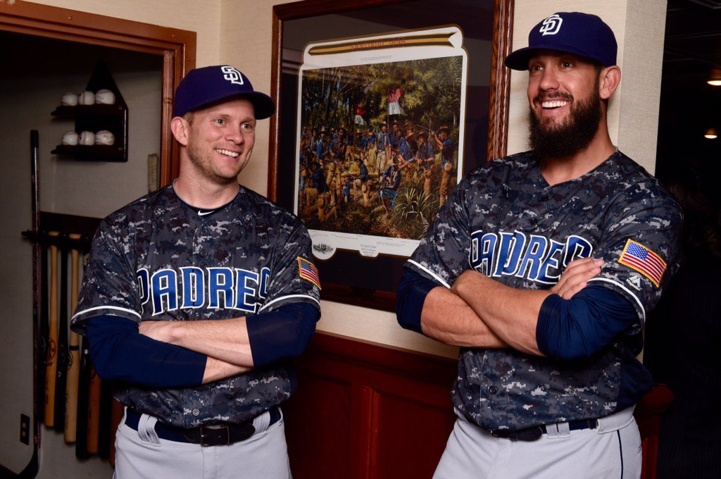
The Padres crossed us up yesterday — or at least they crossed me up. I’d been told by a team source that they’d be unveiling their new uniform set at 8pm Eastern. Instead, they held an event four hours prior to that just to unveil their their new camouflage design, which is blue — an MLB first (and, let’s hope, last) — and then held another at 8pm to unveil their new home unis. (The road sets are unchanged.)
You can see my thoughts about the new designs in this ESPN piece, which was posted last night. One thing not covered in that piece: The new blue/yellow color scheme is supposedly to “commemorate” the 2016 All-Star Game, which the Padres will be hosting, so the new home jersey is being touted as a “commemorative All-Star jersey.” That’s just marketing bullshit, of course — it’s their new home jersey, at least for 2016. Calling it “commemorative” makes it sound more special, but that’s nonsense. (It’s worth noting that the MLB Style Guide simply lists it as “Home Uniform.”)
Still, it’s not clear whether it’ll be retained after next season. A team source tells me, “The feeling around the office is that the jersey is just a test-market of the blue and yellow color scheme. If it’s popular among fans, it may be continued beyond 2016 with a more permanent use of the blue and yellow.” That’s interesting, but it sure doesn’t jibe with the way the uni-verse currently works, what with long lead times and being locked into things years in advance. Do the Padres really have the flexibility to improvise here? I’m skeptical. Whatever they have planned for next year, I suspect it’s already set in stone.
My source also tells me this: “The old brown camo [as opposed to the new blue camo] will be worn twice in 2016 for tributes to the Marines.” There’s more info on that here.
Meanwhile, there’s one item at the end of my ESPN piece that’s worth expanding upon here: As I first reported here back in early October, all MLB teams will be wearing Jerry Dior’s silhouetted batter logo on the back of their pants in 2016, and yesterday’s unveiling provided our first peek at that:
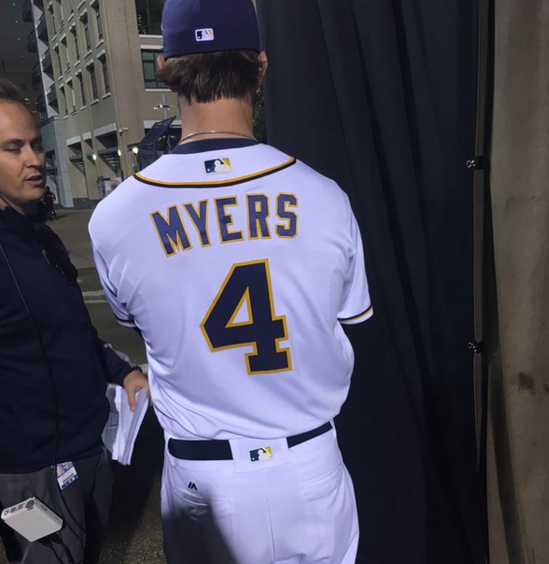
As you can see, the logo is rendered in team colors — blue and yellow, in the Padres’ case — rather than the standard red-white-blue design. This matches the protocol for the logo’s appearance on team caps and team jerseys, where it always matches the team’s color scheme.
When I tweeted that photo yesterday, lots of people responded by asking what this would mean for the Tigers, who’ve used thin belt loops for many decades. I’m assuming they’ll have to switch to belt tunnels — an unfortunate example of how logo creep can affect a team’s visual identity. (As an aside, I was heartened to see how many people were aware of the Tigers’ loops and thought about the new logo’s implications for same — good to see people being uni-alert!)
Meanwhile, do we need a new term for this logo placement, or will “tramp stamp” suffice?
(My thanks to Phil for his assistance as last night’s event unfolded.)
The Ticker
By Paul

Baseball News: Did you notice that the Tigers used their cap “D,” not the jersey version, for the name placards at Jordan Zimmermann’s introductory presser the other day? That’s because — although it hasn’t yet been formally announced — the Tigers are redesignating the cap logo as their primary logo for 2016. ”¦ Interesting story about how MLB teams still get rings even if they lose the World Series. ”¦ Too bad David Price signed with the Red Sox. I was hoping he’d end up on a team with a contrast-colored squatchee, so his de-squatchification would be more obvious. ”¦ New fifth-anniversary logo for the Yokohama DeNA Baystars (from Jeremy Brahm). ”¦ Also from Jeremy: New Hanshin Tigers player Matt Hague wore the team’s jersey while signing his new contract.
College Football News: The Tokyo Bowl, being held on Dec. 6 in Japan, will be color vs. color. “The red team is Nihon University (Nihon Phoenix) and the blue team is Kwansei Gakuin University (Kwansei Gakuin Fighters),” says Rickey Layman. “They are two of the best teams in Japan, playing in what is the Japanese version of the Rose Bowl (the two teams that beat them will be playing for the national championship the same day).” ”¦ Clemson QB Deshaun Watson will have a hand warmer sewn into his jersey this weekend (from Ben Whittington). ”¦ Reprinted from yesterday’s comments: GOP presidential candidate Ted Cruz, who got in trouble a few days ago for using a logo that appeared to be based on the Big 12 logo (similar to when fellow candidate Jeb Bush ran afoul of the SEC in October), is selling an overpriced polyester shirt on his campaign website. The uni number presumably refers to the next president’s ordinal, plus Cruz will be turning 45 years old later this month. After Greg Binsi posted that link in yesterday’s comments, R. Scott Rogers provided a detailed design critique. ”¦ College team merch is apparently poised to become the dominant form of “athleisure” apparel (from Tommy Turner). ”¦ Here’s a position-by-position breakdown of which helmet designs will be worn by which Navy players for the Army/Navy game (thanks, Phil). ”¦ UCLA congratulated Josh Rosen on being named the PAC-12 Offensive Freshman of the Year but used a picture of him in last year’s uniform (from Jared Buccola).

Hockey News: The NHL is running a Zamboni design contest for the 2016 All-Star Game (from @GKG_77). ”¦ “My coworker’s mom has this hockey jersey from when she lived in Frood, Ontario, based around the Frood Mine (a really big nickel mine) in 1936,” says Adrian Bischoff. “They had a hockey team made up of miners. Pretty awesome. Seems to be wool. I wonder if they had indoor rinks or if they only played on lakes?” ”¦ I’m putting this in both the hockey and NBA sections: Jerry Seinfeld announced a 2016 residency at the Beacon Theater in NYC and was presented with personalized Rangers and Knicks jerseys. Seinfeld is known as a Mets fan, so why didn’t he get one of their jerseys instead? Because the Beacon is owned by Madison Square Garden, which also owns the Rangers and Knicks (from Dane Drutis). ”¦ Xmas sweater jerseys for the Albany Devils. … The Sharks wore their early-’90s throwbacks last night. … This is pretty cool: We knew USC and UCLA went color-on-color on the gridiron, but they also do so on the ice!

NBA News: Do you care what a bunch of teenage girls think of the NBA’s Xmas uniforms? Right, me neither, but The Washington Post asked them anyway (from Tommy Turner). ”¦ Andrew Payne asks a good question: “Why do basketball referees wear warm-up jackets? I can’t think of another sport where the officials do that.” And we can’t blame this one on merchandising, since nobody’s running out to by officiating apparel. Anyone..? ”¦ I’m putting this in both the NBA and hockey sections: Jerry Seinfeld announced a 2016 residency at the Beacon Theater in NYC and was presented with personalized Knicks and Rangers jerseys. Seinfeld is known as a Mets fan, so why didn’t he get one of their jerseys instead? Because the Beacon is owned by Madison Square Garden, which also owns the Knicks and Rangers (from Dane Drutis). ”¦ Lots of stuff pertaining to last night’s Sixers/Lakers game: (1) The Sixers saluted Moses Malone and announced that they’ll be retiring his number next season. (2) They honored Malone with this backboard padding (from Robert Hayes). (3) Earlier this season they were wearing this memorial patch, with the three black stars for Malone, Darryl Dawkins, and Harvey Pollack. But last night they had a new memorial patch. Here’s a closer look. I’m told that they had those stars on the court as well, although I couldn’t find a photo (from Dan Roche). (4) Prior to the game, the Sixers presented Kobe Bryant with a jersey from his Philly-area high school. Oddly, they used his current Lakers uni number, not the number he wore in high school (from Pat Costello).

College Hoops News: Brutal new sleeved alternate for Weber State (from Tyson Jex). ”¦ Florida’s Gator mascots dressed up in Star Wars costumes last night (from @DaveDoop). ”¦ The TV broadcast of last night’s Virginia/Ohio State game featured digitally superimposed ads on the court.

Grab Bag: New soccer jersey for FC Rot-Weiß Erfurt, to coincide with their new stadium (from Ed Å»elaski).Very interesting article about the role of coin tosses in sports. Recommended. ”¦ I mentioned in yesterday’s travelogue that we stopped at the Genesee Brewery in Rochester. Looks like we were a few days early (from Blair Spangler). ”¦ Back in February I wrote an article on snap-fit design, which, loosely speaking, refers to things that go “Click!” when you close them. Now Adrian Bischoff has sent me this very cool snap fit design guide, along with a absolutely fantastic video that shows how a retractable “click” pen works. Great stuff. ”¦ Scores of TV meteorologists have been wearing the exact same dress on the air. ”¦ The Los Angeles Times has issued a Star Wars style guide. ”¦ Speaking of Star Wars, George Lucas says “he has assiduously avoided the Internet since 2000 ”” no Facebook, no Twitter, no email, even.” Although this means Lucas doesn’t read Uni Watch (and although he spells his surname incorrectly), it’s inspiring to know that one of the world’s most potent creative forces gets along just fine without cyberspace. ”¦ New rugby sevens shirt for Wales (from Tim Dunn). … Hey, remember when USFL refs wore shorts?
The Kobe Lower Merion jersey confused me last night. It is fairly well-known that he wore #33 in high school. Throwbacks with his #33 were sold widely for a while.
Kobe wore #24 during his freshman year at Lower Merion before switching to #33.
link
I live in the Philly area and yes the Sixers did have the 3 stars on the court’s sideline for Moses, “Stats” Pollack, & “Chocolate Thunder”
The link to the article on coin flips takes us to Dressed to the Nines.
Fixed. Here’s the proper link, so you don’t have to scroll back up:
link
I say call the new pants logo the “#2”. Double meaning at its finest.
Agreed,
Pods failed to update the “Swingin’ Friar” on these sets… wtf? They left out the best part of their Unis. I won’t ramble on about the silly Cammo-Lamo-Ding-Dong look save for this… if you are wearing NAVY cammies… and fall in the water, how the hell are they gonna see you?
Sailors, and the (civilian) secretary of the Navy, have made exactly that point about blue camo for people on ships at sea: link
They’re known in the Navy as “blueberry” camo, and it is not a term of affection.
It is if you believe the Padres’ press release.
Fortunately, nobody does.
for accuracy’s sake, that new Wales shirt is actually for the 7s team, not the proper national team…
Fixed.
I was kind of hoping the Padres would align their color scheme with the Chargers. I guess that wouldn’t work if the Chargers move to LA like they have threatened.
City-alignment would have been a good move – Rays should go with the baby/yellow/navy scheme.
I don’t know what this baby/yellow/navy scheme is…
Whoa whoa whoa, Tigers are switching all their logos to the better* cap Old English D? This is major. Sources? Explanations? I never thought that day would come. But happy to see that uni “quirk” fixed. Cap version is far superior, IMO.
They’re switching the “primary” logo from the jersey D to the cap D, that doesn’t mean they’re actually going to fix the uniform. Don’t get too excited.
Just the logo used for graphics. For example” When you see a match on TV for two teams it would have been the Cleveland block C next to the Tiger’s ‘blockier’ jersey D. Now it will show the ‘sharper’ cap D.
In advertising, the organization uses both. Usually if the ad shows ‘action’ or ‘excitement’ it is the cap D. If the add is featuring ‘tradition’ or is going for classy look it is the jersey D.
If it is ever changed it is a lose lose. Now its a loss because they don’t match, but the blocker D looks better on the jersey and the sharper D looks better on the cap. Either the jersey will look worse or the cap will look worse.
If you look back to the past, the hat D is always (almost always) different from the jersey D, which has been pretty consistent. Probably an old manufacturing issue of what type of lettering could fit or look right on a ball cap compared to the flat surface of the jersey.
Source: MLB Style Guide.
Explanation: Unclear.
The funny thing is that twice in recent years, I’ve tried to purchase throwback-color “cream” baseball pants from the MLB online store. For, um, Halloween costume purposes. Let’s go with that. Anyway, the pants have been listed in the MLB store, and I’ve tried to purchase them when MLB has emailed me a coupon for its online store, but both times after making the purchase the pants went from being listed in-stock to back-order, and in each case six weeks later my order was cancelled by MLB because the pants weren’t really in stock after all.
Makes the conspiracy-nut side of me wonder if MLB has been listing pants in its online store just to see if anyone is fool enough to buy them. So now, thanks to idiots like me, MLB has decided it can sell baseball pants after all, so on goes the #2 logo.
Will the Padres be wearing the gray road uniforms in the All-Star Game, though? The NL is the visiting team in 2016 (and in 2018 in DC) – but have there been details on how that will work? Simply bat first? Or go all out and wear gray, use the visitor’s locker room, etc?
Excellent question. Not sure.
What? I’m shocked to learn that four NL cities will host ASG’s in a row.
Hey Paul, off topic here but have you ever written about/investigated why the Giants switched their helmet number font from their rounded “steeler”-like numbers to the block numbers? The Giants I believe used it first. I like the look of the rounded numbers better even with the block font they use for their jerseys. Old pics of Gifford and Huff make me wish they’d bring them back.
I think they want the helmet numbers to match the jersey numbers.
Coin toss: When I know that a coin toss will be required at an event I’m participating in, I make a point to bring a substantial coin for the toss. An old Eisenhower dollar, for example, or a newer gold dollar coin with either a good or an interestingly obscure president, sometimes an old British one-pound coin, or even sometimes a hefty challenge coin. The one thing that disappoints me about curling is that the club just has a penny at each sheet for the coin toss to determine which team curls first. A penny? That’s no way to start a game. Geurilla coin-replacement may be called for.
Re article’s mention of coin toss still serving as tiebreaker even in this day & age: my daughter’s college team played in an 11-team conference, the top 8 of whom qualified for the conference tournament. The tournament manual’s painstakingly-detailed tie-breaking procedures for determining tournament seedings ends thusly:
Step 8. Coin flip (or similar random action involving all tied teams).
Her freshman year, 3 teams were tied for 6th place at season’s end. They remained tied even after steps 1-7 of the tie-breaking procedures were applied. A coin toss not being feasible in that situation, the teams literally drew from a hat to determine their 6-7-8 seeding order for the tournament.
Her junior year, three teams again ended the season tied, only this time for 8th place, i.e., the final tournament spot. Two of the teams were ones who’d drawn from a hat 2 seasons prior. Again, the tie-breaking procedures were applied; again, the 3-way tie remained unbroken even after steps 1-7 were exhausted; and again, a coin toss not being feasible, names were drawn from a hat (by the conference commissioner this time) to determine which team progressed to the tournament, and which 2 were done for the season.
Predictably, the team that hadn’t participated in the prior hat drawing was the one selected in this one.
A handful of local elections wind up with ties every November, and coin flips are the most common method of breaking the tie under state laws:
link
In one case in Alabama recently, a tie was broken by having a third party draw names from a hat. The candidate pulled from the hat won the right to call a coin toss. The winner of the coin toss then had the opportunity to decide which of the candidates would pick first from a bag with 20 numbered ping-pong balls. The coin-toss winner let his opponent pick first, then the opponent’s ball was put back in the bag, and the coin-toss winner picked a ball. But since the first ball was replaced into the bag, it never mattered who chose first, so the whole sequence was even more of a farce than it sounded. (The guy who won the coin toss drew a lower-numbered ball, and so lost the election.)
My favorite is when tied candidates use a deck of cards, either cutting after a shuffle to get the higher card or drawing five-card poker hands.
I’ve curled a lot and I’ve never seen a penny (or any other coin provided) by the club. When I third I make sure I have a loonie or toonie or other substantial coin, and when I skip I make sure my third has a loonie.
We just flip a slider. “Black or white” is just as good as heads or tails.
Of course, some day the BLCC (Brooklyn Lakeside Curling Club) will be ‘good’ enough that everyone actually has a pair of curling shoes, making the sliders obsolete and thus necessitating a proper coin.
My vice never carries change — and apparently neither do any of our opponents. So, for now, tis a slider flip.
I haven’t yet seen a step-on slider at the Madison club. It’s all the elastic sliders, and of course curling shoes. But you can’t really flip the sliders with the elastic for a coin toss, since there’s a huge weight/size imbalance. I get why the club puts pennies at each sheet: There’s always a coin to toss, so no delays if the third or skip doesn’t have one in his pocket, and nobody is going to steal the pennies.
In a club of 500+ members, it will be a while before first-year me actually has to worry about flipping a coin as a third, so my aesthetic displeasure at the pennies will likely remain a picayune annoyance for some years to come. But someday, I’ll secretly replace all the pennies with loonies or thistle pound coins or something.
Given the great football and basketball unis and color schemes for UCLA, the dominant navy blue is very disappointing. I like the USC ones though.
This is a closer view of UCLA – link
The UCLA hockey jerseys are just generally a mess. You would think even club sports at a major university would be able to put together something half-decent, especially as UCLA is an Adidas school, and Adidas owns Reebok.
As for the colors, the UCLA sports teams are all over the board as far as the shades of blue they wear but it less common to see Bruin blue and Navy blue worn together except when one is simply used as a minor trim. In this case the lighter blue is very prevalent. Compare the use of both colors by the hockey team with the women’s volleyball team:
link
With the Padres Rays-style colors, they should steal back the Rays fauxback! That would be dandy!
I wouldn’t call navy and gold particularly “Rays-style colors”. Even if the Rays did have some claim on them, which they don’t, Tampa Bay uses a lot more sky blue than gold with their navy.
Surprisingly, the superimposed on court graphics for the UVa-OSU game didn’t bother me as much as I expected. It was also used for UNC-MD and, I suspect, the rest of the ACC-B1G Challenge.
A team that wins a pennant deserves a ring, even if they don’t win the World Series. Being National League or American League Champions is a big deal; we can be thankful that this is an honour which is still appreciated, and which has not been diminished by the scourge of interleague play.
agreed
True enough.
Baseball is unique that way. There aren’t any link or link or link about winning the NFC or the Eastern Conference.
But there are banners unfurled for winning “The Wild Card”
Is that typically how a #4 is centered? It doesn’t look right to me.
4s are tricky, because they fall away to one side, creating an illusion of being narrower than they are. We’ve wrestled with this on the membership cards.
That is Matt “The Hit Collector” Hague (2015 International League MVP with the Buffalo Bisons) signing a contract with the Hanshin Tigers, not “Mike Haig”.
Too bad he didn’t wear this sweet Happi Coat to sign the contract link
Thanks. Fixed.
Last name is still wrong: should be “Hague”.
Ugh. Fixed.
link
For sure, Kobe is more well known as #33 for Lower Merion, because of his senior year, the state championship, some after the fact merchandising, etc. But according to above article, #24 was a high school number for him, and it was unavailable from the Lakers at first, spurring Kobe to take #8. For that matter, #33 was even more unavailable. Retired for Kareem.
So maybe presenting Kobe with a #24 high school jersey is a way of digging even deeper in history, as if to say “We knew you way before you hit the spotlight.” Not unlike the Red Wings giving Gordie Howe a #17 jersey. Or, maybe it was chosen for the synergy. “Last time that famous #24 comes home? He was our #24 once too, believe it or not. Let’s give that to him. It will match for this special occasion.”
Couple of Padres thoughts. There’s precedent for the “commemorative” thing. The old Philadelphia A’s under Connie Mack wore blue and white. For the team’s 50th anniversary in the American League in 1951, the A’s added a gold outline to the white A on their blue caps. Not sure if the blue A on their home white jerseys also got the gold outline. The commemorative gold came off the A’s unis in 1952.
The brown home alt means the Padres are joining a growing list of teams that are splitting the baby between fan nostalgia for old color schemes or uniforms and more recent, not-fan-favorite, unis. Brewers, Twins, Phillies (sort of), Mariners (sort of), Indians (even more iffy sort of). Others I’m forgetting? I hate hate hate this phenomenon. If the old unis or colors are really so important, just adopt them. Adapt them, modernize them, whatever. But having vastly different basic looks – brown and gold versus navy and white, for example – undercuts one of the primary functional purposes of a sports uniform. A throwback uniform a couple of times a year over an 81-game home season is one thing, but wearing something other than your team colors once a week is asinine.
I hate hate hate this phenomenon. If the old unis or colors are really so important, just adopt them.
Agreed. The Brewers’ schizophrenic split bothers the hell out of me.
I’ve been ranting in this space for years about some MLB team bringing yellow back into the primary color fold. Glad it’s moving that way, home uni looks great. Hope they move towards “owning” the color – since the Pirates have moved to a predominantly black palette. Your move A’s and Rays.
Never been a fan of the brown, but am happy those ardent supporters got their wish as well.
Shockingly, the girls critiquing the NBA Xmas uniforms were actually spot-on in some of their critiques. I guess it doesn’t take much uni knowledge to see the flaws in some of those designs.
The Padres set with the SD initials on the chest would look a lot better if they weren’t in the same division as the Giants. This really feels derivative.
Or maybe the Giants should drop their road alternate jersey and go back to that gorgeous regular road.
Sure, they probably should, but I don’t see why they would have to change because of a copycat team.
+1
Too many California teams. It’s hard to forge an identity in those circumstances, especially in a town as conservative as San Diego.
arrScott, more recently, the LA Anaheim Angels put a gold outline on their own cap A’s for their golden anniversary. Difference here is that this is the first allegedly commemorative jersey to last a whole year and sit in such an official capacity. This isn’t a one game “ring day” top or a normal top with a Champs patch that lasts all season. It’s a “commemorative all star jersey” that is the home jersey.
Since Paul mentioned it, I like his theory. Behind the scenes, it’s set in stone, but as a facade, it’s fake uncertainty. If the navy and gold works, you’ll randomly see the home hat on the road and then some gold will get on the gray jerseys. If not, there are plenty of softball tops to go around while the official home outfits never get used, and the once home or road now just road alt could always come back home. Kind of like a worst of both worlds between the Mets wearing black hats nearly everyday for too long and the Astros wearing the brick red softball top instead of road gray.
Sigh, another team shoots themselves in the foot as the Padres release a series of schizophrenic unis that have no relation to each other. If they’re going to stay with navy and white, then the addition of yellow is a huge improvement. But stop with the brown “alternates”. The ONLY way I will be interested in the Pads again is if they return to brown and gold full-time. I was a fan of the team and those colors from day one and my interest ended when brown/gold ended.
Thankfully, there is the pic of that Frood Tigers jersey to soothe my palate. Anyone notice the similarity of the logo to the short-lived NHL team the Hamilton Tigers of 1920/21???
link
link
-Jet
“Schizophrenic” is apt, and maybe even understates things. A good baseball uniform set includes some level of consistent distinction, such that a fan can tell at a glance what the team is, home and road. The Dodgers, for example. The Braves back before all the alt cap nonsense. The M-cap era Twins. The new Padres uni set is the opposite: Four main uniforms, each one seemingly unrelated to the others in any fundamental visual style. While I actually like all of the Padres uniforms just fine individually, the whole is so disjointed and confused that I regard the change as a major downgrade.
Even setting aside the whole thing with having a brown-and-gold uniform alongside blue-and-gold and blue-and-white, there are formal elements that could have been adopted across the board to create a visually consistent identity. The spinnaker-like contrast-front cap for example: That alone, applied to the blue home and road caps, would have given the Padres a strong, consistent, and distinctive visual identity. A gold front-panel at home, and maybe gray on the road, and bam! The fan can tell at the shortest glance by the cap alone that he’s looking at a San Diego player. Or the two-color headspoon on the home uni: Apply that across the board, including to the road (blue and gold) and blue alt (white and gold) as well as to the brown alt (white and gold), and again the Padres would be much easier to identify at a glance even with every other element of their unis being a confused mess. Or the full Padres and San Diego script. It’s not quite distinctive enough to make the unis pass the at-a-glance test, but they have nice consistency and are distinctive enough to help. So replace the SD monograms with Padres at home and San Diego on the road, and the Friars would go some distance toward consistency and distinctiveness. In the confusing diversity of their uniforms, the Padres gave themselves a number of potentially terrific options for achieving visual unity and uniqueness; if they would pick even a single option and apply it consistently, they would massively improve their uniforms without sacrificing the variety they clearly want to have.
sooooo, what you’re saying is you lost interest in the padres 30 years ago? who have you supported since?
also, since you lost interest, you should know that the mid/late-90s and mid-2000s were great times to be a pads fan, even if they were wearing blue then.
Always a Mets fan since ’65, but once the Pads came along I added them to my fandom. I’m never a fan of just one team. Lost interest in all modern sports around 2000 though, just like coming here to yak about unis. I never lose interest in them!
-Jet
I totally see that.
Uniforms can be an important part of the contract between team and fans. The Packers or Yankees can go through a rough patch, but the fans see those uniforms and know that they’ll be back on top. Eventually. Someday.
Once a team changes colors (even more so than a logo or specific uniform), than can break the contract and allow fans to jump off. The emotional connection is interrupted.
Ditching the original colors, no matter how ugly, is the equivalent of scuttling the ship.
Any other ugly sweater shirts have off center screen printing?
Frood miners had an indoor arena they played in at Copper Cliff called Stanley Stadium.
“Stanley Stadium – During the thirties, Copper Cliff was one of only three towns across Ontario that had an indoor rink … On January 15, 1935 Stanley Stadium with the first artificial ice unit in the district, was officially opened.”
link
Picture of the inside of the arena for it’s opening:
link
Page 4 & 5 of this 1937 issue of the Inco Triangle has “Shift League hockey” and “Nickel Belt Hockey League” along with the introduction of the Sportimer clock at Stanley Stadium.
link
Frood Miners team won the Allan Cup in 1937:
link
That looks like a project for Ebbets Field Flannels. I’m also holding out for a Trail Smoke Eaters jersey, another black and orange gem.
Pre-1960s hockey arenas are incredible. They are like being in century old churches, only less benevolent.
Rugby referees have warmup jackets, but that’s because we often referee in cold, shitty weather and would like to stay as warm as possible before we have to strip down to short-sleeve jerseys and shorts.
Anyone else bothered by the Padres piping?
I don’t like the yellow and blue ping, and correct me if I am wrong, it seems opposite of the sleeves. It’d be better as one color or a bordered color like the Braves.
Don’t know. I kinds like it, although all-gold would have been better.
Still, hard to take this one-year jersey very seriously.
Never mind on my opposite of the sleeves. I see that the gold is always on the outside.
I see pros and cons to the supposed one year uniform scheme. The Dodgers red numerals were meant to be just a one year thing and now they are iconic. I love the traditional uniforms that remain the same through a teams history, as mentioned by another commenter, a great uniform has a consistency home away, and alt (in included. Since the Padres canned that idea of tradition and consistency a long time ago and since they are not my team, I don’t mind the one year commemorative home uniform
I like the piping but don’t understand why the inconsistency across uniforms. (This aligns with some of the other “schizophrenic” comments.) The road pants have piping to match the jersey, the home’s don’t (despite going with the piping-heavy headspoon-sleeve combo). The road alts have double piping with a gap of an inch or two, which the other jerseys don’t.
It’s often cold in arenas early before the crowd heats it up. I have a jacket to wear on the basketball bench before the game. I never need it once the arena and I heat up.
Because the Beacon is owned by
Madison Square Gardendouchebags.Couldn’t help myself.
Hey Paul, maybe I’m becoming color blind, as you didn’t mention this in your ESPN piece, nor is it shown in the logo listed by Chris Creamer (link)
BUT if you look closely here:
link especially the straight ahead view, it would appear the cap logo is blue on the brown hat?
that’s some serious over design right there…
MLB Style Guide shows it as brown.
Proofreading: “Why do basketball referees weawr warm-up jackets?” (Someone already answered that arenas can be cold before a game, especially if there’s a sheet of ice under the floor.)
Just got an email from MLB advertising a line of team and event-branded wine:
link
Hmmm. No Milwaukee Brewers wine? And as much as I enjoy a good pun like Reds Red, shouldn’t Cincy really be represented with a bourbon?
Yes the neck loop piping is a bad choice but these homes are pretty nice. Always loved anything similar to 70’s Brew Crew duds and this is about as close as you’ll in MLB now. The away duds are fail. Glad they ditched the lame script jerseys.
I don’t know if George Lucas can be called a “potently creative mind”.
THX-1138, American Graffiti and original Star Wars are his three contributions that stand the test of time. Beyond that, his movies suck.
Howard the Duck anyone?
JD Salinger can do one great artistic work and ride it for a lifetime, George Lucas not so much.
Hockey refs wear warm-up jackets during, well, warm-ups.
Wandering rant warning: With the MLB logo now on pants, we see it replicated three times on the back of Wil Myers. Obviously this is because they are pouncing on the opportunity to sell pants to R Scott and anyone else. Every year we get more crappy stickers on uniforms that you can’t even read from the stands and only on close ups on TV. It looks awful in college basketball when you get the conference logo, the flag, NCAA logo during the tournament, makers mark, and the team emblem at the bottom of the collar all junking up the jersey design. Like we don’t know it’s the NCAA tournament. Jerseys look even worse in college football with all of the now regular splotches plus maybe a bowl game sticker and tiny team name all crammed on the front. Am I the only one who hates the tiny team name above the numbers, especially in the NFL? Used to be you’d only see team (or school) names on jerseys in college and below but they were at least big enough to read. The Browns ruined that this year. Another barf is the replication of the helmet logo on the shoulder because sellers know kids don’t wear helmets daily and want the logo on the jersey somewhere. That puts the team logo prominently on a player in four redundant locations from the shoulders up. And the Padres going to the MLB default template jersey — head spoon and replicated hat logo over the heart. Actually, I like the colors and the jersey looks fine by itself (road unis are still prison issue boring). But we’ve seen that design on half the league already. Obviously I’m not a fan of replication. Come up with something new. Put the swinging friar on the chest, put the old MLB Health patch on there, anything but the cop out hat logo. But again, for sales, you now need every logo on evert item of clothing. How about the NL West logo somewhere on there if there is such a stupid thing. And they say only soccer and women’s basketball have ventured into the realm of ads on uniforms in these here parts.
^^^What he said.
How about the NL West logo somewhere on there if there is such a stupid thing
Please God don’t give them any ideas….
The folks they try to sell the replica uniforms to seem to like the flair, as in Office Space flair. We are clearly in the minority.
A couple random things:
1.) I still prefer the Padres in blue and orange (NO BROWN, EVER!!!) but the blue and yellow looks OK to me. My first thoughts when seeing the home uniform was to wonder if it has pants stripes, looks like it doesn’t which will drive my OCD crazy. My second thought is how much it looks like the Natinals home uniform. I get that baseball and basketball you have the “least to work with” as opposed to hockey and football. But the Natinals seem to have inspired the new home look here.
2.) Not changing the Padres road uniforms was a terrible idea. Carry over the white and yellow “SD” hat logo and maybe add a yellow bill or something to add some yellow to it if you don’t want to change the uniform itself! Seems lazy and makes it feel like the blue and yellow is just a bridge either to brown (ugh!) or yet another uninspired generic new look down the road. Same for last year’s blue alt. Can’t they at least change the “SD” to the new yellow and white.
3.) The yellow and white SD looks better with the uniform than on it’s own but the yellow squatchee is already bugging me. Change it back to blue. I’m not opposed to teams to have a different color squatchee but the yellow is a bit too bright and eye catching.
4.) No need to keep last year’s cammo AND introduce the new blue cammo. No need for either actually but the blue looks better and is something the Pirates should consider since Pirates sailed on water and all (not that they need a cammo alt either).
5.) The brown alternate? Kill it with fire now before it gets a foothold! If they want to go back to brown make it brown and orange not brown and gold. The old Padres wordmark from last season was a thousand times better as well. I’m really going to hate the split D in the middle.
6.) The MLB logo on the back of the pants is OK. Not the end of the world for me to see the league logo there. I’d prefer that over a makers mark. And to have it in team colors looks OK (the NFL, NHL, and NBA needs to do this with their on uniform logos as well). Do the Tigers need to go to a complete traditional belt loop system though? Can’t they just fill in the back of the pants with a solid piece of material with the logo and keep their usual loops the rest of the way? Doesn’t seem like it would be too hard to do that.
Overall on the Padres I give it a slight upgrade on the addition of the yellow to the blue and white. Could have been better, could have been much worse.
And finally on an unrelated note. I saw yesterday’s post very late last night. Your first mistake, Paul, was going a county too far north to try the pizza in Pennsylvania. As a born and raised resident of NEPa I may be in the minority in my thoughts but Old Forge Pizza isn’t real pizza!! OK, it’s decent but not the greatest although I prefer my pizza round as opposed to rectangle.
Salerno’s used to be much better but has gone very downhill in the last 5-10 years. If you wanted a taste of the “rivalry” in the area Acaro and Revello’s would’ve been the two to try although Revello’s has also gone way downhill lately. Acaro is edible but IMO there are many, many better places than Old Forge just south of the County line (but we have had a County war on how to do and say just about everything going back generations so I may be biased).
I like for my team to be in fall colors because that’s when I expect to see them playing.
This. This all day. I’m glad I’m not alone. #LoseTheBrown
Not changing the Padres road uniforms was a terrible idea. Carry over the white and yellow “SD” hat logo and maybe add a yellow bill or something to add some yellow to it if you don’t want to change the uniform itself!
I’m really going to hate the split D in the middle.
On those two items, we agree, BTM. Better than nothing I suppose.
I did say at other times if they insist on going brown it should be the brown and orange. I didn’t hate that look as much as I did their earlier looks but it didn’t look anywhere near as good as the blue and orange. Then again I also much prefer the 90’s Chargers look to the powder blues.
Paul, break a (proverbial) leg at the City Requilary tonight!
I’d go if I were closer. Sounds like a fascinating place.
Thanks! (The event isn’t actually at the Reliquary — it’s at the Brooklyn Historical Society. Which is also fascinating place!)
San Diego is a big Navy town. That’s why they did the blue cammo.
My God! What’s that on the Padres’ new uniform? It’s… it’s color! I consider that a positive turn of events. Baby steps, people, baby steps…
I actually like the Padres leaving the road unis unchanged (though I admit they’re a little boring). I always found the Tigers’ navy at home and navy-orange on the road to be a fun quirk that didn’t feel disjointed. Other teams, don’t seem to have stolen this yet, so the Padres doing so doesn’t feel so forced.
Of course, the Padres spoiled the whole thing with too many alts and too much inconsistency (see my comment above about piping), so the set lacks the style consistency to link the different-colored designs. But I like the concept they’re going for.
Does anybody else think – the Atlanta Hawks “volt green” is a lot closer to yellow, than the Seattle Seahawks neon green? I prefer Seattle’s shade, I know for most on this website that’s like saying I prefer someone hammering a nail through my forehead, vs hammering it through my neck.
Padres Uni – OK, nothing to get excited about.
There might be some cognitive bias in thinking the basketball Hawks’ trim is more yellow than Seahawks-esque green. I speak from experience. I assume based on my own prejudices that the Atlanta Hawks are red and yellow because those were Nique’s colors and that’s how it should be. But then I snap out of it and it definitely isn’t yellow anymore.
Coming from both a high school and a college who both used brown & gold colors I applause the Padres for going back to their roots. That said I wish they’d go more toward their 84 unis. I also love what my alma matter Western Michigan has done with their football uniform combos