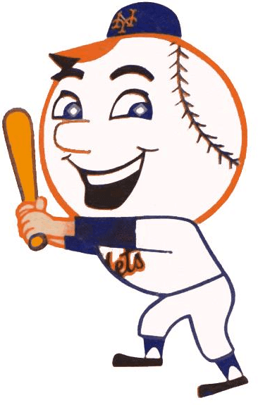
As many of you know, for several years now I’ve been trying to find the identity of the artist who designed Mr. Met — not the live mascot but the cartoon character. The Mets no longer have any records on the character’s history, and I’ve been unable to find the answer myself. I came tantalizingly close three years ago, but then the trail went cold. Grrrrrr.
More recently, however, I’ve been back on the case. The good news is that I think we now have an answer to this longstanding mystery. The bad news is that I can’t quite prove it yet. Here’s the story.
In late May I received an email from Russell Harvey, whose father was the late comic book publisher Al Harvey, founder of Harvey Comics. It read as follows:
I believe Mr. Met was created or the first finished illustrations were by Al Avison, one of my father’s friends and a longtime artist for my father’s company, Harvey Comics, and other comic book publishers. Al told me he was the original Mr. Met artist many years ago and showed me some of his illustrations of the character. … I believe this story to be accurate, but I was a teenager when Al showed me his Mr Met drawings. Al may have miscommunicated to me his actual role, or I may have misinterpreted it.
I was vaguely familiar with the name Al Avison — he was an old-time comic book artist and had worked on Captain America way back in the 1940s. Had he really created Mr. Met? Unfortunately, I wouldn’t get the chance to ask him that myself: He died in 1984.
I asked Russell Harvey if Avison had any surviving family, and he pointed me toward Avison’s son, Todd Avison. I got in touch with Todd and explained that I was a journalist trying to solve the mystery of Mr. Met’s creator. He responded, “Well, you’ve come to the right place — that was my father!”
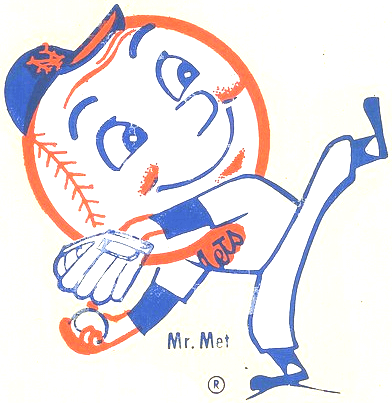
I asked Todd if any of he had any original drawings that could substantiate his father’s connection to Mr. Met. He said he wasn’t sure but that his father’s archives were in storage and he wouldn’t have time to check until early July. In the meantime, he suggested that I speak with his mother — Al Avison’s widow — Peg Avison, who’s now in her late 80s, because she might be able to add a few pieces to the puzzle.
So in early June I called Peg Avison. Here’s how our conversation went:
Uni Watch: I’m told that your husband may have been the creator of Mr. Met.
Peg Avison: That’s right, I remember it well. You know, like, “What do you think of this?”
UW: You mean he was showing it to you and asking your opinion, while he was working on it?
PA: That’s right. We worked together, usually in the same room.
UW: Did you make any suggestions or have any feedback?
PA: I don’t think so.
UW: You’re an artist yourself, right?
PA: Yes, that’s right.
UW: Did the two of you ever collaborate on this type of project?
PA: No. I wasn’t into the cartooning side of things. Strangely enough, I was a men’s fashion illustrator. Unusual for a woman at that time. Now, too.
UW: Do you recall how he received the assignment to create Mr. Met?
PA: No, I don’t.
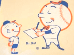
UW: Do you know if the name “Mr. Met” was your husband’s idea, or if it came with the assignment, or if the name came afterward?
PA: No, I’m not sure. It’s funny, I was just thinking about that after talking with [my son] Todd. It could have come from someone with the Mets. I don’t know if he was given a blank slate or a preconceived idea. I can’t tell you.
UW: Once the character was finished and started being used by the Mets, was that something that you and your husband talked about? Like, “Oh, yeah, Al created that,” something along those lines?
PA: Yes.
UW: Was he a baseball fan? A Mets fan?
PA [laughing]: He was a Yankees fan!
UW [laughing]: Oh no! So that was the dark secret behind Mr. Met — he was created by a Yankees fan.
PA: As I recall, he was a Ted Williams fan, too. That was Boston, of course, but he made an exception for him.
UW: Did he develop a soft spot for the Mets after creating Mr. Met?
PA: Oh, sure. And also, with the Mets being a new team, I think a lot of the city was kind of enthused about them.
UW: Mr. Met was used in all sorts of applications: on yearbook covers, ticket stubs, program covers, and so on. Was your husband involved in those applications, working with the team, or did they just take his drawings and use them as needed?
PA: He was just the artist. He didn’t work with the team on any of that. He didn’t have the background to be intelligent about any of that, about the marketing of a baseball team.
UW: Do you know if any of his original Mr. Met drawings still exist?
PA: I don’t know. I have a vague recollection of a few things kicking around the house, but god knows where it is. It’s possible that [my son] Todd has something, though.
UW: Are there any people who worked with your husband back around that time who might be able to verify this story? It’s not that I don’t believe you, but I’m looking to make as strong as a case as possible.
PA: Most of those people are no longer alive.
UW: Yeah, I realized that was probably a long shot.
———
So that left me with Todd Avison and his family archives. I heard back from him shortly after the Fourth of July holiday weekend: “I went through my father’s boxes this weekend and all I came up with was a 1963 Mets yearbook. Unfortunately, my father didn’t seem to save much of his commercial artwork. I don’t think he thought there was any value in it.”
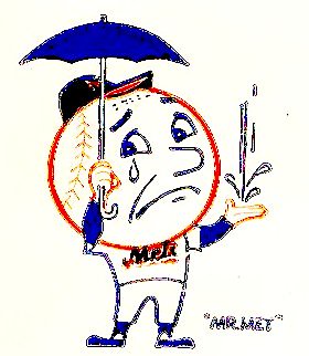
Dang.
Still, it’s significant that Al Avison’s archives included a 1963 Mets yearbook, because that publication marked Mr. Met’s debut. He appeared on the cover, and one of the interior pages introduced him to the fan base (but without any illustration credit). If Al Avison kept that yearbook in his archives — and remember, his wife said he wasn’t even a Mets fan — I think that’s as close to a smoking gun as we’re going to find.
It’s pretty clear that Al Avison believed he created Mr. Met and shared that belief with at least several people — maybe lots of people. It’s tempting to say, “Okay, I’m convinced,” but I don’t think we’re there yet. Remember, the myth of the MLB logo being based on Harmon Killebrew came from Killebrew himself, who sincerely (but mistakenly) believed he had been Jerry Dior’s inspiration and told people as much for years. So while I’ve heard enough to be convinced that Avison told his wife and son and others that he created Mr. Met, that doesn’t make it true. Do I think it’s true? Yeah, I do. But we don’t yet have definitive proof.
Russell Harvey — the guy who first sent me down this road — has suggested a few other avenues of potential research, like checking with the Society of Illustrators (they may have some of Avison’s old work), or combing through old newspapers in Darien, Connecticut, where Avison lived. I’ll follow up on those ideas when I have the time, but I’d say we’re probably talking needle/haystack territory.
And that’s a shame. An original drawing, in addition to definitively solving the mystery of Mr. Met’s authorship, would also be a really cool thing to see. But I think that’s now very unlikely. Sigh.
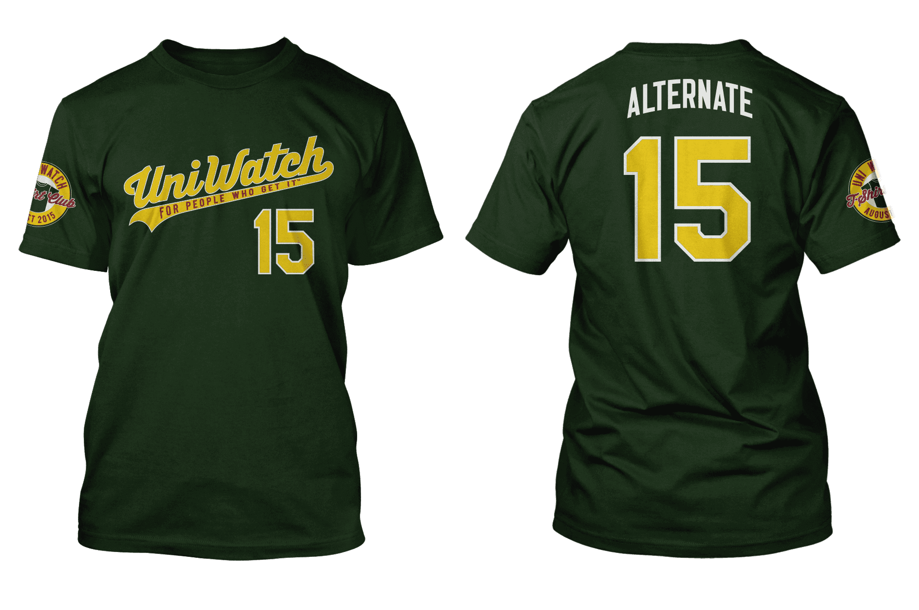
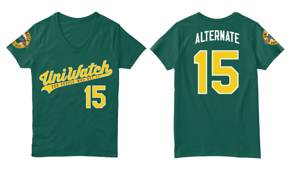
T-Shirt Club — LAST CALL: Today is the LAST DAY to order the Uni Watch T-Shirt Club’s latest design — the green alternate shirt. In response to reader requests, we’ve added a women’s V-neck option, which comes in a slightly lighter shade of green. The men’s crew neck and women’s V-neck options are both shown below (click to enlarge):
To order, go here, and you can get further info here.
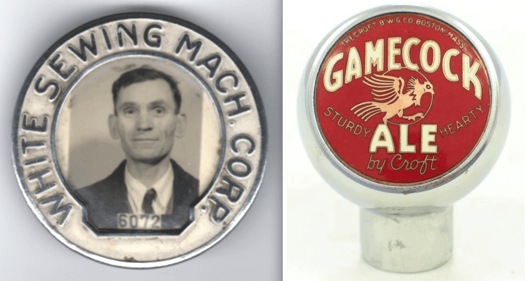
PermaRec update: On the left is a very beautiful 1940s employee I.D. badge; on the right, a 1940s beer tap handle. What do these two items have in common? Find out over on Permanent Record.

Baseball News: Very entertaining helmet logo glitch yesterday for Jonathan Herrera of the Cubs. He eventually got it properly oriented (screen shots by Jeff Stark). ”¦ The Nats usually wear red for Sunday home games but switched to white yesterday because of the heat. ”¦ Yankees OF Brett Gardner may have risked a fine yesterday by wearing white cleats (thanks, Phil). ”¦ My friend Bill Scanga found a baseball uni-related factoid on the underside of a Snapple cap. ”¦ Lots of MLBers now wear those oven mitt-style sliding gloves while on the bases, but Red Sox 1B Mike Napoli’s seems particularly large (from Tim Golden). ”¦ Lots of fun uni details in this print of Mickey Mouse and Goofy playing baseball, which Chris Flinn spotted in a barber shop. ”¦ Here’s a rare sight: Randy Johnson wearing No. 34 for the Mariners, which he briefly wore early in his Seattle tenure (from David Finer). ”¦ Odd sitution in Saturday’s Rangers/Astros throwback game, as one team wore the MLB logo and one didn’t. … Rays P Chris Archer had some stirrup issues yesterday (from Steven Schapansky). … “Crazy Hot Dog Vendor” jerseys yesterday for the Reading Fightins (from Eric Scarcella). … The Salt Lake Bees will wear Salt Lake Gulls throwbacks on Aug. 1. … Rugrats uniforms on July 31 for the Frederick Keys (from Andrew Torrez). ”¦ Several Japanese baseball items from Jeremy Brahm, including red uniforms for the Hiroshima Toyo Carp for three August games; 1979-81 throwbacks for the Hokkaido Nippon Ham Fighters; and yellow jerseys for the Seibu Lions to mark 100th anniversary of the Seibu Railway. ”¦ If you didn’t already think the Star Wars thing had gotten out of hand, this should seal it: The Nats’ racing presidents dressed up as Star Wars characters yesterday. Further info here (from Tommy Turner). ”¦ Great shot of Mike Schmidt wearing the National League’s 1976 All-Star pillbox BP cap (from @prefix6).


Pro and college football News: Brett Favre’s charity flag football game in Madison, Wisconsin, was presented by Hewlett-Packard — says so right on the sleeve patch. … Looks like Nebraska will be getting new uniforms this Thursday (thanks, Phil). ”¦ Really nice cover photo/design for the WVU media guide (from Coleman Mullins).

Hockey News: Interesting piece on Finland’s Hockey Hall of Fame, which of course has lots of great-looking jerseys (from John Muir). … Detroit News hockey writer Ted Kulfan has ranked all 30 NHL uniform sets (from Lee Lawson).

Grab Bag: New checkerboard jerseys for the Tennessee women’s soccer team (from Lee Wilds). … Here’s a good article about how to design an effective app icon (from Ilana Hardesty). ”¦ Interesting infographic on how our brains interpret logos (thanks, Brinke).

What Paul did last night two nights ago: On Saturday night I was out at a bar in Red Hook with my friends Shane and Friederike. At about 10:30pm we began biking home. Red Hook, like many parts of Brooklyn, is a rapidly gentrifying neighborhood, but big stretches of it are still industrial and very ghost-like at night. We chose a route that included a long stretch of Imlay St., which was completely deserted — no cars, no people, no street lights, no nothing. It felt like we had the whole world to ourselves.
At the end of Imlay St. we reached the Red Hook Container Terminal, a big shipping port. Like everything else, it appeared to be shuttered for the night, but it wasn’t deserted. As we approached the entrance gate, we saw several dark blobs on the roadway — a pack of feral cats. It was actually much darker than these photos suggest, because I punched up the images a bit in Photoshop (for all of these, you can click to enlarge):

There were maybe seven or eight adults plus half a dozen kittens. The kittens were eating food that someone had put out for them, a nice reminder that even the roughest-seeming places can be softened by a touch of human kindness:

The cats were skittish, but two of them let me get close enough to get a decent shot. I think it does a nice job of capturing the tough, gritty life of a street cat, finding a way to survive in a largely inhospitable place (click to enlarge):

NHL Uni Rankings – Kulfan ranked the Original 6 in the top 6.
I found those rankings underwhelming. It seems he doesn’t know what he’s doing, when he states up front that he only ranked the home and road unis and not the alternates, and then proceeds to bash the Caps based on their alternates by specifically calling out all the stars on their unis. (The Caps’ regular unis only have three stars on them, as part of the logo.) He also apparently missed the part about the Blues changing uniforms before last season, as he apparently ranked them last based on their prior set (while ranking the Preds 10th based on their current set, which incorporates the same piping as the prior Blues unis).
Well, you know what they say about opinions and assholes…
I’d like to tell Mr. Kulfan that Brooklyn is ON Long Island. It’s even on the left side of the logo. Do some research first.
Extra long oven mitts = slightly longer reach = slightly better chance of sliding in to a base before the tag gets there. Just wait until these things reach tennis racket length before the league legislates against them.
The racing Presidents might be foreshadowing the pierogies at PNC Park. #shudder
Did Red Lobster change their logo yet again??!!
link
ouch!
No love for Napoli
Great job tracking down Mr. Met’s story! A fun read, to be sure.
The Mickey Mouse baseball poster is nice because it is fairly accurate. Goofy blocking the plate (sort of), Mickey slidng to avoid the tag, etc. Not overly cartoony. I like seeing that in animation/cartoons sometimes. A little realism never hurt anyone.
I believe Randy Johnson wearing #34 was a salute to Nolan Ryan (1993?). Johnson wore the royal/yellow Mariners’ combo for the first four years of his career in Seattle and it appears he is wearing navy/teal in the #34 photo.
Yes! I forgot that that’s what it was for. Thanks for the memory jog!
link
With Jonathan Herrera’s helmet logo glitch … It seems you’re seeing more and more of those these days, but what I found more interesting was that after batting with the logo askew and getting a hit, it was while he was standing on first that he removed his helmet and adjusted the logo himself:
link
Oooh, I hadn’t seen that shot — awesome!
I clearly haven’t been paying enough attention – what’s the purpose of the oven-mitt gloves? Protect against jammed fingers? Or getting stepped on?
Well, it’s not there to look cool; that’s for sure!
Jammed fingers
There’s an extra has in the lede paragraph, there is also a missing “s” in the Detroit News link in the hockey section.
Both fixed. Thanks.
I feel like that happens to Chris Archer on a weekly basis
Gee, I hope he doesn’t bristle at constructive criticism.
Just curious, Paul, have you asked the Mets if there is a pay record from back then? Sometimes, even if there are no other records, you can find a check stub or invoice. I realize it’s more than 50 years ago, but accountants tend to hold the records longer than other departments.
Interesting thought — I’ll ask. But I’m dubious. Even if they still had something like that in, say, 2008, it probably got tossed during the move from Shea to Citi.
I always liked that the Salt Lake Gulls wore colors most often associated with south Florida. And I love those throwback caps — they have a real Flint Tropics vibe to them.
that detroit news ranking of all 30 nhl team jerseys states “Kulfan considered only the teams’ standard home and away uniforms; no alternate or special jerseys, such as throwbacks” yet the caps jersey is not only an alternate jersey, but an alternate jersey they’re not even using any more.
just saw someone above had already mentioned this. glad it wasn’t just me!
The irony of Hewlett-Packard sponsoring the Favre game, but getting the jersey number colour wrong on the patch. It should be green.
Someone needed to shake that Cyan toner cartridge!
I love the Hotdog vendor shirts!!!