
By Phil Hecken
Here we go again. It seems only a year or so ago, I wrote about the Miami Hurricanes getting new uniforms, and thanks to their new deal with adidas, the ‘Canes got a new set last night.
Gone are “Smoke,” “Surge,” “Juice,” and “Stormtrooper” (Nike’s names for the gray, green, orange and white unis). Adidas has replaced those with (for now) just three: an orange, a green and a white (click on these and any photos below to enlarge):


The Canes unveiled their new uniforms at Club LIV at the Fontainebleau Hotel in Miami Beach to much fanfare — and while they contain the “trademark” treadmarks of (almost) all adidas unis, they’re fairly restrained.
The adidas press release corporate-speak describes the uniforms like so:
Developed in collaboration with the University of Miami athletic department, the team’s new look is highlighted by updated metallic stripes on the jerseys and pants, incorporating hurricane style cuts and patterns throughout the new uniform. Additionally, the “Hurricanes” moniker is strategically placed across the ribbing of the inside collar for the players to see when they don the uniform, while the classic oversized “U” logo is stitched into on the back of the jersey for all to view.
Made with a cutting-edge, proprietary yarn blend that increases durability and abrasion resistance, Primeknit is the premier compression uniform system, featuring the latest generation of adidas TECHFIT technology. Primeknit helps keep players cool and increases range of motion, giving athletes an unrivaled level of comfort and allowing them to perform at their highest levels. The jersey’s padlock system secures tension over the shoulder pads, while the bodymap fit adheres to the player, making it difficult for opponents to grab, hold or tackle.
Whatever.
Before we look a bit more closely at the unis, the good news appears as though the ‘classic’ white helmet is the ONLY helmet (so far) the team will have — this not only looks great, but will please the traditionalists (if there are any left):

You will recall (and if you don’t, you can refer to my linked article from last year) that the Canes had introduced a couple of new helmets with the last uni set.
I already mentioned that the uniforms have the ‘treadmark’ pattern on the jersey — it’s not as apparent on the white jersey, but it stands out on the green and the orange ones:

An interesting design element (which we saw with the most recent UCLA jersey as well) is a striping pattern that contains breaks, and this one appears to resemble, for lack of a better word, feathers (yes, adidas describes them as “updated metallic stripes on the jerseys and pants, incorporating hurricane style cuts and patterns throughout the new uniform”):

This pattern is also seen in the pants ‘stripe’:

The treadmarks (despite all the accompanying corporate-speak about how they’re faster, stronger, lighter, etc) are an annoying design feature — much like the Nikelace has become a ubiquitous design element for Nike. But I actually like the shoulder and pants-stripe pattern. It’s evocative of past U uniforms, but (of course) with a ‘modern’ twist. I’m not really sure (despite the press release) what look they’re going for with the pattern, but for now I don’t hate it. It might even grow on me. It could certainly have been worse.
At the unveiling last night, the team announced (and you’ll see below) that the uniforms are designed to be worn in mix-and-match style. While it’s not quite as good as seeing them on the field, you can get a better idea of how the uniforms will look below (with a big thanks to twitter user @jonathanlaura for some of these shots):


Overall, I think, especially considering what adidas had done design-wise to the past few schools we’ve seen in the past year — these turned out OK. I like that there is (for now) no gray and no black, as the orange and green are two fantastic colors that work well together. It’s also nice that there is only one helmet (again, so far). And despite the awful treadmarks, they probably won’t be uber-noticeable unless you’re right up close. And this may be damning with faint praise, but they could have been so much worse. They kept it fairly simple (having three basically identical uniforms in three different colors), even the mixing and matching (I really like that white/orange/white look) should look pretty good.
If you want to see more of the unis (although it’s pretty much just stock adidas photos), there is a full gallery here, along with a lot of corporate bullshit commentary from those responsible for these unis.
OK, readers — what do you think?
Meanwhile…on the Diamond…

…the Rangers and Astros played a throwback game yesterday, with the Astros wearing (yet again — but that’s perfectly OK) their ‘tequila sunrise’ uniforms, which they’ve worn before this year and have worn in the past. Their opponents, the Texas Rangers, wore their powder blue road uniforms which they wore from 1976 through 1982. I didn’t get to see any of the game, but from photos, it looked like the usual assortment of hosiery styles (stirrups, socks and pajama coverings) was present. Of course, since the Astros and Rangers were in different leagues (and interleague play didn’t begin until 1997), the uni matchup that took place yesterday could never have taken place in a regular season game before. Not that any of us (except maybe Jimmer Vilk) would hope for a uni clash like this every day, it was fun to see the rainbow guts vs. the powder blues once.
More photos can be seen here. And you can watch video and a brawl here (thanks, Brinke).
But that wasn’t the only “special” uniform game yesterday.
The Pirates and Brewers engaged in a Negro League throwback game:

Both teams have worn Negro League throwbacks before (and both do them very well) — The Brewers donned uniforms of the 1923 Bears. The Pirates wore jerseys from the Pittsburgh Crawfords (1931-38). Even though the eras didn’t quite match up, it was still a great looking game. You can see more photos here.

Uni Tweaks Concepts
We have another new set of tweaks, er…concepts today. After discussion with a number of readers, it’s probably more apropos to call most of the reader submissions “concepts” rather than tweaks. So that’s that.
So if you’ve concept for any sport, or just a tweak or wholesale revision, send them my way.
Please do try to keep your descriptions to ~50 words (give or take) per image — if you have three uniform concepts in one image, then obviously, you can go a little over, but no novels, OK? OK!. You guys have usually been good with keeping the descriptions pretty short, and I thank you for that.
Like the colorizations, I’m going to run these as inline pics — click on each one to enlarge.
And so, lets begin:
First up today is Lee Traylor who has a new look for the Cardinals:

Hi Phil,
Thought I’d take a crack at re-designing the Arizona Cardinals and wanted to share.
Thanks,
Lee Traylor
And we close today with Matt Armstrong with an updated concept for the Atlanta Hawks:

Phil,
I have refined one of my road uni concepts for the Atlanta Hawks. I’m really nervous about our rumored new uniforms for next season if our Christmas concept is any indication. I’m hoping for something closer to the ”˜Nique era with a modern tweak to take advantage of the redesigned “Pacman” logo.
Matt Armstrong
And that’s it for today. Back with more next time.
T-Shirt Club reminder: In case you missed it earlier this week, the Uni Watch T-Shirt Club’s latest design — the green alternate shirt — is now available. And in response to reader requests, we’ve added a women’s V-neck option, which comes in a slightly lighter shade of green. The men’s crew neck and women’s V-neck options are both shown below (click to enlarge):
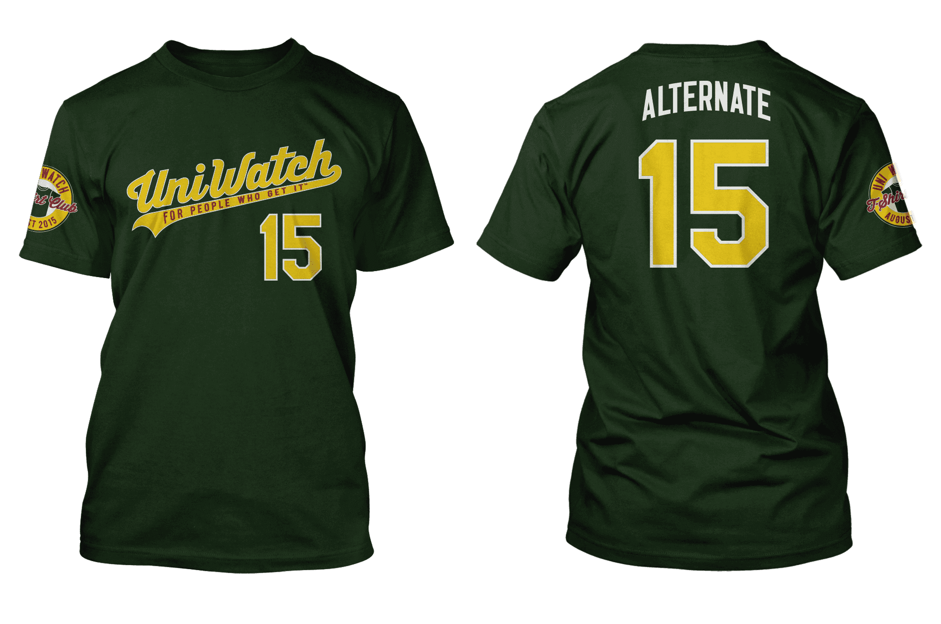
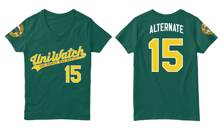
To order, go here, and you can get further info here.
Uni Watch News Ticker:

Baseball News: Paul (and baseball historian John Thorn) are quoted in this article, “Purists say longer baseball pants is a sock in the eye”. Good stuff there. … Here’s an additional look at the All-Star gear for Kris Bryant (from Warren Junium). … Cool shot of a 1980 Buffalo Bisons card for Jim Buckner (from Aaron Husul) who notes they were a Pirates farm team at the time. … Also from Aaron, here’s an entire album of Joe Pepitone showing off his various hair and uniforms over the years. … The Worcester Bravehearts have got themselves some really nice hosiery (shame not all the players are sporting it tho). From Worcester Bravehearts. … “The Birmingham Barons/Chicago White Sox relationships is one of the best parent club/farm team is one of the best I have ever seen,” writes Dustin Semore. “From the players wearing White Sox batting helmets to adapting White Sox logos to match Birmingham.I was at a Barons game and saw the classic ‘Swinging Man’ logo – but instead of ‘Sox’ underneath – there is ‘BHAM.’ I love it.” … Is this a hint at the new Padres’ uniforms? “Yes, I know this is a stretch, but look at the jersey and number font of this toy for sale by MLB for the Padres’ All Star Game,” says C. Tenorio. “It has to be somewhat reminiscent of the host team’s (next) uniform, right?” … Yesterday, the Fresno Grizzlies threwback to the Astros’ rainbow guts uniforms. … The Delmarva Shorebirds did the Christmas in July thingy (via Travis Nardella). … Lots of players now wear those oven mitt-style sliding gloves, but Mike Napoli’s seems larger than most (via Paul). … Whoops — bit of an apostrophe catastrophe on this Reds t-shirt giveaway (nice spot by Jay Mazzone).

NFL/Football News: “I bought this jersey in about 1976 from an ad in football digest,” writes Rob Bartlett. “My memory is that it was the Hawaii team in the WFL. When I look at any archive pictures the color is wrong. Can you help with what team it actually is, or is it a Hawaii?” Here are some tags and a patch. Anyone know what team this is? … “Not sure if you’ve covered it, but in SI’s obit for Ken Stabler they ran a picture of him with what appears to be a yellow smiley face sicker on the front of his helmet,” says Charles Noerenberg. “I found another image with the same sticker.” … Is this the Seahawks 40th Anniversary logo? That was found on a Washington State Lottery ticket by Ryan Wetstein. … Here’s the new Speedform from Under Armour for ND Football (thanks to Warren Junium). Also from Warren, the Cincinnati Football Under Armour Video, who writes, “Look at the football team and all their UA gear.” … “I found these cool NFL items at the Brimfield Flea Market,” says James Hayes. “The chair was a crazy $600. Unsure about the Denver stuff. Seller was M.I.A. The Miami chair would look better with Pat the Patriot.” … Now that Miami is with adidas, here are the Five Worst Miami Uniforms Of the Nike Era, at least according to Fansided. … Rex Ryan went skydiving the other day. Here’s a look at the patch on his jacket (from Aaron Husul). … I think we’ve seen these before, but here’s a look at the UMass uniforms for 2015 (from UMass Lad). … Lotsa shoppers yesterday: “Saw this kids shirt today at Target,” says Mike Wissman. “Interesting version of Steely McBeam. Wonder if it’s something new or just for kids.” … Reader Joe Bailey was at a conference in New Orleans, doing some shopping with his wife and “saw this Sir Saint dish towel in a trendy women’s shop. As much as I love brownie the elf, I appreciate the saints continued use of this logo.” … Here’s a look at the new football helmet for Bishop Carroll Catholic High School in Ebensburg, PA (from Zane Heiple).

NBA/Basketball News: “If the HWC patch is for Hardwood Classic but ‘Hardwood’ is one word, then isn’t this a fukk up?” asks Douglas Ford. “Or do you think HWC is an acronym for something else?”

Hockey News: Here’s a pretty cool shot of a 1973 Munro WHL table hockey game (from Aaron Husul). Also from Aaron, this Buffalo Bisons hockey team jacket, which looks to be from the 1931-32 season. … Still more from Aaron, this ‘undated’ Lake Placid jersey [Looks like a Ralph Lauren sweatshirt — PH]. … Check out the beautiful Buffalo Bisons sweater (also from Aaron). … Finally (and sorry for the small images on some of these), check out this this old hockey valentine card (Aaron again).

Soccer News: Players’ first names are embroided on the bottom right of Japanese team Jubilo Iwata’s shirts, a pretty unique feature since the Urawa Red Diamonds did it back in 2003 (from Thomas Fiers). … The LA Galaxy’s Steven Gerrard still repping his old club with his Liverpool shin guards (from Holy Calamity). … When Gordon Strachan was playing for Manchester United in the 1980’s, he was the spokesperson for the “Centapost” football training game, and wore a unique Centapost jersey in advertisements for the game (thanks to Graham Clayton).

Grab Bag: Namibia revealed their new RWC kit. Says submitter Eric Bangeman, “A definite step up for the Welwitschias, who generally wear rather plain kit.” … Check out this pic of Brendan Todd at the Open with an MLB.com logo on his jacket (nice grab by Douglas Ford. … The Curling team’s LA Kings ‘Burger King’ outfits certainly make a fashion statement (from John Muir). … Canada Day shirt seen in the wild: “Here’s a (bad) screenshot of me wearing my Canada Day t-shirt of the month at the All Star game. I’m the one in red,” says Bruce Strang. “Okay, I’m standing, situated above the T, just after Joc Pederson caught a Manny Machado fly ball at the warning track. Product placement, baby.”
That’s it for today kids! I’ll catch you guys next weekend — everyone have a great week.
Follow me on Twitter @PhilHecken.
Peace.
“The Marlins’ tribute to Italy was tasteful, and nicely subtle with il tricolore and the Marlins name in Azzurri blue. Why can’t MLB do that with the Stars and Stripes and Canada Day unis?”
–diggerjohm99
Great concepts by Lee and Matt
But one question for Matt’s about his Hawks concept (which I love, btw). Did you submit it a long time ago or have you not seen the Hawks new uniforms?
link
The Cardinal logo is off — it seems as if it’s eyes have rolled up in its head as if it were unconscious or dead.
Or possessed by demons. We’ll go with that, as it sounds cooler than being dead.
For Bartlett’s WFL jersey, is that a Southern California Sun replica?
link
Though I agree the Sun had colors closer to that pink shade, Kookla, i think the font and stripes look more like the Memphis Southmen pictured below.
link
the SI cover with Csonka and Kiick had been done previously when they were with the dolphins
link
The jerseys being worn by Csonka & Kiick also don’t have the WFL patch on the sleeves. I wonder if it isn’t just essentially a fashion jersey for the league and not any one team. I don’t think the orange would fade to that bright of a pink, at least not so uniformly… like the shoulders would be lighter than the body because of more sun exposure or something.
All the pics of Southern California Sun jerseys I’ve seen have a white sleeve stripe, not a black one as in this pic.
No WFL teams wore league patches on jerseys or helmets.
If you see any for sale that has a patch, don’t buy it if you want authentic, game worn memorabilia.
Look at this Carvel Ice cream miniature helmet display I stumbled upon while looking for the answer to Bartlett’s “pink jersey riddle”.
link
What’s up with the logo on Miami’s pants? It’s slightly different than the regular one. The logos on the helmet the back of the jersey are the regular one.
The Astros throwbacks were not too bad…the numbers and stripes looked too low on the back and they link I guess it would be too much to ask to recreate the ball and circus font they used on the back in 1975. The Rangers looked good, but those back numbers looked too small.
As seen in this photo, the numbers were not just too low, but so low on some guys that it was a major problem:
link
No, it would not be too much to ask to recreate the ball and circus font they used on the back in 1975. That’s THE one I’d like to see again.
Not sure if I’d like to see this jersey clash every day, but if the powder blue was the Kansas City Royals (or possibly one or two other teams) and the Astros was the 1975 version put me in the “Jimmer Vilk” camp.
Phil,
Another fun uni-contest, and congrats to the winners… and losers. Wow, suddenly this sounds like a special olympics advert. Anyhoo…
I like popularity contests like these because it gets the Uni-versers to put their pencils/puters where there mouths are and we find that original uni design is… not so simple after all since it involves researching and studying unis of yore, color, logotype creation, et al.. all the elements that go into creating a brand. All the things we like to do in the first place. Win, win.
As far as online voting goes… the All Star Game voting method of vote early, vote often tends to skew results, but if it worked for MLB (till it didn’t) why the hell not?
Perhaps a “Panel of experts” you know, Pee El, T Radom, Chris Creamer and yourself using guidelines for judging might be a better solution. That way it would be easier for us in the Uni-verse to bribe, blame, … I mean learn that uni-design actually follows some known standards and practices.
Just a thought, I could be wrong.
Big day for teams called the Buffalo Bisons!
As a traditionalist, Iam grateful that Miami kept the white helmets and showed restraint with their uniform redesign. I expected something truly horrific.
Looks like Munro table hockey game was for WHA, not WHL.
Love Miami’s white uniforms–nice cascade effect of 11 adidas logos.
Wow am i soooo glad I never ordered a wfl jersey out of football digest…. not long ago I found one of the ads in an old digest I still have, and I wished I had, but this jersey is off. The ads were black and white, and as a kid I didn’t know the teams colors, so I never pulled the trigger. No team wore a jersey colored like this…. I mean the stripe pattern is right, and although the patch is a nice touch, no team wore that. The options to buy were the Sun, the Wheels, the fire, the Bell, and the sharks…. none of those teams wore a light pink jersey with dark numbers. I know I saw one of these a few years back that someone claimed was a sharks jersey…. navy blue and silver striping…. while the layout was right though, the Sharks wore black, not navy blue. Seeing this now makes me think they just got “close” instead of right on. The pink suggests the Sun, and then they just added black instead of orange? Dunno…..
But in 1976 weren’t Football Digest and jersey makers operating under this restraint below?
link
In the hockey news it should be WHA table hockey game not WHL.
What strikes me odd is the coexistence of the Toronto Toros and the New York Raiders on that particular piece of merchandise. It suggests the piece was made after the Ottawa Nationals had already made their change, but the Raiders hadn’t yet become the Golden Blades.
Am I the only person who liked the orange and green Miami helmets? I thought they were interesting and really looked nice on the field. I didn’t care too much for the rest of the design, but I don’t understand all of the hate on the helmets.
Count me as a fan of the Miami redesign (outside of the Lotto/Errea sublimation).
Ok. The U. Compared to the crap Nike has given them recently, these are fairly decent and subdued. That orange over green, though. Ugh. Let’s hope we don’t see that one on the field.
As a AZ Cardinals fan all I can say is hell no Lee Taylor.
Haha, noted.
I have to admit, I like the new Miami uniforms. Traditional and modern without being garish. Adidas managed to hit the sweet spot.
Orange-on-white and white-on-orange look the best, but even the orange-on-green and green-on-orange are surprisingly pleasant.
For uniform and color schemes I consider blue and black to be the same color in that only one should be used in a color scheme/on a uni the only exception is when they are the main 2 colors in a scheme or silver and/or white are the other colors (Memphis U, and Middle Tennessee).
So giving the Cards a black and red scheme means you either have to swap the blue for black in the nod to the flag, minimize it’s presence (I.e. the V on Fresno State’s helmets), or dump black in favor of blue.
I love the idea of including the flag on their uniforms but it just doesn’t work with a red and black color scheme.
Miami fan here
Those uniforms are hideous, Adidas is terrible, and this is the final kiss of death for a program just trying to hang on. At least they got paid, that’s what matters right?
Why would anyone want treadmarks on their uniforms? Looks like you just got run over. And what’s with all the spread-fingers hand gestures now?
Not trying to be adolescent or anything but are those supposed to be shoulder pads over top of Sir Saint’s ‘jersey’ or are those man-boobs?
The Steelers character looks like another of the characters from the NFL Rush Zone cartoon series.
Correct.
Ken Stabler had the smileface sticker on his helmet for most of a season back in the day. IIRC, TV Guide had a cartoon cover with a drawing of Stabler – with the smileface sticker prominently part of the artwork.
The Miami stripes are just plain stupid. Nothing good about them. As Ricky would say, “They roont it.”
Have you ever done something well, but then ruin things by proceeding where you need not proceed? That’s what Adidas and Miami did.
Rue McClanahan is rolling over in her grave.
How about that tail fin (flukes) on that Miami Dolphins $600 helmet chair?
Typical adidas templated crap. At least the nikelace does not cover half of the entire uniform. The angle of the broken sleeve stripes seems awfully similar to the angle of the stripes in the adidas logo itself. Hmmmmm….
The Hurricanes need color hats. The white hat only looks good with the white shirts and britches.