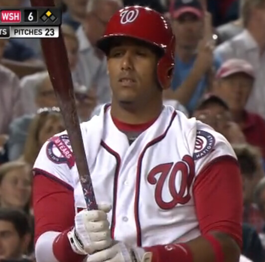
I was toggling back and forth between the Mets/Cards and Yanks/Nats games the other night. While tuned in to the latter, I noticed Nationals infielder Yunel Escober doing something odd during his plate appearance during the bottom of the seventh. After each pitch, he tugged on his left sleeve and sometimes on his right sleeve as well, pulling them up toward his shoulders and creating the odd look that you see above. It looks particularly weird because the Nats have patches on both sleeves this year, so the patches look really out of position.
Once Escobar stopped fidgeting with the sleeves and assumed his batting stance, the sleeves would droop back down to their usual length. Then he’d start the whole routine over again after each pitch. Here are some additional screen shots:
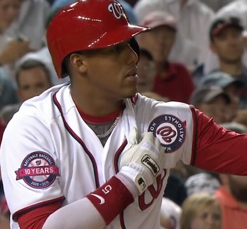
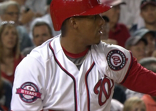
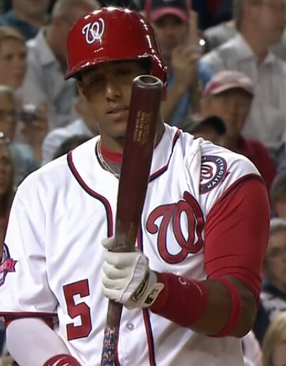
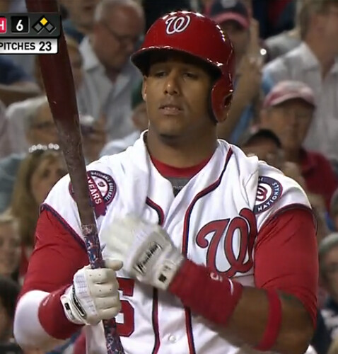
I hadn’t noticed Escobar doing this before (admittedly, I probably haven’t seen him play very often), so I went on Twitter and asked if this is a regular thing with him. A Rays fan immediately responded, saying Escobar, who played for Tampa Bay in 2013 and 2014, did the same thing when he was with the Rays.
I couldn’t find any photographic evidence of that, so I went to MLB.TV and started looking at video. Sure enough, I got this (admittedly crappy) shot from a Rays/Chisox game that took place last September:
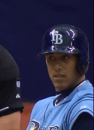
So it appears that Escobar has been exhibiting this quirk for a while. How has it escaped our collective notice until now?!
Whether he realizes it or not, Escobar is following a path blazed by two previous players. The first was Ted Kluszewski, who famously went sleeveless during his days with the Reds and White Sox (and even went undersleeveless when the Reds wore vests).
The other example that comes to mind is Deion Sanders of the 1997 Reds, who wanted to wear his sleeves very short as a tribute to Jackie Robinson. When the National League office (back when such an institution existed) ruled that Sanders’ sleeves had to match those of his teammates, the rest of the Reds opted to shorten their own sleeves in solidarity, which had the odd effect of moving the team’s sleeve patches up to the shoulder area — which, to bring us full circle, looks a lot like Escobar’s patches!
Power Rankings reminder: In case you missed it yesterday, the latest installment of the Uni Watch Power Rankings rates all 32 NFL teams’ uniform sets, from first to worst. Check it out here.
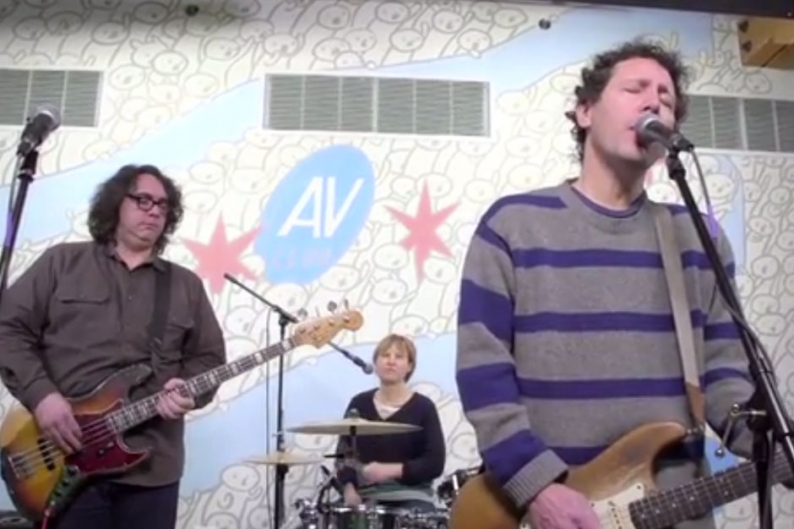
Attention NYC-area music fans: I happen to have an extra ticket for tonight’s Yo La Tengo show at Cake Shop. If you didn’t realize Yo La Tengo was playing at Cake Shop tonight, that’s because they’re billed as the Condo Fucks. But “Condo Fucks” is just a Yo La Tengo pseudonym. It’s gonna be a great show (the tremendous Antietam are also on the bill), especially since YLT never plays tiny clubs like Cake Shop anymore.
I could scalp the extra ticket at the door for major coin, but I’d rather see it end up in the hands of a Uni Watch reader. So here’s what we’re gonna do:
If you’re interested in acquiring the ticket, email me at this address by 3pm Eastern today. Your email should include two elements: (1) a monetary bid of at least $12 (that’s what I paid for the ticket), and preferably a lot more than that, and (2) an explanation of why I should pick you to get the ticket. The highest monetary bid will not necessarily win. I will weigh multiple factors — sincerity, persuasion, wit, intelligence, pathos, and, yes, cash — to choose the winner. I’ll choose the winner by 3:30pm, and the winner will then have to meet me in person at Cake Shop at about 8:30pm in order to claim the ticket.
Ready? Go!
T-Shirt Club reminder: The June offering from the Uni Watch T-Shirt Club — the BFBS design, which is available here — has had a weird week. We got a ton of orders on the first day, so we thought, “Ooooh, this is gonna be one of the most popular ones!” But then orders slowed to a crawl the next day and were at, like, a sub-crawl yesterday. Weird! I’m always happy no matter how many (or how few) we sell, because the design and the project’s conceptual consistency are the main things for me. Still, this week’s sales pattern has defied all the previous trends, so here’s a another look at this month’s shirt looks like, just in case anyone needs a reminder (click to enlarge):
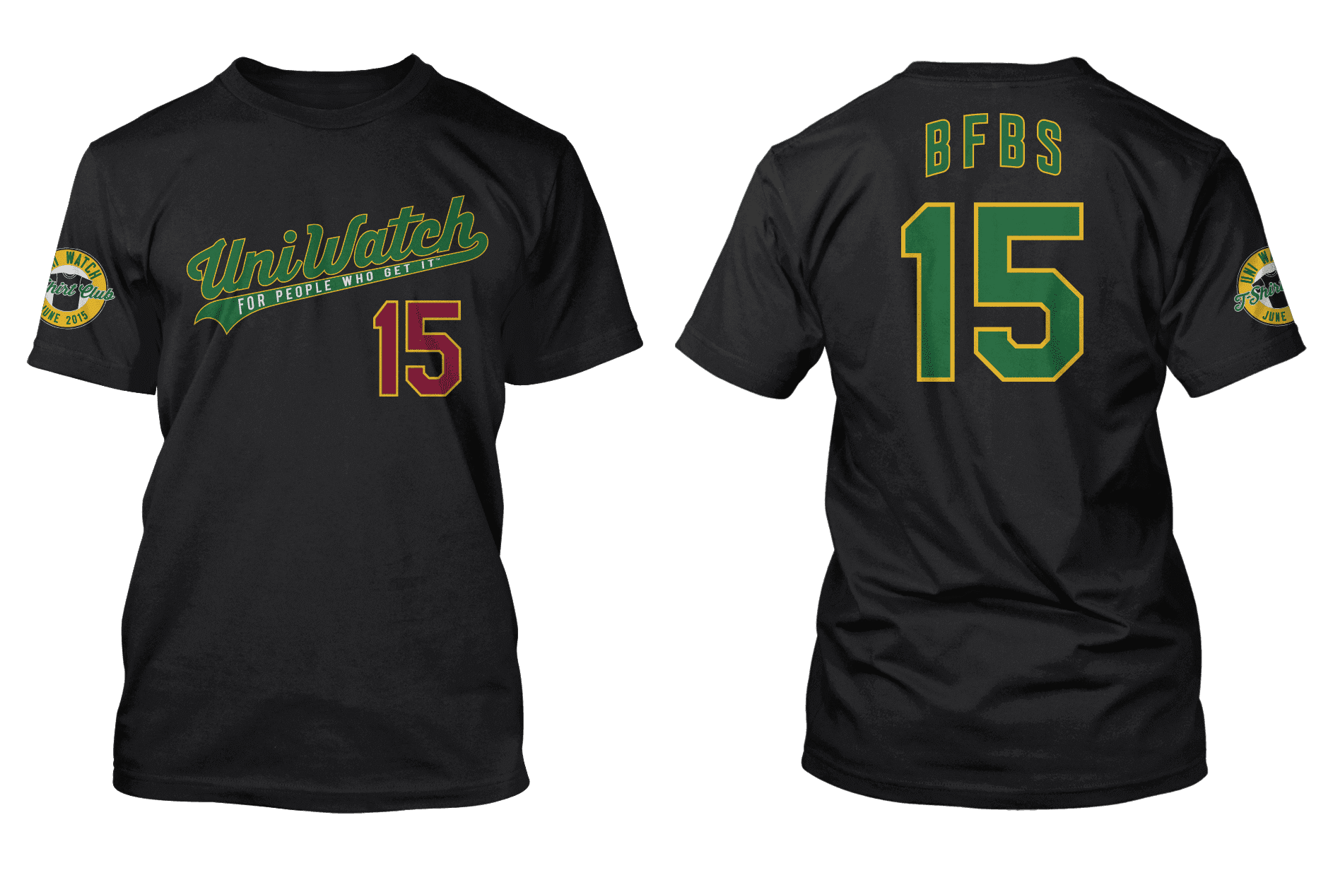
The shirt is available through next Tuesday on this page.

’Skins Watch: The U. of North Dakota continues to narrow down list of potential team names to replace “Fighting Sioux” (from Kary Klismet). ”¦ The County Board of Arlington, Virginia, has passed a resolution calling on the ’Skins to change their name (from Tommy Turner). ”¦ Here’s a good overview and guide to the ’Skins trademark case (from Cassie Hayes). ”¦ A trademark squatter is snapping up the rights to possible new team names for the ’Skins (from Tommy Turner). ”¦ Good article and inforgraphic on Massachusetts high schools that still use Native American mascots (from Brian Mazmanian).

Baseball News: Bryce Harper is the most uni-inconsistent player I’ve ever seen. He varies between pajamism, high-cuffery with solid socks, and high-cuffery with stirrups. All three of those photos show him wearing batting gloves, but recently he’s gone bare-handed, and now I’ve spotted him wearing one glove, a style that I thought was unique to Hunter Pence among today’s MLBers. ”¦ Holy moly, look at the socks on this 1941 college player (from J.G. Preston). ”¦ You heard of “Red Red Wine”? Try this: the Reds’ red wine (thanks, Phil). ”¦ Rays 3B Evan Longoria, a lifelong sneakerhead, has helped design his own New Balance sneaker. ”¦ The Potomac Nationals’ Star Wars jerseys feature Lando Calrissian (thanks, Phil). ”¦ Here’s a short article on U. of Minnesota baseball uniforms from the 1920s (from Ryan Barland). ”¦ The Orioles will be giving away barbecue aprons on Memorial Day. “It doesn’t get much worse than that American flag lettering,” says Andrew Cosentino. ”¦ Oooh, check out this shot of the Angel Stadium concourse from the 1960s (nice find by Chris Cruz). ”¦ Hoo baby, dig this shot of Mike Schmidt wearing the 1976 National League all-star team’s pillbox BP cap (major thanks to Mike Williams). ”¦ Shin-Soo Choo of the Rangers has his surname on the back of his cleats. “Together they read, ‘Choo Choo,'” notes Stephen Hayes. ”¦ This year’s Independence Day caps really suck, but hey, it could’ve been worse. “They’re not even trying anymore,” says Mike. ”¦ Here’s a good look at Maryland’s flag-based two-in-ones. ”¦ Check out former Braves star Dale Murphy wearing a hybrid new/old uni in an old spring training shot (from Brian Rowland). … Not uni-related, but the Mets sure do have a flair for bad PR.

NFL News: Oooh, look at this Saints helmet buggy. “I took that photo 15+ years ago,” says Russell Goutierez. “It was taken on Manhattan Blvd. in Harvey, a suburb of New Orleans. It was chained up outside an auto body shop.” ”¦ John Benson did mock-ups of modern uniforms for a bunch of old, defunct NFL teams, like the Duluth Eskimos, Dayton Triangles, Pottsville Maroons, and five more. Further details here.

College and High School Football News: The Illinois High School Association is being sued by a former high school football player over its head-injury and concussion policies. The association says the lawsuit is “a threat to the institution of high school sports.” ”¦ There were rumors floating around that Cal would wear a white helmet this fall, but the school has nipped that one in the bud (thanks, Phil). ”¦ This pamphlet about Nike’s graphic identity group, which was distributed to leaders at Tennessee, is fascinating (from Alex Bauer). ”¦ Check out the rainbow of helmets in this old scene from The Andy Griffith Show (from Mike Bialas). ”¦ Have we seen the new Wake Forest uniforms yet? I think so, but here they are, just in case (from Casey Brown). ”¦ While watching video from the 1971 Nebraska/Oklahoma “game of the century,” Mike Baucom noticed that Nebraska punt returner Johnny Rodgers didn’t have the shoulder stripes on his jersey. Was it a tearaway jersey?

Hockey News: People often forget that the Bruins wore white socks with their black jerseys in the late 1960s (from Patrick Thomas). … Todd Radom has written a good article about how the Mighty Ducks became the Ducks. “Midway through the article there’s a discussion about a leak of the then-upcoming logo by a focus group participant, and the subsequent effort by the branding team to leak false logos to discredit the original (correct) leak,” says Mike Styczen. ”¦ Special Memorial Cup jersey for the Quebec Remparts (from Dane Drutis).

Soccer News: New home kit for Everton (thanks, Phil). … Prince William received an England women’s soccer jersey for newborn daughter Charlotte (thanks, Brinke). ”¦ The LA Galaxy are starting a “Scarf of the Match” program, and the first one is a doozy. ”¦ Barcelona’s long-rumored horizontal-striped kit has leaked. ”¦ Liverpool’s new third kit will debut this Sunday against Stoke City. Also: Liverpool has a new training kit (both of those from @holycalamity).

Grab Bag: Ever wonder what happens if you set a few thousand Ping-Pong balls on fire? Me neither, but here’s the answer. ”¦ Next year’s running of the Indy 500 will be the 100th edition of the race, and they’ve already prepared a logo for the occasion (from Scott Johnston). ”¦ Here’s a good article on the costume designer for the new Star Wars movie. ”¦ A Pennsylvania McDonald’s outlet celebrated a supervisor’s 40th anniversary with the company by wearing throwback uniforms. Further info here.

What Paul did last night: The great singer-songwriter Amy Rigby is doing a Thursday-night residency at HiFi this month, and last night’s show was a freakin’ all-star affair. For starters, Amy’s husband, the late-1970s new wave cult hero Wreckless Eric, was playing bass in her band, plus she also called two guests onstage for a few songs: the wonderful chanteuse Syd Straw and then Lenny Kaye. Lenny fucking Kaye!
Kaye is now 69 but looks healthy and as cool as ever. He has a long mane of grey hair that makes him look a bit like Bob from Twin Peaks. (Sorry, no photos — I tried, but the lighting was bad and the pics all came out like shite.)
Saw tons of friends, lots of drinks and hugs, and the music was sensational. A great, great night.
“Not uni-related, but the Mets” ends abruptly.
I’m guessing there are non-baseball sections, too.
Fixed.
Now the baseball’s missing, and it looks like most of the ‘[angle bracket]a href=”‘ are now missing. It happens.
Tags are fixed, but baseball’s not.
I think everything’s good now.
The Mets item Gregg originally mentioned is now gone, which could be deliberate.
…and it’s back.
Bryce Harper – even the stirrups are inconsistent. One is black sock, the other is white sock.
I am looking at the site on my phone and most of the links are showing code.
Just a typo: “Speacial Memorial Cup jersey”
Got it.
*Dayton Triangles
Wow! Did Howard Johnson’s set up a concession stand at Angels Stadium? Those are their colors!
Also, that display case full of bobbleheads (or nodders) is sweet.
Will Clark was another player I remember constantly tugging on one of his sleeves during his at bats.
If someone were to sepia that Mike Schmidt photo you could swear he was from 1905! The mustache makes it!!
(though he could use a bit of a haircut!)
North Dakota Flickertails – I like it. Wasn’t aware of the history; makes it kind of a no-brainer to revert to that. And it would give Minnesota some welcome company in the non-threatening-small-rodent-mascot bracket.
That full list is rough–eveything is weather or military related or just has ‘green’ attached to it. I don’t think Flickertails has a chance even though nearly all of the 64 names are terrible. Maybe something bare bones like North Dakota Riders?
Distressing to see the “yes” vote totals. In the lead are Nodaks, Force, North Stars, Pride, and Spirit.
Others with more current support than Flickertails include Big Green, Flames, and Sundog(s). The only non-brutal nickname with more support than Flickertails is Roughriders.
I love NoDaks as a mascot. North Stars or Northern Lights would be good options too. Also that lead is just how many folks voted for it to be considered.
Bison Slayers has to be the worst because it’s a response to NDSU’s mascot.
Back when the Weather Channel was just a stationary radar map of your region with National Weather Service alert audio looped over it, the Minneapolis version would often refer to conditions in or weather coming from “NoDak.” Of all the non-Flickertail nicknames still in the running, NoDaks is consequently my favorite.
I had no idea Chris Mullin had been hired by St. John’s. Tells you how much I pay attention to basketball…
Not surprised by the Mets, though.
….or is it Reds’ Red Wine?
I was thinking that, too.
Good one! I’ve made that change.
“or is it Reds’ Red Wine?”
~~~
The second after I tweeted that, I knew I should have either gone with that, or Red Reds Wine.
Good one!
I bet Keith Hernandez would be sure those chevron socks were always perfectly aligned…….and pointing to his mustache!!
“Check out the rainbow of helmets in this old scene from The Andy Griffith Show”
A bevy of masks too. Is the one in the bottom right Lucite?
**What It Was, Was Football**
It was back, last October, I believe it was.
Seein’ that picture made me crave a big orange drink.
It’s spelled “Kluszewski.”
I did not know that Amy Rigby & Wreckless Eric were married, which sheds a different light this little ditty of theirs I downloaded a while back.
link
Even more intriguingly, the penultimate post on that now-dormant site was inked by none other than one Paul Lukas.
For the uninitiated, Yo La Tengo actually got their name from a baseball story:
“During the 1962 season, New York Mets center fielder Richie Ashburn and Venezuelan shortstop Elio Chacón found themselves colliding in the outfield. When Ashburn went for a catch, he would scream, ‘I got it! I got it!’ only to run into Chacón, who spoke only Spanish. Ashburn learned to yell, ‘¡Yo la tengo! ¡Yo la tengo!’ instead. In a later game, Ashburn happily saw Chacón backing off. He relaxed, positioned himself to catch the ball, and was instead run over by left fielder Frank Thomas, who understood no Spanish and had missed a team meeting that proposed using the words ‘¡Yo la tengo!’ as a way to avoid outfield collisions. After getting up, Thomas asked Ashburn, ‘What the hell is a Yellow Tango?’.”
I been rearranging the letters in Yo La Tengo ten ways to Sunday, and I’ll be damned if I can make “Condo Fucks” out of that.
I’m not really a fan of Disney (and much less so of Michael Eisner), but I gotta say…”the Mighty Ducks of Anaheim” was a *really* cool name for a sports team.
Spoken like a true troll ;)
Thanks!
I’m kinda surprised that no one jumped on that.
My High school is on that list (Taconic, Pittsfield MA) graduated 23 years ago. And one just over the border in Dalton (Wahconah).
Pittsfield just voted to build a new Taconic that is going to combine it with the other public high school (Pittsfield High School) into one school, (they are the Generals) so hopefully the Braves mascot will be going away when that happens.
Jose Cruz rolled up his sleeves but not as exaggerated as Escobar. At one time, I thought Tony Pena also rolled his sleeves up just so the stripe on the Pirates jersey sleeves were inside out. But judging from photos, it doesn’t seem he did it all the time.
link — Jose Cruz
link — Tony Pena
Escobar’s sleeve-pulling isn’t anything weird. For most of my life, I’ve occasionally had the sudden compulsion to pull up my t-shirt sleeves in a similar manner. Not all the time, but often enough.
I’m not sure why.
Why? Where else are you going to link?
I wonder if Yo La Tengo will wear a patch to honor the link.
If someone in this motley assortment didn’t link to that piece I would consider this day missing something.
Pajamism! I’ve never heard that one before. Love it!
* I like the LA Galaxy scarf – I wish they’d go back to their gold/green or teal/gold, now that David Beckham is no longer there to tell them how they should dress.
* The sleeve thing reminds me of Tiger Woods tugging on his sleeve because he wore really baggy shirts. Though I thought players got custom-fit jerseys from Majestic, so comfort shouldn’t be an issue, right?
I seem to remember Deion Sanders wanting to wear shorter sleeves in the 90s when he was playing for the Reds and being told that any alterations to the uniform were not allowed. I could be remembering wrong but I think there were set minimum sleeve lengths or something, similar to the maximum short length rule that the NBA has.
Someone didn’t read today’s main entry all the way to the end.
Guilty
Pssst, Deion’s mentioned in the article.
Anyway, at least from my experience, the comfort of the shirt sleeve is dependent more on the fit than the length (when I run, I have a shirt that I always end up rolling up because the armhole is too wide, but I don’t have that issue with my tighter-fitting shirts).
Majestic’s tailors usually give more arm room to pitchers – I imagine they could do the opposite for non-pitchers.
Immediately thought of Tiger as well on the sleeve thing!
Just taking a look at all of the Memorial Cup commemorative jerseys through the years and noticing a couple of things. None of them incorporate camo anywhere. Second, many although not all of them are very specific. They honour a local regiment or a ship that is named after the city that is hosting (eg. HMCS Rimouski). They remind me more of the ways that the service academies dress their teams than every team that just throws their regular logos on a camo background and calls it a day. Aesthetically they are much more pleasing (aside from the Mississauga one, but still no camo). I don’t think Québec’s entry this year is particularly strong. It’s a bit too general, which is a shame because Québec has tonnes of military history to draw on. The militarization of sports always seems to be a topic here and I’m wondering what Uni Watch readers think of these jerseys, especially the American readers?
The photo you identified as solid socks on Harper are actually low stirrups. He is wearing solid socks in the no glove pic. So make his tally pajamas, low ‘rups, high ‘rups and solids.
He’s also not wearing an undershirt in the one glove photo. Is this unusual? As a UA guy, is he avoiding the neck swoosh? Are other non-Nike guys doing this?
The photo you identified as solid socks on Harper are actually low stirrups.
I believe that what you’re interpreting as a low stirrup opening is actually the tongue from his cleats.
Nope. If you look closely at Harper’s right (our left) tongue area, you can see the sanitary sock.
Agreed. Black tongue, white sani. Just a sliver showing.
Re: Johnny Rodgers. Yes, he was wearing a tearaway jersey in that game (against Greg Pruitt, no less), though he didn’t always do so:
link
A game that, by the way, more than lived up to its billing, and a punt return that clinched him the Heisman Trophy. Man, he was an exciting player.
It wasn’t uncommon for backs to wear lighter jerseys back then — I’ve always assumed it was because of cost rather than weight. Many schools didn’t worry about matching the stripes of the Durene jerseys on the cheaper ones, before people started to … get it.
Potomac Nationals to fans: I’m altering the uniform. Pray I don’t alter it any further.
…nice!
I love what you’ve done there!
re: North Dakota nicknames
I thought “Roughriders” were on the “not considered” list. And wouldn’t it fail the “unique” test with the Saskatchewan Roughriders just 450 miles up the road?
Also disappointed that the “Nasty Norwegians” and “Abdominal Snowmen” didn’t make the cut.
Finally, I hope folks in Arlington are aware that they’re going to miss out on the ‘Skins’ Publicly Financed Stadium Sweepstakes.
Shh! Americans don’t know from CFL teams.
I’m disappointed that North Dakota Prairie Rose will definitely not be the new nickname. What the heck is wrong with North Dakotans that they’re afraid to embrace the actual state symbol? Might as well go ahead and change the state flower to barbed wire already if the men of North Dakota are insufficiently secure in their masculinity to rally behind the wild prairie rose.
I know I’ve mentioned this before, but the first time I heard about folks taking exception to the Fighting Sioux nickname was in 1979. A friend who was attending UND at the time told me about an intramural basketball team made up completely of Lakota guys that called themselves the “Fighting Norwegians”. I thought it was darned funny.
“Graphic Identity Group” is a really creepy phrase. It smacks of totalitarianism: eventually, we will all be placed in a graphic identity group, based on our purchasing preferences, our income level, and who we follow on Twitter. The logos will be computer generated, snarling, and dull. (Nationalism, race, and ethnic affiliation were the graphic identity groups of the 20th century. They started wars and inflicted countless horrors upon humanity, but the logos were hand drawn, and for the most part, pretty cool.)
When playing tennis, I tug at my sleeves before I serve. They don’t get in the way or anything, but I just feel like they need to be pulled back. Luckily I can wear sleeveless shirts on the court.
I had never seen the Reds all wearing short short sleeves. That’s pretty cool.
I have always thought the Ducks had the worst logo in the NHL, even after the re-branding. After seeing the “rejected” logos I am scratching my head and saying who is running the show? and how did such a dreadful logo get chosen over these.
Many of them put the past and current logo to shame. I have to say I have a soft spot for the “Flying A” logo since it reminds me of this.
link
When REDSKINS is gone, then what?
Are you going to go after
Braves?
Indians?
Seminoles?
Chippewas?
Fighting Sioux (well that one’s already gone)
Chiefs?
Chinooks?
Blackhawks?
Winterhawks?
Aztecs?
My position for years has been that teams (including many of those that you listed) shouldn’t use Native American imagery unless they have specific permission from a local tribe.
We’re not going to relitigate any of that today. Simply explaining to you, since you asked, what my position is.
Fair enough. But you’ll still say the mascot names from the list above, but not the Football team from the District of Columbia.
It was interesting a couple of weeks back that an old picture of someone from the Memphis Chicks was shown here. I never knew that Chicks was short for Chickasaw (as I’d not seen one of their uniforms before).
On Blackhawks/Winterhawks, there isn’t a specific tribe associated with those names and in fact, they could be seen as much as a slur as the name you won’t say. However, their uniforms are some very beautiful native american imagery. What’s the stance there?
A point on the Massachusetts Schools. I think it’s a bit of a stretch saying there’s an issue to a school calling themselves the Tomahawks, with an image of crossed Tomahawks and two feathers (as shared in the article).
Tim, when I said, “We’re not going to relitigate any of that today,” I meant we’re not going to relitigate any of that today. Let’s move on. Thanks.
I’m curious as to what the UWPREC thinks about the Bears switching from using black as their base shoe color to white. My personal opinion is football teams look much better in black shoes, especially teams with more traditional uni schemes. The Steelers have the same issue.
Wait — are you saying they ARE changing this season, or you’re wondering what I’d think IF they changed?
No, the Bears have been wearing white shoes for, I believe, the past two seasons. It’s bugged me because I preferred when they wore black.
JR Superstar was wearing a tear-away against OU. Really just a white t-shirt with a red 20. Jeff Kinney scored the winning TD in the 35-31 classic barely wearing one as well.
Kinney: link
Great shot of Rogers with stripe-clad teammates: link
Stirrups on the umpire.
A little too high and thin for my tastes, though.
The mention of Ted Kluszewski’s sleeves reminded me of the jersey the Reds had hanging at Riverfront/Cinergy for his retired number. It also showed short sleeves, even with ragged-looking edges, like they had been torn off.
link
Wow….a gem from the late 70s British Punk/New Wave movement – Wreckless Eric.
My favorite song “Whole Wide World” from his first album… I remember him more than Lenny Kaye.
In my opinion, Flickertails is the runaway favorite. The only others that are close are Fighting Green or NoDaks. I’d be surprised if any of the others win.
With this type of unpopular change, you either have to go with something from the past or something that is essentially a non-name.
Looking at Paul’s rankings I’ve noticed that he goes with the common gripe that the Panthers’ look is too “90’s” yet almost all the teams on the top of his list have kept the same look since the 60’s.
But the Panthers were a 90’s expansion team.
I would suggest that it’s a stroke of genius that Jerry Richardson has stuck with the same uniforms for all these years. Eventually the 90’s will become “classic” just like the 60’s are now.