Click to enlarge
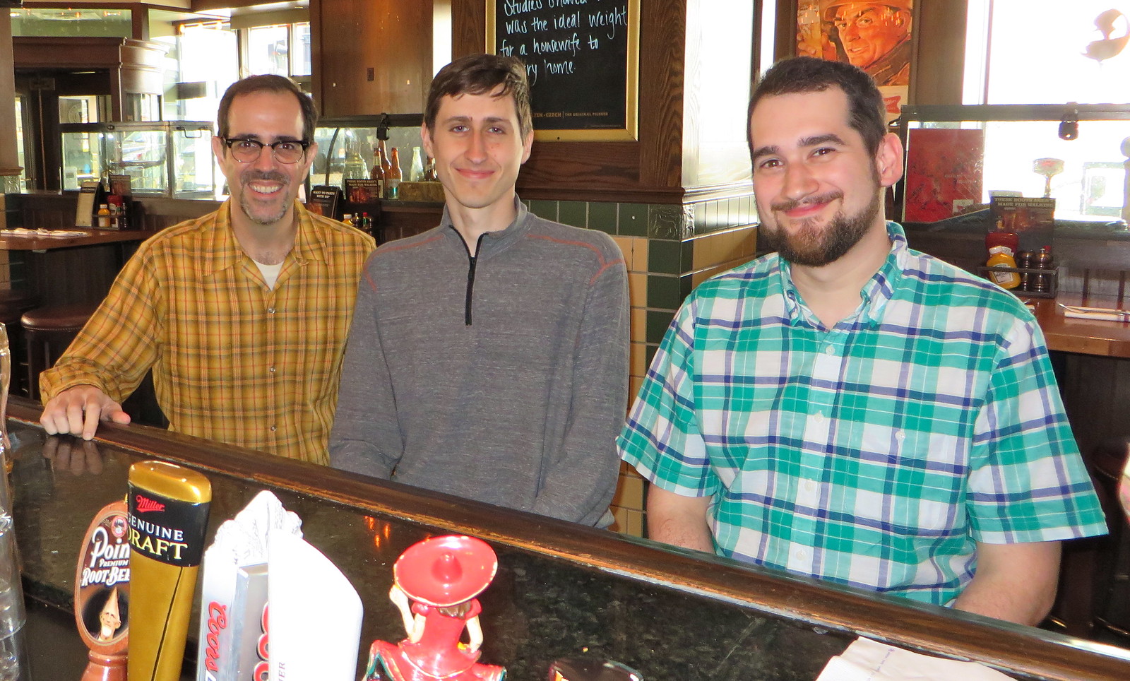
Who was that yesterday afternoon at the Miller Time Pub & Grill in Milwaukee? From left, that’s me, Uni Watch intern Mike Chamernik, and SportsLogos.net impresario Chris Creamer. We were all in town for the unveiling of the Bucks’ new logo set, which took place last night. You can read my assessment of the logos here, and I have an additional feature with exclusive behind-the-scenes details on how the team’s new design was developed. Enjoy.
The unveiling event was interesting. The Bucks were on the road in Philly last night, but the team had an open house, with fans invited to come to the Bradley Center to watch the game on the scoreboard. Everyone was allowed to wander onto the court if they wanted (or they could sit in the seats), and lots of former Bucks players were on hand to pose for photos with fans. There was free popcorn, face-painting, and so on — a nice fan-friendly vibe.
When the televised game got to halftime, three big easels were put on a stage at center-court. Then three artists came out and “speed-painted” the team’s three new logos, which was actually pretty cool to see. I videotaped the whole thing — do yourself a favor and mute the volume (there were these awful singers performing onstage while the painters did their thing), but the process is worth checking out. Below the video are some snaps of the finished paintings, which you can click to enlarge:
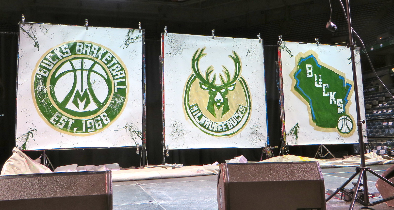
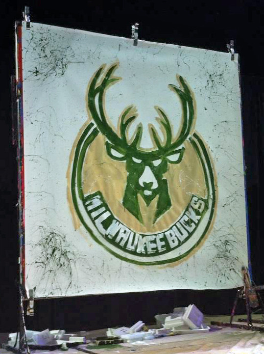
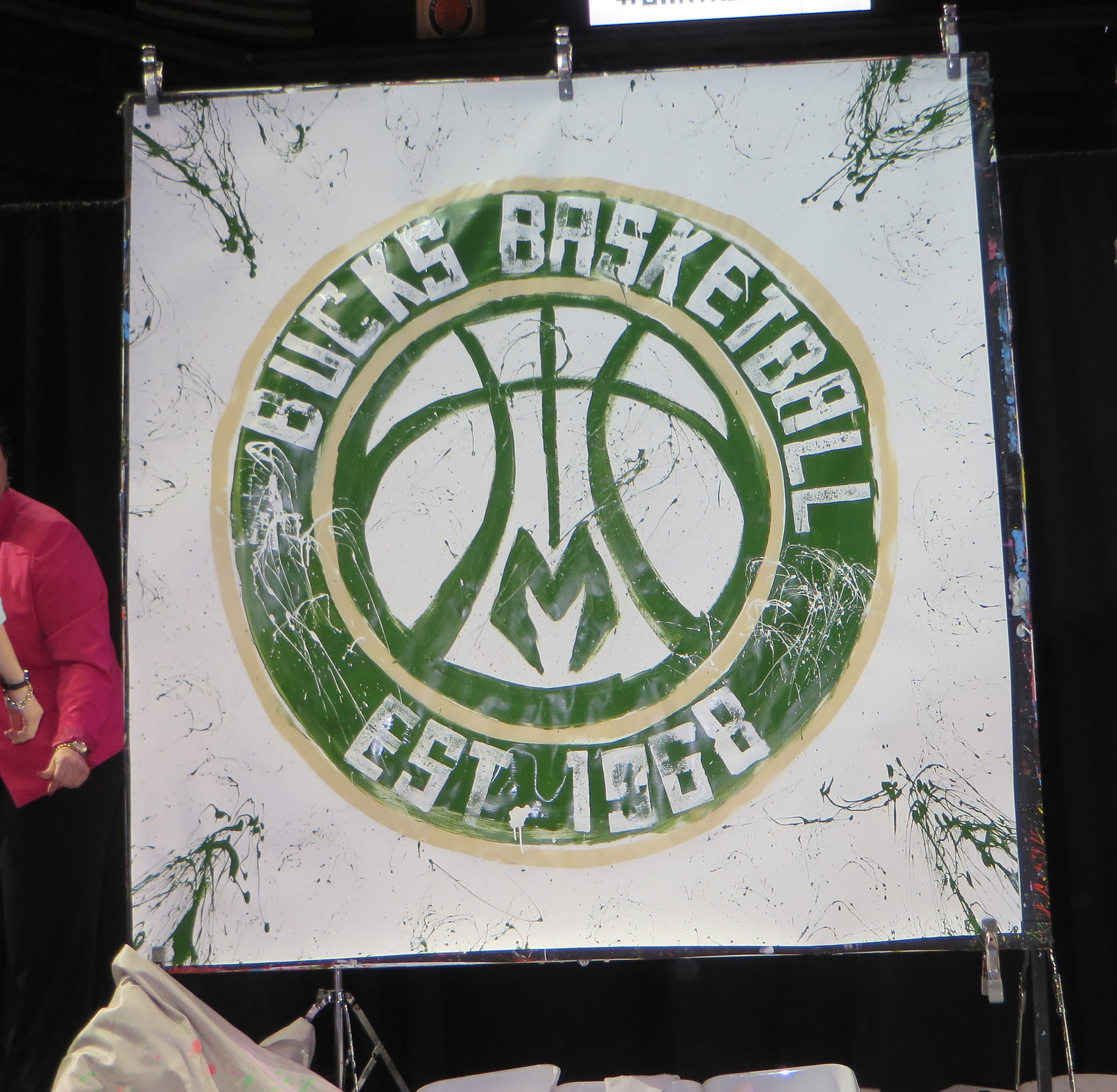
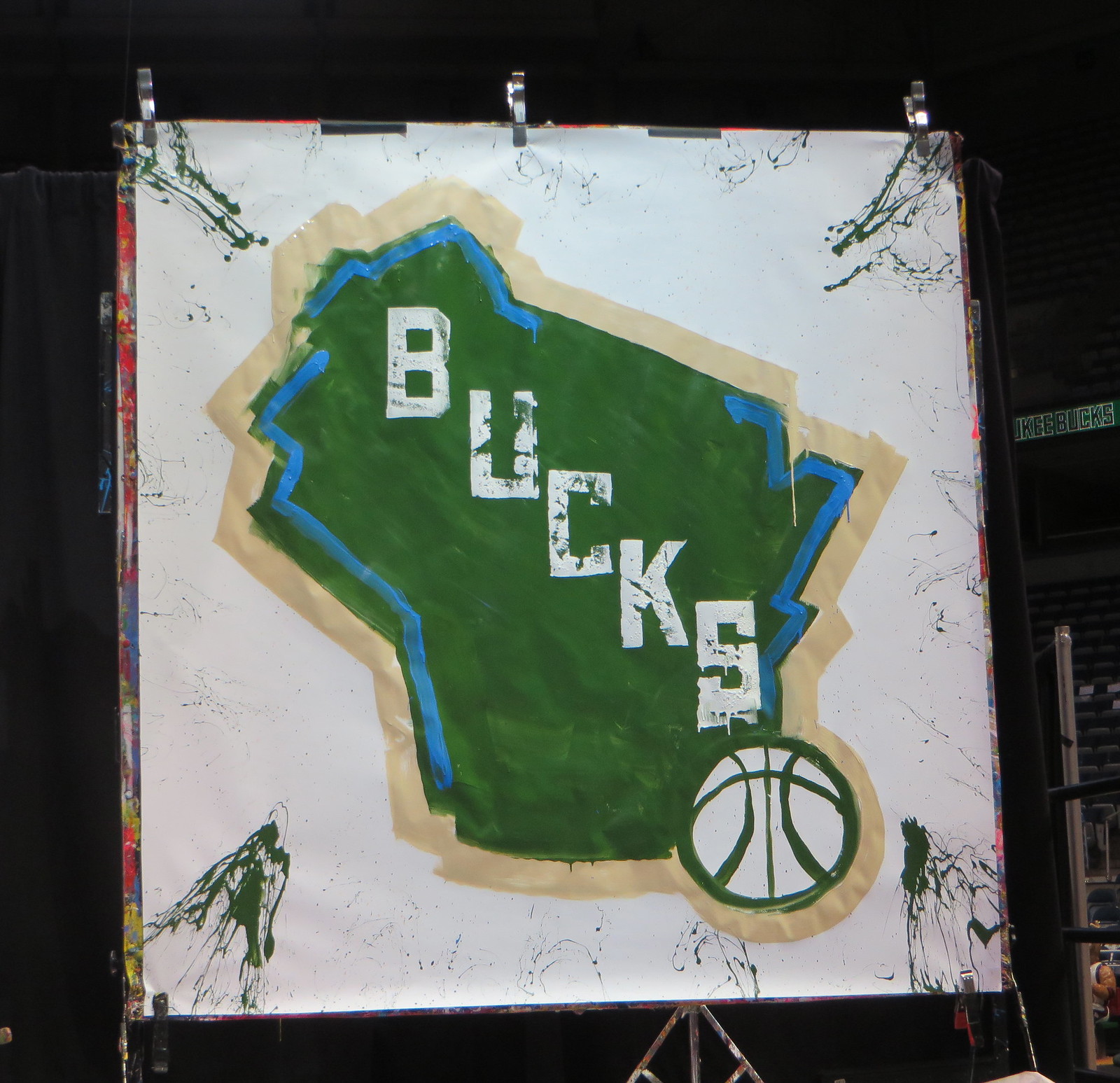
They did all of that freehand and from memory — no pencil tracings to follow, no templates. Afterward, I asked several Bucks execs how many practice rounds the painters had to do, but nobody seemed to know. I thought it was pretty impressive. I also thought it was pretty ballsy of the team to present its new logos in such an unpolished format. Of course, the official versions of the logos were also on display (and available for sale) throughout the arena, but the painted versions, with all their drips and minor imperfections, were definitely the showcase. I liked that.
Later on, while jibber-jabbering with a few people, I spotted something odd on the floor — a Bucks gong (click to enlarge):
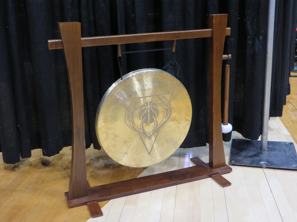
Why the hell do the Bucks have a gong? I asked around and was told that whenever someone in the team’s sales office sells a full season ticket, he or she gets to bang the gong (and, I’m guessing, everyone else in the office quietly goes out of their fucking minds). The gong was on hand last night because they had been selling season tix to the open-house attendees earlier in the evening. Interesting backstory, but now they’re gonna have to get a new gong with the updated logo.
One final note about my time in Milwaukee: An interesting historical event took place on the site of my hotel, and another one took place one block away:
You know that time some crackpot shot Teddy Roosevelt and he kept on giving his speech with the bullet still lodged in…
Posted by Paul Lukas on Monday, April 13, 2015
Milwaukee: Full of history!
Posted by Paul Lukas on Monday, April 13, 2015
Thanks to Chris C. for letting me know about the Teddy Roosevelt plaque and to Mikey Powers for letting me know about the American League plaque. Thanks also to the several Uni Watch readers who recognized me at the arena and said hi, and doubleplusthanks to reader Brett Tomczak for buying me a beer. (Here’s a link to his graphic design operation, which seems like the least I can do in return.)
Okay, now I’m off to Cleveland to cover tonight’s Browns uniform unveiling. My colleague Jeremy Fowler, who’s ESPN.com’s Browns beat reporter, will have a news story in response to the unveiling, and I’ll have a reaction/assessment piece — both of those will go up tonight. And just so you know: I have not been given an advance peek at the Browns’ designs, and I have no idea if the leaks currently circulating are legitimate (although they seem fishy to me — I sense some deliberate misdirection at work here). We’ll find out for sure tonight.
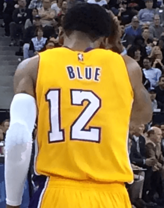
Maybe he should’ve stayed in the D-League Embarrassing situation last night in Los Angeles, where the Lakers signed guard Vander Blue from their D-League affiliate and assigned him uniform No. 12. But apparently they didn’t have a jersey with that number, so they had him wear a No. 2 jersey with a hastily added “1,” resulting in a number that was laughably off-center:
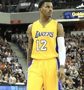
The situation was the same on the front of Blue’s jersey, although it didn’t look quite as bad because the front numerals are smaller and can sort of hide beneath the umbrella of the team’s wordmark:
Lakers beat reporter Mike Trudell confirmed that the number snafu was due to a last-minute scramble to provide Blue with a jersey. That’s an explanation, but it’s not a justification. Seriously, how is it possible that a top-level team would have to resort to such an amateur-hour move? Kinda sums up the Lakers’ season, eh?
(Thanks to Chris Chaussee for tipping me off to this one.)
Collector’s Corner
By Brinke Guthrie
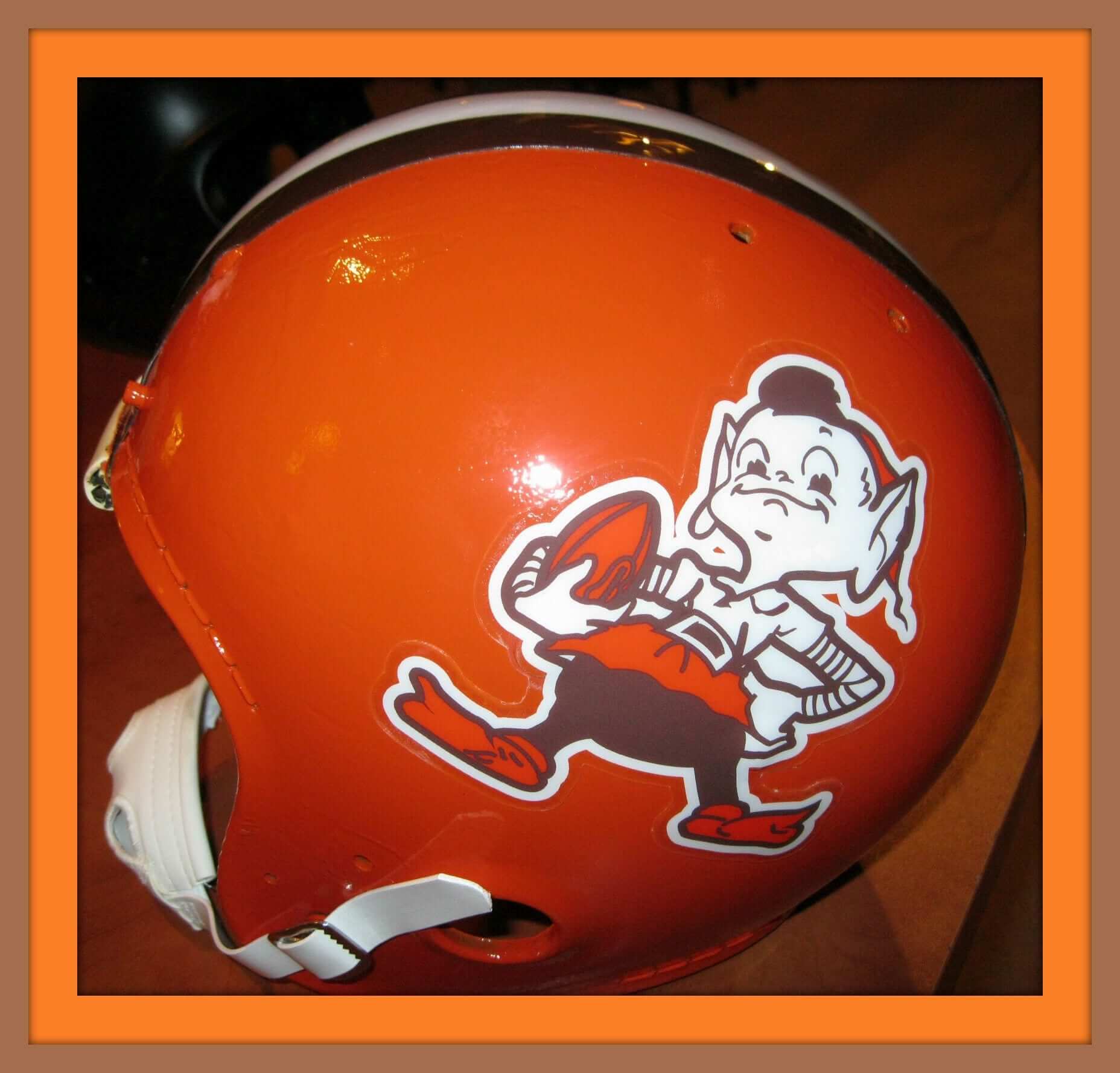
Leading off with the Brownies today, in honor of their impending uniform unveiling tonight. Ever seen that Angry Brownie look on this mini helmet (shown above)? He looks even rougher and tougher on this 1950s pennant. We’ve also got a 1970s window sticker, a 1970s table lamp without the white stripe (oops), a 1970s ceramic helmet bank, a 1960s/1970s helmet radio, a 1970s Brownie “Acrometal” plaque, a 1970s helmet desk set, and a mini-helmet with the ill-fated “CB” logo.
Phew, that’s a whole lotta Browns! But you say you’re not into the Browns? No worries — here are the rest of this week’s picks:
• Now is that a totally groovy cover on this 1970 Falcons Fact Book, or what.
• Speaking of groovy, how about this 1970 yearbook from the Eagles! I couldn’t figure out why there were depictions of the four seasons? Then I looked closely- football is the “Fifth Season.” Far out.
• Nice design on this 1975 MLB ASG program cover.
• I had of course heard of the “Terrible Towel” in Pittsburgh, but I didn’t know about being a “Steeler Stalwart,” as this Mutual Radio Network sticker suggests.
• Some primo logo action on this 1970s NBA toy chest. Buffalo Braves!
• Love the look of this 1960s Chargers pennant.
• Great looking 1960s NY Football Giants bobble. Usually you see some decay/cracking along the helmet neckline, from bobbing up and down — not the case here.
• Terrific artwork on this 1970 Broncos poster.
• Used to love ICEEs back in the day (Cherry Smash on the bottom, Cola on top — always). I’d try to beat my dad putting on the golf course at the Harmony Landing Country Club in Louisville for an ICEE. Check out the logo art on this 1970s Phillies/ICEE cup.
• Remember “Baseball, Hot Dogs, Apple Pie and Chevrolet”? I hear echoes of that in this 1970 baseball promo pin. Has to be from 1976, right?
• Pckers fans, here’s a 1960s Football Beer Stein and 1976 Helmet Radio combo for you.
Follow Brinke on Twitter: @brinkeguthrie
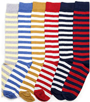
Special deal on striped socks: If you’re a regular visitor to the site, you’re probably used to seeing the ad for American Trench striped socks in the right-hand sidebar. Now American Trench is offering a special deal available only to those who are reading this text right here: the “Go Big or Go Home” multi-pack, which features seven pairs of rugby-striped socks for $49 — a really good deal.
I have several pairs from this series myself (I’m wearing one of them right now, in fact), and I can attest to their quality. You know what to do.
Uni Watch Hit Parade: If you were a political science major like I was, you may be familiar with the historian Richard Hofstadter and his highly influential 1964 essay “The Paranoid Style in American Politics.” And you may therefore also appreciate the name of a DC indie group called the Paranoid Style, which is almost certainly the only band to name itself after a Richard Hofstadter essay.
But even if you’ve never heard of Richard Hofstadter, you should definitely hear the Paranoid Style, because they’re hot stuff (which is probably the first time Richard Hofstadter and the term “hot stuff” have appeared in the same sentence). Built around a husband/wife team who sound really, really smart, a guitar sound that totally delivers the goods, and a vocalist who sort of glides above the sonic chaos, they make it sound easy. Here are the three best songs off their new EP, which I’ve been playing non-stop for the past week or so:
Uni Watch News Ticker
By Garrett McGrath

Baseball News: The Giants have added a memorial patch for broadcaster Lon Simmons (thanks, Paul). … “During the World Series banner celebration yesterday, Madison Bumgarner delivered the Giants’ championship flag astride a SFPD horse,” Chris Schoenthal says. “I thought it was even more interesting that the logo painted on the horses appears to be the rounded Giants ‘SF’ from the ’83-93 years, rather than the angled one that is currently in use.” … Here is a nice roundup of MLB promotions going on this season (thanks, Phil). … The Diamondbacks are still asking fans behind the plate to not wear opposing team gear (from M. Skuz). … According to Angels beat writer Mike DiGovanna, it seems that the team has pulled Josh Hamilton merch from its team store (thanks, Brinke). … A bobblehead of Wally the Green Monster was installed at Fenway Park (From Paul Dillion). …Yesterday, Paul posted about the Braves having five players named Johnson over the past three seasons and asked if that was a record. It appears that it is not. “”The Pawtucket Sox had five players named Rodriguez on their 1994 roster -”“ Steve, Carlos, Frank, Tony, and Ruben,” says Joe Kuras. “In 1995, all but Ruben returned and were joined by Victor (currently Boston’s assistant batting coach). All five Rodriguez players appeared in the same game once in 1995.” ”¦ Mike Delia had attended 11 consecutive Opening Days at Fenway Park but was unable to attend this year due to a new job he took with the San Francisco Municipal Railway. But he was there in spirit, thanks to these cool Bosox stirrups that he wore (courtesy of Uni Watch’s own Robert Marshall III). ”¦ Actor Kevin James wore a Mets jersey to the premeire of Paul Blart: Mall Cop 2 (from Chris Flinn).

NFL News: The Browns have set up webpage complete with a live stream for their uniform reveal tonight at 7:30 PM EST. Nine current players and nine alumni will model the uniforms for the reveal (thanks, Phil). ”¦ There was another leak of the new orange uni yesterday. … The Giants posted a photo of a behind-the-scenes mock draft board completed by Amani Toomer that used outdated logos for the Buccaneers and the Jaguars (thanks, Phil).

NBA News: Kobe Bryant has released a new sneaker. That link also has multiple photos and information on all of the colors. … A gallery in Rip City is having a Trail Blazers-themed art show next month.

Grab Bag: Contrary to what had previously been reported, Army’s sports teams will still be called the Black Knights. Further info on the school’s redesign here, here, and here. … “The Essendon Football Club (the Bombers/Dons) is running TV advertising around the concept of their very traditional uniform,” James MacNeil says. “It’s rare for teams to promote themselves in TV adverts, but they just emerged from a PED/PR nightmare, so perhaps that’s why.” ”¦ “The Vermont men’s lacrosse and Champlain Valley Union boys lacrosse teams have worn this ‘Scotch 30’ decal for the past two seasons,” says Tris Wykes. ” It honors former UVM player and youth coach John Scotnicki, who died of cancer in June, 2013.” ”¦ “I wrote a piece on my beer blog highlighting Modern Times Beer and their amazing brand design,” writes Ryan Lindemann. “The can design reminds me of a baseball jersey and stirrups, with the overall uniformity, script logo, and colored stripes at the bottom of each can.”
Spiffing deal on the sox! BTW if you’re averse to a given color, worry not: you can customize the color combo.
Regarding the Chargers pennant listed on eBay as being from the 1960s: If it really was from the 1960s, wouldn’t it have the AFL logo instead of the NFL logo?
About 20 years ago I was at a sports expo with lots of AFL pennants —I have and purchased a late sixties 67-68 standing Buff pennant. I was told than and have been told since by dealers the NFL merger caused all future merchandise to be sold under NFL licence. Now I not 100% about this but I been told same story from several dealers.
Paul,
You should check out Slyman’s for lunch. 3106 St Clair Ave NE, Cleveland, OH 44114.
If you’re wanting to stay in central downtown, check out East 4th. Lola and The Greenhouse Tavern are favorites. And the CLE clothing company is there. Lots of interesting Cleveland themed apparel.
link
Will you publish your analysis/thoughts on the Army rebrand?
Just added a buncha Army links to the Ticker. Haven’t had time to look at it, frankly — crazy time for me right now.
I don’t even pretend to be a worthy substitute for Paul, but hey, we’re all entitled to our $0.02 in the comments section, right? So I’ll give my own quick assessment of the Army rebrand:
1) “Army West Point” as a brand name feels contrived. I have no issues with both “Army” and “West Point” appearing on the uniforms, but smushing the two classic names together is clunky and heavy-handed. It’s like a hyper-correction that unintentionally breaks tradition in order to make sure you don’t miss the tradition.
2) The promotional literature plays up the compound “Army West Point” name while relegating “Cadets” and “Black Knights” to what seems like secondary and semi-official roles. Is Nike going for a soccer-style naming convention with the whole “Army West Point” thing? Sort of like how Manchester United is most frequently called some variation or abbreviation of “Manchester United,” but also uses the nicknames “Red Devils” and “Reds” occasionally. Considering how the new “Athena Shield” logo looks a lot like a soccer club’s crest, and I’d say the similarities are more than mere coincidence.
3) Speaking of the “Athena Shield” logo, I like it. Simple, easy to identify, and easy to replicate.
4) The uniforms themselves all look fantastic to me. Classic, clean, understated, and strong. The new stencil font works well with these designs. This may be Nike’s best program-wide rebranding effort ever. I’m slightly surprised to hear myself give Swooshie such unqualified praise after much of their recent gimmickry in the NFL and the College Football Playoffs.
1) agree
2) no change to Black Knights as primary nickname or Cadets as alternate, so no need to “push” those like there was the name, logo, fonts — note also no mention at all of mascot mule, which is also unchanged
3) and it is already everywhere at West Point, from the school crest to buildings to cadet uniforms
More specifically, that Bucks gong is actually a Tam-Tam.
(all tam-tams are gongs, but not all gongs are tam-tams)
I really hope the Bucks new home uniforms are actually cream instead of white. The last thing we need is a white jersey with cream trim.
I agree. The Bucks need something to set them apart. And the new logos are great. The singing at the unveiling, was, not…..
I was just coming here to say the same thing. Based off Paul’s analysis last night over at ESPN that if we like the logos, we’re really going to like the uniforms… I have a good feeling that we’re going cream instead of white.
I’m really hoping we get the side panels again, and I can see the blue working in there.
link
The Bucks could own a cream home set just like how the Lakers owned yellow at home for so many years.
Welcome to Cleveland, and enjoy your stay! If you’re craving a burger and you’re downtown, head over to Johnny’s Little Bar at the corner of W. 6th and Frankfort. Best burger in town.
The Lakers didn’t have a number ready for Vander Blue, but they had a nameplate for him?
They probably have nameplates ready for all of the primary colors.
Nicely done, Bucks. An NBA logo set that I actually like. Almost a first.
If Milwaukee is truly the birthplace of the American League, then why were the Braves and then the Brewers in the National League? Just rhetorical questions.
Actually, the Brewers were originally in the American League. They switched leagues in the 1990s.
But the bigger answer is this: Both of those franchises moved to Milwaukee from other cities (the Braves from Boston, the Brewers from Seattle), so their league affiliations were already set.
And in the first year of the American League, there was ANOTHER Milwaukee Brewers team. That was moved after one year and became the St. Louis Browns (and eventually the Baltimore Orioles). So Milwaukee has had two teams in the AL (Brewers I and Brewers II) and NL (Braves and Brewers II).
Sorry, I was typing my post as you were posting yours.
The Milwaukee Brewers were a charter member of the American League in 1901. They moved to St. Louis in 1902 and became the Browns. The plaque isn’t written very well in my opinion. It accurately states that there were eight original American League teams yet it really only refers to five. No mention of Detroit or Cleveland and a more direct reference to the Mikwaukee team would help clear up the misconception about the Brewers. Perhaps they don’t want to draw attention to the fact that the team lasted in Milwaukee for only one season.
Deer dressed in a tuxedo?
Thanks for including me and my site in the ticker! Cheers!
We got a chance to see the Twins new gold-trimmed home uniforms yesterday. I have to say it looks better than I thought they would. The trim on the cap logo is still unnecessary but the uniform looks pretty decent.
link
My ESPN piece on the story behind the development of the Bucks’ new look is now up:
link
I love the local angle of it. I also love how tired the Bucks’ braintrust is of certain uniform tropes like beveled letters and overdone number fonts.
Terrific report. Thanks for the detail!
One minor quibble: The image here link labels the entire western border’s blue as representing the Mississippi River. But only the southern half of the Minnesota-Wisconsin border is the Mississippi; the northern half is the St. Croix River. The St. Croix forms the “nose” of Wisconsin’s “Indian head” region before it flows into the Mississippi at Prescott.
The water border between Wisconsin and the UP of Michigan is kind of driving me crazy. The “Lake Superior” border is too long (even if you extend it along the Montreal River border with the UP), and the Brule/Menominee River border north of Green Bay is nonexistent. And that’s not including the peninsula getting amputated at Sturgeon Bay.
I know the logo is stylized and isn’t supposed to be 100% to scale or anything, but… those little errors bug me even more than the non-symmetrical stuff in the old bucks head logo. And all it would take is to move some blue lines.
I loved both pieces on the Bucks’ new logos as well as the interview you did with Antonietta Collins. Great stuff! I’m impressed with how uni-astute Collins is. I’m guessing you had a big hand in shaping the questions she asked, but I’d like to think her own interest in the subject is also on display.
As for the logos, I think the Bucks hit a home run with this redesign. My only two issues:
1) The “happy accident” of the antlers forming the outline of a basketball seems a little overstated since I always thought link did the same thing, if perhaps link.
2) I wish the representation of the link in the tertiary logo was more tapered and less truncated.
Agreed on both 1 and 2. The basketball was there already, but so subtly that it might actually have been a “happy accident” in the original. And even as stylized as that Wisconsin outline is, the Door Peninsula looks nothing like that. It’s as if the Bucks are telling everyone north of Sturgeon Bay to root for the Pistons or something.
That Essendon commercial is brilliant. Forget just becoming a Bombers fan; it makes me want to be an Australian.
I’m glad the Cleveland jerseys say CLEVELAND on the chests. I might have confused them for the Cowboys or Vikings or something.
“But he was there in spirit, thanks to these cool Bosox stirrups that he wore”
Man, I wish they’d go back to those socks! And the blue sleeves.
I can’t help but feel that the Browns “leak” is actually a deliberate fake. The shadows on the numbers looks too dated for a uni set releasing in 2015. There was something online about the front office sending out fake designs to see who was leaking info, though that information could itself be false. We’ll know tonight.
link
The pic of the Manziel jerseys is said to be through the windows of the team shop
“When new jerseys are created, the NFL and Nike work together in what’s called a TV testing to ensure all of the colors look in sync with high-definition cameras.”
Hi-def or not, the problem with the 1980s jerseys was the orange-on-brown was not legible with the naked eye. By darkening the orange and eliminating some of the white outline, I can’t see this being better.
Great story on the Bucks designers. If this is a big Nike misdirection, I’d love to hear the back story on this, too.
Collector’s Corner:
“Check out the logo art on this 1970s…ICEE cup.”
The Independence Hall logo wasn’t used by the Philadelphia MLB team until 1984.
Both that logo and the cover art featured on the 1970 Philadelphia NFL team yearbook were crafted by Dick Perez.
I like the Bucks new logo set, but keeping the drop shadow would’ve been better – that looks more industrial-ish. As a Wisconsin boy who didn’t grow up in Milwaukee, I appreciate the state-shaped tertiary logo.
Unexpected bonus Wisconsin item in today’s post: Vander Blue is from Madison and played college hoops at Marquette.
Green and Cream is a classic combination. It was the original livery for the Philadelphia Transit Company:
link
When SEPTA brought back the PCC trolleys in 2005, they repainted them in the same livery:
link
Sorry if this has already been mentioned, but it appears UNC football is going back to the more basic look for next year:
link
I am torn about the Browns’ leaks. On the one hand, I am generally okay with the look of the leaked jerseys. On the other hand, I would be really impressed if this was an elaborate fake to cover up the real jerseys being revealed tonight. I only hope that if the leaks are fake, the actual new jerseys are a step up.
the leaks were dead on accurate.
Re: bucks cream instead of white jerseys
They are required to have at least one white jersey, correct?
The new Milwaukee Bucks identity is nothing more that a bunch of borrowed parts and pieces from past identities. The end result is a collective yawn from the Bucks Camp and Lodge of Milwaukee. Deer Hunters might be a better team name?
Logo? Facelift of Dick Sakahara original 1992-93 design:
link
Font is a eerily similar to the WE THE NORTH Raptors stuff:
link
Missed opportunity to do something special.
Completely disagree.
We’ll see. As witness the blunt lettering of WE THE NORTH and the new Hornets’ duds, the Bucks may merely be among the first teams trying a back-to-basics approach, rather than the vanguard of a new trend. But let them put the product on the floor before slagging it off.
I’m still not sure if I like the new Bucks font. I think it may grow on me but I really wish they kept the drop shadow.
The new logos and colors themselves are no green and purple era greatness but it’s a huge improvement over the green and red. I’d really like to see them done in the colors they wanted to use but couldn’t because of the time crunch. Can they possibly keep those ideas and tweak the look in a few years?
And I do wish they completed the circle in the main logo. Some of the earlier versions had it completed and it looked a lot better. I’ll wait to see the uniforms to judge it completely but overall it’s not bad. It’s definitely an improvement.
The new Browns unis are not the train wreck I had envisioned. I would have preferred brown numbers on the white jerseys, and I hope they do not wear orange on orange much!
The new Browns jersey is worthy of being a MAC uniform, something that a Bowling Green or a Toledo or a Kent State would come up with, for a NFL team, it’s a joke. I suspect the 5 year countdown has already started in Cleveland to change it back
So Grover Cleveland High School got new football uniforms?
It is very high school. The city name above the numbers is bush league. I can’t look directly at the name going down the leg. Awful.
+1
Technically, the name is going up the leg. But it is still awful.
How can NIKE, a company with a cadre of no kidding pretty damn good creative designer types come up with high school confidential -y inspired unis?
This is just a “Dick dance in golf shoes” moment for the long suffering Clevelanders…
woe to the republic.
Whatever the Browns did, they were only going to be third worst uniforms in the league after Tampa Bay and Jacksonville, so at least that’s something to cling to for the next five years.
I get a 90s NBA feel from the NFL right now. Cartoony and “bold” over classic and traditional. Paul’s constant warning about the superhero stuff is spot on.
wow, those browns leaks were real and awful. the big name across the chest is something high schools/colleges do, not pro teams
The dumbing down of America continues with the new Browns uniforms.
It’s a losing battle. People have been trained to want the superhero costume. Normal uniforms are “boring” if they don’t include nine different combinations and sublimated images and gimmicks and bells and whistles. It’ll turn back in approximately 20 years, based on how long it took MLB to become reasonable again.
My first Browns game at the Stadium was a 42-0 rout of the Chicago Bears in 1960 (Bobby Franklin interceptions accounted for 14 of those points, as I recall). Ever since then, from the Celebrezze Administration, through the “our-name-our-colors” White Administration, up to the renascent city of today, the constant in an ever-changing civic landscape has been the Browns’ classic, perfectly designed uniform (the 1984 season notwithstanding). The Packers and Steelers, and later, the Dolphins and others, copied the distinctive sleeve striping, and there has never been a more satisfying autumnal color scheme than seal brown with burnt orange trim. The Browns’ uniform from 1947 until this evening was a PROFESSIONAL uniform, not meant to appeal to middle-school or flag-football players, but rather to mature fans of the sport.
And now Nike, whose art department must be run by 4th graders with crayons, have utterly ruined that professional tradition with this sophomoric, unimaginative design. When my seven-year-old self woke up that December Sunday in 1960 to go to my first game, I believe I had a pajama top from Sears that looked more like a pro football jersey than this piece of sterile childishness.
How it took the graphic “artists” two years “of precise planning and laborious execution,” to come up with this is beyond me. One thing going for it, however: it certainly mirrors the maturity of the current Browns’ leadership. Good night, Browns, and good luck.
The Browns should be ashamed.
Milwaukee Bucks looking like Milwaukee Bulls. Good job with the ripoff.
I think the gong (Established 1968) logo looks more like the new Wizards primary turned upside down.
When you drive into Wisconsin from Illinois, I believe the welcome sign looks like that