Interesting mix of sports design and music design yesterday, as the Rolling Stones announced a 15-city North American tour and promoted it by adapting their familiar lips-and-tongue logo to include stripe patterns and other imagery from the teams whose stadiums they’ll be playing in.
My favorite version by far is the one for the show at Heinz Field in Pittsburgh, which totally works (click to enlarge):
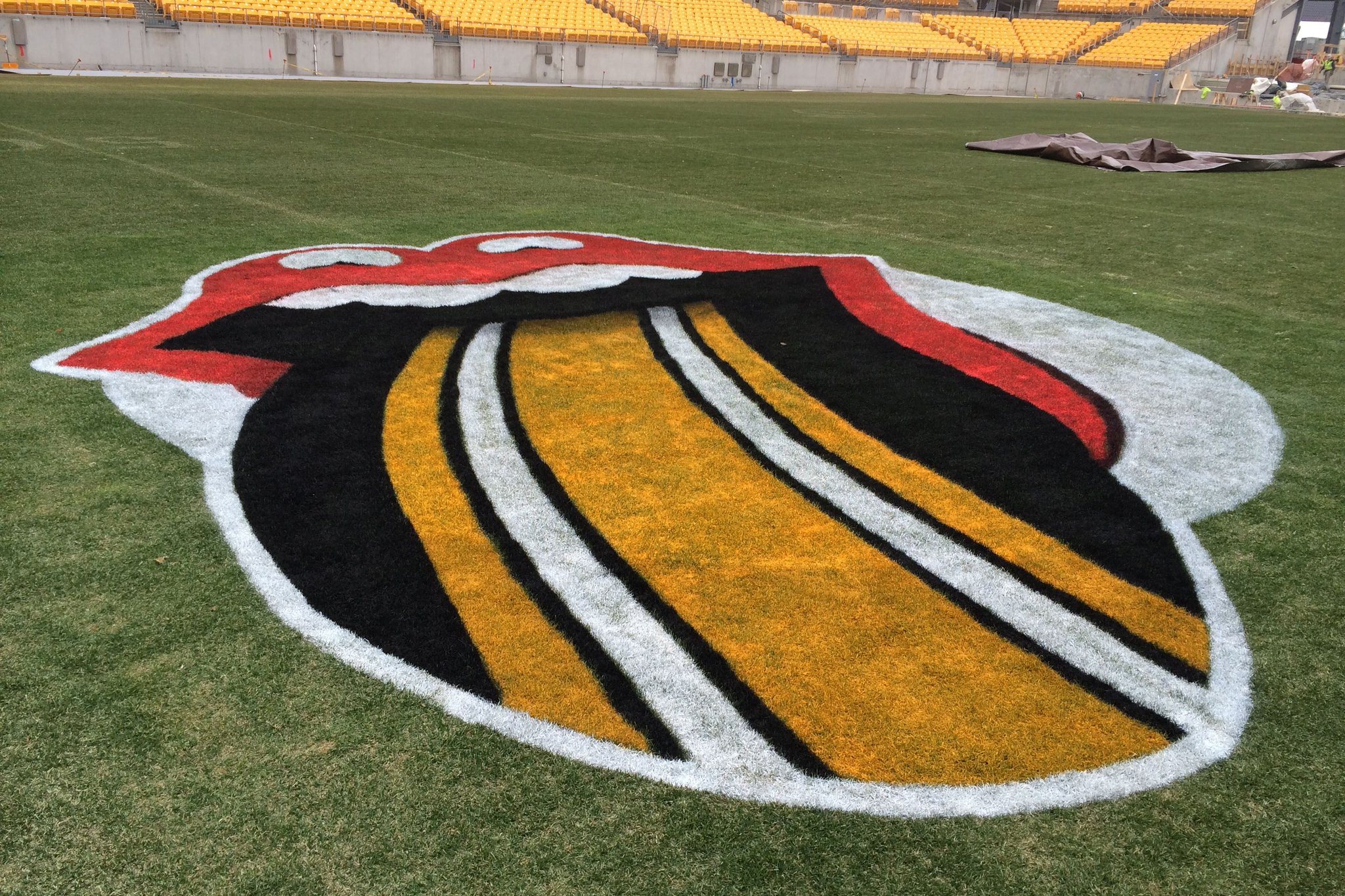
It’s interesting that the Steelers’ jersey stripe pattern is so instantly recognizable (at least to me). Really speaks to the strength of that striping.
Also quite good are the logos for the shows at Ohio Stadium in Columbus (Ohio State) and Arrowhead Stadium in Kansas City (Chiefs):
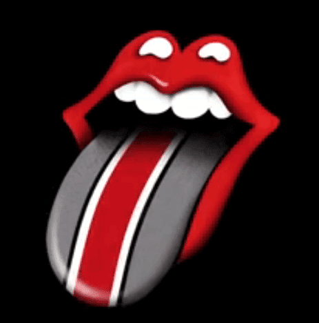
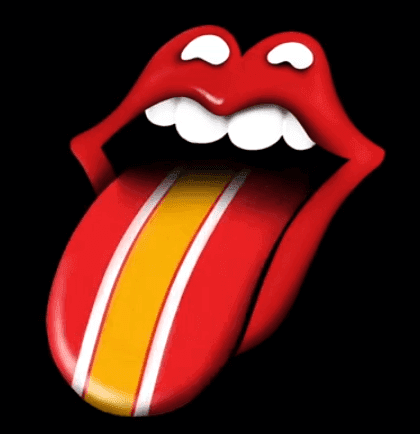
Those stripe patterns are strong and easily identifiable (again, at least for me).
Somewhat less successful are the ones for LP Field in Nashville (Titans) and Ralph Wilson Stadium in Buffalo (Bills):
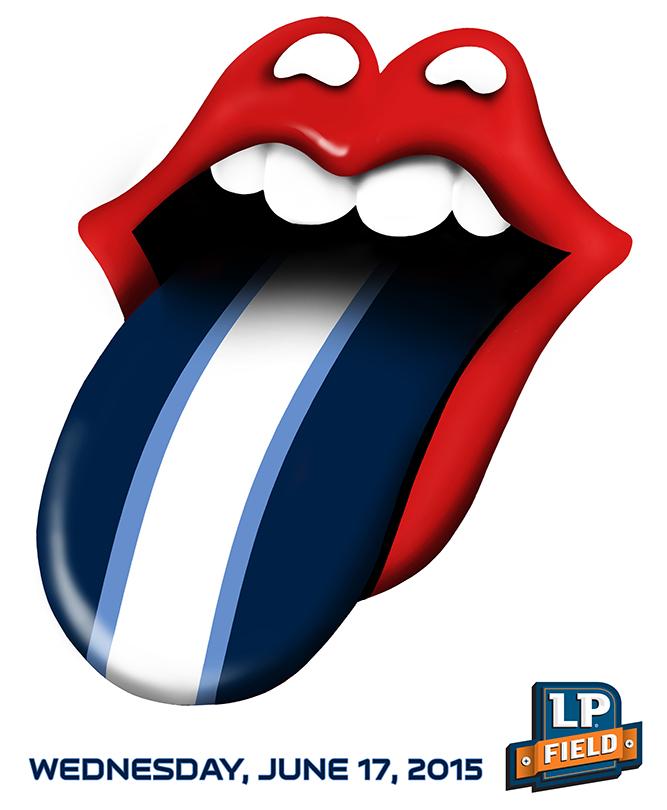
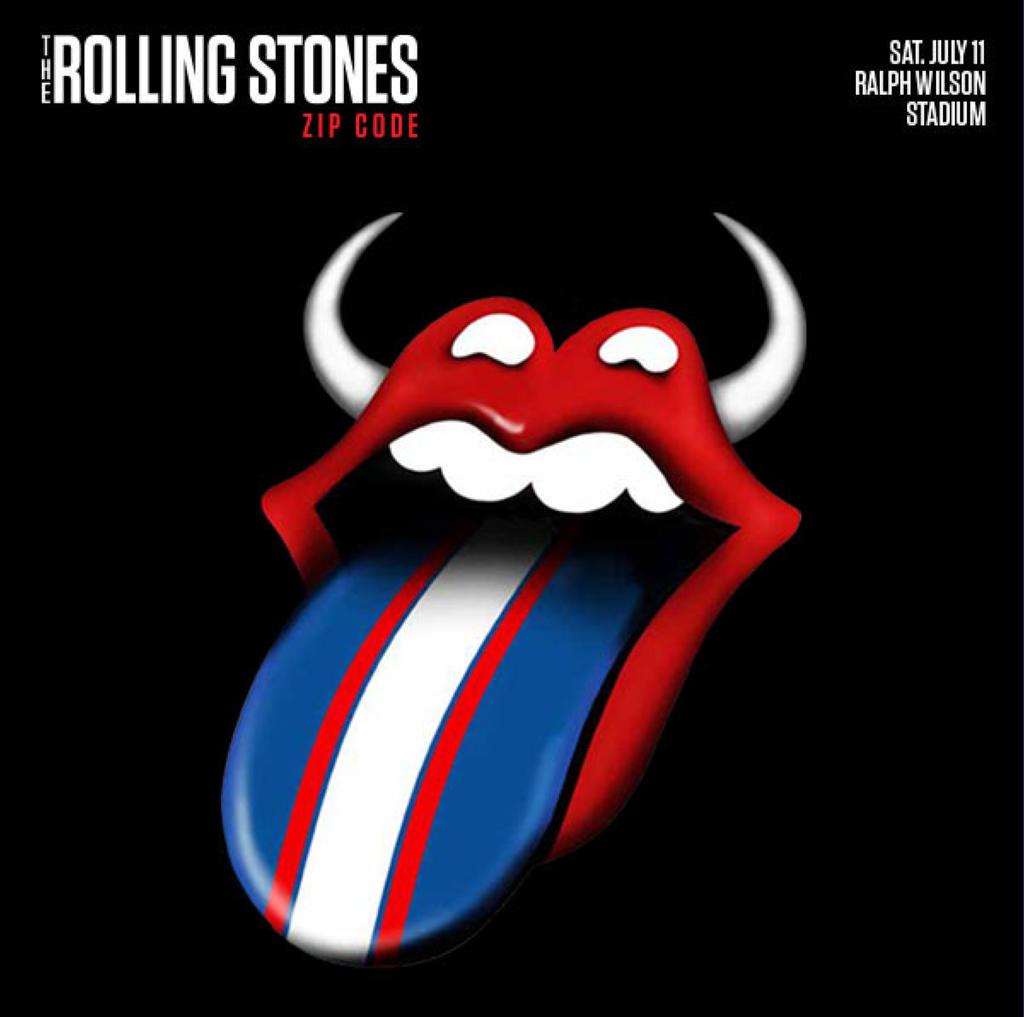
If I didn’t already know which teams/stadiums those were for, I’m not sure I would guessed, at least not right away.
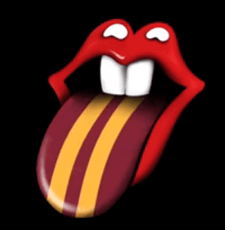
The one for TCF Bank Stadium in Minneapolis (U. of Minnesota) is funny, because they added gopher teeth to the logo:
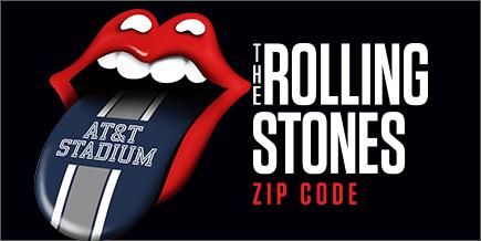
The design for AT&T Stadium in Dallas (Cowboys) would have been a lot stronger if not for the douchebag-y inclusion of the stadium name:
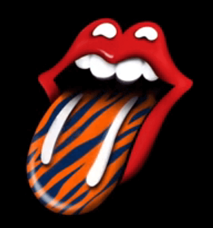
There’s also a show at Comerica Park in Detroit (Tigers), so they went with tiger striping, although it ends up looking more Zubaz-ish:
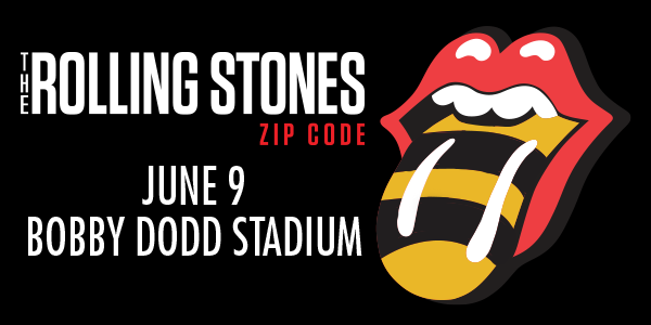
Sticking with imagery that’s team-based but not uni-based, I kinda like the logo for the show at Bobby Dodd Stadium in Atlanta (Georgia Tech), which plays up the Yellowjackets theme:
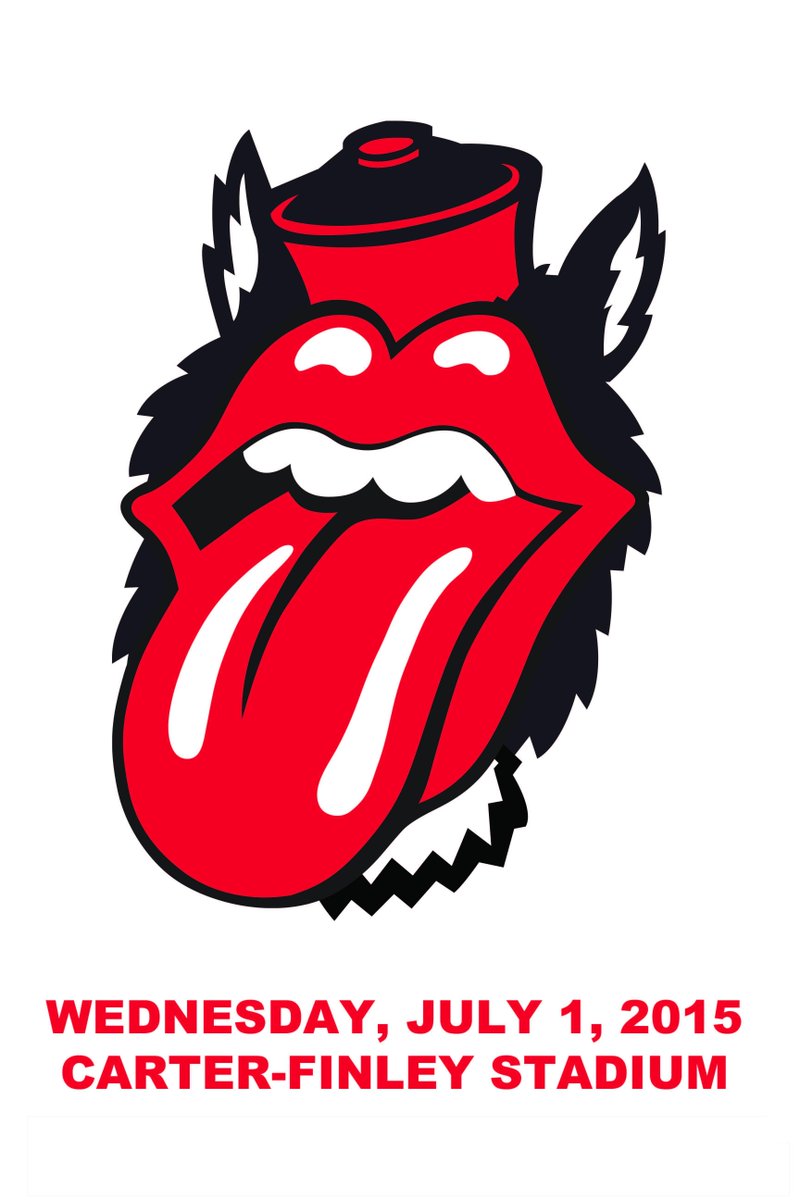
Then there’s the logo they came up with for Carter-Finley Stadium in Raleigh (NC State), which is slightly freakish-looking:
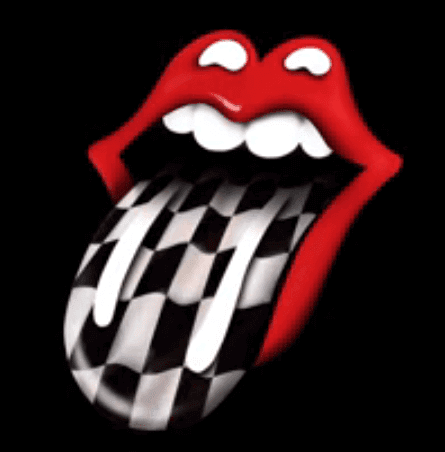
There’s no team that plays at the Indianapolis Motor Speedway, so they went with the most obvious auto racing-themed motif:
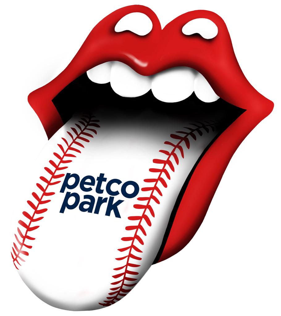
The logo for the show at Petco Park in San Diego (Padres) is a lose-lose, featuring a generic design and coporate douchebaggery:
The logo for the Orlando Citrus Bowl show isn’t doing all that much for me either:

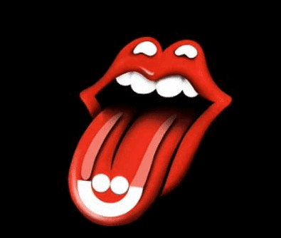
I’m very disappointed by the design for the show at the Marcus Amphitheater in Milwaukee. The show is part of Summerfest, so they’ve taken the Summerfest logo and used that as their theme:
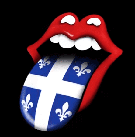
Finally, there’s the show at Le Festival D’Été de Québec. The logo for that show just plays off of the Quebec flag:
I think that’s all of them.
Major late-’70s MLB headwear find: Everyone knows about the pillbox caps that the Pirates wore in the late 1970s. Less well-known are the stovepipe-style caps — basically the same as the pillboxes, but with “an extra layer on the cake,” so to speak — that the team experimented with during spring training of 1978 and/or ’79. I’ve heard about these caps several times over the years but had never seen photos of them until reader Tristan Ridgeway came up with these shots:
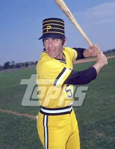
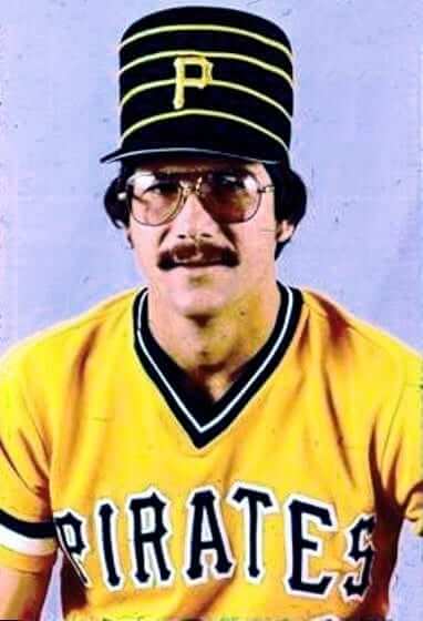
I’m trying to narrow down when and where these photos were shot. If you know, please give a holler. Thanks.
ESPN contest reminder: I’m currently accepting entries for an ESPN contest to name and design a team for a prospective NHL expansion franchise in Las Vegas. Details here.

Baseball News: Yesterday I mentioned that the Phillies would be wearing 1915 throwback caps on April 9. Now we have our first look at that cap (from Nick Kimlinger). ”¦ The BP jerseys and caps for this season’s MLB All-Star Game have leaked via a video game. Interestingly, the jerseys have the pillbox cap motif that we’d already seen on the patch that the Reds are wearing, but the caps themselves aren’t pillbox-style. Odd. ”¦ Here’s a little guide to this year’s Nats uniform set. ”¦ Interesting point by Jeffrey Sak, who notes that the Indians OF David Murphy will be wearing No. 7 on his back and on his sleeve this year, because of the team’s Al Rosen memorial patch. This doesn’t happen very often, because people who are important enough to get a numerical memorial patch have often had their numbers retired (or at least removed from circulation). Can anyone think of other examples when a player was wearing a number that was also being memorialized on his sleeve? ”¦ Reliever Alex Torres, who wore that crazy padded cap last season with the Padres, will wear a different kind of protective cap with the Mets this season. Further details on the new protective cap here. ”¦ Interesting story about how the Braves’ spring facility has literally zero Braves branding (from Patrick O’Neill). ”¦ Here’s a video of Yankees reliever Dellin Betances visiting the New Era factory to make his own cap (from Nicholas Schiavo). ”¦ Fans attending Opening Day Opening Night at Wrigley Field this Sunday will receive No. 14 pins for Ernie Banks. ”¦ Reprinted from last night’s comments: This season’s commemorative MLB baseball are listed here (from Ben D.).

College Football News: “For the past several years the Kansas State football team has displayed a Black Lion decal on the back of its helmets, symbolizing the team’s close relationship with the 1st Battalion, 28th Infantry at nearby Fort Riley, Kansas,” says Scott Ingalsbe. “It began back in 2007 as a jersey patch and then evolved to the decal. But now this unit is being deactivated. If the tradition continues, next season the Wildcats will probably wear a decal with the 16th Infantry Regiment’s Distinctive Unit Insignia, as they are continuing a partnership with a different Fort Riley unit, 1st Battalion, 16th Infantry.” ”¦ This is pretty funny: Ohio State’s vet school campus has a Michigan-themed fire hydrant (from Jonathan Daniel). ”¦ Miami’s spring game was color vs. color (from Eric Wright). ”¦ Check this out: Down in Baton Rouge they have an LSU-themed fire truck (from Tom V.). ”¦ Although you can only read part of the article, it appears that a legal ruling yesterday was good news for Ridddell. ”¦ An Arizona State recruit may have inadvertently leaked a new ASU helmet.

Hockey News: Check out the personalized logo for Gordie Howe in this 1978 birthday announcement. Definitely one of the earliest examples I’ve ever seen of an athlete’s personalized mark (good find from John Verruso).

NBA News: Lots of chatter about the Bucks possibly announcing a new color scheme today, although it’s unclear how much of it may be April Fool’s-related. Lots of logo leaks floating around as well, but it’s too soon to say whether any of them is legit.

College and High School Hoops News: Wisconsin’s cummerbund uniforms look even better (read: worse) in red. ”¦ I’m quoted in this New York Times article about college hoops uni numbers. ”¦ Entertaining article on former Purdue coach Gene Keady’s notorious combover (from Andy Horne). ”¦ “I have a ton of WinCraft pennants for every sport imaginable from when I was a kid,” says Mark Medinger. “Here’s a good video/article on their creation for the Final Four and how they’re shipped out to 6,000 vendors.” ”¦ Shane Drahota found this photo of his grandmother’s high school basketball team from nearly 100 years ago. … Good story on Duke’s and Kentucky’s respective shades of blue.

Soccer News: Reader Benn Wineka has noticed that the score bug on MLS broadcasts sometimes lists the home team first, sometimes second.

Grab Bag: New marching band uniforms for Kansas. ”¦ New uniforms for NYPD traffic cops. ”¦ “IAM Cycling teammates Sylvain Chavenel and Vincente Reynes ended up in a tug of war as Chavenel was trying to take off his jacket at Sunday’s Gent-Wevelgem race,” says Sean Clancy. ”¦ Our friends at Pop Chart Labs have produced a series of new sneaker-centric prints. ”¦ Here’s a new one: a rugby jersey designed to look like a wood carving (from Pete Clark). ”¦ Here’s what golfer Rickie Fowler will be wearing at the Masters. ”¦ This is pretty cool: a calligrapher who can freehand-draw famous logos (good stuff from Dave Rakowski). ”¦ Mohawk Racetrack — that’s a harness racing track in Canada — released a new logo for this year’s NA Cup. Unfortunately, it has a big honking apostrophe catastrophe. ”¦ “Your recent discussion about white footwear reminds me of one of the most embarrassing moments in Australian sport,” says Graham Clayton. “St. George rugby league player Graeme Langlands wore a pair of white Adidas boots during the 1975 Sydney Rugby League Grand Final against Eastern Suburbs. Langlands had a pain-killing injection in his leg prior to the game, but the injection went wrong and deadened his leg. Langlands was a passenger until he was replaced late in the game. Eastern Suburbs won the game 38-0, still the biggest victory in grand final history.” ”¦ The Norwegian curling team upped the ante on its ugly pants by going high-cuffed with striped socks. ”¦ The good news is that the city of Houston is encouraging its residents to get out and walk more by closing major streets to car traffic on Sunday afternoons. The bad news is that the program is sponsored by Cigna Insurance and is called Cigna Sunday Streets. That’s right — corporate naming rights for a fucking walking initiative. “This has to be a finalist for douchiest douchebaggery of the year,” says Cort McMurray. ”¦ Here’s more about that lawsuit filed by PGA caddies who want compensation for wearing corporate logos.
Neat article in NYT about Duke/Kentucky blueshttp://www.nytimes.com/2015/04/02/sports/ncaabasketball/for-duke-and-kentucky-theres-blue-and-then-theres-blue.html?hpw&rref=sports&action=click&pgtype also, find it funny if you look at the headline of the Nats style guide, “subject to what’s available for sale”, goes to show you the merch is wagging the tail.
I had just added that to the Ticker as you were posting your comment!
The image does not read “subject to what’s available for sale,” it reads “images via MLB shop, subject to change.” Two different phrases entirely. The images will probably change when the not-yet-released designs are released. No doubt the holiday designs will be available for sale, but let’s not give that tail credit/blame for wagging the dog just yet.
Is Alex Torres changing his name to Alex Williams for April Fool’s day?
Fixed.
Nice April Fools on the Pirate Pillbox extra layer. Very funny.
April Fools is something best left to those who can do it well, and this will be hard to beat for the Rule Of Funny and dancing on the line of plausibility.
Love that!!! You actually had me for a second…
AHHHH! I totally fell for it. Keeping in that theme, here is something I found on my first trip ever to reddit…
link
A leaked Bucks logo change? Looks awfully good for a Fools. Then again, I am pretty gullible.
Actually, this item here suggests that this MIGHT be legit….
link
They remind me of the monorail conductors at Disney World.
The giveaway, for me, was using Tim Foli as one of the examples- he was acquired in early mid-season of the ’79 season and I reasoned he would not have worn a Pirate stovepipe since he was a Met in spring training.
Info is wrong about the winning margin in a Rugby League Grand Final between Eastern Suburbs and St George being the largest in history in 1975. That was eclipsed in 2008. I should know because my team was the one on the wrong end of the 40-0 shellacking. Everything about the white boots is spot on though.
Big Al,
Thanks for the correction. I lost interest in Rugby League after my team, the North Sydney Bears, were axed from the competition, so I don’t follow the modern competition too closely.
That calligraphy/logo drawing guy is awesome.
(though he forgot the “circle R”)
I need those pens!! Shut up and take my $$ !
Interesting in that Nationals graphic that they call it a “road” cap, but an “away” jersey. Is that a normal distinction, or just an inconsistency?
Good spot. I’ve always used the two terms interchangeably (usually to avoid repetition). That may be the case here.
The latter, I’m pretty sure.
Maybe my mind is just in the gutter this morning, but for some reason the white accesnts on the Stones logo are looking especially suggestive, especially on some of the team logo ones. I think it might be because when the tongue is a color other than red, the white lines look less like shine marks and more like a foreign substance.
Anyone else taken by surprise by ESPN.com’s site redesign last night? It was quite jarring to be on the site around 10 PM EDT under the old format, only to return after midnight to see a completely new look.
Admittedly, I don’t watch Sportscenter anymore, so I don’t know if the network was doing any cross-promotion for the site.
I knew it was coming (it’s been in the works for ages) but didn’t know when it was going to go live.
Gonna take some getting used to.
I really like the redesign, I’ve been using the sports center app for a while with a similar format.
A redesign that allows for nearly half the page (not counting full page adverts) to be consumed with ads. Awesome – eesh.
Indeed it will take some getting used to, same thing happened when SI changed it layout, User Experience meets Marketing – see if you can guess who wins. Having said that, the Mothership can be pretty flexible when handling user feedback, especially when it is of the negative variety.
same thing happened when SI changed it layout…”
~~~
Yeah, but the ESPN page might actually work.
adblock for the win. i guess they had to go that route because there wont be any more page clicks because it can scroll endlessly through articles
it only showed for me for a bit last night. then when i signed in, it went away.
it doesn’t look like it’s fully done yet. some of the pages revert back to the old design
pros:
endless scrolling is neat
cons:
too white…sort of hurts the eyes
Why would a company *want* their website to look like Bleacher Report’s?
In reference to the ASU helmet, whatever happened to the days when schools used their actual school colors, and only their school colors, in their uniforms. ASU has beautiful unis when they leave out the black, gray, and copper and just stick to maroon and gold. Damn Oregon for starting this whole mess!
Unfortunately, there are more color combos than there are teams. I admire the willingness to think outside the box, but when teams trot out a new look each week, some equity is squandered. It’s still cheaper than cooking up an entirely new school simply so its team colors can be anthracite and copper.
There’s actually plenty of teams to account for pretty much all of the reasonable color schemes. The problem is too many teams using the same ones over and over.
When I clicked the ASU helmet link, I looked a the pic and thought, “Which one is the new one?” I had to read the paragraph to find out.
For me, at least, that’s a common thought I have on these leaks and reveals. “Didn’t [insert school here] already have a [GFGS/BFBS/chrome/etc] jersey?” Unless it’s a program I closely follow, it all starts to blur together.
Long gone are the days I could turn on the TV and know pretty quick which two teams were playing looking at nothing but a wide-angle shot of the two teams uniforms.
You wanted to see how strong the stripe branding was, but you didn’t let us guess at it before revealing which stadium/team it was for. Wouldve been fun to guess at if you just put your comments below the picture instead of above.
The NWSL’s Seattle Reign have new away & third jerseys.
Away
link
Third
link
Smiles everyone! Smiles!
Disco inferno
Is Tristian “Stovepipe Tris” Ridgeway related to the Tristan Ridgeway that has submitted other items?
Typo. Fixed.
The hydrants in the immediate vicinity of Michigan Stadium are also painted in maize and blue (with winged helmet motif), presumably to avoid being painted red for Ohio.
Well, not really. They used to be painted by students in maize-and-blue motifs as a cool community thing, now they’re all just painted like football helmets. Doesn’t have anything to do with Ohio State.
The “5” is in the wrong place on that first Pirates April Fools Day pic also.
Could just look out of place because of his twistedness.
Colts are doing a whiteout April Fools’ joke. (I assume it’s a joke. No way it’s legit)
Seems like something Nike would do though….
link
Oh, that’s a good one. A lot of work for an April Fool’s prank, but it turned out pretty well.
It would be a mean, funny, mean, funny joke if it were pulled by a team which goes head to toe in BFBS.
Seeing how the Colts already wear about as little pigment on their road set as possible it’s not much of a change.
The leaked All-Star Game video game images from last year did not reveal the cap designs either. link
My dream: We get pillbox caps for all teams at the ASG.
My nightmare: We get regular caps, but with pillbox-style hoops around the panels.
If I had to bet money, I’d wager that my nightmare option is what we’ll get, if we get templated caps at all.
That link worked beautifully. Let’s try that again:
link
As someone who’s officiated HS basketball for a long time, I really don’t care what numbers are on uniforms. But I think Paul’s quote misses the mark – the real problem, one that wasn’t mentioned, is the practice of retiring jersey numbers at all. Many of these retirements seem gratuitous.
International basketball (FIBA) restricts all numbers to 1-15. You can be 6, 7,,8, or 9 there. They manage to survive on a system that has half the numbers available to them as our NCAA/NFHS games.
^^^This. Michigan State has only itself to blame for the “dwindling” jersey numbers available to its players. As if the fact that MSU has retired more jersey numbers than either UCLA or UNC isn’t attestation enough, they’ve even retired two different jersey numbers for a single player.
link
I mean, it would certainly be understandable if a school like Austin Peay or Weber State honored a player who earns national recognition (say, Second-Team All-American) by retiring his jersey number. A team that aspires to (and does) compete on the level of an MSU? Not so much.
The best solution seems to be what Michigan Basketball does–“honor” jerseys, but leave them in circulation. There are five banners in the rafters, but only one (Cazzie Russell’s 33) is actually retired. Covers all the bases.
UNC does the same – if you meet a certain set of requirements, your jersey is honored and raised to the rafters. But to have your number retired, you have to have been a National Player of the Year.
link
“But I think Paul’s quote misses the mark — the real problem, one that wasn’t mentioned, is the practice of retiring jersey numbers at all. Many of these retirements seem gratuitous.”
Agreed. The retiring of a jersey number, if it’s to be done at all, should be an extremely rare occurrence. Setting records isn’t enough. Winning a championship isn’t enough. Being inducted into that sport’s hall of fame likely isn’t enough. Don’t ask me what’s sufficient for such an honor; I really don’t know. But it should be very rare.
“International basketball (FIBA) restricts all numbers to 1-15.”
Yeah, I’d noticed that. It’s really lame.
I like to see a variety of numbers.
Geezer British oldies act?
Seems fairly self-explanatory (and self-evident), no?
I wasn’t pointing out that it was unclear you were talking about the Stones–everybody knows the tongue logo. It’s just… Why take a shot at the Stones when there are acts out there that are truly “oldies” acts, playing half-empty state fair pavilions and street fests to play their single hit from 1963, rather than a still-relevant band selling out stadiums across the world?
Let’s get one thing straight: I lovelovelove the Rolling Stones. In fact, they are my Very Favorite Band.
However…..
1. The Stones have not released an album of new material in nearly 10 years.
2. They have not released a *good* album of new material in nearly 35 years, and have written almost no songs of any consequence during that period. Or to put it another way: As creative artists, they’ve been irrelevant for a long time — for much longer than they were ever relevant, in fact. (They’re still *culturally* relevant, of course, and will probably remain so long after their deaths. But that’s different than being creatively or artistically relevant.)
3. What do we call a creatively irrelevant musical group that keeps playing its hits from decades past and occasionally releases a vanity album that nobody cares about? An oldies act. (Or as *New Yorker* writer/editor David Remnick has written, the Stones have essentially become “the world’s greatest Rolling Stones cover band.”) There’s nothing wrong with being an oldies act, mind you — it’s a perfectly valid form of entertainment, and is arguably even a valid form of education. But let’s be honest enough to call it what it is.
4. There’s nothing wrong with people in their 70s (or older) making music. Tons of jazz musicians do it, for example, often quite well. But it gets a little tricky when you’re an oldster playing youth-oriented music, with youth-oriented lyrics, as part of a career predicated on youth-oriented values. There’s some cognitive dissonance there, you know?
5. Mick’s voice has been shot for years. Any sense of nuance is long gone. All he has left now is bluster. Many of the songs really suffer as a result.
6. No band, old or young, is good in a stadium. It’s not music, and it’s barely even performance. It’s mostly just spectacle. There’s nothing wrong with spectacle per se, but again, let’s be honest enough to call it what it is.
7. All of the above notwithstanding, if they want to keep playing their hits in stadiums, hey, be my guest. I’m not trying to tell my Very Favorite Band what to do; I’m just acknowledging the reality of the situation.
Here’s recent Rolling Stones setlist I could find.
link
Only one out of 19 songs on it is even from the current century, and it’s a single included on a 50-year retrospective of the band (which is what, the fourth retrospective? Fifth?). A mere two more songs from the 1990s. And perhaps most incriminatingly, nearly half that setlist corresponds to what they played the one time I saw them in concert. Which was in 1981.
How are they anything but an oldies act?
Of course they’re an oldies act — that’s really not open to question or debate.
Bando was/is assuming that being an oldies act is shameful or pathetic. I disagree. Either way, though, the simple fact of them being an oldies act is pretty open and shut.
“I lovelovelove the Rolling Stones. In fact, they are my Very Favorite Band.”
You realize that some people will take that literally, right?
“There’s nothing wrong with people in their 70s (or older) making music.”
I totally agree…
“But it gets a little tricky when you’re an oldster playing youth-oriented music, with youth-oriented lyrics, as part of a career predicated on youth-oriented values.”
True. But other than having a band cut out all of their older material from the set list, what would be the alternative?
I was never quite clear on what it meant to be “relevant.”
Is recording new music with some regularity sufficient for this designation?
“I lovelovelove the Rolling Stones. In fact, they are my Very Favorite Band.”
You realize that some people will take that literally, right?
It’s meant to be taken literally, because it’s literally true.
other than having a band cut out all of their older material from the set list, what would be the alternative?
Write and perform new material.
Is recording new music with some regularity sufficient for this designation [of relevance]?
Artistic/creative elevance is mostly a function of artistic/creative quality. So simply creating material isn’t enough (although it’s a start). To be truly relevant, one must create *good* material.
That’s why the Stones were relevant in the first place — the vast majority of what they recorded up through 1981 was very, very good.
There are two recent acts that I think are up to the caliber of 1970s Stones: Streetlight Manifesto and The Fratellis. Darned few in between either. Maybe occasional runs by They Might Be Giants and Elvis Costello.
Great music, like all other great art, is timeless. Leonardo’s paintings and Shakespeare’s plays don’t belong to their eras; they belong to the entiretly of human history. The same is true of the Stones’ music. So there’s nothing “incriminating” about the band having the same setlist as they had in 1981.
Still, it’s cool when an old band or artist can make good new stuff. The songs that I have heard from Paul McCartney’s latest album are excellent. And my very favourite band, Kiss, released a good album in 2009 and a great one in 2012. That made me rather proud.
“It’s meant to be taken literally, because it’s literally true.”
Huh. Sorry, I had presumed that you were dishing out a bit of April Fool’s with that one.
I guess I didn’t expect someone who seems really into punk and college music to also be fond of a band that fits so squarely into the so-called “dinosaur rock” classification. But that’s probably just my own bad stereotypes at work there…
“Write and perform new material.”
You’ll hear no disagreement from me on that one. Far too many bands have been performing nearly the same set list for the last 20-25 years, despite having actually made new albums during that period.
And it’s largely because knuckle-headed fans don’t pay attention to new releases (especially if they don’t get airplay on commercial radio, which is another issue entirely), and just want to go see a nostalgia act. The bands go along with this, because they want to sell tickets.
Art vs. commerce. It’s unfortunate.
“That’s why the Stones were relevant in the first place – the vast majority of what they recorded up through 1981 was very, very good.”
I might agree, up through about ’74, maybe. Except for Buttons and Majesties…yecchh.
Can’t say I’ve found much of the Stones’ material very good/interesting since Tattoo You. And, I know this is largely personal preference, I’ve never though Exile on Main Street was particularly special. I very much like their early material and I suppose Let it Bleed is my favorite recording of theirs, although that’s somewhat predictable. While on that subject, I’ve read many reviews and articles praising Keith Richards as a guitarist, but I find his playing to be good, not great, and often pretty boring. Sorry to insult anyone’s sensibilities.
Might the Tigers’ Stones logo intentionally be referencing Zubaz?
link
Good point!
Them Brits don’t know baseball, so they might be forgiven for googling “Detroit Tigers colors” and landing on that Zubas photo.
Too bad it wasn’t this Tiger with Stones’ lips pasted on the mouth!
link
I’m sure some of you PShoppers can whip one up for us though.
Can anyone think of other examples when a player was wearing a number that was also being memorialized on his sleeve? – Late last season the Yankees put a Derek Jeter patch on their sleeves, so DJ was wearing his number on his back, and a commemorative patch with his name & number on his sleeve!
I said “memorialized” — not commemorated.
Matching number on memorial and current player? Sure.
Chicago Bulls #2, Norm van Lier memorialized, Tim Thomas played
Montréal Expos #9, Lee Stevens played, memorialized Rocket Richard (crossover!)
Philly Flyers in an alumni game at the Winter Classic #10, John LeClair played, Brad McCrimmon memorialized
Good ones — thanks!
Also, Baseball Almanac shows Tyler Yates wore #33 for the Atlanta Braves in 2007. This would have been the year of the Lew Burdette and Johnny Sain #33 memorial patch.
FYI: american convention is generally to list the home team second, i.e. PIT @ CLE
European convention lists the home team first, i.e CLE is hosting PIT
I’ve always wondered about this. Specifically, I’ve wondered whether the American style is driven by baseball, where the home team has to be listed on the bottom (because the road team bats in the top of the inning, the home team in the bottom of the inning). Is that what led to the American convention of listing the road team first, across all sports?
I have always assumed that baseball was the driver to how American sports scores were listed.
I would love to hear how it came about if that is not the case.
Even when they give the scores in Europe, they always mention the home team first.
“Liverpool fell to Aston Villa nil one yesterday…”. The audience immediately knows Liverpool lost at home.
Because I’m American, I am used to the home team being listed second, because I watch soccer, it doesn’t bother me have the home team listed first.
I don’t have a specific preference to what MLS does, although I agree that it was consistent. It’s literally the only league I watch where I can’t always tell where the game is being played just by a quick glance at the bug.
Lee
American scoring owes its convention to baseball, where the home team bats in the bottom of the inning. Each system has some inherent logic.
The Wolfpack logo for the Carter-Finley tour date is AWESOME.
That’s all I got.
Interesting piece about Kansas State football decal The red portion looks exactle like Fort McHenry in Baltimore Harbor. Can’t imagine why an Army outfit in Kansas would have that on their insignia. Curious.
Came across this:
link
link
The star shape was a common design for forts. Doing a quick search of the 16th Regiment, i found that they were stationed at Fort Jay in NY, another star fort, at the time of the insignia’s creation.
or what dumb guy said! haha
Well played April Fools joke with the Pirate Pillbox extra layer
Thanks! All credit goes to Tristan Ridgeway, who sent those images to me last week and suggested that I use them today. I thought it struck just the right note of sounding almost believable. Lots of you seem to agree!
The key was not leading with them…having them “under the fold” was a veteran move. Well played
Thanks!
I think Tristan’s use of the Topps-watermarked image also helped. Somehow that made the whole thing feel more legit, at least to me.
Yeah, you got me too.
Nice.
Lee
Goddamnit! Totally fooled!
Too bad the Pirates didn’t keep those hats around a few years longer so that they could wear them against Sidd Finch when they played the Mets.
Looking at the 1978 birthday announcement for Mr. Hockey made me realize how much I miss the term “youngster” when watching NHL games.
The Braves’ spring training facility has almost no Braves branding?
Didn’t the Mets try that when CitiField opened?
I’ve been to plenty of baseball games in that Disney stadium, and it certainly does have a feel that the Braves play spring training in Disney, Braves certainly feel like a tenant there. Certainly doesn’t feel like any other spring training facility. They draw well because they’re not far from Atlanta and for a lot of folks (visiting Disney) I would guess that is their one option for a spring training game.
I like the way the 1977 White Sox collars on the Bucks logo forms an M.
April Fools jokes are great in press releases: link
But the gag is in the subtle tricks (voice activated copiers and Keurig machines)
What about players switching jerseys during pre-game skates? Or a player changing his number. Sidney Crosby comes out wearing a jersey with his name but with 11. It’s changed in the programs and official game notes. It’s a joke on the fans and announcers. Would it be unsportsmanlike toward the opponents?
Also, a great Throwback Night for two teams to wear their ugliest jerseys in their history for one night.
I noticed over the past week that the page headers for the site vary from time to time from the standard “7” in the magnifying glass to the “15” anniversary header. It seems to be different from browser to browser or even clicking through on the same page from the “normal” page to the comments. Is this intentional, or just a bug?
Been like that since Uni Watch’s 15th birthday last May.
I do not understand that rugby story at all. What was so embarrassing about that?
Deanna,
Langlands was one of the greatest Rugby Players of all-time, and it was embarassing to see a player of his stature being unable either to kick the ball or run at full stretch during the game.
link
Haha great. And unfortunately just realistic enough to be slightly believable
Those Pirate caps look more like marching band shakos than stovepipe hats.
For the Pirates photos, I was more interested in the black-white-gold sleeve striping when everything else (belt, pant legs, collar) is black-white-black.
Arguing about the Stones being “relevant” is ridiculous. Today’s entire music industry is irrelevant! I ask you this, what current big name performer will sell out 100,000 seat venus in 50 years? The Stones put asses in the seats more than anyone with 30, 40 & 50 year old songs and you’ll see fans of all ages at their concerts. They were “old” when I saw them at Ohio Stadium Bridges to Babylon tour but they totally rocked… and they will rock again.