Click to enlarge
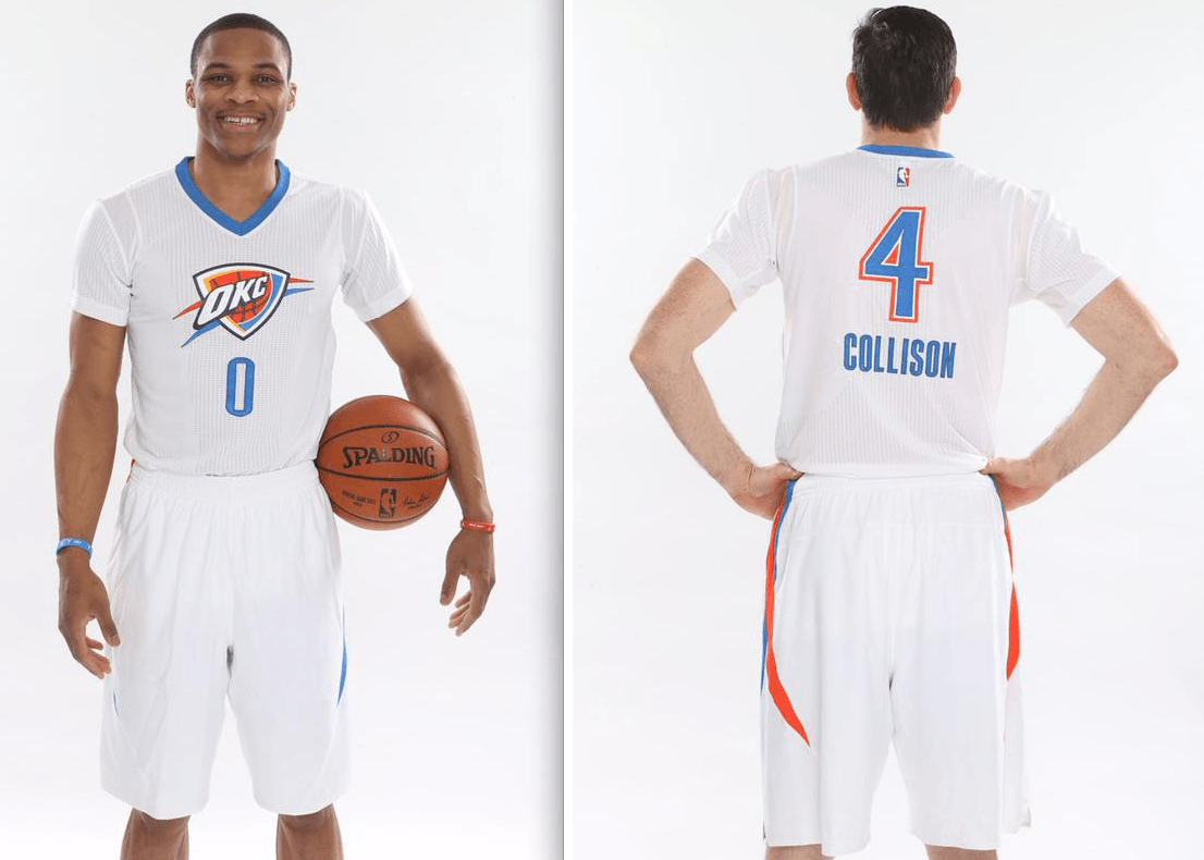
Another day, another sleeved NBA jersey, this time for the Thunder. It’ll be worn for the final four Sunday home games of the regular season, beginning this Sunday, March 8.
A few thoughts:
• I don’t think this uniform is unattractive per se (I’ve always liked the Thunder’s color scheme), but there’s certainly no compelling reason for it to exist.
• Some people like to say the sleeved jerseys look like T-shirts, but this one really looks like a tee, what with the white background color and the ringer collar. They really could have used a sleeve patch here, just to make it look more uniform-y.
• The subscript NOB feels gimmicky, but there’s one thing good thing about it: With the NBA logo moving to the back of the jerseys this year, NOBs and numbers have been pushed down a bit too far for my liking. Moving the NOB lets the number sit at a better level, and the visal transition from the NBA logo to the number feels pretty smooth — smoother than the transition from the logo to an NOB.
• This jersey, like many of the recent NBA alts, has been designated as a “Pride” jersey, meaning it’s supposed to reflect some aspect of the team’s and/or the city’s heritage. The Nets’ “Pride” jersey, for example, has echoes of the team’s old Dr. J-era design, and the Pistons’ version has the “Motor City” chest mark. But what exactly is “Pride”-ful about this new Thunder jersey? The team couldn’t even come up with a plausible-sounding answer to that question on its own website:
“We’re excited to tell the story of our team, our fans and our hometown with this new alternate uniform,” said Brian Byrnes, senior vice president of Sales and Marketing for the Thunder. “We believe the uniform embodies the spirit of this city, with simple and forward-looking design elements that showcase the three letters that resonate in our arena and have come to represent our team and our community: OKC.”
How lame is that? Aside from the last bit about the three letters, you could apply the rest of that mush-mouthed corporatespeak to virtually any uniform worn by any team in any sport! And this is your senior VP for marketing? Yeesh.
And as for those three letters: In case anyone forgot, the Thunder already wore those letters this past Christmas and also the Christmas before that. So I guess those jerseys were “Pride” jerseys too. Who knew? It’s a (retroactive) Christmas miracle!
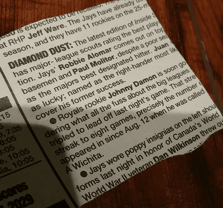
An early MLB poppy? SportsLogos.net honcho Chris Creamer recently came across this Toronto Star clipping (which you can click to enlarge), the bottom item of which indicates that the Blue Jays “wore poppy insignias on the left shoulder of their uniforms” on August 19, 1995. Chris, who’s from Toronto, was unaware of this, and it’s news to me as well. It’s not referenced in Bill Henderson’s guide or in any other uniform database I’m aware of.
Chris has been unable to find any photos from the game in question and wondered if any Uni Watch readers might know more. Do you? If so, speaketh up. Thanks.
Click to enlarge
Too good for the Ticker: The jersey you see above is currently selling on eBay. It’s from the days when such garments were made of wool, which of course is unthinkable today. It has a tremendous chenille chest logo with chain-stitched detaiiling — here’s a closer look at that (click to enlarge):
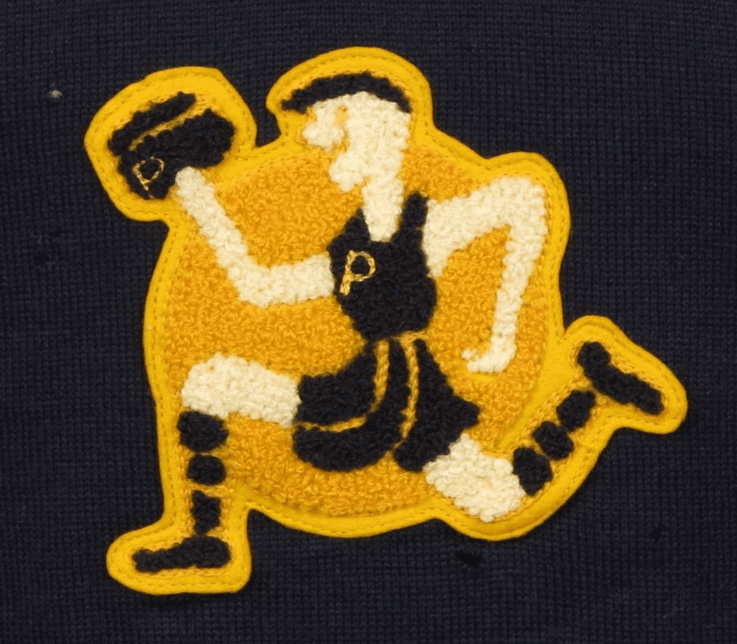
So much to like here: the big grin on the guy’s face, the negative-space striping on the socks, the chain-stitched striping on the shorts, the chain-stitched “P” on the chest and also on the — well, what is that in his right hand anyway? A baton? A boxing glove? A not-very-round basketball?
Of course, his chest mark really should have been a running guy, wearing a jersey showing a running guy, and so on — an infinite regression. But there’s only so much detail you can show on a patch.
This jersey was manufactured by Champion, back when the company’s logo looked very different than it does today (click to enlarge):
(Big thanks to my pal and vintage clothing maven Robin Edgerton for letting me know about this one.)
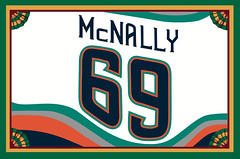
Membership update: A few more designs have been added to the membership card gallery (including Pete McNally’s Islanders fish sticks design, shown at right). We have one slot open in the current batch, which means the next person to sign up will get his or her card very quickly. You know what to do.
As always, you can sign up for your own custom-designed card here, you can see all the cards we’ve designed so far here, and you can see how we make the cards here.
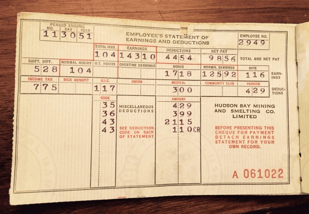
PermaRec update: The pay stub shown above, issued in 1951 by the Hudson Bay Mining and Smelting Co., is part of large pay stub collection — an entire lifetime’s worth — that Jim Wooley found after his parents died. Get the full story on Permanent Record.

Help wanted (but not by me): David Plotz is a very, very smart guy who was the editor-in-chief of Slate when I did my 10-article “Permanent Record” series there a few years ago. Last year he left Slate to become the CEO of Atlas Obscura, a great site devoted to the wonder and adventure provided by special and unusual places. It’s sort of a travel site, but it’s really more about what an amazing place this world can be. I’m already an Atlas Obscura fan, and I know it’s going to get even better under David’s stewardship.
David is now building a new staff to take AO to the next level, and he’s looking for people to fill three positions for AO’s New York offices: deputy editor, staff writer, and photo editor (part-time).
Let me put this as straightforwardly as possible: If you’re a young-ish journalism/media type in the NYC area and have a somewhat quirky sensibility, you could do much, much worse than to be working for David Plotz. Trust me.

Baseball News: While looking for something else, I came upon this photo of John Kruk and Darren Daulton wearing “Phillies Alumni” and “Phillies Hall of Fame” patches. … Let the “Fuck Face” jokes commence: new bat knob decals for the Orioles. … New knob decals for the Red Sox, too. In addition to the basic template, there are special designs for Dustin Pedroia (Sasquatch), Shane Victorino (Flyin’ Hawaiian), and Hanley Ramirez and David Ortiz (Dominican Republic). ”¦ One more team with new bat knob decals: the Royals. ”¦ Someone on eBay is selling a big assortment of stirrups. ”¦ Here’s a close-up of the Nationals’ 10th-anniversary patch. ”¦ Big story on the Brandiose guys, who at this point have designed about one-third of all MiLB teams. … David Goodfriend spotted Sandy Koufax, who’s assisting at Dodgers camp, wearing a grey-underbrimmed cap the other day. ”¦ Brutal G.I. Joe uniforms yesterday for FSU softball. ”¦ Good article on the design of Mets OF Juan Lagares’s glove. ”¦ Steve Markahm has launched a new blog called Baseball Card Photo Sleuth, which is exactly what it sounds like. ”¦ With Minnie Minoso’s death yesterday, there have been lots of photos of him circulating, including this one. Check out that sticker on his windshield! (Good spot by Alan Tompas.) ”¦ Beautiful cream throwbacks with Northwestern-striped stirrups yesterday for Eastern Michigan (from @3MTA3__3MTA3). … Good article about how the Yankees’ bumper crop of retired numbers creates problems when assigning numbers to new players.

NFL News: Pretty cool video showing the planned renovations to the Dolphins’ stadium (thanks, Phil). ”¦ The Seahawks unveiled their then-new color scheme 13 years ago yesterday (from Paul Stave). ”¦ A gym in Manhattan has poached the NFL Red Zone logo (from David Greenwald).

Hockey News: Check this out: NHL team ponchos! Dave Schneider says a friend of his spotted those down in Puerto Vallarta. ”¦ Some thoughts on the OHL’s new Flint, Mich., team’s search for a name. ”¦ Vince Vaughn took the Polar Bear Plunge over the weekend while wearing a Blackhawks jersey (from Chris Flinn). ”¦ I think we’ve seen this before, but once more won’t hurt: Check out the crazy vertically stacked number format for Malden Catholic High School in Massachusetts.

NBA News: Yesterday’s Clippers/Bulls game featured sleeved alternates, “Los Bulls,” and color-vs.-color — all at once! … In a related item: A coupla years ago I asked Hispanic Uni Watch readers what they think of the “El” and “Los” jerseys. Their responses are worth revisiting — take a look here.

College and High School Hoops News: Check out the variety of high school hoops uniforms in this shot of the 1982 All-Nebraska team (sent almost simultaneously by Brett Baker and Greg Mays). ”¦ The USF and UCF women’s teams had a seriously loud shoe match-up yesterday.

Soccer News: Villarreal has got to have the weirdest-looking “4” ever to appear on a uniform. It’s part of this font. ”¦ FC Barcelona players traveled to Saturday’s match at Granada wearing denim over denim because of a sponsorship agreement with a clothing company (from Yusuke Toyoda). ”¦ Also from Yusuke: Here are the mascots of all 40 J. League teams ranked by popular vote.

Grab Bag: Public works projects throughout the UK will be adorned by the Union Jack. … Irish cricketer John Mooney has added a throat-protection attachment to his helmet. ”¦ Throwback paint scheme in the works for NASCAR driver Brad Keselowski (from David Firestone). ”¦ Also from David: You’ve heard of a team’s uniforms being lost in transit? That’s nothing compared to what happened to Team Xtreme, who had their trailer and Sprint Cup car stolen.
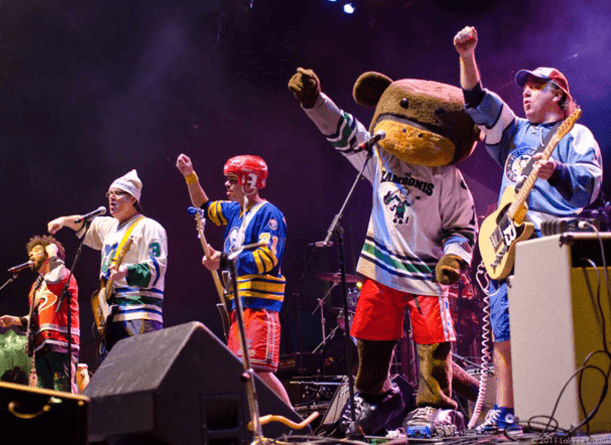

What Paul did last Friday night: On Friday evening I went out to see the Zambonis, the hockey-themed band that always wears hockey jerseys and pants onstage. Drummer Mat Orefice is a longtime Uni Watch reader and occasional Ticker contributor, but I’d never seen or met him or the rest of the band until now.
After their set, I gave them a coupla Uni Watch 15th-anniversary patches and they gave me a CD (look it up) and a T-shirt, both of which carried some fine print: “Zamboni and the configuration of the Zamboni ice resurfacing machine are registered in the U.S. Patent and Trademark Office as trademarks of Frank J. Zamboni & Co. Inc.”
And that’s not the only thing the band has had to do in order to keep calling itself the Zambonis. The company gets a cut of the band’s revenue, and band members aren’t allowed to say, “shit” or “fuck” onstage, because that might besmirch the company’s good name.
Mat says he doesn’t mind any of this. In fact, he’s become something of an evangelist for the company, as exemplified by this one story he told me (I’m paraphrasing his comments here):
Just a month or two ago I saw this story on CNN about people in Wisconsin who’d gotten sick from Zamboni fumes. So I looked into it and could tell from the photos that it wasn’t actually a Zamboni — it was an Olympia, which is Zamboni’s competing brand. So I called up Zamboni’s legal office and told them. Two hours later, the CNN story was changed.
Pretty interesting mix of sports, visuals, and branding, eh?
It’s likely not, of course, but it looks like the thing the guy is holding up on the patch is a curling stone.
Interesting.
I thought chenille-man was carrying a cam-corder with the mic backwards.
Here:
My first thought too. Clearly a curling jersey, because sixty years ago real men wore tank-tops on the ice.
Still, probably not a ball of any kind, since it also has the gold P on it.
Purdue Pete?
link
Not Pete. Pete has always had his hammer. He was founded by University Book Store (which is actually independently owned) and has never been in this pose. Also, he dates from 1940, and this seems to be before that…
link
isn’t it just the purdue train engine?
I love this jersey. Anyone know if basketball jerseys from this era would have had a number on the back? I didn’t see any mention in the listing.
I did an extensive project on Purdue’s basketball uniforms back in 2008/2009, and I didn’t come across anything like this, so if it IS a Purdue uniform, I don’t think it’s a basketball uniform. And players had numbers at least as early as 1929 at Purdue, so if it were from that time, it’d have some sort of number on it.
“Dummer Mat Orefice…..”
That ain’t right.
Fixed.
Would anybody happen to know what team would have worn that jersey? Black-and-gold, (presumably) starts with P. First thoughts were either Purdue or Pittsburgh, but certainly not any logo I’m familiar with.
A great mystery. What’s the school? I’m guessing some high school, which whittles it down to 387,458 possibilities. And “(W)hat is that in his right hand anyway?” My lame guess is that it’s a hat that the speedy person in shorts has swiped off the head of someone else, thereby “explaining” his naughty-happy expression. His naughty-happy expression, of court, may be simply a product of the limitations of the sewing technology or a projection from my own imagination or both.
Hence it’s a shirt commemorating the 20th reunion of the Phillipsburgh High School track team. The alums are making a humorous reference to the tradition whereby the winner of the Phillipsburgh / Plattsville annual Thanksgiving football game gets a one-year lease on the beloved Black-and-Gold Cap. The ancient harriers are just having a little fun at the expense of the venerable P-P rivalry.
I like how your mind works.
Sadly there’s something missing from the sentence that starts “Let me put this as straightforwardly as possible”.
Fixed.
Surely they should just give up on long sleeve jerseys for basketball. What will Adidas do next? Sleeveless soccer jerseys
They don’t have long sleeves — just sleeves.
Sleeveless soccer jerseys
Puma’s been there, done that, and link.
>>>FIFA banned that.
They always have their priorities straight.
Thunder alts look like underwear.
Thunderwear!
Or maybe Thunderoos, eh?
Ha! Thunderpants.
I totally missed that. To me they look like uniforms a team in a recreational league would wear.
I really like that NOB-under-the-number thing, though. Paul is totally correct. With the stupid NBA logo under the collar, you have to frame the number with the other two elements. The “regular” style, with the number all the way at the bottom and the name and logo above it shaped like some kind of skyscraper with an observation tower, just looks totally wrong in comparison.
As I wrote that part of today’s text, I thought to myself, “Mark in Shiga is gonna be all over this detail.”
You bet I am, and I’m not even really into basketball.
Of course, ideally there would just be a number on the back, with no logos or names or anything else!
The Phillies make special jerseys for their annual Alumni Weekend, and players are patched according to their achievements. Thus, Dutch and the Krukker are so adorned.
Re: Villareal – why are there two different 7s but not a single legible 4?
Yeah, the whole typeface is really weird.
Sorry, meant to link to the link.
That… thing that they’re using for the number 4 looks more like a futhark rune, or something from Tolkien. It looks really, really weird.
…and people think the TB Bucs numbers are bad. Pfft.
Yep, only Philadelphia MLB team “Wall of Famers” get jerseys with the large patch (though it seems that Jim Eisenreich didn’t even get an alumni patch on one occasion):
link
That RedZone poster is amazing. I love the part about sweet(sic) pouring…
I don’t have any way of commenting over at WordPress so I’ll leave my comment here. I’m knowledgeable as a Canadian lawyer.
Our Canadian corporations statutes require corporate names to end with one of “Corporation” “Limited” or “Incorporated”, abbreviations of those, or their French equivalents.
My understanding of UK companies is that the only acceptable endings are either Limited or PLC (for public companies).
As to why: I don’t have a better reason other than “that’s what our rules say”. Sorry.
The explanation is here:
link
Long story short, until passage of the Limited Liability Act of 1855, shareholders in a corporation still could be liable for the corporation’s losses; their liability wasn’t limited strictly to their investment. Post-passage, companies used the term “Limited” to denote to the public that they were.
You’re right, but that doesn’t answer the question of why some places are “Limited” and other places are “Incorporated”.
From the article you linked to “In most countries, corporate names include a term or an abbreviation that denotes the corporate status of the entity (for example, “Incorporated” or “Inc.” in the United States) or the limited liability of its members (for example, “Limited” or “Ltd.”). These terms vary by jurisdiction and language. In some jurisdictions they are mandatory, and in others they are not.”
Puerto Rico, or Puerto Vallarta?
Ponchos or Serapes?
Sorry, I mis-read the email from the contributor — yes, it’s Puerto Vallarta. Will fix.
The Notre Dame women’s basketball team tweeted a shot of their memorial patch for the late The Rev. Theodore Hesburgh, former President of the University, who passed on Friday.
Looks like the bass player for the Zambonis uses a Danelectro Longhorn, which is my favourite weird guitar of all time. Blue Sabres jersey with red helmet and pants is an appropriately garish stage look too.
I think the item in the right hand is a train with smoke coming out the top. Therefore, it’s Purdue.
OOOhhhh! Good call!
Great call!
You beat me to it.
Still seems odd/silly, but that’s where I was headed too.
Ahh the Zambonis are still kicking out the jams at hockey venues!
They played Hartford more than once or twice. Anyone else seen the video for “Hockey Monkey” on a Jumbotron near you?
Why are there 2 sevens in that Villareal font?
The only thing I can think of is that one is used if 7 is part of the number (17, 27, etc) and the other is used for the player whose number is 7.
I mentioned here a few weeks back that my son’s youth baseball league is sponsored by the Diamondbacks. Our team was assigned teal jerseys with purple hats and the Diamondbacks original wordmark.
I ordered custom striped socks for the team, and I think they turned out looking pretty good.
Here’s a link
Nice.
“If you’re a young-ish journalism/media type in the NYC area and have a somewhat quirky sensibility.”
Aw nuts.
Great picture here:
link
At some point do the guys at Brandiose send out a press release with a huge headline?
APRIL FOOL’S.
The garbage they produce is utterly shockingly bad.
P.U.
Proof that “the eyes see what they want to see”–that jersey is obviously the only known example of a Pittsburgh Ironmen NBA jersey and the smiling Pittsburgh player is effortlessly carrying an iron anvil. The team must have changed colors from red and white to black and gold sometime in the season and the rear numerals must have been poorly stitched and have long since been removed. Or perhaps black and gold were always their colors, tough to say with a lack of color photo evidence.
Here’s a baseball question for all Uni experts?
Why do road teams always need to wear the gray pants no matter what color jersey they are wearing? This leads to many terrible combinations (just try and watch Oakland wear their yellow jerseys and gray pants?). I think many of the jersey combinations would be more telegenic if MLB allowed teams to wear white pants on the road (only with colored jerseys. White jerseys at home). Does anyone know why this rule is in place?