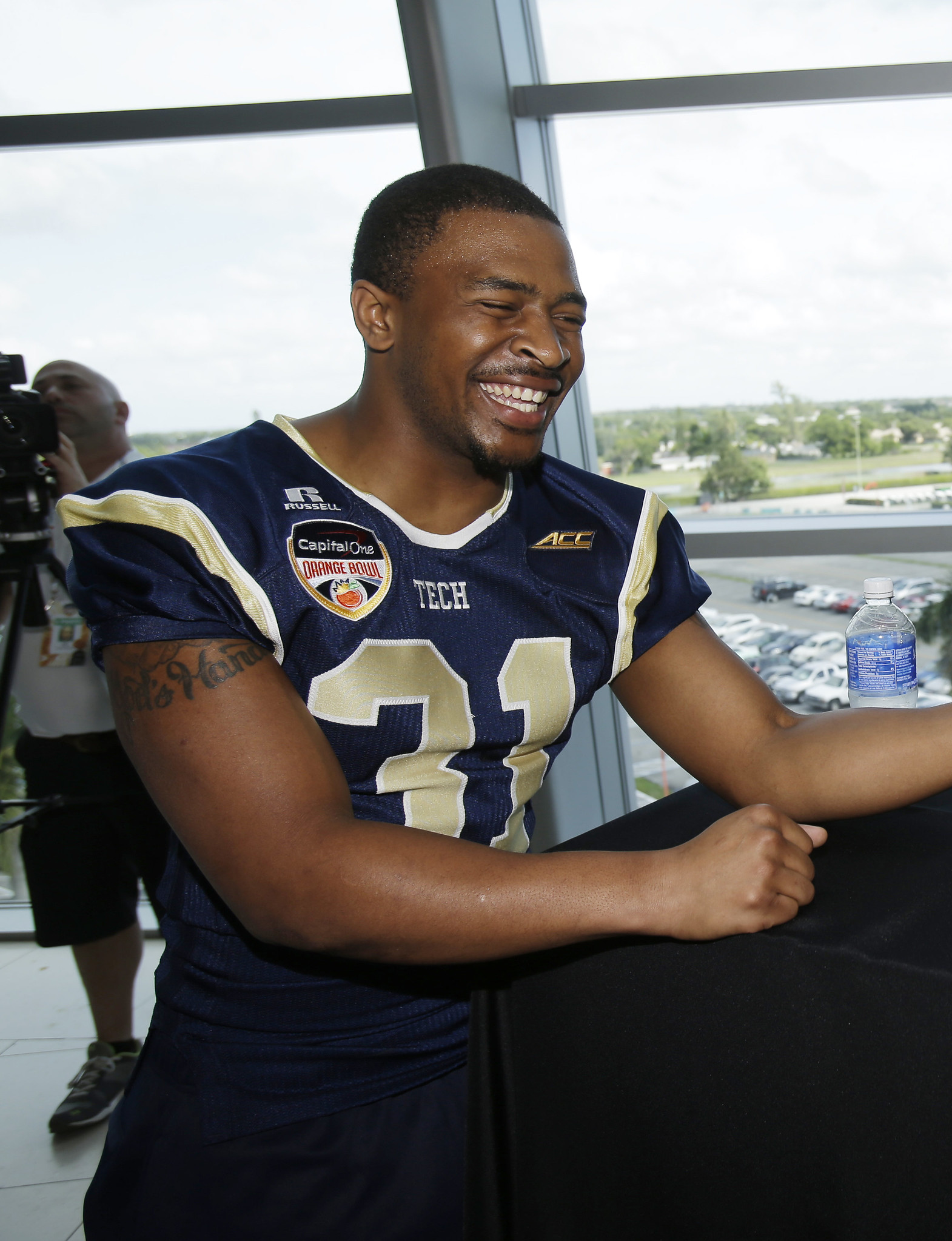
Click to enlarge
What is Georgia Tech A-back Deon Hill (shown above at yesterday’s Media Day for the school’s upcoming bowl game) so happy about? For one thing, he’s wearing the team’s blue jersey, which Tech will be wearing tomorrow night against Mississippi State. The Yellow Jackets are among the very few college teams that wear white at home (LSU is another prominent example), and of course they also end up wearing white on the road, so tomorrow’s game will be two years to the day since the last time they wore a colored jersey, which was in the 2012 Sun Bowl.
According to this article, the players are eager to wear something other than white. Here are some quotes:
• From safety Isaiah Johnson: “Every game, home and away, we wear white. So we wanted to switch it up. We could have worn gold and that would have been fine. ”¦I’m glad I get to wear it for my last game.”
• From linebacker Quayshawn Nealy: “A lot of guys have been wanting to play in the blue for the longest and we’re finally playing in them.”
This raises an interesting point: In most ways, college football’s uniform culture is much more freewheeling than the NFL’s. Teams change unis every year, there’s no limit on how many alternate jerseys you can have, no limit on helmets, and so on. But the NFL lets the home team choose whether to be white or color, which allows for a certain degree of flexibility, while the NCAA generally sticks to the “color at home, white on the road” format (except for teams that have requested and been granted a waiver, like Georgia Tech, and occasional “special circumstance” games). So this is one way in which the college scene is more rigid than the NFL.
All of which leads to a question: Should the NCAA adopt the “home team’s choice” protocol? Or are college uniforms crazy enough as it is?
Shirsey T-Shirt Club update: Thanks for all the feedback yesterday on the upcoming launch of the Uni Watch T-Shirt Club. That’s what we’re gonna call it — T-shirt = yes, Shirsey = no. (If you missed all of this yesterday, look here.)
As I mentioned yesterday, Teespring and I were working on a new sleeve patch design for the project. It’s now finished, and I don’t mind saying I think it looks awesome:
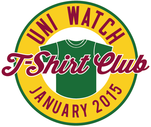
Obviously, the month at the bottom will be changed with each shirt in the sequence. It’s possible that we may make other small adjustments to the patch from time to time, reflecting a given month’s design. Or we might not. Either way, I’m really happy with this design. Hope you are too.
The first shirt in the series will be the white “Home” design (the patch will be updated), which will be available for sale starting next Tuesday, Jan. 6. Like all of the shirts in the year-long series, it will only be available for one week, whoop-whoop. We are considering one tweak to its design, which I hope to be able to show you tomorrow.
Update: OK, here’s the change we’re considering — instead of doing the front uni number in green (to match the script), we’re thinking of changing it to maroon outlined in gold (click to enlarge):
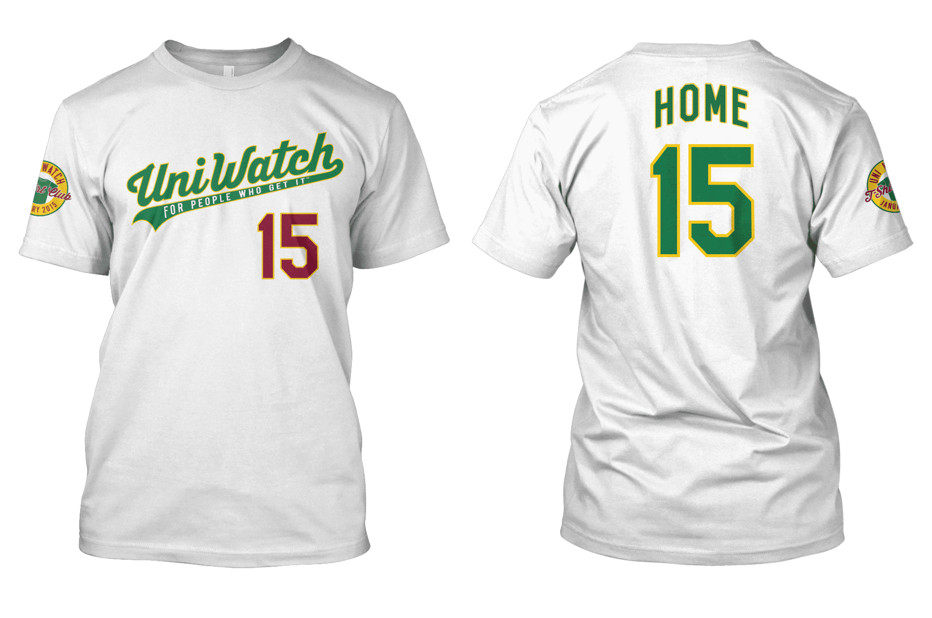
Changing the number to maroon would (a) give a greater presence to this color, which is part of the Uni Watch color scheme; (b) make the shirt design less A’s-like; (c) match the maroon number under the magnifying glass that’s shown at the top of this website; and (d) be a subtle shout-out to one of the great stories in uniform history.
I love the idea of changing the front number from green to maroon, but I have to admit that I’m conflicted about how it looks. What do you folks think?
(My continued thanks to Brian Molloy of Teespring, who has been very patient with my art direction and endless requests for revisions. Thanks also to Scott M.X. Turner, whose original magnifying glass logo design and subsequent 15th-anniversary logo design are proving to be very durable.)
Collector’s Corner
By Brinke Guthrie
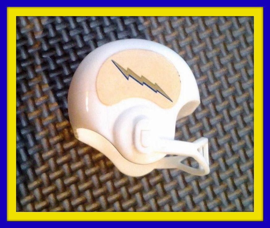
Ever seen this Chargers gumball helmet? I remember getting this in the late 1960s or early 1970s, and wondered “Why is the lightning bolt straight?!”
See, even when I was 10 years old, I knew I Got Itâ„¢. Now here’s the rest of the final Collector’s Corner of 2014:
• Here’s a nice set of 1970s NFL helmet magnets. All look to be in good shape except for the wings on the Eagles helmet.
• Check out the artwork on this vintage 1960s Astros pennant!
• This 1970s New York Football Giants spiral notebook looks like it’s in great shape. Also for the Giants fans: this rather understated sideline windbreaker.
• Wow, terrific set of 1965 NFL book covers also featuring the New York Giants. And they’re “Thermo-Plastic Coated”!
• More magnets, but for a different sport: Check out this very cool 1970s NHL standings board/magnets set. Mint in package, baby.
• Don’t you wish the Vikes would return to their classic look, and maybe include the logo on the sleeves like this 1970s T-shirt does?
• “Buy one of our sticks and we’ll belt you.” Hope that ad copywriter got a bonus for this NHL Cooper hockey stick/belt buckle promotion.
• Never seen this before: an NFL team towel from the 1970s with all the then-current logos. Twenty-six teams shown, so this is from before the Seattle/Tampa expansion.
• This takes me back! Had one of these big ol’ 1970s Cincinnati Bengals beer steins. It sat on the shelf next to my Reds World Series steins, as I recall.
• Can’t recommend this highly enough — the late-1960s Sports Illustrated Pro Football game.

PermaRec update: An early-1900s student whose employer called her “impertinent” for having the nerve to take the front elevator (!) is the subject of the latest Permanent Record entry. Enjoy, and my thanks to everyone who’s provided supportive feedback on this project ”” means a lot.
Uni Watch News Ticker
By Mike Chamernik

Baseball News: A really neat mini U.S. Capitol building has been constructed for the NHL Winter Classic at Nats Park, and some observers think the Nationals should make it a permanent park of the ballpark (from Tommy Turner). … A Reggie Jackson game-worn Kansas City A’s rookie year batting helmet is for sale on eBay (from David Firestone).
NFL News: Check out this old advertisement with a photo of Phil Simms. “I thought it was odd that they removed the side TV numbers and added his name to the sleeve of the jersey,” says Jamie Burditt. “And it appears to be actually printed on the jersey itself, it does not look like a camera trick or something. The font seems to match the style the Giants wore in that era also. I never seen an ad where they moved the NOB to the sleeve.” … Groupon is selling NFL team throw pillows, but the Browns and Bengals ones (at least) are in the Seahawks’ jersey template (from Tony Crespo). … The Patriots posted their 2015 opponent schedule on their Facebook but the Jaguars pointed out the Pats showed Jacksonville’s old helmet logo (from Stephen Hayes). … David Firestone found a photo of IndyCar driver J.R. Hildebrand in a 49ers-themed driver suit.
College and High School Football News: Notre Dame, as per longstanding tradition, will add NOBs for its bowl game (from Phil). … New uniforms for the All-American Bowl. … Here’s a look at Oregon’s Rose Bowl patch (from Phil). … Clemson wore helmet decals to honor its first bowl game. … West Virginia’s Rushel Shell had a banged-up helmet decal yesterday. … The Detroit Free Press used John Harbaugh’s photo on its front page for a story about Jim Harbaugh and Michigan. … A Texas fan wore a “5 Core Values” jersey at the Texas Bowl (from Phil). … Louisville will wear all black for its bowl game today. … “I finally got around to watching Unbeaten, the Big 10 Network documentary about Brook Bolinger,” says Marc Burgess. “This shot from the 1994 Orange Bowl struck me as odd, because Bolinger has an Orange Bowl patch with a white background while Tommy Frazier has one with a red background. I’ve never seen mismatched bowl game patches before. Is there a reason for that, or is it just poor quality control?” … A New York State man donated $4,000 so members of his district’s championship high school football team could keep their jerseys.
Hockey News: Toledo has some excellent WHA-adjace jerseys for its Winterfest Alumni game (from Phil). … Will Scheibler found a 1938 hockey trophy that had skate blades on the sides of it. … The Winter Classic is still in two days but some Modell’s outlets have cut Caps’ merchandise prices in half.

Soccer News: From yesterday’s comments: “Wayne Routledge had a little shorts malfunction during today’s Liverpool vs. Swansea City game,” says Ryan, who didn’t give his last name. “They totally ripped on one side. They brought out a new pair of shorts. He took them off right on the pitch and put the new ones on. The crowd really started hooting and hollering when he took off the shorts.”

NBA News: The Mavs put a 70-by-70 foot logo on the roof of their corporate headquarters. … I was looking through the Bucks-Hornets game photos last night and I saw that Milwaukee guard Jerryd Bayless wears his headband backwards. Bayless started wearing a headband in 2012 (when he joined the Grizzlies for his fifth season in the league) and has always worn his headband reversed. According to the end of this video clip, Bayless said the he started wearing a headband solely for practical reasons, because he shaved his head and wanted to soak up the sweat. But, we still don’t know why he wears it backwards. I want to get to the bottom of this!
College and High School Hoops News: Georgetown will give out pink “G” t-shirts to support Men Against Breast Cancer (from Phil). … Marshall’s men’s and women’s teams have added a memorial patch for university president Dr. Stephen J. Kopp (from Phil). … That California high school that banned the “I Can’t Breathe” T-shirts has now had a change of heart (from Phil). … Middle Tennessee State’s Reggie Upshaw goes JrOB (from Phil). … Long Beach Poly High School in California had its girls’ basketball uniforms stolen after the team traveled to Miami for a holiday tournament.

Grab Bag: A few decades ago, cyclist Eddy Merckx was as big a part of Adidas as Kareem Abdul-Jabbar was (from Sean Clancy). … House Majority Whip Steve Scalise is in the news for some bad reasons, but he has a sweet jersey in his office (from Aaron Scholder).

Chargers gumball helmet looks like someone had Air Force Academy on their mind.
“Should the NCAA adopt the ‘home team’s choice’ protocol? Or are college uniforms crazy enough as it is?”
Yes.
It should be noted that Bowl protocol is slightly different than regular season protocol — in the 2012 Sun Bowl, for example, GT was designated as the home team, and (for some reason), the Sun Bowl requires the home team to wear dark. No exceptions.
For the Orange Bowl, as the higher ranked team, Mississippi State (#7) was given a choice as to what top — and adidas had decided to go white (that’s a special white version of the “100 Year uni” Miss State wore this year). So, by circumstance, Tech was forced to wear blue.
It’s nice to actually see the blue tops, but GT’s unis, unless their throwbacks, are pretty awful in either white or blue. Better matchup, IMHO, would have been Miss State in their maroon 100 year uni versus GT in throwbacks.
GT should do a link throwback. Those were dynamite.
What’s this issue with our current jersey template? I mean yes our pants are borderline dumb (It could be better byt I don’t have an issue with the piping except for the stripe that runs across the butt), but the jersey is clean. I wouldn’t mind seeing us add TV numbers to the look, so its not like our look can’t be improved, but awful?
Then again I think we should go to the unis I submitted to the UniTweaks 2 years ago (I think they were published in a February 2013 post), which blends the throwbacks with our cell (honey comb) design element.
Should the NCAA adopt the “home team’s choice” protocol?
Yes. Neither the NFL or NCAA should dictate what uniforms are worn when or where. The home team announces “we’re going to wear X for this game” and the road team brings whatever uniform they want to match up against it. That is how it should be. Period.
My main problem with the uniforms of today is that ugly does not seem to be taken into account. Make it and wear it no matter what it looks like. Pro teams should (Buccaneers Jaguars) should not try to look like silly college teams and college teams(Oregon) should not just wear anything Nike tells them to.
This topic reminds me of a story I find quite funny. Back in the mid-90s, Vandy coach Gerry DiNardo left to take the coaching job at LSU. Vandy was bitter about his decision, and they got back at LSU and DiNardo. In the next years (I’m not sure which), Vandy played LSU in Baton Rouge, but they denied LSU’s request to wear white. This resulted in a rare LSU SEC game in purple jerseys.
Wake Forest denied our request quite a few times when we went back to white all the time starting in 1995. They even forced us to wear our Gold jerseys featuring the font from 2000 in 2002 (because we didn’t have a gold jersey with the current font). Boston College also denied our request in 1998.
Teams would try and do it to throw us off and unfortunately it appeared to work.
Thanks to a conference restructuring we didn’t play Wake at home again until 2009, and sure enough, they denied our request to wear white at home. Fun Fact: Tom O’Brien, who coached BC in 1998 when they denied our request to wear White and won, returned to Bobby Dodd 2 more times, the first was during a time when we wore Gold at home so there was no request to deny, the 2nd time came in year 3 of our return to White at home saw O’Brien coaching NC State, a game that the Jackets lost (however they weren’t as big of underdogs this time around, and may have even been favored).
The Rose Bowl has had a lot of mismatched bowl patches in the past, especially when Michigan is in the game.
link
The player next to Frazier should be Brook Berringer, not Bolinger.
Yep, Berringer. As for the question posed, I had never noticed this mis-match and am now most perplexed.
Nebraska had 2 jerseys. The APEX jerseys had the regular Orange Bowl patch (Berringer), whereas, the Russell jerseys had the embroidered patches.
…from Huskergameused.com
Tommy Frazier wore his jersey from the Orange Bowl game the year before when they lost to Florida State. Check it out
I remember at the Oklahoma game that year, Frazier wore a #17 jersey. Maybe after he was injured there was some sort of problem with his jerseys and that is why he wore the previous year’s jersey at the Orange Bowl.
Yeah, that was my fault- I meant Berringer. I’ll say that’s autocorrect’s fault (which may or may not be true). I’d hate to think I just watched a whole documentary about the guy and then couldn’t remember his name.
Should the NCAA adopt the “home team’s choice” protocol?
Yes! Let the home school decide what it wants to wear.
In fact, I’m in favor of doing away with a requisite white jersey team altogether. Black-and-white tv is essentially dead. Let’s have more color-vs-color games! Let’s start having games that follow more along the lines of soccer games. Just as long as the colors of the two teams aren’t too similar.
No, let’s not have more color vs. color. Ugh. White jerseys in all sports look good.
The problem is that whether or not “the colors of the two teams aren’t too similar” is pretty subjective, and matchups that might seem acceptable to somebody with normal vision might not work for those with colorblindness.
Plus, often times the two teams’ jerseys will clash and the whole game becomes an eyesore.
I like the idea of some sort of Capitol dome or model at Nationals Park. I love the stadium, but I admit that it doesn’t have a signature item or whatever. Sure, it wouldn’t be Camden Yards’ warehouse, but how many stadiums really get to have something like that?
Nats park already oozes cheesy gimmickry to me with how they approach their gameday experience for fans, the Capitol on top of the Red Porch would just be another chapter in that, to me. Not to mention that the real Capitol is actually visible from certain seats, so those seats would be looking at two rotundas. Not only would that be visually redundant, but there’s no need for a fake anything when you already sort of have the real one.
If they HAVE to have a DC landmark put in for the identity of the park, make it something unique. I suggest putting a replica White House somewhere…then it could even be used for the start (or end!) of the President’s race.
Right, the Capitol is visible from certain areas of Nationals Park, so it’s sort of silly to have a replica in the ballpark.
What is this word “adjace”?
Confession: I have no idea. When I woke up this morning and edited the Ticker that Mike had prepared for today, I looked at that word and thought, “What the fuck is that?” Googled it — nothing.
Mike is generally pretty dependable, so I decided “adjace” must be one of those things that the young-uns know about but that I’m too old to have heard of. So I left it in.
Anyone..?
Me and you both, Paul, on the thought and searching it out. LOL
Since those Toledo alumni jerseys were modeled off the IHL Goaldiggers uniforms (great name, btw), they’d be more IHL-inspired than WHA-adjace (whatever the eff that means).
It’s latin.
adjacÄ“: second-person singular present active imperative of adjaceÅ
adjaceÅ: Alternative form of adiaceÅ
adiaceÅ: I lie beside, at, near or next to; am adjacent to, am continuous to, adjoin, border upon.
Or the short version: it’s a typo. Not really sure what word he was going for, though.
None of those definitions make any sense in the way the word is being used, Jeff.
In fact, all it seems you’ve done is define the word “adjacent”. LOL
Exactly, Teebz. Thus my conclusion that it was a typo and not the intended word.
It’s apparently also a fantasy nation or something. Pretty funny writeup on that “nation” too:
Phil, Nationstates.net is a game where you can create your own country. It seems that write-up is about one of those “nations”. Good creativity in that write-up, though!
And, coincidentally, here is the link. LOL
Paul, you might like the chosen flag of Adjace! ;o)
Here’s the tweet I forwarded to Mike with that jersey pic.
There’s nothing on there that says (or links to) anything with “-adjace” either, so this must be a term Mike is familiar with. Never heard it before this morning, myself, either.
Mike?
Mike is one time zone behind those of us in the east, and he worked late last night at his real job and then even later on the Ticker, so it may be a little while before he joins the discussion here today….
“Adjace” is short for adjacent, and in this sense it’s a short way to say “similar to”, “a poor man’s version” or “a remake of.”
I hear this word all the time in a podcast I listen to, Cheap Heat on the Grantland Network, and I use it myself in real life. I did not know it would cause so much confusion!
Mike, I like you. You’re a good dude. But it’s not English, and it’s wrong. Bastardizing the language doesn’t make it right, and those guys from Cheap Heat should be forced to stop this crap.
I’m not blaming you, though, Mike. Nothing drives me more mad than when people in the public spotlight start using language wrong. I blame the Cheap Heat for introducing something into the lexicon as “hip” or “cool” when it’s completely wrong in terms of what they were trying to achieve.
“Adjacent” does not and has never meant “similar to” or “a remake of”. The Latin, adjacere, means “lying near to” from “ad” (to) and “jacere” (lie down). So Canada would be “US-adjace” if properly used.
Therefore, the Toledo jerseys can’t be “WHA-adjace” unless they are next to a WHA artifact… if used as the language intended.
It’s not quite the same thing, but I can’t get used to hearing that an artist or record company is going to “drop” an album. Every time, I think that it’s being cancelled, not released.
I seem to remember that phrase being discussed on Howard Stern, and Gary Dell’Abate saying he hated it too. LOL
Teebz— You write: “Nothing drives me more mad than when people in the public spotlight start using language wrong.”
“Wrong” should not be used; it should be “incorrectly” or even possibly “wrongly”.
Wow. I had no idea this would cause all this. The adjace movement suffered greatly today. I’ll take a lap. I am glad to see that language and grammar is still important. Writing in all forms has become much too informal nowadays.
“Teebz– You write: “Nothing drives me more mad than when people in the public spotlight start using language wrong.”
“Wrong” should not be used; it should be “incorrectly” or even possibly “wrongly”.”
~~~
Eh. He’s a Canadian. They spell words wrong all the time too…like “colour” and “offence” and “grey”
Oh so much to teach, and so little time.
It’s actually correct, Komet. The fast-and-easy rule is that you use “wrongly” before the verb and “wrong” after the verb.
For example, “he was wrongly detained” vs. “he answered that question wrong”. Both are adverbs, and both are correct in those positions.
Don’t get me wrong (see what I did there?): formally, it should be wrongly. However, when placed after the verb in question, “wrong” indicates “in an unsuitable or undesired manner or direction”. If it is meant as “falsely”, wrongly would be right when following the verb. –> “he acted wrongly”
In short, “using language wrong” is idiomatically correct whereas “using language wrongly” would also be correct yet overly formal and less common.
And Mike? No need for a lap, dude. You’re still awesome. It’s them podcasters who need to take the lap for messing with the language. ;o)
Anyway, it’s a cool sweater.
Exactly. Haha
Bayless isn’t wearing his headband “backwards.” As a circular object of uniform dimensions, his headband has neither a “front” nor a “back.” Bayless simply elects to wear it with the logo facing to the back.
Which as a long-time headshaver myself, I’d guess is a purely aesthetic decision. Not to mention the correct one, as having a logo emblazoned on the otherwise blank canvas that is his forehead would sure be a goofy look.
Regarding the Nebraska mismatch, NU had their first deal with Adidas that began in 1995. But it was unclear if it began with calendar year 1995 or the 1995 football season. The Orange Bowl was in January ’95, following the ’94 season. So the players got to choose – on an individual basis – whether they wanted to wear new Adidas gear or the Apex jerseys they had worn all season. So that game is full of mismatched jerseys and I’m guessing the patch difference is an Adidas/Apex split.
“This topic reminds me of a story I find quite funny. Back in the mid-90s, Vandy coach Gerry DiNardo left to take the coaching job at LSU. Vandy was bitter about his decision, and they got back at LSU and DiNardo. In the next years (I’m not sure which), Vandy played LSU in Baton Rouge, but they denied LSU’s request to wear white. This resulted in a rare LSU SEC game in purple jerseys.”
Rule was changed in the SEC not long after that to make it the home team’s choice for conference games. That’s why LSU hasn’t worn a dark jersey at home in an SEC game since that Vandy game. Florida wore white at home a couple of times since against LSU (’98 and ’00) and Miss. State has done the same to LSU (’07 and ’09).
As an LSU fan, I wish more teams would force the Tigers to wear purple on the road. I know white home jerseys are an LSU tradition, but I like the purple jerseys (OMG, NOOOO!!!!) and I think football teams just look tougher with dark home jerseys. That’s a silly psychological thing for me, but white home jerseys are one reason (among many) that I detest the Dallas Cowboys.
I’m with you there! I’d love to see LSU wear the purple jerseys more often.
Oh wow, looked at those comments from yesterday. So not only to commenters poo poo “Shirsey” but some were actually suggesting “jirt”???!!! hahahahaha STOP IT!
Shirsey, Shirtsey and t-shirt jersey would all have been fine really.
Helmet magnets missing Atlanta Falcons. Made me think how wacky the NFC west used to be aligned.. LA, SF, NO and Atl. Also Jets helmet appears to be from the 80’s. What year did they switch to green helmet?
The Jets switched to the green helmet in 1978. The Chargers helmet is from 1988 or later, though.
The predecessor to the NFC west, the NFL Coastal (1967 to 1969) was even wackier with Baltimore-Atlanta-LA -SF.
If you scroll back up to the T-Shirt Club section, you’ll see that I’ve now added the possible design change that we’re considering for the January shirt. Feedback welcome.
YES!
Definitely have the off-color front number, a la the Dodgers!
Wow…I agree with Phil!
Yes to the maroon number!!
I agree with your initial thought: I like the idea of changing the color of the number and, as Phil notes, my first thought was that it was reminiscent of the Dodgers. (Trying to hold back my long-standing dislike for the Dodgers and all things Los Angeles. Hang on. Wait…Okay. I think I’ve got it). But the darkness of the number seems jarring, for lack of a better word. (Thinking…) In the end I think the distinctiveness of it overcomes my initial reservations, and I think the maroon number is the way to go.
Spiffy!
When might the price(s) become available?
I’ve said all along: $20 – $22ish.
It’s now turning out that the multi-color sleeve patch might push things as high as $25. Or it might now. But definitely no more than that.
The maroon numbers look great….. keep them!
The Nebraska quarterback is Brook BERRINGER not Bolinger.
On the t-shirts: how about the NOB be the month the shirt is available?
No. Here’s why:
1) The month will already be on the patch.
2) The NOBs are part of the fun, like “BFBS” for the black shirt.
Any chance for an NNOB? All my $200 polyester shirts are NNOB. Names change, numbers don’t. Not a deal breaker, but that’d be the one I opt for.
On the T-shirt, stick with the A’s parody. The Dodgers left Brooklyn in 1957, so save that idea for 2017.
It’s not an “A’s parody.”
Green and gold (and maroon) are the Uni Watch colors, and we wanted to do a classic-looking script. I can’t help it if the A’s do something similar.
Georgia Tech’s blue jersey has significant traction for their fans, it was worn by the 1991 team as it wiped out Nebraska for a share of the national championship. I don’t think it was worn only once that season.
It was also worn as we devolved from a National Champion to a 1-10 team. I’m glad George O’Leary threw those out when he took over, going back to White at Home, and Gold when we couldn’t.
I like every logical reason for making the front number maroon…but I just don’t like the look of it that way. I would vote for the green front number. I also prefer a patch that has the magnifying glass, not the t-shirt in the middle. When I wear this shirt, I want people to ask me about Uni Watch and the magnifying glass is the heart of Uni Watch, not t-shirts. I would buy one or two shirts and wouldn’t consider myself to be in a club.
I hear ya. We tried to come up with a good way of including the mag glass in the patch design, but it just didn’t fit.
The mag glass will be making at least one appearance as part of a shirt design, however.
Please tell me the magnifying glass will be part of a parody of the Turn Ahead The Clock jerseys. I can see it now, an ENORMOUS magnifying glass splashed across the front, weird stacked vertical NOB, and contrasting sleeves.
I greatly prefer home teams in colors. I love that I can instantly identify where a game is being played just by looking at the colors. Plus colors just look wrong on the visiting team, especially when the rest of the stadium is decked out in home colors. I actually wish the NFL would go with the NCAA’s color system. Dark at home, white on the road, unless you get a really special exemption.
Oh, and the maroon numbers on the shirts are way cool. That’s a good touch.
*Except in hockey.
After all, good guys wear white as per Hollywood.
I had this discussion, yet again, last night. Teams should wear their team colors at home – especially for hockey!
Your enemies should all look the same, in my opinion.
There’s also the argument that it’s easier to identify your home players when wearing their colored sweaters against the ice. Much, much easier to see. The Preds wore their whites last night at UC and it was hard to read their uni numbers/names, which is just fine because I couldn’t care less about seeing their individual players – I’m there to see/watch my team.
So red vs. white for 42 nights a year plus playoffs, Jen? Seems a little boring. Like strikeouts. All a little fascist. LOL
I only read the header and rushed to comment.
I love, love, love the front number being switched to the Dodgers style.
I am however not in favor of “T-Shirt Club”. I really would’ve favored a U-W patch with an .EST mark.
I know I am not a comment veteran, however I have read the site, as well as all the ESPN entries, daily for some 6 years now.
Just my thoughts. Say la vie, can’t please everybody. I still intend to buy the initial 4 offerings though.
Should the followup designs strike my fancy, I will purchase them too. I really like the idea of collecting all 12 in the coming year, but if I wouldn’t wear it in public, I won’t be purchasing. So, basically, that is a plea for the stars ‘n stripes and/or pintokeber designs to be conservative.
Thank you in advance. Hope to meet you all one day at a gathering in one of these ravishing designs. Cheers.
Thanks for the feedback, Ryan.
The problem with including the mag glass on the patch is that a partially magnified number, like the number at the top of this page or the “15” on the anniversary logo, is (relatively) easy to depict. But partially magnified letters that are part of a word is really tricky to do without sacrificing legibility.
I agree that it would be great to include the mag glass in the patch. We just couldn’t figure out a way to do it.
Dot the i with a little magnifying glass?
Put the whole logo inside one?
Those are the only ways I can think of doing it.
Jim, I think you may have lurched into the realm of genius there — I like!
Let me see what we can do.
I like the front number in maroon. But there was nothing wrong with the green either. My bigger concern is the lack of the magnifying glass, as mentioned above. I understand you can’t put every aspect of UW onto the shirt, but that one seems like it should be a priority.
Either way, it looks great, and I’ll likely order at least one. My love for grey (with an E!!) and black t-shirts will have me at odds with myself, purchasing BFBS or GFGS just seems wrong on an ethical level.
The grey design will simply be “Road,” not GFGS.
Betcha the GFGS shirts will be more of an antracite color.
Yeah, I remembered it would say “Road”, that’s no big deal. I was just talking about having one in black and/or grey at all. Just funny to think about the irony.
“Don’t you wish the Vikes would return to their classic look, and maybe include the logo on the sleeves like this 1970s T-shirt does?”
As a Vikes fan, I can say absolutely not. The new uniforms are fantastic (after that crapfest they trotted out there previously, even moreso). The matte helmets, the white over purple road unis, the “sail” stipes on the sleeve and the different sized pants stripes (somewhat unique but not gaudy) all lead to an excellent current uniform.
I’m a Vikes fan too… the new uniforms are not “fantastic”. Of course they are better than the previous set, how couldn’t they be?
While I do like the white over purple (why the hell does it HAVE to be with the purple socks?), none of the other things you mentioned do it for me. Plus the black face-masks are pointless, and the number font is dumb.
All in all, their uniform looks over-thought, which appears to be the trend.
I very much prefer the 1996 look.
Lee
Different strokes for different folks I guess. I did forget the number font, that is one element I do not like.
The black facemasks look fine to me. I know BFBS is a huge deal around here, but really the facemask is more of a trim item and I think it looks fine in black.
Don’t care at all about the purple vs. white vs. striped socks, though I know that also gets alot of worry here.
Overall, I think it’s a good mix of old and new cues.
I like the maroon front number. For all four reasons cited.
Still think the patch should be on the left sleeve, though. :)
Interesting article about uniforms by former NHL ref Paul Stewart
link
I love the contrasting number on the front.
These are going to be great!
Looking forward to the inevitable special Stade Français Paris Uni-Watch T-shirt.
Big fan of the front number in maroon. I see it as an improvement.
I’m sure it’s in the works, but will there be a “throwback” tshirt? I imagine something in cream with NNOB. Possibly larger numbers on the back, a la 50/60 Phillies
Aside from the four I’ve already shown you, the designs will not be disclosed until each one is revealed.
At some point, I anticipate shirts commemorating a series “across the pond” with a gaudy sponsor patch from The Brannock Device Co., Inc.
Works as a NASCAR uni, too. Probably a future May shirt to celebrate the birth of Charles F. Brannock.
I like the maroon number. Makes the whole thing pop more.
However, with all due respect, I can’t stand the T-Shirt Club name. It strikes me as childish. Makes me think of some kids sitting in a tree house.
Makes me think of some kids sitting in a tree house.
You say that like it’s a bad thing. Actually, that’s pretty much the vibe I was going for. Sorry you don’t like it!
Eh, just not my thing. Still an awesome project.
No Gurlz Allowed.
I like the red number on the tee, as well. Just have some trouble with the history of the Dodger’s red number including on-screen appearance for T.V. as a factor, as color T.V. popularity was still more than a decade away, and a dark blue number on white or gray would read far better than a red one in the B&W world of 1952.
Red # > Green #
Put me down as a vote in favor of the maroon front number on the t-shirt. I like it for all the reasons stated in Paul’s written rationale for the decision. I’m curious how the front number would look without the gold outline, to make the nod to the Dodgers’ uniforms stand out even more. But the gold does tie it together with the rest of the design elements, so I can see how the design, as it stands now, also makes sense.
I’m curious how the front number would look without the gold outline…
We tried that, but it looked too stark, too bold. And I’m not looking to exactly mimic the Dodgers — just do something in the same spirit.
I must have missed it when the OR Rose Bowl unis were previewed, but I lovelovelove that duck patch on the sleeve! Sort of a modern take on the old Donald Duck looking sleeve logos of yore. I have generally hated all the OR uniform shenanigans, but like this particular version of the jersey.
How about the number in gold with green trim?
Also, do we get to pick the NOB and/or number?
Those would be the throwback;)
How about the number in gold with green trim?
No.
do we get to pick the NOB and/or number?
NO! Don’t you get it? The NOBs will be “Home,” “Road,” “BFBS,” etc. They are NOT customizable!
And these t-shirts are only for people who get it!
Not to be a noodge or anything, but how about making just the number customizable?
I know, I know, production costs and all that. Just a suggestin’. :)
OK, OK, I get it!
While I like the idea of the maroon number, I’m not sure it goes well with the green script – at least not the lighter green as shown. The darkness of the maroon number seems off (I think in the Dodgers’ case it works because the red/blue are closer in brightness, or if anything the number is brighter than the script). Would a darker green – closer to what is in the sidebar of the site – work? Or are there limitations with the shades the printer can handle?
(Also, I just noticed that there are many different shades of yellow/gold in play on the site – the yellow in the T-Shirt Club logo is different from the yellow in the header lettering, which is different from the site piping, which is different from the 15yr patch. This is bordering on Cowboys-level ridiculousness! ;) ).
I like the maroon number, but it does look a little odd to me on the shirt. I think it’s because the “Uni Watch” part above it is green with a yellow outline only. If you added a thin maroon outline around the script as well (sort of like the stripe at the top of the page) I think it would look better, but the number would still pop. Without something like that, I think it looks like a mistake of some kind.
Love the contrasting maroon number. I vote for maroon (which is something I never imagined I would ever have to say).
Fun Fact: This is the first time our dark jerseys have featured Gold Numbers since the 1950s (only pics/videos I have seen of them were in black and white, so its hard to tell what accent color we were rocking at the time, but the white jerseys featured Black numbers at the time so I imagine they were Black).
Um, whose dark jerseys?
GT
Douglas,
Please stop referring to Georgia Tech as “We”. Unless you play for Georgia Tech, “You” are not Georgia Tech. It’s really difficult/annoying for the rest of us to follow. Happy New Year
If he went to/goes to GA Tech, he is absolutely allowed to say “we”. No need to play or have played for the team.
A thousand times yes on the maroon # !
Maroon is the best color; love it with the dark green and gold…
I love the idea for the maroon front numbers. It makes the front number stand out. Great Idea
gtech is so weird for wearing all white. the year they won the national champ they wore blue. way to run away from tradition…. and Russel Athletic has to go.
link
link
We weren’t wearing Blue in 1917, 1928, or 1952 though.
Also here’s the result from the last season where were wore Navy at home (we went back to White at home in ’95 with Gold jerseys if we couldn’t).
link
Hint: it took us 4 seasons to go from National Champs, to a team that couldn’t win a game against a FBS (then D-1A) opponent. We had very little success in Navy, 3 winning seasons to be exact.
Those Georgia Tech reminds me of the current Rams uniform, especially the 2000 model where they had the squared off numbers. Maybe they’ll get a chance to wear gold pants since the Rams seem to think they are allergic…
First. I love seeing Georgia Tech in the navy. Much better looking than the gold IMO. I wish they did the LSU thing and broke out the navy or gold at home for certain games each year instead of just going white all the time.
Now to answer the question. Yes, the NCAA should allow more uniform flexibility like the NFL for the uniforms. But in a slightly different way (I guess). When the season schedule is set the home teams should have to set each home game as “dark” (color?) or “white” so the visiting team knows if they should bring a white uniform or a “dark” (color?) uniform to the game.
This way it still allows teams freedom to do the Oregon thing and mix various combos while not announcing them ahead of time but also allow plenty of time to get the proper equipment ready week by week.
While discussing uniform rules I know this will be unpopular but if I ruled the NCAA I would make TV numbers on the uniforms mandatory. I don’t care if they’re put on the shoulders or the sleeves but they should be required. I would also make names on the uniforms mandatory as well for ALL teams as well. ND looks so much better today with the names on there. I’d make the NOB mandatory in baseball as well, sorry Yankee fans.
Some teams wouldn’t like these changes (Alabama/ND for example) but it’s my fantasy world and it would be mandatory. Then again in that fantasy world I would also ban gray facemasks unless you actually have GRAY as a school color, I still call it gray… And I would also ban the all white on the road look as well. Get some colored pants!!!
I know most people would hate my fantasy world that I would rule over but it would look 100% nicer to me. Of course I’d hate the fantasy world most people would rule over as well so I guess it balances out.
Also, also… My vote is to keep the uni number green to match the rest. I’ve never been a fan of the uni number not matching the wordmark and/or the rear number so the Dodgers have always driven me crazy doing this. I’m not surprised the maroon is getting so many votes.
IMO if you want to add maroon keep the front number as is and change the “Home”, “Road”, etc… to the maroon outlined in gold instead.
Disappointed that the sleeve patch is changing, I really liked the anniversary patch.
It’s kind of funny to see that the Dallas Mavericks have such an unassuming building for their corporate headquarters.
Georgia Tech wearing Blue For Blue’s Sake,since Tech’s Official school colors are Old Gold and White.
Blue has been an accent color for Tech for years. It’s not like they just randomly picked it.
Navy was voted in as an official school color in the 1950s and black is allowed for certain logos, letterhead, and accents. If you ask me, the bigger issue is mixing navy cleats and jerseys with black face masks. link
I do believe our facemasks are a deep Navy (black in most lights, but Navy upon closer inspection).
And Navy has only been an official ACCENT color for a few years (I forget if that move was made in the early 2000s or in the 90s).
We didn’t make that move in the 50s, if we had, then our 1950s uniforms would have featured black accents (numbers and sleeve stripes, and I believe our dark jerseys were black as well, but I’ve never seen a color photo/video of those). And we certainly wouldn’t have worn Black in football and Baseball in the early 80s (during the Black Watch era, and our first ACC Baseball title we definitely used black as that accent color).
Sorry, this link describes the color usages better about halfway down the page: link
“Georgia Tech has two official colors: white and gold. However, to provide some flexibility in design, we also incorporate blue, black and a secondary gold. “Georgia Tech Gold,” as labeled below, must be reproduced in metallic format. For other purposes, “Buzz Gold” is recommended.”
Maroon number: yes
Watching Georgia – Louisville. All I can say about the Louisville helmets is “Huh?”
I thought Belk was a computer or tire company which shows just how dumb corporate names are for bowls. Can we go back to real bowl names?
I’m not a huge commenter, but I read the site everyday and will buy several of the t-shirts, so I feel obligated to weigh in.
I like the idea of the maroon numbers on the front, but I’m not a huge fan of the way it ultimately looks. Something about it just looks off.
I really dislike the “t-shirt club” patch. It just seems a little childish. I’d much prefer a standard uni-watch patch or a modified aniversary patch. Plus, the lack of a magnifying glass really bums me out.
The ticker item about the mini-Capitol at Nats park should say “part of the ballpark” rather than “park of the ballpark”. Interesting story!
“….Georgia Tech A-back Deon Hill…”
WTH is an “A-back”??
In Paul Johnson’s offensive scheme, instead of fullbacks, halfbacks, and tight ends, GT uses A-backs and B-backs.
The A-backs are sort of a hybrid between TEs and HBs. They line up outside the tackles and are the ones who are sent in motion pre-snap. On triple-option plays, one A-back is the “pitch” option while the other runs a blocking scheme.
The B-back is a hybrid between a FB and a HB, lining up behind the quarterback. On triple-option plays, B-backs are the “dive” option.
I think the color for both sets of numbers – front and back – would look great in maroon.