Click to enlarge
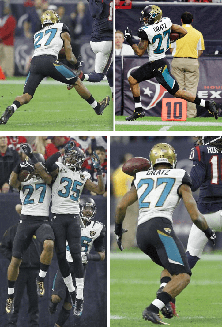
Since 1945, one uni-related difference between the worlds of pro and college football has been that NCAAers can go bare-legged while NFLers are required to wear full-length hosiery. But as you can see above, Jaguars cornerback Dwayne Gratz apparently decided that that rule didn’t apply to him yesterday, as he bared his calves and rolled up his pants to biker shorts levels for good measure. Not a good look.
In other news from the final week of the NFL’s regular season:
• The two New York coaches (well, technically New Jersey, but we’ll let it slide) — Rex Ryan of the Jets and Tom Coughlin of the Giants — both wore NYPD caps. Disappointing to see that Coughlin was no longer wearing the little peace symbol he wore the previous week.
• More postgame jersey swaps: Jordan Matthews (Eagles) and Odell Beckham Jr. (Giants), Matt Asiata (Vikings) and Stephen Paea (Bears), and Brandon Flowers (Chargers) and Dwayne Bowe (Chiefs).
• The NFL logo was missing from Browns defensive back K’Waun Williams’s collar.
• Speaking of collars: This isn’t new, but the Cowboys’ Nikelaces changing from white to blue is reaching epidemic proportions.
• Lions defensive lineman Ndamukong Suh’s sideline hat looked extra-long, almost like a Rasta tam.
• The Seahawks thanked their “12th man” with a salute printed on their sidelines.
• Two teams wore white at home: the Dolphins and Titans.
• Protestors outside the ’Skins stadium called for the team’s name to be changed and engaged in “heated and profane” confrontations with fans.
• A sign at the Georgia Dome listed the Falcons’ opponents as the North Carolina Panthers.
• Another amusing glitch: The NFL’s Red Zone channel thinks Mark Sanchez still plays for the Jets.
• Nothing amusing about this: In a development I can only describe as repellant, the Ravens’ live mascot — an actual raven, not some guy in a costume — was wearing a little cape emblazoned with a corporate lifestyle logo. Douchebags,
• No photo, but with a flu bug spreading through the Bengals’ roster, some Cincy players reportedly wore masks during their flight to Pittsburgh.
(My thanks to all contributors, including Colin Abendroth, James Armstrong III, Matt Barber, Charlie Charnigo, James Gilbert, Sean Kneringer, Matt Larsen, Jerry Lawless, Aaron McHargue, Rich Savickas, Jeff Shirley, Matt Straus, and of course Phil.)
ITEM! Uni Watch shirsey update: In case you missed it last Wednesday, I announced that I’ve partnered with the T-shirt company Teespring to create a series of Uni Watch shirseys that will soon be available for sale (if you can’t the the slideshow below and/or want to see larger versions of the shirts, click here):
Response to the announcement was very, very positive (thank you!) — so positive, in fact, that Teespring and I have decided to expand the project into a year-long endeavor that we’re now calling the Uni Watch Shirsey Club. We’re still finalizing some of the details, so a few of the things I’m about to tell you could end up changing slightly, but here are the basics as they stand today:
1. There will be eight more designs in addition to the four that I’ve already shown you. That will make a total of 12 designs — one for each month of 2015. You’ll see the rest of the designs as they become available for sale. You can probably guess what some of them will be, although I think a few of them may surprise you.
2. The mock-ups currently show a sleeve “patch” of the Uni Watch 15th-anniversary logo, but we’re going to change that to a Uni Watch Shirsey Club patch, the design for which is being worked on as we speak. It will have a basic template and be modified with each shirt to include “January,” “February,” and so on. Update: The patch has now been designed:
3. The January shirt, which will be the white “Home” design, will be offered for sale beginning next Tuesday, Jan. 6. After that, each subsequent shirt will be made available on the third Tuesday of each month. So the February design will go on sale on Jan. 20; the March design will go on sale on Feb. 17; and so on. I’ll reveal each new design about a week before it goes on sale. (Note: The other three designs that I’ve already shown you — grey “Road,” green “Alternate,” and black “BFBS” — will all be included in the 12-month roll-out but will not necessarily be the next three in the sequence.)
4. Each shirt will be available for sale for only one week (that’s how Teespring works — each shirt is a limited edition), from the Tuesday when it’s made available through the following Monday. Once a shirt’s one-week window closes, it will no longer be available for purchase.
5. Except for the January shirt, which will deliver to customers by Jan. 26, each month’s shirt should deliver within the first 10 days of that month.
6. Prices will likely be in the $20-$22 range.
7. I’m pretty sure sizes will run at least from S through 3XL.
8. People who purchase all 12 shirts will be eligible for a bonus prize at the end of the year. I haven’t yet decided what this prize will be, although I have some ideas. Stay tuned on that.
9. I have lots of additional design ideas. So if the response is strong, it’s definitely possible that the project could be extended into 2016.
And there you go. I’m really excited about this — not so much in a “Let’s sell some stuff!” way, but more in a “Fun creative project!” way. Additional details soon, and continued feedback welcome.
One question: How do you folks feel about the word “shirsey,” and about the name “Uni Watch Shirsey Club”? I’ve always been kind of agnostic about “shirsey” myself (maybe because it reminds me of the name Shirley), although it does capture the essence of the shirt + jersey product. I considered just calling this project the Uni Watch T-Shirt Club, but there have already been lots of Uni Watch T-shirts — these are the first Uni Watch tees designed to look like jerseys, so I wanted to have a more specialized name for the project. Thoughts? Never mind — lots of negative response to “shirsey,” which pretty much confirms what I thought. We won’t use that term.
(Special thanks to Brian Molloy of Teespring, without whom none of this would be happening.)
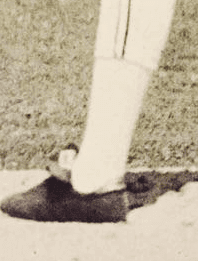
The case of the missing stirrups: Here’s a weird one: It looks like the 1975 Twins didn’t bother to wear stirrups in spring training — or at least Danny Thompson, Ray Corbin, Craig Kusick, and Rod Carew didn’t. Bizarre!
This immediately got me thinking about other teams with uni-related preseason rituals, like the Red Wings’ non-arched NOBs and the Steelers’ missing helmet numbers. Were the Twins basically telling the players to “earn” their stirrups by making the final roster cut? Or did they just not want to bother with certain niceties for spring training games? Was this a one-year thing, or did they do it for other seasons as well? If anyone knows more, do tell.
(My thanks to @uniformcritic for tweeting these photos, and to Phil for letting me know about them.)

Baseball News: Designer William Vaught has created a poster-sized scorecard to track all the MLB ballparks he’s visited. “Some parks I’ve obviously been to many times — four or more visits is a home run, one visit is a single, two visits is a double, and so on.”

NFL News: NFL.com writer Dan Hanzus blames the Bucs’ crappy season on their uniforms. ”¦ Bud Light is currently running an ad that includes their bro-ish slogan as a Broncos NOB (from Cork Gaines). ”¦ As an aside, isn’t it odd that “being up” for doing something and “being down” for doing something mean the same thing?

College Football News: Good article on how the Oregon design program was created (thanks, Phil). ”¦ NC State QB Jacoby Brissett had some unusual-looking armhole openings in the school’s bowl game. Robert Obrecki asked Adidas about it and got this response. ”¦ What with the team patch, bowl patch, conference patch, and logo creep patch, Nebraska barely had room to shoehorn in that captaincy patch (from Nathan Long).

Hockey News: Nats Park is being prepped for the upcoming Winter Classic and looks good so far. ”¦ This article on the history of hockey at Northern Arizona University includes a 1981 photo that shows a college team — not sure which one — wearing Cooperalls (nice find by Travis Holland). ”¦ Who does Cole Gunner play for? The Air Force hockey team, of course (from Scott McClure). ”¦ Malden Catholic High in Massachusetts has a bizarre rear-jersey format: stacked numerals with the NOB running down the right side (from Michael Abelson and GPJR). ”¦ The Slovakia flag normally looks like this, but the flag hanging at the Bell Centre for the World Junior U-20 Hockey Championships looks like this — note the orientation of the coat of arms. “According to Wikipedia, the coat of arms is to be rotated when the flag is hung vertically,” says Casey B. “Very interesting tidbit!” For sure.

NBA News: While looking for something else, I came across this shot of Kings C DeMarcus Cousins and Spurs F Tim Duncan simultaneously wiping their faces with their jerseys during a game last month.

College Hoops News: Reader John Austin was at the UNC basketball museum and saw these great uni-numbered stirrups worn by Mitch Kupchak and Bobby Lewis and Walter Davis. I love how that last shot shows both home and road versions. You can see how they looked on the court here, here, and here.

Grab Bag: I showed this old roller derby photo to derby enthusiast the Rev. Nørb, who responded with something really interesting: “Looks like the Midwest Pioneers and SF Bay Bombers. Those uniforms were worn by more than one team over the course of their lifespan. From what I can gather, the league would buy about 10 male and 10 female unis for each team, which remained property of the league and were often repurposed when an old team was dissolved and a new team was hatched. Hence, the Eastern Express of the 1980’s wore the old NY Chiefs unis from the ’70s, the Latin Libertadores wore the old NY Bombers unis, etc. Another interesting facet of derby uni-ology is that teams generally were assigned jersey numbers that were consecutive and unique to that team: The Red Devils wore 11-19 or so (same numbers for the women’s field as the men), the Bay Bombers 31-40, the Chiefs 41-49, the Pioneers 50-59, etc. The Jolters wore single digits in the ’7’s but not in the ’50s and I don’t know who wore 20-29. Fascinating shit, I tell you!” Indeed. ”¦ Saturday’s funeral for one of the NYPD officers who were recently murdered prompted a really interesting radio segment about the history of NYPD uniforms and funeral rituals. Strongly recommended. ”¦ Oh baby, how awesome is this curling sweater label! It’s from this sweater. ”¦ When that AirAsia plane went missing on Saturday night, the airline changed its logo on its Twitter and Facebook pages from red to grey. ”¦ This article about elite athletes with asthma includes the following: “Surprising numbers [of cyclists] carry inhalers in the back pockets of their jerseys.” ”¦ Faaaascinating article, with accompanying slideshow and video, about how camel racing in the Middle East is now increasingly done with robotic camel jockeys! Really interesting — recommended. ”¦ Lots of old U. of Minnesota sports photos, across many sports, here (from Tom, who didn’t give his last name). ”¦ Darrell Waltrip’s 1987 All-Star racing suit was a doozy (from David Firestone).

Arcane question: since Shirsey Club is going to extend beyond the 16th anniversary, will all the shirseys bear number 15?
The 15 refers to 2015 — the year in which the program will roll out.
If we extend the program to 2016, the number will change.
One hypothesis in the case of the missing ST ‘rups:
Calvin being Calvin.
Actually, I kind of remember seeing the Twins stirrups in spring training here. I thought the rule was if you don’t have stirrups, you’re injured in some way and can’t do all the drills or something.
Jacoby Brissett has had arm openings like that all season (a quick image search will do). More like a lineman’s cut than a QB, it’s bothered me all year but I can’t complain about his on-the-field results.
Is William Vaught planning to make that MLB stadium scorecard poster/image available (non-watermark) for purchase? My wife and I are about halfway through the parks and that looks great.
My only issue with that poster is that he’s got the same ballpark listed twice – Chase Field is Bank One Ballpark.
It’s a great looking poster. One problem that I’ve found with trying to track ballparks (I use a framed, laminated map glued to sheet metal with magnets to track MLB, MiLB, and baseball museums) is what to do when one has visited multiple ballparks as I like to “count” both teams and stadia. Anyone have a graceful way of showing this?
Doh! This poster does exactly what I was looking for by showing various iterations for the same team.
Rob S. is correct, however, in that Chase is just the new sponsor for the BOB with no architectural renovations to make it feel like a different ballpark. Anaheim Stadium has felt like three different parks – early days with the open outfield, enclosed/cookie cutter style during the Rams days, and post-Rams/Disneyfied version with the waterfall.
Even though there have been previous Uni Watch t-shirts, Uni Watch T-Shirt Club is a better name than Uni Watch Shirsey Club. Mostly because “shirsey” is a [url=shittyportmanteaux.tumblr.com]shitty portmanteau[/url].
Also, I honestly prefer what Dwayne Gratz is doing because the Jags’ black pants-into-black socks thing looks terrible. At least with some leg in between, the leotard look gets broken up.
Shirsey, you can’t be serious!
I am serious. And don’t call me Shirsey.
Not surprised that I was too slow to start this thread.
I don’t mind “shirsey” as a quick term when written, but it doesn’t seem worthy of a project with this much thought and care put into it.
Maybe it only interests me, but I’d like to note that yesterday was the last time we will see the Cleveland Browns in the uniforms that have been basically unchanged for 50+ years.
Hoping that Nike doesn’t screw this one up. Hoping..
The odds are against you, jon.
I thought “Shirsey” was a typo until I started reading what it was. I think I actually like “Jirt” better for a couple reasons: 1) It’s one syllable and as such is easy and fun to say. 2) I’d be more inclined to call this thing a “Jersey T-shirt” rather than a “T-Shirt Jersey,” and I think the first description is more accurate.
“Jirt” is too close to “jorts”, in my opinion.
Back off man, that bird can wear capes if I wants to.
“Shirsey” is a terrible word. It’s even worse when used in a semi-official capacity as in “Uni-Watch Shirsey Club,” or whatever. It’s also very limiting. I understand why you’d want to have some exclusivity… but why not bundle all these ideas under one umbrella (even the stirrup crowd could be bundled under one club/department/whatever). Why not just refer to it as the Uni-Watch Uniform Club or something of the sort?
Shirsey… so bad.
The irony of the black for black sake is not lost on us. Lol.
Agreed, “shirsey” is an awful-sounding word. Until recently it never even occurred to me that these things needed a name. I guess I used to think of my “Mets shirts with the name and number on the back” and was fine with calling them that. Those shirts from my youth, by the way, have vanished, and I can’t fathom going to an MLB park now and spending $34.99 on a replacement. 20 bucks for a t-shirt is more reasonable.
I really like the shirts (particularly the Away model), but “shirsey” is way too cute and clever-ish. I like idea of Scotty M (below) re “Athletic Club.” “Uni-Watch AC” would be cool.
Just to clarify: You realize I didn’t create the term “shirsey,” right? It’s a commonly used term:
link
Like I said, I’ve never been in love with it, but I was considering going with it for this project. Based on the responses that are coming it, we will NOT use it.
Thanks for the good feedback.
Lol, yeah, figured you didn’t invent that word. What about “Aesthetics Club” … kind of a play on Athletic Club. Okay, I’ll stop now and you all can figure it out ;)
“Official Aesthetic Supporter” – or not
Meant to post in the above… Uni-Watch “Athletic department” or “athletic club.” I’m sure others have ideas.
I think that is DW’s fire suit from 1997. He drove for his own team with Parts America as sponsor in ’97, and that suit seems to have a Darrell Waltrip 25th anniversary patch on it. He first raced Cup in 1972.
I love the idea of one shirt per month. However, twelve more t-shirts in the closet is going to make the wife want to inflict pain on both you and me, Paul!
Ok, time to guess what the remaining 8 designs will be.
Camouflage, Hispanic, Stars & Stripes, yellow alternate, pinktober, a fauxback with racing stripes, TaTC with a giant magnifying glass on the front, and Sci-Fi night (because actually using Star Wars would cause legal issues).
I’d like he would keep the unfortunate genres (BFBS, Pinktober, Stars & Stripes/Flag Desecration) as “once in cycle” thing.
Here’s what I’d like to see:
1. Early Baseball fauxback – link
2.Brooklyn Uni-Watchers-Uni-Watch colors, Brooklyn name,Celtics font
3. ‘Skins Watch parody
4. LSU-esque football jirt
5. Boca Juniors-esque soccer jirt (The U-W works as a soccer crest)
6. Minimalist- Not the “true” yellow alternate, but a yellow jirt with green accents. A Cubs blue jersey sans red essentially.
7. Superhero/Sci-fi theme
8. Bizaroo world- White “home”w/Purple for Green; Green for Yellow; Orange for Red
There’s a ton of things that could be done with this idea if it lasts long enough. I think the white, gray, green, and possibly black versions should probably repeat every year, but the other 8 or 9 could be different each time, even if they follow the same theme. This year’s “pinktober” jersey shirt might be pink with green numbers, then next year’s version could be green with pink numbers. You could even change the primary colors or jersey style each year. These are basically mimicking the Oakland A’s. Next year could be modeled after the Yankees or White Sox with pinstripes and some sort of old english UW logo.
I think there is more variety if play these concepts a bit more loosely. Team Salute (Home + Away + Alternate + Genre Parody)
2016 should be a salute to 1986 with the Montreal Canadiens as affectionately parodied team. link
1. Home Red w/ Blue stripe
2. Road White
3. “Alternate” Reverse the Home Jersey colors
4. GFGS version of the Road
5. Salute to his favorite football team the NY Giants who won their first Super Bowl in was the 1986 season.
6. Salute to his favorite baseball team the NY Mets who won their last World Series in 1986.
7. Salute to 1985/86 Celtics in which he can use the Uni-Watcher as the home jirt. The Celtics lost only one home game that season.
8. Salute to 1986 Albaceleste Argentina jersey who won the World Cup that year. He seemed to display an affinity to the Argentina jersey in his World Cup analysis this year.
9. Dale Earnhardt NASCAR parody
10.Salute to the silks worn by the 1986 Kentucky Derby winner.
11. Brooklyn in Louisville 1986 fashion
12. Combine minimalism w/ Pinktober for a red and white Red-cember jirt for AIDS awareness. (Something that is oddly underrepresented in the “sports have made you aware of…” genre).
I’m a lock to buy the BFBS one, and probably a tequila sunrise version, should that turn up!
I wonder if all of these 12 will be the Athletics script. I could see shirts with the Red Sox font in white, red, navy, grey. Possibly the Brewers old-style font, Rockies font, Giants/Pirates font. Maybe a yellow and brown Padres style? White Sox beach blanket with double decker UNI and WATCH? Cardinals-style with stirrups hanging off the ends of the bat instead of birds on top? Tampa Bay’s retro look?
If some of the shirts were long sleeved they might more easily lend themselves to designs for other sports: hockey jerseys, retro football jerseys, curling sweater, roller derby, etc.
Shirsey is a clumsy word and feels like kind of a mouthful to say. I unfortunately do not have a witty alternative to suggest, but shirsey is just bad.
Jirt
“Jirt” sounds like something you get on a shirt, and it sounds like something that doesn’t come off easily. I vote for anything but that.
Would it be alright if I wear a jirt with my link?
Love that guy’s ballpark scorecard. I have long tried to think of a better way to track my visits than the handwritten scrawl on notebook paper that I have carried in my briefcase for thirty years.
I vote no on shirsey. Tshirt club is better, less amaetur
I googled the definition of jersey, and if the t-shirt isn’t going to be worn during a sporting event (in my opinion based on the definition) it isn’t a jersey.
I never liked the word shirsey.
link
I vaguely remember the origins of “jersey” discussed on Uni Watch before (I think!).
The Jacoby Brissett jersey is strange… To me it looks easier to hook him under the pads. If Adidas makes him stop tailoring it like that, that would be interesting…
Just for clarification…the raven is not in a “cape” it is the back of his harness. The front has a Raven logo….so a raven is wearing a Raven. It has a clip so he does not fly away if he gets startled. I wonder if the Seahawks hawk or the Auburn eagle has a similar set up.
Not a fan of thr word shirsey and would really prefer if it didn’t appear on the T-Shirt.
I thought the anni logo with the modification of “EST.” was perfect.
Thanks for all the “shirsey” feedback. Confirms my uneasiness with the term. We won’t use it. Not sure what we’ll use instead, but it won’t be the anni logo, because that won’t work for a year-long project.
We’ll figure it out.
If you’re not going to use that word, please don’t use “jirt” either. That’s SO much worse.
I actually like the way “shirsey” rolls off my tongue. Whatever y’all end up calling it, I’m still calling it a shirsey.
Believe me, we will NOT be using “jirt.”
Not only do the short pant legs look terrible, but they are also very unsafe. He could get hit in the knees and he wouldn’t have any protection.
I like the stadium poster. I’ve done visualizations of the ballparks my friends and I have attended… both Major and Minor
link?:showVizHome=no#1
Size represents number of visits, and you can filter on whether the parks are open or now closed (It’s an old chart, so there may be some that have since closed, still marked as open)
I also have another Visualization for my annual season ticket draft for the AAA Charlotte Knights.
link?:embed=y&:display_count=no
I noticed the font on Rex Ryan’s NYPD cap was a little thicker than on Coughlin’s. Coughlin’s looks more like NYPD caps I have seen before on athletes:
link
So the question I have…is there an officially licensed NYPD cap? I could probably go to the mall, pick a blue hat, have it embroidered with a standard font and get it to look similar to the others. I googled it and there seems to be no real consensus with different caps claiming to be official.
Love the stadium scorecard and would love to be able to make/get one myself. While looking at it though, isn’t Chase Field and Bank One Ballpark the same stadium? I usually find people nitpicking others creations to be childish but I thought William would appreciate it.
“You’ll see the rest of the designs as they become available for sale.”
That kind of sucks. I’m sure that I’m not the only one who can’t afford to buy 12 shirts.
So buy the ones you can afford. Or don’t buy any! No problem.
I think it’s fun to have some suspense, some surprise.
Anyway, I couldn’t show you the other eight right now even if I wanted to (which I don’t), because they haven’t been finalized yet.
Well, the point is more “I’d like to buy the one that I like best of the bunch since I can afford one”, not “I’m going to buy one semi-randomly” half-way in and then be disappointed when the pinktober camouflage ones come out and I’d rather have that instead. Er, maybe not so much that particular example…
Seems a weird business plan for Teespring.
Like most things connected to Uni Watch, there is no “business plan.”
The idea here is not to rack up the most sales or the most dollars; the idea is to do something creatively satisfying, and that includes preserving some element of surprise.
I don’t really think that will result in fewer sales. But if it does, so be it.
Are you sure the Malden Catholic hockey team wasn’t wearing “Most Idiotic Uniform Idea” night uniforms?
link
In this picture, you can clearly see the NFL logo on Randall Cobb’s jersey is on the green fabric and not the yellow/white/green stripe like it is here:
link
Has this ever happened before?
Packers have been using this cut for some of their skill players for years, going back to the Reebok days.
Ok. Thanks Paul, just something I saw and was wondering about.
I have a totally random question for the DIYers out there. For those of you that make football helmets, what is the best method for cutting off pieces of stripes or decals that cover vent holes?
In the past, I’ve never worried about it, but I made a Seattle helmet and the portion of the wide center stripe covering the vent holes is having a hard time staying down. I’m think that if the decal was cut over the vent holes, the edges on the decal would stay flat on the helmet.
Thanks!
isn’t it odd that “being up” for doing something and “being down” for doing something mean the same thing?
I thought it was being up for doing something and being down with doing something.
I think one can also be “beaten up” or “beaten down.”
Apart from the excellent job Mr. Vaught did on his scorecard, I noticed an “apostrophe catastrophe”. The Cleveland ballpark, now known as Progressive Field, was originally known as Jacobs Field, for Tribe owner Richard Jacobs.
I really hope there is a Shirsey Club shirt that is purple.
I’ve always associated the term “shirsey” with those awful pink and white NHL jerseys they sell for female fans. Because you know, why would any female fan want an actual jersey?
Anyway, that’s what I think of when I hear the word. Not feeling it for these shirts.
The Jag player’s low socks is not a good look, but I like it better than the ridiculous unitard look!
Thats funny the NFL guy blames the Buccs season on new uniforms
I always thought when a team gets new unis or new stadium they’ll have a good season in 2 seasons (more or less) Nothing scientific. It always seems like thats the case. In every professional league
Well… on the one hand you’ve got the Broncos & Seahawks winning championships within 2 years of changing unforms. On the other, you’ve got the Bills & Vikings having changed uniforms twice in the last 15 years and accomplishing nothing.
T-shirt club idea is cool. I’m hoping for a green on green monochromatic one.
Another suggestion would be to not limit it to t-shirts – in my case I rarely wear them. But the 15th patch is great and I really like the idea of more patches or other small goods.
I also like someone’s suggestion above for some designs based on the worst unis in history – a faux-fringe Caribous of Colorado design, maybe a Canucks Flying V but with a W instead (for watch – maybe a U on the sleeve). Fun stuff.
In the image of the Cowboys’ color-changing Nikelace, is it just me, or do I see 5 different shades of blue on their unis in that shot? I’d always thought it was just 3, but I see the pants, the Nikelace (very similar to the pants, but possibly different on account of the fabric), the jersey numbers, the arm stripes, and the helmet are all different. Does this lack of standardization bother anyone else? It’s got to be at the top of my list of uni pet peeves.
Frankly, I think the navy/silver look suits them best. If they insist on wearing white jerseys at home, I don’t see why it would be so difficult to make all blue elements on said jersey navy, and use the same pants as when they wear the navy jerseys. Anybody with any solid logic as to why this isn’t possible?
link the Suh hat is just depending on how you wear it. I own a similar hat from an NFL team, and you can wear it with the brim rolled up, or you can roll it down and where it really long. I always thought about it because I would see players on the sidelines wearing them that way with a large color band, for the camouflage ones
So it’s sort of a tuck/flip technique in order for the logo to remain outward. Never seen that before.
But I am old and live in Florida!!
Any word yet on what combo the Panthers will be wearing for next weeks game? Or the Bengals for that matter?
Did the Astros debut the Tequila Sunrise unis during the regular season of 1975 as opposed to Spring training? Greg Gross looked like he was wearing the 1974 Astros road set in the Rod Carew Twins no-stirrup photo.
Does the NFL have a regulation regarding the color facemask teams wear week to week? Even though a team cannot change its helmet for home and away games, could they alter their facemask? For example, the Chargers could wear a navy mask for home games, white for road, and powder blue for their alternate jersey.
Uni-Watch Uni-Club?
Paul, what will the composition / weight of the shirts be?
You’ll have options — American Apparel, some others. In some cases, there will be fewer options, depending on the shirt’s color.
Love the roller derby pic. And being a Motor City ex-pat, that scoreboard was unique. The picture was snapped at Detroit’s long-gone Olympia Stadium.
link
Dwayne’s a real funny guy… Seems like this isn’t his first stupid mistake this year. Probably will be fined pretty heavily.
I find it interesting that whenever an NFLer does anything out of the ordinary uniform-wise, people reflexively say (on Twitter, in this site’s comments section, elsewhere), “He’ll be fined” or “I wonder how much he’ll be fined” or “That’ll cost him.”
At this point, NFL uni fines are so commonplace that saying, “He’ll be fined” is almost akin to saying, “He needs oxygen to breathe.” I mean, what exactly do people think they’re adding to the discussion when they say, “He’ll be fined”? Do they think they’re telling us something we don’t already know?
And if a player *isn’t* fined for a given uniform infraction, who cares? It certainly makes no difference to our lives. And it apparently makes no difference to the players either, because it’s all chump change to them.
Just sayin’.
I agree, but given that the new rookie contracts given by the NFL I’m sure this won’t be easy for him to recover from as say someone like Peyton Manning.
I know it’s so common now, but it makes it more interesting that he’ll actually feel it personally, which makes this choice by him very interesting, or just plain dumb going back to my original point. It’s not his first stupid mistake.
Going off my point, HE makes around $650,000 a year after his signing bonus, let’s say after everything he clears $250,000 (probably generous). Given their short careers, that has to last him several years of his life after he retires.
A $10,000 hit that’s 4% of his after tax/agent income. Let’s say I make around $50k after taxes, that’s like getting a $2000 fine! I don’t know how many people could afford that and I will average many more years at that or better than he ever will.
Just saying it’s not chump change for all of them, especially a young player like him.
Ashley Williams had a little short malfunction during today’s Liverpool vs Swansea City game. They totally ripped on one side.
You can see it in this Vine – link
They brought out a new pair of shorts. He took them off right on the pitch and put the new ones on. The crowd really started hooting and hollering when he took off he shorts…
My bad… Its Wayne Routledge; not Ashley Williams.
I wouldn’t want to belong to any club that would have me as a member. (Woody.) Definitely in for probably the White Home one.
Two quick shirsey questions:
1. Will they all have, e.g., “HOME 15” on them or is that just a template for customizable name/number? (Apologies if this has been answered; I assume it’s the former.)
2. Given that the four items shown appear to use a baseball template, shouldn’t the “patch” be on the left sleeve?
Thanks. Happy New Year to all.
Jay, come on — did you look at the other designs?
The white one will have a “Home” NOB; the gray one will be “Road”; the black one will be “BFBS”; and so on. Each shirt will have an NOB appropriate for its design.
The number will be 15 throughout next year (2015). If the project is extended into 2016, we’ll change the number.
I realize baseball teams usually put a team logo patch on the left sleeve. But I’ve always thought that having a front uni number that’s left of center *and* a left-sleeve patch feels too unbalanced. Putting the patch on the right sleeve helps balance out the front number on the other side. Or at least that’s how it feels to me.
OK, OK. Was just hoping I could get my #12, that’s all. :)
Seeing the Liberty Bowl clip led me to look through that site. Check out these University of Western Ontario helmets. They’re several flavors of awesome:
link
I actually say “shirtsey” with the T sound. *shrug*
Why is it “disappointing” that Coughlin wasn’t wearing his little peace symbol last week?
Why do I not see a post about the Oregon Uniforms? Probbaly the team that started this whole revolution in the first ever cfc? Probabaly the most beautiful uniforms you will ever see..You are not a legit website if you fail to mention this