Our friends at Grey Flannel Auctions are running another catalog auction, which means it’s time for me to showcase some of the most interesting items they’re selling. Here we go:
• I love the elegant simplicity of this cap that Babe Ruth wore during a 1934 tour of Japan.
• Little-known uni-related fact about Mike Schmidt: When the Phillies wore zippered jerseys, he had a little button and loop added to his front shirttails, to keep them from spreading apart.
• Schmidt also had button added to his jersey for the Phils’ infamous one-day mono-burgundy uni. That listing page also includes this game photo, which I hadn’t seen before.
• Speaking of the Phils, look at the amazing chain-stitched numerals on this Steve Carlton jersey. Here’s the full listing.
• Interesting pair of San Francisco Giants McNOBs here: Willie McCovey had a base-aligned lowercase “c,” while Willie McGee’s “c” was raised.
• Love this two-tone Cardinals dugout jacket, although it would be even better if the right sleeve were navy.
• This Reds cold-weather jacket looks like a gown! Interesting to see the “Reds” inside the underline — I don’t recall seeing the Reds use that format before.
• Speaking of cold-weather attire, check out this Braves garment.
• Notice anything odd about this Bill Veeck leisure suit-style promo jersey? The numbers are the wrong font! Should look like this.
• In April of 1964, when I was about three weeks old, Arnold Palmer wore this cardigan in the Masters. What a beaut! I would totally wear that.
• I’m a little confused by this Edmonton Oilers “practice bib” — never seen anything like that before. Did these used to be common?
• Not sports-related, but I love this Baby Ruth candy bar vendor’s jacket. Looks kinda like a jockey’s silks, no?
• Here’s a maker’s mark I bet most of you have forgotten: the old Wilson/Staff logo, which the 49ers wore in 1995. Here’s the full listing for that jersey.
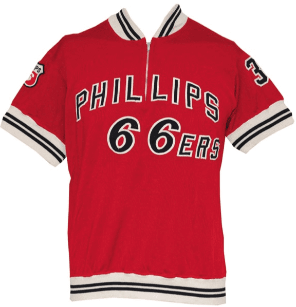
• So much to like in this 1963 Phillips 66ers warm-up jacket and, even better, this 1967 66ers warm-up top. Tasty!
• Naturally, I love the colors on this early-1960s Bob Cousy warm-up fleece. But the interesting thing is the buttons — they seem really big, no?
• Hmmm, seems like there were major kerning issues with this mid-1950s Philadelphia Warriors jersey. That “A” is practically falling off of the jersey!
• Two rarities in one: The NOB on this late-1980s Sacramento Kings jersey is nameplated and beneath the number — both very unusual for the NBA.
ESPN reminder: In case you missed it yesterday, the annual Uni Watch Holiday Gift Guide, chock full of interesting uni- and logo-related items for your shopping consideration, is now available. Enjoy.
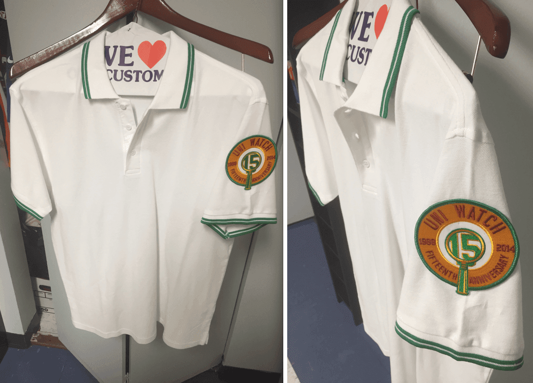
Click to enlarge
Patchwork: The shirt you see above belongs to reader Mike Engle. He bought himself a Uni Watch 15th-anniversary patch, then ordered the shirt from Amazon (“less than $18, including shipping,” he says), and had his local dry cleaner sew the patch onto the left sleeve. “I think it looks fantastic,” says Mike. “And I happen to own maroon and gold turtlenecks, so it will look even better layered!”
If you want your own Uni Watch 15th-anniversary patch, you’re out of luck for now — they’re sold out. But I’m willing to order more if there’s enough demand. If you want to add your name the waiting list, let me know. Thanks.
Meanwhile, for those of you who’ve already purchased a patch, what have you done with it? Send me photos and I’ll feature them here on the site, like I did today with Mike’s shirt.
NFL Superhero Project
By Thomas Correia
There are now only three Thursday games left on the NFL schedule, including tonight’s matchup between the Cowboys and Bears. For that game, we have an entire secret agency that’s ready to take down any threats facing a hero made completely of rock (click to enlarge):
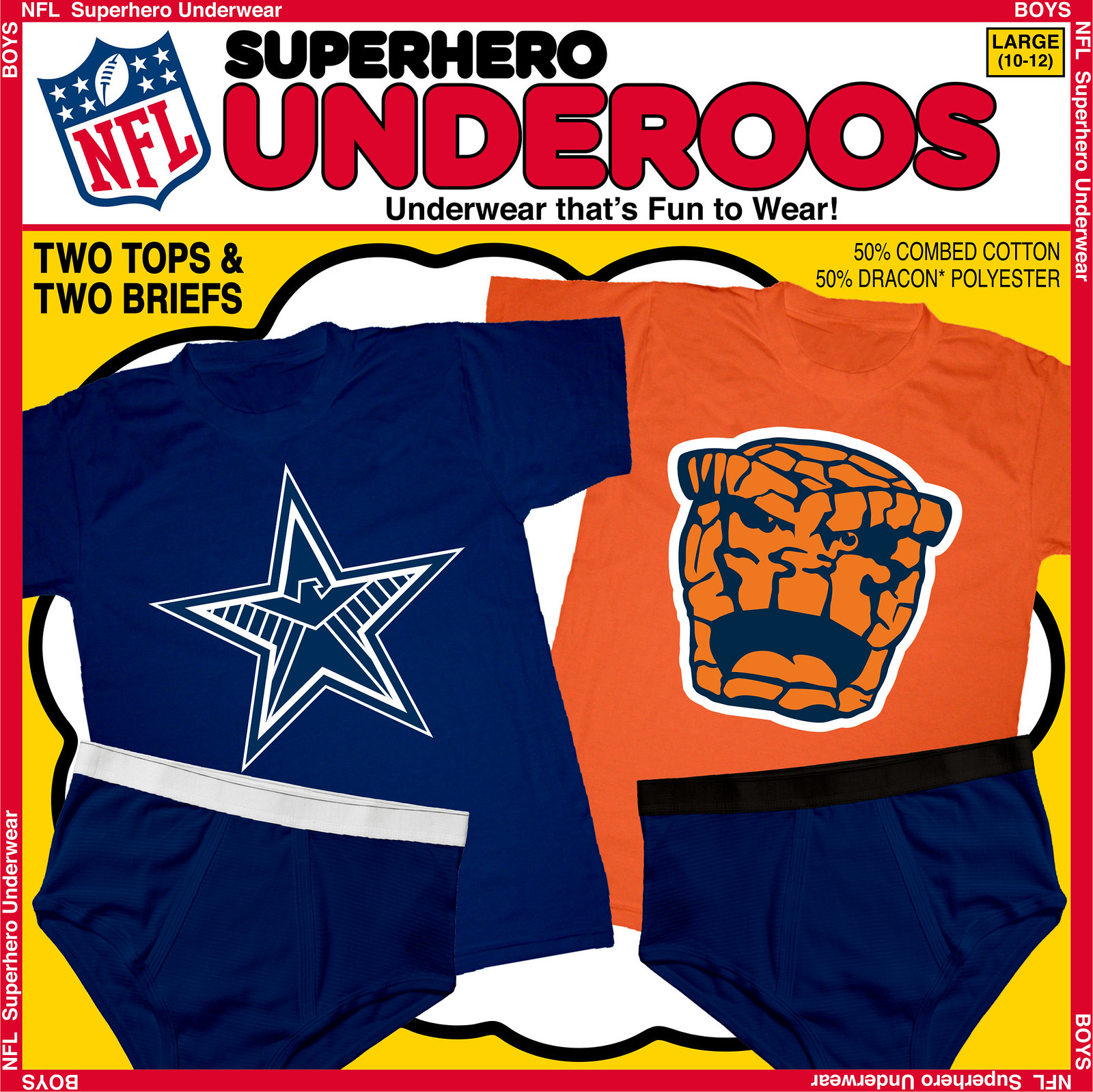
The Cowboys’ star is such a simple and classic logo, which actually makes it harder to “hero-ize.” I had hoped to find a hero to complement the star’s two-color simplicity, but instead I went with a whole organization that also uses a simple two-color treatment: Marvel’s S.H.I.E.L.D. They can arguably be called “America’s Team,” just like the Cowboys, so this seemed like a perfect combination.
After drawing a blank on Chicago’s “C” logo, switched gears and focused on their orange bear head logo. I figured no one is bigger, fiercer, and orangier than the Thing, from Marvel’s Fantastic Four. The jaggedness of the bear head logo worked well with the jagged rocks on this hero. The one big tie-in is that the eyes are taken from the bear logo.
Next week: Cardinals vs. Rams. Which heroes will represent those teams? Post your best guesses in today’s comments.
Today’s Uni Watch Birthday
By Douglas Ford
[Each day this month, Douglas Ford is selecting an athlete who’s celebrating his or her birthday and presenting some uni-notable photos of that athlete. Here’s today’s installment.]
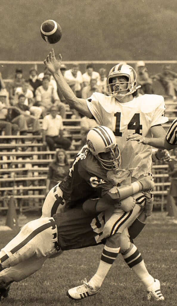
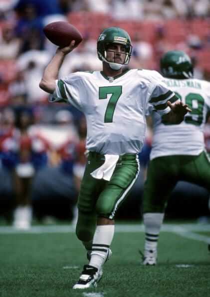
Today’s birthday boy had the distinction of having led his team to the biggest comeback victory ever in both the collegiate and professional ranks, with the Terps and Bills, respectively. But here’s how he looked in beautiful tube socks in high school and later leading the Jets in those 1990s sack exchange uniforms — happy birthday, Frank Reich!
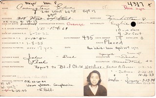
PermaRec update: Check this out ”” a student who literally had a black mark on her record (shown at right, upper-right-quadrant). I don’t mind saying this is a pretty good one, folks — get the full scoop over on Permanent Record.

Baseball News: Here’s a good look at the Mets’ new alternate road cap. ”¦ Loooove the texture in this old photo of Hall of Famer Zack Wheat and his son (from Pete Woychick). … Astronaut Terry Virts is an Orioles fan, and Monday was his birthday, so he wore a Matt Wieters jersey in space (thanks, Brinke). … As noted yesterday, the Oklahoma City RedHawks have been renamed and are now the Dodgers. Here’s their new uniform and logo style guide, including an “OKLA” logo that’s a clever idea, but the execution feels too clunky (from Brett Clark). ”¦ Oh man, this is too awesome: a catcher with a bullseye on his chest protector (big thanks to Rob Neyer). ”¦ The Sacramento River Cats will wear California State flag-themed jerseys next September (from @balddude). ”¦ Former Yanks catcher Jorge Posada wore No. 20, but he had No. 39 on his catcher’s helmet during the 1998 postseason as a shout-out to teammate Darryl Strawberry, who’d been diagnosed with colon cancer (from Andrew S.).

NFL News: Is it standard for NFL sideline ballboys to wear their first names on their chests? (Screen shot by Andy Bartsch.) ”¦ Here are some shots of Bears players cutting their socks to create the leg warmers. Hate it when they wear the stripes down low like that (from Ryan Becerra). …Very mature move by Rob Gronkowski, who used tape to put a “69” on his practice jersey yesterday (from Ray Roig). ”¦ The Chargers will wear their powder blue alternates on Sunday. ”¦ Did Bills S Aaron Williams have a blue visor on Sunday? (From Chase Beard.)

College Football News: Arizona will wear red helmets for tomorrow’s Pac 12 championship game against Oregon. No word yet on the rest of the uni (from Dane Drutis). ”¦ Ohio State has added a “53” memorial decal for Kosta Karageorge.

Hockey News: Reprinted from yesterday’s comments: This year’s NHL All-Star Game uniforms may have leaked. Those are real stinkers, so let’s hope they’re just someone’s concepts. ”¦ The Canadiens have added a “4” memorial decal for Jean Béliveau.

NBA News: The Kings will wear Rochester Royals throwbacks tomorrow night. ”¦ Cavs G Kyrie Irving now has his own signature shoe. ”¦ Speaking of the Cavs, the waistband-rolling trend has hit the NBA, thanks to Cavs F Mike Miller.

College Hoops News: Crazy shorts design for Gardner-Webb. Yes, I know that’s one of Under Armour’s basic templates, but it still looks crazy. ”¦ UNC wore purple shoelaces last night in honor of coach Roy Williams’s friend Ted Seagraves, who died this week of pancreatic cancer. ”¦ In that same game, fans were given green T-shirts as part of a recycling promotion (from James Gilbert). ”¦ Two color-on-color games last night: Notre Dame vs. Michigan State and, in a real visual stinker, Penn State vs. Virginia Tech. ”¦ A USF player went NNOB two nights ago. Not sure if that was a blood jersey or what (from Griffin Smith). ”¦ Remember St. John’s center Chris Obekpa and his tucked-in shorts? Under Armour has apparently made a shorter set of shorts for him (big thanks to James Ballow). ”¦ Two things about Northwestern F Vic Law: (1) He’s yet another Under Armour player who’s rolling up his waistband. (2) No photo, but he’s apparently gone to a JrOB (from Cameron Songer). ”¦ And still more Under Armour players doing the waistband roll: Auburn’s Tahj Shamsid-Deen and Jack Purchase. ”¦ Fans attending last night’s UCF women’s team’s game against Georgia Southern received a voucher for — get this — an ugly sweater T-shirt. Can ugly sweater headbands and leggings be far behind? (From Brian Crago.)

Soccer News: No photo, but this article says that soccer players Yaya Touré, Carlton Cole, Kei Kamara, Patrick Vieira, Fabrice Muamba, and Andros Townsend have saluted healthcare workers by wearing their names on the backs of their jerseys.

Grab Bag: Jersey snafu at the Canada Cup of Curling this week: “Here Marc Kennedy, a member of Team Koe, wearing the shirt of teammate Brett Laing,” says Matt Farrell. “They had two Laings on the ice.” ”¦ New Mexico State and Oklahoma State have settled a mascot dispute. ”¦ Tiger Woods has a new sponsorship deal with Hero MotoCorp but will not wear the company’s logo on his golf bag or shirt. ”¦ Man, old roller derby jerseys were the best (from Michael P. Mahon). ”¦ The online pornography site YouPorn — aka The Site Where You Spend All Your Time When You’re Not Here at Uni Watch — has been trying to sponsor a video game team (yes, there are professional video game teams) but has been getting pushback because, well, you know. But they’ve struck a compromise with a team that’s willing to call itself Team YP.
The link in today’s column to the ESPN gift guide is actually a link to a Buster Posey toy
Oopsie. Now fixed. Here’s the proper link:
link
“Front” in the Bill Veeck item should be “font”.
Thanks. Fixed.
Seems a bit off to me for Ohio State to have a sticker of the number of a QB who got hurt and a player who killed himself next to each other on their helmets. Just doesn’t fee right.
That sticker just means it’s Raekwon McMillan’s helmet, who also wears #5.
See picture through link here: link
Can see that the sticker on Billy Price’s helmet reflects his jersey number, #54.
I really wish the Chargers would switch to a white, powder or (ugh) gray facemask when they wear the powder blue alternates. The navy one just looks out of place and kinda seems like they’re wearing the wrong helmet. I know there’s a little bit of navy trim on the uniform, but it’s just not enough.
Would a yellow facemask full-time be an improvement or a disaster?
Disaster.
Lee
I disagree…care to reconsider?:
link
The navy on the helmet decal and the jersey and the pants of their alternates is enough for them to leave the face mask alone.
Lee
How would you feel about a powder blue facemask with their regular navy uniforms? Be honest.
Not so keen. But mainly because the helmet was white, not because the jersey was navy.
Lee
You know I looked at the Schmidt picture of the button and loop and noticed that brownish stain. After putting two (front shirt-tail) and two (placement of the exit point of the male urinary tract) together, I must theorize that stain is in fact game worn Mike Schmidt urine. All yours for a current bid of $7195!
So it should contain Mike Schmidt DNA, which means you could clone him.
I’ve always framed the “best baseball player ever” question in terms of, if you could have eight clones of any one player, plus a league-average pitcher, to compose an entire team, who would you clone? And my answer has always been Mike Schmidt. With that jersey, a person could actually field exactly that team.
Well, you are the Wizz-man.
(sorry dude. couldn’t help myself)
Here’s a closer look (maybe too close) at the Gardner-Webb shorts:
link
You can see Tyler Strange has the waistband roll.
The Gardner-Webb shooting shirts were also interesting, but I haven’t found a good image yet.
That game on Tuesday was also the season debut of Arizona’s grey uniforms.
Seems odd that the lower part of the *front* of the shirt is still considered the shirt”tail”. But apparently it is.
I don’t know really know what it *should* be called. But tail seems like the back part not the front.
What do I know? My subscription to Esquire expired years ago!
Record Producer: That’s not an MP, that’s a YP, your problem. Come up with the money, or forget it.
Reed Rothchild: Okay, now you’re talking above my head. I don’t know all of this industry jargon, YP, MP. All I know is that I can’t get a record contract, we cannot get a record contract unless we take those tapes to the record company. And granted, the tapes themselves are a uh um oh, you own them, all right, but the magic that is on those tapes. That fucking heart and soul that we put onto those tapes, that is ours and you don’t own that. Now I need to take that magic and get it over the record company. And they’re waiting for us, we were supposed to be there a half hour ago. We look like assholes, man.
Lots of love for the Phillips warm up and shooting top. So are you saying sponsors on uni-related items are ok if done in a cool retro way? Or is it just the jerseys that are a no go spot in you opinion? Maybe just the big 4 leagues?
Phillips wasn’t advertising on another team’s jersey; Phillips owned and ran the team.
So if an owner of a franchise puts the logo of the company where he made his money at on the jersey.. is that ok?
I’m against jersey sponsorship in general. I’d be a bit cautious putting a company logo on a jersey then have the player commit a crime or whatever. TMZ then using that image linking the product and the player in photo form.
If you create/establish/found/etc. a team, it seems to me that you should be able to call it whatever you like. It would be nice if you didn’t use the team name as a vanity project for your other business, but I don’t think you have an obligation to do that. In the case of the 66ers, the team itself *was* a vanity project for the company, so of course they were gonna be named after the company.
Rocco, you might want to do a little research. In the NBA’s early days it competed for talent with the “industrial” league in which major companies, Westinghouse, GE, etc. etc. fielded and sponsored their own teams, consisting of company employees (who they could simply fire if they brought disrepute to the company in the manner you suggest). The teams were every bit the equal of NBA teams, and the 66ers were cream of the crop by a wide margin. They featured the game’s first 7-footer, two-time NCAA champion Bob Kurland, who was also the first player to dunk regularly and the player for whom the goaltending rule was enacted.
Kids these days, sheesh. And get off my lawn while you’re at it.
Considering how many hacks are on the squad this season, it would actually make sense if Arthur Blank decided to re-brand his NFL squad as the Atlanta Home Depots.
Scott why would I research where teams got their players? I was referring to corporate logos on uniforms. But thanks for the facts.
My point in this was that maybe corporate logos on uniforms might look fine if done in a tasteful way. Maybe become treasured like an old Phillips 66 jacket.
The Daytona Cubs are announcing their new name this morning. Any guesses to which direction they will go? Since it’s (reportedly) Studio Simon’s job rather than Brandiose, it’s safe to say we’ll see nothing like these suggestions:
Racetrack-themed. The Daytona Doughnuts–after the celebration ritual of victorious racers. The logo could be a doughnut; a kindred spirit of Montgomery Biscuit logo.
Florida animal-themed. The Daytona Spoonbills, after the rare native roseate spoonbill. The uniforms could be bright pink with a logo of a bird catching a fly ball in its spoon-shaped beak.
A way to combine both racing and animals is the Daytona Racerunners. The mascot would be a six-lined racerunner–that little striped lizard. For a logo, the lizard could be driving a car or waving a checkered flag.
link
I love it.
New favorite minor-league team. Based on the color scheme alone. About time someone adopted exactly those colors. [cough cough Rays cough cough]
Washington, IL hosted a Tournamnt of Champions with some of the top HS programs in the country. I don’t have any photos, but I did see a lot of players with UA doing the waistroll.
So the OKC Dodgers alternate caps are just old Chunichi Dragons stock, right? ;-)
The hat with the script “D” is totally wizard! I wish the parent club would use it with the away uniform.
On the soccer ticker item, I think the players wore the healthcare workers’ names on their jerseys for a commercial spot, not in an actual game. Patrick Viera doesn’t even play anymore: he’s the manager of the Elite Development Manchester City, the club’s youth team.
Apopos of nothing, I met Patrick Viera last year. He is the most impressive man I’ve ever met.
Right, and Muamba doesn’t play either — he’s the guy who suffered cardiac arrest on the pitch a couple of years back and who was revived after his heart stopped for over an hour. I could see why he’d want to honor health care workers.
Looks like the Philadelphia Warriors’ jersey has vertically arched letters, but the seamstress flopped the “A”. Always hire that proofreader!
Then again, that would have made the drop shadow fall in the wrong direction. Too many details for mortals to coördinate.
Dinero Mercurious (The NNOB USF basketball player) is wearing a spare jersey. Apparently his original number is 34, but the jersey sent to the team with his name and number 34 was incorrect (not sure why, possibly sizing). Anyway long story short, he’s been wearing 20 with NNOB all year, and I’m not sure whether they’re trying to get a new jersey or a new nameplate for the number 20 jersey. Either way, he wont be NNOB for the rest of the way.
I could have sworn the Ballboy/Name issue had been broached here before. Searching the site didn’t help me though. Perhaps it was somewhere else (not that there is *really* anywhere else, of course).
I would guess that “practice bib” is from the days before teams began wearing six differently-colored practice jerseys, to tell who is on your team during an intrasquad scrimmage or whatever, so signal “no-contact”, etc.
Beautiful job on the Bears logo, Tom…and nice unexpected choice for the Cowboys. Your Thursday Night compositions are light years ahead of the games themselves in terms of quality!
Agreed on the bibs. I can’t provide any visual proof, but I have this feeling players didn’t always strictly wear their game numerals on their colored practice jerseys/bibs. Coulda been Messier’s bib, coulda been someone else’s.
Ebbets Field Flannels has a new US cap like the Babe Ruth that you can purchase. It is a beautiful cap.
link
And the cap goes right on the Christmas list.
They’ve offered that cap on and off for a while now. Be warned: The red is sufficiently bright that if you wear it in the Northeast, you will be approached by Syracuse alumni and parents who want to know where to get that retro ‘Cuse cap. I kid you not.
Best thing in the auction might be link, with Warren Spahn’s number chainstiched on a little patch on each one.
How the hell did I miss those?!
Grey Flannel foolishly chose a photo of one of Spahn’s caps to headline link. The Milwaukee Braves cap is nice and all, but c’mon. Stirrups!
the new Mets alt cap looks like it was inspired by the 1940ish New York Baseball Giants cap.
There is nothing close to Sack Exchange era about the uni worn by Frank Reich in that picture, save for the helmet logo. There was no black trim and definitely no green pants for the Sack Exchange (christened in the early 80s). The picture a full decade removed from the heyday of the Sack Exchange.
Maybe it was a typo and he meant “SUCK” exchange since the Jets were 1-15 the year Reich was their QB?
Ahh, the Kotite era.
“Hey Richie…BOO!”
Yea, I was thinking that too; the Sack Exchange was the early-’80s defensive line of Gastineau, Klecko, Lyons and Salaam.
Maybe the article meant to say that this was the ’90s version of the Sack Exchange uniform, viz., the latter plus the black trim and green trou.
There’s a special place in my heart for The Thing because he’s a fellow Jew. Magneto is a badass, too, but he doesn’t like my kind.
Scott,
If you’re saying that Magneto doesn’t like Jews, than you’re wrong since Magneto is indeed Jewish (and a Holocaust survivor).
But if you’re saying Magneto doesn’t like humans without mutant abilities, than you are right (assuming you don’t have mutant abilities, of course).
Hope you like The THING logo.
Correct. They did a limited series revealing that Magneto was born Max Eisenhardt, a German Jew and survivor of the Shoah.
RE the OKC Dodgers rollout: mixed bag of results. Those monochrome blue alternates are hideous and should never see the light of day. Yes, they’re based on the old satin jerseys, but those were white and pastel blue; the roya- oops, I mean DODGER blue is just way too much. Anyone doubt that, they need only look at the Phillies’ monochrome maroon clownsuit. Tell me again how long that lasted?
The first thing I thought of when I looked at the ‘OKLA’ logo was… I guess clunky is a good word for it. Eats me alive when the spacing between letters isn’t right, but that is horrible. You have four ‘block’ letters, meaning each one fits nicely inside the same rectangle. The overlay of the L and the A is dictated by the parent club, so why not simply repeat the same pattern with the other two letters? As it is, it looks amateurish.
The home cap looks good, the ‘D’ batting practice cap is OK, the rest… the details get lost with the distance. Tell me again why a minor league ball club needs five different on-field caps and four different jerseys?
Because if they used the same spacing for all 4 letters, they’d become really badly smashed together. The bottom of the K would actually intersect with the A, and it’d just look bad, trust me.
I thought the Dodgers did wear a satin blue jersey that was much darker than pastel blue?
There was a question of whether or not Buffalo Bills Safety Aaron Williams had a blue visor, the answer to that is yes.
link
Oilers wore those grey bibs for many years in training camp, up to fairly recently. Might even still wear them? They have numbers on both sides which makes a lot of sense since management would be able to identify players easily for evaluation.
Did other teams wear them, or was this just an Oilers thing?
Just an Oilers thing, and they were always grey.
If you do a Google image search for “Oilers training camp” you’ll see some older photos with players wearing them in camp. Looks like in the more recent photos they aren’t wearing them.
Ladies and gents, your Daytona Tortugas:
link
I’m pleased with this. It’s very minor league-ish, which is perfect. The words ‘Daytona’ and ‘Tortuga’ have great consonant-vowel symmetry. It’s almost like a tongue-twister. “Take a tortuga to Daytona.”
The logo and colors are well-executed. It will be interesting to see the unis.
My only minor grievance is that there are now two turtle teams among the 160 main-level MiLB clubs. It would have been fun to see a lizard (Geckos, Skinks, etc.) introduced to the mix, but I can’t complain. What the shell, there’s room for two turtles.
Great logo, horrible name. Just the opposite of how I felt about the Biloxi Shuckers.
Spiff-a-rino!
It’s great to see a team adopt a whimsical mascot rather than a fierce one.
The may have leaked NHL All-star sweaters.
OH my eyes, it hurts
Seriously though I am really hoping it is just someones concept idea.
Or someone’s nightmare.
New alt logo for Rome Braves
link
I’m surprised they hadn’t thought of this earlier, at the same time they came up with the Roman column logo. Hats off to the Rome Braves for putting a fun spin on bland brand.
“Oh goody! My illudium Q-36 explosive space modulator.”
link
The new Mets alt road cap is not half bad. Certainly miles better than the alt home cap. Albeit no less unnecessary.
When I learned of the passing of Jean Beliveau I knew a helmet sticker was forthcoming. However, based on his stature with the organization, I hope there are plans to add something visible under the ice surface, for the remainder of the season, that honors him.
I can’t stand the leg warmer trend with the Bears. In practice it tends to squish the stripes in a thin orange-ish blob. Players have been doing it to wear tights instead of full socks. Problem is, the blue tights aren’t the same color as the blue socks, especially in photographs.
link
link
Additionally, no two players wear their stripes at remotely the same height. Cutler and Marshall wear theirs super low and Jeremiah Ratliff wear his super high.
link
It just adds to this years embarrassing season.
link
The only thing people dodge in Oklahoma are tornados. Their logo should be a player avoiding a twister.
Even though they were dodging trolley cars in Brooklyn, the nickname is perfect for Southern California freeways. If you’re not a dodger, you’re an angel.
link
link
The Kings had their name under the number for years, going back to the Cincinnati Royals days – they went to regular NOBs in 1990.
Nameplates were actually pretty common in the NBA during the 70s & 80s – off the top of my head, the Kings, Bucks, Nuggets, Cavs, Bullets and Warriors all used nameplates at one point or another.
The Mets’ new cap is the second most interesting thing in that photo. Check out Matt Harvey’s Batman inspired logo.
Yeah, he’s run with that “Dark Knight” tag that SI gave him.
For a guy with a whopping total of 12 MLB wins, his hubris is off the scale.
If this is it than it’s cool.
link
Uni Watch was mentioned in the Mothership Ombudsman today.
Sorry, but I have no idea how to link to it.
I’ll be covering this tomorrow.
“Two color-on-color games last night: Notre Dame vs. Michigan State”
Ummm, since when does the home team wearing yellow or gold qualify as color-on-color? Many teams have done this for years and is hardly noteworthy.
Notre Dame doesn’t usually wear gold at home, so yeah, it counts.
Not crazy about the black waistband on the Bears underoos. Seems BFBS to me. Would have gone with orange or white.
Haha. I just stuck with what he usually wore in the comics.
link
I could’ve gone White, but SHIELD/Cowboys have the same thing.
Fair enough.
You say you’re going to talk about what the ESPN Ombudsman said tomorrow. Hope all is well, but I can’t believe they didn’t put the space in Uni Watch!
Tell me about it.
Just a nitpick, but I assume you meant to say that the “OKLA” logo looks clunky, not clunk.
Kee-rek.
Will fix.
No guesses for next week’s NFL Superhero Project?
Here’s some hints.
Cardinals: mercenary
Rams: step-brother
Rams: someone just said Loki, so I’ll go with Juggernaut, just to be different.
Cardinals: Deadpool (I could actually see Marvel doing a parody of the Cardinal logo with Deadpool’s face on it).
It is Loki…(Juggernaut, step-brother, NICE!)
You got the Deadpool guess correct! Good work Rick!
How come when Golden State, the Pacers, Notre Dame, Michigan, etc. wear yellow/gold at home it gets a color vs. color mention, but the Lakers, who do it most of the time, don’t get mentioned?
Because life is inconsistent. Get used to it.
Loki for the Rams?
You got it Special K!
I went to a UAB basketball game when they faced USF. If I’m not mistaken… #20 entered the game with NNOB and at the next time out, the officials checked to scorebook rosters and he wasn’t listed and so the Bulls received a technical foul for the wrong number for a player in the scorebook. There is no #20 listed on USF’s official roster. Not sure what it’s deal is.
re: the Posada photo
link
“Strawberry communicated yesterday to his teammates with an uplifting video message that they viewed before batting practice in Arlington, Tex. Every Yankee had Strawberry’s No. 39 on the back of his cap. …
After Strawberry made the Yankees chuckle, they sauntered into the dugout like a long-forgotten band from the 1980’s: Men Without Hats. None of the Yankees wore caps during the pre-game workouts because a tailor was embroidering 39’s.”