Never a dull moment in the NBA, where teams are scurrying to get their uni ducks in a row in time for the start of the preseason this weekend. Here’s what went down yesterday:
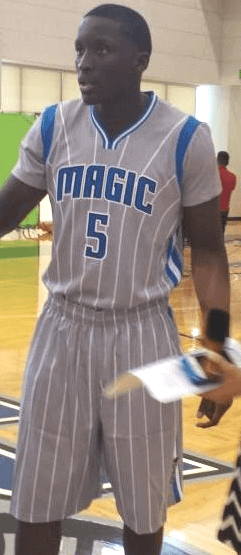
1. The Magic held their media day, and photos quickly began circulating of various players wearing gray pinstriped uniform featuring, of course, sleeves. Here’s some additional info, a rear-view shot, and some additional photos.
My thoughts on this one:
• Color-wise, I think this shade of gray works quite nicely with blue. One of the better gray designs I’ve seen, in any sport.
• I like the gusset stripes at the shoulders. Wish more of the NBA’s sleeved jerseys went this route. (Of course, I’d like it even more if they used striped gusset inserts, but hey, baby steps.) But the gusset stripes have a retro feel that clashes with the modern collar design. They’d be better off going with an old-school scoop-neck collar for this one.
• The preceding compliments notwithstanding, there’s exactly zero reason for this uniform to exist. But rationality hasn’t played much of a role in the uni-verse for a while now. Sigh.
• They sure are going all-in on the sleeves, eh? Remember, a buyer from a major sporting goods chain recently told me that the sleeved jerseys aren’t selling well, and a lot of the players reportedly aren’t in love with them either. But the league is apparently committed to the sleeves. See, that’s the problem with a two-year production/retail cycle — once the wheels start turning, you can’t stop them, even if you wish you could.
2. The Rockets site ClutchFans reported that the Rockets will celebrate the Lunar New Year by wearing this Chinese-lettered jersey on Feb. 21, 23, and 25:
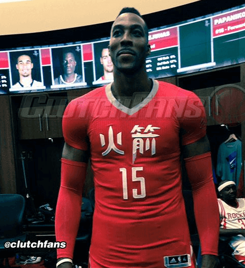
Too bad Jeremy Lin and Yao Ming don’t play for the Rockets anymore, eh? Still, Houston does have a notable Chinatown, so I suppose we could file this one under ethnic outreach, like the Latin Nights jerseys. Or maybe we should just file it under “Another excuse to push the fucking sleeves.”
That ClutchFans entry also mentions some uniform changes the Rockets are supposedly making for 2015-16, including news about a new alternate jersey and narrower shoulder straps on the home and road primaries.
3. Yesterday also brought our first peek at the Raptors’ 20th-anniversary patch (click to slightly enlarge):
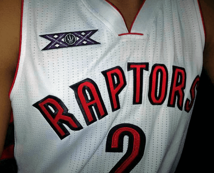
I’m not a fan of using roman numerals for anniversary patches, which always seems pompous and overblown. In this case, you know they did it just as an excuse to use Xes. The letter X — it’s like the alphabet version of the color black.
Red menace: For only the second time in team history — or the second consecutive season, if you prefer to look at it that way — the Chiefs wore solid red last night (the first time was last year’s home opener). According to coach Andy Reid’s postgame presser, they went full-bloodclot because the players asked owner Clark Hunt if they could do it. But this year’s red-out wasn’t quite the same as last year’s, as you can see here (click to enlarge):
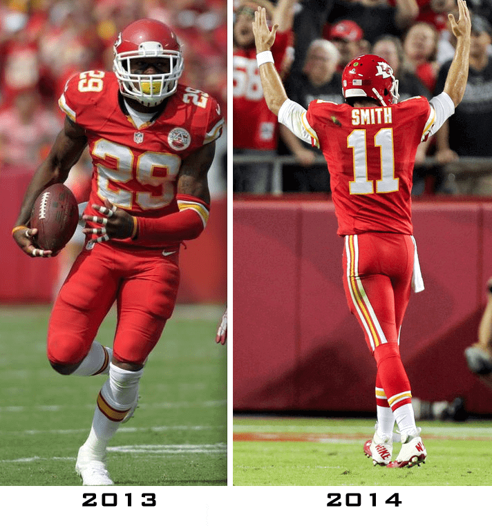
That’s right — they changed their socks. Last year they wore the white socks, which are what they normally wear with the red pants; this time they switched to the red-topped socks. They normally wear those with the white pants, but I guess they wanted the red-out to be as red as possible. What, no red facemasks? (Note to Chiefs: That question was strictly rhetorical.)
Collector’s Corner
By Brinke Guthrie
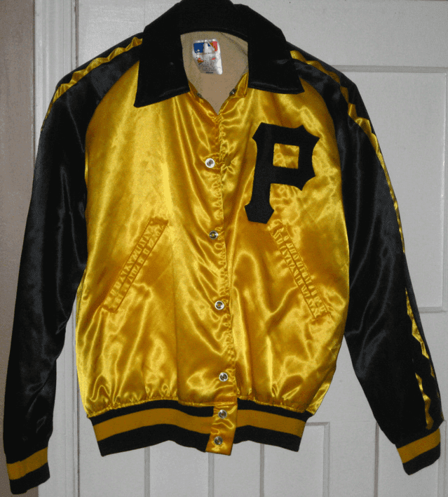
The Pirates host my Giants tomorrow evening in the National League Wild Card game, and it’s a pretty sure bet that none of the Buccos will be wearing this 1970s “We Are Family”-style jacket. Can’t Majestic think out of the box, or must everything be from a template? (P.S. Can’t forget this 1970s Pirates helmet bank, either.)
Okay, now to some other stuff:
This 1970s-1980s Browns seat cushion looks to be in good shape. So does this Cliff Engle Brownies sweater.
• Paul, you might recognize this beer coaster: Ever had a Knickerbocker beer when watching the New York Football Giants? [Knickerbocker was no longer being produced by the time I reached drinking age. But I used to collect breweriana, including coasters, so I am indeed familiar with that coaster design. ”” PL]
• This decal says it was heavenly to be an Angels fan back in the day.
• Did Motorola have an NFL deal back in the 1970s? Seems so, given their logo on this NFL Koozie.
• Here’s a set of 1970-1971 NHL posters, brought to you by your local Canadian Coca Cola Bottlers. Another poster from the same period: ““The Wild Bunch,” from the San Diego Gulls.
• Gotta like this 1960s Packers lighter in team colors.
• The 1970s Atlanta Braves meant business! Or, at least their stickers did.
• I’ve heard of Nerf footballs, of course. Had plenty of ’em get waterlogged at the Terrace Park Swim Club and then tear apart. But have you ever heard of a 1970s “Itza” football?
• Here’s a 1970s parade sign from the Pro Football Hall of Fame in Canton. Been there once, fantastic place to see a game.
• “LUV YA, BLUE!” Oilers fans yelled that at the TV while reaching into this 1970s Oilers ice bucket. They kinda soft-pedaled the team name, though.
• Great double-bar facemask and old school font on this 1970s Patriots thermal mug.
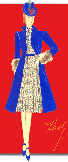
PermaRec update: A fascinating story of a dressmaker who perished in the Holocaust and whose clothing designs are then found and finally produced decades after the fact (including the one shown at right) — that’s the crux of the latest entry on Permanent Record.
This is the part where I remind you to spend all your money on Uni Watch 15th-anniversary patches, stickers, and T-shirts alreeady, okay? Okay.
Uni Watch News Ticker
By Garrett McGrath

Baseball News: We previously mentioned that Detroit firefighters gave Tigers reliever Joe Nathan a fire helmet emblazoned with the Tigers’ logo after he gave a $50,000 donation. He wore it on Sunday night to celebrate the Tigers’ AL Central title (from Jeffrey Sak). … Nationals utility player Kevin Frandsen wants fans to wear nothing but red during the playoffs (from Tommy Turner). … In more Nats news: A fan was supposed to go home with the game-used jersey of Jordan Zimmerman, who pitched the first no-hitter in team history, but went home with an autographed one instead (from Chris Flinn). … Here is the logo for the 2014 MLB Japan All-Star Series (from Jeremy Brahm).

NFL News: Yesterday, we pointed out that Falcons defensive lineman Kroy Biermann has been wearing red contact lenses to cut down on glare. It seems that Buccaneers receiver Louis Murphy was also sporting a pair (from Wayne Koehler). … Can you spot all of the outdated logos on the NFL Films website? Joe Bailey spotted Dolphins, Browns (should have gray mask), Jaguars, Vikings, and Seahawks. Any others? ”¦ Here’s the most generic and wrong-colored Cowboys T-shirt you’ll ever see. The guy wearing it is Pink Floyd guitarist David Gilmour, shown there with Paul and Linda McCartney. The three of them were attending a 1970s Led Zeppelin show (from Aaron McHargue).

College Football News: Auburn has a T-shirt launching Gatling gun, which is every bit as cool and safe as it sounds (thanks, Phil). … The University of Arizona is wearing red helmets on Thursday night (thanks, Phil). … The Indianapolis Star ranked the ten best helmets in college football (from Treg Harris). … The University of Kentucky is doing “blackout” for their game on Saturday, but that doesn’t necessarily mean the team will be wearing black unis (thanks, Phil). … Georgia Tech is wearing white helmets for their whiteout game on Saturday (thanks, Phil). … “Can’t think of another school that has New Balance as their uniform manufacturer, but University of Maine is sporting the brand,” says Ryan Rudman. “Makes sense, because New Balance has three factories in Maine.” ”¦ Stars/stripes helmets upcoming for the Citadel.

Soccer News: Here’s an article about the creation of Champions League logo (from Yusuke Toyoda). … Whoa — fashion designer Yohji Yamamoto has created a new pair of adidas F50’s for Real Madrid’s Karim Benzema (from Stephen Boyd). ”¦ Beautiful sriped uniforms for Paul’s alma mater, SUNY-Binghamton. [Very nice, but the purple keeper’s kit is the turd in the punchbowl. ”” PL] (From Benjamin Ramos.)

College Hoops News: The University of Northern Iowa has their new uniforms (thanks, Phil). … The Georgetown Hoyas posted a picture of two uniforms the team will be wearing this upcoming season. … The Western Kentucky University Hilltoppers are having a uniform fan vote (thanks, Phil). … Indiana University ”“ Purdue University Indianapolis (wow, that is long) posted a picture of their new court.

Grab Bag: The FIVB will be using LED nets in 2015. The LED nets can display messages, flags, logos, scores, sponsor branding, countdowns and refereeing decisions (from Jeremy Brahm). … In more volleyball news: “Check out the referee uniforms from this French volleyball match,” says volleyball expert Jeremy Brahm. “Normally very plain, but the French tricolore makes in interesting.” … Innovation and E-commerce have been the keys to Nike’s growth (from Tommy Turner). ”¦ On the other hand, here are three Nike T-shirts that Mad magazine — and maybe some Uni Watch readers — would like to see (from Paul Stave).

Collar aside, the Magic uniform actually looks halfway decent for a sleeved jersey, and the contrasting gussets are a big factor in that.
Also, typo alert: “Yoa” Ming.
Thanks. Fixed.
there’s exactly zero reason for this uniform to exist
I can think of one reason…that’s the best the Magic have ever looked. Ever. Keep this as the regular uniform, Orlando!
The original kit was close, but I never liked that they used a star for both an a and a dot for the i.
“I’m not a fan of using roman numerals for anniversary patches …” Amen, though why stop there. Personally, I think Roman Numerals are just the worst. It’s a quasi-pretentious (kind of like using a $10 word, when a $1 would work just as well) and they just look terrible.
I’d actually hoped the NFL would use Superbowl L (see, ridiculous) as a chance for a clean break. Instead, they’re going to go Superbowl 50 then Superbowl LI (see, still ridiculous)
For me, it’s Arabic Numerals or nothing.
Roman numerals are good for Chicago albums.
“Good” and “Chicago albums” = phrases that never belong in the same sentence.
Awww.. Don’t hate. Congratulate!
Chicago WILL be in the Rock Hall someday. Hopefully sooner than later.
I agree that Roman numerals are pretentious, though, and need to go, whether it’s albums or bowl games or clocks or whatever.
Binghamton soccer is wearing hooped shirts, not striped. Hoops are horizontal, H is the mnemonic. But they still look awesome!
Can we say vertical stripes instead of “hoops”, or is this another case of the British Invasion of soccer terminology on American soil?
Of course I prefer “toque” to knit hat, so…
No. Vertical stripes are not hoops. Hoops are horizontal stripes only.
andyharry, that what I meant to say. But then again, I don’t know my ass from a hole in the ground. ;)
+1 on the toque. If the world could adopt 1 “Canadianism” (or whatever you want to call it) I’d pick that one.
Whenever I hear British and hoops in the same sentence I usually think of this:
link
No. There are stripes and there are hoops. The ones that go top to bottom are stripes. Those that go round and round the body are hoops.
Come on, now. It’s quite simple.
What if they’re horizontal, but they’re broken up by a side panel? Are they still “hoops” then?
Sure. They’re just interrupted.
I like having terms to distinguish between two distinct patterns. Isn’t that the point of a lexicon, anyway?
And can we say that the purple goalie shirt is quite nice? Plus, it won’t clash with most other shirts so it’s functional too.
I’m with terrible. I love love the hoops and the shade of green. And the purple keeper is good too. Keepers should appear clearly different from their mates and, whenever possible, in a color that would be not good if worn by more than one player.
I appreciate the idea that the keeper needs to contrast but how often do the goalie and field players jerseys relate design wise (and not just ad creep-wise)? I noticed that Mexico did a good job of contrast/relation at the recent World Cup. They both had the Luchador design on them that was not liked by the Uni-Watch Project Runway judges.
So both Joe Nathan and Bryce Harper had fire helmets on during their clubhouse celebrations. Is this the thing to do this year?
Is that a leaf blowing or some other debris, or is that actually a rip on the back of Alex Smith’s jersey?
Also, as I flipped from the Red Wings preseason game to check on MNF, I came to the realization that we had two teams clad in all-red last night, but the Wings make it look good, while the Chiefs… ugh.
But then, hockey and football have different aesthetics.
Pretty sure it’s a rip.
The Magic aren’t wearing “gray”…it’s “silver” (vomits a little) and they’re calling it their “Pride” uniform.
Please, we must properly refer to these gorgeous and necessary adidas costumes by their proper names…
/sarcasm
Why is Dwight Howard wearing no. 15?
Um… lunar new year? 2015? It actually happens on February 19.
Buccaneers’ WR Louis* Murphy, not Larry Murphy.
Fixed.
Tampa Bay logo is off on that NFL films as well.
I haven’t seen anything in the Ticker on this yet, so maybe I missed it, but Tennessee is trying to “Checker Neyland” this Saturday by telling fans to wear orange or white depending on which section their tickets are in by going to this website (there’s a photoshop on there of what it would look like): link
I think it’s especially cool that this was started by a couple fans while watching the Oklahoma game. They tweeted the photoshop picture and created the website. Butch Jones provided an official endoresement yesterday afternoon, and the university (of course) has started selling t-shirts: link. Maybe they’ll share some of the profits with the guys who started it (yeah right).
Lastly, this isn’t the first time something like this has been done at Tennessee. Fans checkerboarded the stands in Thompson-Bolling arena for a basketball game in 2006: link.
What if I want to wear, say…blue?
Then please sit in the visitors’ section with the rest of those nasty Gator fans.
Then you’re a bad fan, obviously.
I hate “You must wear this color” dictums, but I have to admit that the checkerboard effect is pretty cool. I’d be more inclined to go along and participate in that than I would for a color-out.
Is it a “dictum” by the organization or was it a grass roots movement by fans that the organization said “sure, sounds great”? I think that makes a difference.
It’s the latter. It really did just start as a tweet by a couple UT fans that went viral within the Tennessee community. The school didn’t even officially acknowledge it until this past Sunday after the hash tag had already been circulating for almost 2 weeks.
Then wear blue…What exactly was your point here?
Interesting list of college football’s “best” helmets. I’ve seen these lists before but don’t recall ever seeing Wyoming’s helmets included. I’ve always liked them too. I know it’s a matter of taste and opinion, but Michigan’s are #1 in my book (even though I’m not a fan of them). I’d agree ND and theOSU should be there, although they are easy picks. I’ve also never seen Air Force on a similar list, and agree they are cool as well. But Arizona State? Blech! I much preferred the helmet logo with the devil on it. I also can see Oregon included, but again, I like the old school version with the “OU” on it (or was it UO?). Crap, I think I’m showing my age…
Forgot to mention: although they are not on TV much, I think Dartmouth’s helmets are great, and quite unique. I’d put them on any such list. I would never include those Maryland helmets. Something about the shape of that flag logo looks really odd (plus, it’s a red/black/yellow puke-fest, not that Wyoming’s combo of brown/yellow is much better!).
I agree with the author’s choices, more or less, but Dartmouth is one of my favorites. To that I would add BYU’s helmets; I’ve always liked the “Y” in the oval.
I’m really surprised the classic University of Texas ‘Longhorn’ helmet is not on that list (especially considering a couple that are).
Hey – Northern Iowa has “Uni” on their jerseys. So if someone could photoshop “Watch” on them, and remove the purple, maybe we’d be on to something.
I worked at the yorkville/ruppert towers on 1st and 89th in the early 90’s and there was a great display case with knickerbocker beer items; trays, cans, openers, etc.
1970s “We Are Family” jacket in action.
link
Joe Nathan’s helmet has the defunct “caged tiger” logo. I hate that logo.
Me, too. Very overdone; it looks like it was drawn by the same guy who did the Florida Panthers insignia. I seem to recall Columbia U. went for a lion head that was similar. The complex cat face was a thing, then.
LOVE THE MAD MAG SHIRTS! DOWN WITH THE ‘SWOOSHBAGS’!
Had a -pink- Itza football as a matter of fact…
(Think underinflated Voit football with thinner and rubber-ier material)
(rubberier?)
Back in the 70’s, we’d get to school an hour early to play football with our Itza balls – they had a little heft to them, and were much better to play with (especially when it was windy) than Nerf balls. Invariably, they never seemed to be perfectly balanced, and if you ever found one that you could throw a perfect spiral with, you’d treat it like gold. Sometimes, we’d take the lopsided ones and over-inflate them so they’d fly better. My sister had a green one and I received my orange one for my birthday in 1977.
Yup, just went to ebay and bought a new Itza ball for $12.50, and I’ve got a feeling my six-year-old son is going to love it. Thanks, Brinke.
ITZA back
link
It’s back! The Gilmour Cowboys t-shirt, a classic for sure. From Uni Watch 2/4/2014:
“…photo was taken at the the Knebworth Festival on August 21, 1976 during a Rolling Stones performance,” Clint Schultz says. “I grew up in Texas and I’ve never seen the Dallas Cowboys appear in green and red. The Dallas Cowboy player who wore No. 56 was Hollywood Henderson, who was only a rookie in 1975. A simple search turned up another image of the bootleg Cowboys shirt being work by The Who’s Keith Moon link . //cdn.uni-watch.com/2805/12299420494_1394e8f27d_o.jpg “
Let’s try that photo link again – link
Super-picayune correction: A fan was supposed to go home with the game-used jersey of Jordan Zimmerman, who pitched the first no-hitter in team history, but went home with an autographed one instead seems to imply that the autograph was something special in lieu of the game-worn jersey. All of the jerseys given away in the “shirts off our back” promo were autographed. Due to the no-no, the TV feed didn’t break for commercial after the ninth inning, and showed the players coming out with their jerseys, autographing them, giving them to the lucky fans, and posing for photos together.
You sort of knew that the fans who drew Zimmermann and Ramos would be getting substitute jerseys, so the really lucky fan was whoever was chosen to receive Souza’s jersey. Most spectacular defensive play in Nats history, and that fan probably got the actual game-worn jersey.
“Can’t think of another school that has New Balance as their uniform manufacturer, but University of Maine is sporting the brand,” says Ryan Rudman. “Makes sense, because New Balance has three factories in Maine.”
You’re going to be seeing a lot more of this in the future – Warrior’s European soccer contracts will be link next season.
Beautiful sriped uniforms for Paul’s alma mater, SUNY-Binghamton.
Actually, in soccer those are called “hoops”. Stripes are vertical.
Oh, crumb. I’m about an hour and a half late to this party. Shame on me for not refreshing.
I like those Magic jerseys although it looks like they are wearing a blue back pack with the gusset stripes.
Also is that Raptors anniversary patch purple? It looks like it in that photo
I’m generally not a fan of monochrome unis in football, and the Chiefs reinforced that notion for me.
Nothing looks worse than monochrome dark football unis. White, okay.
Re: The Oilers ice bucket in Collectors Corner; I have a Saints version with the same design, and have also wondered why the makers used that “subdued” format: a repetitive row of logos around the top; a one-color body, and a TINY-sized, non-descript sans serif font name of the team on one side. Must have been for ease in production purposes or something.
Depending on how it’s displayed, might we then refer to the American flag as the “Stars and Hoops”?
(This is a silly non-issue, I think. One person’s stripes are another person’s hoops.)
Actually, no; the American flag is flat, so it has stripes. On a jersey, the stripes encircle the player, so they look like hoops. Any Celtic fans out there? Up the Hoops!
Dammit, I didn’t see Mr. Chilvers’s reply up top. I may have a future working for the Department of Redundancy Department.
I’m tired of seeing the Seahawks logo without the updated gray stripe. It just seems like laziness too not change it. It’s such a huge upgrade over the blue.
On eBay, there’s lots of bootleg Super Bowl Champions merch that still has the old logo.
to, not too
I would understand the Chinese characters on the Rockets jerseys if Jeremy Lin or Yao Ming were still playing for them. And I also understand the NBA’s outreach in China. But if they are celebrating the “Lunar” New Year and not “Chinese” New Year (which I’ve even occasionally called it), why wouldn’t they also include the language of other countries that celebrate it? Given my last name, it’s pretty obvious which country I’m talking about (and that I may be biased about this), but especially given the Vietnamese population in Houston, is it fair to ask the question of why not include my people in this as well?
For better or worse, Lunar New Year tends to be a celebration of Chinese culture (sort of how Columbus Day is de facto Italian Pride Day in the Northeast), and festivities in other countries tend to be influenced by the Chinese celebrations too (Tet is pretty heavily Chinese/Confucianism influenced, right?).
Also, China is a huge-ass, yet-to-be completely tapped market, so yeah, money talks.
Essentially all Vietnamese traditions are influenced by Chinese culture, so I see your point. I guess for me, it was me wanting to get my people a little love and attention especially given the significant Vietnamese population in Houston. But more than anything, the biggest and most obvious answer to my question, is as you most perfectly summarized: Money Talks.
BTW, thing I learned today: Houston has the largest ethnic Vietnamese population in the U.S. outside of California.
Itza balls were great,if you think a leather football takes some weird bounces, you should have seen the bounces the Itza ball took. And the one I had was around forever. I got it around 1974 and my kids still played with it at my parents house around 2010. I think my mom finally threw it out when she moved two years ago.
Chief did it right last night!
The only thing that would look better is if the ’72 Oilers went all blue.
I know the colors are different, but the Magic uni almost remind me of the late 70’s Cubs road unis:
link
On the NFL Films website, the Buccaneers’ logo link as well.
The Permanent Record story on the rebirth of clothing designs by a woman killed in the Holocaust was very moving. I’ve shared it with a number of friends in the garment industry. What a great way to memorialize her talent.
Thanks — glad you liked!
Dan Gilbert just tweeted a video of the Cavs’ new floor. link
note the skyline at mid court.
Normally I wish they’d just stick to wine and gold, but the blue outline gives the court a Coliseum-ish feel.
That giant fishhook C has to go, though.
Funny how with those NHL posters they really screwed up Keon. Not only had the Leafs changed to the new style with the stripes down the sleeve by then, but it looks like the wrong crest for the 1967-70 style and the socks appear to have one broad striping instead of three small ones.
. . . so now not only are basketball shorts longer than football pants, hoopers have longer sleeves than gridders too. I dread where this trend might lead.
(insert picture of lingerie football league here)
*Note* Last year, after KC went all-red, Uni-Watch questioned the Chiefs not wearing red socks with the blood clot set. Sounds like they heard you!!!
Salvador Perez was wearing a a New Balance (rather than Nike) undershirt in the Royals/A’s game. It could be seen when he had Gatorade dumped on him.
The Panthers logo is outdated on the NFL Films site too.