There was a ton of uni news yesterday, and I’m about to make some additional news here myself, so we’re going to have two posts today: this one, which will be all about the NBA (and will also have the Ticker and other secondary content), and another one, which will be about last night’s MLB All-Star Game. The second post should be up by noon Eastern, and maybe a little sooner, so be sure to check back for it later on. is available here.
Now then, let’s turn our attention NBA-ward, beginning with a Uni Watch exclusive. Here are this year’s Christmas Day designs (click to slightly enlarge):
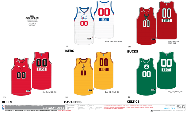
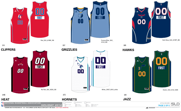
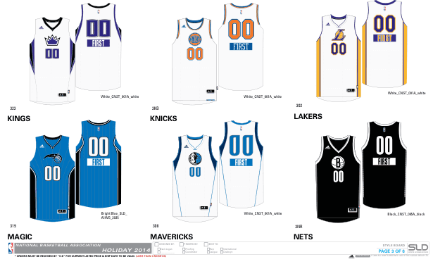
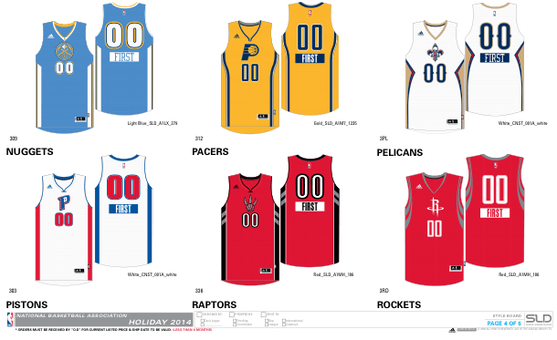
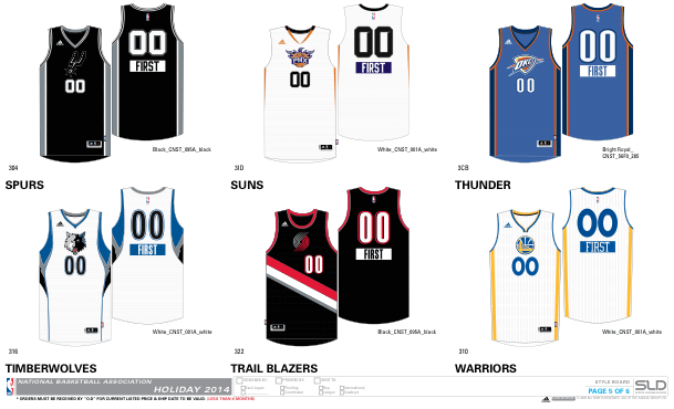
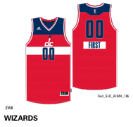
Not so bad, right? I got those about six weeks ago from a source who took them from an Adidas catalog. Today felt like the right day to share them, given all the other NBA stuff that leaked yesterday (which we’ll get to in a minute).
Keep in mind that the NBA schedule wasn’t yet done when these designs were created, so the league and Adidas didn’t know who’d be playing on Christmas Day. But they had to have designs ready for retail orders, so they created a Christmas design for every team, even though most of them will never make it onto the court. That’s standard practice — they did the same thing last year and the year before that. I’m not sure if the schedule has been finalized by now, but it certainly hasn’t been publicly released, so we still don’t know who’ll be playing on Dec. 25 (although certain teams, like the Knicks, pretty much always play on that date).
A few notes on the designs:
• No sleeves! (Although, as you’ll see in a minute, that doesn’t mean the league is moving away from sleeves in the larger sense.)
• The basic template — logo centered on the chest, with the uni number centered beneath the logo — feels a lot like those college basketball designs that Nike foisted on us in early 2013. Aside from being derivative, though, it’s pretty decent-looking. Of course, there’s no good reason to create a separate Christmas template to begin with. But if they have to do it, this is definitely an improvement over recent years.
• The big gimmick, as you can see if you look closely at the rear-view mock-ups, is that the players’ first names — not their surnames — will appear on the back of the jerseys. Yawn.
• Whatever else you can say about these, at least they won’t be difficult to read (like the 2012 Xmas unis) or look like soccer jerseys (like last year’s Xmas unis).
So that’s my contribution to the frenzy of NBA leaks over the past 24 hours. Now let’s turn our attention to the stuff that leaked yesterday.
First, some quick background: Someone apparently made an Adidas retail catalog available for download on one of the SportsLogos.net discussion boards, and several people downloaded it and then began tweeting screen shots from it yesterday afternoon. One of those people was Uni Watch reader Conrad Burry, who directed his tweets at Phil, who in turn sent them to me. Soon the images were circulating all over the uni-verse and media outlets began reporting on them. That included ESPN.com, where I wrote this straightforward news piece on the leaks.
Breaking leaks are always hectic. Now that the dust has settled, I’d like to take a closer look at each item that leaked yesterday:
1. Teams that have won a championship will have a gold mark on their back collars (for all of these images, you can click to enlarge):
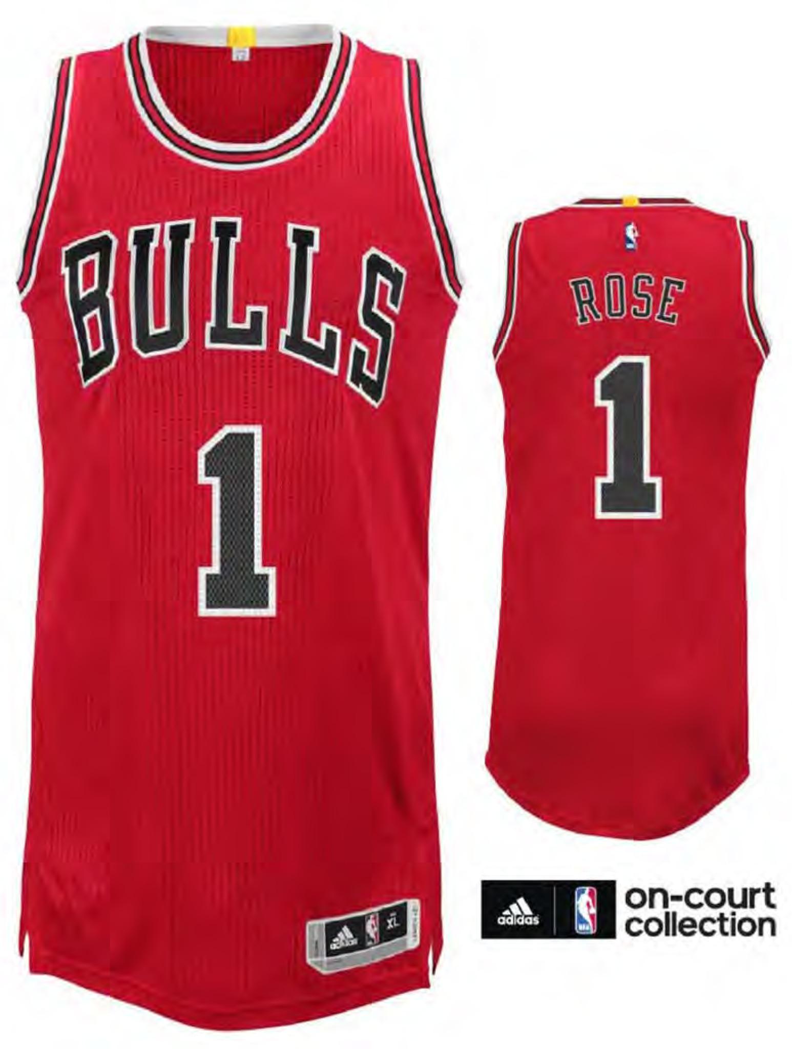
During the World Cup, several readers told me they’d like to see the Big Four leagues adopt something like the FIFA’s star system to recognize championships, so I guess this will make those fans happy. But the way they’re doing it boils down to a simple “Haves vs. Have-Nots” binary, so the Blazers (one title) will wear the same “badge of honor,” so to speak, as the Celtics (17 titles), which seems a little weird. I can see having the current defending champ wear the gold tab, but giving it to every past champion feels like overkill to me. Turns out that multiple titles will be indicated by a tone-on-tone notation on the tab — “2x,” “5x,” or whatever, and the tab will also include a little depicton of the O’Brien Trophy:
A few other notes and thoughts on this:
• Some NBA jerseys have gold collars, like the Lakers’ road jersey or the Rockets’ alternate jersey. Seems like the championship tab won’t be very visible on those uniforms.
• Will franchises get credit for titles won under previous names and/or in previous cities? According to the catalog (which I’ve now gotten a copy of — thanks, Phil), it appears that they’re being inconsistent about this. For example, there’s no gold tab shown for the Thunder, so the franchise is apparently not being credited for the championship it won as the SuperSonics in 1979. On the other hand, the Kings are shown with a gold tab, apparently in recognition for the Rochester Royals’ 1951 title (same franchise). Do the Wizards get credit for the Bullets’ 1978 championship? No, according to the catalog. But do the Hawks get credit for 1958, when they played in St. Louis? Yup. So it’s all a bit of a mish-mash. But these are just catalog mock-ups — maybe they’ll come up with a more consistent protocol once the season starts.
• If you remove the Thunder and Wizards from the mix, as noted above, 15 of the league’s 30 teams will be wearing the gold tab. Personally, I don’t think getting a gold star from the teacher feels quite as special if half the kids in the class are getting it.
• One thing that doesn’t make sense: The catalog shows the Magic with the gold tab. I’m assuming that’s a clerical glitch.
2. The Celtics are switching to “Boston” on their road jersey, just like back in the day:
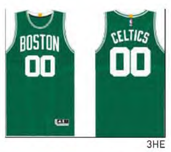
As you may recall, we’d gotten a hint of this a week or two ago, based on a green “Boston” shirsey. Personally, I’m fine with it.
3. The Hawks’ shorts will have the Pac-Man logo:

We discussed this logo here on Uni Watch back in May. I’m a fan.
4. The Pacers, Kings, and Raptors will have throwbacks:
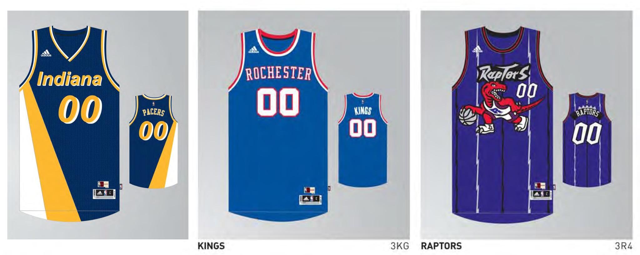
The NBA often usually likes to come up with a theme for each season’s throwback program, but I can’t discern any common theme to these three — can you? The big eyebrow-raiser, of course, is the Raptors design, which has now been mothballed long enough to have achieved “So bad it’s good” status — perfect for a throwback. Oh, and that’s a Rochester Royals design for the Kings, incidentally.
5. The Celtics and Bulls will once again have sleeved St. Paddy’s Day uniforms:
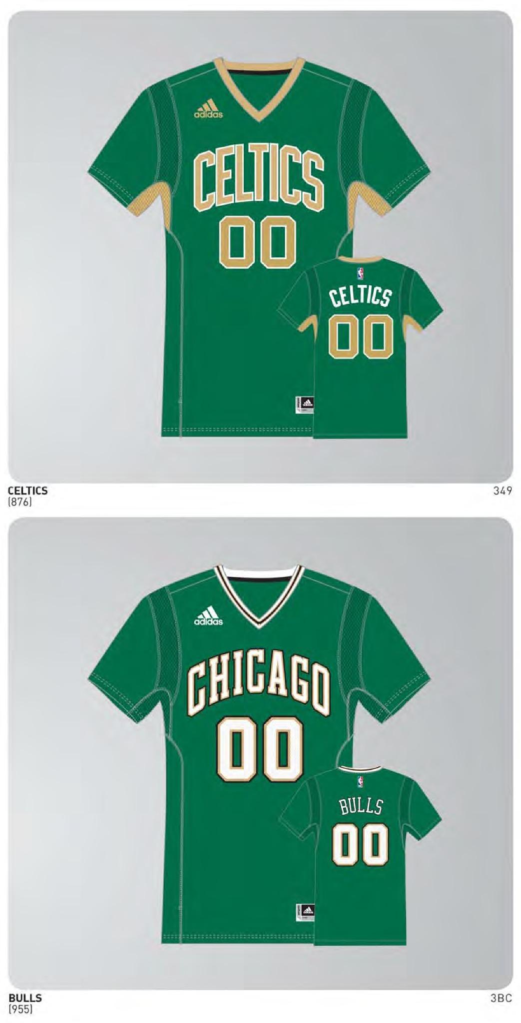
Eh, whatever — the usual slop. Very similar to last year, only now the Celtics have golden underarms. I’m sure there’s an Irish Spring joke in there somewhere, right?
6. This season’s edition of the Lakers’ BFBS jerseys will have sleeves:

A gimmick jersey gets gimmickier — whatever. Frankly, if you had asked me whether last season’s version had sleeves or not, I wouldn’t have been able to remember. (For the record: It didn’t.)
7. No sleeves, however, for this season’s Hispanic heritage jerseys:
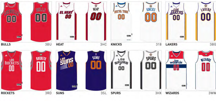
Again, these gimmicks all start to blur together after a while, but I did vaguely recall that last year’s Hispanic jerseys had sleeves.
8. A bunch of alternate and “Pride” uniforms (like Detroit’s “Motor City” jersey and Portland’s “Rip City” jersey) are apparently in the works, but those designs aren’t shown in the catalog:
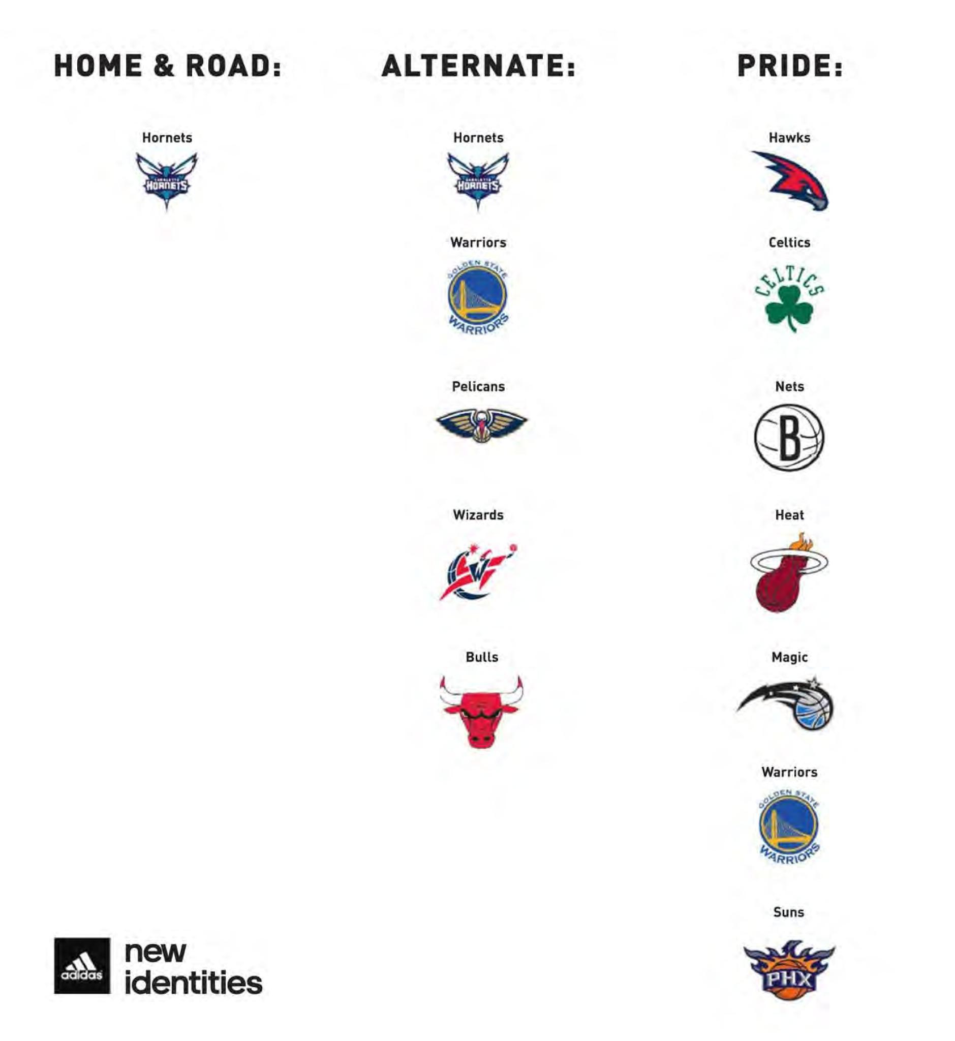
I’m assuming that the Nets design will be the black-and-white Dr. J-era uniform that was first described here on Uni Watch back in January. Several of the other teams slated for “Pride” unis were mentioned in this Uni Watch entry. So it appears that all of the pieces are falling into place.
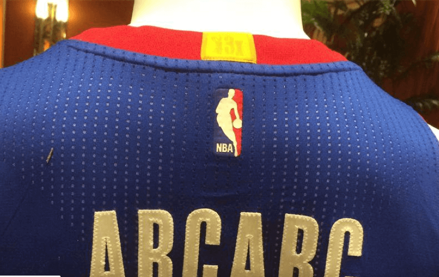
One additional tidbit: We had already seen mock-ups of the Kings’ new uniforms a few weeks ago, but here are new photos from the league meetings that show the road design on a mannequin — including the little gold tab on the back:


The funny thing is that the gold tab was also shown on those earlier mock-ups, but it’s such a small detail that nobody noticed.
Whew — that’s a lot of NBA news! Okay, here’s the rest of this morning’s entry. Remember to check back later on (or follow my Twitter feed) for today’s second post, which will be about last night’s MLB All-Star Game.
(Extra-special thanks to Phil for his assistance with this entry.)

Awl in: There was a reporter from the Awl At last month’s Uni Watch 15th-anniversary party. He interviewed me and a bunch of the other attendees, and he told me his article about the party would probably run within the next week or so. Then I never heard from him again. But yesterday my friend David Wilson told me, “Nice story in the Awl!,” which is how I found out that the reporter’s story had posted last Friday. So there you go.

Baseball News: Check out this shot of former Dodgers OF Glenn Burke wearing a “General” batting glove. I don’t remember that brand at all. ”¦ This is awesome: One hundred years ago, almost to the day, a minor league in California disbanded due to a dispute over uniform colors (great find by SJ Johnson). ”¦ “I am in post-production on a documentary film about the 1913 Covington Blue Sox of the Federal League (the team that was transferred to KC in June of ’13, becoming the Packers),” says Cam Miller. “I wanted to share the Blue Sox jersey I made as a ‘prop’ for my screenings. The image on the left shows St. Louis manager Jack O’ Connor and Covington Kentucky manager Sam Leever on Opening Day in Covington, May 9, 1913. The image on the right is my jersey prop. I found it interesting that the ‘C’ was not really a block letter — it had 45-degree angles cut on the ends.” … The Indians presented Derek Jeter with this guitar last week. “I can’t help but notice that ‘2’ on the guitar is actually the old Dallas Cowboys font with that top serif, not the proper Yankees font,” notes eagle-eyed Douglas Brei. … In 1988, the Pirates were wearing huge “RSC” lettering on their right sleeve as a memorial to Pittsburgh mayor Richard S. Caliguiri. The lettering was so big that it pushed that year’s All-Star Game patch up onto the shoulder (from Douglas Smith). … Just what everyone’s been waiting for: a Day-Glo baseball glove from Nike (blame Brinke).

Pro and College Football News: Here are some NFL/MLB logo mash-ups (thanks, Brinke). ”¦ The Broncos will wear their blue alternates against the 49ers in Week 7 (thanks, Phil). … Here’s a great shot from the 1964 Cotton Bowl showing Navy with SNOB.

Hockey News: “I was visiting an ice hockey camp here in northern New England on Tuesday,” says Tris Wykes. “Pre-teen and teenage girls make up the roster this week, and I noticed that some of them had decorated their helmets with bows. In recent years, equipment manufacturers have cranked out pink and purple and sparkly gear for this demographic, but it’s fun to see them adding their own touches as well.”

Basketball News: New court design for Long Beach State. … Here are the Washington Generals — the team whose job was to lose to play the Harlem Globetrotters — wearing basketball stirrups (from William Yurasko).

Soccer News: MLS’s new Orlando City team will have very purple uniforms (thanks, Phil). … Someone apparently likes German National Team’s head physician, Dr. Hans-Wilhem Müller-Wolfhart, so much that he got his NOB on a jersey with a Caduceus instead of a uni number (from Alex). ”¦ New kit for Blackburn Rovers. “It uses a ‘Cambridge blue’ that’s far lighter than what we’re used to,” says Chris Cruz. ”¦ New away uniform for FC Barcelona — and here’s the home uni. ”¦ New kit for West Bromwich Albion (from Andy Bronson). ”¦ “I was watching Drake and Josh with my little brother and the character of Josh (played by Josh Peck) seems to be wearing an old France national team jersey,” says Anthony Nuccio. “The episode in question is from 2007. Does anyone know anything about this jersey?”

Grab Bag: Wow, look at this Mobil/Pegasus auto racing driver suit (from David Firestone). ”¦ Also from David: A good close-up view of that STP suit that was shown in yesterday’s Ticker.
Lots of folks are nostalgic for the days when baseball players wore white shoes at the ASG instead of the customary black. I can’t imagine anyone in thirty years being nostalgic for the nauseating neon footwear on display last night.
Let’s please save the All-Star Game comments for today’s second post, which will be devoted to the ASG.
Looks like Müller-Wolfhart’s jersey has the Rod of Asclepius, not the Caduceus: link
I personally didn’t know the difference, but your usage spurred me to look it up. Learn something new at Uni Watch everyday!
My immediate thought on seeing that jersey was: just how many times did Germany’s #13, Thomas Muller, have to endure ribbing from a teammate about the team medic publicizing his flatulence issues?
French football shirt dates to 1982, and I would bet he has number 10 for Platini on the back.
link
For Josh’s sake, I hope hope hope he wasn’t wearing the #3 jersey; things wouldn’t end well for him.
link
Of the two jerseys of any kind I own, one is the away version of that jersey, long-sleeve. And it’s gorgeous.
Good old Adidas with their templates. Yeah, let’s use the NOB under the numbers for EVERY FREAKING TEAM and ruin the coolness that it would otherwise have if only a couple teams did it. Well, at least they didn’t standardize the side striping too.
The gold championship spot on the jerseys is both dumb and badly executed. It looks bad, isn’t necessary in any way at all, and if you’re going to do something like that shouldn’t it have a number on it so it looks like it means something? I don’t know how many teams don’t have championships yet, but at some point in the future every team will have one… what then?
…and of course the Hispanic jerseys are still stupid for every team except the Knicks
I say make the NOB-under-the-number style the new standard.
Look how much more balanced the jersey backs are this way. With all the cruft being shoved onto the backs of jerseys — the pointless NBA logo, the gold bar — the number is, on the “regular” jerseys, the bottom-most of four elements.
The number should be in the center, and if there have to be othe relements, an equal amount should go above as below. Gold bit+logo / number / NOB lets the other parts frame the number. Look at the #14 Sacramanto jersey (if you can bear the purple) and see how the other stuff is almost tucking the number into the guy’s pants. It’s a good thing Muggsy Bogues isn’t on this team; his number wouldn’t even be visible.
I love the Marquette-style name placement as well; was a bit surprised it wasn’t noted in the post.
Tangentially-related uni note – that number/name placement is actually becoming increasingly popular at the HS club sports level for young women, lacrosse & field hockey especially. The reason: it enhances recruitment opportunities by making it easier for college coaches who are scouting to identify players (the name can be printed in a larger font size, and won’t be partly obscured by a ponytail).
Nice to see the Kings commemorating the title they won as the Rochester Kings in 1951 back when every player wore knee pads and utilized the diaper shot…
Dumb if the Wizards don’t get the little gold mark. Feels like more of a contiguous franchise than the Kings.
It makes no sense. The traditional definition of franchise continuity is simply that the team is the legal holding of the owner and if it is relocated or sold to a new owner, the history follows the property. It makes sense that the Kings and Hawks would both have the gold stripe, but the Washington omission is baffling. Maybe the clerical error that put the gold dot on the Magic uniforms was intended for the Wiz.
Side note: I’m not surprised that OKC doesn’t have one for the Sonics’ championship considering that part of the relocation agreement kept the Sonics’ branding materials and history away from the OKC franchise. It’s up for debate whether “history” is something that can be put into a contract, but the Sonics’ history is not officially OKC’s.
I thought the Thunder were “sharing” the history with a presumed-inevitable new incarnation of the Sonics?
Hmm. Here’s what was link:
OKLAHOMA CITY — The championship banners and trophies from the SuperSonics’ best days will be staying in Seattle. But the flat screen TV in the coaches’ locker room, that is going to Oklahoma City.
The city of Seattle and Clay Bennett’s ownership group have divvied up the artifacts of the NBA’s past in the Pacific Northwest, with the details outlined in a settlement obtained Wednesday by The Associated Press.
The agreement calls for Bennett’s Professional Basketball Club to leave any banners, trophies and retired jerseys. Those will be placed in a curatorship at Seattle’s Museum of History and Industry, although the new Oklahoma City franchise would be allowed to borrow them to put on display periodically and make copies.
…
Bennett will retain the rights to the SuperSonics’ name and logos, but has agreed not to use them after moving to Oklahoma City. If a new NBA team arrives in Seattle, Bennett would turn over the rights to the new team’s owner at no cost, as long as it meets with NBA approval.
The league hasn’t yet announced a new name for the Oklahoma City franchise, which has applied for trademarks for six: Thunder, Bison, Energy, Wind, Marshalls and Barons.
That team will be allowed to use the SuperSonics’ statistical history, although a future Seattle NBA franchise could also stake a claim to share those records.
So has the agreement been changed? Has the (sigh) Thunder lost their claim on the old Seattle records? If not, why don’t they get to wear the “we once won a championship” mark?
I think part of the deal was not being able to take credit for any Seattle success. Which is fine, I don’t think anyone in OKC gives a hoot about the Seattle version of the team other than being thankful they drafted Durant.
Not just that, but the Bullets actually WERE a Washington-based team (well, Landover) when it won its lone NBA championship.
The OKC thing is like the Ravens not adopting the Browns’ history as its own, and makes intuitive sense; unlike, say, the Ravens’ Indianapolis counterparts who (I believe) proudly display the Super Bowl V trophy. Making it fittingly ironic that the trophy they display is not the actual Lombardi Trophy given the Baltimore Colts, but a replica of same.
This D.C. Sports Bog piece on the Wizards uniforms includes an image at the bottom that seems to show the gold tab on the inside of the collar, but not the outside.
link
Ok… those MLB/NFL logo mashups are bad, and they should feel bad. Cleveland was especially dumb by putting Wahoo’s feather on the bulldog -and- using the block C. The bulldog and C could actually work pretty well for the Browns if the dog was repositioned a bit, but then… feather. Why?
because it’d be hard to tell that it’s a mashup if they only used the generic block C??
So… render the dog in Indians colors? Make Wahoo orange & brown? Put the Wahoo head on top of the Elf body in either team’s colors? Use the dog with more of the feather being visible and drop the C entirely?
They were all pretty terrible except for KC and Cincinnati. The Bengals should adopt that logo today.
I used to enjoy mashup projects, but they’ve digressed from clever to amusing to pedestrian to bad to worse. I think I’m going to stop clicking…
But I will throw a link to my ridiculous link for amusement’s sake.
The Drake and Josh France National Team shirt is the design worn circa 1982 most famously during the 1982 FIFA World Cup held in Spain ,France made it all the way to the Semi Final where they lost to West Germany in the World Cups first ever penalty shootout after ending 3-3 after extra time ,notably the shirt has the Adidas 3 stripes as worn in 82 but is without the Adidas Trefoil logo which was last used on Adidas sportswear in 1997 ,but currently associated with the Adidas Originals brand, another notable aspect to this shirt was Red and White alternating pinstripes ,not as famous a design as there 1984 shirt which was The inspiration for the 1998 shirt in which France won the Euro84 and World Cup98 both on home soil!
“In 1988, the Pirates were wearing huge “RSC” lettering on their right sleeve as a memorial to Pittsburgh mayor Richard S. Caliguiri. The lettering was so big that it pushed that year’s All-Star Game patch up onto the shoulder.”
The 1988 ASG in Cincinnati was the first in which players on all teams wore the ASG patch on their jerseys, not just the team hosting the game.
paul’s worst nightmare? a purple zubaz suit
link
Did he lose a bet or something?
I’m all for adopting a fifa style system commemorating championships won, but getting just one mark misses the point entirely. Just seems lazy.
“i got it fellas! what about a little gold mark, just one, no matter how many championships are won!”
On the other hand, imagine a Yankees uniform with individual stars, crowns, etc. for each championship
The Yankees could take a lead from AC Milan, Juventus and other dominant clubs in Europe. They have gold stars that represent 10 championships, and silver stars that represent individual championships.
See update below.
I am OK with these adoption as long as it’s consistent (in soccer, mostly every team decides for themselves).
About the Yankees, they can adopt the Italian system when you get one star per every 10 championships you’ve won, also applies for NBA.
For the current champ you could adopt the Premier League system where everyone wears the Premier logo in the normal colors (white and blue) but the champ wears them on a golden tone. In Italy, only the champion can wear the Scudetto patch (which is a circle with the Italian flag colors) and NBA could do something similar with a O’brien trophy patch (though that’s a lot of patches).
“Scudetto” is Italian for “shield.” Accordingly, the champion of Serie A wears a shield-shaped patch in the colors of the Italian flag in the following season, not a circle.
The circular patch is used for the team that wins the Coppa Italia.
Personally, I would have liked to see stars inside the collar or a custom jock tag or something. Having it on the outside makes it too cluttered for me.
Back NBA logo + useless ugly yellow tag (yeah, that’s not what I call “gold”). How to double waste good looking and adless (for now at least) jerseys… Bravo, NBA…
It looks like every title winner team’s jersey is on a -50% offer, seriously. The christmas jerseys… sigh, they’re not necessary at all. Bring back the snow flake NBA logo on regular jerseys please…
The good news is, the dino jersey is back. And I like the “new” Kings wordmark. The old one was not fitting well on the jersey.
So, is EVERY team playing on Christmas Day, now?
Someone didn’t read today’s post very carefully.
Got ’em!!! lol
Update! The gold tabs will have little tone-on-tone “2x” or “5x” (or whatever) labels to indicate how many titles a team has won:
link
*ahem* ;)
Note that the Spurs, with 4X, already needs updating (indicating these photos were shot before The Finals were played).
I don’t think the photos were shot before the Finals; I think the jerseys were prepared before the Finals.
Or that
odd to say this about the NBA, but thats almost too subtle.
I think a better alternative to the gold tab on the color would be a gold border around the nba logo patch.
Agreed — good idea.
I’ve never thought other sports needed to follow suit with FIFA, but think the NBA could’ve done something better than a gold laundry tag.
Not a bad idea, but I think it is kind of lame to have a uniform represent the franchise’s World Championship when players themselves haven’t had anything to do with winning one, especially in recent years.
Example might be, for easy sake, Kevin Love gets traded to the Lakers. His jersey will be adorned with a gold tag plus a number of championships. Stupid.
I could see it maybe used for DEFENDING CHAMPIONS, maybe even as far as players still on the defending champions team, but not for the history of the franchise. That’s why banners hang in the house the team plays in.
EDIT!
Not a bad idea, but I think it is kind of lame to have a uniform represent the franchise’s World Championship when players themselves POTENTIALLY (come to team after trade, FA, etc.) haven’t had anything to do with winning one, especially in recent years.
Not a fan of the nba logo on the back of the uni but maybe they should’ve tried to render it in team colors like the MLB does. But I much prefer leaving that space on the back for teams to use their secondary logo if they so choose.
I’d agree, but ideally there wouldn’t even be any space there; the name should come right below the collar and then the number below that.
Why has no one mentioned the FNoB being on the lower back instead of above the number? Has this been going for some years?
We talked about it in the comments yesterday – that link might have been just a placeholder, a generic jersey so Kaká had something to hold up for the cameras.
Neither Orlando nor their fellow expansion club New York City FC have unveiled their uniforms for next season, but they’ve both started signing players with all the requisite photo-ops. NYCFC’s first signing held up link (before teh club released link that may or not resemble their eventual jersey). Kaká held up that jersey, but there’s been no official announcement and the shop only has link in stock.
It is a very safe bet, though, that Orlando City will indeed wear link. That much we can be sure of.
I’d love to see Orlando City go with a purple jersey, gold short, and purple sock look as their primary and a gold jersey, purple short, gold sock for the alts. I’m really hoping NYCFC incorporates a lot of the NYC Orange into their look. MLS is such a navy/royal/light blue centric league now.
I’m really hoping NYCFC incorporates a lot of the NYC Orange into their look.
link
Sorry for the shameless plug. ;)
“NBA jerseys next season will have gold patches recognizing past championship teams.”
Yet another unnecessary element on too cluttered uniforms. Secondary logos, pants logos, league logos, manufacturers logos, wordmarks (I never saw the point of those on football uniforms. Are the linemen so dim they need to be reminded of who they’re playing?) Whatever happened to less is more?
I agree with you about clutter in general, although it’s worth pointing out that the NBA is the only major league that doesn’t allow manufacturer logos on its jerseys.
The contrast nameplates sort of bug me, but I love the names under the number.
Maybe I’ve been watching too much Bundesliga, though.
The club name over the number in the Bundesliga is a neat feature. Seems to emphasize team over individual, though I believe Borussia Dortmund has the names reversed.
Only a few Bundesliga Clubs do it that way any more, as UEFA requires them to have the name placed above the number for international competitions. Schalke 04 is one outlier that comes to mind, they switch the positioning for UCL matches. I, as a German, have never liked the club’s name on the back, clear example of redundancy.
The 2 on the guitar the Indians presented to Derek Jeter isn’t in the Cowboys’ font. It’s actually the Indians’ font called “TribeType”.
They’ve been using it for a few years on their website and other collateral, for just about everything except the on-field look.
Speaking of the Washington Generals as you did in the basketball ticker, I read that Red Klotz, the longtime player and coach of the Generals (who actually was on an NBA team that won a championship) just died. I hope they don’t put his all-time coaching won/loss record with the Generals on his tombstone. I believe some tomfoolery contributed to that record.
Keep in mind that the NBA schedule wasn’t yet done when these designs were created, so the league and Adidas didn’t know who’d be playing on Christmas Day.
Well, we can safely assume the Cavs will be playing that day now, and the Sixers won’t.
Those two teams are examples of what I like and don’t like about the Christmas jerseys. I like the ones with big logos (Sixers, Bulls…that one might be the best of the whole bunch), but I don’t like the ones with smaller logos (Cavs, Hornets, Wiz).
I’d prefer the Kings’ Christmas jersey to the regular one with the KingS lettering. But the script Kings is better than both of them by far. Speaking of the Kings, I like putting the name under the number, but not the first name. This isn’t Brazil (bad year to be emulating them, huh?) or Phi Slamma Jamma.
If I recall, the Celtics got away from wearing “Boston” on their jerseys because of Bill Russell. He was loyal to Red Auerbach and the team, but he wouldn’t wear anything that mentioned the city that gave him so much grief (to put it mildly). I think he and the city have made up recently, so that could explain the change.
Interesting! Didn’t know that. Thanks, Jim.
Trying to look that up, and all I could find was an old quote where he said he played for the Celtics, but not for Boston.
Russell was quoted in a 2010 bio as saying “from my first year I thought of myself as playing for the Celtics, not for Boston,” so no doubt there’s some truth in this story. That said, though, the team is wearing “Celtics” jerseys in its 1956-57 team picture (Russell’s rookie year).
link
Actually, Paul, in a column last year you posted a picture of a mid-1960s Celtics-76ers game played in Philly in which Russell is wearing a “Celtics” jersey and teammate Larry Siegfried a “Boston” one. I only recall b/c in the Comments section I linked to a pair of pictures of Russell wearing a “Boston” jersey that clearly were from the early part of his career. Here’s a link to the column:
link
I could be mistaken about this as I’m going from a long-ago memory on it, but it seems to me that the change on the road unis from “Boston” to “Celtics” coincided with Russell becoming the coach.
Personally, I don’t think getting a gold star from the teacher feels quite as special if half the kids in the class are getting it.
Hard to believe that many teams get one. Reminds me of the good ol’ Larry O’Brien days, when parity wasn’t just a theory.
The Wizards should get a gold star, too. You can’t punish them for having a goofy new name.
They absolutely should. A change in city means a new team, but a change in nickname means nothing. It’s the same Washington NBA franchise.
Hey, NBA, could we make the “Hispanic Heritage” (or whatever) jerseys a little less patronizing? I’m fine with “Nueva York” but could we at least make an effort to use actual Spanish words, like MLB does with “Gigantes” and “Cerveceros,” instead of simply putting “Los” in front of an English word? I mean, it makes sense with “Los Mets” (as dopey as that is) because “Mets” is a made-up word. So is “Lakers.”
But why “Los Bulls”? Why not “Los Toros”?
Why not “El Calor” instead of “El Heat”?
Shouldn’t “Los Rockets” be “Los Cohetes”?
What’s wrong with “Los Soles” in place of “Los Suns”?
Or “Los Espuelas” for “Los Spurs”?
Would anyone object to calling “Los Wizards” “Los Magos”?
I get that these are proper names and that there’s a rationale for using a team’s proper name. A couple of years ago I actually asked the L.A. Angels’ Spanish broadcasters how they said the name on the air, because technically it should be “Los Angeles de Los Angeles.” They say, “Los Angels de Los Angeles.”
What does the Uni Watch community think? Is it better to use the team’s actual English name, or translate it to Spanish?
Translate to Spanish whenever possible. I mean, otherwise, what is the point?
Plus the Los things bothers me. Correct me if I am wrong, but isn’t Los the equivalent of “the”. We don’t put THE BULLS on the uniform. It’s just Bulls. Shouldn’t a genuinely proper uniform just be TOROS?
Jay,
We’ve been through this before — maybe not for some of the newer readers, but I’m sure you’ve been around long enough (and thanks for your loyalty!) to know we’ve discussed the “definitive article” Latin Heritage jersey (not just for the NBA, but for your beloved team as well.
Not that we shouldn’t discuss it — but lets not beat a dead horse ;)
Thanks, Phil. Always need you to keep me on my toes. :)
I was sure it’d been discussed before. I don’t always read the comment threads, though.
Excellent points. My question is, and I say this as someone who will admit to not being very familiar with the Spanish language… why do we need “Los” or “El” to be added to the nickname? We don’t put “The Bulls” on the jersey, so while it should be “Toros”, shouldn’t it only say “Toros”? It’s like they are hammering home the point that it’s Spanish to people that only know the language from lame TV jokes where putting “El” in front of an English word means native Spanish speakers should suddenly understand you. But again, if I’m wrong and the article is an important part, forgive my ignorance.
Some Western/Latin-based languages always put a definite article in front of stand-alone nouns. Meaning, when you translate the English word “book” to French, you get “le livre,” not just “livre” (although the latter would appear by itself in a French-English dictionary). Stand-alone nouns don’t really translate. English uses Latin grammar but a largely Indo-Germanic vocabulary, which creates some confusion when translating one to the other.
Thanks. Good explanation.
As we’ve discussed many, many times, the NBA says that the league’s market research shows that Hispanic Bulls fans actually refer to the team as “Los Bulls” (and so on).
So while something Los Toros might be more conceptually satisfying to you (and to me), it wouldn’t actually be showing much respect for the Hispanic community.
Fair enough. Sorry for either missing or forgetting that discussion.
Just a couple of notes:
Espuela is feminine so it’s Las Espuelas, but people refer to them as Los Spurs propably because it’s a men team.
Lakers can be roughly to Lagueros, there’s a city in Mexico called “Lagos de Jalisco” and the people are called Laguenses which might be another translation.
This (using “los”) applies to all sports. People will say Los Phillies, Los Yankees, Los Cowboys, Los Islanders, El Jazz, El Thunder, Los Marlins, Los Kings, etc.
When people in Mexico talk about NFL and MLB, you can also hear a lot of the names in Spanish since it’s been broadcasted longer than the NBA and the NHL.
To commemorate championships why don’t the NBA and NHL come up with simple Trophy patch with a number in the centre UEFA Champions League style ie in the case of the Islanders they would have a simple Stanley Cup patch with 4 in the design ,NFL could apply the same with the Vince Lombardi trophy ,tho I. Would only like to see them wore in the Playoffs not all year !
The NHL doesn’t really need that. They have knowledgeable fans.
Like this? Luckily cooler heads prevailed before they wore them:
link
Love the Kings Rochester throwbacks as a native of that particular town. I don’t think anyone that may have watched Rochester beat the Celtics in 1951 is still alive, but I like the effort.
Someone who was around 20 yrs old in 1951 would be in their mid 80’s now. That’s old, but not dead yet!
I’m sure our friend Terry Proctor is thrilled to see the recognition for his Rochester Royals.
Today’s second post, about the MLB ASG, is up:
link
I don’t an issue with any of the league/adidas NBA designs on an individual basis.
What I don’t like is this mentality that everyone gets the same. The same template, the same tab.
It’s just like how NCAA schools all have the same pro combat uniform or the NHL stadium series teams all getting ‘new’ uniforms that all have similar design elements.
I want teams to look different. I want Detroit teams having designs from Detroit bred talent to come up with a design that represents them and their geography/history, not what some Adidas/Reebok/Nike/UnderArmor designer envisions how the entire league should look.
It’s turning pro/college teams into TGI Friday when I want the local 60 year old dive pub.
Couldn’t possibly agree more — these days the leagues seem to be sticking their snouts in all kinds of things that should be the exclusive province of the teams.
Did anyone else notice that the NBA is going full time to using sticker/heat pressed NBA logos next season instead of embroidered/stitched NBA logos? I noticed this past season only teams with new uniforms got the sticker/heat pressed logo while the rest still used the traditional NBA logo patch. Looks like a stitched Jerry is no longer.
If true, it could be that those teams still had a lot of inventory of jerseys with embroidered Jerrys.
ucla’s new alternate football uni link
link
Two things:
1. Why are these logo mashups still making the Ticker? This isn’t really news-worthy, and it has nothing to do with the teams involved.
2. The Broncos need to retire the blue jerseys and use link as their alternate, helmet rule be damned!
Why are these logo mashups still making the Ticker?
Becuase they’re logo-related and some people find them interesting.
Now here’s a question for you: If something’s not your bag, why not just skip it instead of taking the time and energy to post this type of comment?
#2. I don’t get why the NFL doesn’t use vinyl wraps to get around having to have different helmets for throwbacks…
Cam Miller, I love your promotional jersey. Look forward to seeing your documentary!
Ugh. Sorry, don’t know what that post is where it is.
I like the EPL style of the defending champ wearing a gold tone league emblem. The 4 major leagues should adopt it.
First names on jerseys are great when superstars have unique names like Kobe, LeBron and Carmelo. I don’t see OKC jerseys with Kevin, and Wiz jerseys with John having the same appeal.
LeBron’s jersey says “James” on regular jerseys. I wonder how many fans buy then because their first name is James.
I trust the NBA will correct the mistake with the Wizards and recognize the ’78 championship team.
If my theory pans out, then players like Ariza (I know, he’s probably going to Houston, but let’s use him as an example) will have 1x on the back of his jersey from the title he won with the Lakers.
Full credit for the “100 years ago a baseball league disbanded in dispute over uniforms” goes to Baseball Think Factory which has a daily feature from 100 years ago.
as someone who plays some ice hockey the bows on the helmets are not cute at all. and if anything potentially danegerous when they get knocked off. The last thing anyone needs to things that can fall off onto the ice.
Here’s MY theory on the gold tabs: what if, instead of the tabs representing how many titles that particular team has won, it shows how many titles that individual player has won? If LeBron never wins another title again, then he’d never get to wear the gold tab. On the other hand, anyone playing for the Lakers will have a 16x on their golden tabs. With my theory, LeBron will will have 2x on his Cavs jersey, and Kobe will have 5x even if leaves LA. Does anyone think my theory is true? Or even if it’s not, would it be a better idea than the tab showing the number of team titles?
I’m sure this “innovation” is for retail reasons, not for the players. A Celtic fan will be happy to commemorate all 17 championships, regardless of who was the team.
Given the current climate of sports, I don’t think we need to come up with even more ways to glorify the individual as opposed to the collective.
From link
Seattle was going to go the other way:
“Chris [Hansen] even wanted to remove the players’ names from their jerseys to shift attention away from individual players. I told him the marketing department of the NBA might have a problem with that one.”
The Raptors throwback is coinciding with the team’s 20th anniversary
I think these Christmas Day uniform is the first foray into jersey advertisements. All you have to do is, like the WNBA, move the logo up and to the side and slap a big ole ad on the front above the numerals.
Yes the Christmas jerseys have no sleeves, but they look like summer league jerseys. I dunno, I’m not really a fan. Seems like Adidas keeps trying to reinvent the wheel for those ones.