[Editor’s Note: Today we have an excellent guest entry by David Firestone, who’s provided a close look at a unique element from MLB uniform history. ”” PL]
By David G. Firestone
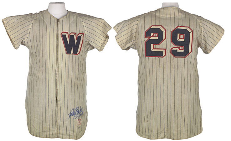
From 1956 to 1958 the Washington Senators utilized what came to be known as the “3D” uniform. These jerseys featured an ambitious and innovative design, with the front “W” insignia and back numbers rendered in block-shadowed type. The design was scrapped after 1958, and very few original examples survive. As was frequently the case with MLB uniforms at the time, many of the original jerseys had the logos and numbers removed and were then re-used in the minor leagues.
So what happened to those numbers that were removed? Some of them occasionally show up on eBay, and I recently bought four of them for my personal collection: a 1 worn by Eddie Yost; a 4 worn by Ken Aspromonte; a 6 worn by Albie Pearson; and a 30 worn by Whitey Herzog and Faye Throneberry [click to enlarge]:
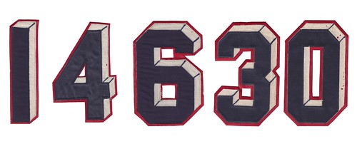
These numbers weigh twice as much as traditional numbers from the same era. Though they do show some material loss, they are all in generally good condition.
If we take a closer look at these numbers, something unusual becomes apparent: The bottom red layer and top blue layer are both tackle twill, but the cream-colored center layer is the same flannel material that formed the body of the jersey [click to enlarge]:
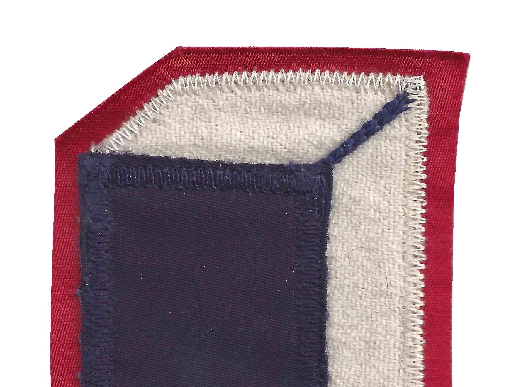
[As an aside, I’m also fascinated by the diagonal strokes that form the “block” effect. From a distance, or when the photos are viewed at a small size, these strokes almost look like they were drawn on with a marker. Up close, however, it turns out they were done with chain-stitching! It’s particularly interesting to see how the chain-stitching connects to the lockdown stitching on the back of the number. ”” PL]
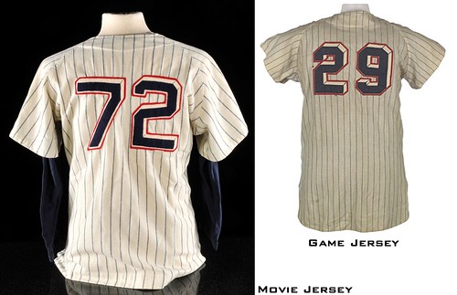
Although the 3D uniform was worn for only three seasons, it lives on in the world of cinema because it was featured in the 1958 Warner Bros. musical Damn Yankees. The uniform numbers can clearly be seen in the “Shoeless Joe from Hannibal Mo.” scene:
Here’s an auction listing for one of the jerseys used in the movie. If we take a closer look, we can see that they did a reasonably good job of replicating the numbers but were not 100% true to the original [click to enlarge]:
Whether on the field or in the movies, the Senators’ 3D design is unique. I hope you’ve enjoyed this closer examination of it.
———
Paul here. Excellent stuff, David — thanks for sharing it with us.

Podcast alert: Last Friday I was interviewed for a podcast on the excellent design site Core77. The interviewer, Don Lehman, asked me about the Super Bowl, the Olympics, and lots of other uni-related stuff. If you’re a regular reader of the site, and/or if you’ve heard me before on the radio, a lot of what we covered in this podcast will probably sound pretty familiar. Still, if you’ve ever been dying to hear me talk for an hour solid, now’s your chance.
Collector’s Corner
By Brinke Guthrie
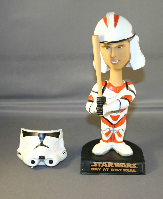
Now that football season is over, it’s time to look forward to baseball, beginning with one of my favorite bobbleheads ever, the Buster Posey Star Wars Clone Trooper from last season. The front of the helmet is held on with magnets — it pops off so you can see Posey’s face. Got mine right next to my computer, along with my other favorites — Jerry Garcia and Carlos Santana. (His plays “Black Magic Woman.”)
In other finds:
• Take a look at these 1970 NFL Topps mini-posters!
• Here’s a nice-looking vintage Vancouver Canucks yo-yo. The eBay listing says ’60s but it’s gotta be at least 1970 at the earliest.
• Here’s the perfect shirt for long-suffering Cubs fans: “I have two favorite teams: the Cubs and the team that’s playing the Cardinals.”
• Here’s an unopened package of 1970s NFL Magnetic Note Holders. “Collect all 26 teams!” The same seller also has a set of AFC/NFC magnetic standings boards.
• Hope the art director for this 1975 Derek Sanderson socks ad won a prize for it. “I tried to think of a funny comment to attach to this link, but words fail me,” says reader Jake Elwell, who submitted this one.
• If I am not mistaken, that is also Mr. Sanderson at top left in this set of 1970s Bruins color portraits, no?
• This 1970 Vikings medallion is very cool.
• Atlanta Braves fans, you simply won’t find a better parka anywhere than this quilted, full-zip hooded version by DeLong. Here’s another Braves jacket with back-in-the-day styling c/o Starter.
Seen something on eBay or Etsy that you think would make good Collector’s Corner fodder? Send your submissions here.
Tick-Tock: Today’s Ticker was compiled and written by Garrett McGrath.

Baseball News: The Diamondbacks are going to wear digital camo on Memorial Day. … The Royals proved that they might be paying attention to current pop hits with their new 2014 slogan. … The Washington Nationals are all ready for spring training (from Tommy Turner). … The Scraton/Wilkes-Barre RailRiders (AAA Yankees) will be wearing a throwback jersey that honors three distinct eras of their history.

NFL News: Teams wearing white have won 9 of last 10 Super Bowls, and are now 30-18 overall. … Everybody’s favorite traffic-influencing governor passed off a symbolic hosting helmet to the governor of Arizona in Times Square over the weekend (from Jon Solomonson). … The NFL logo at midfield looked smaller than those in the past. Here is a comparison of the logo from Super Bowl XLV and the game on Sunday night. It is a few yards smaller on both sides and doesn’t stretch as far vertically either (cool observation, Jeff Flynn). … Here is an infographic about the big game, updated with the stats from Sunday (from Dave Bloomquist). … Some guy from an indie band made a portrait of Marshawn Lynch out of Skittles. I feel for the assistant or whoever actually sorted all of those candies by color (from Gordon Blau). .. The Buffalo Bills posted this picture to remind their fans that they might have something to cheer for and that the NFL has a ton of logos (from Ryan Mallon). … “I got this image from one of those history in photos type Twitter accounts. It said the Linda, Paul McCartney, and David Gilmour photo was taken at the the Knebworth Festival on August 21, 1976 during a Rolling Stones performance,” Clint Schultz says. “I grew up in Texas and I’ve never seen the Dallas Cowboys appear in green and red. The Dallas Cowboy player who wore No. 56 was Hollywood Henderson, who was only a rookie in 1975. A simple search turned up another image of the bootleg Cowboys shirt being work by The Who’s Keith Moon. It seems odd that Hollywood Henderson is all mixed up the the most legendary British rock bands of all time (and a color blind bootleg screen printer).”

College Football News: Miami Athletic Director Blake James confirmed that the university will have an updated look in 2014, though the design is not finalized. “I don’t want to stir up the fan base and say we’re going to come out and look significantly different,” James said, “but I’ll say our look even better next year than this year.” Sounds like the green, orange, and white are staying (from Bryant Grosso). … The University of Kentucky ran this uni-inspired commercial during halftime of the SB in their local region (from Jeremy Baker). … Grambling State unveiled a bold new look.

Basketball News: With David Stern’s retirement and Adam Silver’s ascension to the commissioner’s chair, the NBA is now using new balls with Silver’s signature. … In one of the more bizzare SB ads, Chrysler featured a short clip of Julius Erving wearing a No. 6 jersey, even though the footage pre-dates his time with the 76ers. I found original footage from the documentary Doin’ It In The Park where you can see that the Adidas logo was removed and the No. 6 was added. That being said, nothing will ever beat this scene from The Fish That Saved Pittsburgh where the Doctor dunks for his date (thanks to Greg who runs a Dr. J website for pointing this out).

Grab Bag: Former Fed Chair Ben Bernanke’s going-away party was baseball-themed and had baseball cards featuring his image (from Robert Silverman). … Fifteen American artists designed track suits in response to Russia’s anti-gay legislation (thanks, Phil). … The Prime Minister of New Zealand wants to remove the Union Jack from the country’s flag.
And now, on a very serious note: I recently heard from a longtime Uni Watch reader who, unfortunately, is suffering from a very serious illness. He had a request, which I’ll let him explain in his own words:
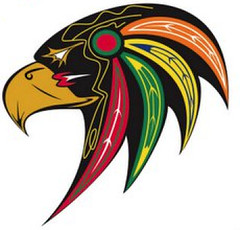
My disease is progressing faster than I would like, and I’m thinking ahead toward funeral options. If I am to be buried, I’d like it to be in a jersey, and I have thought about maybe doing a sweater based on this Blackhawks logo, which was linked on Uni Watch last summer.
I’ve received the designer’s permission to use the logo in a real project, but my DIY skills and health are not up to par to execute such a project on my own. Do you have any suggestions as to who I might contact for assistance? I know it’s kind of morbid, but I’d love to be able to wear that design in my casket.
Wow.
If there are any DIYers out there who’d like to help this reader with his project, please shoot me a note and I’ll put you in touch with him. Thanks.
You wouldn’t want me to DIY that onto any jersey you’ll be wearing for the rest of eternity, but I’d be willing to chip in $5-10 bucks to whoever IS willing/able to do just that! Godspeed to you, whoever you are.
I’m with Jim above, happy to contribute to a fund. Just an amazingly special request and very courageous.
Hate to even post another subject, but I suppose the show goes on…
Grambling won’t dedicate resources for mold remediation in their locker rooms, but they’ll engage in uni-shenanigans? What in the world?
PS, The Fish That Saved Pittsburgh is the second best hoops movie in the history of ever! (behind Hoosiers)
One on One
Robby Benson
I would also donate to help make this happen. Does someone here with connections have the ability to start a site?
It is a few yards smaller on both sides and doesn’t not stretch as far vertically either (cool observation, Jeff Flynn).
Hate to be the turd in the punch bowl this morning, Paul.
Never apologize for pointing out an error, Walter. I’m thankful for all such corrections. Will fix text now.
Re: Size of NFL logo.
Unlike past Super Bowls, the NFL logo was not a replacement for the logo that usually appears on the field. Because the Jets and the Giants share MetLife, they decided to use the NFL logo as the mid-field logo for all games. (Too hard to change out the logo when the two teams have home games that are played, e.g., Sunday and Monday night.)
So the NFL just left the logo alone, rather than painting a new one.
Good call Seth, you beat me to it. Exactly right.
And, btw, David Gilmour, not “Gilmore.”
Yah. That was pointed out to me too, twice, when I posted that same image on January 26th (in the Grab Bag section, next to last item).
I guess it’s an easy mistake to make, although as a huge Floyd fan, I have no excuse for making it.
Sorry for that double-post. Even if Garrett (who compiled today’s Ticker) didn’t realize it had already been posted, I should have caught it when editing Garrett’s work.
Oh, please. When I do the weekend ticker, I know I must be duping something YOU posted — and there is a LOT more new info today, which is awesome!
Seeing as we’re double-posting, I’ll re-post a link to the original article which has a larger comparison photo of Gilmour and Moon: link
Sanderson, Bucyk, Eddie Westfall and Ted Green, going clockwise from top left
Those Senators’ uniforms have long been favorites of mine. Perhaps they are responsible for the esteem I have for 3-D lettering styles.
I love ’em too. Shame they were so short-lived, but I suppose they were too expensive to produce.
On a non-sports-related note … I was driving by a Toyota dealership a few days back, and noticed vertical signs (like the ones linked to below) on the side of the road. Luckily, I was stopped by traffic long enough to be impressed that they don’t need to use super-thick fabric, or worry about letter bleed-through on a two-sided flag, as the uppercase Toyota logo in that format is perfectly symmetrical!
link
It sort of looks like the Hyundai works as well. Nissan…not as much.
Hyundai is close … but only because they cheat with the “n”!
…and the “D”??
Well, as I said, Hyundai CLOSE, but not as close as you’d think … the U, N, D, and A are ALL ever-so-slightly non-symmetrical, in the font they use.
link
Re: the Derek Sanderson sock ad in Collector’s Corner–so THAT’S what you look like after you get run over by the Zamboni? Shades of Eddie LeBec….
White-wearing teams have won 30 of the 48 Super Bowls. If Dallas and Washington hadn’t had some nice runs, I’m guessing the number would be more balanced. Of course, that’s not taking into account years they would be designated the away team and worn white anyway.
Or the years they were forced to wear blue and may have lost early on.
I know SB V was one of those years.
That was the only time they wore blue.
If my calculations are correct, teams wearing white would be 27-21 if Dallas, Washington and Pittsburgh (in SB 40) had worn their darks as the designated home team instead of their whites.
The only time that the ‘Skins wore white and won the SB as the home team was in SB 17. As for Dallas, the only time this was case for them was their victory in SB 27.
Is it “forced to wear blue”? Is there a chapter-and-verse quote for that, or merely tradition?
A quick search showed Dallas in white and Buffalo in blue for both of their back-to-back meetings in XXVII and XXVIII.
Buffalo v. Washington and Buffalo v. NYG kept to the dark jersey for home, but Washington was the “away” team in that meeting.
(PS It took me far too long to realize that the NFC (or NFL) team is the “home team designee” in odd-numbered SBs, which also means odd-numbered years.)
“Is it “forced to wear blue”? Is there a chapter-and-verse quote for that, or merely tradition?”
~~~
In the early years of the SB, yes. The home team wore dark — there was no “home team decides” option. Not sure when that changed, but it didn’t last very long. That’s why you had a Cowboys (in blue) vs Colts (in white) for SB V. (Doing this from memory). A few teams (Cowboys, ‘skins, Steelers) have chosen to wear white as the home team; we’ve yet to see a team wear white to FORCE another team to wear color (as I always hoped someone would have done to the Cowboys).
Usually, the home team will select color, since that’s what they traditionally wear at home, but not always.
Dallas was actually “forced” to wear blue (color) in SB V though. As I said, the rule has since changed to permit the home team to choose color or white.
Thanks for the reply.
Super Bowl XIII (1978 season) was the first time that NFL allowed the home team to chose jersey color as opposed to making the home team wear dark. Of course, the Cowboys were the NFC Champions that very season and immediately invoked the new rule.
Then too, in Super Bowl XX (1985 season), the Patriots had worn white at home the whole season and decided to wear DARK as the home team on their way to getting slammed by the Bears.
I hung up my sneakers long ago and I have little interest in the basketball today, but that documentary, Doin’ It In The Park, looks like it could be really good.
I’ve always thought of those Senators numbers and insignia as “battleship,” not “3-D”. But either way, they’re the Senatoriest of Senators uniforms. Fun idea, but they got the on-field execution exactly wrong. Ship hull lettering, which in those years would have been familiar to everyone in the game and the rooting public, have shadows that drop down and to the right:
link
Thanks for the detailed look at this great bit of history!
Let me help ya out.
Thanks! I just went to bitly to make this: link
Posts like today are why I love this site. Fun post!
Thanks, Steve. All credit to David Firestone for this one, but I had as much fun editing it as you probably did reading it!
Had a lot of fun writing it!
I had never seen the Posey bobblehead before.
That is….is….just the nerdiest baseball thing ever.
Top of my must have list.
Haha, it looks more like the actor Jon Heder to me: link
Looks like that link won’t work, try this one:
link
Posey bobblehead for comparison: link
I hate to say it, but the Seahawks Nike-forms are growing on me. That reality hit home when I was looking at the ‘Hawks uni-retrospective this weekend. The all gunmetal look was not a favorite. The white jersey over the navy pants looked relatively slick in comparison.
I agree. White over navy look is really sharp. I like their “Wolf Gray” as well.
And dammit, that neon green is a really good look, against the navy or the gray. Perfect for a team from Seattle.
When I saw the ticker item about the Scranton/Wilkes-Barre jersey honoring “three distinct eras”, I thought “nice idea, but that’s probably not going to look very good.”
And I was right.
Were you ever!
If can’t find a DIY’er for the Blackhawk bird head jersey, there may be another alternative.
Don’t know if they are an authorized user of the hawk’s head logo, but if interested in a sublimated hockey jersey with the hawk’s head it looks like this place uses it on hockey jerseys:
link
Think I saw a display model at a local embroidery/screen printing shop.
That D-Backs monstrosity looks like a promotional give away. Have they confirmed the full blown camo for the field as well?
No. But there’s no way they’d give away that jersey on Memorial Day unless they’re wearing something similar.
I haven’t seen The Fish That Saved Pittsburgh but it has the greatest sports star cast list ever: Dr. J, of course, plus Kareem Abdul Jabbar, Butch Beard, Spencer Haywood, Connie Hawkins, Don Chaney, Lou Hudson, Bob Lanier, John Williamson, Cornbread Maxwell, Chris Ford and Norm Nixon, plus others. Plus Meadowlark Lemon and Jonathan Winters. Wow.
link
Yes, it is fantastic. Definitely available in full on YouTube.
There’s a lot of noise in the world, and the Internet seems intended primarily as a means of amplifying the most grating of it. There’s a lot of noise here, sometimes.
When I read something like the concluding entry in today’s post (call it “A Dying ‘Hawks Fan’s Last Request”), and you see the thoughtful and gracious responses, I feel deeply humbled. It’s touching to think that someone we know, someone who is suffering, has enough faith in the people who come here to ask their help in bringing a little light to his or her darkest time. And it’s inspiring to know there are generous and talented people here, who will make that happen. It helps me remember that there are great wells of decency and kindness left in world, that above the noise, there is much that is “noble and praiseworthy, and of good report.”
Thank you all, and Godspeed, you anonymous Hawks fan with impeccable taste in culturally sensitive alternative logos…
And how. Reading the email from that reader was one of the more humbling experiences of my life. Powerful stuff, and it really speaks to the strength of the Uni Watch community that someone would entrust this type of thing to us.
Even breweries are getting in on repurposing the MLB logo:
link
Those Grambling jerseys are not real. Grambling is sponsored by Russell(as is their entire conference) and those jerseys are on a nike “pro combat” template. Besides, there’s no way a struggling athletic department could afford to outfit a football team with so many new jersey combos.
In regards to the Royals’ slogan: According to the latest SI, Lorde drew her inspiration for the song “Royals” from a 1976 photo of George Brett being surrounded by autograph-seeking fans. It sounds likely that the slogan is a reference to the song. I wouldn’t be surprised if we see Lorde throw out the first pitch at Kauffman Stadium sometime this season.
She tweeted something like “I thought the world series and the super bowl were the same thing” this past Sunday!
Slight chuckle when I saw those helmet magnets in the collector’s corner.
At my old house, every football season I’d put those up on the fridge, much to the chagrin of my wife and keep them in order of the standings. I’m pretty sure they’re packed somewhere away “lost in the move” I suppose.
Just last week, I feel asleep on the couch and had a dream that my niece was making me eat them and they were getting stuck in my throat. I woke up in a coughing fit.
Willing to chip in as well.
Those senators unis are fantastic and so much better than the current ones. The current sens jerseys have no flow, the number font is so clunky in contrast to the script “W”
It appears Ovi has the end of a jersey sleeves sown onto his elbow pads. Must be how he combats the no pulling up the sleeves rule. Seems odd, but it’s Ovi.
In the WB/Scranton ticker note, there’s a typo. Scranton is misspelled as Scraton.
Just want to wish the “DIY Blackhawks” guy well, and hope he gets what he wants for his final preparations. I don’t have any experience in doing such things, but if you haven’t already, try calling Hawks Quarters or something local and ask what it would cost to get it done. Take care.