Click to enlarge
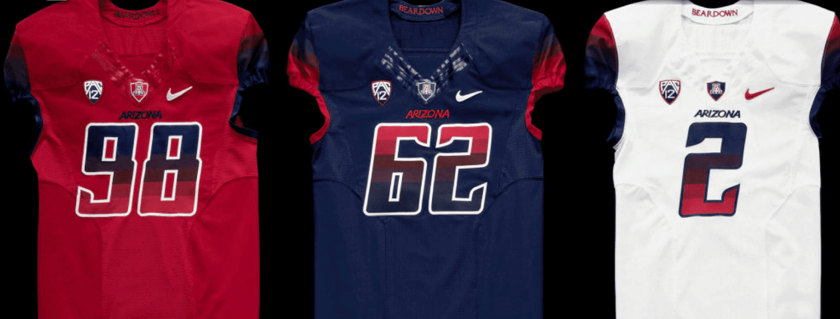
Arizona unveiled new football uniforms yesterday. As you can see above, the most interesting thing about them (not to be confused with the best thing about them) is that the numbers and sleeves have a color gradation, sort of like the Astros’ old tequila sunrise uniforms. You can see more photos here.
Leaving aside the question of whether the gradation is a cheap gimmick (it obviously is), don’t these numbers violate the NCAA’s new rules about numbers having to contrast with the background color of the jersey? The lower portions of the numbers on the red and blue jerseys would seem to fail that test, no?
[Update: Shortly after posting today’s entry, I received an email from reader Kenny Abbey, as follows:
They received a waiver from the NCAA to have those numbers. If you remember, I e-mailed you awhile back saying that the unis were to be unveiled around the middle of April. It turned out because of the new rule UA had to file a waiver to be able to have the gradient numbers, because the uniforms were already made & in UA’s possession before the rule was made, which delayed the uniforms being shown. We were granted the waiver to have the numbers this year, but I’m not sure what will happen with them for the 2014 season, when the rule goes in to effect.
So there you go.]
To see more, check out this video:
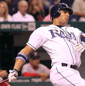
Follow-up No. 1: Yesterday I wrote about Astros first baseman Carlos Peña’s armbands and mentioned that he had also worn armbands while playing for the Rays. That prompted a note from reader Cork Gaines, who runs the excellent Rays Index blog. Here’s what he had to say about Peña:
Peña actually changed his armband pattern every few games with the Rays last year. For the most part it was something we tracked casually (“Hey, look, he’s wearing white now”). He wore a different-colored undershirt with each of the Rays’ four different jerseys, so I assumed at first that there was a pattern, but I tracked it for the first two months of the season and there was no obvious pattern. So I chalked it up to how well he was playing. If he was playing well, he’s keep the same armband format for a week or so. But as soon he had a bad game, he switched it up.
In the first two months, he had a 14-game stretch with the same pattern, and an 11-game stretch. However, he also had a bunch of stretches where a pattern only lasted two or three games.
Also, how he created the stripes varied. Sometimes it was two bands with space between. Sometimes the two bands were pushed together which made it look like a single thick band. And other times he wore one thin band on top of a single thick band.
Attached are his banding patterns for those two months with all his combinations in chronological order [click to enlarge]:

Note that on Mother’s Day he wore pink. There was also a stretch of three games in which he didn’t wear undersleeves but still worr the armbands. And finally, there was one game that he didn’t wear arm bands. During that game, Pena wore a protective shield on his elbow while batting. Only time all season I recall him wearing the shield. And it was also the only time I recall him not wearing the armbands, even in the field.
Good stuff — thanks, Cork!
Follow-up No. 2: Yesterday I asked if anyone knew anything about Sid Gillman pioneering the use of NOBs on football uniforms, as is claimed on the Wikipedia entry for Gillman. Here’s what I wrote yesterday:
[T]he first pro sports team to wear NOBs was the 1960 White Sox, and then most AFL teams ”” including but not limited to Gillman’s Chargers ”” followed that fall. I’ve never heard of this being attributed to any specific AFL exec and always thought it was one of many initiatives that helped differentiate the new league from the NFL.
That led to a note from longtime reader/pal Chance Michaels, who sent along the following passage from this recent biography of Bill Veeck:
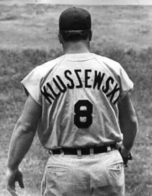
Another Veeck innovation, for which fans have been grateful ever since, was the labeling of players’ uniforms. As the [1960] season got under way, White Sox players’ last names were sewn onto the backs of their jerseys in sizable black letters ”” a radical departure from tradition that had been sparked by nothing more than Veeck’s noting that the increasing numbers of women coming to the ballpark wanted to know who the players were. Veeck had gotten the idea at a basketball game in Minneapolis, where he noticed that players had their names emblazoned on their warm-up jackets. When the newly labeled Sox played the Yankees in New York in early May, the spectators seemed amused that Ted Kluszewski’s name appeared with the letter Z sewed on backward. Overall the fans were quite taken with Veeck’s novel idea.
Veeck got an immediate call from an official of the emerging American Football League (AFL) who had seen a newspaper photo of the Kluszewski jersey and wanted Veeck’s blessing to make player nameplates an AFL rule, believing they and other innovations such as the two-point conversion would give the nascent league an edge over the National Football League, especially as it tailored itself to television. Veeck was toying with the notion of attracting an AFL team of his own to play at Comiskey Park and said the idea was fine with him.
Lots of great info in there, but it appears to confirm my belief that football NOBs were a general AFL thing, not a Sid Gillman thing. I mean, maybe Gillman is the “official of the emerging AFL” who placed the call to Veeck, but even so, it would still be a stretch to say football NOBs were Gillman’s idea. Maybe one of you Wiki-savvy types should go and remove that claim from Gillman’s entry.
Follow-up No. 3: In case you missed it yesterday, take a look at this:
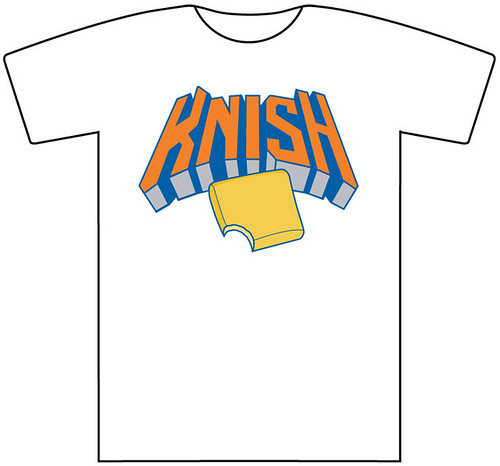
For further details, look here.
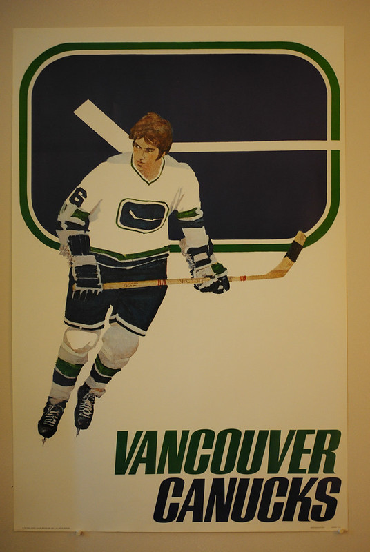
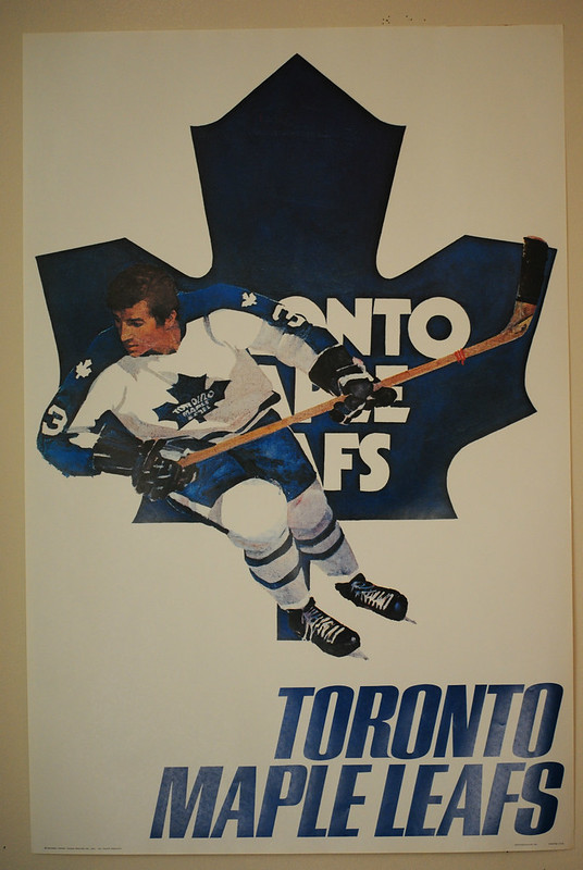
Collector’s Corner
By Brinke Guthrie
Want one of those 1970s NHL posters that are so popular here, like the two shown above? Found a bunch of ’em, along with some cool MLB posters. Go! Now!
Here’s the rest of this week’s featured items:
• Coke and the 1970 Padres — they’re the real thing. (Apparently the Expos were the real thing, too.)
• Speaking of the ’Spos, check out this funky little Expos decal.
• Volpe alert! How about a set of 1971 Indiana Pacers thermal cups still wrapped!
• From reader Nicholas Schiavo, here’s a great miniature Mets bullpen buggy!
• Here’s a new one, at least to me: 1960s-1970s Adidas hockey skates. [Wow. I have to say, I really like that design. ”” PL]
• Remember those 1970s team rulers? Had a Reds one. This 1970s Sprite promo model is for the Astros.
• Here’s a 1970s Cricket table lighter decorated with American League logos of the time.
• Figured Paul would be intrigued by the weird sleeve inserts in this vintage football jersey of unknown origin. [Good call, Brinke. I like! ”” PL]
• Finally, Scott Hord sent a note relating to last week’s Collector’s Corner:
I saw your link for the Roger “Skipper” Staubach poster on eBay and it reminded me of a shirt I had as a kid that my mom got me. I believe it was from Sears, and it had a pic of Bob Griese (glasses and all) and the words “Cool n Easy Bob Griese.” It was a light gray shirt and I cherished it as a kid, ’cause it was tough to find Dolphins items in the middle of central Pennsylvania. Seeing that Staubach link made me do a search on eBay for Griese, and sure enough, they have a poster in the same style as the T-shirt.
Seen something on eBay or Etsy that you think would make good Collector’s Corner fodder? Send your submissions here.
Uni Watch News Ticker: The Redskins have posted an interview with an Inuit chief who says he’s fine with the team’s name (from Patrick M. O’Neill). … Meanwhile, a DC sports radio host says politicians who’ve advocated for the team to change its name should be voted out of office. … The Packers will be wearing their throwbacks this fall. … The Maple Leafs hosted their first playoff game in nine years last night and wore their throwbacks for the occasion. … The Rangers created a blue-out last night by draping blue T-shirts on the seats (from Robert Silverman). … The Spurs wore their gray alts last night, creating a color-vs.-color game against the Warriors — if you count light gray as a color, that is. … The Boston Canons (MLL) had mismatched helmet designs the other day. “The one on the left is a Cascade R with a Sandy Hooks memorial decal, a U.S. flag, and two unidentified helmet stickers worn by Chris Boland,” says Rob Stukenborg. “The one on the right is a Cascade Pro 7 with no helmet stickers worn by Paul Rabil.” … Here’s a pretty enjoyable article about the USFL. Key passage: “Because the league struck equipment deals with grade-C companies, the players were stuck with Pop Warner-esque helmets and clunky Pony shoes. ‘God, those Ponys were awful””wearing them was like walking on the moon, they were so heavy,’ says [former New Jersey Generals noseguard Tom] Woodland. ‘Nobody was happy about that'” (from Brice Wallace). … Reprinted from yesterday’s comments: Here’s a ranking of the NHL playoff series by uniform. … If this jersey is legit, it’s one of the most unusual FNOBs we’ve ever seen (big thanks to Eric Stangel). … Jaromir Jagr was once again practicing in shorts and a pom-pom hat yesterday. Guess that’s his new look (from Mark Kaplowitz). … Check out the awesome outfits worn by the guys who’d just broken the 24-hour roller skating record 100 years ago (nice find by Jeff Ash). … Dan Cichalski won this game-used Notre Dame baseball jersey at a charity auction. “The listing said winners had the option of having the player or the entire team autograph the jersey,” says Dan. “I didn’t plan on either, but then today I got an email that said: ‘Congratulations on winning #20 Charlie Markson’s game-worn throwback jersey. Due to NCAA regulations, the jersey must be multi-player or team autographed. Please let me know which of the below options you prefer: (1) Have the team autograph the outside of the jersey. (2) Have two players autograph the outside of the jersey. (3) Have two players autograph the inside of the jersey.’ That’s news to me!” … The newest Korean baseball team will be called the Wiz. “I think the last Wiz in sports was the KC Wiz in ’96, before they changed to the Wizards,” says Dan Kurtz. ”¦ Speaking of team names, I love this: a high school team called the Cavemen. “That’s in honor of the Mount Timpanogos caves, which honeycomb the nearby mountain and were being touted as a tourist destination at the time of the school’s opening in the 1920s,” explains Cort McMurray. ”¦ Check this out: Redd Foxx, Eddie Murphy, Sidney Poitier, Bill Cosby, and Richard Pryor — a veritable Murderer’s Row of black film and comedy talent — in softball uniforms. “This would appear to be from 1990, when Ghost Dad came out,” says Scott Crawford. ”¦ Check out this completely awesome Pitt logo photo (big thanks to Phil Johnson). ”¦ Entertainment Watch: Saw the Ricky Jay documentary, Deceptive Practice, on Sunday night. It includes a brief glimpse of Jay wearing a softball uniform. Also, saw a tremendous triple-bill rock show last night: Tweens, Parquet Courts, and the Breeders. Nobody was wearing a jersey.

Larry Michael is the teams pxp man, so not exactly neutral.
He is a hawk harrelson level homer.
Used to be you’d turn down the sound on the TV and turn up the radio with Frank, Sonny and Sam. When Danny dumped Frank Herzog for Larry “The Homer” Michael is when I stopped listening to the games on the radio.
I moved away from DC before Frank and Sonny and Sam left the radio, but we always turned the radio on and sound on the TV down.
San Diego High School’s teams are known as the Cavers: link
Mishawaka High School in Indiana is the Cavemen also. I don’t know if I’ve seen them use that on a jersey though. I’ll send a photo if I find any.
Also the Hannibal Cavemen, a summer college baseball league team out of Hannibal, Missouri. link
On behalf of all people who are descended from cavemen, I find this use as a team nickname offensive.
Eric Stangel just needs to find the corresponding Doug Widell jersey.
Indeed. The style looks legitimate to me for the FNOB; the “AVE” and “OUG” were much smaller than the D and WIDDELL.
I’d heard about the Harlem Nights v Ghost Dad softball game, so I’m psyched to see the pic.
IFC has this to say about the game:
[T]here is an amusing behind the scenes story that when Bill Cosby, who was making “Ghost Dad” at the time, led the “Ghost Dad” cast and crew to victory against the “Harlem Nights” squad at softball, Murphy told the rival team, “We’ll beat you where it counts – at the box office.” They did, taking in $60 million vs. “Ghost Dad”‘s gross of $25 million, though neither set the world ablaze.
I was confounded as to why cinema great Sidney Poitier was in a Ghost Dad uni. He actually DIRECTED it! Wow. I had no idea he was invloved with such a stinker.
“Murders Row of black film and comedy talent”…
Too bad they all struck out with these films…
Harlem Nights was no stinker … “I’ll shoot you in your pinky toe.”
Still a cool pic – and it is worth it to zoom in close enough to see Redd’s tat…
Now we know why Red Foxx always wore a long sleeve shirt in “Sanford and Son”.
oh great, all I had to see was the words “Sanford and Son” and now that theme song is running through my head.
Bum-bump-ba-BAH-da-bump, Bum-bump-ba-BAH-da-bump, Bum-bump-ba-bah-da-bah-da-bah-da-BUMMMM…. bap-pa-BAH-DA-BAH-DA-BUMP-BA-BAAAH!!!
Just received an email from Kenny Abbey regarding the Arizona uni numbers:
“They received a waiver from the NCAA to have those numbers. If you remember, I e-mailed you awhile back saying that the unis were to be unveiled around the middle of April. It turned out because of the new rule UA had to file a waiver to be able to have the gradient numbers, because the uniforms were already made & in UA’s possession before the rule was made, which delayed the uniforms being shown. We were granted the waiver to have the numbers this year, but I’m not sure what will happen with them for the 2014 season, when the rule goes in to effect.”
I’ll add this to the text now.
The Dave Widell jersey was from the brief period when his brother Doug was a teammate on the Broncos. IIRC that was about 1992 and Dave was a starter while Doug was a backup. Good thing neither had a longer first name.
This photo was apparently posted on Uniwatch in the past.
link
Didn’t Dave Brown have his NOB in the exact same format when with the Giants?
Mishawaka, Indiana High School teams are also the Cavemen.
Cavemen looks better ‘cross a jersey than Spelunkers. Although Spelunkers is a much funner name!!
I’d take both of ’em over Lightning.
Hurley Midgets, Watersmeet Nimrods, Ishpeming Hematites, Houghton Gremlins (all Michigan U.P./Northern Wisconsin school nicknames)
I wanted to buy a Nimrods sweatshirt at a gas station in Watersmeet a couple years ago. Sadly, the largest size they had in the store was a medium and I was a full-on XL at the time.
Brush Beetdiggers (occasionally mispronounced rather hilariously as Digbeeters which sounds like something rather worse), Ft. Collins Lambkins, Rocky Ford Meloneers and Alamosa Maroons (now Alamosa Mean Moose) are some Colorado favorites.
Montevideo Maroons and the ever-original Elkton Elks.
Amazingly, there’s a “Beetdiggers” in Utah, too. The Jordan High Beetdiggers have a farmer mascot. He’s on one knee, hacking away at a freakishly enormous beet, with what I can only assume is a beet digging implement.
Texas has some good mascots, too. The Itasca Wampus Cats and the Texas City Stingarees are two of the better ones.
There was a semipro football team called the Hartford Charter Oaks, which usually came out as “Hartford Artichokes”.
That’s a fun one for headline writers, not that the New York Post covers that much semipro softball.
Scottsdale Community College is known as the artichokes. Their athletics website is actually link and they have lots of gear from their online bookstore link
I’m a fan of Arizona’s uniforms. Even the rule-breaking numbers. The whole thing looks very Arizona to me.
Be still my heart, I think I may have a new holy grail: the Harlem Nights softball jersey.
There was a pretty good murderer’s row of talent (James Earl Jones, Billy Dee Williams, Richard Pryor) in “The Bingo Long Traveling All-Stars and Motor Kings” … and with better uniforms!
Hey, Lando Calrissian and Darth Vader! “I am altering the deal. Pray I don’t alter it any further.”
Larry Michael is some sort of media VP with the Skins. One of his first decisions was to fire beloved play-by-play man Frank Herzog. Michael then named himself the play-by-play announcer. His play-by-play is as eloquent as his defensive of “Redskins”
Herzog = “Touchdown…Washington Redskins!”
“Moving left to right on your radio dial.”
Larry Michael is a despicable, lying, no-class POS. I worked with him on radio a few times, many years ago. F*** him.
Sweet! Libel IS allowed on Uni-Watch!!
I don’t think that word means what you think it means.
libel defamation by written or printed words, pictures, or in any form other than by spoken words or gestures.
For speech to qualify as libel, it would have to be knowingly false. Descriptors like “despicable” and “no-class” and “POS” cannot be verified one way or another. I suppose “lying” could be challenged, but GZ would merely have to show that Michael has lied at some point.
Otherwise, negative opinion, however insulting, is not defamation.
The “DC sports radio host” you are talking about works for the Redskins. He does the play by play for the games, hosts TV shows produced by the team. His name is Larry Michael, and he is one of the most hated media personalities in Washington D.C., at this point possibly second only to Mike Wise. Seriously, at one point they did a poll at the Post, on Michael’s popularity rating among DC sports fans, and it was below 20%.
Also, ESPN 980 is owned by Red Zebra Broadcasting, which is owned by Danny Snyder, who just happens to own the Washington NFL team.
Another interesting note here is that Michael is speaking with Doc Walker. He is a former member of the Washington NFL team and a long time host on ESPN 980. I’m pretty sure he works the sideline for Washington NFL team games. I’m not positive this is still true, but for years he would not refer to the team by it’s full nickname. He would call them “the Skins” or the “Burgundy and Gold” but never their full name.
Yes Walker is on the side lines now. It sounds like they will have him replace Huff at some point.
The numbers on the Arizona uniforms look similar to the numbers used in the movie Rollerball (the original one with James Caan). …Futuristically gaudy.
I’m glad I’m not the only one that got that vibe!
Interesting article on the USFL’s New Jersey Generals… as well as the comment on Pony cleats. I remember wearing those during high school football — definitely clunky… as were the Starter cleats. However, in examining the first photo of Herschel Walker in the article, it appears he is wearing the signature 3-stripe Adidas. Perhaps this is a later photo?
If you look at this picture, you see Herschel wearing adidas, but other players wearing Pony. I’m guessing he got to opt out of wearing Pony somehow: link
Here’s another pretty cool item for collector’s corner!
link
Never trust a guy with two first names.
Except, of course, Clark Kent and Bruce Wayne.
Or John Wayne … pilgrim.
Larry David? Keith Richard? Adam Rich? Joey Lawrence?
Sirhan Sirhan
Especially Joey Lawrence.
Whoa!
The NCAA doesn’t allow for player autographed memorabilia to be sold by schools because the NCAA protects its student-athletes from exploitation by the school. But if the whole team signs it, then it’s exploiting the team, not just one player.
Makes sense to me.
NCAA also protects athletes by making sure the money goes to charity or the university, never to the athletes.
What a surprise to scroll down and be greeted by the lovely Canucks poster, with the original uniform and logo in all of its glory. (Too bad the photo is so washed out. Those posters are bright white.)
Meanwhile, I watched 5 minutes of the Spurs/Warriors game. I still think the Warriors new look is a mess, but what struck me most was the fact that Andrew Bogut was wearing black socks almost up to his knees. He looked….how should I put this? Maybe this is generational, but in my youth, isn’t this what your dad looked like before he put his pants on.
UA should stick with the solid blue helmets. I think those look sharp.
I’m not a fan of the red/red face mask at all
Agree on the red/red. U of A’s white helmet is one of few I like, but the copper is nifty and the blue works.
how is the knish feedback coming along?
All good food for thought….
What’s a knish? And why are these all based on New York teams? Surely you can do a “Seafood” mimicking the Seahawks, or “Clams” that resembles the Rams… Lakers as “Bakers”… the old Washington Bullets as “Buffets”…
link…
Inuit Chief? If you read the comments, his own uncle calls him a big fat liar, and some other guy explains how he isn’t who he says he is. Hilarious.
Publishing this article on the team’s website without doing a lick of research seems more offensive than the Redskins name.
Copied & pasted from the comments:
This is a message from “Chief” Stephen Dodson’s uncle…
“I’d like to clear some stuff up here. I’m Stephen’s uncle, he was raised by my brother, his eldest uncle, not his father. We are Aleut, not Inuit and he is 1/4, not full, as his mother, my sister, is only a half. Stephen isn’t a “chief” but in the Air Force that was his nickname, as it was my brother’s nickname in the Marine Corp. I’m not even sure Stephen has been to Alaska, to be honest about it all. I know my brother never went to Alaska while he was alive, none of my six siblings have, as far as I know. I have no problem with Stephen expressing his views or standing up for what he believes in, but let’s keep it honest. I don’t know if the person that wrote this interview embellished Stephens stats or what, but the truth is as I have stated here. Stephen is a good man, a great father and I love him as a son. I know my brother loved him as a son because he adopted him as his own when our sister wasn’t capable of taking care of him. I personally find the Redskins name offensive, but we don’t always agree on things like this. I know some Indians that aren’t offended by the Redskins name and more still that are. The fact remains that it is a racial slur and therefore wrong in my opinion.”
From the interview:
“… Dodson is a full-blooded American Inuit chief originally from the Aleutian Tribes of Alaska, and said he was tired of being spoken for as a Native American…”
I know a few things about the Arctic and its peoples. The Inuit do not do “chiefs,” do not do “tribes,” and do not describe themselves as Native Americans. They consider themselves — with reason — as a circumpolar civilization distinct from Amerindians. Many Inuit, especially older folk, can be a little snobby about it, and take pains to distinguish themselves from the Athabascan cultures, who do indeed describe themselves frequently as “indians” or “Native Americans” or (in Canada) one of the “First Peoples.”
I would guess that the Redskin apologist quoted in the (stupid) article is an Aleut.
Yeah, but who cares about such trivial distinctions? They keep telling us they’re RESPECTFUL and this is all about TRADITIONS!
I totally get the arguments for keeping the Redskins nickname, but holy shit, could the Redskins come up with any defense that’s not dumb, misleading or smarmy?
Glad to see the Packers are going to use the throwbacks again, but they need to use the helmet that Washington used with theirs.
So happy the Packers are wearing their throwbacks this year! I love the way they look, too bad they can’t use the pigskin-ish helmets used by Washington. That would be a good looking uniform!
That Pitt logo is one of the coolest human formations I’ve ever seen. I love how they packed more people on the edges to give it a definite outline with their faces, just awesome.
nice to see Arizona adding PURPLE to their uniforms. hahaha.
As an Arizona State alum, I support this comment. :D
Our black uni is ugly, but their set is worse.
More on the Packers: All Aaron Rodgers cares about is the pants!
link
One for the ticker: the Dali Lama wearing licensed hats and visors from the places he visits: link
Uh, the *Dalai* Lama, not to be confused with a South American camelid named after a Spanish surrealist artist.
Where did you see the show you spoke of at the end? I would love to see the Breeders.
Webster Hall, NYC.
As an Arizona alum, I am ambivalent towards the new uniforms. The issues that needed to be fixed with our previous uniforms seem to have been fixed, but I would have done it differently. Also, I’m not sure why we needed a new number font and I don’t see the need for the gradient.
That being said, I’m glad that the only extraneous color in the uniforms is the copper helmet. Yes, it is technically CFCS, but at least the color has a connection to the state, which is more than can be said for most schools that add BFBS or GFGS uniforms.
All in all, they could be better, but they could be so much worse.
It was link…
“I think the last Wiz in sports was the KC Wiz in ’96,”
I think I remember Moises Alou saying, ca. ’03, that he’d pee on his hands to keep them supple or whatever.
As long as we’re talking anniversaries: 25 years ago today…
link
“You fell, you fat pig. Have another doughnut”
I don’t mind the gradient on the Arizona numbers, but that font is atrocious. What is that, OCR-A?
link
Herschel Walker wore adidas his last year or two at Georgia, even though everyone else wore team-issued Spot-Bilts. Then Walker continued to wear adidas throughout his record-breaking pro career. Few realize that Herschel retired with the third most all purpose yards in NFL history, and the most ever all-purpose yards in pro football history.
Like the gradient accents on Arizona’s uniforms, but dont like how the numbers and the sleeves fade in opposite directions. To me, it creates a sun-up sun-down problem.
Has hockey just woken up from a 30 year slumber on the Island ? (what a loud building)