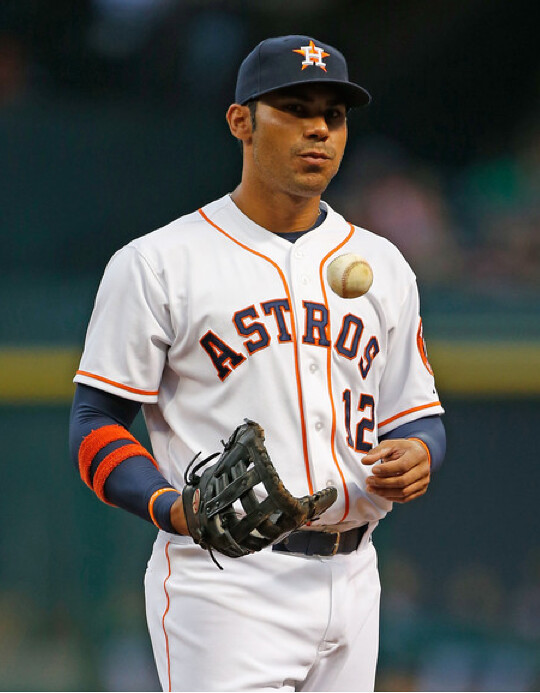
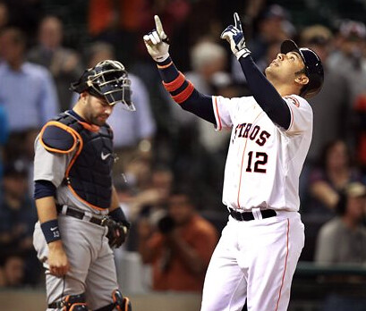
Last Thursday night I received a note from reader Don Gale, who wanted to let me know that Astros first baseman Carlos Peña was wearing a pair of armbands that created a very cool double-stripe pattern. I immediately loved the look — reminded me a bit of the Cubs’ old striped undersleeves (which, as you may recall, were revived two years ago for a throwback game).
I asked Don if Peña always wore his armbands this way, and he said he hadn’t noticed it before. So I did some quick photo research and discovered that the double stripes are indeed Peña’s visual signature. It’s a great look. How great? Let’s count the ways:
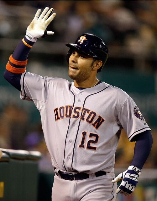
1. It looks great when he’s preparing to swing:
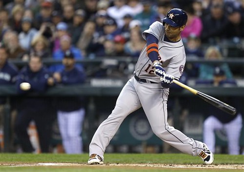
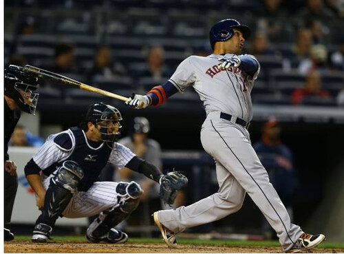
2. It looks great on his follow-through:
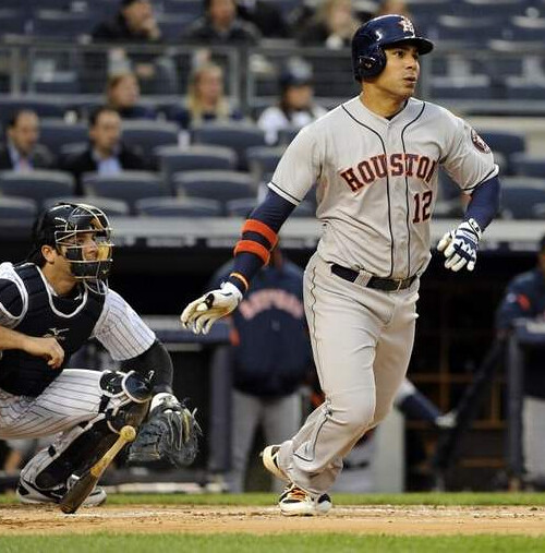
3. It looks great as he’s running out of the box:
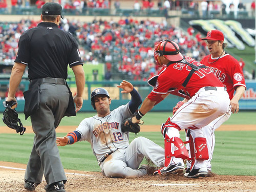
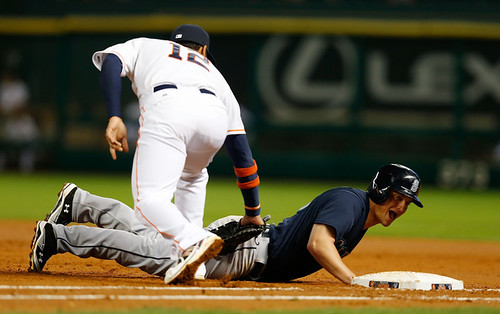
4. It looks great when he’s sliding:

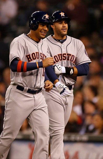
5. It looks great when he’s trotting back to the dugout after scoring a run:
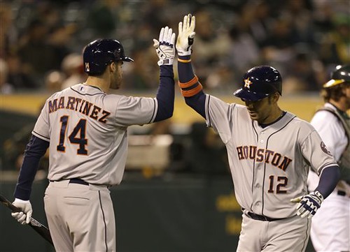
6. It looks great when he’s high-fiving a teammate:
7. It looks great when he’s praising the Lord:
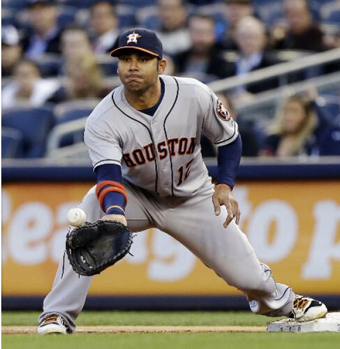
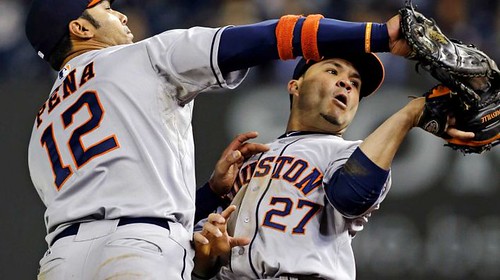
8. Out in the field, it looks great when he’s slapping a tag on a baserunner:
9. It looks great when he’s stretching for a throw:
10. And it looks great when he’s reaching to snag a pop-up:
That’s a whole lot of great! It turns out that Peña wore the double stripes when he played for the Rays too, but back then he also wore an armband and wristband on his left arm, something he no longer does now that he’s with the Astros. I also found a shot of him wearing what appears to be a single band on his right forearm during his time with the Cubs.
In short: Peña’s been doing this for a while, but somehow I’d never noticed. One thing I wonder about is whether he’ll keep doing it once the weather gets warmer. Like, does he always wear a long-sleeved undershirt? If not, will he still wear the armbands over his bare arms? And if so, how will that look? (My hunch: Not as good.)
Peña isn’t the first player to have a specific armband protocol, of course. Luis Castillo usually wore a big orange armband, and Nomar Garciaparra often wore red on one side and black on the other. (He also wore a little angel pin on his left armband, which was the subject of an ESPN column that I wrote back in 2007.) And there are plenty of additional examples.
But Peña’s armbands are definitely the coolest-looking of the bunch. Thanks again to Don Gale for pointing them out to me.
Research query: I was looking at the Wikipedia entry for Sid Gillman (shown at right) the other day and noticed the following: “Gillman also came up with the idea of putting players’ names on the backs of their uniforms.”
As you probably know, the first pro sports team to wear NOBs was the 1960 White Sox, and then most AFL teams — including but not limited to Gillman’s Chargers — followed that fall. I’ve never heard of this being attributed to any specific AFL exec and always thought it was one of many initiatives that helped differentiate the new league from the NFL.
Of course, lots of things on Wikipedia are wrong. And the Gillman/NOB statement doesn’t have a source citation. So I’m skeptical. But I’m also curious — has anyone else ever heard of football NOBs being Gillman’s idea? If so, do tell. Thanks.
Food for thought: As most of you are aware by now, over the past few years I’ve explored — just theoretically, of course — the visual intersection of sports and meat. With the Knicks enjoying their best season in years, I recently decided it would be fun to expand my sports/food parameters beyond the realm of protein. Here are the results (click to enlarge):
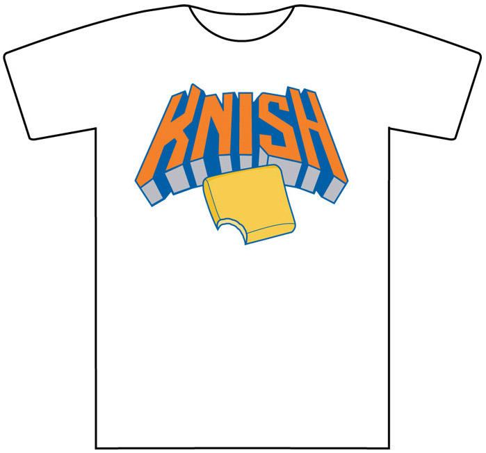
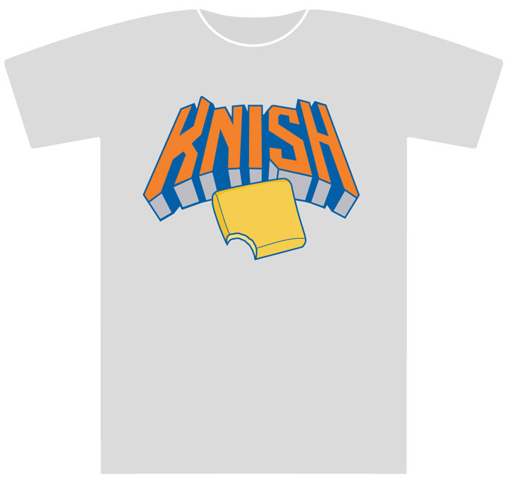
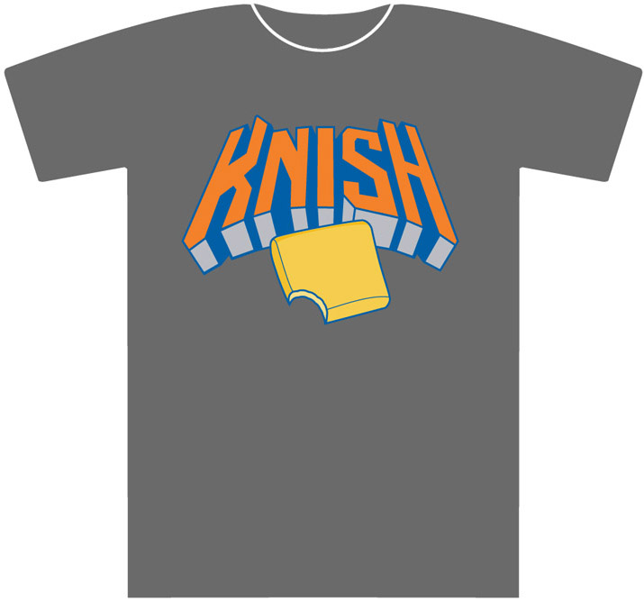
Not bad, right? These shirts have not been produced and are not for sale. They’re just digital doodles, fun little exercises. But if they were available — just hypothetically speaking, of course — I wonder how many people might be interested in them. Can I see a show of hands?

PermaRec update: The latest entry on the Permanent Record Blog is about an old film canister found in an antiques shop, which leads down an intriguing rabbit hole involving a 1970s teen exploitation film (the poster for which is shown at right). Check it out here.
OMFG: My latest One-Man Focus Group column is about the apostrophe catastrophe.
Uni Watch News Ticker: The changes to the Chargers’ jersey that we’d all observed — no more neck roll, two-color NOB lettering — have now been officially confirmed. … Last week it was reported that the Dallas Stars would unveil their new uniforms during the fist week of June. We now have a firm date: June 4, 7pm Eastern. ”¦ Rex Henry spotted an amusing pair of Ovechkin fans after last Thursday night’s Caps game. … John Cravaack was recently put in charge of creating the uniforms for his local youth football team, and he did a truly outstanding job. … Remember Logorama, the Oscar-winning animated short from a few years ago? It’s now the basis of a new book that showcases over 40,000 logos (thanks, Kirsten). ”¦ Bosox pitcher Clay Buchholz, accused of throwing a spitter, said, “Are they talking about the stains on my shirt? There probably are stains on my shirt, because I’ve been wearing the same shirt for the last three years.” It’s not clear to me if he’s referring to his jersey or his undershirt. ”¦ Athletic Club Bilbao went MNOB the other day — that’s mothers’ names on back (from Andrew Bassler). ”¦ Someone on craigslist is selling a pretty wild pair of Chicago Bears shoes (from Steve Jacobson). ”¦ Temple University has told a Canadian high school to stop using its logo. Further info here (from James Ashby and Kurt Esposito, respectively). … “I’ve watched a ton of hockey in my day,” says Chris Wautel. “I can honestly say I’ve never seen a center ice corporate ad before (or if I have, I never realized it). That’s the logo for Skoda, a European car company.” … New uni number assignments for the Titans and Patriots (from Jimmy Morris and Tom Adjemian, respectively). … New uniforms coming this summer for Virgin Atlantic Airways (from Mike Cooperman). … Notre Dame football coach Brian Kelly was on the radio recently, and the topic of the team’s Shamrock Series uniforms came up: ” If you didn’t like the shamrock, and the blue shamrock, if you didn’t like that one, you’re going to hate this year’s. It’s gonna be awesome. So I’m just getting you ready for it” (as transcribed by Warren Junium). … The Dolphins were mixing their new-logo helmets with their old-logo practice shorts at rookie minicamp the other day (from Frankie Parish). … In a related item, the Vikings are using their new helmets but their old practice jerseys (from Joseph LaFerla). … A long time ago, Mako Mameli sent me photos showing that the Raiders used to have shield-shaped yard-line markers. If you skip ahead to the 2:50 mark of this interview with Raiders special teams coach Bobby April, you can hear him lobbying for a return to those shields. I’m pretty sure the interviewer had no idea what he was talking about. … Renick Bowman has noticed an inconsistency in the Pacers’ uniform striping. As you can see in the highlighted area of that photo, the color sequence on the jersey striping, from left to right, is white-gray-gold, but on the shorts it’s gray-white-gold. Weird. … Mets reliever Robert Carson wore a BP jersey with a nickNOB prior to Friday’s game in Atlanta (from Robert Silverman). … Here’s a video showing how the Seattle Sounders’ equipment managers prepare for a road trip (from Kevin Corcoran). … The Brewers usually wear a solid-blue cap with their Friday throwbacks. But this past Friday they wore their BP caps. Still had the solid-blue batting helmets, though. … The Giants held Metallica Night on Friday, and they made Metallica/Giants caps for the band members (from John Muir). … The Hanshin Tigers are wearing a special uniform for “Ultra (urutora) Summer” home games in July and August. “The urutora and the spelling matches Ultra, and tora is tiger in Japanese,” explains Jeremy Brahm. … What’s worse than a Native American mascot? A testicle mascot. … Ryan Hertlein found something odd for sale: a David Wright Yankees jersey. … Here’s a color match-up you don’t often see: cream vs. white. That’s Vanderbilt in the cream throwbacks and South Carolina in white (from Gabe Ortiz). … Michael Orr notes that Ajax’s kit design works fine for shorter NOBs, but longer names present problems. … Jim Mullin has been working on a project to document every football helmt worn by Canadian universities since 1965. “Some are American copycats, some are inspired, and some are too unique for their own good,” says Jim. “In some cases, I’m sure that translating the Dead Sea Scrolls was easier.” … Here’s a video clip of AC/DC wearing Scottish soccer uniforms for a 1978 gig in Glasgow. “Even Angus Young ditched the schoolboy uniform,” notes James Ashby. … Scott M.X. Turner was watching Game 5 of the 1969 World Series and noticed that the orange layer of twill was missing for the dot on Frank Robinson’s “i.” ”¦ The Giants did the “Gigantes” thing last night. ”¦ Speaking of the Giants, all those boaters in McCovey Cove now have their own hot dog vendor in a kayak (thanks, Phil). ”¦ Cardinals fans were asked to pick their favorite uniform during yesterday’s game. Here are the results (from Paulie Sumner). ”¦ Love this old Shea Stadium postcard that Dan Cichalski recently scored. ”¦ Dueling cancer-awareness jerseys in an NCAA softball game yesterday: UGA wearing pink for breast cancer, LSU in teal for ovarian cancer (from Christopher Mycoskie). ”¦ Ryan Kessler of the Canucks broke his chinstrap last night and had to get a new helmet prior to a faceoff (from Dan Snider). ”¦ Here’s a look at the gear for the NCAA lacrosse tourney. ”¦ Alan Beam recently worked on a rebrand for the Grand Prairie Airhogs. ”¦ The Brewers and Cardinals wore 1913 throwbacks yesterday. Chance Michaels and Phil had a good preview of the game in yesterday’s entry, and they’ll have a more extensive breakdown on Saturday. ”¦ David Miller has ranked all 30 MLB logos and all 32 NFL helmets. ”¦ Oh baby, look at this amazing Eastside Beer baseball jersey, complete with a spectacular sleeve patch.
Call me weird, but I think having wristband-stripes on only one arm just looks silly. Wear them on both arms, or don’t bother.
…and David Miller needs to update his rankings to reflect the new Seahawks, Panthers, Jags, Dolphins & Vikings… and then not invalidate the whole thing by putting the Browns in the top 5.
You are weird, first off, and Pena gets to decide what he wants to do and why, second off.
That’s true, but at least he needs to get his facts straight. The 49ers did indeed “futz” with their helmet in the 90’s replacing the classic red/white/red stripe with black/red/black and also replacing their grey facemasks with red, before changing it all back again (for the better, by far) in 2009.
RISD has had a penis mascot for years. This is Scrotie. GO NADS!
link
Now that’s a serious case of blue balls…
Jeez. It’s not like I’m offended or anything, it’s just that I didn’t know that it was OK (in Providence, RI at least) to dress up as a giant reproductive organ. But I’m getting acclimated. “Scrotie” is good, “Go Nads” is hilarious. And I like the sperm-shaped S on the chest. OK, adjusting pretty well…
It’s just a shame that MIT is the Engineers instead of the Beavers. What? Dude, get your mind out of the gutter. Beavers, the North American mammal, are nature’s consummate engineers, animals that did more to synthetically reshape earth’s natural environment and ecosystems than any species prior to modern humanity.
Plus, as two quirky schools that have athletics programs more or less as a lark, RISD-MIT games would be epic.
MIT does use the beaver as a mascot/logo, even if it doesn’t use it as the “official” nickname.
link
link
link
“And I like the sperm-shaped S on the chest.”
~~~
NTTAWWT
I think Pena’s arm stripage would look better if his armbands weren’t quite so thick. I like texture, but this feels like a whole different dimension.
I’m with ya’. But it could be worse.
link
Good point.
Carlos also has a set of navy armbands:
link
I suppose he thinks that they look better with the rainbow alt than when the Astros wear the orange caps:
link
link
Never mind the arm stripe-age….
those Astros home unis are freakin’ GORGEOUS!!!
That orange piping…. wow!
-Jet
For a minute there, I thought Metallica had a new guitar player.
Those Metallica / Giants caps were actually a fan giveaway item at the game.
The Giants/Metallica hats weren’t just for band members – they were a stadium giveaway…
link
I could get used to those Brewer throwbacks real quick. Those look sharp.
Glad you liked ’em. I agree, but obviously I’m biased.
Yeah, I think they should wear them more often! Nice and clean, love them! I also like the look with the BP cap on top of the pinstripes.
Iowa baseball in GI Joe played Michigan in fine ’80s throwbacks. Can’t find a picture of that game right away, but both teams have used this look a number of times this season. You win some, you lose some.
The stripes are “correct” on the Pacers’ style guide, for what it’s worth.
They’ve been like that for the last 2 seasons, at least. I think when the new Rev30 unis were introduced it got fouled up.
More research is needed…
the shorts match the style guide, but the jersey does not.
They’ve been mismatched for a long time, I can’t say when but I saw a note about the mismatching of the uniforms several years ago, I want to say 2010.
Heck I think its even been noted on here before.
I think its an issue on the gold uniforms as well, maybe even the white ones too.
Pookie~Nookie, why the tilde instead of a hyphen? Did rpm sneak into the Mets clubhouse or something?
“… Love this old Shea Stadium postcard that Dan Cichalski recently scored…”
Wonderful.
Weekday props to Chance and the Brewers.
Watched a bit of that IIHF hockey tournament. Most annoying thing was the car parked in the corner. Put your ads on the boards (or at center ice if you really must) but the highlighted car in the darkened arena was such a terrible mismatch.
The car in the stands is nothing new. I’ve seen Skoda do that for years. I agree, it’s annoying.
Yeah and the Skoda logo was at the center in a 2011 IIHF event too.
WFWS – wristbands for wristbands sake. Pena’s don’t look great, they look dorky and pointless. At least they don’t have a manufacturer’s logo…
C’mon….wristbands are cool.
link
Enjoying Mr. Miller’s articles. I’m particularly amused by the Mega Man heads atop the football helmet article.
what’s with the links opening up in new windows? it always have popped up as a new tab. is it my end thats messy or yours?
hmm.. apparently just the beginning it was opening up in new windows. after this link (I also found a shot of him wearing what appears to be a single band on his right forearm during his time with the Cubs.), it returned to opening in tabs. *shrug*
Robert Carson is also appears to be wearing a previous year’s BP cap. Why are there Mets logos in the dugout if it’s in Atlanta? Is this photo from a previous instance of him wearing the Pookie~Nookie jersey?
I’m really surprised the Cardinals alternate jersey won in the Twitter Poll. I’m even more surprised that the Cardinals didn’t do a specific cap for that uni – even if it was just changing the STL to match the cream color of the jersey. I also wonder why the Cardinals never do a helmet that matches alternate or throwback caps (see Sunday’s throwback in MIL & Sunday home games as examples). Wouldn’t mind seeing the caps they wore on Sunday (or a version of them) as full-time road caps.
I’m not surprised: I went to a Cards Grapefruit League game in March, and it was almost unbelievable how many fans were wearing that new cream alt. It was easily the plurality of all Redbirds jerseys being worn, which is impressive for an expensive bit of merch that had only just recently gone on sale.
i like the arm bands. too bad about the pajama pants.
The guy that ranked the helmets used the Vikings helmet design last used in 2006.
He also has the old Seahawks helmet and comments on the old uniform. Not the most informed list ever.
The opening clip from this Youtube video about hockey pranks shows a NOB prank –
link
-Jet
Interesting that the Giants wore the “Gigantes” jerseys but didn’t sport the Sunday home game orange billed caps
The Albany Great Dane looks like Scooby Doo.
Rooks rike it’s rime ror a rawsuit…
I don’t know. It’s not like Albany is profiting commercially. Unless whoever Hanna-Barbera’s parent company is considers this trademark dilution…
I would also like to see the Raiders bring back shield-shaped yard-line markers. Loved them as a kid.
I imagine they would need approval from the league, which I presume is highly unlikely.
“As you probably know, the first pro sports team to wear NOBs was the 1960 White Sox …”
Not sure if others before this but the New York Americans (NHL) put names on the backs of their jerseys in 1926.
link
Paul – just want to let you know that I’m really enjoying the OMFG series. Truly.
Thanks.
Thank you!!
Holy shit am I out of the loop with the MLB.
Until Saturday, I had no idea that the St. Louis club had returned to wearing red caps on the road and now I find out that they’ve got an alternate uniform?
Someone please tell me that they’ve also ditched those idiotic bird-on-bat Sunday caps.
the higher powers in the organization are still undecided whether to wear blue or red hats on the road…they wear both, but have only worn blue once this season, and that was in Philly. As for the Sunday caps, that is still part of the kit, and will not be going away as the owners love it. I think they should use it with their third jersey instead of a sunday thing. or combine the two, and wear alternate unis and hats on sunday.
“The MLB?”
/pedantic
Sorry.
…teh MLB…
/fixed
Here’s Michael Waltrip’s helmet which he wore driving his Crimson Tide ride yesterday at ‘Dega:
link
On the AC/DC video:
Scotland in April 1978 would have been in an absolute patriotic frenzy over the upcoming World Cup in Argentina. Never before and never again were the Scots so sure they were going to win the Cup, especially because they had qualified and England hadn’t. Given that it was also the height of the Scottish National Party’s rise, a time when British Caledonian looked like the viable “Second Force” in Britain’s airline world, and a time when the slogan “It’s Scotland’s Oil” stood for the legitimate belief that Scotland’s North Sea reserves would make for a better life apart from Britain, it all takes on a very amusing historical context. Entirely plausible, then, that even AC/DC would get swept up in it.
Of course, the only legitimate musical use of that Scotland shirt was by Andy Cameron, singing his World Cup fight song on-stage at the BBC for Top of the Pops in front of a London studio kitted out in tartan:
link
From a Uni point of view, that was also the first Scotland shirt (and indeed the first Scotland team) that was extensively marketed. A valuable shirt today if you can get one, especially as at the time they were sold mostly as souvenirs for kids.
The definitive read on Scotland’s 1978 campaign is Graham McColl’s excellent “’78 – How a Nation Lost the World Cup”. Barring that, I’d recommend this summary by When Saturday Comes:
link
Great info. Thanks! Ah, European football in the 1970s. Sounds like someone ought to write a book tracing the experiences of Holland 74 and Scotland 78 against each other.
I’m not a big fan of teams wearing the spanish name on the front, but it’s whatever. I think it would horribly funny to see the Dodgers on the road wearing The Angels instead of Los Angeles as a spanish to english instead of vice versa….heh, too bad there’s already the angels in the same town..
I think it’s time to rename the Angels. They’re far too redundant for their own good.
how do you feel about the Phillies?
Nah, that’d be a terrible name for a team in LA. Plus, Phillies is already being used by an NL club.
Aside from the numerous MLB teams that wear Spanish-language jerseys 81 games per year, at least two teams wear Spanish-language jerseys every game of the season. And each just happens to be the team in its league closest to the Mexican border. Coincidence, or political statement?
[Kidding. It’s a fun coincidence.]
The Angels should be the Los Angeles Angels, because when the Rams played in the very same building, they were called the Los Angeles Rams. You take your name from the nearest metropolitan area.
California Angels.
Those Hanshin Tigers Ultra Summer uniforms are a huge improvement over their regular ones.
A month into the season and I must, I ADORE the Astros’ number font. It’s clean and bold but not clunky. First class job.
The number font is excellent. Had they gone with the Shooting Star wordmark on the home jerseys, Houston’s re-do would have been as good as Toronto’s was last year.
Agreed – so close, yet…
That horrifying testicle mascot brought to mind this old 45:
link
Am I the only one who thought Pena’s wristband look evoked the Human Rights Campaign’s Equality symbol? That was the first thing I thought, but he’s obviously been doing it long enough that he’s not making any statement other than a fashion one.
I wish someone would tell me why someone from Temple U. was looking at a Kelowna HS’s website. Who the heck cares if a tiny school IN ANOTHER COUNTRY is using something that looks like your logo. Concentrate on academics!
Because you run the risk of someone who’s not a tiny school IN ANOTHER COUNTRY being able to rip off your logo if you don’t go after the tiny school IN ANOTHER COUNTRY who uses something that looks like your logo.
Sadly, this is how the law works here, and this is how people try to work around it. It forces people with brands to protect them, rather than just letting the law protect them.
And, oddly enough, not everyone at Temple U. is or would be concentrating on academics, given most athletic departments are clearly demarcated from the school’s academic initiatives.
Ehh, I’d rather the entities protect their brands than ask the law to do so. There’s a simple fix charge them $1 a year to use the logo, you protect your identity and you are still within your legal right to go after anyone who is not a tiny school using your logo.
Georgia Tech does this with the Buzz logo that a lot of high schools like to use, however if you blatantly rip off the Buzz logo and/or name they will sue you. It’s why the Salt Lake City Buzz are now the Bees, while Sprayberry High School in Marietta, Ga (where The Blindside was filmed) retains the Buzz logo.
Haven’t gotten a pic yet, but Jonathan Papelbon has been wearing either a really dark navy or a black shirt under his jersey since spring training
Yikes those link are fugly. Also seems like the numbers on the dark ones could be quite difficult to read in a game.
My first thought was that the white trim would be quite helpful. I’d still have to wait for an actual game to say for certain. The basic font is all right (disregarding the gradient).
That David Wright Yankees jersey is another horrible example of a knockoff that’s proliferating in the jersey industry.
“It looks great when he’s praising The Lord”
That’s the funniest one.
link
Backhand Shelf (of theScore) blogger/editor-in-chief Justin Bourne is channeling his inner Jim Vilk, and I think he did a pretty good job!
Amen. Pretty much nails them all, although I don’t mind the look of the Caps/Rangers series.
Packers will again be wearing their throwbacks again on October 20 against the Browns
link
I really hope Hydro Graphics will take over making the faux leather helmets.
That promises to be The Jeff’s least favorite NFL matchup of all time. No helmet logos at all.
Yeah, hopefully they can get helmets identical to the ones worn by the redskins this past season.
In the Giants – Dodgers game last night, Home Plate Umpire, Fieldin Culbreth seemed to be wearing an older style long sleeve umpire shirt from around 4 or 5 years ago with the double white stripe on the collar and no white piping on the sides.
No mention of the Gordie Howe movie on Hallmark channel last night??
I was wondering how accurate the Aeros unis and other WHA hockey unis were.
It was not a bad movie. I had to do paperwork for my work when it was on.
Came across this story which Man Utd posted on their Facebook feed.
link
Robin van Persie, who wore the iconic #10 at Arsenal for two seasons (and the #11 prior to that) before transferring to Utd last summer, chose the decidedly less-prestigious #20 upon his arrival, as Wayne Rooney already had a claim on the #10.
Evidently #9 will be available for the ’13-’14 season, but RvP has said he’ll stick with the #20, so that fans who bought the shirt with his current number “won’t have to buy a new” one.
Some thoughts on this:
1) There’s probably plenty of fans who would run out and buy the hypothetical new shirt the moment it became available, so while it comes across as a nice gesture, he’s reinforcing the notion that (I think) Paul abhors: purchasing team wares is a large component of fandom.
2) It would seem that, in soccer, players aren’t too attached to a particular number–that is, here in the States, we often hear stories about one player “selling” his number to a more famous new teammate. Certain numbers have special meaning for players, but what that number could be varies greatly. It seems in soccer that, unless you’re a goalie wearing 1, or a midfielder with 7, or a forward wearing 10 (or any other number 1-11), there’s no huge attachment to particular numbers. Of course, I could be completely wrong, as I’ve only really started watching a lot of soccer within the past 4-5 years.