Good Sunday morning Uni Watchers. I hope everyone had a good day yesterday.
Last weekend, I did a fairly brief examination of the 1991 Raleigh-Durham Skyhawks, a winless, one-year wonder in the new World League of American Football (WLAF). Folks seemed to enjoy the look back, so today I’m introducing the next in what will likely be a serial on short-lived teams with interesting uniforms.
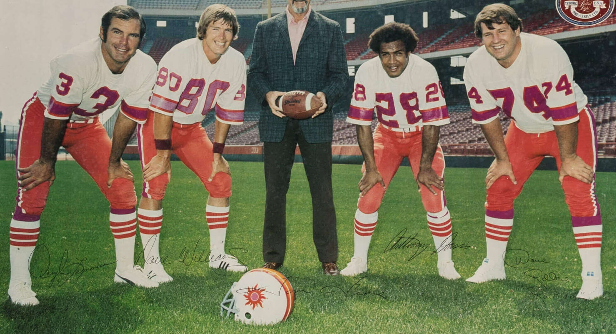
The team we’re going to look at today — the Southern California Sun — played one and a half seasons in the World Football League (WFL), and should be known to Uni Watchers, as I’ve done a few WFL posts over the years. I’ve been a “fan” of the Sun since I first saw their unis, way back when the WFL began play (I’m not certain I ever saw the team play on TV, but I remember reading of the team and league in Sports Illustrated and similar magazines). Of course, what stands out about the Sun was their unique uni-scheme, featuring the pairing of magenta and orange! While there may have been a purple/orange team (think Clemson among others), no one has — at least to my knowledge — ever paired orange with magenta. In fact, I’m fairly certain magenta has never been used as a color (even as an accent) on another North American sports team.
The Sun’s uniforms were fairly standard as far as designs go: three-striped helmet with logo on both sides, jersey featuring sleeve stripes (and the design changed slightly in the second season, as we’ll see), three-striped pants and three-striped low socks over solid high socks. But what made these stand out…literally…was the daring color scheme used by the team.
We won’t get into the league as a whole (nor the delicate financing), but suffice it to say that what began in the fall of 1974 as a direct competitor to the NFL fell into bankruptcy and a cancelled season by 1975. And unlike the AFL, which equalled the NFL in popularity and talent, eventually forcing a merger between the leagues, the WFL became the first of many subsequent “rival” football leagues to fold.
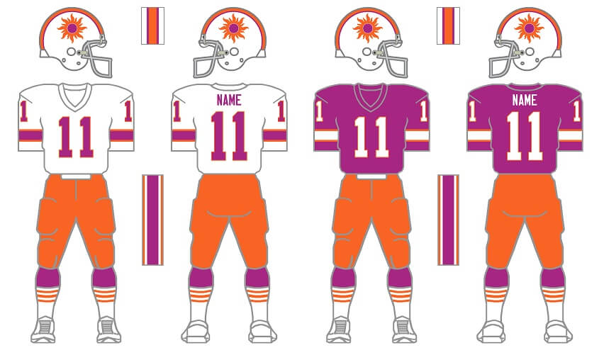
With high hopes for success, the Southern California Sun were awarded an inaugural WFL franchise in 1973, and began play on July 10, 1974. The team had just two jerseys (a HOME white and a magenta road), one helmet and one pair of pants.
HELMET:
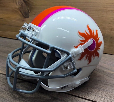
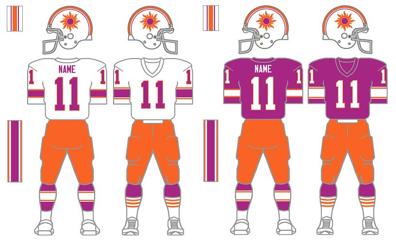
The helmet was white, with a wide orange stripe bordered by two thin magenta stripes. The logo was a magenta circle with a white (or clear) outline, surrounded by orange “flames.”
JERSEYS:
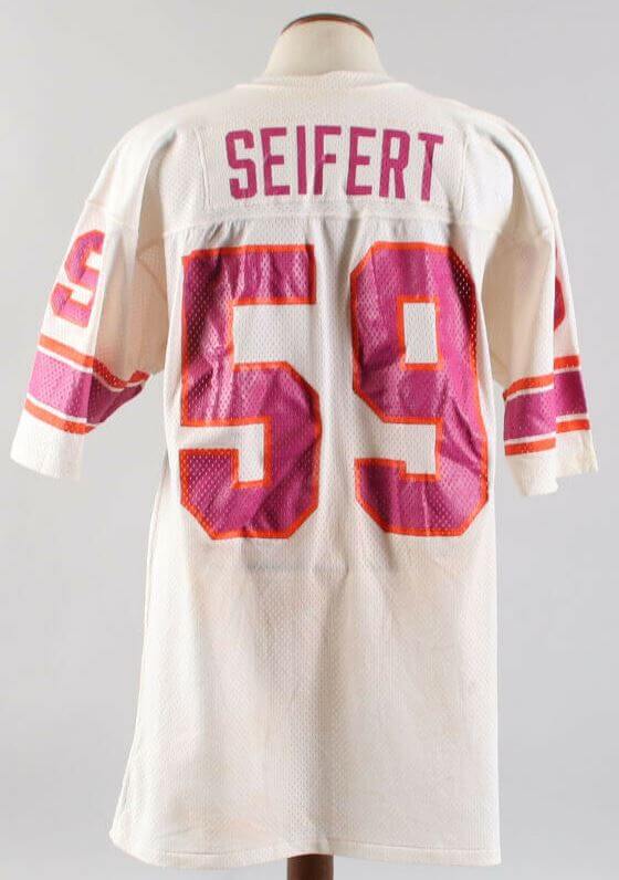
In 1974, the team sported two jerseys: they wore a white jersey at home, and that jersey featured magenta numbers outlined in orange, with a wide magenta stripe surrounded by two thin orange stripes on the sleeves. Originally the road jerseys had no NOB, although those were added by week 2. Road jerseys were similar — magenta base with white numbers outlined in orange, with a wide white sleeve stripe bordered by narrow orange stripes.
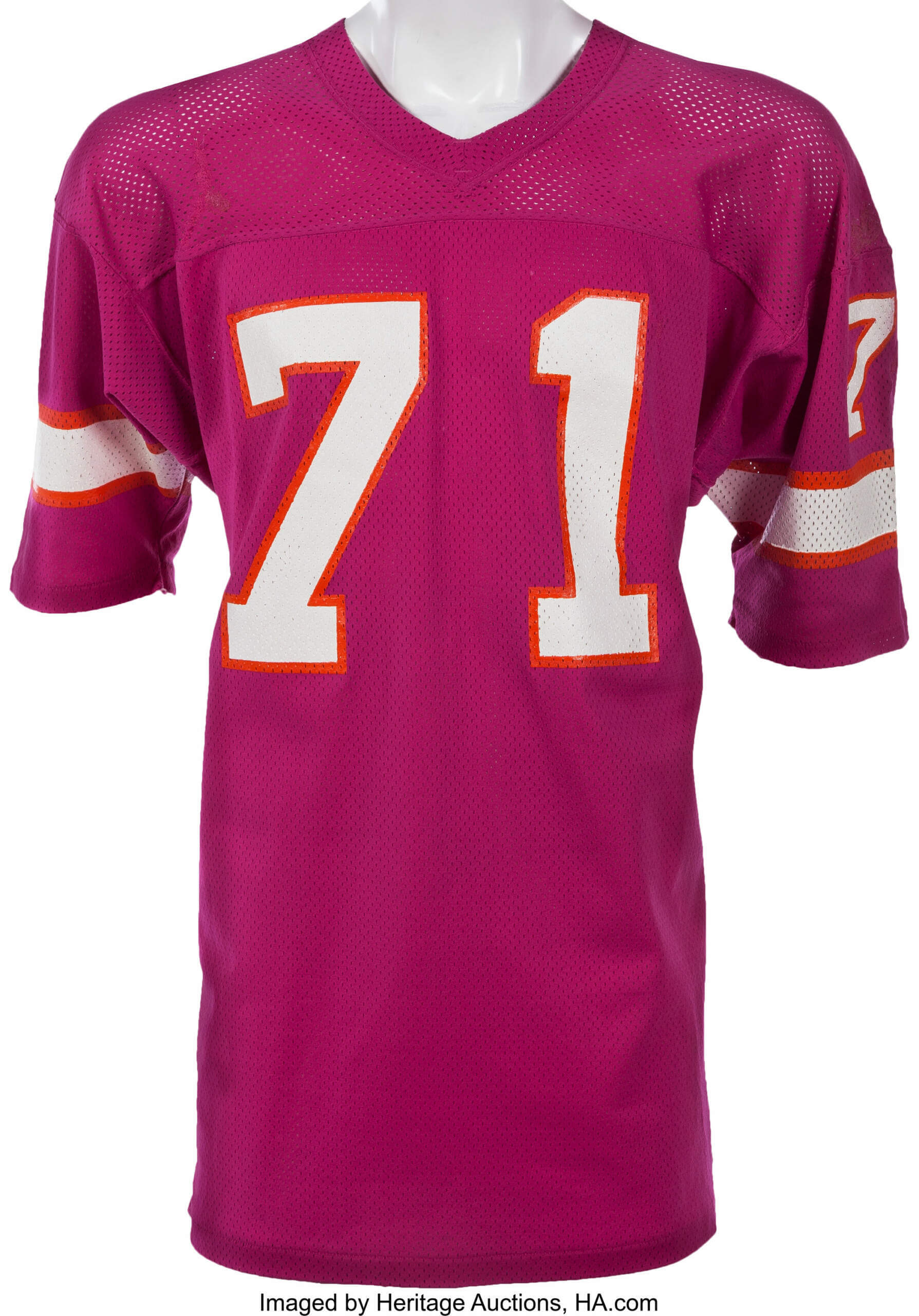
PANTS:
The team had one set of pants for both jerseys: orange with a thick magenta stripe bordered by two thin white stripes. The team wore solid magenta undersocks, with a set of white low socks featuring three orange stripes.
In 1975, during the season, the team changed their jerseys slightly — moving the thin stripes to achieve a Northwestern look. You can see the differences below (left jersey shows 1974-5 styling, while right jersey shows the 1975 mid-season switch to the Northwestern styling). You’ll also note the graphic on the left depicting a different style sock: the team went to a striped undersock featuring the new style sleeve striping with a low white. These would all be mixed and matched during the 1975 season.
1975 JERSEYS:
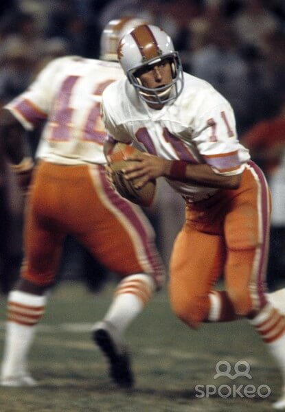
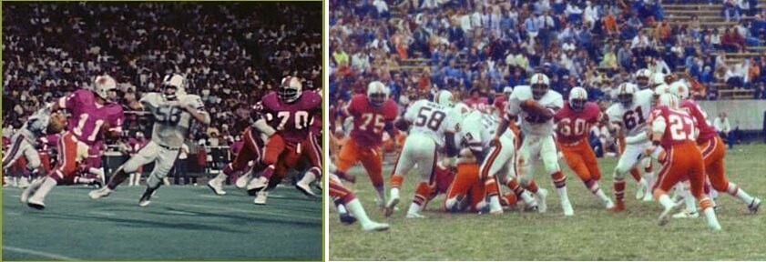
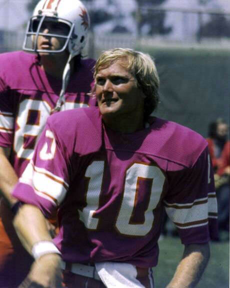
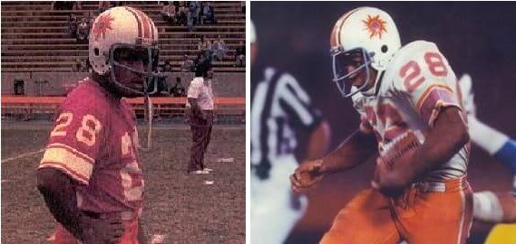
As you might imagine, photos of the team in action are somewhat rare (and the image quality is pretty poor), but below are some photos of the team in action throughout the 1974 and 1975 seasons. You should be able to note the slight changes made to the jersey between the seasons.
1974:

1975:

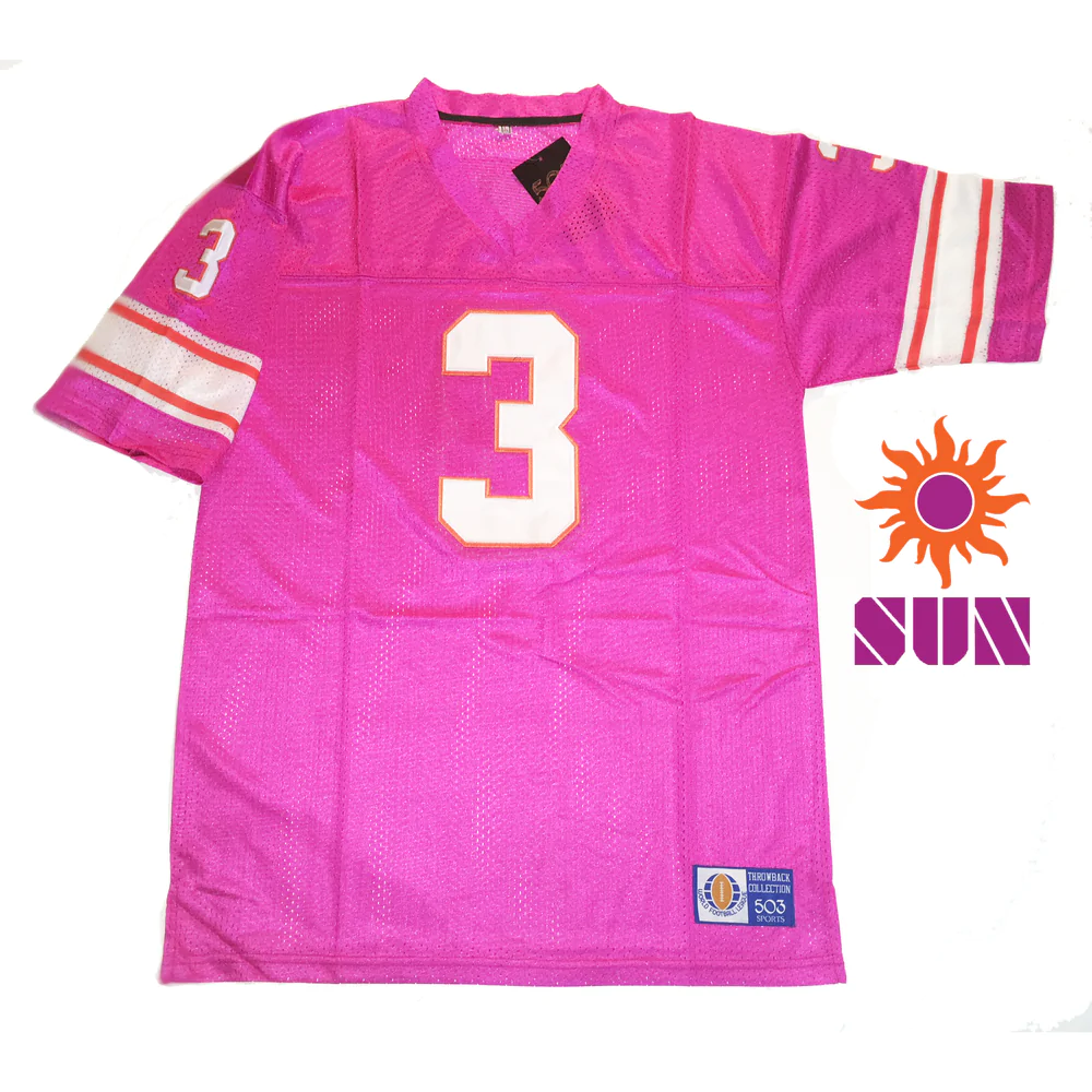
Interestingly, originally the Sun almost had a magenta jersey featuring orange numbers (outlined in white), but one would assume that due to visibility issues the orange numbers were scrapped. However, there was a prototype created (or at least a mock-prototype created later) AND the 1974 Media Guide, created prior to the season, showed the prototype:
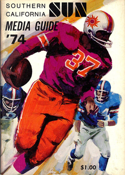
Note the “prototype” jersey shown below used the pre-1974 orange numbers, but also shows the post 1974 sleeve striping. Still, you can get an idea of how the orange numbers would have looked on the magenta jersey.
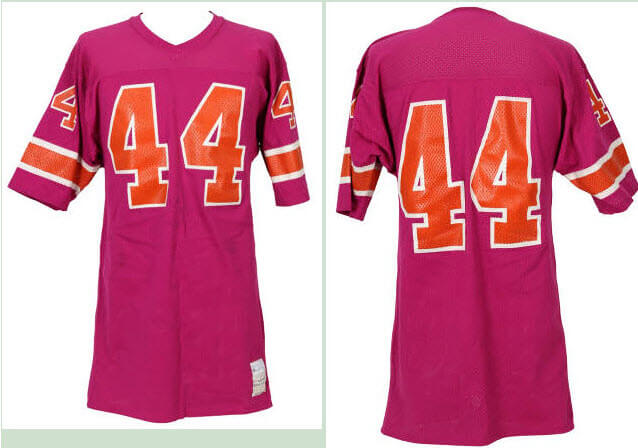
by Jimmy Corcoran
Whenever you see uniforms from leagues that are no longer around, or uniforms from the 70’s on Twitter, you always see the Southern California Sun. I actually got to see these uniforms in person as a kid when they came to Philadelphia on Aug. 21, 1974, and even to this day I can say they lived up to the hype. Pictures don’t do them justice, in person they were stunning, you couldn’t take your eyes off them. I had seen three WFL teams play in person up to this point, the Storm, the Stars and the Southmen and though I thought the Southmen were good, the Storm and Stars uniforms looked dull to me, but the Sun were in a league by themselves.
My father, who was a uniform guy and always took a lot of pride in wearing his uniform, would sometimes say as he was putting it on, “It’s a privilege to play this game Jimbo, not too many guys get the honor to wear a football uniform for their job.” He was the guy who first told me, wait until you see the Sun uniforms, they are wild. He had friends that played for other teams who had already played against the Sun and told him their uniforms are like nothing you have seen before. Yes, players actually discussed other teams’ uniforms.
When the Bell went out for pre-game warmups, I stayed close to my father because there was no one on the sidelines for me to talk to yet, the place was empty. He was in the first row stretching with the WRs and the Sun had not come out yet, I was thinking where are they? All of a sudden, they started to jog out and this was my first look at the uniforms I had heard so much about. To a 10-year-old kid they were better than advertised, I just thought they were the coolest football uniforms I had ever seen. I looked back and my father and the WR next to him had stopped stretching and actually stood up to get a good look at them and they were talking about them. I walked over to my father and he said, “What do you think Jimbo?” I said I liked them, and he said, “Those are some wild looking uniforms, yeah, the King digs them too.”
The first thing I noticed, the jerseys were different than the ones I had seen in programs and promotional material. Those jerseys had orange numbers trimmed in white with a thick orange sleeve stripe trimmed in white. But these were the opposite — the 1973 Rams originally had gold numbers trimmed in white, but they were too hard to see so they changed them to just plain gold numbers; the Sun must have had the same problem, so they went with white numbers.
I wanted to get a better look at the Sun uniforms, so I walked around the end zone over to the Sun sideline, no one said anything to me. I had on a Bell T-shirt and a laminated pass on my belt loop. I stood behind their bench, they all had sun tans, they looked like they lived in California. My father was on the field, and I could hear all the Sun players yelling “Kill the King!” Some referred to him as the Queen; they seemed to really hate him. There was a long table with Gatorade on it and several Sun helmets also on the table, the Sun wore the laminated helmets like a lot of the Chicago Fire did, but I noticed some of the Sun decals were on the outside of the helmet, not underneath it with the clear shell over it. I also noticed two different style decals, some were round, and some were outlining the Sun decal. All of a sudden, I hear someone calling me. “Little man! Hey little man!” I looked over and it was RB James McAlister #42, he said, “Can you pour me a Gatorade?” I said sure, got him a cup, and filled it up for him. I went over back to the Bell sideline and watched my father sitting on the bench, not knowing where he was after receiving a concussion from a head shot from Dave Roller, but he didn’t miss a play; my father was very durable, he played in all 19 games for the Bell plus the two scrimmages and the playoff game against the Blazers, that is twenty-two football games.

The Bell ended up losing this game 31-28 but got their revenge on Oct 23, 1974 when they destroyed the Sun 45-7. But after this loss to the Sun I was in the locker room sitting between my father and his old Pottstown Firebirds RB John Land. I asked John what he thought of the Sun uniforms, he said, “I liked them Jimmy, they were different, but I think our blue uniforms are the best in the league” and I had to agree with him.
DECALS:
I realize these pictures are from 1975, but the Sun used the same decals both seasons. If you look at Anthony Davis’s decal, you see it is wavy around the flames, but if you look at Pat Haden’s helmet, you see the decal is round.
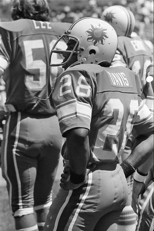
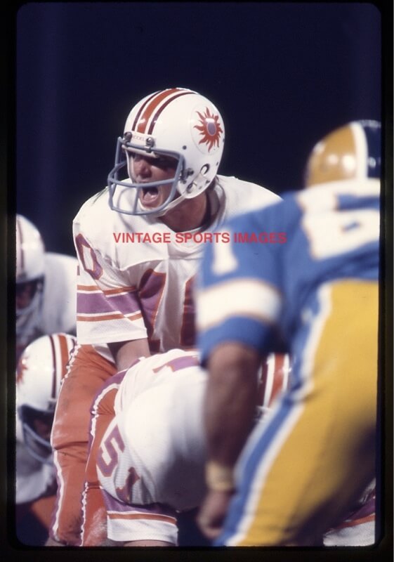
The Sun are still alive in 2023, Royal Retros actually sell Sun jerseys. I know the owner, Dustin Alameda.
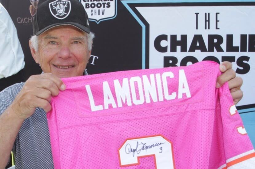
I don’t know the specifics of how many they sell but he told me the magenta outsells all other WFL teams, he made one for Daryle Lamonica. What is it about these jerseys that almost fifty years later, people still want to wear them? Are they that good looking? Is it because they were worn in the ’70s? Why would people buy a jersey from a team they never saw play that was only around for a year and a half? For some reason this was the uniform that resonated with people.
SOCKS:
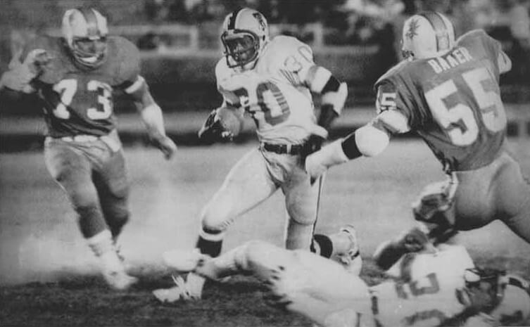
I have seen articles over the years that the Sun wore two different styles of socks during games. This isn’t exactly true and I will explain why. The black and white photo of #30 Claude Watts is the game I was at when they came to Philadelphia in 1974. Most of the linemen had their socks how #73 Neal Skarin did, but the RB’s, DB’s and a few other guys had the white tube socks with the three orange stripes pulled all the way up, making it look like a different sock.
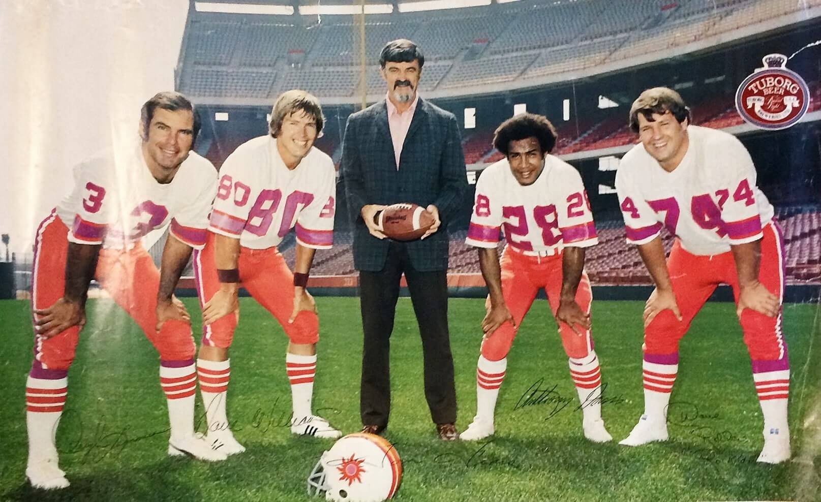
Now in 1975, they added stripes to the magenta stirrup socks that matched the stripe pattern on the magenta jerseys and some guys were pulling plain white tube socks all the way up on them showing a little magenta that now looked like they were wearing three styles of socks at the same time. In the 1975 poster Anthony Davis has his socks pulled up while Lamonica and Roller are also showing the magenta. By the way, Lamonica and Davis never wore this style of jersey, these are the 1974 jerseys, they also wore these jerseys in the 1975 preseason. But as players came and went sometimes you would get both styles of jerseys in a game and you would have the 1974 helmets that were clear shell so you couldn’t change the stripes and the 1975 helmets that were by Riddell that had new center stripes, so there would be two different styles of helmets in the game too.
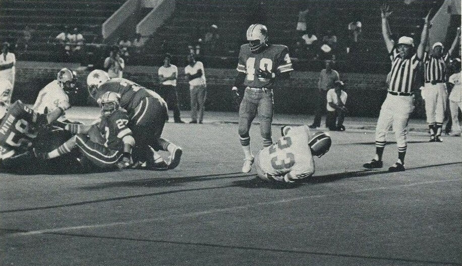
In 1975 the Sun came to play an exhibition game at Philadelphia. You see they have their new 1975 helmets with the new center stripes, but were still wearing their 1974 jerseys. But take a look at #48 Stan Brown, he is wearing a Sun jersey that I have never seen before; the sleeves have the thick orange stripe with the two thin white stripes like the jerseys they never wore in games in 1974 with the orange numbers, but this one has a white number, maybe another prototype that they rejected?
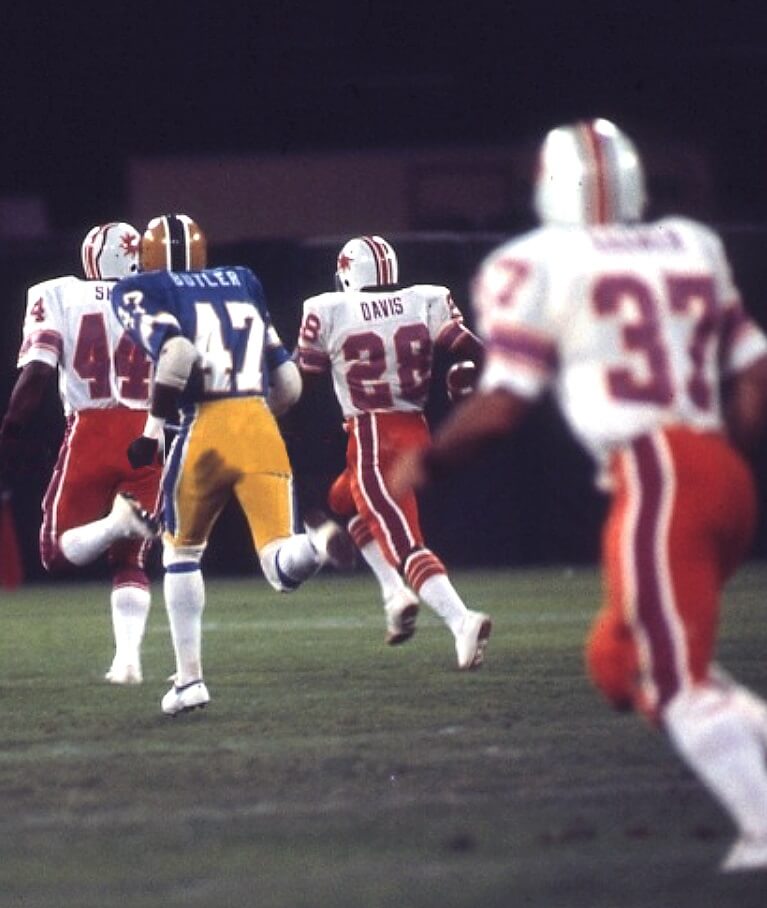
The two-color photos of Anthony Davis #28 and Pat Haden #10 were taken on Aug. 29, 1975, at Anaheim Stadium. You will see three different sock looks in this game: the offensive linemen in the Pat Haden photo are wearing the magenta stirrup socks and are showing the stripes that were added in 1975, in the photo of Anthony Davis taking the kick all the way back, he is wearing the white socks with the three orange stripes pulled all the way up and you see #44 Don Shy and #37 Bill Kramer wearing plain white tube socks with no stripes pulled all the way up, so you have three different sock looks in the same game.
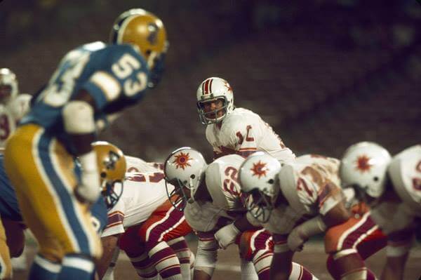
The Sun may be gone…but they’re definitely NOT forgotten! You can read more on the Sun here.
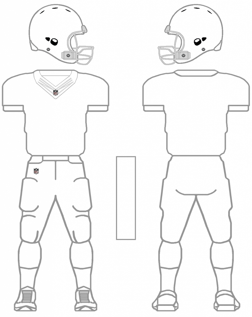
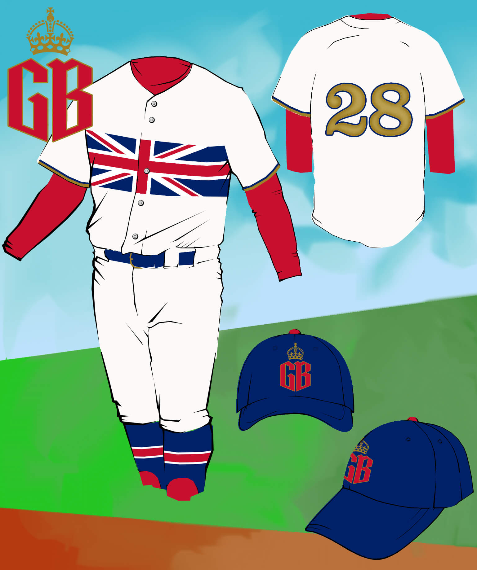


I never knew I wanted the panthers to have a matte electric blue helmet so badly! Please please make that change!
I always thought the Panthers should go with black as their principal color, since panthers are black. But these blue kids are amazing and would show the logo wonderfully. I prefer these to the silver they have always had.
i’m with you there. i feel that teams like the panthers and ravens have an excuse to feature a color (in their cases, black) prominently in a way that emphasizes the mascot without feeling like a costume. therefore they could go full black without it ever being BFBS. however, if the panthers went black tops, pants, socks, with bright blue numbers, and sock stripes, with these bright blue matte helmets, i think they’d look so slick.
‘I always thought the Panthers should go with black as their principal color, since panthers are black.”
I read this sort of reasoning when Bengals were releasing their alt helmets (‘there’s white tigers, ya know’) and when they went literal, they wound up looking like zebras. Similarly, the Rams embraced bone, and that led to adding the term ‘dishwater’ to the UW lexicon.
No one (?) ever proposes switching the color scheme of the Philadelphia Eagles to anything but kelly green (which won’t make them resemble actual eagles), the Memphis Grizzlies to bring on the brown, and on and on.
As for the blue helmet, the Panthers would run the risk of looking like an XFL team’s old branding:
link
…some may argue they play like they belong there anyway, so why not?
Didn’t the ABA Floridians wear orange and some shade of hot pink/magenta? The Heat throw it back to them sometimes.
Yes, the Floridians wore magenta and orange.
The only other team I know of that was magenta was Harvard University. To this day, Harvard uses magenta for its academic regalia — you can instantly distinguish a PhD recipient in a crowd!
Harvard used to drape the outdoor graduation space with magenta-colored banners, but in recent years have gone to crimson.
Harvard changed over to crimson in 1875. The school newspaper also changed its name.
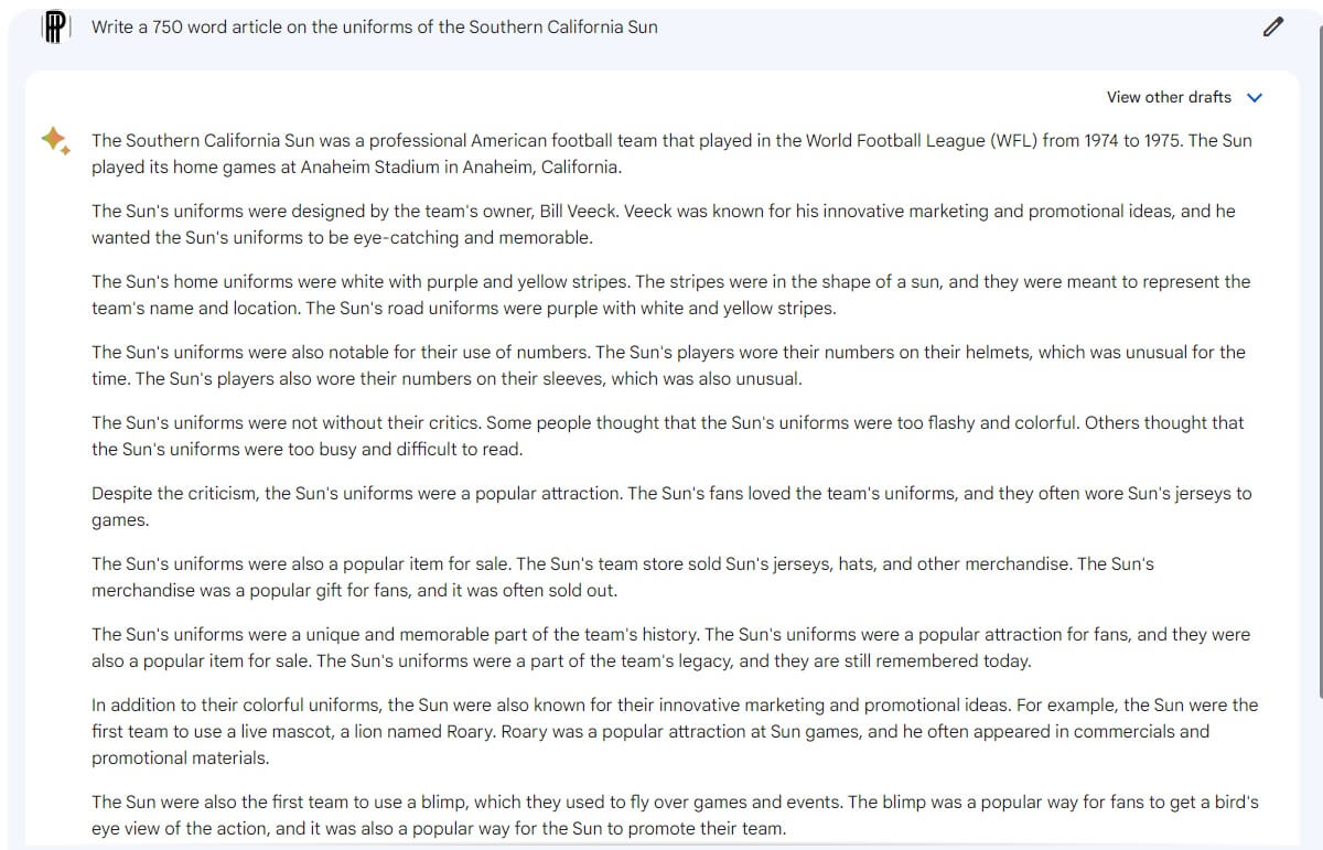
I’ve been playing around with Bard the past week as well, purely for shits ‘n gigs.
My wife is dreading writing a maid of honor speech (especially in her second language) so we’re going to give Bard a shot for at least developing a flow/format, which I think it can be helpful for.
It’s also helpful for reminding you what not to do.
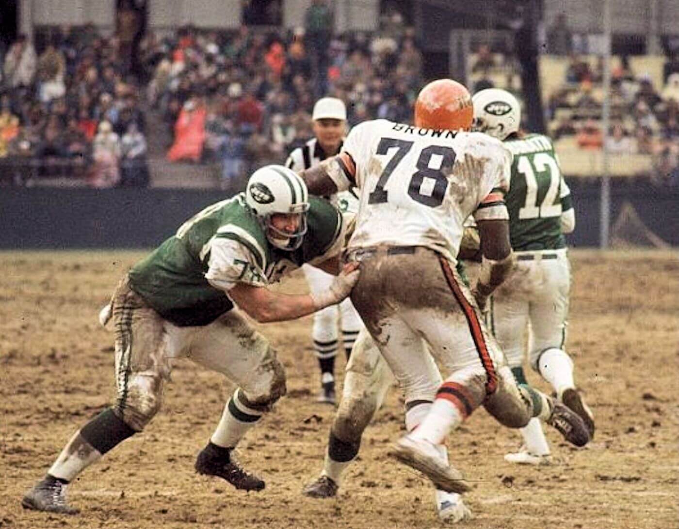
GTGFTS: 12/12/1976, Shea Stadium; Bengals 42, Jets 3. Joe Namath’s last game as a Jet.
Oops; GTGFTU.
That’s the game!
Also DL Bob Brown’s last game.
Here’s hoping that this game remains as the last on-field appearance by a NYJ in #12.
Under NO circumstance should Rodgers be allowed to wear that#. Retired IS retired!!
I love that the Sun, who played in Anaheim, were called Southern California. I’ve always thought that this would be the perfect name for the Angels. I get why they don’t want to be “Anaheim”, wanting to represent the entire metro area. But most Orange County folks don’t appreciate being associated with “Los Angeles”. I grew up in Long Beach, and later lived in Orange County, and any time I told someone outside of the area where I lived I told them “Southern California”. And no, “California” wasn’t a good name for them, since California is a large state with the north wanting nothing to do with the south. I get that when they first were called the “California Angels”, there was no American League team yet in Oakland, but it still made no sense.
I’d just like the Angels to go back to wearing the stitched Halo on the top of their hats.
I loved that.
Me too!
Thanks for the post. These are really outstanding uniforms. Was there any controversy with the Southern California Sun having a similar name and uniform colors to the Phoenix Suns who played their first season in 1968-69?
I have always admired the courage it took for a football team to choose and wear a color like magenta, but I loathe that color so much. I can barely stomach it even in nature.
Another beef? There isn’t enough contrast between the magenta and the orange. In some lighting, the various stripes look like a solid stripe.
Great stuff, today, Phil, Jimmy, et al. (but not you, “Bard”)! I’ve always appreciated the Sun’s uniforms simply because of their sheer brazenness. The sports world leaves far too many colors off the table when it comes to uniform design (a trend made worse by Big Merch’s tail wagging the dog). There are lots of unused or rarely used color combinations that would look great on uniforms if just given the chance. Are the Sun’s orange and magenta one of those combos? Well… probably not. But I’m glad the Sun gave it a try and didn’t just become another navy blue and red team!
I have not used any AI to write anything. But, College Board revamped its plagiarism policy for Advanced Placement to include using AI-generated essays. Despite how ridiculous the above text may be, it is improving exponentially.
As an aspiring teacher/professor I’m genuinely concerned about AI, grammarly, etc. I know there is plagiarism detection software for straight up copying text but how would they detect AI use?
Yesterday’s GTGFTU was a tough call!
I focused on Miami’s winter wear and belt/socks… didn’t even notice the font difference on Volk’s jersey.
While the Dolphins never wore that style #2 during the ’70 as Jimmy Corcoran mentioned, they adopted something similar post-1996:
link
link
…and continue to wear a reasonable facsimile today:
link
Well, if Chris H isn’t able to identify that odd number 2 font on Volk’s jersey, it may be a mystery that is left in the 70’s. I still think it is a salesmen’s sample jersey that they rejected but needed for the game.
I agree, and even for the 1970s, those sleeves are a bit long and the sleeve numerals and stripes just a bit lower than usual, again, even for the sleeved, meshed 1970s Pro Football. Really odd.
Not a fan of that mock-up Panthers helmet. I don’t think a uniform update is really needed for them.
Love this article about the Sun uniform. Cool name, cool logo, cool uniforms. Not the maroon and orange of Virginia Tech, not the purple and orange of the Frankfurt Galaxy of the former NFL Europe, not purple and orange of Clemson but magenta and orange. Wow. Especially the jersey with the Northwestern sleeve stripe is very good and that logo and wordmark scram seventies. I really dig it.
As for the blue Panthers helmet, you need blue pants to go with it for the best result but the Panthers uniform is already good as it is, I think.
unpopular opinion upcoming…
California Sun Away Magenta unis with the orange pants >>>>> Orange Creamsicle Unis
blasphemous I know, but I can’t deny it anymore…I have been converted.