[Today we have a Part 2 of a guest article from our own Anthony Emerson, who is going to take a look at the uniforms for the World Baseball Classic. Last weekend we looked at the unis of the teams involved in Pools A & B, and today we conclude with Pools C & D. Enjoy! — PH]
Here is Part 2 of our review of the 2023 World Baseball Classic unis. Part 1 can be found here. Today, we’ve got some heavy hitters, including the USA, Puerto Rico and the Dominican Republic.
Pool C
Mexico

Mexico has some of the very best unis in pool C — colorful without being ostentatious, and unique as one of only two teams in the entire tournament to feature green (Australia is the other). The white uni is also quite nice, as is the light blue and pink, which is certainly unique in the entirety of baseball, let alone the WBC. The unis do suffer from having Microsoft Word-esque NOBs and uni numbers, but a lot of teams are suffering from that at this WBC. Overall: A.
United States
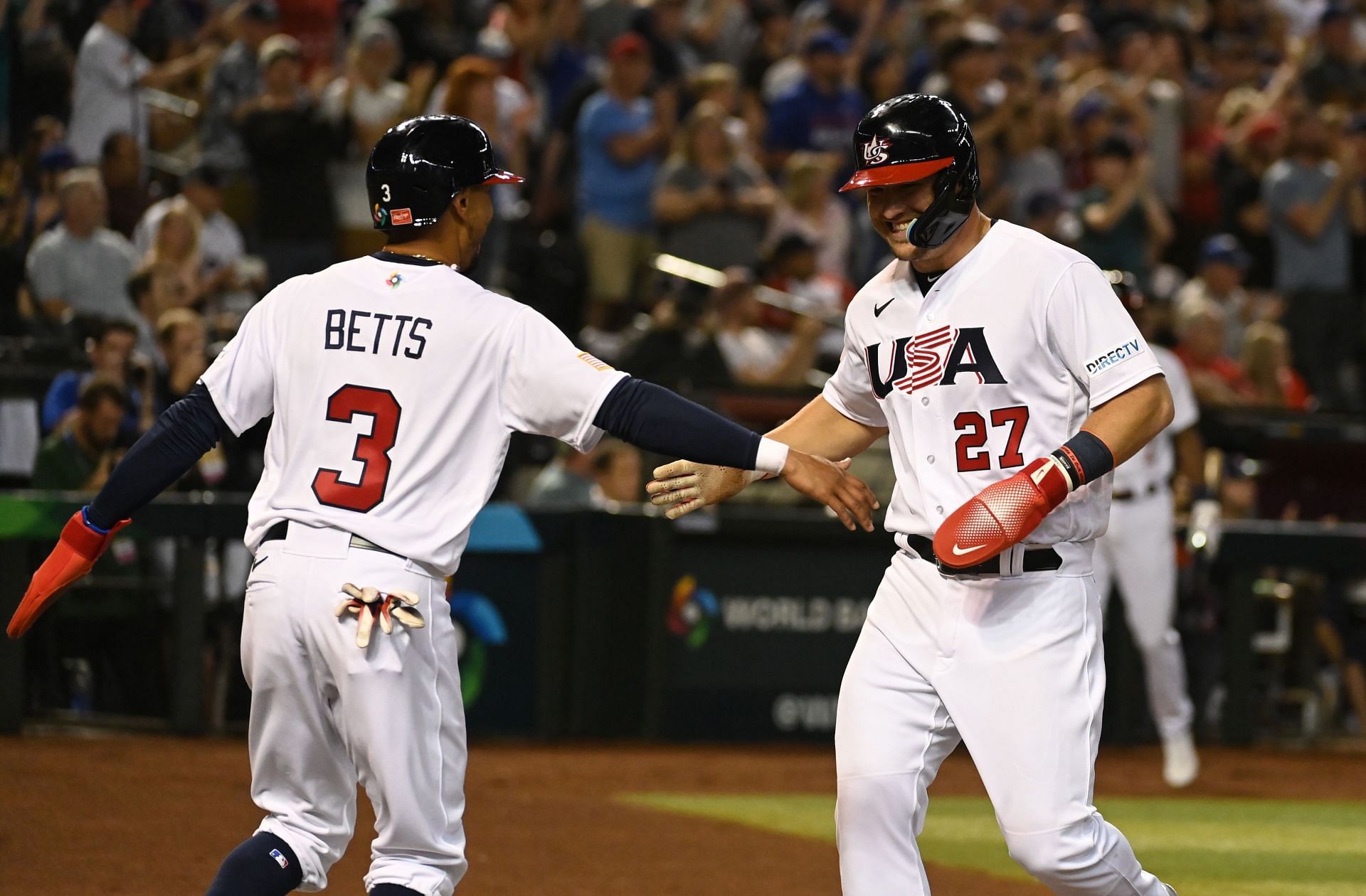
The defending World Baseball Classic champs haven’t ever really changed their uniforms since the inaugural WBC in 2006. It’s fine, I guess. There just seems to be so much more you could do with this — maybe a fauxback inspired by the 1934 US tour of Japan unis, or anything involving that “US” cap logo. The current cap logo itself feels dated. Something about it screams late-90s to me.
Unlike the past WBC, the USA’s gray “road” uniform is lighter than the one worn back in 2017. Overall: C+. Nothing outright offensive but it feels like we should see more from the Americans.
Canada

Oh, Canada. I feel like I should give them credit for at least trying something new (this photo comes from a game against the British, whom we will get to in due time), but why is that wordmark so small? Why is the front number so small and close to the wordmark ? What is going on with that truncated collar? What’s going on with those truncated pant stripes? And if you think the greys are better, allow me to disabuse you of that notion. Worst of all, the previous Canadian WBC unis were fine. Nothing spectacular, but nothing obviously wrong.
The real nail in the coffin for these is that inexplicably tiny wordmark though. You know it’s bad when the wordmark on the coaching staff’s windbreakers appears to be bigger than the wordmark on the actual jerseys. I’m sorry, but how did this get approved? It looks like a manufacturing error. Overall: D-, they get extra credit for at least trying something different.
Colombia
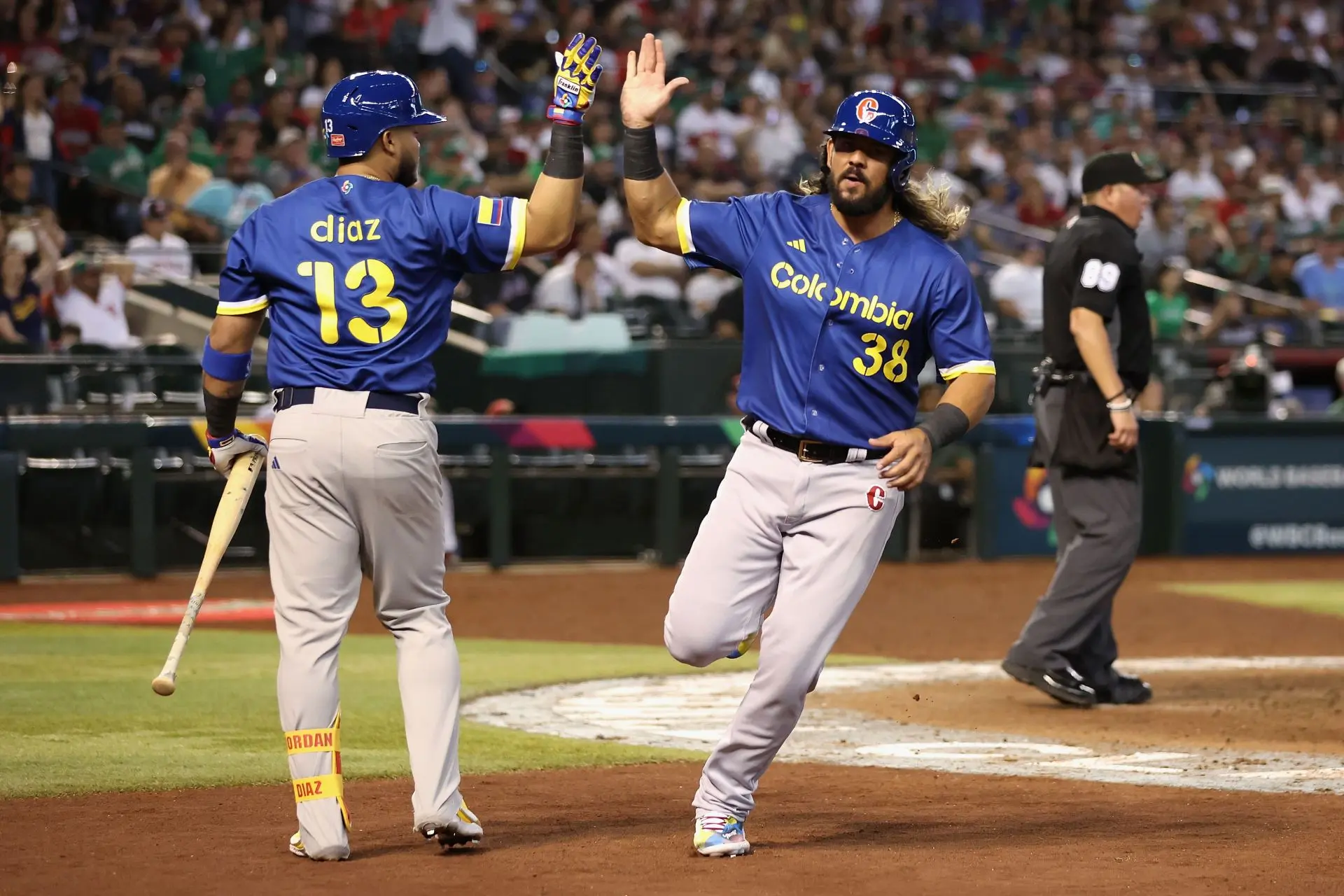
Oh my god, a team actually putting some thought into how the NOBs and uni numbers look! Colombia gets points for that, leaving aside how they look (which is not great, but still). I do like the wordmark, though the total absence of red on the jerseys isn’t a great choice — it makes the pant leg logo stand out more, and not in a good way. Speaking of, I do like that Colombia added a pant leg logo. I feel more teams should do that — I really like it for the Cubs, I like it for Puerto Rico, and I like it here. There’s also a yellow jersey with white pants — that shot shows that the sleeve cuff striping doesn’t go all the way around the sleeve, which I don’t like. It probably has to do with the template Adidas is using but how hard would it have been to extend that all the way around? And I’m not sure I dig the cap and pant leg logo being so different from the overall uni design. Overall: B.
Great Britian
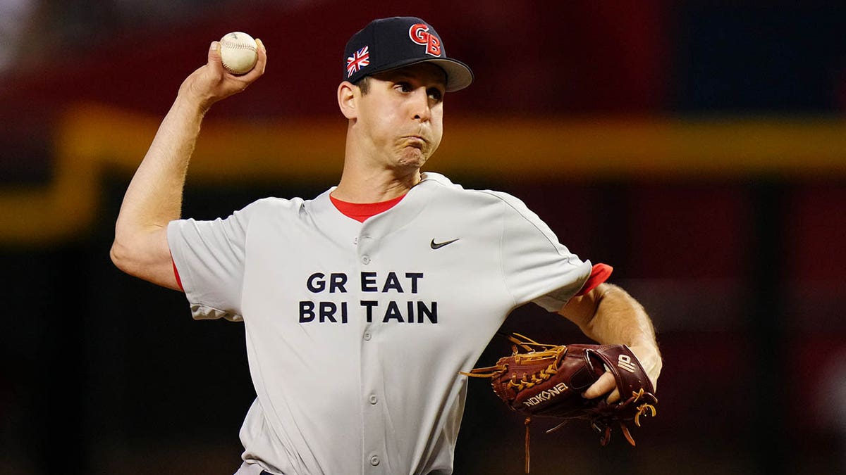
I’ll be the hundredth person to make a “not so great Britain” joke. But what happened here? Nothing like putting your wordmark in Arial Black and then saying “I guess this suffices.” To make matters worse, P Ian Gibaut lost the “T” in “Great” on his red jersey during their last game, further embarrassing the beleaguered Brits. The red jersey is not much better, but it does look like someone spent five minutes on it as opposed to just one.
During my research for this piece, I came across this image, with multiple photos from the qualifiers, and a much better Great Britain wordmark. How did the actual tournament unis get so messed up? Overall: F.
Pool D
Venezuela

The Venezuelans weren’t a pre-tournament favorite despite the nation’s rich baseball talent, but they are currently the last remaining undefeated team (at the time of writing). I can already hear the purists saying that these are too busy or that there are too many elements but I’m gonna level with you: I don’t care. I love these, and the maroon unis. I love the script (how often do we get a cursive ‘z’ on a uniform?), I love the sleeve cuff stripes, I love the colors. These unis are fun, electric and vibrant — just like the WBC should be. Overall: A.
Puerto Rico
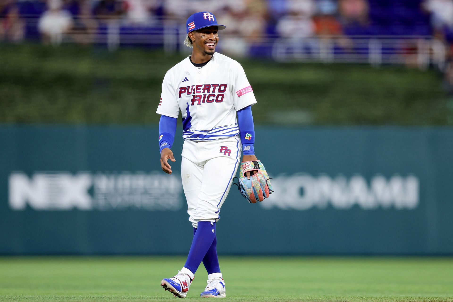
Whether you like these unis comes down to whether you like the waves-and-tower design. And I gotta be honest, I don’t. The tower is rendering of the tower of Castillo San Felipe del Morro, a 16th-century citadel built by Spanish colonizers just north of San Juan on the coast of Puerto Rico. It is an iconic landmark of the island, a UNESCO World Heritage site and a US National Historic Landmark, but I don’t think it works as an element on a sports jersey, or at least a baseball jersey. Most of the wave effect is also hidden underneath players’ pants on the field. I just don’t think it really works. There’s also a red jersey with no El Morro elements, which is extremely boring. Like Colombia, I do like that Puerto Rico has a pant-leg logo (notably, both PR and Colombia are Adidas teams), and I like that Puerto Rico tried something different, so they get credit for that. Overall: C-.
Dominican Republic

The Dominicans dropped the previous wordmark which was used since the WBC’s inception. The new wordmark is certainly less “baseball-y” than the previous one, but for a one-off tournament, I love it. I really like the cuff striping too. The DR also has a gradient jersey, with the opposite gradient of the Cubans’. It is what it is — I don’t love it, but I’m certain it’s hugely popular among fans. Overall: B-.
Israel

Okay, first thing’s first: I love the Star of David cap. It’s so simple and perfect it should really become a fashion accessory all on its own. The rest of the uni I’m not feeling so much. I can’t decide if these are better than the 2017 unis. I think I like the move to pinstripes but I don’t like the move from a script to a wordmark — having a wordmark with inner lining is too busy when on pinstripes, and it hurts the overall readability of the jersey. I do like the new wordmark much more on the blue jerseys, and I do like the striping on the socks, which is only visible on the small handful of players who go high-cuffed. Overall: C-.
Nicaragua

Nicaragua’s WBC debut is marred by exceptionally boring unis — the white is an inverse of the blue. A no-frills (unless you count armpit stains) uniform, it’s almost difficult to describe this uniform because there’s so little to work with. They could’ve done something with the cap logo and wordmark to salvage some points, but the font used is ugly. At least they’re better than the Brits’? Overall: D-.

Japan is still undefeated
There was a reason Great Britain used the font they did. It ties into the Made in Britain campaign.
Technical issue: the “Microsoft Word-esque NOBs and uni numbers” link in the Mexico segment goes to an Access Denied page.
Critique: I don’t know exactly what font GB is using, but I can definitely tell you it’s not Arial Black, or any Arial font. It’s also not a Helvetica. To me, the font looks very specifically British, like something you’d see on some type of signs in London.
Looks similar to Gotham, which i peeersonally wouldn’t say feels very British – although its hard to say whether its *exactly* that or any of its look-alikes, not enough letters here to really tell.
Finding it kinda funny how their older font feels just a bit more modern. That curved leg (or whatever you call it) on the capital R looked fun.
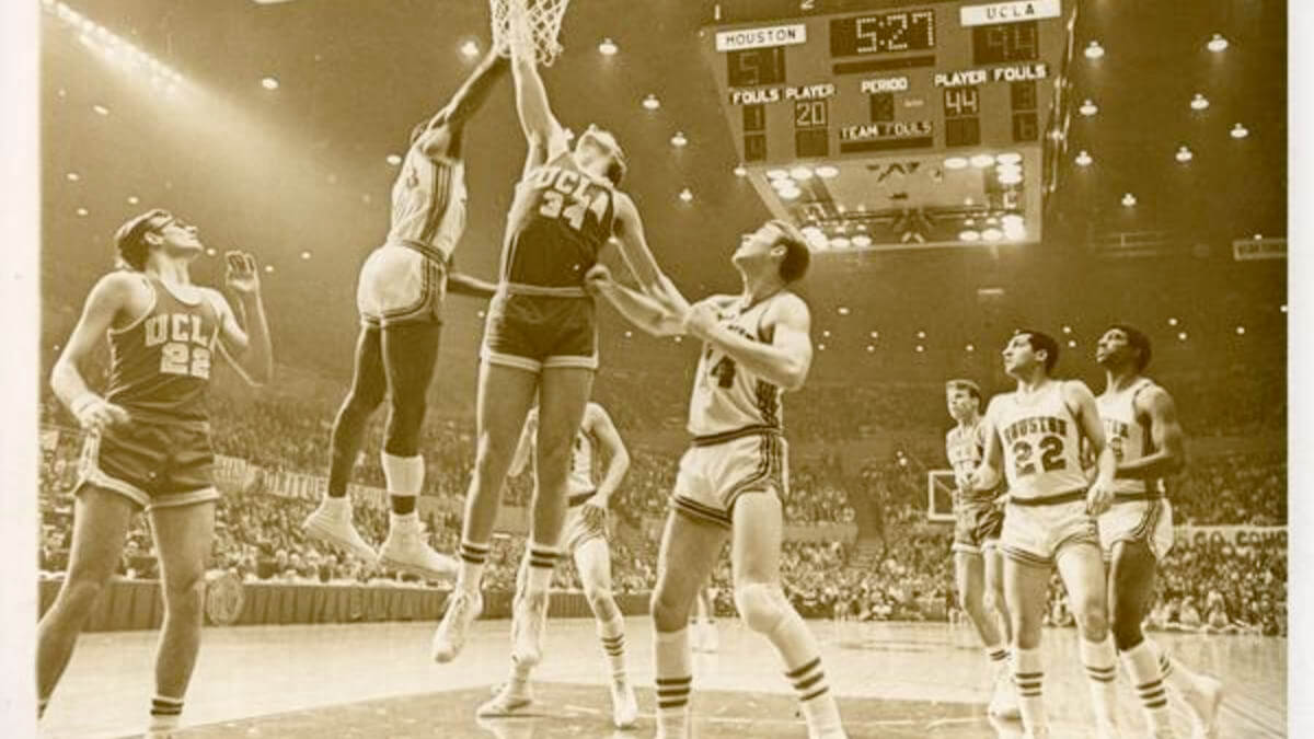
Is that the UCLA-Houston ‘Game of the Century’?
January 20, 1968, at the Astrodome in Houston, Texas. Houston 71 UCLA 69. First NCAA regular season game broadcast nationwide in prime time.
No. It’s the NCAA tournament game later that same season. The GOC score was a 71-69 Houston win. On the scoreboard of this game pic, UCLA has tallied 94, to Houston’s 51. I believe the final score of this game was 103-69.
That’s the game when Elvin Hayes got poked in the eye and had to wear goggles. His Phi Slama Jama Cougars, which included Clyde Drexler and Hakeem Olajuwon, lost to UCLA, who were led by Kareem, Reggie Miller, and Ed O’Bannon. It was a contest I’ll never forget.
I should have had my glasses on! I thought it was 44 for UCLA. Ha!
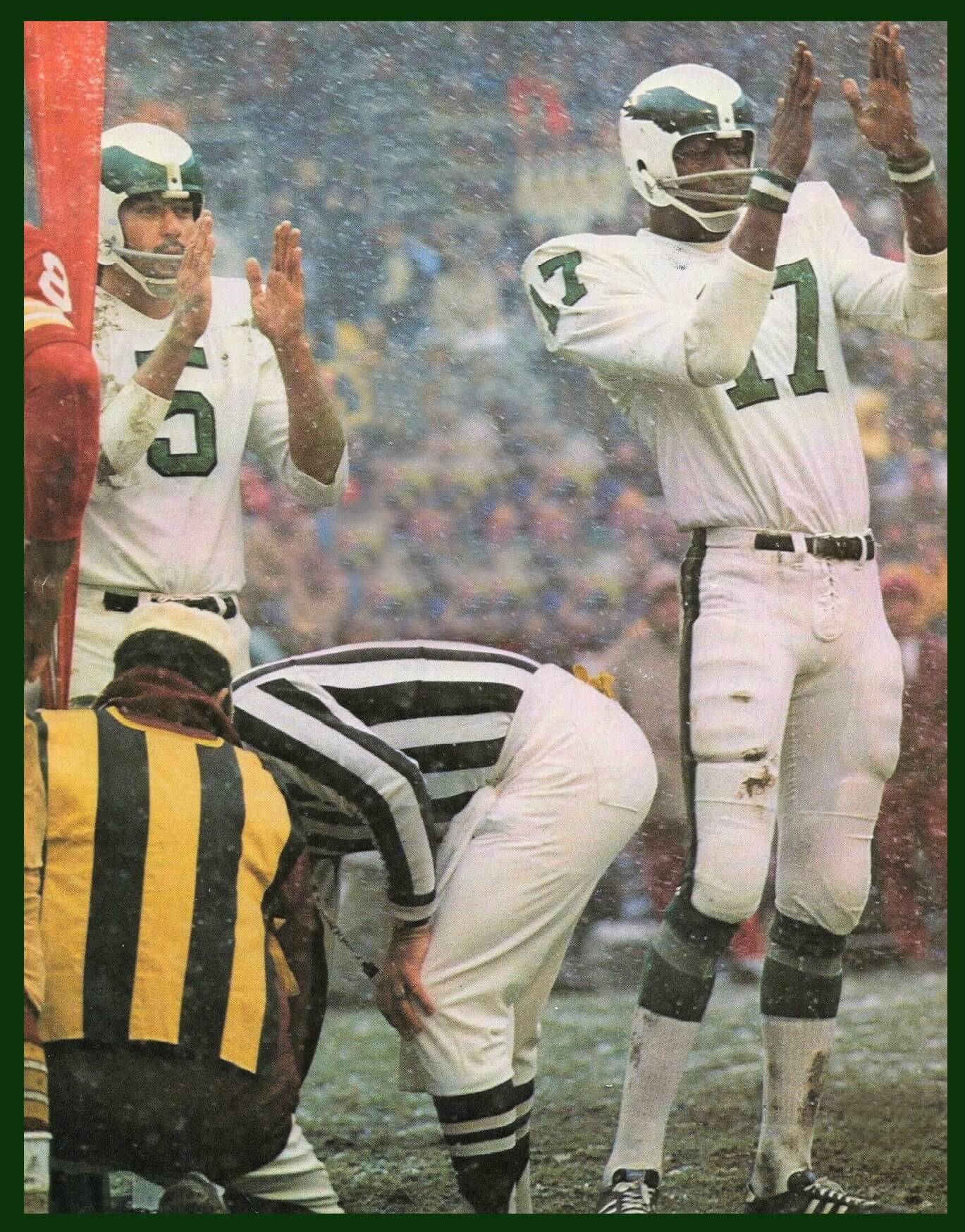
What’s wrong with going back to the Reggie white era kelly green jerseys with the spread eagle instead of the one with the numbers on it
Man, MLB players need to stop wearing those embarrassing oven mitts on the base paths. The tiny injury risk is worth it to not look like a goof.
In regards to the tweet – not gonna lie – god i don’t really understand the appeal of Eagles’ kelly green unis at all. Well okay I mean its completely fair, the color is *alright*, and i know there’s likely a nostalgia factor but this just feels sooo dull to me. Midnight green and their modern NOB fonts are just so nice to look at imo, some of the best in the NFL as a whole.
(although the 1973-1995 wordmark is cool as hell, have to admit that)
This lifelong Eagles fan disagrees 100% with you. Why?
1. The midnight green is veering dangerously into teal.
2. The current black alts and helmet don’t work with a base color that dark. And I hate the BFBS.
3. The name/number font is too refined for NFL football and a city like Philadelphia, and the image they want to project. Block Varsity or some variant thereof is fine.
4. I get the attachment to recent success but kelly green was their color for decades, with white and silver. Jeff Laurie’s wife rebranded the team when they bought it in 1996. Now they’re divorced and he remarried. Get rid of the remnants of that failed marriage!
*Lurie
Ahh, i see, can understand then – also didn’t know about the rebranding context either. I’m just kinda looking at the unis as more of an outsider I suppose – only got into american football around late 2021, not American myself, grew up with soccer visuals more or less, so just a different perspective here.
Really love when teams go for non-blocky fonts and whatnot, really like the teal-ish tone, but i def understand your reasoning.
I love non-block fonts… on some teams. Chargers, Bears, Texans, to name 3. Just not the Eagles. And as Rick said after me, that midnight green/teal color screams mid-’90s
Agree with all this. I’ll add, green is an underutilized color in the NFL, and all of professional sports. I also wish the A’s would adopt Kelly Green as their main uniform color. I think your teal comment is right on. Around the time the ex-wife changed the color, teal was a hugely popular color.
“.. green is an underutilized color in the NFL…”
Jets, Eagles, Jaguars, Packers, Dolphins (aqua is green, right?), and Seahawks (‘action’ used today, ‘forest’ used prior)…I’d say that’s a fair amount of representation, even if green is just an accent.
I like that the A’s are the sloe MLB green team…and agree that they look(ed) best when dressed in Kelly.
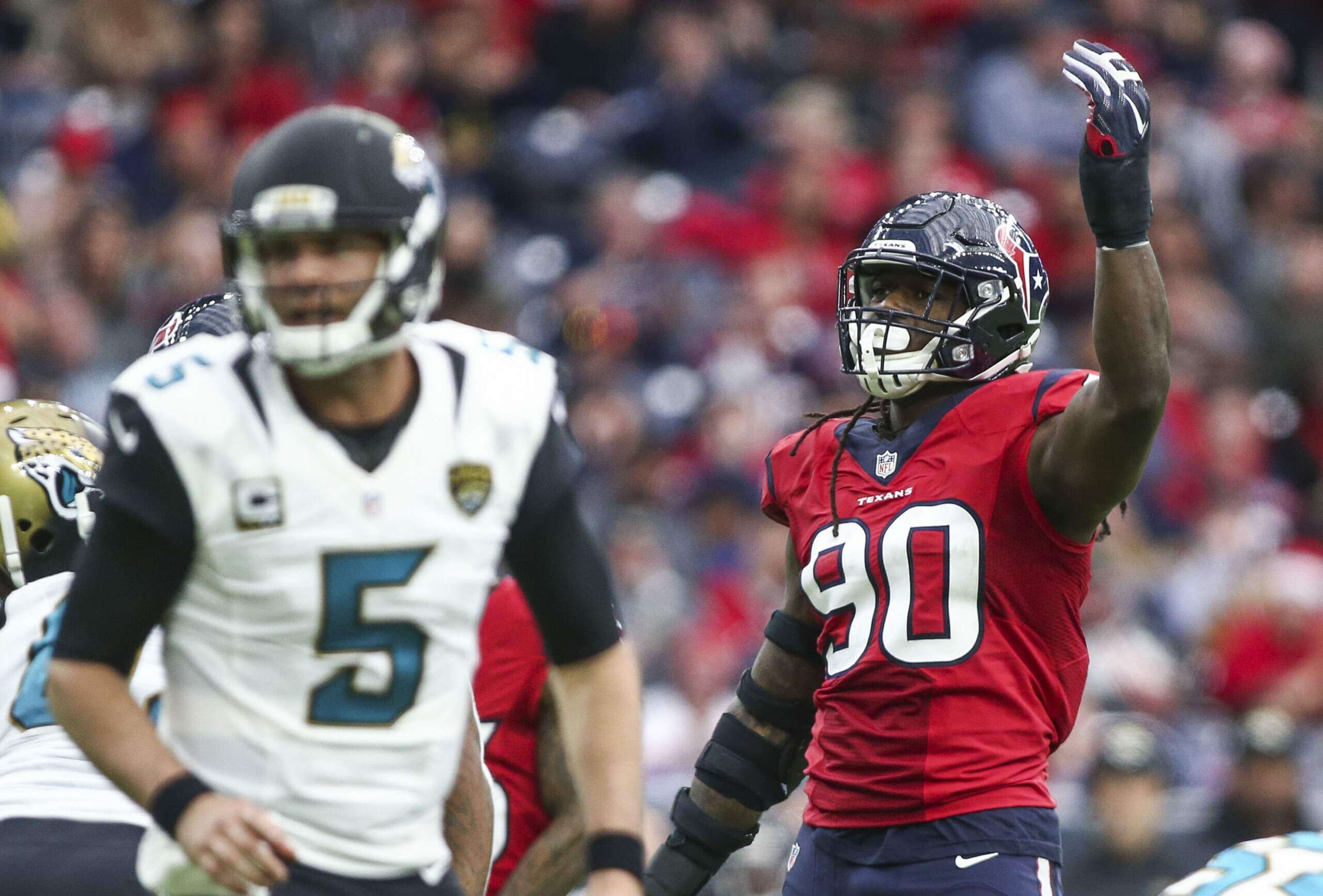
GTGFTU – Jaguars at Texans on December 18, 2016. The only time the Texans wore the red jerseys with the navy pants, and also the only time they wore red jerseys versus the Jaguars while the Jaguars wore those 2013-2017 monstrosities.
Regarding the Eagles upcoming kelly green throwbacks I’m assuming they will use the 1985-1995 version but they could wind up with the 1960 style as shown in that photo of Michael Vick from 2010.
Some might label that matchup an out-and-out eyesore, but I’ll put this out there:
Had the Jags settled on a single helmet color (I preferred gold), would those uniforms be so universally panned as the ‘worst ever’? I say no. I like the sharp edges, redesigned logo and splashes of color, though the teal leaned a bit to blue to me and suffered from a balance problem with the gold and black.
And to those who lobby for the Texans to adopt the Oilers color scheme…what is it that is so bad about their uniforms as is (save the combo above, which ain’t too terrible) that makes a change make sense? 2 decades of uni-stability says that a lot is positive about their branding IMO. If the Titans ever rethink the sword motif they have going on now, they’d benefit greatly by busting out the Luv Ya Blue era beauties!
And as for the Eagles, they wear a modern classic uniform that doesn’t make me long for a full time return to the Kelly green times. Occasionally throw back…and ditch the black alt.
ChrisH…you might be the only one who considers the Dolphins aqua and Jaguars teal as green teams. And the Seahawks main color is navy blue, with their hi-viz green as an accent except when they wear those gross color rush uniforms. So yeah, IMHO only the Jets, Packers, and Eagles, are green teams in the NFL.
I don’t think of the Florida AFCs as green teams (way I see it, the ‘Phins are a white team, the Jags a black one). They use teal and aqua for accent, as the ‘Hawks use neon for a pop against all the blue. My point was that ‘green’ has a fair amount of use in the NFL-even if you throw those 3 out, there’s still 3…that’s plenty.
GTGFTU: December 18, 2016, Jacksonville Jaguars at Houston Texans
The Jaguars wore that style from 2013-2017, So it had to be one of those years. Given the Texans are division foes, they played eachother 10 times during those 5 seasons.
Let’s shift our focus to the Texans. The Texans are wearing their red alternate jersey, which they only wore for one of those 10 meetings, December 18, 2016
Oof looks like I got beat!
Team USA baseball needs a rebrand SO badly. That look is so stale, dated and uninspired. They could do SO much better.
Completely agree. If nothing else, the cap logo has been bad since it was unleashed on the world. Always seemed like a ClipArt placeholder, they just never replaced it.
That uniform is like CBS’ college basketball music… it wore out its welcome a looooooong time ago.
Hey! You’re amazing but that music and the Masters music are both amazing and should never change.
Another knock against the Canada uniforms. They are strictly red and white, yet batting helmet has a black bill. Look like using the batting helmets from the prior uniform set and not changing them to match the new uniform with no black.
Preach!
But I think we’re being a tad harsh on Team Maple Leaf.
I’ll argue that the incomplete pants stripes make sense if the pants themselves were worn properly, meaning high cuffed. And the collar treatment has a sorta-retro feel akin to the mid-70s White Sox, but does come off as a faux neck roll (Full disclosure: I also liked the old fake neck roll on the Nike-crafted NFLers jerseys).
As someone who doesn’t like the Braves, I hate that the back of the USA jerseys look so much like the Braves.
Maybe this is a subtle joke at the expense of Great Britain’s unis, but the header above their review reads “Great Britian.”
I agree with the earlier comment in that Team USA badly needs a rebrand, with an updated cap logo at the very minimum that needs to be changed. It’s just a horrible logo and it has to good.
In terms of grades, I think USA should get -1,000 for having paid ad’s on their sleeve and helmet. Just trashes up the place.
Canada tried to be a little different, with a few tweaks it could be a great uniform set. Bonus 1,000 points for not trashing up the place with paid advertisements.
Columbia badly needs to have their cap/pant logo C to match the uniform C. I did the uniform font, it was a nice change of pace from what everyone else is doing.
I like the Great Britain unis. If the Yankees introduced them in 1936 everyone here would be fawning over them.