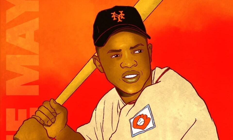
Good Saturday morning, Uni Watchers. I hope everyone has had a good week (I wish I could say the same, which I’ll briefly explain in today’s outro). So, today’s article, plus the Ticker, will be it for me for this weekend (apologies).
Several weeks ago, reader Anthony “Ant” Giaccone began sending me dozens of his sports drawings — two of which I ran during Super Bowl weekend. Those two drawings were of Len Dawson and Harold Carmichael, representing players from the two teams playing in the Big Game. At the time I mentioned I’d be featuring Ant’s art in the coming weeks, and today we’ll take a first look at his work.
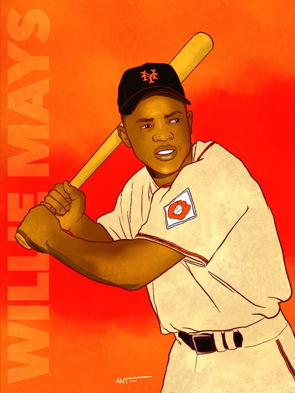
Ant’s drawings encompass a variety of sports eras and disciplines, but for today I wanted to focus on ten of those featuring baseball players who were roughly contemporary, playing in what many would call the “golden era” of baseball (late 1940s through 1960s). In addition, I had several questions I asked of Ant to kind of set this series up, and also asked him for brief descriptions of the drawings I had selected. As you’ll note from today’s splash, Ant had sent me an image of the Say Hey Kid (pictured wearing his 1951 New York Giants rookie uniform).
Let’s begin!
Uni Watch: How do you choose your subjects?
Ant Giaccone: That’s a good question. As it relates to Uni Watch, I sent you a number of illustrations that showcase sports stars with (hopefully) interesting uniforms for the viewers/readers of the website. I try to find reference material that is somewhat exciting, disruptive, or just fun to look at. For example, the one of Clemente swinging a bat is just a cool image that provides drama, action, and you don’t even see his face or see his number but you know it’s him.
On my instagram site, you’ll also see a ton of musicians, pop culture icons, cars, and a bunch of illustrations from “Inktober” the past two years (those are done based on preselected prompts — artists all over the world participate).
UW: When did you first start? How long have you been doing this?
AG: I started at a young age. My dad (who was a New Rochelle police officer) took oil painting classes when I was around 5 or 6 years old. His “moonlighting job” was a hand letterer/sign painter who also did store front windows, trucks, boats, and pinstriping on hot rods. I would always tag along with him and draw whenever he was painting. I drew all the time. I eventually took drawing classes as well and then attended SVA where I learned very quickly that there are people who can run circles around me artistically. That’s where I went into advertising and graphic design. I can’t really compete with artists, but I can create coherent dynamic compositions. I mean, I guess I have a unique “outsider art meets graphic poster” style of sorts. And because of this, I became a “director of art” versus a professional “maker of art.” … and like a little kid, I do love drawing, if just for fun.
[As an aside, both Todd Radom and Graig Kreindler are SVA alums — PH]
Weird art anecdote: While growing up just outside NYC, I attended a lot of concerts in the 80s. I would buy used classic Levis denim jean jackets at Goodwill for around $5 and paint the back of them of the rock bands that would play The Garden, The Byrne Arena, or Nassau Coliseum. I would paint 2 or three jackets and sell them in the parking lots before the show. I would then have enough money to see the concert (I’d wait until the opening band would finish and try to get tickets close to face value). I probably saw over 70 shows. From The Cars, The Who, Iron Maiden, to Van Halen (5x), Rush, and Pink Floyd — even the Jackson 5 reunion and Madonna. I’m guessing that somewhere in a Goodwill today is an old faded painted jacket I did. (“Circle of Life” LOL)
UW: What’s your medium?
AG: The invention of the Apple iPad and the dawn of “digital art” changed everything for me as I finally found a medium that I could have fun with. The mixing of art, typography, and graphic design was “my jam” (so-to-speak). It allowed me to put it all together in a way that made sense in my head. I use an Apple iPad Pro 12.9” with an Apple Pencil and the program is Procreate.
UW: Tell us a little more about yourself.
AG: My day job is as an executive creative director (kind of like Don Draper in MadMen but with a lot less money, women, and drinking). So when I draw my subjects I tend to have a semi-graphic design aesthetic — almost like the baseball posters Sports Illustrated used to sell back in the 70’s with a modern spin. Also, as nostalgic fan of the golden age of illustration, I tend to gravitate towards compositional illustrators like Norman Rockwell, JC Leyendecker, Bob Peak, Milton Glaser, etc.. So my drawings always seem to have logos, pennants, graphic elements, or typography attached to them.
I’ll have more questions and follow-ups with Ant, but for now let’s get into the drawings!
Willie Mays
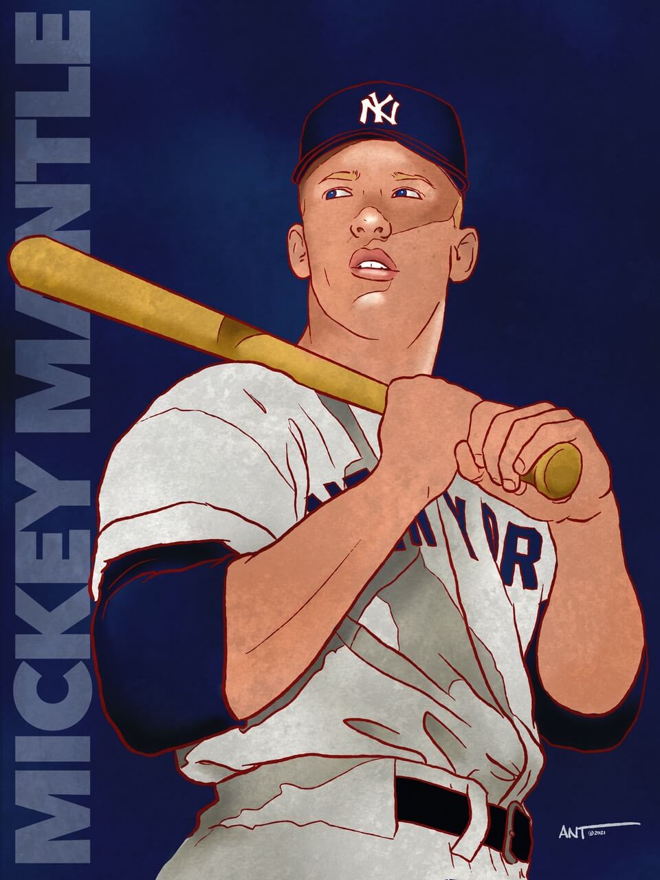
Mickey Mantle
Duke Snyder
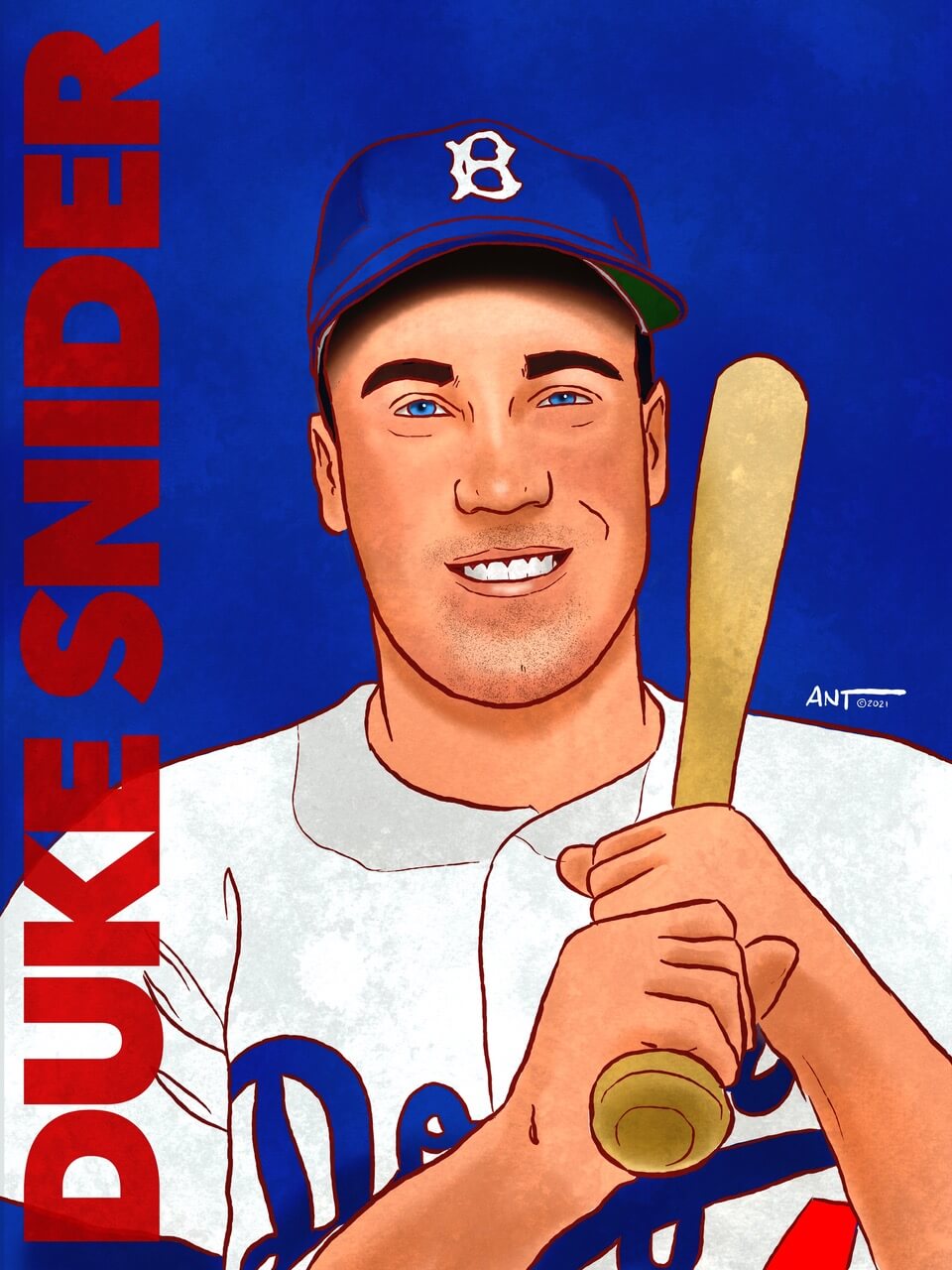
Willie, Mickey, and the Duke. — I think I did these after watching episode 7 of Ken Burns’ Baseball “The Capitol of Baseball” about NYC’s iconic teams of the 1950s. “The Big Three of NYC”
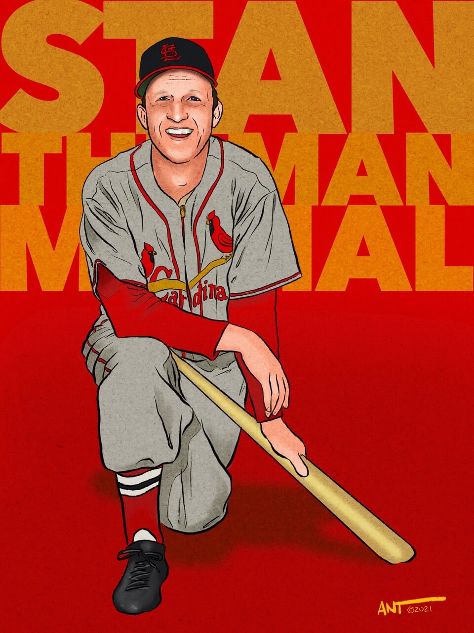
Stan Musial
Yogi Berra
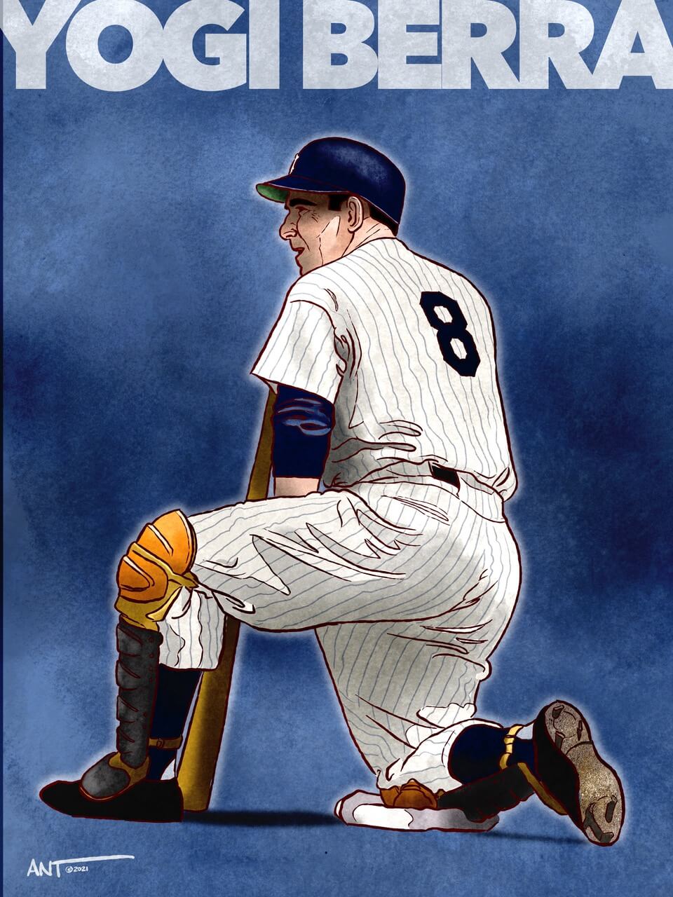
Yogi, Stan — Someone on Instagram viewed Willie, Mickey and The Duke, and requested Stan Musial (my first commission ever) and as a Yankee fan, I have always loved Yogi. This was my colorized version of a black and white photo I came across.
Roberto Clemente (I)
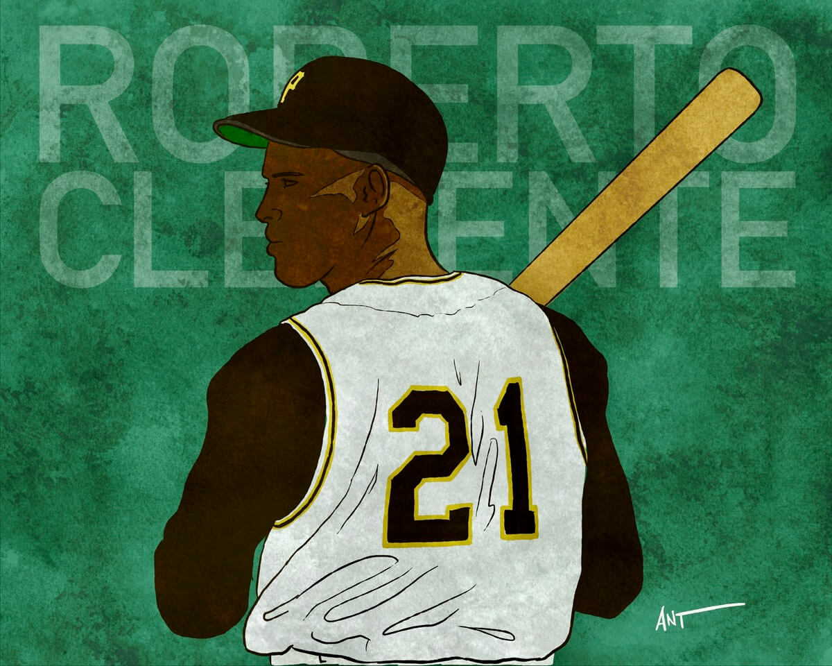
Roberto was drawn quickly (20-minutes) for his birthday a few years ago. Plus I love that simple uniform vest and colors.
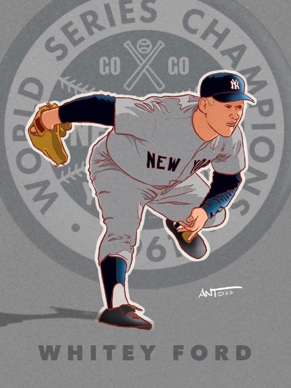
Whitey Ford
Brooks Robinson
Roberto Clemente (II)
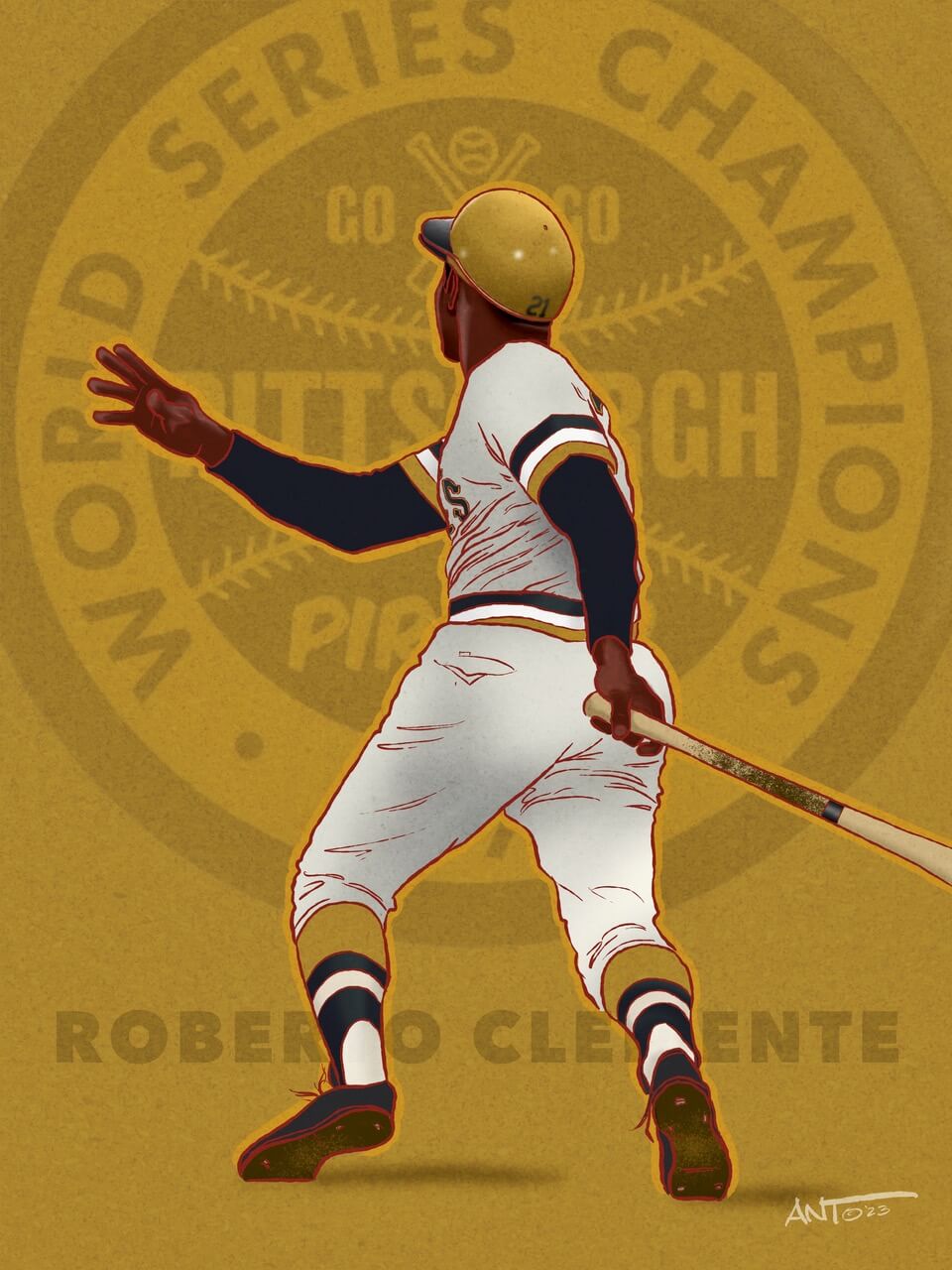
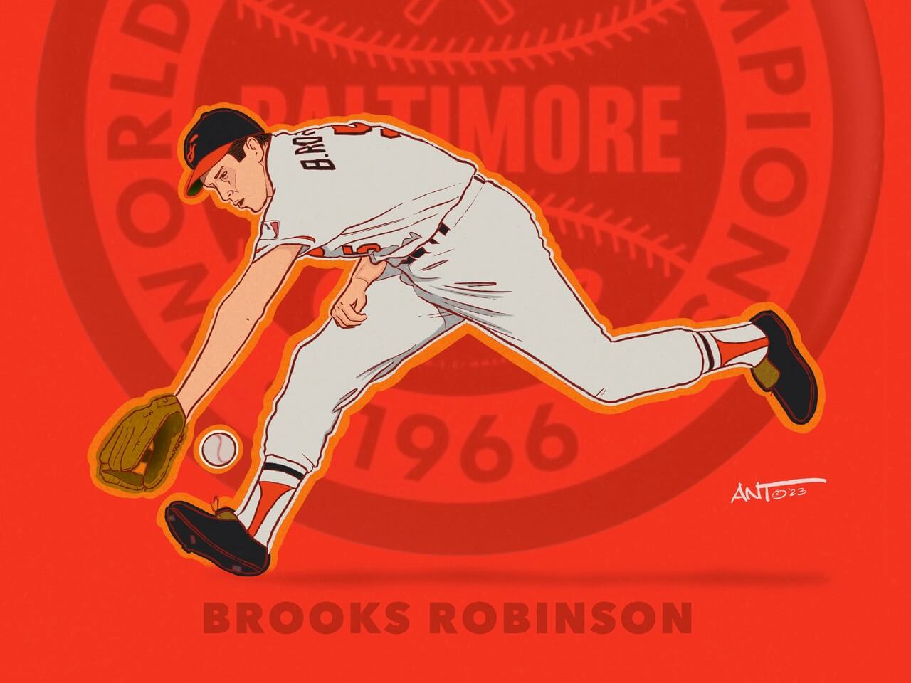
Whitey, Brooks, Roberto — these were drawn after I had gotten in touch with you about my illustrations. They were meant to showcase uniforms, star players, and World Series years (including Joe Rudi in 73). I found these cool World Series graphics on line and incorporated them into the background for interest.
Ernie Banks
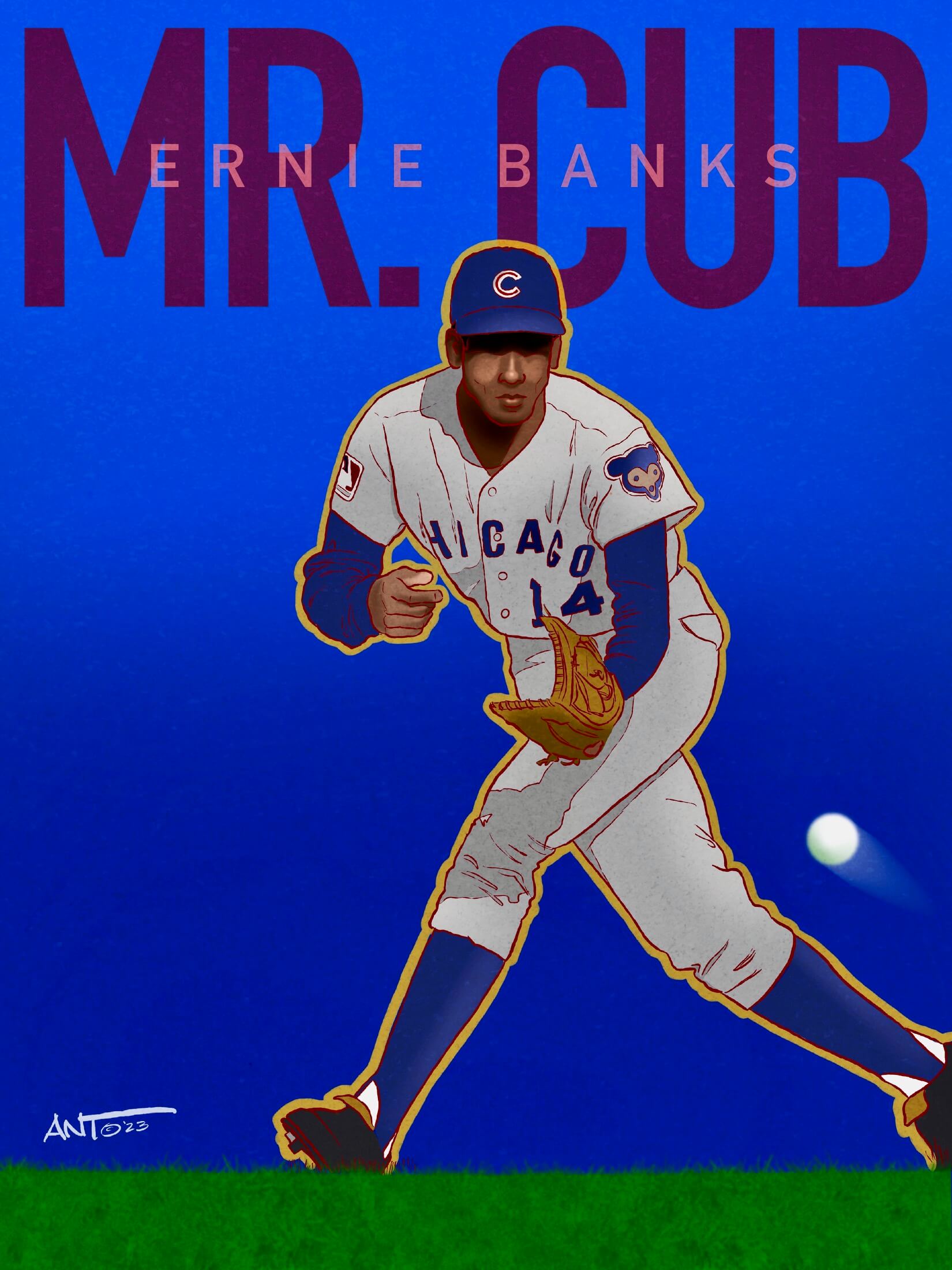
Ernie Banks — this was created as part of a series to showcase “nicknames” (along with Morgan, Griffey, Fidrych, Carlton, and Smith) — It would be cool to show these together.
Wow! Great stuff, Ant — you’ll notice in a couple of Ant’s descriptions, he mentioned players that weren’t shown today — those players were amongst the many drawings he sent, but for space reasons, those weren’t included in today’s post.
I’ll be back with Ant again (probably in several articles over the coming weeks and months), but that’s a good place to stop. Big thanks to Ant for sharing these and I hope you’ve enjoyed this little look into sports-as-art! With spring training underway, our thoughts will soon turn to the diamond (and all the new rules for this season), so I’m pleased to give you all nice retrospective of the Boys of Summer.
During the day, Anthony is a executive creative director with over 25 years in customer-transformations in the fields of advertising and promotional, shopper, digital, and experiential marketing. He has created successful brand building campaigns, engagements, and loyalty programs for over 100+ Fortune 500 companies such as Heineken, M&M’s, Coca-Cola, and Starbucks, just to name a few.
After hours, Anthony draws. A lot. He played semi-pro baseball out of high school, but realizing he couldn’t hit a curveball, decided to attend The School of Visual Arts in NYC, where he has a BFA in Illustration and Graphic Design. He’s an inaugural member of Uni Watch fan club and has one of the very first membership cards produced with his childhood idol Thurman Munson’s #15 on it. …he accepts commissions and his work can be found on Instagram: art_x_ant


Phil, I always thoroughly enjoy your weekend content and today is no exception. Certainly no need to apologize and commend you for your dedication to family. Thoughts to you and yours.
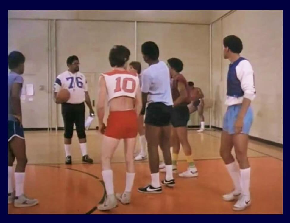
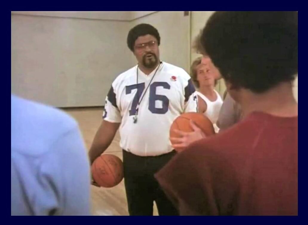
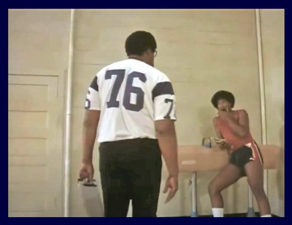
Great stuff today from everyone! Love the illustration and the story of how you developed your talents, Ant. Nice find on the Rosey Grier guest spot on The White Shadow, Jimmy. And superb job curating and presenting it all, Phil!
Phil, best wishes to you and your family as you deal with that multitude of health and other issues. We’ll survive tomorrow without you and look forward to more of the great uni content next weekend.
Thank you BvK! Much appreciated. Cheers!
No need to apologize, Phil. Family always comes first. We appreciate today’s content for sure. A question for Ant: is your work commission only or do you sell lithos as well? The baseball art really warmed me up today seeing as we just got 8-10 inches of snow (with thunder & lightning!) last night. I really got a kick out of the rock concert parking lot story too!
Thank you Patrick! I really appreciate it. Cheers!
In addition to being a New Rochellean, Ant and I have something else in common: We painted denim jackets with pictures of rock bands. The ones I painted for others were a part of my job in White Plains. I made one for myself— three times. Like a tattoo, the artwork looked great at first, but I quickly grew tired of it and painted over with something completely different.
Sorry to hear about all these challenges.
Hoping for health for the Hecken clan.
Take care!
Ant’s work is terrific. Great stuff!
Best wishes to you and the family, Phil.
Best wishes to Phil’s family.
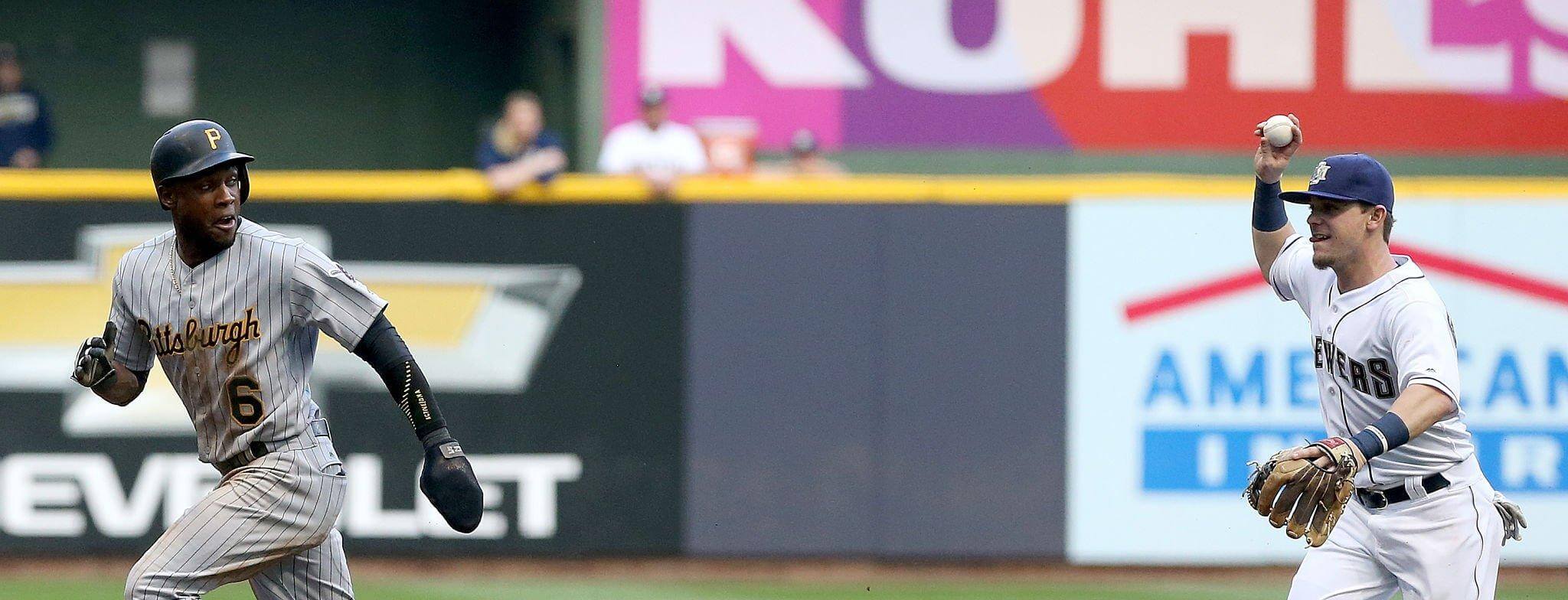
No takers for GTGFTU?
Best I can do is June 18-20, 1998… Lou Collier (PIT) reached base in all 3 games, and I can’t definitively tell which of those 3 may have had a play that certainly resembles a rundown using bbref’s play-by-play listing. Gun to my head, I’d say the top of the 7th on 6/18/98, PIT @ MIL.
Good guess…but incorrect.
Phil (and Paul): Anytime you gents need to take a day or a weekend when real life intrudes, it’s more than OK to give it a rest here on UniWatch. Everyone gets that, too.
I second that, Jeff.
GTGFTS
Pittsburgh 3, Milwaukee 5
July 30, 2016 @ Miller Park
Recognized Scooter Gennett playing for the Brewers but knew he had played there after the era of the uniform he’s wearing, so it must be a throwback. (Hopefully not cheating by) consulting Bill Henderson’s Game Worn Guide, the only time those were worn during Gennett’s tenure in Milwaukee was 7/30/16.
Way to go, Jo!
That game was a ’90s throwback, but both teams wore uniforms from different years..Milwaukee in ’94-’96 (when they were still in the AL) Todd Radom-designed MB set against the ’97-00 road pinstriped Bucs…but thankfully without the gray caps.
Congrats!
I like the color of the lines in some of the drawings – kind of a dark red/brown or maroon. Unique!
Thanks Michael. I really appreciate the compliment!
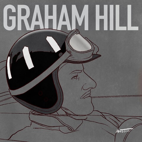
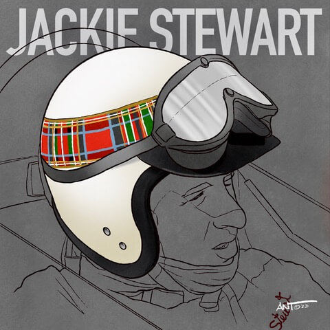
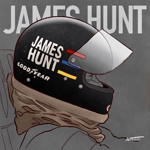
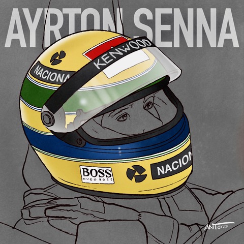
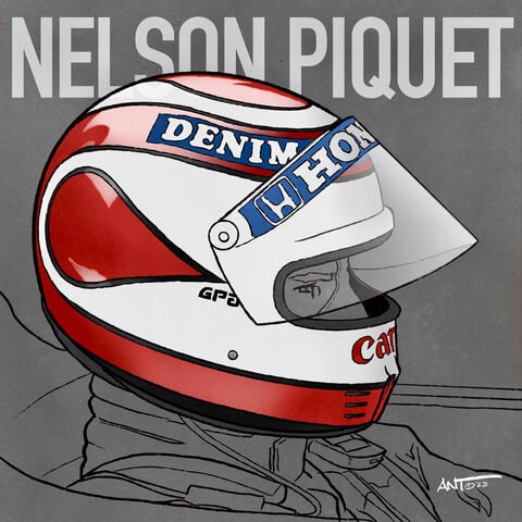
It’s funny, a few years ago one of my friends noticed I did the same thing. I can honestly say it was somewhat unintentional as I was trying to find a color that wasn’t black (as to not look like a glorified coloring book) and I randomly chose the dark red/burgundy color. It seems to work on most drawings and it’s the only thing I can say is my personal “style”. …But when I did the Formula 1 helmets (above), I noticed it wasn’t working against the dark grey background. Can’t win ’em all! LOL