Good Saturday Morning, everyone! Hope you guys had a good week.
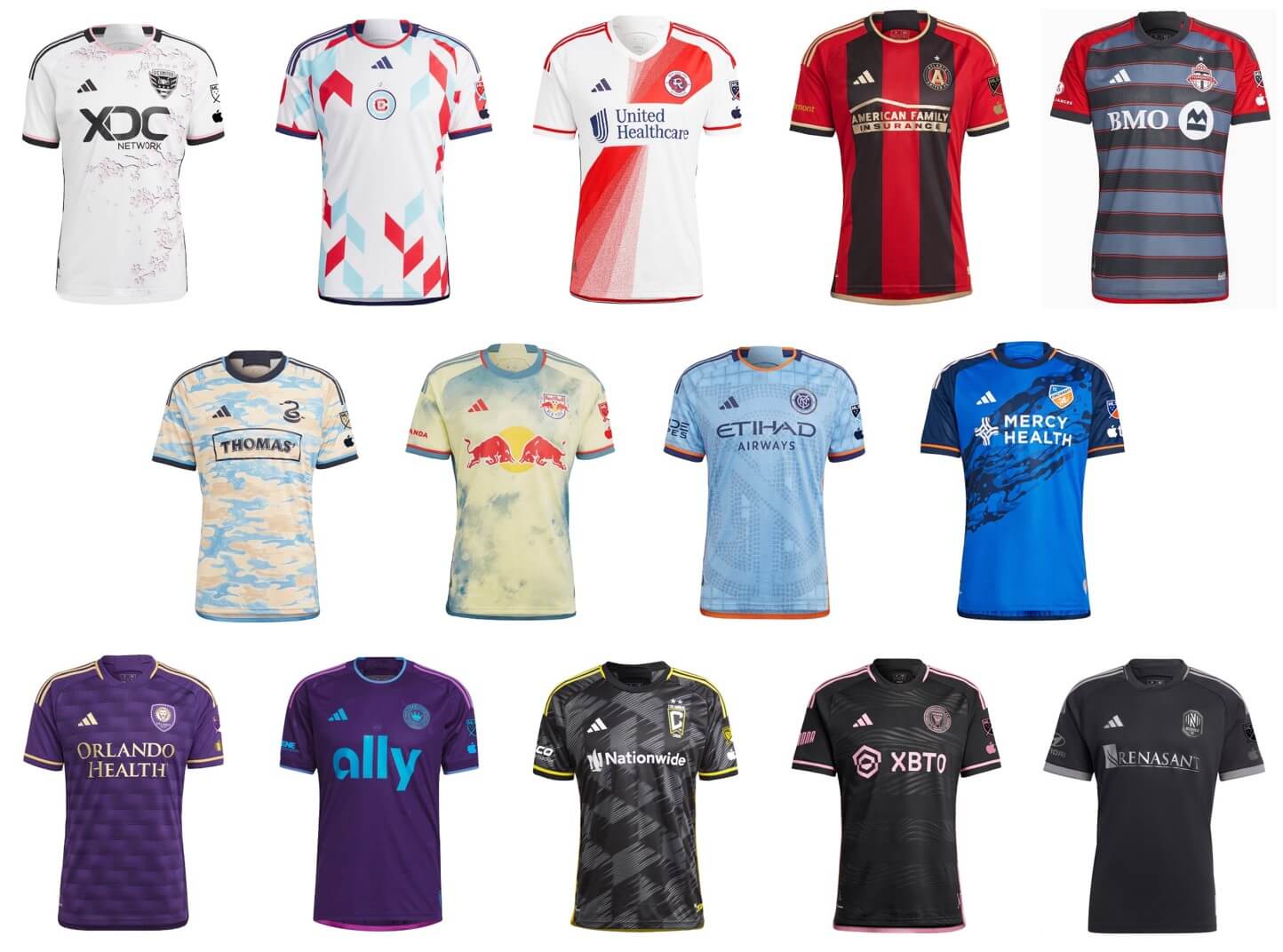
It’s time for the annual MLS Preview, and I’m back once again (for their eighth season) with soccer guys Kyle Evans and CJ Fleck, who’ve not only previewed and reviewed the MLS kits and jerseys from previous years, but have also reviewed other leagues plus the Olympics and World Cup.
There’s a lot to get to today — we’ll begin with the Eastern Conference and conclude with the Western Conference later this morning — so let’s get started.
2023 MLS Uni Preview — Eastern Conference
by Kyle Evans & CJ Fleck
Thanks Phil! We’re glad to be back for our 8th(!) MLS season jersey p/review. The league kicks off today, now with 29 teams with the addition of St. Louis City SC (moving Nashville to the Eastern Conference) and LAFC are the defending MLS Cup champions. The competition format changes as well, with a month long Leagues Cup tournament between all MLS and Liga MX teams as well as an expanded MLS playoffs (9 teams in each conference).
All of the uniforms continue to be made by Adidas, but you will now see an AppleTV patch on the left sleeve of every jersey due to the league’s new broadcast platform. As always, each team’s primary and secondary jerseys are on a 2-year rotating cycle, meaning that every team reveals a new jersey each year and wears them for 2 seasons. Each of the new kits have a “name” primarily for marketing and storytelling purposes which we will avoid. On to the jerseys!
Atlanta United (primary)
Red and black vertical stripes with gold accents
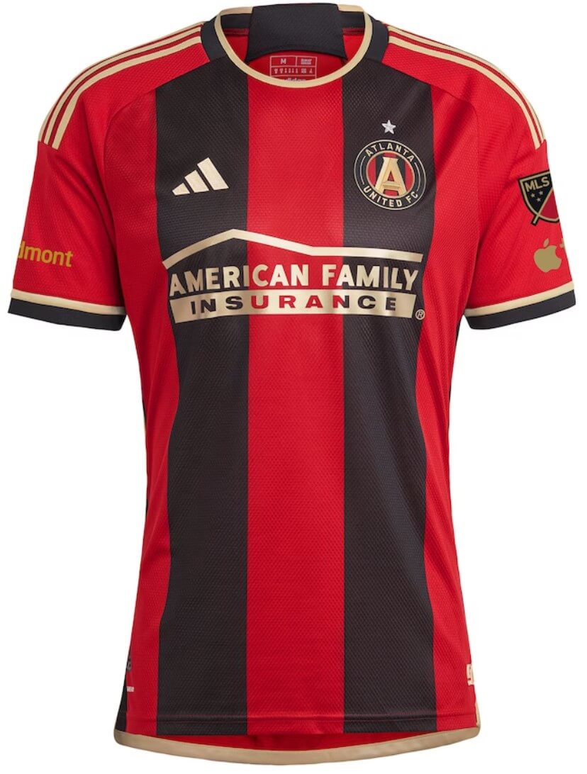
Kyle: The perfect look for the 5 Stripes and the gold elements are great.
CJ: I do like the use of gold as Kyle says, but let’s remember they’re still advertisements, including the Adidas stripes. Good look overall though.
Charlotte FC (secondary)
Purple with neon blue accents and sublimated crowns
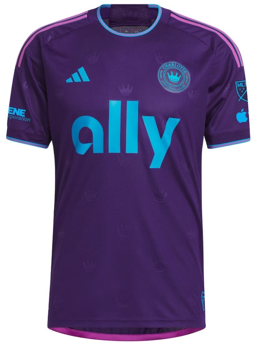
Kyle: I know you won’t really see them, but I’m not a fan of the sublimated crowns. Maybe if they went with the Charlotte Crown team name.
CJ: Extremely 90s, though that enormous ad in the middle is certainly of the present age.
Chicago Fire (secondary)
White with red and light blue parallelograms
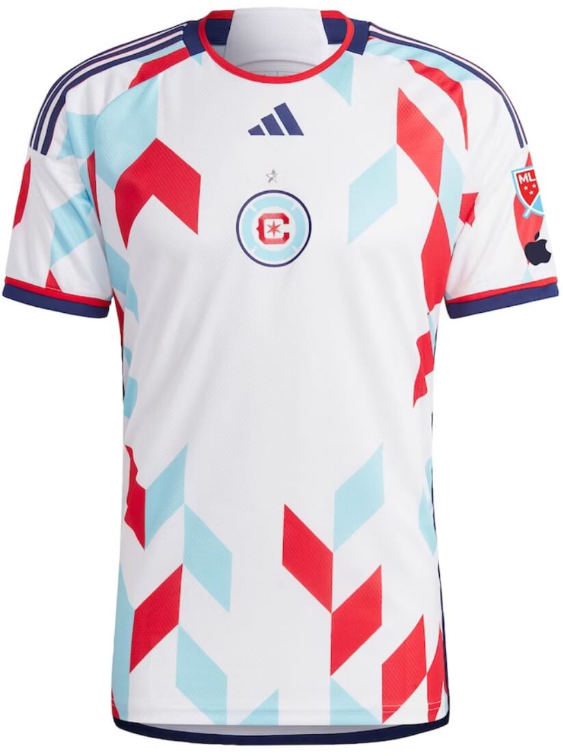
Kyle: I’m not saying there should be an ad, but the empty middle is certainly expecting one. As for the geometric design, it doesn’t excite me.
CJ: Certainly eye-catching, but I’ll wait to see an in-game look at it. Could be a blur at game speeds.
FC Cincinnati (primary)
Blue with navy sleeves and a river-like diagonal pattern
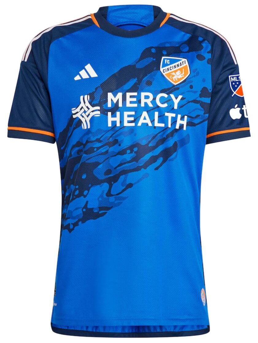
Kyle: Storytelling aside, the design works in the spirit of a sash.
CJ: I would rather a real sash design over an attempt in spirit, plus it could use more orange in general.
Columbus Crew (secondary)
Black and gray slanted checkerboard design
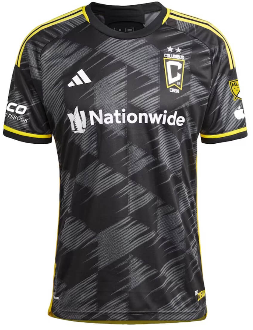
Kyle: Honestly, Columbus continues to be one of the best looking teams in the league.
CJ: Hard to disagree with Kyle here, though Columbus is blessed with an easy color combination.
DC United (secondary)
White with cherry blossom design and black accents
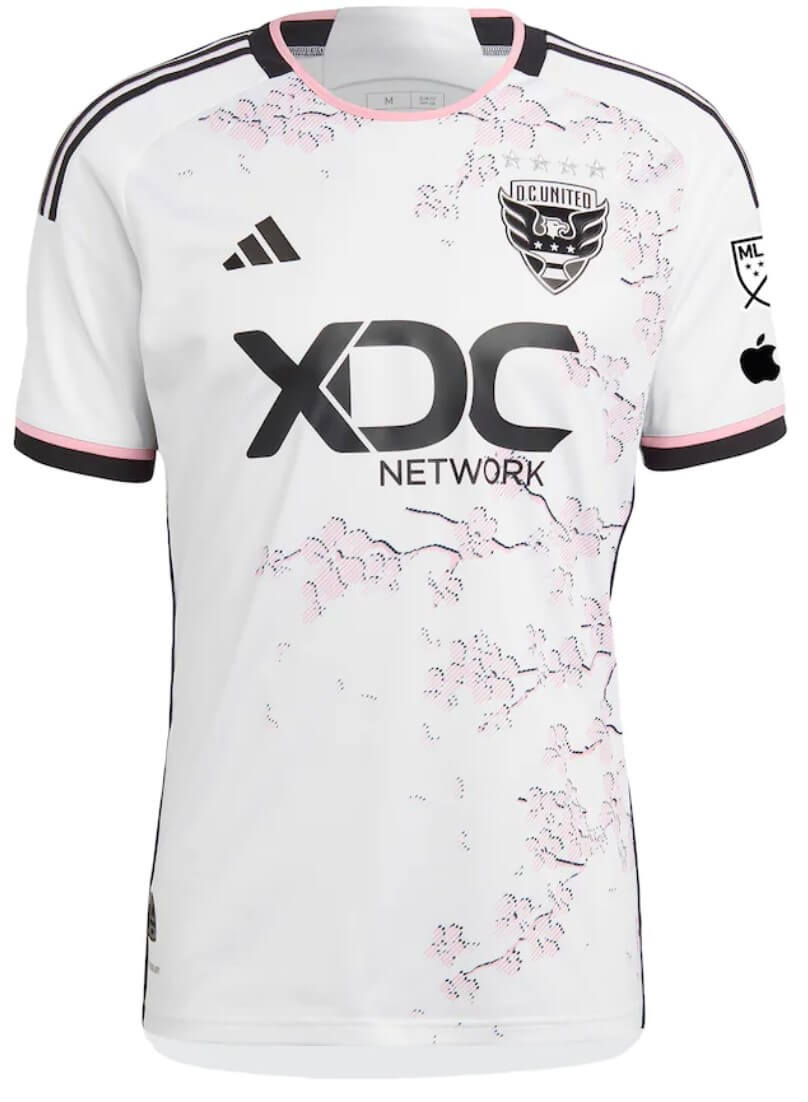
Kyle: Seems like every DC team is embracing the cherry blossom jerseys, and why not? I think this one has the right balance of not too overwhelming or too subtle.
CJ: Probably invisible on the field, but worth the design time for sure.
Inter Miami (secondary)
Black with pink accents and subtle wave-like pattern in horizontal stripes
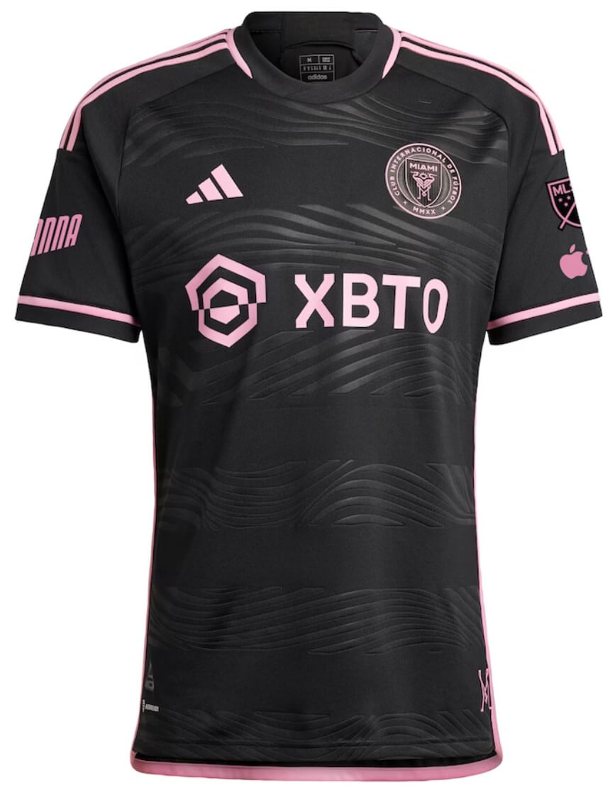
Kyle: Black and pink continue to work well together.
CJ: Much like Columbus, just a solid combination in general.
CF Montréal (primary)
This is a leak and has not been officially released yet, there was a delay associated with the new rebrand.
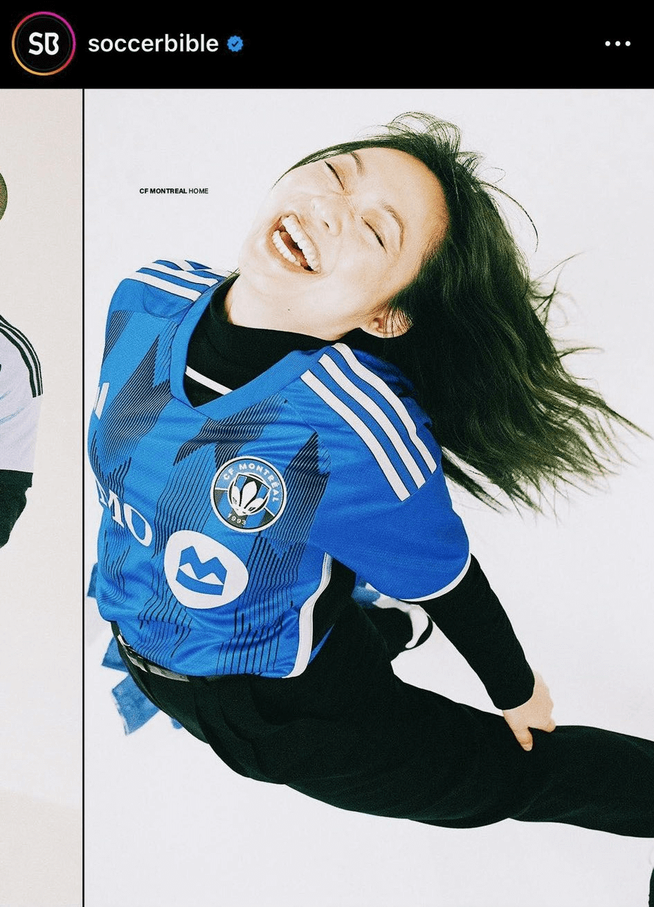
Kyle: I hope this is the actual jersey. And nice job on a much improved new crest.
CJ: Looks promising! We can only hope.
Nashville SC (secondary)
Black with gray accents, tribute to Johnny Cash
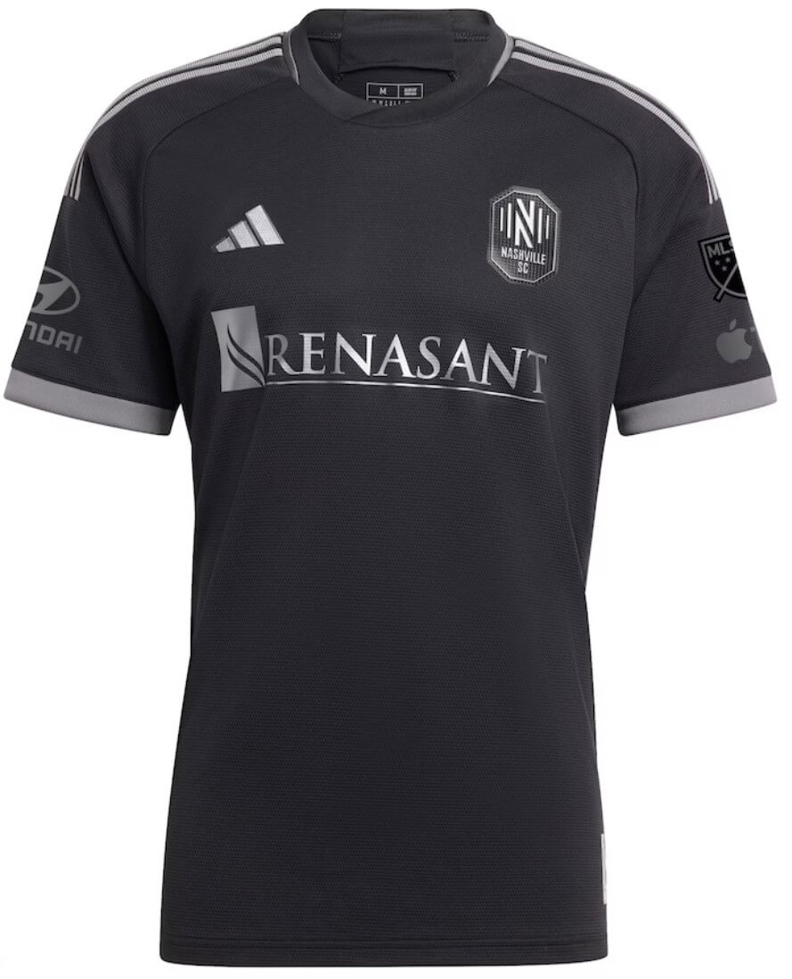
Kyle: There’s enough black jerseys in the league, but I respect the collaboration and musical tribute.
CJ: I normally wouldn’t buy the tie-in on a basic black kit, but the muted accent colors really make this for me.
New England Revolution (secondary)
White with red rotating gradient sash
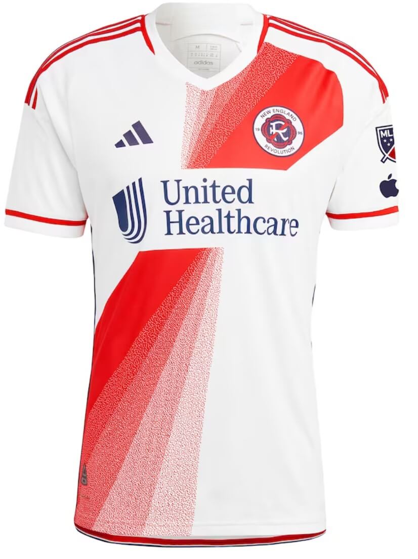
Kyle: One of my favorites of this season’s releases, a unique take on a sash that matches the new team crest.
CJ: The sash is an unfortunate casualty of the ad, but it’s a great effort.
NYCFC (primary)
Light blue with navy/orange accents and a sublimated team crest in subway mosaic style
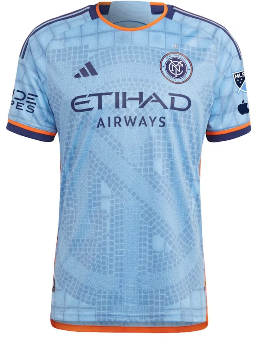
Kyle: The nod to subway mosaic art without being overwhelming is well done.
CJ: Another fashion element that probably gets lost on the field, but I agree with Kyle.
New York Red Bulls (secondary)
Light yellow with splashes of pale blue, created by a luxury clothing designer
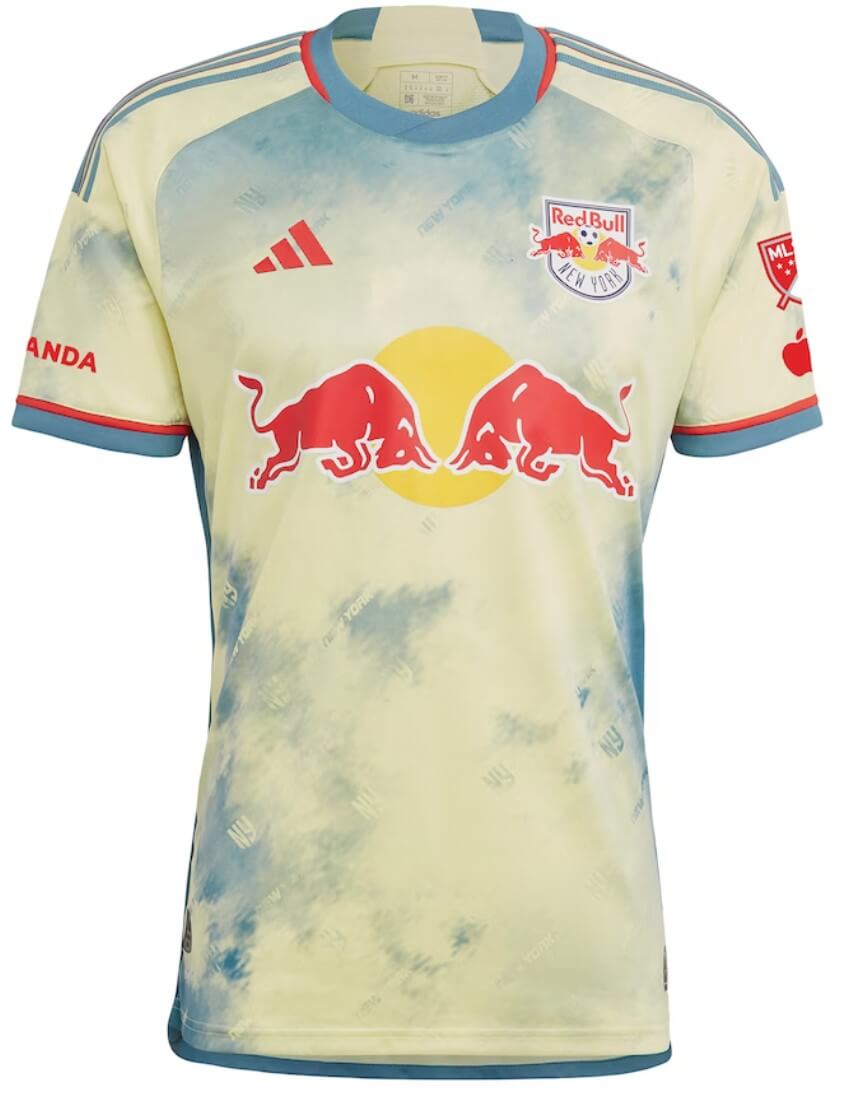
Kyle: This one has grown on me too, a really unique use of colors.
CJ: I’m not sold, but there certainly have been worse designs in the history of the league.
Orlando City (primary)
Purple with gold accents and brick-style design
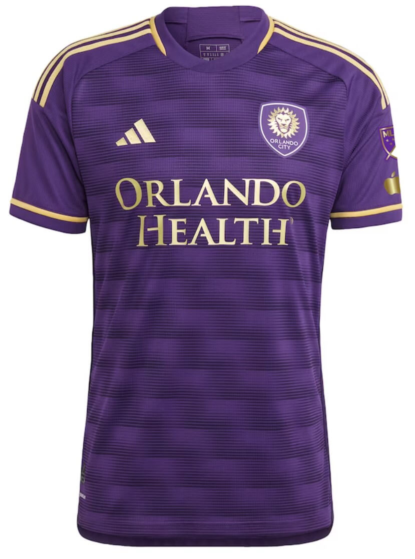
Kyle: Once again, the gold accents look great.
CJ: Well executed and solid look.
Philadelphia Union (secondary)
Camo-style gold and blue design
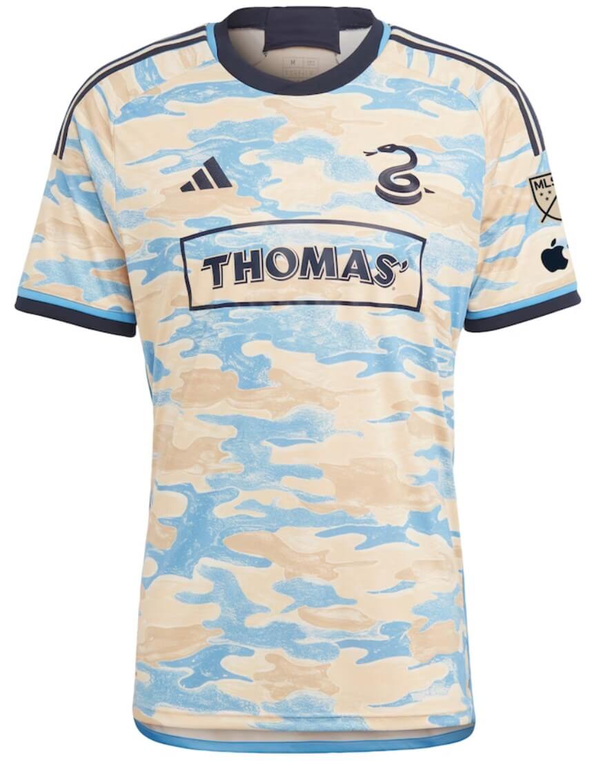
Kyle: Sorry CJ, this one looks like a training top to me.
CJ: Alternate logo use can’t win out over the faded camo look. Even worse, it apparently gets paired with plain blue shorts and socks.
Toronto FC (primary)
Gray and black horizontal stripes separated by thin red stripes and red sleeves
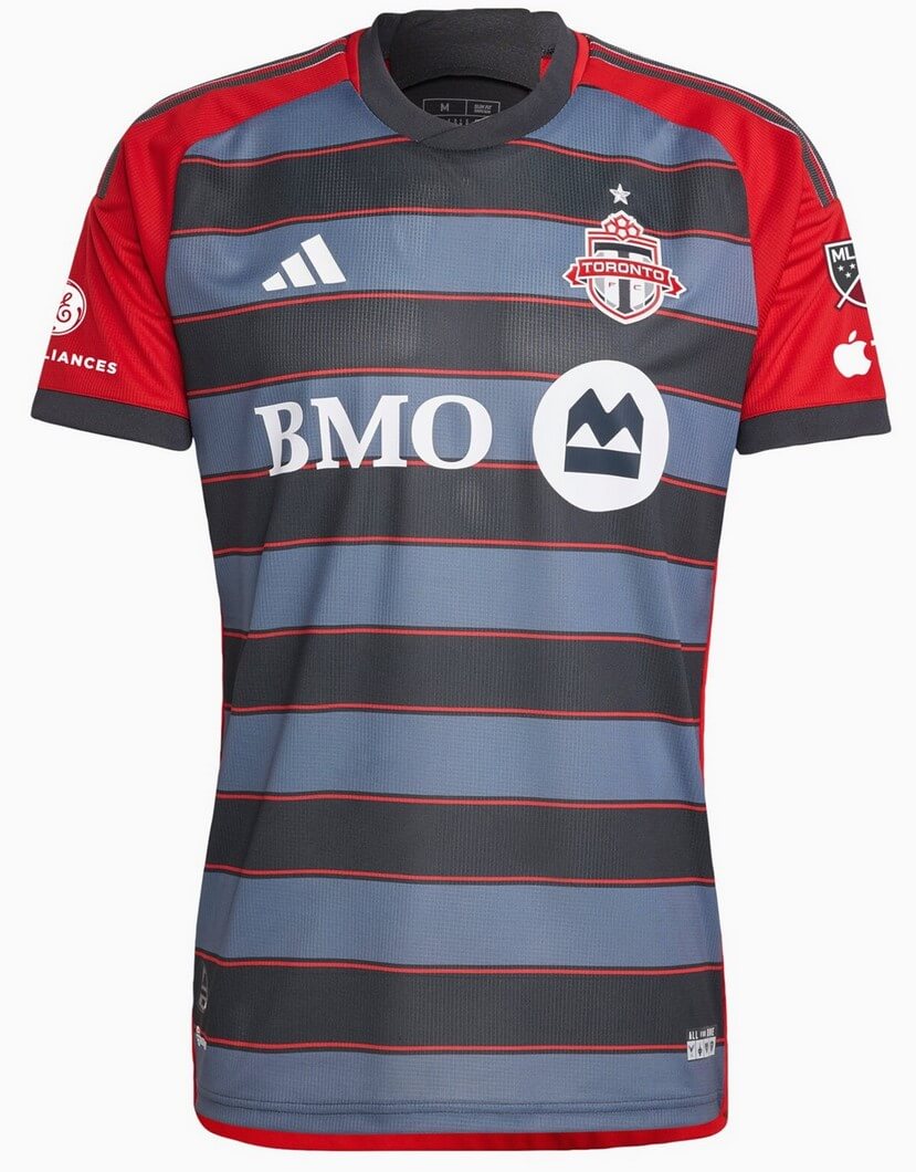
Kyle: This is the first primary kit in TFC’s history to not be predominantly red and while it’s not terrible, I think it’s too far removed from their visual identity and history.
CJ: Quite like the last entry, this also looks like a training top. Given the limited kit options, it’s surprising to go that far from their visual identity as Kyle says.
Thanks, guys! They’ll be back again with Part II — the Western Conference — later this morning.


For a second-tier league, MLS has some decent kits. Adidas didn’t go completely cookie cutter. I could see myself wearing a few of those. Digging Miami and NYCFC.
By the way, we’re looking at the future of NBA uniforms. Huge ad front and center…small team logo in the corner. It’s coming.
A mixed bag – some good (Atlanta, NYCFC, Orlando), some interesting (NYRB, DC U), some bad (Cincy, Union).
It is increasingly unclear who adidas is targeting with uniforms – the teams who wear them in the field or the consuming public and their disposable income. So many of the best intracacies on these designs (crowns on Charlotte, bricks on Orlando, stripes on Miami, tile mosaic on NYCFC) won’t be visible from the stands or on TV. Others (Chicago, Union, Columbus, NYRB) will look like a blurry mess. I always thought teams should view their prototypes from the upper deck of the stadium and through a camera lens as well up close.
Regarding my team specifically (Union), this is a mess on its own merits. Too heavy on a gold that comes across as a pale beige, camo that has no connection to the team or the city, very muted top, doesn’t pair at all with the shorts and socks. That it replaces perhaps their best design ever – the lightning bolts in Philadelphia city flag colors with the bright yellow shorts – is just insult to injury.
To quickly answer: the consuming public.
Lee
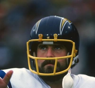
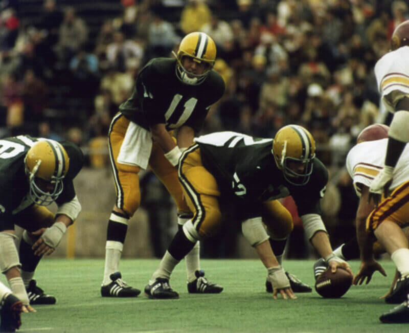
This is the first time I’ve seen a photo of Fouts with a Dunguard facemask as a Charger. Maybe it was from preseason or training camp picture day in 1974? That would be the first year for the royal blue and yellow uniforms. The facemask we are most used to seeing him wear is a Schutt OPO model; maybe Schutt didn’t have their yellow masks ready for a picture day of some kind so they put that Dunguard on his helmet?
Thanks, John.
I assumed Fouts wore a Riddell, as I went off Paul’s piece on the origins of the Chargers yellow facemasks, which indicated they were only obtained from both Riddell and Dungard:
link
Plus he wore his usual mask in his rookie year too:
link
Could not find any proof that the Dungard was worn by Fouts in a game, but at least 2 of his team mates…surely more… wore that style -maybe he just grabbed one to put on that for the photo?
TE Wayne Stewart in ’74:
link
QB James Harris in ’77:
link
Both had nose bumpers though.
I’m pretty sure that as soon as Riddell and Dungard agreed to do the yellow and white facemasks Schutt decided to join them. Riddell metal facemasks were always slightly different shapes than the traditional Schutt facemasks.
I think we’re both on the right track in saying it was just a helmet he grabbed for a photo shoot.
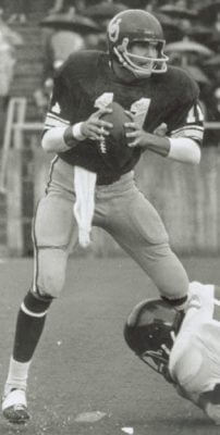
Just a wild guess, but I think GTGBTU is the last time the Chicago Fire donned white helmets. The game is against the Shreveport Steamers. I suspect this was an exhibition game or dual practice, possibly 1973 or 1974.
GTGFTU: Yes, not as it seems. First thought was Chicago Fire of WFL but so far as I can determine their helmets were red although with a similar logo. This has to be the Chicago Fire of the American Football Association. They only played one season, 1981. They won their division but lost the title game, called American Bowl V, to the West Virginia Rockets on Aug 30, 1981. I recall watching it on TV as I lived in the Chicago area then and it was televised at least locally. It was played on the Rockets’ home field. I cannot recall the Rockets’ logo or colors, so I cannot be sure this is the championship game pictured, but it is an AFA contest. It is hard to imagine that there are a whole lot of game photos from the AFA still around so I would guess that this is the final.
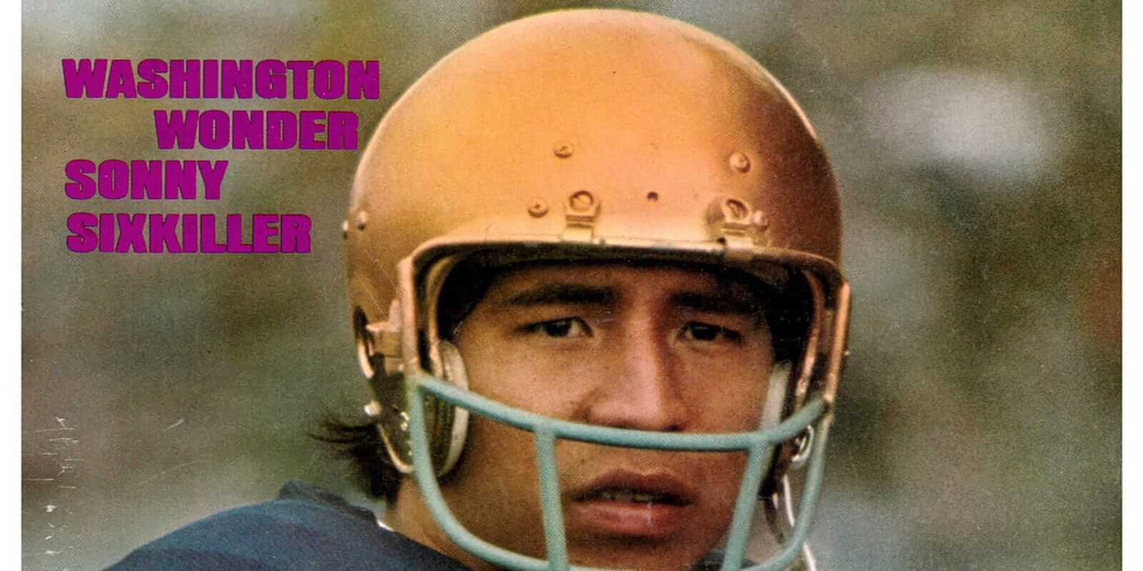
Sonny Sixkiller! his locker was next to my father’s when he was with the Bell. When I met him, I said you were number 30 on the Mean Machine in the Longest Yard, he laughed and said that’s right kid. The Bell didn’t have a number 6 jersey for him, he wore 28 in the team photo.
Your GTGFTU enrty is a real stumper, and it being B/W makes it real tough!
I have more questions than an answer.
Assuming this is a WFL game…
The Chicago Fire went white-over-white at home (Soldier Field was turf at the time, right?) but wore red helmets for their 1 and only season.
Their opponents-looks like Shreveport- have their season 2 logo on their helmets…but the jerseys are stripe-less…they only wore those when they were the Houston Texans (they only team that didn’t have sleeve stripes?), who had logo-less helmets when they debuted against the Fire in ’74.
Don’t think the WFL never held an all-star game.
Help?
You will be surprised who played QB for the Steamer, maybe Phill will let you know tomorrow.
I miss This Week in Baseball. When the Oakland Coliseum got Diamond Vision in 1986, they would play TWiB during BP. Nothing better than the end credits music with the slow motion plays.
Advertisements breaking up the sash will always be one of the most tragic uniform occurrences
I’m going for it…
07/04/1981
Shreveport Steamer at Chicago Fire…an American Football Association contest:
link
Well played, Mr. Corcoran!
No Chris H, well played by you! nice job. Over the years I have had people ask me if the Chicago Fire also wore white helmets? Though I am considered an expert on the WFL I had no idea who that other Fire team was? I could tell by the turf shoes and facemasks that it was late 70’s early 80’s, but was not familiar with this league.
I had no idea this league even existed!
Scroll through that link above…there’s a team that played against that iteration of the Fire that looks like they got their helmets from the Philadelphia Eagles and then there’s the West Virginia Rockets who outfitted themselves in Houston Oilers-looking blue britches.
I remember the Baltimore Eagles, their QB played for Maryland, my father actually would throw to some of their WR’s to stay in shape while waiting for that call in 1976 from the NFL, another thing that didn’t work out.
Chicago Fire 24 vs Shreveport Steamer 15 AFA game played at soliders field 1981
Joseph G is another winner! I guess this wasn’t as hard to figure out as I thought it would be. And the QB for the Steamer that day was a ghost from Thanksgiving’s past, the mad bomber Clint Longley.